Showing posts with label guild. Show all posts

Saturday, April 2, 2016

April Flowers Vote

It's time to vote! We had a great turn-out from our guild members, so many beautiful creations for the Flowers theme... it's tough to choose just 3 pieces, I wish I could vote for all of these lovely polymer clay creations! Check them out for yourself:


Head over to the PCAGOE site and vote for your top 3 favorite pieces! Remember, one lucky voter is chosen every month, to win a prize... it could be you! Voting is open from now until April 7th at midnight EST, so go there now and cast your votes!

Wednesday, March 2, 2016

Time to vote for March Challenge

Yes, it's time to vote again! The March PCAGOE "Rings" themed challenge opened for voting yesterday... it will run through to March 7th at midnight EST. Look at all the lovely entries our members created this month:


I don't know about you, but it was tough for me to pick just 3 favorites! Head over to the PCAGOE blog to cast your vote... remember a lucky voter will be randomly chosen to win a prize, and that could be YOU! Go here to vote now! Thank you!!

Saturday, February 6, 2016

February Vote - Four Seasons

Wow, time has gotten away from me again! There's only 1 and a half days left to vote for this month's challenge! Here's a peek at the fun pieces my guild members and I have created for the four seasons theme:


Please head over the the PCAGOE blog and vote for your 3 favorite entries! One randomly selected voter will be chosen to win a free prize... it could be you this month! Voting will close for this challenge at midnight EST on February 7th, so hurry over to the PCAGOE page now!

Monday, January 25, 2016

Seasons of Change

I think most people on the east coast of USA are ready for a change of season! While I am a lover of all 4 seasons, I must admit that after shoveling the nearly 3 feet of snow, that was dumped on our area this past weekend, has left me not too keen for more of the "white stuff"! I do however love being snowed-in, especially when some of that time can be spent creating... as was the case this weekend. The project that I tackled was my guild's February challenge piece, of the theme "4 seasons (spring, summer, autumn, winter)".


I kept thinking of one of my favorite songs, by singer songwriter Nicole Nordeman... called Every Season (you can listen to it here). I love the word imagery Nicole uses in her song to describe and make us sense each season; and this featured in my thoughts while creating this challenge piece. I decided that I wanted to do a series of small wall hangings that depicted the growth changes of a plant from spring to winter. When brainstorming my ideas for this, I was excited about the concept of using the background of each canvas to depict the season's weather. Spring would have raindrops, summer would have hot blazing sunbeams, fall would have a colorful sunset sky, and winter would be a frosted coating of ice.


I created the backgrounds first, and had a lot of fun doing these! I used inks, washes and paints on the polymer for the winter and summer canvases. Spring raindrops were created using liquid Fimo drops, and autumn background is a simple skinner blend of sherbet sunset colors. The plant begins it's life as an unfurling and budding shoot in spring; leafs out and flowers in summer; changes leaf color, fruits into berries and begins dropping leaves in autumn; and finally is bare branches, picked over berries and decorated with snow for winter.


I created the canvases so that they can be hung separately, I like how this separateness allows for changing up the look of them and gives the owner flexibility in how they will be displayed.


I had a lot of fun coming up with various ways to shoot them with the camera, imagining different ways in which they could be hung on the wall, or how they might be stacked upon one another in a shop while waiting to be sold.


If you didn't notice, the winter background has a treatment of inks with mica, which makes the frosted background appear different at varying angles, you can get a good idea of that effect in the following 2 photos:


I'm not sure if I like them best grouped together in a bunch, like the first photo of this blog post, or displayed in a straight line... then there's the option of vertical or horizontal... 


I'm really quite pleased with the turn-out of these pieces, there's something about each one that I love, but overall I think that the summer one is my favorite. That's somewhat amusing to me, as I'm not a summer girl... while I love all the seasons, the sultry hot and humid heat of the summer is probably my least favorite time of year. Which one of these appeals to you most, and why? Does it correspond to your personal favorite season? I'd love to hear your thoughts on this project, please leave me a comment below! Voting for this challenge will open on February 1st at the PCAGOE blog. I'll post a reminder here when the vote is open!

Monday, October 5, 2015

PCAGOE October Inspiration Challenge

As of this posting, there are 2 days left to vote for the PCAGOE October challenge! Take a look at the wonderful pieces created, alongside the Wyatt Waters' paintings which inspired each piece:


If you missed the post about my piece (#6 in the above photo), go here to read about it. And don't forget to cast your vote for your 3 favorite challenge entries at the PCAGOE blog.  Remember, you could be the lucky (randomly selected) voter to win a prize just for voting, so don't delay!

Tuesday, August 25, 2015

A Walking Polymer Advertisement

Text or Letters. There are so many ways to use them to create art. The September Polymer Clay Guild of Etsy challenge theme is just that: Fun with ABCs, basing your art around letters or words. I had so many ideas floating around in my head for this challenge. But, as the month of August marched on, I found myself with limited time to create. Then, the recurrence of a health issue for a family member meant I wouldn't even have time to be in my studio, so I had to come up with something that would be portable, which meant limited supplies. Hmm, this meant no pasta machine or needing to juggle sharp blades... which for my mind, spelled out using paintbrushes and liquid polymer. That thought was when my final inspiration struck!


I had purchased some very inexpensive T-shirts which I wanted to decorate with polymer, you may remember my previous polymer decorated T-shirt which you can find here. But this time, I wanted the design to be more contiguous, which meant that I needed the polymer to be super flexible, as a t-shirt decal would be. I could have tried straight liquid polymer, but I knew that would result in a stiffer (more uncomfortable) product, so I came up with a concoction of liquid polymer plus 2 additives. The cured texture of this mixture is more like a rubbery latex material and it flexes beautifully with the fabric! The only problem is that when too much of one of the ingredients is added it creates a gummy, gooey blob. And when too much of the other ingredient is added it created a smoother product, but one which didn't cure fully. So, it required a lot of patience and trial and error. I am not revealing my concoction yet, because I feel it is not perfected. I do have some ideas of how to make it even better, which I want to explore before I reveal my mad scientist experimentation results.

So, I set to work and created a T-shirt painted with my business logo. The front was bedecked with the chosen font of my business name logo, and on the back of the T-shirt, I tried my best to simplify and capture (in painted polymer) my polymer quilled globe design (which has become my business logo - see the header of the blog above), plus the text of the web address of this blog.


Unfortunately, time was running low and when it was time to paint the inside of the continents (the very last thing I did), I was left with the choice of letting them go unpainted, or painting them with a combination of straight liquid polymer from 2 different brands. As I had predicted, the result of the straight LPC, without my secret additives, was a stiff texture. Luckily, these are such small areas, that it will not detract from the comfort of the T-shirt. Unfortunately too, I was unable to add the scrolled faux quilled design to the interior of the continents, due to lack of time.


All-in-all, I'm happy with the results of my experimentation and my new walking advertisement for my business! As I alluded, I am wanting to experiment further with this idea, and have a stack of T-shirts piled up, waiting to be decorated. When I get the combination adjusted to a well workable, curable and predictable mixture, I'll be ready to share my experimentation and results, possibly in the form of a tutorial. Thanks for stopping by my blog to check out my logo T-shirt project! I'd love to hear your thoughts on this piece, please consider leaving me a comment below! Voting opens for this PCAGOE challenge on September 1st and will run through the 7th at midnight EST. I'll try to post a reminder here, when voting is open.

Wednesday, November 5, 2014

November Vote!


Time to Vote again! Go to the PCAGOE blog to cast your vote at this link.  Remember, 3 lucky voters win a prize every month! Thanks to Marie Young of Young Creative for the promo photo posted above!

Thursday, September 25, 2014

Catching Dreams in Four Directions

The theme for my guild's challenge this month is Native American/Southwest. I may have mentioned previously on this blog my former love affair with Native American art. It began as a college student as I became aware of environmental issues. A fan of Greenpeace and their ship, The Rainbow Warrior, at that time I learned the Native American Prophecy that gave the Greenpeace ship it's name:

"When the earth is ravaged and the animals are dying, a new tribe of people shall come unto the earth from many colors, classes, creeds and who by their actions and deeds shall make the earth green again. They will be known as the warriors of the rainbow."   -- Old Native American Prophecy

It was this quote that inspired my first environmental artwork, which was a wood cut print. I guess because it was a time of exploring different ideas to find that which resonated with my soul, I delved into Native American stories. I became fascinated with the symbolism, and their respect for the earth and every living thing captivated me and mirrored my own beliefs. My entire senior drawing portfolio was based upon Native American art. 


Later, I learned how to weave a dreamcatcher. At the time, there was a bit of a craze for them, and I wanted to make one as a gift for a special friend (the mom of one of my best friends). She had Native American blood in her ancestry and she kept a collection of Native American figurines and southwest decor. This bit of my history was the basis for this piece. I knew I wanted to create something incorporating the liquid polymer coated string, so I decided to revisit my history and make a dream catcher. But I wanted something more, I looked at medicine wheels and wanted to incorporate some of the symbolism from medicine wheels into the piece. Here is a great image that shows some of the symbolism and colors associated with the 4 directions on a medicine wheel:


Thinking about the piece further, I decided to try to make my own feather, using the string coated with liquid polymer idea with which I've been playing recently. The feather alone took a full day to make, that's a lot of string! Have a look:


I decided to make the frame of the dreamcatcher/medicine wheel resemble a wooden branch. But, I didn't have enough packages of clay in tones of brown, so I began by wrapping my base support with scrap clay. I decided that I really liked the mottled undertones from the scraps, so I just smeared some burnt sienna and black paints onto the surface so that the clay could give a sort of underpainting effect to the circular bases. A smear of transparent liquid polymer with a scattering of embossing powder after curing gave just the right finish. I wove the dreamcatcher part with string and coated it with transparent liquid polymer. 


I sketched out some ideas as to how to create the medicine wheel part of the piece. I wanted something that looked authentic, so I decided to create a piece of faux leather and chose to paint my four direction animal and color symbols onto that surface. For this piece, I mixed up some buckskin color using translucent, ecru and raw sienna Premo. Tearing the edges gave me the look I wanted, of an animal pelt that was cut with crude tools. The surface was given a faux leather treatment which involved texturing it, adding hints of burnt sienna acrylic paint and spot scorching to bring out a darker amber in selected areas. The stylized 4 direction animals were painted on top of the faux leather piece with acrylic paint in their symbolic colors. 
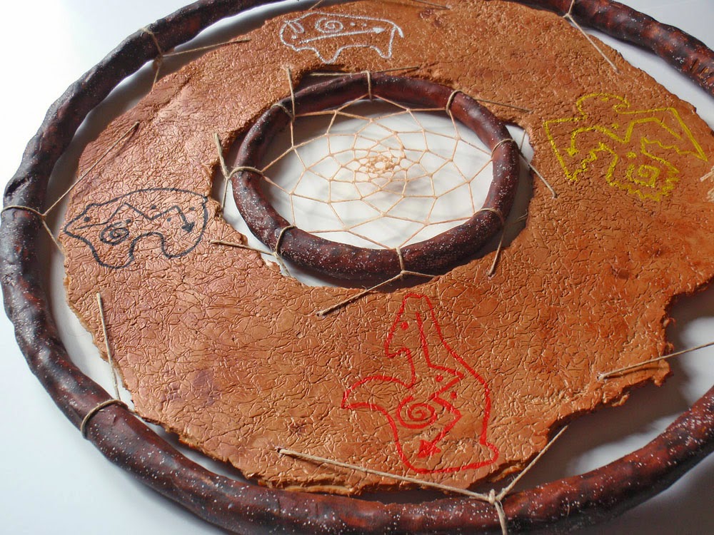
 

The hardest part of this entire piece was threading and securing the faux leather to the rings! I first tried to use the same string I used in the dreamcatcher and feather, but it kept breaking when I pulled too tight and was too loose to hold the heft of the faux leather. I needed something with less give, so thankfully I had a ball of natural hemp cord which was strong enough and taught enough to do the trick. The final touch was to add the feather to the side of the frame and attach some dangling beads. Had I had more time, I would have made some faux turquoise beads for this, but I didn't want to be working until deadline as I did last month... so I opted to raid my bead stash. I chose some turquoise beads that were repurposed from a vintage piece of jewelry I bought from a local place. I'm not quite sure what the original material of these beads is, I'm afraid it might be dyed bone. I was hoping to say this piece is a vegan dreamcatcher since everything I made for it is faux (no sinew, no leather, no feather) but I can't say that due to my hunch about the beads. Ah well...  maybe I will eventually take the time to make those faux turquoise beads and swap them out... might be a selling point on etsy! ;)
Here's the back of the piece, for those who are curious:


I am really pleased with this, but I don't feel the need to keep this one, so it will go to my etsy shop... It was a nice return to a former passion (theme) and all went fairly smooth with this project. I was really pleased with the faux feather, and it was fun to create! I'll be moving on from the lpc covered string idea for a while, as I revisit another technique which I explored a year ago. I'm hoping to write an article based on my upcoming experimentations and I'm excited about the new ideas that are brewing for the potential article! Hopefully I'll still be able to come up with pieces for the next few challenges while I work on my article pieces... stay tuned!  

I'll try once again to post a voting reminder... voting for this challenge opens October 1st and will close on October 7th at midnight. Please leave me a comment below and give me some feedback on this piece and anything else you care to share about Native American art! Thanks for visiting!


Friday, September 5, 2014

Still Time!!

There's still time to vote!!  I almost forgot to post a reminder on the blog again! As of this writing, there are 2 remaining days to cast a vote for your favorite entries and get a chance to win one of 3 prizes! The voting form can be found at the PCAGOE blog.


Also, as I mentioned in my last blog post, we're doing something special on the guild facebook page to celebrate the anniversary of The Polymer Arts Magazine. Each 2 weeks on the guild facebook page, we do an artist feature of one of our guild members. For the first 2 weeks of September 2014 we are featuring Sage Bray, who happens to be Editor/Publisher of The Polymer Arts magazine.  You can find the PCAGOE facebook page here. Check it out!

And be sure to hurry over to the PCAGOE blog to cast your vote for the challenge (voting ends midnight EST September 7th 2014)! Many thanks in advance to all who take the time to vote!

Friday, July 25, 2014

Rays of Summer

*If you are looking for my Bead Soup reveal, go here. 

For the month of August, my guild (PCAGOE) challenge theme is home decor.  I had been wanting to do an experiment with polymer by creating lots of negative space (sort-of a lacy polymer if you will).  Having sat on this idea for more than a year, I decided to push my challenge idea to incorporate this feature.  I prefer items for the home to be functional as well as beautiful, which I wanted for this piece as well.  So, my question to myself was, what functional item could incorporate my "lacy polymer" idea?  My mind immediately lighted on the idea of a soap dish because the negative holes between the polymer would allow a bar of soap to dry out and keep the bottom from becoming gooey. 


So, my first challenge was to find a base over which to create the "lacy polymer" part.  Considering that I "can" a lot of food from our garden every summer, I have an abundance of Ball jars.  The ball jars have metal rings which, after a season or two, become spotted with areas of rust around the inside of the ring.  When there's rust on the inside of the ring, they should not be used to seal jars of food.  I have had a bag full of these slightly rusted Ball jar rings waiting to be turned into something else.  If you follow my blog or know me at all, you already know how much I love to upcycle and recycle items that would typically be tossed to the garbage.  So, one of these slightly rusted rings became my base.


I first created the "polymer lace" over the ball ring and cured it.  Next, using Premo white, I added an oval dish, surrounding the circular ring, that I formed over a glass vase.  The piece was cured again.  I then added clay around the entire metal ring and joined it to the oval dish.  After a second curing, I sanded the solid clay parts to smooth out any bumps and fingerprints.  I then extended the radiating design of the center out over the oval part of the dish, these extruded pieces of clay were secured over bonding agent to assure their strength and bond to the dish.  I loved the idea of the center lace design radiating out onto the dish, and this reminded me of a sunflower or summer sun rays.


The outside of the dish was treated to winding extruded strands of polymer and finally a thicker extruded strand was added as a lip to the dish.  After another cure, the entirely white dish was then painted with a mixture of green, yellow and blue liquid Kato polymer, and flecks of copper and antique copper mica were splattered on to add interest and to achieve a glazed ceramic-like finish. 


I used the heat gun to spot cure the lpc and then did one final oven bake to be certain that the liquid polymer was completely cured.  As usual, I'm really happy with my prototype simply because the idea is out of my head and made a reality!  But, I still hope to revisit the idea to refine the process and improve the end result.   What do you think about my little soap dish?  Leave me a comment below!


The voting for this piece will take place from August 1st through midnight on August 7th at the PCAGOE blog.  I'll try to remember to post a reminder when the challenge voting is live...


Friday, May 23, 2014

Art Deco Dreams

My favorite two design styles are the Art Nouveau and Art Deco periods. (If you're here in search of my Bead Soup reveal, please scroll down to the next post or find it here)  My latest polymer project proved difficult, simply because I love both of these styles and I had many ideas and inspiration.My guild's challenge theme for June 2014 is Art Deco/Art Nouveau, hence my dilemma.  I'm actually more drawn to the Art Nouveau style, and I had originally had something else entirely in mind when I stumbled upon this fantastic bottle at my local Goodwill:


This bottle screamed Art Deco to me.  Actually, as it sat on the shelf at the Goodwill it called out to me, "you must use me for the Art Deco challenge"... really it did! ;)  I tried to ignore it, because well, I already had something else in mind for this project, but it sat there staring at me saying, "You can't ignore me, you know you must use me".  And so I brought it home.  This baby is big, with the globe stopper on top, it measures 16" tall, with the stopper pulled off, the bottle alone is 12.5" tall and about 6" in width at the widest point.  The cd in the photo above is for scale, to give you an idea of just how large this piece is. 

So I began by sketching out an idea.  I decided to stick with a traditional Art Deco palette in peachy/coppery tones. I started out with the first layer, covering the tear drop shapes with a blend of translucent premo mixed with a tiny bit of pearl white and a lot of copper metal leaf. For the other areas of the bottle's first layer, I chose premo copper straight from the package.  I cut some circular shapes and a line connecting them down the centers out of the teardrop areas and put it in for the first cure:


After a nice sanding to get rid of any bumpies, during which the cut circles popped off of the piece, I worked on building the next layer.  Using the half circle shape on my extruder, the extruded lengths were used to frame the teardrop shapes in a blend of premo copper, sienna and red.  A cut pattern of radiating rays and circles (in premo bronze mixed with translucent) was put in place to decorate the copper areas.  And a large circle was placed around the top... in it went for a 2nd cure: 


 The next step was to add more circles around the top, cover the bottle's lip and to cover the bottom.  I also had to cover and decorate the globe shaped stopper.  The top 1/3 of the stopper had a beautiful pattern of graduating rings, which I wanted to keep uncovered.  I used the translucent/metal leaf blend, the copper premo and the bronze/translucent blend for the base layer of the stopper.  The cut decorations on the stopper were also done in the bronze/translucent blend.  


 After the 3rd cure, I coated the entire piece with liquid polymer and hit it with the heat gun.  A fourth and final bake to ensure that it was fully cured, and it's finished!  I didn't want a high gloss sheen on this one, so I didn't sand or buff any further, I quite like the semi-gloss finish that resulted from the liquid polymer glazing.  I was going to glue the circle shapes back into place in the teardrop areas, but I like it better as open glass, besides it mimics the open glass as on the top of the stopper. 


Once again, I'm fairly happy with this project.  But it's not one that I feel I need to keep, so it will likely be going into my etsy shop, unless the hubby protests! ;)   What do you think?  Let me know in the comments, and tell me what's your favorite time period for style and decoration?  Voting for this challenge will open on June 1st and will run through June 7th midnight EST.  I'll try to remember to post a reminder here with the link!

Saturday, February 22, 2014

Which came first...

...the chicken or the egg?  It was this age-old riddle that provided the base inspiration for my newest piece.


For my guild's (PCAGOE - Polymer Clay Artists Guild of Etsy) March 2014 challenge, the theme is eggs.  I had decided to finally make use of a glass egg-shaped container I purchased at one of my local thrift stores some time ago.  This cute little container was a frosted glass egg that was made up of 2 halves separated by a decorative wavy cut.  I had other ideas for this challenge initially; I thought perhaps I might do another cut and layered project; I tossed around ideas pertaining to "traditional" Easter egg themes.  And then one day, while working on my studio and moving a vintage glass hen dish (you know the ones, mine looks exactly like this)...  I thought of the old chicken/egg riddle, added that thought to my guild challenge, and the rest as they say, is history.


The hen is modeled from buff orpington hens (click the link to see a photo of one).  I first sculpted the hen with some yellow premo, knowing I would give her lots of texture and would alter the coloring with an antiquing coat of burnt sienna, white and black paints, to add lots of depth to the feathers.  Her comb, beak, ear lobes, eyes and wattle were all coated with a gloss finish to add a little shine to those parts, her feathers and the bottom basket half have no coating. Next came the sculpting of the grass and then constructing the basket with extruded strips.  I knew again that I would antique the basket with white to make it look like a white-washed Easter basket.  I then decided to add a little surprise to the inside of the box....


...some grass and some brown eggs.  The grass and eggs are not attached to the inside, so they could be removed and the box could be used as a trinket box.  I had originally intended to sell this piece, even after it was finished I had decided to list it to my etsy store.  But after my husband saw it, all that changed... he at first thought it was something I had bought.  When he realized that I had made it, he urged me to keep it, as he thinks it's one of my best pieces.  The dimensions of this piece are 4 1/2 inches tall by 3 inches wide.  The little eggs are about 3/4" tall by 5/8" wide.  Here are a few other views and close-up shots:

 
Top View
 
Tail View


I'm pretty happy with my little sculpture, not as happy as my husband seems to be, but happy enough....  What do you think about her? Leave me a comment below!  Voting for this challenge opens on March 1st and ends midnight March 7th.  I'll post a reminder here with a link to the guild blog when voting begins!