Showing posts with label Technique. Show all posts

Thursday, March 1, 2012

Robert Fawcett on Drawing

Defeat and Death on Battan by Robert Fawcett

When asked in a 1960 Famous Artist Magazine interview how important drawing was to the total result of a picture, Robert Fawcett replied with the following quote:
Drawing constitutes the fountainhead and substance of painting and sculpture and architecture...Let him who has attained the possession of this be assured that he possesses a great treasure.
-Michelangelo
After my last post, I realized there was much more to share from the book Robert Fawcett- The Illustrator's Illustrator (which I highly recommend by the way).  I figured I'd post a little more today. The following is a breakdown of Fawcett's drawing style and mark making along with a few quotes from the above noted interview.


Q:What is the use of a picture anyway?
A: What use is a Beethoven symphony? To feed the spirit, to feed the soul.


Q: Do you believe artists should be trained?
A: They must pursue constant and relentless drawing. Being able to draw only comes about by drawing. Of course training will give the artist hints. But in the last analysis, the artist develops himself.


Q: Must an artist have talent?
A: I do not think that artists are naturally born...Sweat and application will develop the artist. An artist who wants badly enough to do it will do it anyway. It will be impossible to dissuade him. If students want to be spoon fed, this is not likely to be a real desire on their part to be artists, but merely a whim.


Q: What do you hope to communicate to those who see your work?
A: I would like them so see a sense of positive organization in my picture. If you see a picture that is well organized you have no trouble looking at it. This is the logical outcome of drawing. Drawing is seeing. And what we do is create a kind of order in a picture that makes it easy for people to look at.


On the art of seeing:
I'm just a built in eye. I can see with such clarity. But the hand always falters between the eye and the paper. ...You can learn to see by seeing....If I have a trained eye, I will record a more comprehensive picture because I know how to translate what I see. there should be the least amount of interference between the eye, the brain and the hand. When you have exhausted conventional seeing, you can go into more interesting things.

Q: What is the best advice you can give an aspiring illustrator?
A: If you want to be an artist, you will be an artist. If you do not become one, there is nobody to blame but yourself. The techniques can be learned and should be learned thoroughly. Then comes the relentless application of your knowledge.

Many thanks to Manuel Auad of Auad Publishing for his gracious permission to share these pictures and excerpts.


Tuesday, May 31, 2011

Painting With Texture in Photoshop


I recently learned how to import my own gesso texture into Photoshop and paint with it (see previous post here for full image). Some of you Photoshop pros are now saying something like "well, duh", but for me it was a big step forward. It's also much easier than I thought it would be. I am working with Adobe CS4, so I don't know how closely the following applies with newer or older versions.
STEP ONE was to chose a gessoed masonite panel- the type I usually prepare for my oil and acrylic paintings. I took black acrylic paint and with a sponge, worked paint down into the textured surface. I wiped most of it back out with slightly damp paper towels so that the deep texture retained the paint but most of the high texture peaks were wiped clean. I then scanned this 8" x 10" panel on my flatbed scanner at 600 dpi.

detail of my gessoed texture

With this scan now open in Photoshop, I adjusted the levels to exaggerate the contrasts a bit, pushing the darks and lights further apart. Next, under the EDIT tab at the top of Photoshop, scroll down to DEFINE PATTERN and click it. A box will come up with a thumbnail of your new pattern and a prompt to name it. Click OK and your pattern is now saved in the textures section of your Brushes Palette. To paint with this new texture, simply open the brushes palette and check the texture box. Click the word TEXTURE and your current selected texture will show up. To the right of your texture thumbnail is a small arrow pointing down. Click it and the textures in this palette will pop open. Your newly scanned texture will be at the bottom of the list. Select it and you are ready to paint with it.


Things to keep in mind when painting with texture:
If you want your texture to echo exactly what you have scanned and mimic a real gessoed board, DO NOT CHANGE THE SCALE SLIDER after you begin to paint. If you do, the size of your texture will not be consistent across the canvas.
You can choose to paint either the highlights or the valleys of the texture by leaving it NORMAL or by selecting INVERT. Normal will paint the "high" points of the texture much as with drybrushing and if you select invert, the paint will fill in the low points of the texture and leave the high spots relatively paint free. I found this to be very effective when I wanted to "glaze the shadows" without killing my texture. Keep in mind that when switching back and forth between the two, it is easy to forget and you may end up painting your highlights in the depths and the shadows on the peaks of the texture. I decided that INVERT would be for darks and normal would be for lights, so I could keep it straight in my mind.
Also, the depth slider allows you to determine how prominent or subtle you want the texture to appear. I found I liked the texture depth at about 70-75%. Using the OTHER DYNAMICS setting in the brush palette also is incredibly useful in order to take full advantage of your Wacom tablet capabilities, as it allows for softness at the edge of brush strokes, but that is fodder for another post. I hope this makes sense. if you have any questions after having tried this out for size, just shoot me an email or comment.

Monday, January 10, 2011

Van Gogh Deja-Vu

My version of Vincent's Chair - Oil on canvas 28" x 36"

When I was working on my undergrad degree I had an art history class in which we were given an interesting option. We could either write a scholarly report on an artist of our choice from the period or make a copy painting instead. For me the choice was easy and I immediately chose the painting option. I had always admired impressionist painters and Vincent  Van Gogh in particular. I didn't realize at the time how difficult it would be to research his materials and working methods, let alone find adequate reproductions from which to work. Of course observing the actual painting firsthand would have helped, but given that the painting I chose was at the National Gallery in London, that was not an option. I did my best to replicate Vincent's work and got an A on my project.

Vincent's Chair, by Vincent Van Gogh, 1888

My professor noted that it was one of the best Van Gogh copies she had ever seen, though looking back I realize I made numerous mistakes in my interpretation. First off, I did not concern myself enough with finding suitable materials and the relatively smooth cotton canvas I used does not come close to the course textured weave of the original. My attempts at the thick paint stokes of Van Gogh also pale by comparison. I managed a certain level of paint thickness, but having seen many originals by Van Gogh since then, I realize how skimpy my application was in certain areas. Also, I suspect my colors are not all that accurate particularly in the turquoise blue of the door and some of the yellows tend more toward to green than to the orange that I think they should (never having seen the original, it's hard to say). That said, it was a fascinating exercise and one that I think is valuable to any artist looking to learn the process of a master painter. Such deconstruction is a time honored technique for students as long as you don't get sucked in to the art forgery end of the business like John Myatt did in the late 1980's and early 1990's. That is a subject for another post.

Monday, July 12, 2010

American Express Project Finish

Salt Lake City - 12.5" x 12.5" acrylic on illustration board
Client: American Express

After the finished drawing was approved, I began the final painting. For several years I have been using what I call a "digital under painting" on a lot of my work. Basically, I take my final drawing and give it some color in Photoshop, establishing the basic color palette and values. I leave room for the light end of the value spectrum by keeping contrast a bit on the dark side. This allows me to bring up the brightest highlights with my paint. I printed the colored sketch out on my 13" x 19" Epson printer and mounted it on a piece of illustration board using acrylic matte medium. I use a heavy rag paper for my printouts so it won't buckle too much when I mount it. The Epson inks are pretty water stable so there is very little bleeding from this process. I then give the surface a bit of texture and start to paint right over the top with acrylic.

During the middle of this project, I was scheduled to be in New York City studying with my MFA class and knew I would need to work on this painting in the evenings at my hotel. When booking the trip, I figured that it was a good idea to save some money so I went with a sort of European type of accommodation, thinking we could deal with the whole "micro hotel" issue. Well, upon check in, classmate Val Taylor and I discovered we were booked into a broom closet with a bunk bed- bathroom down the hall. It was so small, that I could literally touch both walls of the room at the same time.

Here I am touching both walls of the NYC hotel closet...err... room

Needless to say, painting this picture cross legged on the top bunk while watching ESPN on my 6" personal TV was not my idea of ideal working conditions, but hey, I got a good story out of it. Note to the wise- go aheadspring for the big room if you ever stay at the Pod Hotel in NYC, better yet, find another hotel. I finished the painting up the day after my return and it has been such a hit, that American Express recently optioned a lucrative buyout of the remaining rights.
Friday, July 9, 2010

American Express project part 2

Salt Lake City- color study 1- graphite with digital color

Salt Lake City - study 2 - graphite with digital color

Salt Lake City - Final Drawing - black prismacolor, 10" x 10"

After the client decided on a direction for this project, they asked me to do a couple of color studies. I did a daylight version and sort of a golden evening version (which I thought was more dramatic but that the client did not choose). They settled on the daylight version and I went ahead with a much more detailed drawing. I incorporated some of the adjustments that were suggested, including a more forced foreground perspective. The final drawing is an improvement over the sketch  and was approved to go to final art. Anyone familiar with Salt Lake will recognize such landmarks as the Salt Lake L.D.S. temple, The City and County building, the State Capitol, the Rio Grande Depot, Energy Solutions Arena and Rice Eccles Stadium. All the other buildings also make part of the city skyline though I have taken some liberties in the orientation and arrangement of the buildings. Next post I'll show the final painting and tell the adventure of painting it.

Tuesday, June 15, 2010

51st Sketch Goes Color

Photocopied sketches were pasted on a board and painted over - 18" x 5" - acrylic

Each color comp is 3" x 4"

I got a good feel for color options in a short time

I also often do this exploration using Photoshop to
add color to my drawings instead of acrylic.

I then took the final drawing of sketch 51 and created color comps. Here, I admit to having to break some bad habits. For many years I had become lax in my pre-painting color explorations. I would often skip right to paint from the final drawing without adequately working out the color scheme. This could often lead to frustration and less than satisfying results. I recommitted to working out my color palette before going to final paint. Here I used a simple technique of photocopying my sketch several times and pasting them side by side on the board using acrylic matte medium. I then simply painted over them all with an initial wash of acrylic to establish a basic color feel and temperature. I carried three of them further after deciding I preferred a warm palette for this piece. This was as far as I got during our class as we were not required to make a final painting from this study. I did subsequently create a painting based on the thumbnail explorations that was part of my MFA thesis show. I'll show that one later.

Monday, June 14, 2010

51st Thumbnail

 Thumbnail sketch #51 - 2" x 3"

The revised drawing - 4.5" x 6" black prismacolor

After less sleep than I wanted and a mad scramble to get to thumbnail 50, I finally hit on a design I liked for my project. I actually redrew number 50 and made a few adjustments to get to what I thought I wanted. I knew Howard Pyle Pyle was a genius illustrator, but it became clear to me why he was also considered the the greatest illustration teacher ever (Harvey Dunn, N.C. Wyeth, Frank Schoonover, the list goes on and on). If  a single principle of design could have such an impact on me, I can understand why he was so revered and why his students made such rousing success. The next step was to do color comps for a final painting. I'll post those next time.

Friday, June 11, 2010

50 Thumbnails

Sheep Shearing thumbnails
One of six 8 1/2" x 11" pages I filled with drawings

Howard Pyle taught his students that every painting should be preceded by at least fifty thumbnail sketches. His philosophy was that though you may hit on the best design on sketch 23 or 37, or even sketch 2, the real reason to do so many studies is to exhaust all of your options and to make sure that the one you ultimately choose to base the final painting upon is indeed the strongest solution. During my MFA studies, one of our assignments was to utilize this exercise in designing one of our "dream project" paintings. Admittedly, I hardly ever do more than a dozen thumbnail drawings, so this was quite a challenge to come up with fifty distinct designs. Despite drawing and designing for several hours, I was short of fifty when class rolled around the next morning. I sketched away during the beginning of class and hit on a design I liked at number 50. Looking back, I could easily turn several of these thumbnail drawings into paintings, but at the time it was a revelation to understand why Pyle so strongly advocated fifty drawings. Next post: Drawing number 51.

Thursday, June 10, 2010

Dog-Fish

"Dog-Fish" by Greg Newbold
Acrylic with metal foil - 9" x 9"

Fifi the catfish needed someone to torment, so I decided to give her a friend. I started this guy as a demo for one of the illustration classes I taught last semester, but I recently finished him. I have been using different textures, mediums and brushwork methods a lot more recently. This painting utilizes more drybrush than I have used in the past as well as the crackle medium and foil leaf. I can't decide if he really is a bad dog or if he's just sort of dumb.

Thursday, June 3, 2010

The Choice Between...

The Choice Between (Good and Evil)
20" x 16" - oil, collage paper and foil leaf on masonite panel

On each of our contact periods, our University of Hartford MFA class had an assignment based on that particular trip. For the NYC assignment we were to create a piece based on a photo shoot done at the home and studio of Ted and Betsy Lewin. The Lewins are both exceptionally talented and successful picture book illustrators and were gracious enough to let 40 people invade their delightful Brooklyn brownstone. My painting resulted from a combination of several photos and the concept of good versus evil. I experimented with a number of techniques including torn and cut paper collage as well as foil leaf. the painting was laid in initially in acrylic and finished off in oil. Ted is in black on the right and friend and fellow MFA talent Chuck Primeau is on the left.

Monday, May 17, 2010

Using the Right Model-Part 3

Thumbnail compositions for Professor Plum

David VanWagoner as Professor Plum

Head Detail

Plant reference

The photo "Frankenstein"

 
"It wasn't the Rope in the Conservatory that Killed Him"
Acrylic on Illustration Board- 12"x13"

As I mentioned in my  last post, before I ever take photographs, I do many small studies to work out my composition and get a good idea of things like angle, cropping, overlap, scale, positive and negative shapes, value masses, etc. In short, I use these small sketches to give me a road map of sorts so I know where I am going. I can then engineer my photo shoot and pose my models to match my sketches. By working this way, I prevent my work from being held hostage to "whatever was in the photo" syndrome. Students and sadly  even some professionals fall victim to this and end up settling for what was "in the photo" instead of taking the photos to match the vision they established in their sketch. It can take more time to work this way since one needs to gather props, costuming, scout locations and coordinate models beforehand, but it is always worth the effort when working realistically.
The third painting in the Truth Against Tobacco campaign was to depict Professor Plum with the smoke from his pipe forming a noose around his neck. I had the perfect model in mind- my Uncle Dave. He is a total character and his energy sometimes wears me out. He agreed to pose as a smoker only because it was for an anti-smoking campaign. I ended up flopping the composition and took several poses though I ultimately went with the one shown in the lower right corner. I shot several dozen frames and picked my favorites for what I call a "Frankenstein". I often take my photographs into Photoshop and fit them over my thumbnail sketch. I then cut and paste parts from several photos to get a photo composition that matches my original drawing. I don't worry about the quality of the seams too much since this version is only for my reference as I create the final drawing and painting. The "Frankenstein" for this painting consists of about five different pictures pasted together, many of which are also manipulated before compositing to change things like angles of joints, etc. It's not always pretty but I end up getting what I need for the painting.

Saturday, May 15, 2010

Using the Right Model-Part 2

Michelle Christensen as "Miss Scarlet"
Selected Head Pose
Hand Detail
It's important to get the gesture right.

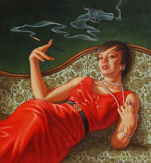
"It Wasn't the Revolver in the Lounge that Killed Her"
Acrylic on Illustration Board- 12"x13"

Here is the second painting I did for the Truth Against Tobacco public service campaign. This one called for the right female model to play the part of "Miss Scarlet". I asked one of my former students Michelle Christensen, an up and coming illustrator in her own right,  to model for me. She was fantastic, having done some professional modeling before, she jumped right into the role, bringing her own red dress and strand of pearls to the shoot. I always do concept and composition sketches before I ever shoot models (more on that next post), so I thought I knew the direction I wanted to go, but I figured since I had the model available I would shoot multiple angles. Michelle gave me more options than I asked for. I think it's very important to recognize when you are getting good information in a photo shoot and run with it. I have about 70 shots on disc and only about a half dozen made their way into the final piece. Some of the unused ones may make it into another painting some day- they were just too good.
When I shoot for a project like this, I always do full shots as well as detail shots. The full shots help establish the overall pose and angle and the detail give me the minute information that I need to polish the finish painting. Even with digital technology, you can only zoom in so close to the subject. Many students frequently make the mistake of not compensating for camera distortion (hence the long angle) or they completely forget to take any detail shots. This makes it very difficult to decipher the fine details and translate them to the final piece. I take care to shoot the long shots and the details at the same eye level and also I pay attention to the gesture if things like the hands and the angles of the limbs. I want the best possible silhouette- one that reads well as the actual object. Notice how much better the hand holding the cigarette (paintbrush) is than the one in the full shot.

Friday, May 14, 2010

Using the Right Model-Part 1

B.J Becker as Colonel Mustard
Reference used for body and chair
Head shot with softer light
"It Wasn't the Wrench in the Library that Killed Him"
Acrylic on Illustration Board- 12"x13"

I teach my students the importance of creating or finding the right reference material for their subject. I am constantly dismayed by the poor quality or lack of reference material that students try to work from. My advice is to always do what it takes to get it right even if that means reshooting your reference material or looking for a different model. Last year I had the chance to do a series of public service advertisements for Truth Against Tobacco. The premise was to spoof the popular board game "Clue" and have the tobacco be the real killer. The first of these ads was to depict Colonel Mustard and I immediately thought to use friend and fellow MFA student B.J.Becker as my model. The biggest problem was that of proximity- B.J. lives out of state. Fortunately, we were to meet up in New York City for a week of contact with our University of Hartford MFA Illustration group. B.J. is a very entertaining and interesting character in his own right and I did not even have to put him in costume (he even had the monocle). The photo shoot took place at the Society of Illustrators in the members club room where we were guests for the week. The finished painting (and series) won a couple of ADDY awards and Juror's choice award.