

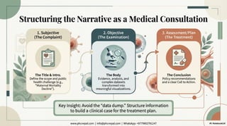
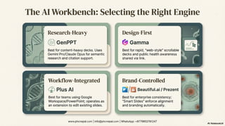


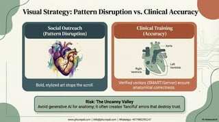


Are your health presentations stuck in the past? The paradigm of public health communication is shifting. We are moving away from the "digital sterility" of traditional medical decks toward a sophisticated, experience-driven model that integrates premium design theory with the power of artificial intelligence1. What You Will Learn in This Deck: This presentation synthesizes insights from 20+ expert sources to guide epidemiologists, healthcare executives, and communicators through the landscape of 2025 and beyond. 1. The New Aesthetic of Health (2025 Trends) Discover why the industry is pivoting toward "Rewilding" and "Functional Serenity," using organic textures and muted earth tones to reduce cognitive load in high-stress medical environments2,3. We explore how trends like "Bold Minimalism" and "Hypercolor" are being used strategically to grab attention in social media outreach and infectious disease alerts4,5. 2. AI in Healthcare: Power & Peril We review the top AI presentation makers for 2026, including Prezent, Gamma, and Beautiful.ai, and how they can reduce design time by 40%6,7. However, we also confront the critical risks: algorithmic bias and the "uncanny valley." Learn about the underrepresentation of darker skin tones in AI-generated medical imagery and the protocols needed to ensure health equity and anatomical accuracy8,9. 3. Mastering Data Storytelling Stop doing "data dumps." Learn the "Medical Consultation Analogy" for structuring your slides (Complaint -> Examination -> Treatment)10,11. We cover how to use specific visualizations—like line graphs for longitudinal outcomes and bar charts for efficacy comparisons—to turn dry statistics into urgent narratives12,13. 4. Technical Mastery & Accessibility Elevate your technical skills with the PowerPoint Morph transition to create seamless, cinematic animations of disease progression or molecular interactions14,15. Finally, we ensure your message reaches everyone by breaking down WCAG 2.1 Level AA compliance, covering essential color contrast ratios and the "POUR" principles (Perceivable, Operable, Understandable, Robust)16,17. Resources Included: • Links to free, high-quality assets like Servier Medical Art (SMART) and the NIH 3D Portal18,19. • Best practices for prompting AI to avoid bias20. • A checklist for accessible design21. Download this deck to transform your public health data into a visceral, persuasive narrative.


