ภาพสไลด์แนะนำ
จัดทุกอย่างให้เป็นระเบียบอยู่เสมอด้วยคอลเล็กชัน
บันทึกและจัดหมวดหมู่เนื้อหาตามค่ากำหนดของคุณ
ภาพสไลด์แนะนำจะแสดงเนื้อหาที่เลือกซึ่งเกี่ยวข้องกับผู้ใช้

แหล่งข้อมูล
ไฮไลต์
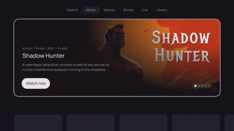
- ใช้ภาพสไลด์เด่นเพื่อไฮไลต์เนื้อหาที่เฉพาะเจาะจง
- ภาพหมุนแนะนำอาจมีองค์ประกอบ UI เช่น รูปภาพ บรรทัดแรก
รายละเอียดเนื้อหา วิดีโอ การดำเนินการ และตัวควบคุมการแบ่งหน้า
- โดยปกติแล้ว แคร์รอสเซลจะอยู่ในหน้าแรกหรือหน้า Landing Page ของแอป ซึ่งทำให้เข้าถึงได้ง่าย
- ภาพสไลด์เด่นดึงดูดสายตาเพื่อช่วยดึงดูดผู้ใช้และสร้างประสบการณ์ที่สมจริง
- เนื้อหาที่แสดงจะปรับตามประวัติการดู ความชอบ หรือเทรนด์ปัจจุบันของผู้ใช้ได้
เวอร์ชัน
การผสานรวมแคโรเซลแนะนำทำได้ 2 วิธีดังนี้
- สมจริง
- Card


บล็อกเนื้อหา
กายวิภาคศาสตร์
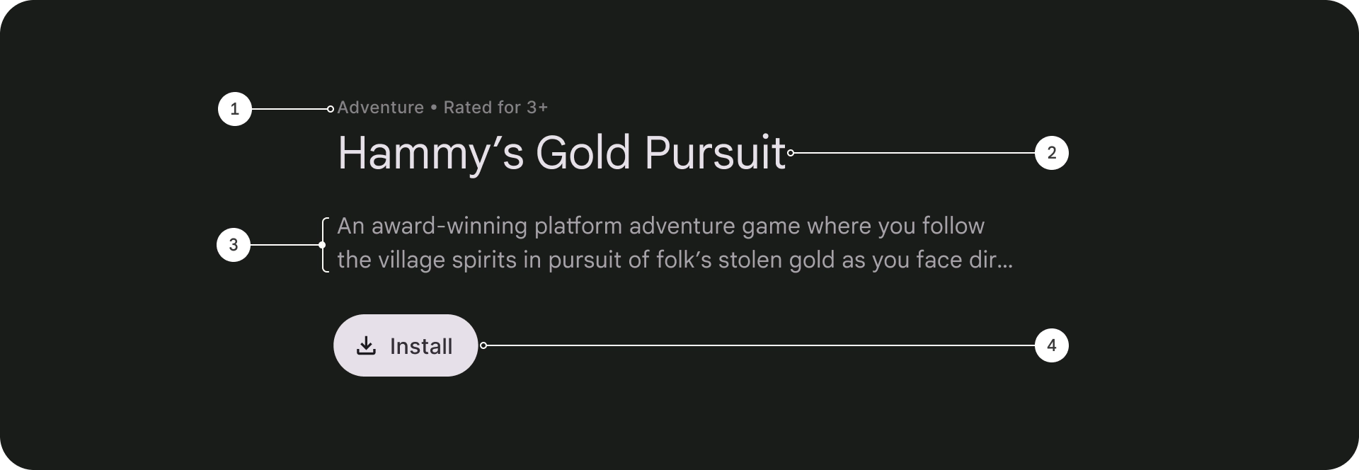
- ขีดเส้นเหนือข้อความ
- ชื่อ
- คำอธิบาย
- ปุ่ม
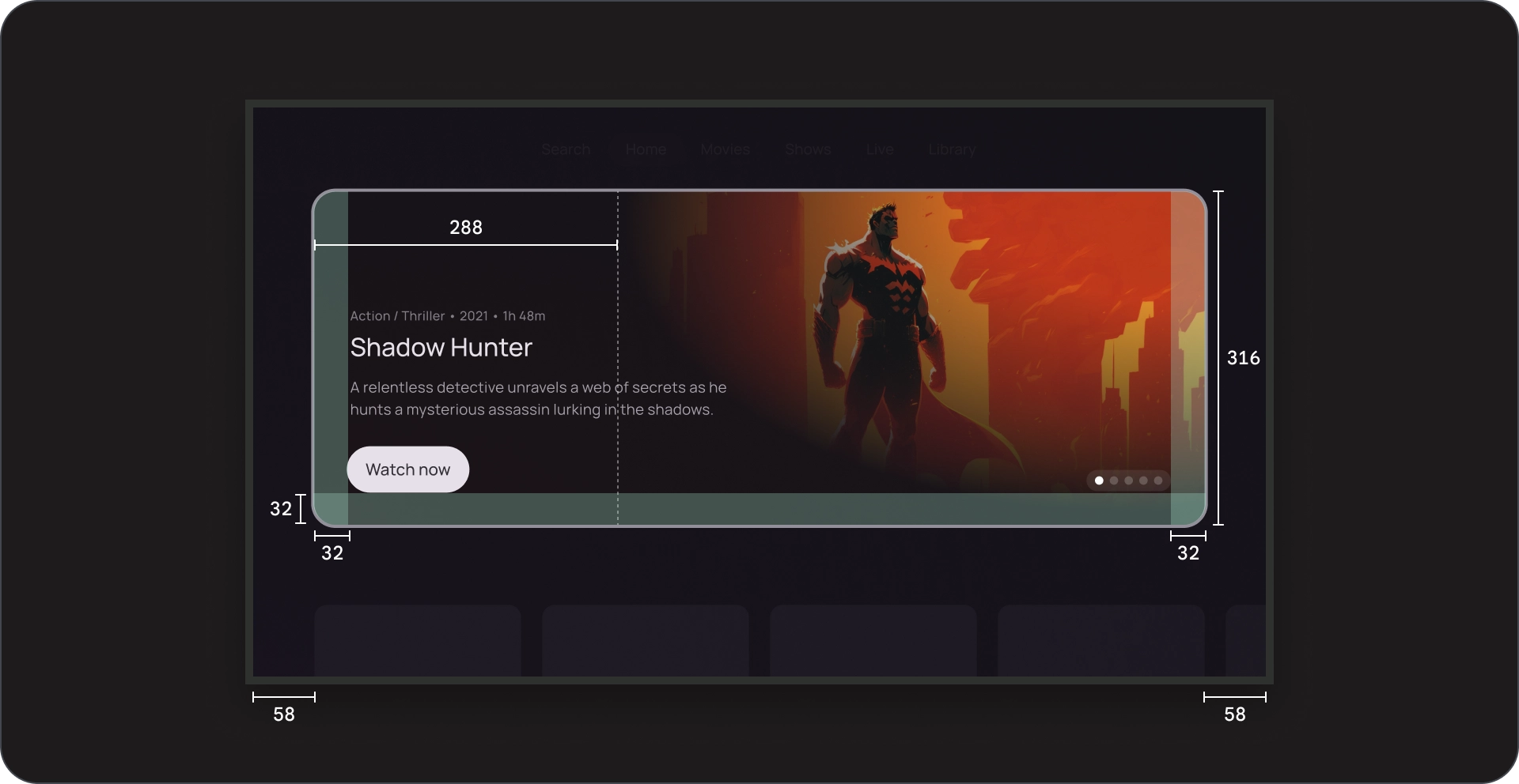
ข้อกำหนด

กายวิภาคศาสตร์

- ฉากหลัง
- องค์ประกอบที่ใช้งานอยู่
- องค์ประกอบที่ไม่ได้ใช้งาน
- องค์ประกอบทั้งหมด
ข้อกำหนด

สมจริง
กายวิภาคศาสตร์


- พื้นหลังของรูปภาพ
- ฉากกั้นแบบโปร่งใส
- Poster
- สีพื้นหลัง
- บล็อกเนื้อหา
- การใส่เลขหน้า
- ตารางกริดเนื้อหา
ข้อกำหนด

Card
กายวิภาคศาสตร์


- พื้นหลังของรูปภาพ
- ฉากกั้นแบบโปร่งใส
- Poster
- พื้นหลังของการ์ด
- บล็อกเนื้อหา
- การใส่เลขหน้า
- ตารางกริดเนื้อหา
ข้อกำหนด
การใช้งาน
ใช้ภาพสไลด์เด่นเพื่อแสดงและโปรโมตเนื้อหาที่คัดสรรมาแล้ว
ในรูปแบบที่น่าสนใจ ดึงดูดสายตา และนำทางได้ง่าย
รูปภาพในพื้นหลัง
รูปภาพในพื้นหลังมีบทบาทสำคัญในการเพิ่มการมีส่วนร่วมของผู้ใช้
ในภาพสไลด์ของแอปสตรีมมิงที่แนะนำ
ภาพคุณภาพสูง
ใช้รูปภาพความละเอียดสูงที่ดึงดูดสายตาและเกี่ยวข้อง
กับเนื้อหาของการ์ดที่โฟกัส
check_circle
ควรทำ
ใช้รูปภาพที่สะอาดตา ดึงดูดสายตา และเกี่ยวข้องกับบล็อกเนื้อหา
cancel
ไม่ควรทำ
หลีกเลี่ยงการใช้รูปภาพที่มีข้อความในพื้นหลัง
ลำดับชั้นภาพที่ชัดเจน
ตรวจสอบว่าพื้นหลังไม่เบี่ยงเบนความสนใจจากเนื้อหาของการ์ดที่โฟกัส
โดยใช้เลเยอร์โปร่งแสงเหนือรูปภาพ ซึ่งจะช่วยให้ผู้ใช้คง
ความสนใจไว้ที่ชื่อ คำอธิบาย และปุ่มคำกระตุ้นให้ดำเนินการของการ์ด
check_circle
ควรทำ
ใช้เลเยอร์กึ่งโปร่งใสเพื่อให้อ่านง่ายขึ้นและช่วยให้เข้าใจเนื้อหาได้ดีขึ้น
cancel
ไม่ควรทำ
ตรวจสอบว่าพื้นหลังไม่ส่งผลต่อความสามารถในการอ่านและความสามารถในการมองเห็น
ของเนื้อหาที่เหลือบนหน้าจอ
ตัวอย่างเนื้อหาและโค้ดในหน้าเว็บนี้ขึ้นอยู่กับใบอนุญาตที่อธิบายไว้ในใบอนุญาตการใช้เนื้อหา Java และ OpenJDK เป็นเครื่องหมายการค้าหรือเครื่องหมายการค้าจดทะเบียนของ Oracle และ/หรือบริษัทในเครือ
อัปเดตล่าสุด 2025-07-27 UTC
[[["เข้าใจง่าย","easyToUnderstand","thumb-up"],["แก้ปัญหาของฉันได้","solvedMyProblem","thumb-up"],["อื่นๆ","otherUp","thumb-up"]],[["ไม่มีข้อมูลที่ฉันต้องการ","missingTheInformationINeed","thumb-down"],["ซับซ้อนเกินไป/มีหลายขั้นตอนมากเกินไป","tooComplicatedTooManySteps","thumb-down"],["ล้าสมัย","outOfDate","thumb-down"],["ปัญหาเกี่ยวกับการแปล","translationIssue","thumb-down"],["ตัวอย่าง/ปัญหาเกี่ยวกับโค้ด","samplesCodeIssue","thumb-down"],["อื่นๆ","otherDown","thumb-down"]],["อัปเดตล่าสุด 2025-07-27 UTC"],[],[],null,["# Featured carousels showcase a selection of content relevant to the user.\n\nResources\n---------\n\n| Type | Link | Status |\n|----------------|--------------------------------------------------------------------------------------------------------------------------------------------------------------------------------------------------------------------------------------------------------------------------------------------------------|-----------|\n| Design | [Design source (Figma)](https://goo.gle/tv-desing-kit) | Available |\n| Implementation | [Jetpack Compose](/reference/kotlin/androidx/tv/material3/package-summary#Carousel(kotlin.Int,androidx.compose.ui.Modifier,androidx.tv.material3.CarouselState,kotlin.Long,androidx.compose.animation.ContentTransform,androidx.compose.animation.ContentTransform,kotlin.Function1,kotlin.Function2)) | Available |\n\nHighlights\n----------\n\n- Use featured carousels to highlight specific content.\n- Featured carousels can include UI elements such as images, headlines, content details, videos, actions, and pagination controls.\n- Carousels are usually located on the app's homepage or landing page, which makes them readily accessible.\n- Featured carousels are visually appealing to help engage the user, and create an immersive experience.\n- The content displayed can be personalized based on the user's viewing history, preferences, or current trends.\n\nVariants\n--------\n\nThere are two different ways of integrating featured carousels:\n\n1. Immersive\n2. Card\n\nContent block\n-------------\n\n### Anatomy\n\n1. Overline text\n2. Title\n3. Description\n4. Button\n\n### Specs\n\nPagination\n----------\n\n### Anatomy\n\n1. Background\n2. Active element\n3. Inactive elements\n4. Total elements\n\n### Specs\n\nImmersive\n---------\n\n### Anatomy\n\n1. Image background\n 1. Cinematic scrim\n 2. Poster\n 3. Background color\n2. Content block\n3. Pagination\n4. Content grid\n\n### Specs\n\nCard\n----\n\n### Anatomy\n\n1. Image background\n 1. Cinematic scrim\n 2. Poster\n 3. Card background\n2. Content block\n3. Pagination\n4. Content grid\n\n### Specs\n\nUsage\n-----\n\nUse featured carousels to showcase and promote a curated selection\nof content in an engaging, visually appealing, and simple to navigate format.\n\n### Images in backgrounds\n\nImages in backgrounds play a crucial role in enhancing user engagement\nin a streaming app featured carousel.\n\n### High quality imagery\n\nUse high-resolution images that are visually appealing and relevant\nto the content of the focused card. \ncheck_circle\n\n### Do\n\nKeep images clean, visually appealing, and relevant to the content block. \ncancel\n\n### Don't\n\nAvoid using images with text in the background.\n\n### Obvious visual hierarchy\n\nEnsure that the background does not distract from the focused card's\ncontent by using a scrim over the image; this helps the user maintain\nfocus on the card's title, description, and call-to-action button. \ncheck_circle\n\n### Do\n\nUse a scrim to improve readability and content digestion. \ncancel\n\n### Don't\n\nMake sure the background doesn't affect readability and visibility of the rest of the content on the screen."]]
