In this article, we would be discussing the tooltip plugin provided by bootstrap. Tooltip is quite useful for showing the description of different elements in the webpage. Tooltip can be invoked on any element in a webpage. Tooltips on bootstrap depends on the 3rd party library Tether for positioning.  Hence, we need to include tether.min.js before bootstrap.js Now let's see an example of a tooltip.
Now we will examine the code which generates the above tooltip
HTML
<!-- Tooltip on a header -->
<h3 data-toggle="tooltip" title="Hey! Tooltip here!">
    Hover Over me to see a tooltip
</h3>
In order to introduce tooltip, we add the data-toggle attribute to an element and we need to initialize the tooltip with jQuery. jQuery code for initializing a tooltip:
JavaScript
<script>
    // jQuery code for initializing a tooltip
    $(document).ready(function () {
        // jQuery Attribute value selector to
        // select the specified element and
        // call the tooltip method on it
        $('[data-toggle="tooltip"]').tooltip();
    });
</script>
We can even customize this tool-tip according to our requirement, let's explore different ways in which we can customize the tool-tip.
- Placement of a tool tip : We can place a tool tip at top, bottom, left and right of an element.
Example:
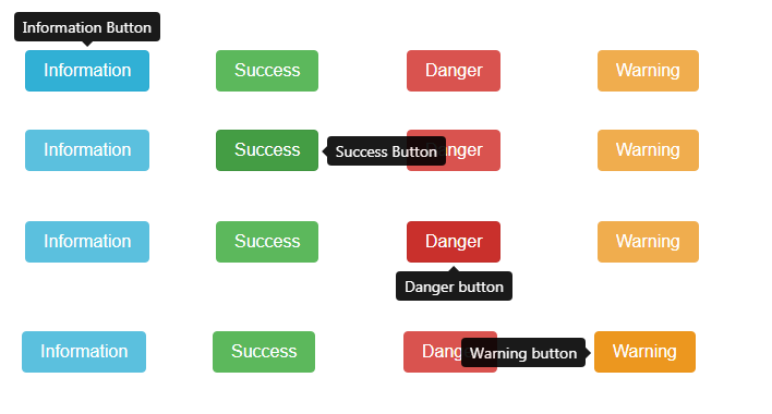
Code for the above example:
HTML
<!-- Tooltips on simple buttons -->
<!-- Placement of tooltips -->
<div class="row" style="margin:30px">
    <div class="col-2">
        <button type="button" class="btn btn-info"
            data-toggle="tooltip" data-placement="top"
            title="Information Button">
            Information
        </button>
    </div>
    <div class="col-2">
        <button type="button" class="btn btn-success"
            data-toggle="tooltip" data-placement="right"
            title="Success Button">
            Success
        </button>
    </div>
    <div class="col-2">
        <button type="button" class="btn btn-danger"
            data-toggle="tooltip" data-placement="bottom"
            title="Danger button">
            Danger
        </button>
    </div>
    <div class="col-2">
        <button type="button" class="btn btn-warning"
            data-toggle="tooltip" data-placement="left"
            title="Warning button">
            Warning
        </button>
    </div>
</div>
- In the above code we have used the data-placement attribute in order to set the placement of tool tip, we have also used row and col classes provided by bootstrap grid system
- Html within a tooltip: We can add html as a content of a tooltip.
Example:

Code for the above example:
HTML
<!-- Tooltip with html -->
<div class="row" style="margin:40px">
    <button type="button" class="btn btn-warning"
        data-toggle="tooltip" data-placement="left"
        data-html="true" title=
        "<h4>Hey!</h4>
<p>Tooltip with html</p>
">
        Warning
    </button>
</div>
- In the above code we have used the data-html attribute in order to add an html within a tool tip.
- Offset for a Tooltip: We can set the offset of the tool-tip relative to the target.
Example:

Code for the above example:
HTML
<div class="row" style="margin:40px">
    <button type="button" class="btn btn-warning"
        data-toggle="tooltip" data-placement="right"
        data-offset="20 0"
        title="Don't click on Warning Button">
        Warning
    </button>
</div>
- In the above code, we have used data-offset attribute to set the attribute
Note: The output of all the code below is non-static hence, the output is not shown here.
- Animation on a tooltip: By default, the animation is added to the tooltip, i.e it fades in and fades out we can remove this animation.
HTML
<!-- Removing animation from the tooltip -->
<div class="row" style="margin:40px">
    <button type="button" class="btn btn-warning"
        data-toggle="tooltip" data-placement="right"
        data-animation="false"
        title="Don't click on Warning Button">
        Warning
    </button>
</div>
- In the above code we have used the data-animation attribute and it is set to false in order to remove animation from the tooltip
- Delay in appearance and disappearance: We could set a time interval for appearance and disappearance of a tooltip. We can set a delay in two ways:
- We set same delay time for showing and hiding
HTML
<!-- Delay in tooltip -->
<div class="row" style="margin:40px">
    <button type="button" class="btn btn-warning"
        data-toggle="tooltip" data-placement="right"
        data-delay="1000"
        title="Don't click on Warning Button">
        Warning
    </button>
</div>
- In the above code we have used the data-delay attribute to delay the tool-tip number assigned to this attribute is in ms i.e tool tip will be delayed for 1000 ms.
- We can add different delay time intervals for showing and hiding tool-tip.
HTML code:
HTML
<!-- Delay in tooltip -->
<div class="row" style="margin:40px">
    <button type="button" class="btn btn-warning"
        data-toggle="tooltip" data-placement="right"
        title="Don't click on Warning Button">
        Warning
    </button>
</div>
- There is no changes in the html code.
jQuery code:
JavaScript
<script>
    $(document).ready(function () {
        // jQuery Attribute value selector
        $('[data-toggle="tooltip"]').tooltip({
            delay: { "show": 1000, "hide": 2000 }
        });
    });
</script>
- Triggering of the tool-tip: We can add an event which will trigger a tooltip, by default a tooltip is triggered on "hover and focus", various events that is allowed are,- click, hover, focus and manual.
HTML
<!-- triggering the  tooltip -->
<div class="row" style="margin:40px">
    <button type="button" class="btn btn-warning"
        data-toggle="tooltip" data-placement="right"
        data-trigger="click"
        title="Don't click on Warning Button">
        Warning
    </button>
</div>
- In the above code we have used the data-trigger attribute and value is set to be click, which means when user clicks on the element the tool-tip will appear
Similar Reads
BootStrap Introduction and Installation To begin Web development you may go through this article first. Grid SystemButtons, Glyphicons, TablesVertical Forms, Horizontal Forms, Inline FormsDropDowns and Responsive TabsProgress Bar and JumbotronBootstrap is a free and open-source collection of tools for creating websites and web application
4 min read
Bootstrap Grid System Introduction and Installation Buttons, Glyphicons, Tables Vertical Forms, Horizontal Forms, Inline Forms DropDowns and Responsive Tabs Progress Bar and Jumbotron Prerequisites: Web Development Basics and  BootStrap (Part-1) Grid System: In the previous article we had learnt about Bootstrap and its I
7 min read
Bootstrap Buttons, Glyphicons, Tables After the previous article, one should be familiar with the Grid System of Bootstrap. Now, we'll learn about making Buttons, the all-new Glyphicons and Tables. Let's get started.Bootstrap ButtonsBootstrap buttons provide a quick way to create consistent and responsive buttons using predefined classe
3 min read
Bootstrap Forms Alignment Types Bootstrap Forms are pre-styled HTML forms provided by the Bootstrap framework. They streamline the process of creating aesthetically pleasing and responsive forms by offering a range of ready-to-use components, layouts, and styles, ensuring consistency and efficiency in web development. Bootstrap Fo
3 min read
Bootstrap DropDowns and Responsive Tabs Introduction and InstallationGrid SystemButtons, Glyphicons, TablesVertical Forms, Horizontal Forms, Inline FormsProgress Bar and Jumbotron Dropdown Menu Using Bootstrap: In bootstrap, dropdowns are created using the class="dropdown". What we will do is create a button and then convert the button in
3 min read
Bootstrap Progress Bar and Jumbotron BootStrap articles : Introduction and Installation Grid System Buttons, Glyphicons, Tables Vertical Forms, Horizontal Forms, Inline Forms DropDowns and Responsive Tabs Progress Bar We all have seen a progress bar while executing some process in our computer. A progress bar shows how much of the proc
2 min read
Bootstrap Alerts , Wells, Pagination and Pager Introduction and InstallationGrid SystemButtons, Glyphicons, TablesVertical Forms, Horizontal Forms, Inline FormsDropDowns and Responsive TabsProgress Bar and Jumbotron Alerts: We often see certain alerts on some websites before or after completing an action. These alert messages are highlighted tex
4 min read
Bootstrap Badges, Labels, Page Headers Introduction and InstallationButtons, Glyphicons, TablesVertical Forms, Horizontal Forms, Inline FormsDropDowns and Responsive TabsProgress Bar and Jumbotron Badges: We all have seen some numerical indicators beside some links on various websites. These are called badges. These badges tell how many
3 min read
Bootstrap Tooltips In this article, we would be discussing the tooltip plugin provided by bootstrap. Tooltip is quite useful for showing the description of different elements in the webpage. Tooltip can be invoked on any element in a webpage. Tooltips on bootstrap depends on the 3rd party library Tether for positionin
4 min read
Bootstrap Navigation Bar Bootstrap Navigation Bar provides a responsive, customizable, and pre-styled navigation component for web applications. It incorporates features like branding, navigation links, dropdowns, and responsiveness, enabling developers to create effective and visually appealing navigation menus effortlessl
6 min read