Bootstrap5 Form controls SASS
Last Updated :
28 Apr, 2025
Bootstrap 5 Form controls can be used to change the default values provided for the Form controls by customizing scss file of bootstrap 5.
SASS variables of Form controls:
- $input-color: This variable provides the cursor color and the font color of the text typed into the input fields. By default, it is gray.
- $input-border-width: This variable provides the border width of the input field. By default, it is 1px.
- $input-border-color: This variable provides the border color of the input field. By default, it is gray.
- $input-disabled-bg: This variable provides the background color of the input field when in a disabled state. By default, it is gray.
- $input-bg: This variable provides the background color of the input field. By default, it is white.
- $input-disabled-border-color: This variable provides the border color of the input field when in a disabled state. By default, it is null.
- $input-border-radius-*: This variable provides the border radius of the input field. By default, it is 0.375rem.
- $input-padding-y-*: This variable provides the top and bottom padding of the input field. By default, it is 0.375rem.
- $input-padding-x-*: This variable provides the left and right padding of the input field. By default, it is 0.75rem.
- $input-font-family: This variable provides the font family of the input field. By default, it is null.
- $input-font-size-*: This variable provides the font size of the input field. By default, it is 1rem.
- $input-focus-bg: This provides the background color of the input field when in focus. By default, it is white.
- $input-focus-color: This provides the font color in the input field when in focus. By default, it is gray.
- $input-focus-border-color: This provides the border color of the input field when in focus. By default, it is blue.
- $input-focus-box-shadow: This provides the box shadow of the input field when in focus. By default, it is 0px with blue color.
- $input-placeholder-color: This provides the color of the placeholder. By default, it is gray.
- $form-label-font-**: This variable provides values to change the font size, style, or weight of the form label.
- $form-label-color: This variable provides the font color of the form label. By default, it is null.
- $form-text-font-**: This variable provides values to change font size, style, or weight of form text
- $form-text-color: This variable provides the font color of the form text. By default, it is gray.
- $form-file-button-color: This variable provides the font color of the button in form file. By default, it is gray.
- $form-file-button-bg: This variable provides the background color of the button in form file. By default, it is gray.
- $form-file-button-hover-bg: This variable provides the background color of the button in form file when hovering on it. By default, it is gray.
The '*' can be replaced sm/lg to make the page responsive for different views.
The '**' can be replaced by size/style/weight to make changes to format different values of font
Steps to override scss of Bootstrap:
Step 1: Install bootstrap using following command:
npm i bootstrap
Step 2: Create your custom scss file and write the variable you want to override. Then include the bootstrap scss file using import.
$class_to_override: values;
@import "node_modules/bootstrap/scss/bootstrap"
Step 3: Convert the file to CSS using live server extension.
Step 4: Include the converted scss file to your HTML after the link tag of Bootstrap css
Project Structure: Here the custom scss file name is “custom.scss” and custom.css is converted file

Syntax:
$class_to_override: values;
@import "node_modules/bootstrap/scss/bootstrap"
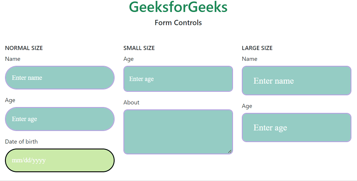
Example 1: In this example, making use of some of the variables mentioned above their default values are changed as shown in the example.
custom.scss
CSS
$input-color:white;
$input-border-width:3px;
$input-border-color:rgb(180, 163, 224);
$input-disabled-bg:rgb(204, 235, 169);
$input-disabled-border-color:black;
$input-bg:rgb(149, 205, 196);
$input-placeholder-color:white;
$input-border-radius: 2rem;
$input-border-radius-sm:0.7rem;
$input-border-radius-lg:0.8rem;
$input-padding-y:1rem;
$input-padding-x:1rem;
$input-font-family:Lucida;
$input-font-size:18px;
$input-padding-y-sm:1.2rem;
$input-padding-x-sm:0.8rem;
$input-font-size-sm:1.1rem;
$input-padding-y-lg:1.2rem;
$input-padding-x-lg:1.8rem;
$input-font-size-lg:1.5rem;
$input-focus-border-color:rgb(235, 75, 75);
$input-focus-box-shadow: 5px 3px black;
@import "./node_modules/bootstrap/scss/bootstrap"
CSS file created after conversion
custom.css
CSS
.input-group-text {
    display: flex;
    align-items: center;
    padding: 1rem 1rem;
    font-size: 1.125rem;
    font-weight: 400;
    line-height: 1.5;
    color: white;
    text-align: center;
    white-space: nowrap;
    background-color: #e9ecef;
    border: 3px solid rgb(180, 163, 224);
    border-radius: 2rem;
}

.input-group-lg > .form-control,
.input-group-lg > .form-select,
.input-group-lg > .input-group-text,
.input-group-lg > .btn {
    padding: 1.2rem 1.8rem;
    font-size: calc(1.275rem + 0.3vw);
    border-radius: 0.8rem;
}
@media (min-width: 1200px) {
  .input-group-lg > .form-control,
.input-group-lg > .form-select,
.input-group-lg > .input-group-text,
.input-group-lg > .btn {
      font-size: 1.5rem;
  }
}

.input-group-sm > .form-control,
.input-group-sm > .form-select,
.input-group-sm > .input-group-text,
.input-group-sm > .btn {
    padding: 1.2rem 0.8rem;
    font-size: 1.1rem;
    border-radius: 0.7rem;
}

.input-group-lg > .form-select,
.input-group-sm > .form-select {
    padding-right: 4rem;
}
index.html
HTML
<!DOCTYPE html>
<html lang="en">
<head>
    <meta charset="UTF-8">
    <meta name="viewport"
          content="width=device-width, initial-scale=1.0">
    <title>Bootstrap 5 Form Controls SASS</title>
    <link href=
"https://cdn.jsdelivr.net/npm/[email protected]/dist/css/bootstrap.min.css"
          rel="stylesheet">
    <link rel="stylesheet"
          href="./custom.css">
    <script src=
"node_modules/bootstrap/dist/js/bootstrap.js">
      </script>
</head>
<body>
    <h1 class="text-success text-center">
        GeeksforGeeks
      </h1>
    <h5 class="text-success text-center">
        Form Controls
      </h5>
    <div class="container text-success mt-5"
         style="width: 970px;">
        <div class="row">
            <div class="col">
                <h6>
                      NORMAL SIZE
                  </h6>
                <div class="mb-3">
                    <label for="nameNormal"
                           class="form-label">
                          Name
                      </label>
                    <input type="email"
                           class="form-control"
                           id="nameNormal"
                           placeholder="Enter name">
                </div>
                <div class="mb-3">
                    <label for="ageNormal"
                           class="form-label">
                        Age
                      </label>
                    <input type="number"
                           class="form-control one"
                           id="ageNormal"
                           placeholder="Enter age">
                </div>
                <div class="mb-3">
                    <label for="dobNormal"
                           class="form-label">
                          Date of birth</label>
                    <input type="date"
                           class="form-control"
                           id="dobNormal"
                           placeholder="Enter date of birth"
                           disabled>
                </div>
            </div>
            <div class="col">
                <h6>
                      SMALL SIZE
                  </h6>
                <div class="mb-3">
                    <label for="ageNormal"
                           class="form-label">
                          Age
                      </label>
                    <input type="number"
                           class="form-control form-control-sm"
                           id="ageNormal"
                           placeholder="Enter age">
                </div>
                <div class="mb-3">
                    <label for="aboutMe"
                           class="form-label">
                        About
                      </label>
                    <textarea class="form-control form-control-sm"
                              id="aboutMe"
                              rows="3">
                      </textarea>
                </div>
            </div>

            <div class="col">
                <h6>
                      LARGE SIZE
                  </h6>
                <div class="mb-3">
                    <label for="nameNormal"
                           class="form-label">
                          Name
                      </label>
                    <input type="email"
                           class="form-control form-control-lg"
                           id="nameNormal"
                           placeholder="Enter name">
                </div>
                <div class="mb-3">
                    <label for="ageNormal"
                           class="form-label">
                          Age
                      </label>
                    <input type="number"
                           class="form-control form-control-lg"
                           id="ageNormal"
                           placeholder="Enter age">
                </div>
            </div>
        </div>
    </div>
</body>
</html>
Output:
Example 2: In this example, we make use of the $form-label-font-size, $form-label-font-weight, $form-label-font-style, $form-label-color, $form-text-color, $form-text-font-size, $form-text-font-style variables and change their values as shown in the example.
custom.scss:
CSS
$form-label-font-size: 22px;
$form-label-font-weight:bolder;
$form-label-font-style:italic;
$form-label-color:green;
$form-text-color:green;
$form-text-font-size: 17px;
$form-text-font-style:italic;
@import "./node_modules/bootstrap/scss/bootstrap"
CSS file created after conversion
custom.css
CSS
.form-label {
    margin-bottom: 0.5rem;
    font-size: calc(1.2625rem + 0.15vw);
    font-style: italic;
    font-weight: bolder;
    color: rgb(0, 51, 128);
}

.form-text {
    margin-top: 0.25rem;
    font-size: 1.0625rem;
    font-style: italic;
    color: rgb(0, 51, 128);
}
index.html
HTML
<!DOCTYPE html>
<html lang="en">
<head>
    <meta charset="UTF-8">
    <meta name="viewport"
          content="width=device-width, initial-scale=1.0">
    <title>Bootstrap 5 Form Controls SASS</title>
    <link href=
"https://cdn.jsdelivr.net/npm/[email protected]/dist/css/bootstrap.min.css"
          rel="stylesheet">
    <link rel="stylesheet"
          href="./custom.css">
    <script src=
"node_modules/bootstrap/dist/js/bootstrap.js">
      </script>
</head>
<body>
    <h1 class="text-success text-center">
          GeeksforGeeks
      </h1>
    <h5 class="text-center">
          Form Controls
      </h5>
    <div class="container mt-3"
         style="width: 900px;">
        <div class="mb-3">
            <label for="name"
                   class="form-label">
                  Name
              </label>
            <input type="text"
                   class="form-control"
                   id="name"
                   placeholder="Enter name">
            <small class="form-text">
                  Your name must include last name
              </small>
        </div>
        <div class="mb-3">
            <label for="age"
                   class="form-label">
                  Age
              </label>
            <input type="number"
                   class="form-control one"
                   id="age"
                   placeholder="Enter age">
            <small class="form-text">
                  Enter age in numbers only
              </small>
        </div>
        <div class="mb-3">
            <label for="classInput"
                   class="form-label">
                  Class
              </label>
            <input type="number"
                   class="form-control one"
                   id="classInput"
                   placeholder="Enter class">
        </div>
    </div>
</body>
</html>
Output:

Example 3: In this example, making use of the $form-file-button-color, $form-file-button-bg and $form-file-button-hover-bg variables. Here in the scss file, the text color, the background of form file button and the background of form file button on hover is changed.
custom.scss
CSS
$form-file-button-color:white;
$form-file-button-bg:rgb(97, 179, 182);
$form-file-button-hover-bg:black;
@import "./node_modules/bootstrap/scss/bootstrap"
CSS file created after conversion
custom.css
CSS
.form-control::file-selector-button {
    padding: 0.375rem 0.75rem;
    margin: -0.375rem -0.75rem;
    -webkit-margin-end: 0.75rem;
            margin-inline-end: 0.75rem;
    color: white;
    background-color: rgb(97, 179, 182);
    pointer-events: none;
    border-color: inherit;
    border-style: solid;
    border-width: 0;
    border-inline-end-width: 1px;
    border-radius: 0;
    transition: color 0.15s ease-in-out, background-color 0.15s ease-in-out, border-color 0.15s ease-in-out, box-shadow 0.15s ease-in-out;
}

.form-control:hover:not(:disabled):not([readonly])::file-selector-button {
      background-color: black;
}
index.html
HTML
<!DOCTYPE html>
<html lang="en">
<head>
    <meta charset="UTF-8">
    <meta name="viewport"
          content="width=device-width, initial-scale=1.0">
    <title>Bootstrap 5 Form Controls SASS</title>
    <link href=
"https://cdn.jsdelivr.net/npm/[email protected]/dist/css/bootstrap.min.css"
          rel="stylesheet">
    <link rel="stylesheet"
          href="./custom.css">
    <script src=
"node_modules/bootstrap/dist/js/bootstrap.js">
      </script>
</head>
<body>
    <h1 class="text-success text-center">
          GeeksforGeeks
      </h1>
    <h5 class="text-center">
          Form Controls
      </h5>
    <div class="container mt-3"
         style="width: 700px;">
        <div class="mb-3">
            <label for="formFile"
                   class="form-label">
                  Choose file to upload
              </label>
            <input class="form-control"
                   type="file"
                   id="formFile">
        </div>
    </div>
</body>
</html>
Output:

Reference:
https://getbootstrap.com/docs/5.0/forms/form-control/#sass
Similar Reads
Forms
Form controls
Bootstrap 5 Form Controls SizingBootstrap 5 Form controls Sizing gives textual form controls on <input>, <select>, and <textarea> elements with custom styles, sizing, focus states, and more.Bootstrap 5 Form Controls Sizing Classes:form-control-sm: This class is used to make the size of the form control small.form
2 min read
Bootstrap 5 Form Controls DisabledBootstrap5 Form controls Disabled are used to create a disabled input field. To create a disabled input field, we will use the disabled boolean attribute on an input to disable the input field. It will remove any pointer event from the field. Form controls Disabled Class: There are no pre-defined cl
2 min read
Bootstrap 5 Form Controls ReadonlyBootstrap 5 Form Controls Readonly is used to create a read-only input field. To create a read-only input field, we will use readonly attribute on an input to prevent modification of the input’s value. It is useful when we want to have a fixed value for the input. Bootstrap 5 Form controls Readonly
2 min read
Bootstrap 5 Form controls Readonly plain textBootstrap 5 Form Controls Readonly plain text is used to create a readonly input field as a plaintext. To create a plain text input field, we will use .form-control-plaintext class. This class removes the styling and preserves the correct margin and padding. Form Control Readonly Attribute: readonly
2 min read
Bootstrap 5 Form Controls File InputBootstrap5 Form controls File input provides customized ways to take the input of the files, i.e., the file input can accept as default, or can accept multiple files at once, or can be disabled the file input. This can also be done for any file input size, which varies from small size to large. This
2 min read
Bootstrap 5 Form controls ColorBootstrap 5 is the newest version of Bootstrap, which is the most popular HTML, CSS, and JavaScript framework for creating responsive, mobile-first websites. It was officially released on 16 June 2020 after several months of redefining its features. Bootstrap 5 Form Control Color is used to set the
2 min read
Bootstrap 5 Form controls DatalistsBootstrap 5 is the newest version of Bootstrap, which is the most popular HTML, CSS, and JavaScript framework for creating responsive, mobile-first websites. It was officially released on 16 June 2020 after several months of redefining its features. Bootstrap 5 Form controls datalists are used to cr
2 min read
Bootstrap5 Form controls SASSBootstrap 5 Form controls can be used to change the default values provided for the Form controls by customizing scss file of bootstrap 5. SASS variables of Form controls: $input-color: This variable provides the cursor color and the font color of the text typed into the input fields. By default, it
7 min read
Form Select
Form Checks and radios
Form Range
Form Input group
Bootstrap 5 Input group SizingBootstrap 5 Input group Sizing is used to extend the default form controls by adding text or buttons on either side of textual inputs, custom file selectors, or custom inputs. In this article, we will learn about Input group sizing. Input Group sizing helps us to create input groups of small, large,
2 min read
Bootstrap 5 Input group Checkboxes and RadiosBootstrap 5 Input group Checkboxes and radios are used to pace the radios and checkboxes within an input group’s addon instead of text.Bootstrap 5 Input group Checkboxes and Radios Classes: There are no specific classes to add checkboxes and radios. To create the checkboxes and radios we use the for
3 min read
Bootstrap 5 Input Group Multiple InputsBootstrap 5 Input Group Multiple Inputs help to take multiple inputs in an input group. Multiple inputs in an input group do not support validations. Bootstrap 5 Input Group Multiple Inputs used Classes: There are no specific classes to create multiple inputs in input group. For creating the input g
2 min read
Bootstrap 5 Input group Multiple addonsBootstrap 5 Input group Multiple addons help to add multiple items in an input group which may include text, button, input, checkbox, radio, etc. Bootstrap 5 Input group Multiple addons Classes input-group: This class is used to create an input groupinput-group-text: This class is used to add text t
2 min read
Bootstrap 5 Input Group Button AddonsBootstrap 5 Input Groups are used to extend form controls by adding the buttons, text, or button groups before or after the text inputs, custom selects, or file inputs. Input Group Button Addons are used to extend form controls by adding buttons or button groups.Bootstrap 5 Input group Button Addons
2 min read
Bootstrap 5 Input group Buttons with dropdownsBootstrap 5 Input group Buttons with dropdowns is used to display a button along with an input group. On Clicking this button, it gives a dropdown menu. Input group Buttons with dropdowns Classes: No special classes are used in Input group Buttons with dropdowns. You can customize the component usin
2 min read
Bootstrap 5 Input group Segmented ButtonsBootstrap 5 Input group Segmented buttons used to segment dropdowns in input groups, use the same general style as the dropdown button.Bootstrap 5 Input group Segmented buttons used classes: There is no specific class used to group Segmented buttons. To create a button, we use the .btn class, and to
2 min read
Bootstrap 5 Input group Custom formsBootstrap 5 Input group Custom forms are extended form controls, used to collect specific information from visitors on your website. Custom form limits are placed on the number of unique forms you have created. There are two types of custom forms as follows:Custom select: The custom select menu is a
2 min read
Bootstrap 5 Input group Custom SelectBootstrap 5 Input Groups are used to extend form controls by adding the buttons, text, or button groups before or after the text inputs, custom selects, or file inputs.Bootstrap 5 Input group Custom select Classes: There is no specific class used to input group custom select. We use combinations of
2 min read
Bootstrap 5 Input group Custom file inputBootstrap 5 Input Groups are used to extend form controls by adding the buttons, text, or button groups before or after the text inputs, custom selects, or file inputs.Bootstrap 5 Input group Custom file input ClassesThere is no specific class used to Input group Custom file input. To create a butto
2 min read
Bootstrap 5 Input group SassBootstrap 5 Input group SASS has a set of variables with default values that can be changed to customize the Input groups. SASS variables for Input group: $input-group-addon-padding-y: This variable is used for padding in the y-axis$input-group-addon-padding-x: This variable is used for padding in t
3 min read
Form Floating labels
Form Validation