Data handling is the process of systematically collecting, organizing, analyzing, and presenting data to extract useful information and support decision-making. It involves ensuring the accuracy and integrity of data, processing it into a manageable form, and presenting it through clear formats such as charts, graphs, and tables. The goal is to make complex data easier to understand and interpret, ensuring its safe storage and accessibility throughout its lifecycle.
 Components of Data Handling
For studying this topic, we also focus on how data is collected or generated for our use from any source. This procedure involves the steps to acquire the data, clean it, and prepare it for analysis and study.
Types of Data
Data can be segregated into two broad categories: Quantitative Data and Qualitative Data.
Quantitative Data
Quantitative Data is data that gives numerical information. It is measurable and quantifiable, and it can be written in terms of numbers, which are amenable to mathematical operations. Quantitative data can be further categorized into:
- Discrete Data: Data that can have definite, distinct values (e.g., number of individuals in a room).
- Continuous Data: Data that can have any value between a range (e.g., height, weight, temperature).
Qualitative Data
Qualitative Data is non-numerical data describing features or qualities. Qualitative Data is descriptive data and cannot be directly measured in terms of numbers. Examples are names, colours, or classes of objects.
➣ Learn the difference the Quatitative and Qualitative data - [Read More]
Important Terms in Data Handling
There are some terms used often in data handling to better understand and deal with data:
1) Data: The set of facts or figures obtained from observations or measurements.
2) Raw Data: Raw and unstructured data collected directly from the source and could require cleaning or formatting.
3) Range: The range is the difference between the largest and smallest value in a set of data. It provides a measure of spread or variability of the data.
4) Statistics: The branch of science that deals with the collection, organization, analysis, interpretation, and presentation of numerical data. It facilitates data-informed decisions.
Steps Involved in Data Handling
Data handling is a methodical process of handling and interpreting data properly. The steps usually consist of-
Purpose: Define and state specifically the purpose or problem. This makes the data handling process dedicated to answering one specific question or resolving a unique problem.
Collection of Data: Collect data pertaining to the set purpose. The accuracy and quality of data gathered play a very important role in significant analysis.
Presentation of Data: Display the gathered data in a simple and easy-to-read manner. It can be in the form of tables, graphs, or marks, based on the complexity of the data.
Graphical Representation of Data: Employ visual aids such as graphs, histograms, and bar charts to represent the data. Graphical representation assists in the easy analysis of trends and patterns in the data.
Analyzing the Data: Scan the data carefully to derive useful information. Statistical techniques or other techniques of analysis are used to derive insights.
Conclusion/Inference: From the analysis, make conclusions or inferences to give a solution or response to the problem statement. This step helps in decision-making or subsequent actions.
Graphical Representation of Data
In data handling, one of the most significant areas is how the data is represented. Proper representation is easier to understand, analyze, and interpret. Among all the ways data can be represented, graphical representation is particularly good at representing trends and patterns effectively and speedily.
Pictographs
A pictograph is the pictorial representation of any data given to us in written form. It can be said that pictographs used to be the earliest form of communication, since, way back in time, people communicated mostly through pictures with each other, as languages were not present.
Indeed, a pictograph plays a role in our day-to-day life too. For instance, when a friend tells us a story, we start imagining the story in our head, and that makes it both easy to understand and easy to remember for a long time.
Drawing a Pictograph
Let's learn to draw a pictograph with the help of an example.
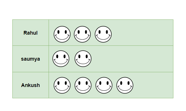
Example: In a reading competition, three students were participating—Rahul, Saumya, and Ankush. They were supposed to read as many books as they could in an hour. Rahul read 3 books, Saumya read 2 books, and Ankush read 4 books. Draw the pictograph for the information.
Solution:
There are some basic steps to draw a pictograph:
- Decide the particular picture or pictures that are required to represent the data. Make sure that the picture is related to the information for easier memorization.
- Here, a smiley face is used to represent each book read.

- Now, draw the pictures according to the information presented. For example, there will be 3 smiley faces for Rahul, as he completed 3 books in an hour.
Bar Graphs
The graphical representation of any quantity, number, or data in the form of bars is called a Bar graph. With the help of a bar graph, not only does the data look neat, but it is also easier to compare the data given.
Types of Bar Graph
Various types of bar graphs include:
Vertical Bar Graph
These are the most common bar graphs we come across; the bars of grouped data in vertical bar graphs lie vertically. Sometimes, when the data categories have long names, horizontal bar graphs are preferred, since in vertical bar graphs, there is not much space on the x-axis.
An example explaining the concept of a Bar graph is added below:
Example: There are 800 students in a school. And the table for their birthdays in all 12 months is given below. Draw the Vertical Bar graph and answer. who
Months | January | February | March | April | May | June | July | August | September | October | November | December |
|---|
No. of Students | 50 | 80 | 65 | 50 | 40 | 90 | 45 | 110 | 80 | 70 | 100 | 20 |
|---|
- In which month do the maximum number of students have their birthdays?
- Which two months have the same number of birthdays?
- In which month do the minimum number of students have their birthdays?
Solution:
The vertical bar graph for the table given in the question will be,

From the Bar graph we can figure out the answer of the questions
- August is the month in which the maximum number of birthdays occur.(there are 110 students whose birthday come in August)
- From the graph, we can tell that January and April have equal lengths of bars, which means they have the same number of birthdays.(both have 50 birthdays)
- The minimum number of birthdays occur in December, as it has the smallest bar (20 students have their birthdays in December).
Horizontal Bar Graph
A horizontal bar graph is a graph where the rectangular bars lie horizontally. In such graphs, the frequency of the data is represented on the x-axis, while the categories of data are shown on the y-axis. These are known as horizontal bar graphs.
Horizontal bar graphs are preferred when the category names are long and there is insufficient space on the x-axis.
Example: In an examination, Reeta appeared for 5 subjects. Her performance is given in the table below: Draw a horizontal bar graph showing the marks she obtained in all the subjects. Also, calculate the overall percentage obtained by her

Solution:
The Horizontal bar graph for the table mentioned in the question,

The overall Percentage obtained by Reeta = \frac{(90+80+95+70+60)}{500}×100
= 79 percent.
Double-Bar Graph
Double-bar graphs are used when two groups of data are required to be represented on a single graph. In a double-bar graph, to represent two groups of data, they are represented beside each other at different heights depending on their values.
Advantages of a points double-bar graph:
- A double-bar graph is helpful when multiple data points need to be represented.
- It helps in summarizing large and big data in an easy and visual form.
- It shows and covers all different frequency distributions.
Example: The table below shows the number of boys and girls in classes 6, 7, 8, 9, and 10. Represent the data on a double-bar graph

Solution:
The double-bar graph for the table given the question,

Line Graphs
A Graph or a line chart visually shows how different things relate over time by connecting dots with straight lines. It helps us see patterns or trends in the data, making it easier to understand how variables change or interact with each other as time goes by.
To make a line graph
We need to use the following steps:
- Determine Variables: The first and foremost step to creating a line graph is to identify the variables you want to plot on the X-axis and Y-axis.
- Choose Appropriate Scales: Based on your data, determine the appropriate scale.
- Plot Points: Plot the individual data points on the graph according to the given data.
- Connect Points: After plotting the points, you have to connect those points with a line.
- Label Axes: Add labels to the X-axis and Y-axis. You can also include the unit of measurement.
- Add Title: After completing the graph, you should provide a suitable title.
Example: Kabir eats eggs each day, and the data for the same is added in the table below. Draw a line graph for the given data
| Weekdays | Monday | Tuesday | Wednesday | Thursday |
|---|
| Eggs Eaten | 5 | 10 | 15 | 10 |
|---|
Solution:

Pie Charts
It is one of the types of charts in which data is represented in a circular shape. In a pie chart circle is further divided into multiple sectors/slices; those sectors show the different parts of the data from the whole.
Pie charts, also known as circle graphs or pie diagrams, are very useful in representing and interpreting data
Example: In an office, the data of employees who play various sports is shown in the table below:
Sport | Cricket | Football | Badminton | Hockey | Other |
|---|
Number of Employees | 34 | 50 | 24 | 10 | 82 |
|---|
Draw a suitable pie chart.
Solution:
The required pie chart for the given data is:

Scatter Plot
A scatter plot is a type of graphical representation that displays individual data points on a two-dimensional coordinate system. Each point on the plot represents the values of two variables, allowing us to observe any patterns, trends, or relationships between them. Typically, one variable is plotted on the horizontal axis (x-axis), and the other variable is plotted on the vertical axis (y-axis).
Scatter plots are commonly used in data analysis to visually explore the relationship between variables and to identify any correlations or outliers present in the data.
A line drawn in a scatter plot that is near to almost all the points in the plot is called the “line of best fit” or "trend line". The example for the same is added in the image below:

Solved Examples on Data Handling
Example 1: In a survey conducted over a week, from Monday to Sunday, for two cities, Agra and Delhi, the temperatures of both cities were measured, and the obtained temperatures are represented as numbers.

Draw the Bar Graph for the given table in the question.
Solution:
The given table has two categories of data: one for the temperature in Agra and the other for the temperature in Delhi. Therefore, the graph can be drawn as a double-bar graph, which would look like the following

Example 2: In a theater, there are 3 plays with a different number of actors participating in each play. In Play 1, there are 9 actors; in Play 2, there are 3 fewer actors, and the number of actors in Play 3 is one less than in Play 1. Draw the pictograph for the information given and analyze at which point the stage will be most crowded..
Solution:
From the information given in the question, we can say that Play 1 has 9 actors, Play 2 has 6 actors, and Play 3 has 10 actors. Representing the actors in pictorial form:
Representing the actors in pictorial form as follows:


Therefore, we can conclude that Play 3 has the most crowded stage, as it has 10 actors performing on stage.
Example 3: In a weather report conducted over 5 consecutive weeks, it was noted that not all days were sunny during the spring season. The observation revealed that Week 1 had 4 sunny days, Week 2 had 5 sunny days, Week 3 had only 2 sunny days, Week 4 had sunny days throughout the entire week, and Week 5 had only 3 sunny days.
Pictograph for the number of sunny days in each week:
Solution:
Representing sunny days in pictorial form for better understanding,


Example 4: Calculating the Mode
Problem: Find the mode of the following data set: 7, 8, 7, 9, 10, 7, 8.
Solution:
Note:- If one number appears more frequently than others, it is the mode.
- Count the frequency of each number.
- 7 appears 3 times, 8 appears 2 times, 9 appears 1 time, and 10 appears 1 time.
- The mode is the number that appears most frequently.
- Mode = 7
Example 5: Determining the Range
Problem: Calculate the range of the following set of numbers: 12, 7, 15, 9, 14.
Solution:
- The range is the difference between the highest and lowest numbers.
- Highest number = 15
- Lowest number = 7
- Range = Highest - Lowest = 15 - 7 = 8
Practice Problems on Data Handling
- Draw a pictograph to represent the number of apples, oranges, and bananas sold in a fruit store: Apples (10), Oranges (15), Bananas (12).
- Create a vertical bar graph showing the number of books sold in January (100), February (120), March (90), and April (110).
- Draw a horizontal bar graph to represent the number of cars sold in five months: January (15), February (20), March (10), April (25), May (30).
- Represent the number of students in three classes (Class A: 20, Class B: 25, Class C: 30) using a double-bar graph.
- Draw a line graph for the temperature recorded over five days: Monday (22°C), Tuesday (25°C), Wednesday (27°C), Thursday (24°C), Friday (23°C).
- Create a pie chart showing the distribution of different types of fruits in a basket: Apples (40%), Oranges (25%), Bananas (20%), Grapes (15%).
- Plot a scatter plot to show the relationship between study hours and exam scores for ten students.
- Draw a pictograph to represent the number of hours spent on homework by five students: A (4 hours), B (3 hours), C (2 hours), D (5 hours), E (4 hours).
- Create a vertical bar graph to show the scores of students in a test: Alice (85), Bob (90), Charlie (80), and Diana (95).
- Draw a horizontal bar graph representing the number of hours worked in a week by different employees: John (40 hours), Mary (35 hours), Alex (45 hours), Sarah (30 hours).
Related Reads:
Summary
Data handling refers to the systematic process of collecting, recording, and representing data in ways that make it easy to understand and analyze. This involves using various graphical methods such as pictographs, bar graphs, line graphs, pie charts, and scatter plots, all of which help visualize data and identify patterns or trends. Mastery of these data handling techniques is essential for making accurate analyses and informed decisions in both academic and professional contexts.
Similar Reads
CBSE Class 8th Maths Notes CBSE Class 8th Maths Notes cover all chapters from the updated NCERT textbooks, including topics such as Rational Numbers, Algebraic Expressions, Practical Geometry, and more. Class 8 is an essential time for students as subjects become harder to cope with. At GeeksforGeeks, we provide easy-to-under
15+ min read
Chapter 1: Rational Numbers
Rational NumbersA rational number is a type of real number expressed as p/q, where q ≠0. Any fraction with a non-zero denominator qualifies as a rational number. Examples include 1/2, 1/5, 3/4, and so forth. Additionally, the number 0 is considered a rational number as it can be represented in various forms such a
9 min read
Natural Numbers | Definition, Examples & PropertiesNatural numbers are the numbers that start from 1 and end at infinity. In other words, natural numbers are counting numbers and they do not include 0 or any negative or fractional numbers.Here, we will discuss the definition of natural numbers, the types and properties of natural numbers, as well as
11 min read
Whole Numbers - Definition, Properties and ExamplesWhole numbers are the set of natural numbers (1, 2, 3, 4, 5, ...) plus zero. They do not include negative numbers, fractions, or decimals. Whole numbers range from zero to infinity. Natural numbers are a subset of whole numbers, and whole numbers are a subset of real numbers. Therefore, all natural
10 min read
Integers | Definition, Examples & TypesThe word integer originated from the Latin word “Integer†which means whole or intact. Integers are a special set of numbers comprising zero, positive numbers, and negative numbers. So, an integer is a whole number (not a fractional number) that can be positive, negative, or zero. Examples of intege
8 min read
Rational NumbersRational numbers are a fundamental concept in mathematics, defined as numbers that can be expressed as the ratio of two integers, where the denominator is not zero. Represented in the form p/q​ (with p and q being integers), rational numbers include fractions, whole numbers, and terminating or repea
15+ min read
Representation of Rational Numbers on the Number Line | Class 8 MathsRational numbers are the integers p and q expressed in the form of p/q where q>0. Rational numbers can be positive, negative or even zero. Rational numbers can be depicted on the number line. The centre of the number line is called Origin (O). Positive rational numbers are illustrated on the righ
5 min read
Rational Numbers Between Two Rational Numbers | Class 8 MathsReal numbers are categorized into rational and irrational numbers respectively. Given two integers p and q, a rational number is of the form p/q, where q > 0. A special case arises when q=1 and the rational number simply becomes an integer. Hence, all integers are rational numbers, equal to p. Th
6 min read
Chapter 2: Linear Equations in One Variable
Algebraic Expressions in Math: Definition, Example and EquationAlgebraic Expression is a mathematical expression that is made of numbers, and variables connected with any arithmetical operation between them. Algebraic forms are used to define unknown conditions in real life or situations that include unknown variables.An algebraic expression is made up of terms
8 min read
Linear Equations in One VariableLinear equation in one variable is the equation that is used for representing the conditions that are dependent on one variable. It is a linear equation i.e. the equation in which the degree of the equation is one, and it only has one variable.A linear equation in one variable is a mathematical stat
7 min read
Linear Equations in One Variable - Solving Equations which have Linear Expressions on one Side and Numbers on the other Side | Class 8 MathsLinear equation is an algebraic equation that is a representation of the straight line. Linear equations are composed of variables and constants. These equations are of first-order, that is, the highest power of any of the involved variables i.e. 1. It can also be considered as a polynomial of degre
4 min read
Solving Linear Equations with Variable on both SidesEquations consist of two main components: variables and numbers. Understanding the relationship between these components and how to manipulate them is essential for solving equations.Variable: A variable is a symbol (often a letter like x, y, or z) that represents an unknown or changing quantity.Num
6 min read
Reducing Equations to Simpler Form | Class 8 MathsReducing equations is a method used to simplify complex equations into a more manageable form. This technique is particularly useful when dealing with non-linear equations, which cannot always be solved directly. By applying specific mathematical operations, such as cross-multiplication, these equat
6 min read
Equations Reducible to Linear FormEquations Reducible to Linear Form" refers to equations that can be transformed or rewritten into a linear equation. These equations typically involve variables raised to powers other than 1, such as squared terms, cubed terms, or higher. By applying suitable substitutions or transformations, these
9 min read
Chapter 3: Understanding Quadrilaterals
Types of PolygonsTypes of Polygons classify all polygons based on various parameters. As we know, a polygon is a closed figure consisting only of straight lines on its edges. In other words, polygons are closed figures made up of more than 2 line segments on a 2-dimensional plane. The word Polygon is made up of two
9 min read
Triangles in GeometryA triangle is a polygon with three sides (edges), three vertices (corners), and three angles. It is the simplest polygon in geometry, and the sum of its interior angles is always 180°. A triangle is formed by three line segments (edges) that intersect at three vertices, creating a two-dimensional re
13 min read
QuadrilateralsQuadrilateral is a two-dimensional figure characterized by having four sides, four vertices, and four angles. It can be broadly classified into two categories: concave and convex. Within the convex category, there are several specific types of quadrilaterals, including trapezoids, parallelograms, re
12 min read
Area of PentagonArea of Pentagon or the area of any polygon is the total space taken by that geometric object. In geometry area and perimeter are the most fundamental quantities of measurement after the side. In general, we study two types of shapes in geometry one is flat shapes(2-D Shapes) and other solid shapes
7 min read
Sum of Angles in a PolygonPolygon is defined as a two-dimensional geometric figure that has a finite number of line segments connected to form a closed shape. The line segments of a polygon are called edges or sides, and the point of intersection of two edges is called a vertex. The angle of a polygon is referred to as the s
11 min read
Exterior Angles of a PolygonPolygon is a closed, connected shape made of straight lines. It may be a flat or a plane figure spanned across two-dimensions. A polygon is an enclosed figure that can have more than 3 sides. The lines forming the polygon are known as the edges or sides and the points where they meet are known as ve
6 min read
Trapezium: Types | Formulas |Properties & ExamplesA Trapezium or Trapezoid is a quadrilateral (shape with 4 sides) with exactly one pair of opposite sides parallel to each other. The term "trapezium" comes from the Greek word "trapeze," meaning "table." It is a two-dimensional shape with four sides and four vertices.In the figure below, a and b are
8 min read
Kite - QuadrilateralsA Kite is a special type of quadrilateral that is easily recognizable by its unique shape, resembling the traditional toy flown on a string. In geometry, a kite has two pairs of adjacent sides that are of equal length. This distinctive feature sets it apart from other quadrilaterals like squares, re
8 min read
Parallelogram | Properties, Formulas, Types, and TheoremA parallelogram is a two-dimensional geometrical shape whose opposite sides are equal in length and are parallel. The opposite angles of a parallelogram are equal in measure and the Sum of adjacent angles of a parallelogram is equal to 180 degrees.A parallelogram is a four-sided polygon (quadrilater
10 min read
Properties of ParallelogramsProperties of Parallelograms: Parallelogram is a quadrilateral in which opposite sides are parallel and congruent and the opposite angles are equal. A parallelogram is formed by the intersection of two pairs of parallel lines. In this article, we will learn about the properties of parallelograms, in
9 min read
Rhombus: Definition, Properties, Formula and ExamplesA rhombus is a type of quadrilateral with the following additional properties. All four sides are of equal length and opposite sides parallel. The opposite angles are equal, and the diagonals bisect each other at right angles. A rhombus is a special case of a parallelogram, and if all its angles are
6 min read
Square in Maths - Area, Perimeter, Examples & ApplicationsA square is a type of quadrilateral where all four sides are of equal length and each interior angle measures 90°. It has two pairs of parallel sides, with opposite sides being parallel. The diagonals of a square are equal in length and bisect each other at right angles.Squares are used in various f
5 min read
Chapter 4: Practical Geometry
Chapter 5: Data Handling
Data HandlingData handling is the process of systematically collecting, organizing, analyzing, and presenting data to extract useful information and support decision-making. It involves ensuring the accuracy and integrity of data, processing it into a manageable form, and presenting it through clear formats such
12 min read
What is Data Organization?It is a critical process that involves structuring, categorizing, and managing data to make it more accessible, usable, and analyzable. Whether in research, business, or everyday applications, well-organized data can significantly enhance efficiency and decision-making. The importance of data organi
9 min read
Frequency Distribution - Table, Graphs, FormulaA frequency distribution is a way to organize data and see how often each value appears. It shows how many times each value or range of values occurs in a dataset. This helps us understand patterns, like which values are common and which are rare. Frequency distributions are often shown in tables or
11 min read
Pie ChartPie chart is a popular and visually intuitive tool used in data representation, making complex information easier to understand at a glance. This circular graph divides data into slices, each representing a proportion of the whole, allowing for a clear comparison of different categories making it ea
11 min read
Chance and ProbabilityChance is defined as the natural occurrence of any event without any interference, we can also say that the possibility of any event is the chance of the event, and mathematically we define the chance as the probability of an event.Probability refers to the likelihood of the occurrence of an event.
9 min read
Random Experiment - ProbabilityIn a cricket match, before the game begins. Two captains go for a toss. Tossing is an activity of flipping a coin and checking the result as either “Head†or “Tailâ€. Similarly, tossing a die gives us a number from 1 to 6. All these activities are examples of experiments. An activity that gives us a
11 min read
Probability in MathsProbability is the branch of mathematics where we determine how likely an event is to occur. It is represented as a numeric value ranging from 0 to 1. Probability can be calculated as:\text{Probability} = \dfrac{Favourable \ Outcome}{Total \ Number \ of \ Outcomes}Favourable outcomes refer to the ou
4 min read
Chapter 6: Squares and Square Roots
Chapter 7: Cubes and Cube Roots
Chapter 8: Comparing Quantities
Ratios and PercentagesRatios and Percentages: Comparing quantities is easy, each of the quantities is defined to a specific standard and then the comparison between them takes place after that. Comparing quantities can be effectively done by bringing them to a certain standard and then comparing them related to that spec
6 min read
Fractions - Definition, Types and ExamplesFractions are numerical expressions used to represent parts of a whole or ratios between quantities. They consist of a numerator (the top number), indicating how many parts are considered, and a denominator (the bottom number), showing the total number of equal parts the whole is divided into. For E
7 min read
PercentageIn mathematics, a percentage is a figure or ratio that signifies a fraction out of 100, i.e., A fraction whose denominator is 100 is called a Percent. In all the fractions where the denominator is 100, we can remove the denominator and put the % sign.For example, the fraction 23/100 can be written a
5 min read
Discount FormulaDiscount in Mathematics is defined as the reduction in price of any service and product. Discount is offered by the business owner to easily and quickly sell their product or services. Giving discounts increases the sales of the business and helps the business retain its customer. Discount is always
9 min read
Sales Tax, Value Added Tax, and Goods and Services Tax - Comparing Quantities | Class 8 MathsTax is a mandatory fee levied by the government to collect revenue for public works providing the best facilities and infrastructure.The first known Tax system was in Ancient Egypt around 3000–2800 BC, in First Dynasty of Egypt. The first form of taxation was corvée and tithe. In India, The Tax was
5 min read
Simple InterestSimple Interest (SI) is a method of calculating the interest charged or earned on a principal amount over a fixed period. It is calculated based solely on the principal amount, which remains unchanged throughout the calculation.Simple Interest is widely used across industries such as banking, financ
9 min read
Compound Interest | Class 8 MathsCompound Interest: Compounding is a process of re-investing the earnings in your principal to get an exponential return as the next growth is on a bigger principal, following this process of adding earnings to the principal. In this passage of time, the principal will grow exponentially and produce
9 min read
Compound InterestCompound Interest is the interest that is calculated against a loan or deposit amount in which interest is calculated for the principal as well as the previous interest earned. Compound interest is used in the banking and finance sectors and is also useful in other sectors. A few of its uses are:Gro
9 min read
Chapter 9: Algebraic Expressions and Identities
Algebraic Expressions and IdentitiesAn algebraic expression is a mathematical phrase that can contain numbers, variables, and operations, representing a value without an equality sign. Whereas, algebraic identities are equations that hold true for all values of the variables involved. Learning different algebraic identities is crucial
10 min read
Types of Polynomials (Based on Terms and Degrees)Types of Polynomials: In mathematics, an algebraic expression is an expression built up from integer constants, variables, and algebraic operations. There are mainly four types of polynomials based on degree-constant polynomial (zero degree), linear polynomial ( 1st degree), quadratic polynomial (2n
9 min read
Like and Unlike Algebraic Terms: Definition and ExamplesLike terms are terms in algebraic expressions that have the same variables raised to the same powers. Like and Unlike Terms are the types of terms in algebra, and we can differentiate between like and unlike terms by simply checking the variables and their powers. We define algebraic terms as the in
7 min read
Mathematical Operations on Algebraic Expressions - Algebraic Expressions and Identities | Class 8 MathsThe basic operations that are being used in mathematics (especially in real number systems) are addition, subtraction, multiplication and so on. These operations can also be done on the algebraic expressions. Let us see them in detail. Algebraic expressions (also known as algebraic equations) are de
5 min read
Multiplying PolynomialsPolynomial multiplication is the process of multiplying two or more polynomials to find their product. It involves multiplying coefficients and applying exponent rules for variables.When multiplying polynomials:Multiply the coefficients (numerical values).Multiply variables with the same base by add
8 min read
Standard Algebraic IdentitiesAlgebraic Identities are algebraic equations that are always true for every value of the variable in them. The algebraic equations that are valid for all values of variables in them are called algebraic identities. It is used for the factorization of polynomials. In this way, algebraic identities ar
7 min read