How to Hide Axis in Bokeh Plot
Last Updated :
23 Aug, 2024
Bokeh is a powerful visualization library in Python that enables the creation of interactive plots and dashboards. One of the customization features it offers is the ability to hide axes, which can be useful for creating cleaner visualizations or when the axes are not needed for understanding the data. This article will guide you through the steps to hide axes in Bokeh, along with some practical examples and tips.
Understanding Bokeh's Plotting Interface
Before diving into hiding axes, it's essential to understand the basic structure of a Bokeh plot. Bokeh uses a figure object as the central element for creating plots. This object allows you to add various elements like lines, circles, and axes to your plot. The figure object also provides methods to customize these elements, including visibility settings.
Why Hide Axes from Bokeh Plot?
There are several reasons why you might want to hide axes in a Bokeh plot:
- Aesthetic Purposes: To create a minimalist design where axes are not necessary.
- Focus on Data: To emphasize the data points or other elements without the distraction of axes.
- Custom Layouts: In dashboards or multi-plot layouts where axes might be redundant.
Hiding Axes in Bokeh Plot
Hiding axes in Bokeh can be achieved through several methods, each allowing for different levels of customization.
1. Hiding Both X and Y Axes
To hide both the x and y axes, you can set the visible attribute of the axes to False. Here is how you can do it:
Python
from bokeh.plotting import figure, show, output_notebook

# Create a figure object
p = figure(title="Plot without Axes", width=600, height=300)

# Add scatter data to the figure
p.scatter([1, 2, 3, 4, 5], [6, 7, 2, 4, 5], size=15, color="navy", alpha=0.5)

# Hide both x and y axes
p.xaxis.visible = False
p.yaxis.visible = False

output_notebook()
show(p)
Output:
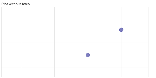 Hiding Both X and Y Axes
2. Hiding Individual Axes
If you only need to hide one of the axes, you can set the visible attribute for either the x-axis or the y-axis individually.
Python
from bokeh.plotting import figure, show, output_notebook

# Create a figure object
p = figure(title="Plot without X Axis", width=600, height=300)
# Add scatter data to the figure
p.scatter([1, 2, 3, 4, 5], [6, 7, 2, 4, 5], size=15, color="orange", alpha=0.5)

# Hide the x-axis
p.xaxis.visible = False

# Add some data to the plot
output_notebook()
show(p)
Output:
 Hiding X Axes
Alternatively, you can hide the y-axis:
Python
from bokeh.plotting import figure, show, output_notebook

# Create a figure object
p = figure(title="Plot without X Axis", width=600, height=300)
# Add scatter data to the figure
p.scatter([1, 2, 3, 4, 5], [6, 7, 2, 4, 5], size=15, color="orange", alpha=0.5)

# Hide the x-axis
p.yaxis.visible = False

# Add some data to the plot
output_notebook()
show(p)
Output:
 Hiding Y Axes
3. Hiding Grid Lines
In addition to hiding the axes, you might also want to hide the grid lines for a cleaner appearance. This can be done by setting the visible attribute for the grid lines to False.
Python
from bokeh.plotting import figure, show, output_notebook

# Create a figure object
p = figure(title="Plot without Grid lines and Axis", width=600, height=300)
# Add scatter data to the figure
p.scatter([1, 2, 3, 4, 5], [6, 7, 2, 4, 5], size=15, color="pink", alpha=0.5)

# Hide both axis
p.xaxis.visible = False
p.yaxis.visible = False

p.xgrid.visible = False
p.ygrid.visible = False

# Add some data to the plot
output_notebook()
show(p)
Output:
 Hiding Grid Lines
Hiding Axis for better Visualization : Practical Examples
1. Hiding Categorical Minor Axes in Bar Charts
In some bar charts, particularly those with nested categories, you may want to hide minor axes to simplify the visualization. For example, in a chart displaying fruit counts by year, you might want to hide the year labels and only display the fruit categories.
In this example, the minor x-axis labels (years) are hidden by setting the major_label_text_alpha to 0.0 and reducing the major_label_text_font_size
Python
from bokeh.io import output_file, show, output_notebook
from bokeh.models import ColumnDataSource, FactorRange
from bokeh.transform import factor_cmap
from bokeh.plotting import figure

output_file("bars.html")

fruits = ['Apples', 'Pears', 'Nectarines', 'Plums', 'Grapes', 'Strawberries']
years = ['2015', '2016', '2017']
data = {'fruits': fruits,
        '2015': [2, 1, 4, 3, 2, 4],
        '2016': [5, 3, 3, 2, 4, 6],
        '2017': [3, 2, 4, 4, 5, 3]}

x = [(fruit, year) for fruit in fruits for year in years]
counts = sum(zip(data['2015'], data['2016'], data['2017']), ())
source = ColumnDataSource(data=dict(x=x, counts=counts))

p = figure(x_range=FactorRange(*x), height=250, title="Fruit counts by year",
           toolbar_location=None, tools="")

palette = ["#c9d9d3", "#718dbf", "#e84d60"]
p.vbar(x='x', top='counts', width=0.9, source=source, line_color="white",
       fill_color=factor_cmap('x', palette=palette, factors=years, start=1, end=2))

p.y_range.start = 0
p.x_range.range_padding = 0.1
p.xaxis.major_label_orientation = 1
p.xgrid.grid_line_color = None
p.xaxis.major_label_text_alpha = 0.0
p.xaxis.major_label_text_font_size = '1px'

output_notebook()
show(p)
Output:
 Hiding Categorical Minor Axes in Bar Charts
Additionally, refer to the link for output: Chart
You can create interactive plots where the visibility of axes changes based on user input, such as toggle buttons or dropdown menus.
In this example, a Toggle button is used to switch the x-axis visibility on and off. The on_change method is used to bind the toggle button's state to the axis visibility
Python
from bokeh.io import show
from bokeh.layouts import layout
from bokeh.models import Toggle
from bokeh.plotting import figure

p = figure(width=600, height=200, tools='')
p.line([1, 2, 3], [1, 2, 1], line_color="#0072B2")

toggle = Toggle(label="Toggle X-Axis", button_type="success", active=True)

def toggle_x_axis(attr, old, new):
    p.xaxis.visible = new

toggle.on_change('active', toggle_x_axis)

show(layout([p], [toggle]))
Output:
 Conditional Axis Visibility Based on User Input
Additionally, refer to the link for output: Chart
Conclusion
Hiding axes in Bokeh can significantly enhance the aesthetics and focus of your visualizations. Whether you're aiming for a minimalist design or creating a complex dashboard, understanding how to manipulate axis visibility is a valuable skill. By following the steps outlined in this article, you can effectively control the appearance of axes in your Bokeh plots, tailoring them to suit your specific needs.
Similar Reads
How to Set Axis Limits bokeh? In this article, we will be learning about how to set axis limits to a plot in bokeh. When we are plotting a graph with a set of values, then X-limits and Y-limits for the points are automatically created. But bokeh allows us to set those axis limits according to our choice. So, at first, we need to
3 min read
How to Hide y Axis Line in ChartJs ? In Chart.JS we can display our information in visual forms. For the customization of the chart, we can remove or hide the Y-axis line from the Chart appearance as per the requirement. We can use two different approaches to hide the y-axis line in the Chart.JS. We will see the practical implementatio
3 min read
Hide legend in Bokeh plot Bokeh is a Python interactive data visualization. It renders its plots using HTML and JavaScript. It targets modern web browsers for presentation providing elegant, concise construction of novel graphics with high-performance interactivity. Adding legends to your figures can help to properly describ
2 min read
How Do I Remove Grid Lines from a Bokeh Plot? Bokeh is a powerful Python library for creating interactive and visually appealing visualizations for web browsers. While grid lines can help in interpreting the data in a plot, there are scenarios where you might want to remove them for a cleaner, more focused visualization. This article will guide
5 min read
How to add color-picker in Bokeh? In this article, we are going to see how to add a color picker widget in bokeh. Widgets are the best way to make charts more interactive. We can also add widgets in the Bokeh application to provide the best front-end user visualization. Using widgets we can do many things like update charts, connec
1 min read
Python Bokeh - Plotting Hexagon Bins on a Graph Bokeh is a Python interactive data visualization. It renders its plots using HTML and JavaScript. It targets modern web browsers for presentation providing elegant, concise construction of novel graphics with high-performance interactivity. Bokeh can be used to plot hexagon tiles on a graph. Plottin
2 min read