04 user interfaces
0 likes2,098 views

In Android, the user interface is built using a hierarchy of View and ViewGroup objects. Views are basic UI elements like buttons and text fields, while ViewGroups serve as containers to hold other views and arrange their layout. The UI hierarchy is defined using XML layout files, which map XML elements to their corresponding View classes. These layout files are loaded and inflated into views at runtime. Views can also be created and added programmatically in code. Views handle drawing, interaction events, and other behaviors to display the UI to the user.


![The onNavigationItemSelected() method receives the position of the item in the list and a unique item
ID provided by the SpinnerAdapter.
Here's an example that instantiates an anonymous implementation of OnNavigationListener, which
inserts a Fragment into the layout container identified by R.id.fragment_container:
mOnNavigationListener = new OnNavigationListener() {
// Get the same strings provided for the drop-down's ArrayAdapter
String[] strings = getResources().getStringArray(R.array.action_list);
@Override
public boolean onNavigationItemSelected(int position, long itemId) {
// Create new fragment from our own Fragment class
ListContentFragment newFragment = new ListContentFragment();
FragmentTransaction ft = openFragmentTransaction();
// Replace whatever is in the fragment container with this fragment
// and give the fragment a tag name equal to the string at the position selected
ft.replace(R.id.fragment_container, newFragment, strings[position]);
// Apply changes
ft.commit();
return true;
}
};
This instance of OnNavigationListener is complete and you can now call setListNavigationCallbacks()
(in step 4), passing the ArrayAdapter and this OnNavigationListener.
In this example, when the user selects an item from the drop-down list, a fragment is added to the
layout (replacing the current fragment in the R.id.fragment_container view). The fragment added is
given a tag that uniquely identifies it, which is the same string used to identify the fragment in the drop-
down list.
Here's a look at the ListContentFragment class that defines each fragment in this example:
public class ListContentFragment extends Fragment {
private String mText;
@Override
public void onAttach(Activity activity) {
// This is the first callback received; here we can set the text for
// the fragment as defined by the tag specified during the fragment transaction
super.onAttach(activity);
mText = getTag();
}
@Override
public View onCreateView(LayoutInflater inflater, ViewGroup container,
Bundle savedInstanceState) {](https://image.slidesharecdn.com/04userinterfaces-111011094513-phpapp01/85/04-user-interfaces-31-320.jpg)


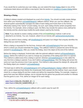


![Note: You can only add one of each button type to the AlertDialog. That is, you cannot have more
than one "positive" button. This limits the number of possible buttons to three: positive, neutral,
and negative. These names are technically irrelevant to the actual functionality of your buttons,
but should help you keep track of which one does what.
Adding a list
To create an AlertDialog with a list of selectable items like the one shown to the
right, use the setItems() method:
final CharSequence[] items = {"Red", "Green", "Blue"};
AlertDialog.Builder builder = new AlertDialog.Builder(this);
builder.setTitle("Pick a color");
builder.setItems(items, new DialogInterface.OnClickListener() {
public void onClick(DialogInterface dialog, int item) {
Toast.makeText(getApplicationContext(), items[item], Toast.LENGTH_SHORT).show();
}
});
AlertDialog alert = builder.create();
First, add a title to the dialog with setTitle(CharSequence). Then, add a list of selectable items with
setItems(), which accepts the array of items to display and a DialogInterface.OnClickListener that
defines the action to take when the user selects an item.
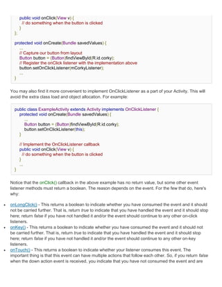
Adding checkboxes and radio buttons
To create a list of multiple-choice items (checkboxes) or single-choice
items (radio buttons) inside the dialog, use the setMultiChoiceItems()
and setSingleChoiceItems() methods, respectively. If you create one of
these selectable lists in the onCreateDialog() callback method, Android
manages the state of the list for you. As long as the Activity is active,
the dialog remembers the items that were previously selected, but
when the user exits the Activity, the selection is lost.
Note: To save the selection when the user leaves or pauses the Activity, you must properly save
and restore the setting throughout the activity lifecycle. To permanently save the selections, even
when the Activity process is completely shutdown, you need to save the settings with one of the
Data Storage techniques.
To create an AlertDialog with a list of single-choice items like the one shown to the right, use the same
code from the previous example, but replace the setItems() method with setSingleChoiceItems():](https://image.slidesharecdn.com/04userinterfaces-111011094513-phpapp01/85/04-user-interfaces-38-320.jpg)
![final CharSequence[] items = {"Red", "Green", "Blue"};
AlertDialog.Builder builder = new AlertDialog.Builder(this);
builder.setTitle("Pick a color");
builder.setSingleChoiceItems(items, -1, new DialogInterface.OnClickListener() {
public void onClick(DialogInterface dialog, int item) {
Toast.makeText(getApplicationContext(), items[item], Toast.LENGTH_SHORT).show();
}
});
AlertDialog alert = builder.create();
The second parameter in the setSingleChoiceItems() method is an integer value for the checkedItem,
which indicates the zero-based list position of the default selected item. Use "-1" to indicate that no
item should be selected by default.
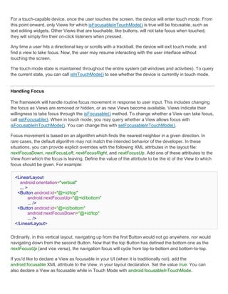
Creating a ProgressDialog
A ProgressDialog is an extension of the AlertDialog class that can display
a progress animation in the form of a spinning wheel, for a task with
progress that's undefined, or a progress bar, for a task that has a defined progression. The dialog can
also provide buttons, such as one to cancel a download.
Opening a progress dialog can be as simple as calling ProgressDialog.show(). For example, the
progress dialog shown to the right can be easily achieved without managing the dialog through the
onCreateDialog(int) callback, as shown here:
ProgressDialog dialog = ProgressDialog.show(MyActivity.this, "",
"Loading. Please wait...", true);
The first parameter is the application Context, the second is a title for the dialog (left empty), the third
is the message, and the last parameter is whether the progress is indeterminate (this is only relevant
when creating a progress bar, which is discussed in the next section).
The default style of a progress dialog is the spinning wheel. If you want to create a progress bar that
shows the loading progress with granularity, some more code is required, as discussed in the next
section.
Showing a progress bar
To show the progression with an animated progress bar:
1. Initialize the ProgressDialog with the class constructor,
ProgressDialog(Context).](https://image.slidesharecdn.com/04userinterfaces-111011094513-phpapp01/85/04-user-interfaces-39-320.jpg)


![notification.defaults |= Notification.DEFAULT_VIBRATE;
To define your own vibration pattern, pass an array of long values to the vibrate field:
long[] vibrate = {0,100,200,300};
notification.vibrate = vibrate;
The long array defines the alternating pattern for the length of vibration off and on (in milliseconds).
The first value is how long to wait (off) before beginning, the second value is the length of the first
vibration, the third is the next length off, and so on. The pattern can be as long as you like, but it can't
be set to repeat.
Note: If the defaults field includes "DEFAULT_VIBRATE", then the default vibration overrides any
vibration defined by the vibrate field.
Adding flashing lights
To alert the user by flashing LED lights, you can implement the default light pattern (if available), or
define your own color and pattern for the lights.
To use the default light setting, add "DEFAULT_LIGHTS" to the defaults field:
notification.defaults |= Notification.DEFAULT_LIGHTS;
To define your own color and pattern, define a value for the ledARGB field (for the color), the ledOffMS
field (length of time, in milliseconds, to keep the light off), the ledOnMS (length of time, in milliseconds,
to keep the light on), and also add "FLAG_SHOW_LIGHTS" to the flags field:
notification.ledARGB = 0xff00ff00;
notification.ledOnMS = 300;
notification.ledOffMS = 1000;
notification.flags |= Notification.FLAG_SHOW_LIGHTS;
In this example, the green light repeatedly flashes on for 300 milliseconds and turns off for one
second. Not every color in the spectrum is supported by the device LEDs, and not every device
supports the same colors, so the hardware estimates to the best of its ability. Green is the most
common notification color.
More features
You can add several more features to your notifications using Notification fields and flags. Some useful
features include the following:
"FLAG_AUTO_CANCEL" flag](https://image.slidesharecdn.com/04userinterfaces-111011094513-phpapp01/85/04-user-interfaces-57-320.jpg)


![adapter.setDropDownViewResource(android.R.layout.simple_spinner_dropdown_item);
s1.setAdapter(adapter);
// Load a Spinner and bind it to a data query.
private static String[] PROJECTION = new String[] {
People._ID, People.NAME
};
Spinner s2 = (Spinner) findViewById(R.id.spinner2);
Cursor cur = managedQuery(People.CONTENT_URI, PROJECTION, null, null);
SimpleCursorAdapter adapter2 = new SimpleCursorAdapter(this,
android.R.layout.simple_spinner_item, // Use a template
// that displays a
// text view
cur, // Give the cursor to the list adapter
new String[] {People.NAME}, // Map the NAME column in the
// people database to...
new int[] {android.R.id.text1}); // The "text1" view defined in
// the XML template
adapter2.setDropDownViewResource(android.R.layout.simple_spinner_dropdown_item);
s2.setAdapter(adapter2);
Note that it is necessary to have the People._ID column in projection used with CursorAdapter or else
you will get an exception.
If, during the course of your application's life, you change the underlying data that is read by your
Adapter, you should call notifyDataSetChanged(). This will notify the attached View that the data has
been changed and it should refresh itself.
Handling User Selections
You handle the user's selection by setting the class's AdapterView.OnItemClickListener member to a
listener and catching the selection changes.
// Create a message handling object as an anonymous class.
private OnItemClickListener mMessageClickedHandler = new OnItemClickListener() {
public void onItemClick(AdapterView parent, View v, int position, long id)
{
// Display a messagebox.
Toast.makeText(mContext,"You've got an event",Toast.LENGTH_SHORT).show();
}
};
// Now hook into our object and set its onItemClickListener member
// to our class handler object.](https://image.slidesharecdn.com/04userinterfaces-111011094513-phpapp01/85/04-user-interfaces-88-320.jpg)


![The example below shows an XML file and the resulting screen in the UI. Note that the attributes that
refer to relative elements (e.g., layout_toLeft) refer to the ID using the syntax of a relative resource
(@id/id).
<?xml version="1.0" encoding="utf-8"?>
<RelativeLayout
xmlns:android="http://schemas.android.com/apk/res/an
droid
android:layout_width="fill_parent"
android:layout_height="wrap_content"
android:background="@drawable/blue"
android:padding="10px" >
<TextView android:id="@+id/label"
android:layout_width="fill_parent"
android:layout_height="wrap_content"
android:text="Type here:" />
<EditText android:id="@+id/entry"
android:layout_width="fill_parent"
android:layout_height="wrap_content"
android:background="@android:drawable/editbox_back
ground"
android:layout_below="@id/label" />
<Button android:id="@+id/ok"
android:layout_width="wrap_content"
android:layout_height="wrap_content"
android:layout_below="@id/entry"
android:layout_alignParentRight="true"
android:layout_marginLeft="10px"
android:text="OK" />
<Button android:layout_width="wrap_content"
android:layout_height="wrap_content"
android:layout_toLeftOf="@id/ok"
android:layout_alignTop="@id/ok"
android:text="Cancel" />
</RelativeLayout>
Some of these properties are supported directly by the element, and some are supported by its
LayoutParams member (subclass RelativeLayout for all the elements in this screen, because all
elements are children of a RelativeLayout parent object). The defined RelativeLayout parameters are:
width, height, below, alignTop, toLeft, padding[Bottom|Left|Right|Top], and
margin[Bottom|Left|Right|Top]. Note that some of these parameters specifically support relative layout
positions — their values must be the ID of the element to which you'd like this view laid relative. For
example, assigning the parameter toLeft="my_button" to a TextView would place the TextView to the
left of the View with the ID my_button (which must be written in the XML before the TextView).](https://image.slidesharecdn.com/04userinterfaces-111011094513-phpapp01/85/04-user-interfaces-92-320.jpg)


04 user interfaces
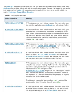
- 1. User Interfaces. In an Android application, the user interface is built using View and ViewGroup objects. There are many types of views and view groups, each of which is a descendant of the View class. View objects are the basic units of user interface expression on the Android platform. The View class serves as the base for subclasses called "widgets," which offer fully implemented UI objects, like text fields and buttons. The ViewGroup class serves as the base for subclasses called "layouts," which offer different kinds of layout architecture, like linear, tabular and relative. A View object is a data structure whose properties store the layout parameters and content for a specific rectangular area of the screen. A View object handles its own measurement, layout, drawing, focus change, scrolling, and key/gesture interactions for the rectangular area of the screen in which it resides. As an object in the user interface, a View is also a point of interaction for the user and the receiver of the interaction events. View Hierarchy On the Android platform, you define an Activity's UI using a hierarchy of View and ViewGroup nodes, as shown in the diagram below. This hierarchy tree can be as simple or complex as you need it to be, and you can build it up using Android's set of predefined widgets and layouts, or with custom Views that you create yourself. In order to attach the view hierarchy tree to the screen for rendering, your Activity must call the setContentView() method and pass a reference to the root node object. The Android system receives this reference and uses it to invalidate, measure, and draw the tree. The root node of the hierarchy requests that its child nodes draw themselves — in turn, each view group node is responsible for calling upon each of its own child views to draw themselves. The children may request a size and location within the parent, but the parent object has the final decision on where how big each child can be. Android parses the elements of your layout in-order (from the top of the hierarchy tree), instantiating the Views and adding them to their parent(s). Because these are drawn in-order, if there are elements that overlap positions, the last one to be drawn will lie on top of others previously drawn to that space. For a more detailed discussion on how view hierarchies are measured and drawn, read How Android Draws Views. Layout The most common way to define your layout and express the view hierarchy is with an XML layout file. XML offers a human-readable structure for the layout, much like HTML. Each element in XML is either
- 2. a View or ViewGroup object (or descendant thereof). View objects are leaves in the tree, ViewGroup objects are branches in the tree (see the View Hierarchy figure above). The name of an XML element is respective to the Java class that it represents. So a <TextView> element creates a TextView in your UI, and a <LinearLayout> element creates a LinearLayout view group. When you load a layout resource, the Android system initializes these run-time objects, corresponding to the elements in your layout. For example, a simple vertical layout with a text view and a button looks like this: <?xml version="1.0" encoding="utf-8"?> <LinearLayout xmlns:android="http://schemas.android.com/apk/res/android" android:layout_width="fill_parent" android:layout_height="fill_parent" android:orientation="vertical" > <TextView android:id="@+id/text" android:layout_width="wrap_content" android:layout_height="wrap_content" android:text="Hello, I am a TextView" /> <Button android:id="@+id/button" android:layout_width="wrap_content" android:layout_height="wrap_content" android:text="Hello, I am a Button" /> </LinearLayout> Notice that the LinearLayout element contains both the TextView and the Button. You can nest another LinearLayout (or other type of view group) inside here, to lengthen the view hierarchy and create a more complex layout. For more on building a UI layout, read Declaring Layout. Tip: You can also draw View and ViewGroups objects in Java code, using the addView(View) methods to dynamically insert new View and ViewGroup objects. There are a variety of ways in which you can layout your views. Using more and different kinds of view groups, you can structure child views and view groups in an infinite number of ways. Some pre-defined view groups offered by Android (called layouts) include LinearLayout, RelativeLayout, TableLayout, GridLayout and others. Each offers a unique set of layout parameters that are used to define the positions of child views and layout structure. To learn about some of the different kinds of view groups used for a layout, read Common Layout Objects. Widgets A widget is a View object that serves as an interface for interaction with the user. Android provides a set of fully implemented widgets, like buttons, checkboxes, and text-entry fields, so you can quickly
- 3. build your UI. Some widgets provided by Android are more complex, like a date picker, a clock, and zoom controls. But you're not limited to the kinds of widgets provided by the Android platform. If you'd like to do something more customized and create your own actionable elements, you can, by defining your own View object or by extending and combining existing widgets. Read more in Building Custom Components. For a list of the widgets provided by Android, see the android.widget package. UI Events Once you've added some Views/widgets to the UI, you probably want to know about the user's interaction with them, so you can perform actions. To be informed of UI events, you need to do one of two things: Define an event listener and register it with the View. More often than not, this is how you'll listen for events. The View class contains a collection of nested interfaces named On<something>Listener, each with a callback method called On<something>(). For example, View.OnClickListener (for handling "clicks" on a View), View.OnTouchListener (for handling touch screen events in a View), and View.OnKeyListener (for handling device key presses within a View). So if you want your View to be notified when it is "clicked" (such as when a button is selected), implement OnClickListener and define its onClick() callback method (where you perform the action upon click), and register it to the View with setOnClickListener(). Override an existing callback method for the View. This is what you should do when you've implemented your own View class and want to listen for specific events that occur within it. Example events you can handle include when the screen is touched (onTouchEvent()), when the trackball is moved (onTrackballEvent()), or when a key on the device is pressed (onKeyDown()). This allows you to define the default behavior for each event inside your custom View and determine whether the event should be passed on to some other child View. Again, these are callbacks to the View class, so your only chance to define them is when you build a custom component. Continue reading about handling user interaction with Views in the Handling UI Events document. Menus Application menus are another important part of an application's UI. Menus offers a reliable interface that reveals application functions and settings. The most common application menu is revealed by pressing the MENU key on the device. However, you can also add Context Menus, which may be revealed when the user presses and holds down on an item. Menus are also structured using a View hierarchy, but you don't define this structure yourself. Instead, you define the onCreateOptionsMenu() or onCreateContextMenu() callback methods for your Activity and declare the items that you want to include in your menu. At the appropriate time, Android will automatically create the necessary View hierarchy for the menu and draw each of your menu items in it.
- 4. Menus also handle their own events, so there's no need to register event listeners on the items in your menu. When an item in your menu is selected, the onOptionsItemSelected() or onContextItemSelected() method will be called by the framework. And just like your application layout, you have the option to declare the items for you menu in an XML file. Read Creating Menus to learn more. Advanced Topics Once you've grappled the fundamentals of creating a user interface, you can explore some advanced features for creating a more complex application interface. Adapters Sometimes you'll want to populate a view group with some information that can't be hard-coded, instead, you want to bind your view to an external source of data. To do this, you use an AdapterView as your view group and each child View is initialized and populated with data from the Adapter. The AdapterView object is an implementation of ViewGroup that determines its child views based on a given Adapter object. The Adapter acts like a courier between your data source (perhaps an array of external strings) and the AdapterView, which displays it. There are several implementations of the Adapter class, for specific tasks, such as the CursorAdapter for reading database data from a Cursor, or an ArrayAdapter for reading from an arbitrary array. To learn more about using an Adapter to populate your views, read Binding to Data with AdapterView. Styles and Themes Perhaps you're not satisfied with the look of the standard widgets. To revise them, you can create some of your own styles and themes. A style is a set of one or more formatting attributes that you can apply as a unit to individual elements in your layout. For example, you could define a style that specifies a certain text size and color, then apply it to only specific View elements. A theme is a set of one or more formatting attributes that you can apply as a unit to all activities in an application, or just a single activity. For example, you could define a theme that sets specific colors for the window frame and the panel background, and sets text sizes and colors for menus. This theme can then be applied to specific activities or the entire application. Styles and themes are resources. Android provides some default style and theme resources that you can use, or you can declare your own custom style and theme resources. Learn more about using styles and themes in the Applying Styles and Themes document.
- 5. Declaring Layout. Your layout is the architecture for the user interface in an Activity. It defines the layout structure and holds all the elements that appear to the user. You can declare your layout in two ways: Declare UI elements in XML. Android provides a straightforward XML vocabulary that corresponds to the View classes and subclasses, such as those for widgets and layouts. Instantiate layout elements at runtime. Your application can create View and ViewGroup objects (and manipulate their properties) programmatically. The Android framework gives you the flexibility to use either or both of these methods for declaring and managing your application's UI. For example, you could declare your application's default layouts in XML, including the screen elements that will appear in them and their properties. You could then add code in your application that would modify the state of the screen objects, including those declared in XML, at run time. The ADT Plugin for Eclipse offers a layout preview of your XML — with the XML file opened, select the Layout tab. You should also try the Hierarchy Viewer tool, for debugging layouts — it reveals layout property values, draws wireframes with padding/margin indicators, and full rendered views while you debug on the emulator or device. The layoutopt tool lets you quickly analyze your layouts and hierarchies for inefficiencies or other problems. The advantage to declaring your UI in XML is that it enables you to better separate the presentation of your application from the code that controls its behavior. Your UI descriptions are external to your application code, which means that you can modify or adapt it without having to modify your source code and recompile. For example, you can create XML layouts for different screen orientations, different device screen sizes, and different languages. Additionally, declaring the layout in XML makes it easier to visualize the structure of your UI, so it's easier to debug problems. As such, this document focuses on teaching you how to declare your layout in XML. If you're interested in instantiating View objects at runtime, refer to the ViewGroup and View class references. In general, the XML vocabulary for declaring UI elements closely follows the structure and naming of the classes and methods, where element names correspond to class names and attribute names correspond to methods. In fact, the correspondence is often so direct that you can guess what XML attribute corresponds to a class method, or guess what class corresponds to a given xml element. However, note that not all vocabulary is identical. In some cases, there are slight naming differences. For example, the EditText element has a text attribute that corresponds to EditText.setText(). Tip: Learn more about different layout types in Common Layout Objects. There are also a collection of tutorials on building various layouts in the Hello Views tutorial guide. Write the XML
- 6. For your convenience, the API reference documentation for UI related classes lists the available XML attributes that correspond to the class methods, including inherited attributes. To learn more about the available XML elements and attributes, as well as the format of the XML file, see Layout Resources. Using Android's XML vocabulary, you can quickly design UI layouts and the screen elements they contain, in the same way you create web pages in HTML — with a series of nested elements. Each layout file must contain exactly one root element, which must be a View or ViewGroup object. Once you've defined the root element, you can add additional layout objects or widgets as child elements to gradually build a View hierarchy that defines your layout. For example, here's an XML layout that uses a vertical LinearLayout to hold a TextView and a Button: <?xml version="1.0" encoding="utf-8"?> <LinearLayout xmlns:android="http://schemas.android.com/apk/res/android" android:layout_width="fill_parent" android:layout_height="fill_parent" android:orientation="vertical" > <TextView android:id="@+id/text" android:layout_width="wrap_content" android:layout_height="wrap_content" android:text="Hello, I am a TextView" /> <Button android:id="@+id/button" android:layout_width="wrap_content" android:layout_height="wrap_content" android:text="Hello, I am a Button" /> </LinearLayout> After you've declared your layout in XML, save the file with the .xml extension, in your Android project's res/layout/ directory, so it will properly compile. We'll discuss each of the attributes shown here a little later. Load the XML Resource When you compile your application, each XML layout file is compiled into a View resource. You should load the layout resource from your application code, in your Activity.onCreate() callback implementation. Do so by calling setContentView(), passing it the reference to your layout resource in the form of: R.layout.layout_file_name For example, if your XML layout is saved as main_layout.xml, you would load it for your Activity like so: public void onCreate(Bundle savedInstanceState) { super.onCreate(savedInstanceState); setContentView(R.layout.main_layout); }
- 7. The onCreate() callback method in your Activity is called by the Android framework when your Activity is launched (see the discussion about lifecycles, in the Activities document). Attributes Every View and ViewGroup object supports their own variety of XML attributes. Some attributes are specific to a View object (for example, TextView supports the textSize attribute), but these attributes are also inherited by any View objects that may extend this class. Some are common to all View objects, because they are inherited from the root View class (like the id attribute). And, other attributes are considered "layout parameters," which are attributes that describe certain layout orientations of the View object, as defined by that object's parent ViewGroup object. ID Any View object may have an integer ID associated with it, to uniquely identify the View within the tree. When the application is compiled, this ID is referenced as an integer, but the ID is typically assigned in the layout XML file as a string, in the id attribute. This is an XML attribute common to all View objects (defined by the View class) and you will use it very often. The syntax for an ID, inside an XML tag is: android:id="@+id/my_button" The at-symbol (@) at the beginning of the string indicates that the XML parser should parse and expand the rest of the ID string and identify it as an ID resource. The plus-symbol (+) means that this is a new resource name that must be created and added to our resources (in the R.java file). There are a number of other ID resources that are offered by the Android framework. When referencing an Android resource ID, you do not need the plus-symbol, but must add the android package namespace, like so: android:id="@android:id/empty" With the android package namespace in place, we're now referencing an ID from the android.R resources class, rather than the local resources class. In order to create views and reference them from the application, a common pattern is to: 1. Define a view/widget in the layout file and assign it a unique ID: <Button android:id="@+id/my_button" android:layout_width="wrap_content" android:layout_height="wrap_content" android:text="@string/my_button_text"/> 2. Then create an instance of the view object and capture it from the layout (typically in the onCreate() method):
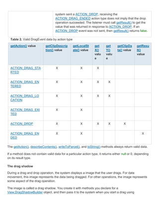
- 8. Button myButton = (Button) findViewById(R.id.my_button); Defining IDs for view objects is important when creating a RelativeLayout. In a relative layout, sibling views can define their layout relative to another sibling view, which is referenced by the unique ID. An ID need not be unique throughout the entire tree, but it should be unique within the part of the tree you are searching (which may often be the entire tree, so it's best to be completely unique when possible). Layout Parameters XML layout attributes named layout_something define layout parameters for the View that are appropriate for the ViewGroup in which it resides. Every ViewGroup class implements a nested class that extends ViewGroup.LayoutParams. This subclass contains property types that define the size and position for each child view, as appropriate for the view group. As you can see in figure 1, the parent view group defines layout parameters for each child view (including the child view group). Figure 1. Visualization of a view hierarchy with layout parameters associated with each view. Note that every LayoutParams subclass has its own syntax for setting values. Each child element must define LayoutParams that are appropriate for its parent, though it may also define different LayoutParams for its own children. All view groups include a width and height (layout_width and layout_height), and each view is required to define them. Many LayoutParams also include optional margins and borders. You can specify width and height with exact measurements, though you probably won't want to do this often. More often, you will use one of these constants to set the width or height: wrap_content tells your view to size itself to the dimensions required by its content
- 9. fill_parent (renamed match_parent in API Level 8) tells your view to become as big as its parent view group will allow. In general, specifying a layout width and height using absolute units such as pixels is not recommended. Instead, using relative measurements such as density-independent pixel units (dp), wrap_content, or fill_parent, is a better approach, because it helps ensure that your application will display properly across a variety of device screen sizes. The accepted measurement types are defined in the Available Resources document. Layout Position The geometry of a view is that of a rectangle. A view has a location, expressed as a pair of left and top coordinates, and two dimensions, expressed as a width and a height. The unit for location and dimensions is the pixel. It is possible to retrieve the location of a view by invoking the methods getLeft() and getTop(). The former returns the left, or X, coordinate of the rectangle representing the view. The latter returns the top, or Y, coordinate of the rectangle representing the view. These methods both return the location of the view relative to its parent. For instance, when getLeft() returns 20, that means the view is located 20 pixels to the right of the left edge of its direct parent. In addition, several convenience methods are offered to avoid unnecessary computations, namely getRight() and getBottom(). These methods return the coordinates of the right and bottom edges of the rectangle representing the view. For instance, calling getRight() is similar to the following computation: getLeft() + getWidth(). Size, Padding and Margins The size of a view is expressed with a width and a height. A view actually possess two pairs of width and height values. The first pair is known as measured width and measured height. These dimensions define how big a view wants to be within its parent. The measured dimensions can be obtained by calling getMeasuredWidth() and getMeasuredHeight(). The second pair is simply known as width and height, or sometimes drawing width and drawing height. These dimensions define the actual size of the view on screen, at drawing time and after layout. These values may, but do not have to, be different from the measured width and height. The width and height can be obtained by calling getWidth() and getHeight(). To measure its dimensions, a view takes into account its padding. The padding is expressed in pixels for the left, top, right and bottom parts of the view. Padding can be used to offset the content of the view by a specific amount of pixels. For instance, a left padding of 2 will push the view's content by 2 pixels to the right of the left edge. Padding can be set using the setPadding(int, int, int, int) method and queried by calling getPaddingLeft(), getPaddingTop(), getPaddingRight() and getPaddingBottom().
- 10. Even though a view can define a padding, it does not provide any support for margins. However, view groups provide such a support. Refer to ViewGroup and ViewGroup.MarginLayoutParams for further information. For more information about dimensions, see Dimension Values. Creating Menus. Menus are an important part of an activity's user interface, which provide users a familiar way to perform actions. Android offers a simple framework for you to add standard menus to your application. There are three types of application menus: Options Menu The primary collection of menu items for an activity, which appears when the user touches the MENU button. When your application is running on Android 3.0 or later, you can provide quick access to select menu items by placing them directly in the Action Bar, as "action items." Context Menu A floating list of menu items that appears when the user touches and holds a view that's registered to provide a context menu. Submenu A floating list of menu items that appears when the user touches a menu item that contains a nested menu. This document shows you how to create each type of menu, using XML to define the content of the menu and callback methods in your activity to respond when the user selects an item. Creating a Menu Resource Instead of instantiating a Menu in your application code, you should define a menu and all its items in an XML menu resource, then inflate the menu resource (load it as a programmable object) in your application code. Using a menu resource to define your menu is a good practice because it separates the content for the menu from your application code. It's also easier to visualize the structure and content of a menu in XML. To create a menu resource, create an XML file inside your project's res/menu/ directory and build the menu with the following elements: <menu> Defines a Menu, which is a container for menu items. A <menu> element must be the root node for the file and can hold one or more <item> and <group> elements. <item>
- 11. Creates a MenuItem, which represents a single item in a menu. This element may contain a nested <menu> element in order to create a submenu. <group> An optional, invisible container for <item> elements. It allows you to categorize menu items so they share properties such as active state and visibility. See the section about Menu groups. Here's an example menu named game_menu.xml: <?xml version="1.0" encoding="utf-8"?> <menu xmlns:android="http://schemas.android.com/apk/res/android"> <item android:id="@+id/new_game" android:icon="@drawable/ic_new_game" android:title="@string/new_game" /> <item android:id="@+id/help" android:icon="@drawable/ic_help" android:title="@string/help" /> </menu> This example defines a menu with two items. Each item includes the attributes: android:id A resource ID that's unique to the item, which allows the application can recognize the item when the user selects it. android:icon A reference to a drawable to use as the item's icon. android:title A reference to a string to use as the item's title. There are many more attributes you can include in an <item>, including some that specify how the item may appear in the Action Bar. For more information about the XML syntax and attributes for a menu resource, see the Menu Resource reference. Inflating a Menu Resource From your application code, you can inflate a menu resource (convert the XML resource into a programmable object) using MenuInflater.inflate(). For example, the following code inflates the game_menu.xml file defined above, during the onCreateOptionsMenu() callback method, to use the menu as the activity's Options Menu: @Override public boolean onCreateOptionsMenu(Menu menu) { MenuInflater inflater = getMenuInflater();
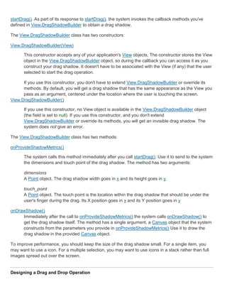
- 12. inflater.inflate(R.menu.game_menu, menu); return true; } The getMenuInflater() method returns a MenuInflater for the activity. With this object, you can call inflate(), which inflates a menu resource into a Menu object. In this example, the menu resource defined by game_menu.xml is inflated into the Menu that was passed into onCreateOptionsMenu(). (This callback method for the Options Menu is discussed more in the next section.) Creating an Options Menu Figure 1. Screenshot of the Options Menu in the Browser. The Options Menu is where you should include basic activity actions and necessary navigation items (for example, a button to open the application settings). Items in the Options Menu are accessible in two distinct ways: the MENU button or in the Action Bar (on devices running Android 3.0 or higher). When running on a device with Android 2.3 and lower, the Options Menu appears at the bottom of the screen, as shown in figure 1. When opened, the first visible portion of the Options Menu is the icon menu. It holds the first six menu items. If you add more than six items to the Options Menu, Android places the sixth item and those after it into the overflow menu, which the user can open by touching the "More" menu item. On Android 3.0 and higher, items from the Options Menu is placed in the Action Bar, which appears at the top of the activity in place of the traditional title bar. By default all items from the Options Menu are placed in the overflow menu, which the user can open by touching the menu icon on the right side of the Action Bar. However, you can place select menu items directly in the Action Bar as "action items," for instant access, as shown in figure 2. When the Android system creates the Options Menu for the first time, it calls your activity's onCreateOptionsMenu() method. Override this method in your activity and populate the Menu that is passed into the method, Menu by inflating a menu resource as described above in Inflating a Menu Resource. For example: @Override public boolean onCreateOptionsMenu(Menu menu) { MenuInflater inflater = getMenuInflater(); inflater.inflate(R.menu.game_menu, menu); return true; }
- 13. Figure 2. Screenshot of the Action Bar in the Email application, with two action items from the Options Menu, plus the overflow menu. You can also populate the menu in code, using add() to add items to the Menu. Note: On Android 2.3 and lower, the system calls onCreateOptionsMenu() to create the Options Menu when the user opens it for the first time, but on Android 3.0 and greater, the system creates it as soon as the activity is created, in order to populate the Action Bar. Responding to user action When the user selects a menu item from the Options Menu (including action items in the Action Bar), the system calls your activity's onOptionsItemSelected() method. This method passes the MenuItem that the user selected. You can identify the menu item by calling getItemId(), which returns the unique ID for the menu item (defined by the android:id attribute in the menu resource or with an integer given to the add() method). You can match this ID against known menu items and perform the appropriate action. For example: @Override public boolean onOptionsItemSelected(MenuItem item) { // Handle item selection switch (item.getItemId()) { case R.id.new_game: newGame(); return true; case R.id.help: showHelp(); return true; default: return super.onOptionsItemSelected(item); } } In this example, getItemId() queries the ID for the selected menu item and the switch statement compares the ID against the resource IDs that were assigned to menu items in the XML resource. When a switch case successfully handles the menu item, it returns true to indicate that the item selection was handled. Otherwise, the default statement passes the menu item to the super class, in case it can handle the item selected. (If you've directly extended the Activity class, then the super class returns false, but it's a good practice to pass unhandled menu items to the super class instead of directly returning false.) Additionally, Android 3.0 adds the ability for you to define the on-click behavior for a menu item in the menu resource XML, using the android:onClick attribute. So you don't need to implement onOptionsItemSelected(). Using the android:onClick attribute, you can specify a method to call when the user selects the menu item. Your activity must then implement the method specified in the
- 14. android:onClick attribute so that it accepts a single MenuItem parameter—when the system calls this method, it passes the menu item selected. Tip: If your application contains multiple activities and some of them provide the same Options Menu, consider creating an activity that implements nothing except the onCreateOptionsMenu() and onOptionsItemSelected() methods. Then extend this class for each activity that should share the same Options Menu. This way, you have to manage only one set of code for handling menu actions and each descendant class inherits the menu behaviors. If you want to add menu items to one of your descendant activities, override onCreateOptionsMenu() in that activity. Call super.onCreateOptionsMenu(menu) so the original menu items are created, then add new menu items with menu.add(). You can also override the super class's behavior for individual menu items. Changing menu items at runtime Once the activity is created, the onCreateOptionsMenu() method is called only once, as described above. The system keeps and re-uses the Menu you define in this method until your activity is destroyed. If you want to change the Options Menu any time after it's first created, you must override the onPrepareOptionsMenu() method. This passes you the Menu object as it currently exists. This is useful if you'd like to remove, add, disable, or enable menu items depending on the current state of your application. On Android 2.3 and lower, the system calls onPrepareOptionsMenu() each time the user opens the Options Menu. On Android 3.0 and higher, you must call invalidateOptionsMenu() when you want to update the menu, because the menu is always open. The system will then call onPrepareOptionsMenu() so you can update the menu items. Note: You should never change items in the Options Menu based on the View currently in focus. When in touch mode (when the user is not using a trackball or d-pad), views cannot take focus, so you should never use focus as the basis for modifying items in the Options Menu. If you want to provide menu items that are context-sensitive to a View, use a Context Menu. If you're developing for Android 3.0 or higher, be sure to also read Using the Action Bar. Creating a Context Menu A context menu is conceptually similar to the menu displayed when the user performs a "right-click" on a PC. You should use a context menu to provide the user access to actions that pertain to a specific item in the user interface. On Android, a context menu is displayed when the user performs a "long press" (press and hold) on an item. You can create a context menu for any View, though context menus are most often used for items in a ListView. When the user performs a long-press on an item in a ListView and the list is registered to
- 15. provide a context menu, the list item signals to the user that a context menu is available by animating its background color—it transitions from orange to white before opening the context menu. (The Contacts application demonstrates this feature.) Register a ListView If your activity uses a ListView and you want all list items to provide a context menu, register all items for a context menu by passing the ListView to registerForContextMenu(). For example, if you're using a ListActivity, register all list items like this: registerForContextMenu(getListView()); In order for a View to provide a context menu, you must "register" the view for a context menu. Call registerForContextMenu() and pass it the View you want to give a context menu. When this View then receives a long-press, it displays a context menu. To define the context menu's appearance and behavior, override your activity's context menu callback methods, onCreateContextMenu() and onContextItemSelected(). For example, here's an onCreateContextMenu() that uses the context_menu.xml menu resource: @Override public void onCreateContextMenu(ContextMenu menu, View v, ContextMenuInfo menuInfo) { super.onCreateContextMenu(menu, v, menuInfo); MenuInflater inflater = getMenuInflater(); inflater.inflate(R.menu.context_menu, menu); } MenuInflater is used to inflate the context menu from a menu resource. (You can also use add() to add menu items.) The callback method parameters include the View that the user selected and a ContextMenu.ContextMenuInfo object that provides additional information about the item selected. You might use these parameters to determine which context menu should be created, but in this example, all context menus for the activity are the same. Then when the user selects an item from the context menu, the system calls onContextItemSelected(). Here is an example of how you can handle selected items: @Override public boolean onContextItemSelected(MenuItem item) { AdapterContextMenuInfo info = (AdapterContextMenuInfo) item.getMenuInfo(); switch (item.getItemId()) { case R.id.edit: editNote(info.id); return true; case R.id.delete: deleteNote(info.id); return true;
- 16. default: return super.onContextItemSelected(item); } } The structure of this code is similar to the example for Creating an Options Menu, in which getItemId() queries the ID for the selected menu item and a switch statement matches the item to the IDs that are defined in the menu resource. And like the options menu example, the default statement calls the super class in case it can handle menu items not handled here, if necessary. In this example, the selected item is an item from a ListView. To perform an action on the selected item, the application needs to know the list ID for the selected item (it's position in the ListView). To get the ID, the application calls getMenuInfo(), which returns a AdapterView.AdapterContextMenuInfo object that includes the list ID for the selected item in the id field. The local methods editNote() and deleteNote() methods accept this list ID to perform an action on the data specified by the list ID. Note: Items in a context menu do not support icons or shortcut keys. Creating Submenus A submenu is a menu that the user can open by selecting an item in another menu. You can add a submenu to any menu (except a submenu). Submenus are useful when your application has a lot of functions that can be organized into topics, like items in a PC application's menu bar (File, Edit, View, etc.). When creating your menu resource, you can create a submenu by adding a <menu> element as the child of an <item>. For example: <?xml version="1.0" encoding="utf-8"?> <menu xmlns:android="http://schemas.android.com/apk/res/android"> <item android:id="@+id/file" android:icon="@drawable/file" android:title="@string/file" > <!-- "file" submenu --> <menu> <item android:id="@+id/create_new" android:title="@string/create_new" /> <item android:id="@+id/open" android:title="@string/open" /> </menu> </item> </menu> When the user selects an item from a submenu, the parent menu's respective on-item-selected callback method receives the event. For instance, if the above menu is applied as an Options Menu, then the onOptionsItemSelected() method is called when a submenu item is selected.
- 17. You can also use addSubMenu() to dynamically add a SubMenu to an existing Menu. This returns the new SubMenu object, to which you can add submenu items, using add() Other Menu Features Here are some other features that you can apply to most menu items. Menu groups A menu group is a collection of menu items that share certain traits. With a group, you can: Show or hide all items with setGroupVisible() Enable or disable all items with setGroupEnabled() Specify whether all items are checkable with setGroupCheckable() You can create a group by nesting <item> elements inside a <group> element in your menu resource or by specifying a group ID with the the add() method. Here's an example menu resource that includes a group: <?xml version="1.0" encoding="utf-8"?> <menu xmlns:android="http://schemas.android.com/apk/res/android"> <item android:id="@+id/item1" android:icon="@drawable/item1" android:title="@string/item1" /> <!-- menu group --> <group android:id="@+id/group1"> <item android:id="@+id/groupItem1" android:title="@string/groupItem1" /> <item android:id="@+id/groupItem2" android:title="@string/groupItem2" /> </group> </menu> The items that are in the group appear the same as the first item that is not in a group—all three items in the menu are siblings. However, you can modify the traits of the two items in the group by referencing the group ID and using the methods listed above. Checkable menu items Figure 3. Screenshot of a submenu with checkable items. A menu can be useful as an interface for turning options on and off, using a checkbox for stand-alone options, or radio buttons for groups of mutually exclusive
- 18. options. Figure 2 shows a submenu with items that are checkable with radio buttons. Note: Menu items in the Icon Menu (from the Options Menu) cannot display a checkbox or radio button. If you choose to make items in the Icon Menu checkable, you must manually indicate the checked state by swapping the icon and/or text each time the state changes. You can define the checkable behavior for individual menu items using the android:checkable attribute in the <item> element, or for an entire group with the android:checkableBehavior attribute in the <group> element. For example, all items in this menu group are checkable with a radio button: <?xml version="1.0" encoding="utf-8"?> <menu xmlns:android="http://schemas.android.com/apk/res/android"> <group android:checkableBehavior="single"> <item android:id="@+id/red" android:title="@string/red" /> <item android:id="@+id/blue" android:title="@string/blue" /> </group> </menu> The android:checkableBehavior attribute accepts either: single Only one item from the group can be checked (radio buttons) all All items can be checked (checkboxes) none No items are checkable You can apply a default checked state to an item using the android:checked attribute in the <item> element and change it in code with the setChecked() method. When a checkable item is selected, the system calls your respective item-selected callback method (such as onOptionsItemSelected()). It is here that you must set the state of the checkbox, because a checkbox or radio button does not change its state automatically. You can query the current state of the item (as it was before the user selected it) with isChecked() and then set the checked state with setChecked(). For example: @Override public boolean onOptionsItemSelected(MenuItem item) { switch (item.getItemId()) { case R.id.vibrate: case R.id.dont_vibrate: if (item.isChecked()) item.setChecked(false); else item.setChecked(true);
- 19. return true; default: return super.onOptionsItemSelected(item); } } If you don't set the checked state this way, then the visible state of the item (the checkbox or radio button) will not change when the user selects it. When you do set the state, the activity preserves the checked state of the item so that when the user opens the menu later, the checked state that you set is visible. Note: Checkable menu items are intended to be used only on a per-session basis and not saved after the application is destroyed. If you have application settings that you would like to save for the user, you should store the data using Shared Preferences. Shortcut keys To facilitate quick access to items in the Options Menu when the user's device has a hardware keyboard, you can add quick-access shortcut keys using letters and/or numbers, with the android:alphabeticShortcut and android:numericShortcut attributes in the <item> element. You can also use the methods setAlphabeticShortcut(char) and setNumericShortcut(char). Shortcut keys are not case sensitive. For example, if you apply the "s" character as an alphabetic shortcut to a "save" menu item, then when the menu is open (or while the user holds the MENU button) and the user presses the "s" key, the "save" menu item is selected. This shortcut key is displayed as a tip in the menu item, below the menu item name (except for items in the Icon Menu, which are displayed only if the user holds the MENU button). Note: Shortcut keys for menu items only work on devices with a hardware keyboard. Shortcuts cannot be added to items in a Context Menu. Dynamically adding menu intents Sometimes you'll want a menu item to launch an activity using an Intent (whether it's an activity in your application or another application). When you know the intent you want to use and have a specific menu item that should initiate the intent, you can execute the intent with startActivity() during the appropriate on-item-selected callback method (such as the onOptionsItemSelected() callback). However, if you are not certain that the user's device contains an application that handles the intent, then adding a menu item that invokes it can result in a non-functioning menu item, because the intent might not resolve to an activity. To solve this, Android lets you dynamically add menu items to your menu when Android finds activities on the device that handle your intent. To add menu items based on available activities that accept an intent:
- 20. 1. Define an intent with the category CATEGORY_ALTERNATIVE and/or CATEGORY_SELECTED_ALTERNATIVE, plus any other requirements. 2. Call Menu.addIntentOptions(). Android then searches for any applications that can perform the intent and adds them to your menu. If there are no applications installed that satisfy the intent, then no menu items are added. Note: CATEGORY_SELECTED_ALTERNATIVE is used to handle the currently selected element on the screen. So, it should only be used when creating a Menu in onCreateContextMenu(). For example: @Override public boolean onCreateOptionsMenu(Menu menu){ super.onCreateOptionsMenu(menu); // Create an Intent that describes the requirements to fulfill, to be included // in our menu. The offering app must include a category value of Intent.CATEGORY_ALTERNATIVE. Intent intent = new Intent(null, dataUri); intent.addCategory(Intent.CATEGORY_ALTERNATIVE); // Search and populate the menu with acceptable offering applications. menu.addIntentOptions( R.id.intent_group, // Menu group to which new items will be added 0, // Unique item ID (none) 0, // Order for the items (none) this.getComponentName(), // The current activity name null, // Specific items to place first (none) intent, // Intent created above that describes our requirements 0, // Additional flags to control items (none) null); // Array of MenuItems that correlate to specific items (none) return true; } For each activity found that provides an intent filter matching the intent defined, a menu item is added, using the value in the intent filter's android:label as the menu item title and the application icon as the menu item icon. The addIntentOptions() method returns the number of menu items added. Note: When you call addIntentOptions(), it overrides any and all menu items by the menu group specified in the first argument. Allowing your activity to be added to other menus You can also offer the services of your activity to other applications, so your application can be included in the menu of others (reverse the roles described above).
- 21. To be included in other application menus, you need to define an intent filter as usual, but be sure to include the CATEGORY_ALTERNATIVE and/or CATEGORY_SELECTED_ALTERNATIVE values for the intent filter category. For example: <intent-filter label="Resize Image"> ... <category android:name="android.intent.category.ALTERNATIVE" /> <category android:name="android.intent.category.SELECTED_ALTERNATIVE" /> ... </intent-filter> Read more about writing intent filters in the Intents and Intent Filters document. For a sample application using this technique, see the Note Pad sample code. Using the action bar. The Action Bar is a widget for activities that replaces the traditional title bar at the top of the screen. By default, the Action Bar includes the application logo on the left side, followed by the activity title, and any available items from the Options Menu on the right side. The Action Bar offers several useful features, including the ability to: Display items from the Options Menu directly in the Action Bar, as "action items"—providing instant access to key user actions. Menu items that do not appear as action items are placed in the overflow menu, revealed by a drop- down list in the Action Bar. Provide tabs for navigating between fragments. Provide a drop-down list for navigation. Provide interactive "action views" in place of action items (such as a search box). Figure 1. A screenshot of the Action Bar in the Email application, containing action items to compose new email and refresh the inbox. Adding the Action Bar The Action Bar is included by default in all activities that target Android 3.0 or greater. More specifically, all activities that use the new "holographic" theme include the Action Bar, and any application that targets Android 3.0 automatically receives this theme. An application is considered to "target" Android 3.0 when it has set either the android:minSdkVersion or android:targetSdkVersion attribute in the <uses-sdk> element to "11" or greater. For example:
- 22. <manifest xmlns:android="http://schemas.android.com/apk/res/android" package="com.example.helloworld" android:versionCode="1" android:versionName="1.0"> <uses-sdk android:minSdkVersion="4" android:targetSdkVersion="11" /> <application ... > ... </application> </manifest> In this example, the application requires a minimum version of API Level 4 (Android 1.6), but it also targets API Level 11 (Android 3.0). This way, when the application is installed on a device running Android 3.0 or greater, the system applies the holographic theme to each activity, and thus, each activity includes the Action Bar. However, if you want to use Action Bar APIs, such as to add tabs or modify Action Bar styles, you need to set the android:minSdkVersion to "11", so you can access the ActionBar class. Removing the Action Bar If you want to remove the Action Bar for a particular activity, set the activity theme to Theme.Holo.NoActionBar. For example: <activity android:theme="@android:style/Theme.Holo.NoActionBar"> Tip: If you have a custom activity theme in which you'd like to remove the Action Bar, set the android:windowActionBar style property false. See Styling the Action Bar for more about Action Bar styles. You can also hide the Action Bar at runtime by calling hide(), then show it again by calling show(). For example: ActionBar actionBar = getActionBar(); actionBar.hide(); When the Action Bar hides, the system adjusts your activity content to fill all the available screen space. Note: If you remove the Action Bar using a theme, then the window will not allow the Action Bar at all, so you cannot add it at runtime—calling getActionBar() will return null. Adding Action Items
- 23. An action item is simply a menu item from the Options Menu which you declare should appear directly in the Action Bar. An action item can include an icon and/or text. If a menu item does not appear as an action item, then the system places it in the overflow menu, which the user can open with the menu icon on the right side of the Action Bar. Figure 2. A screenshot from an Action Bar with two action items and the overflow menu. When the activity first starts, the system populates the Action Bar and overflow menu by calling onCreateOptionsMenu() for your activity. As discussed in the guide to Creating Menus, it's in this callback method that you define the Options Menu for the activity. You can specify a menu item to appear as an action item—if there is room for it—from your menu resource by declaring android:showAsAction="ifRoom" for the <item> element. This way, the menu item appears in the Action Bar for quick access only if there is room available for it. If there's not enough room, the item is placed the overflow menu (revealed by the menu icon on the right side of the Action Bar). You can also declare a menu item to appear as an action item from your application code, by calling setShowAsAction() on the MenuItem and passing SHOW_AS_ACTION_IF_ROOM. If your menu item supplies both a title and an icon, then the action item shows only the icon by defult. If you want to include the text with the action item, add the "with text" flag: in XML, add withText to the android:showAsAction attribute or, in your application code, use the SHOW_AS_ACTION_WITH_TEXT flag when calling setShowAsAction(). Figure 2 shows an Action Bar that has two action items with text and the icon for the overflow menu. Here's an example of how you can declare a menu item as an action item in a menu resource file: <?xml version="1.0" encoding="utf-8"?> <menu xmlns:android="http://schemas.android.com/apk/res/android"> <item android:id="@+id/menu_save" android:icon="@drawable/ic_menu_save" android:title="@string/menu_save" android:showAsAction="ifRoom|withText" /> </menu> In this case, both the ifRoom and withText flags are set, so that when this item appears as an action item, it includes the title text along with the icon. A menu item placed in the Action Bar triggers the same callback methods as other items in the Options Menu. When the user selects an action item, your activity receives a call to onOptionsItemSelected(), passing the item ID.
- 24. Note: If you added the menu item from a fragment, then the respective onOptionsItemSelected() method is called for that fragment. However the activity gets a chance to handle it first, so the system calls onOptionsItemSelected() on the activity before calling the fragment. You can also declare an item to always appear as an action item, but you should avoid doing so, because it can create a cluttered UI if there are too many action items and they might collide with other elements in the Action Bar. For more information about menus, see the Creating Menus developer guide. Using the app icon as an action item By default, your application icon appears in the Action Bar on the left side. It also responds to user interaction (when the user taps it, it visually responds the same way action items do) and it's your responsibility to do something when the user taps it. Figure 3. Email's Action Bar, with the application icon on the left. The normal behavior should be for your application to return to the "home" activity or the initial state (such as when the activity hasn't changed, but fragments have changed) when the user taps the icon. If the user is already at home or the initial state, then you don't need to do anything. When the user taps the icon, the system calls your activity's onOptionsItemSelected() method with the android.R.id.home ID. So, you need to add a condition to your onOptionsItemSelected() method to listen for android.R.id.home and perform the appropriate action, such as start the home activity or pop recent fragment transactions off the stack. If you respond to the application icon by returning to the home activity, you should include the FLAG_ACTIVITY_CLEAR_TOP flag in the Intent. With this flag, if the activity you're starting already exists in the current task, then all activities on top of it are destroyed and it is brought to the front. You should favor this approach, because going "home" is an action that's equivalent to "going back" and you should usually not create a new instance of the home activity. Otherwise, you might end up with a long stack of activities in the current task. For example, here's an implementation of onOptionsItemSelected() that returns to the application's "home" activity: @Override public boolean onOptionsItemSelected(MenuItem item) { switch (item.getItemId()) { case android.R.id.home: // app icon in Action Bar clicked; go home Intent intent = new Intent(this, HomeActivity.class); intent.addFlags(Intent.FLAG_ACTIVITY_CLEAR_TOP); startActivity(intent);
- 25. return true; default: return super.onOptionsItemSelected(item); } } Using the app icon to navigate "up" Figure 4. The standard icon for the Email application (top) and the "up" icon (bottom). You can also use the application icon to provide "up" navigation for the user. This is especially useful when your application is composed of activities that generally appear in a certain order and you want to facilitate the ability for the user to navigate up the activity hierarchy (regardless of how they entered the current activity). The way you respond to this event is the same as when navigating home (as discussed above, except you start a different activity, based on the current activity). All you need to do to indicate to the user that the behavior is different is set the Action Bar to "show home as up." You can do so by calling setDisplayHomeAsUpEnabled(true) on your activity's ActionBar. When you do, the system draws your application icon with an arrow indicating the up behavior, as shown in figure 4. For example, here's how you can show the application icon as an "up" action: @Override protected void onStart() { super.onStart(); ActionBar actionBar = this.getActionBar(); actionBar.setDisplayHomeAsUpEnabled(true); } Then, your activity should respond to the user tapping the icon, from the onOptionsItemSelected(), by listening for the android.R.id.home ID (as shown above). In this case, when navigating up, it's even more important that you use the FLAG_ACTIVITY_CLEAR_TOP flag in the Intent, so that you don't create a new instance of the parent activity if one already exists. Adding an Action View Figure 5. An action view with a SearchView widget.
- 26. An action view is a widget that appears in the Action Bar as a substitute for an action item. For example, if you have an item in the Options Menu for "Search", you can add an action view for the item that provides a SearchView widget in the Action Bar whenever the item is enabled as an action item. When adding an action view for a menu item, it's important that you still allow the item to behave as a normal menu item when it does not appear in the Action Bar. For example, a menu item to perform a search should, by default, bring up the Android search dialog, but if the item is placed in the Action Bar, the action view appears with a SearchView widget. Figure 4 shows an example of the SearchView widget in an action view. The best way to declare an action view for an item is in your menu resource, using the android:actionLayout or android:actionViewClass attribute: The value for android:actionLayout must be a resource pointer to a layout file. For example: <?xml version="1.0" encoding="utf-8"?> <menu xmlns:android="http://schemas.android.com/apk/res/android"> <item android:id="@+id/menu_search" android:title="Search" android:icon="@drawable/ic_menu_search" android:showAsAction="ifRoom" android:actionLayout="@layout/searchview" /> </menu> The value for android:actionViewClass must be a fully-qualified class name for the View you want to use. For example: <?xml version="1.0" encoding="utf-8"?> <menu xmlns:android="http://schemas.android.com/apk/res/android"> <item android:id="@+id/menu_search" android:title="Search" android:icon="@drawable/ic_menu_search" android:showAsAction="ifRoom" android:actionViewClass="android.widget.SearchView" /> </menu> You must include android:showAsAction="ifRoom" in order for the item to appear as an action view when room is available. If necessary, however, you can force the item to always appear as an action view by setting android:showAsAction to "always". Now, when the menu item is displayed as an action item, it's action view appears instead of the icon and/or title text. However, if there's not enough room in the Action Bar, the item appears in the overflow menu as a normal menu item and you must respond to it from the onOptionsItemSelected() callback method.
- 27. When the activity first starts, the system populates the Action Bar and overflow menu by calling onCreateOptionsMenu(). After you've inflated your menu in this method, you can acquire elements in an action view (perhaps in order to attach listeners) by calling findItem() with the ID of the menu item, then getActionView() on the returned MenuItem. For example, the search widget from the above samples is acquired like this: @Override public boolean onCreateOptionsMenu(Menu menu) { getMenuInflater().inflate(R.menu.options, menu); SearchView searchView = (SearchView) menu.findItem(R.id.menu_search).getActionView(); // Set appropriate listeners for searchView ... return super.onCreateOptionsMenu(menu); } For more information about using the search widget, see Creating a Search Interface. Adding Tabs Figure 6. Screenshot of tabs in the Action Bar, from the Honeycomb Gallery sample application. The Action Bar can display tabs that allow the user navigate between different fragments in the activity. Each tab can include a title and/or an icon. To begin, your layout must include a View in which each Fragment associated with a tab is displayed. Be sure the view has an ID that you can use to reference it from your code. To add tabs to the Action Bar: 1. Create an implementation of ActionBar.TabListener to handle the interaction events on the Action Bar tabs. You must implement all methods: onTabSelected(), onTabUnselected(), and onTabReselected(). Each callback method passes the ActionBar.Tab that received the event and a FragmentTransaction for you to perform the fragment transactions (add or remove fragments). For example: private class MyTabListener implements ActionBar.TabListener { private TabContentFragment mFragment; // Called to create an instance of the listener when adding a new tab public MyTabListener(TabContentFragment fragment) { mFragment = fragment;
- 28. } public void onTabSelected(Tab tab, FragmentTransaction ft) { ft.add(R.id.fragment_content, mFragment, null); } public void onTabUnselected(Tab tab, FragmentTransaction ft) { ft.remove(mFragment); } public void onTabReselected(Tab tab, FragmentTransaction ft) { // do nothing } } This implementation of ActionBar.TabListener adds a constructor that saves the Fragment associated with a tab so that each callback can add or remove that fragment. 2. Get the ActionBar for your activity by calling getActionBar() from your Activity, during onCreate() (but be sure you do so after you've called setContentView()). 3. Call setNavigationMode(NAVIGATION_MODE_TABS) to enable tab mode for the ActionBar. 4. Create each tab for the Action Bar: 1. Create a new ActionBar.Tab by calling newTab() on the ActionBar. 2. Add title text and/or an icon for the tab by calling setText() and/or setIcon(). Tip: These methods return the same ActionBar.Tab instance, so you can chain the calls together. 3. Declare the ActionBar.TabListener to use for the tab by passing an instance of your implementation to setTabListener(). 5. Add each ActionBar.Tab to the Action Bar by calling addTab() on the ActionBar and passing the ActionBar.Tab. For example, the following code combines steps 2 - 5 to create two tabs and add them to the Action Bar: @Override protected void onCreate(Bundle savedInstanceState) { super.onCreate(savedInstanceState); setContentView(R.layout.main); // setup Action Bar for tabs final ActionBar actionBar = getActionBar(); actionBar.setNavigationMode(ActionBar.NAVIGATION_MODE_TABS); // remove the activity title to make space for tabs actionBar.setDisplayShowTitleEnabled(false); // instantiate fragment for the tab Fragment artistsFragment = new ArtistsFragment();
- 29. // add a new tab and set its title text and tab listener actionBar.addTab(actionBar.newTab().setText(R.string.tab_artists) .setTabListener(new TabListener(artistsFragment))); Fragment albumsFragment = new AlbumsFragment(); actionBar.addTab(actionBar.newTab().setText(R.string.tab_albums) .setTabListener(new TabListener(albumsFragment))); } All the behaviors that occur when a tab is selected must be defined by your ActionBar.TabListener callback methods. When a tab is selected, it receives a call to onTabSelected() and that's where you should add the appropriate fragment to the designated view in your layout, using add() with the provided FragmentTransaction. Likewise, when a tab is deselected (because another tab becomes selected), you should remove that fragment from the layout, using remove(). Caution: You must not call commit() for these transactions—the system calls it for you and it may throw an exception if you call it yourself. You also cannot add these fragment transactions to the back stack. If your activity is stopped, you should retain the currently selected tab with the saved state so that when the user returns to your application, you can open the tab. When it's time to save the state, you can query the currently selected tab with getSelectedNavigationIndex(). This returns the index position of the selected tab. Caution: It's important that you save the state of each fragment as necessary, so when the user switches fragments with the tabs, then returns to a previous fragment, it appears the way they left. For information about saving the state of your fragment, see the Fragments developer guide. Adding Drop-down Navigation As another mode of navigation within your activity, you can provide a drop-down list in the Action Bar. For example, the drop-down list can provide alternative modes for sorting the content in the activity or switching the user's account. Here's a quick list of steps to enable drop-down navigation: 1. Create a SpinnerAdapter that provides the list of selectable items for the drop-down and the layout to use when drawing each item in the list. 2. Implement ActionBar.OnNavigationListener to define the behavior when the user selects an item from the list. 3. Enable navigation mode for the Action Bar with setNavigationMode(). For example: ActionBar actionBar = getActionBar(); actionBar.setNavigationMode(ActionBar.NAVIGATION_MODE_LIST); Note: You should perform this during your activity's onCreate() method.
- 30. 4. Then, set the callback for the drop-down list with setListNavigationCallbacks(). For example: actionBar.setListNavigationCallbacks(mSpinnerAdapter, mNavigationCallback); This method takes your SpinnerAdapter and ActionBar.OnNavigationListener. More about these next. That's the basic setup. However, implementing the SpinnerAdapter and ActionBar.OnNavigationListener is where most of the work is done. There are many ways you can implement these to define the functionality for your drop-down navigation and implementing various types of SpinnerAdapter is beyond the scope of this document (you should refer to the SpinnerAdapter class reference for more information). However, below is a simple example for a SpinnerAdapter and ActionBar.OnNavigationListener to get you started (click the title to reveal the sample). Example SpinnerAdapter and OnNavigationListener SpinnerAdapter is an adapter that provides data for a spinner widget, such as the drop-down list in the Action Bar. SpinnerAdapter is an interface that you can implement, but Android includes some useful implementations that you can extend, such as ArrayAdapter and SimpleCursorAdapter. For example, here's an easy way to create a SpinnerAdapter by using ArrayAdapter implementation, which uses a string array as the data source: SpinnerAdapter mSpinnerAdapter = ArrayAdapter.createFromResource(this, R.array.action_list, android.R.layout.simple_spinner_dropdown_item); The createFromResource() method takes three parameters: the application Context, the resource ID for the string array, and the layout to use for each list item. A string array defined in a resource looks like this: <?xml version="1.0" encoding="utf-8"?> <resources> <string-array name="action_list"> <item>Mercury</item> <item>Venus</item> <item>Earth</item> </string-array> </pre> The ArrayAdapter returned by createFromResource() is complete and ready for you to pass it to setListNavigationCallbacks() (in step 4 from above). Before you do, though, you need to create the OnNavigationListener. Your implementation of ActionBar.OnNavigationListener is where you handle fragment changes or other modifications to your activity when the user selects an item from the drop-down list. There's only one callback method to implement in the listener: onNavigationItemSelected().
- 31. The onNavigationItemSelected() method receives the position of the item in the list and a unique item ID provided by the SpinnerAdapter. Here's an example that instantiates an anonymous implementation of OnNavigationListener, which inserts a Fragment into the layout container identified by R.id.fragment_container: mOnNavigationListener = new OnNavigationListener() { // Get the same strings provided for the drop-down's ArrayAdapter String[] strings = getResources().getStringArray(R.array.action_list); @Override public boolean onNavigationItemSelected(int position, long itemId) { // Create new fragment from our own Fragment class ListContentFragment newFragment = new ListContentFragment(); FragmentTransaction ft = openFragmentTransaction(); // Replace whatever is in the fragment container with this fragment // and give the fragment a tag name equal to the string at the position selected ft.replace(R.id.fragment_container, newFragment, strings[position]); // Apply changes ft.commit(); return true; } }; This instance of OnNavigationListener is complete and you can now call setListNavigationCallbacks() (in step 4), passing the ArrayAdapter and this OnNavigationListener. In this example, when the user selects an item from the drop-down list, a fragment is added to the layout (replacing the current fragment in the R.id.fragment_container view). The fragment added is given a tag that uniquely identifies it, which is the same string used to identify the fragment in the drop- down list. Here's a look at the ListContentFragment class that defines each fragment in this example: public class ListContentFragment extends Fragment { private String mText; @Override public void onAttach(Activity activity) { // This is the first callback received; here we can set the text for // the fragment as defined by the tag specified during the fragment transaction super.onAttach(activity); mText = getTag(); } @Override public View onCreateView(LayoutInflater inflater, ViewGroup container, Bundle savedInstanceState) {
- 32. // This is called to define the layout for the fragment; // we just create a TextView and set its text to be the fragment tag TextView text = new TextView(getActivity()); text.setText(mText); return text; } } Styling the Action Bar The Action Bar is the heading for your application and a primary interaction point for users, so you might want to modify some of its design in order to make it feel more integrated with your application design. There are several ways you can do this if you wish. For simple modifications to the ActionBar, you can use the following methods: setBackgroundDrawable() Sets a drawable to use as the Action Bar's background. The drawable should be a Nine-patch image, a shape, or a solid color, so the system can resize the drawable based on the size of the Action Bar (you should not use a fixed-size bitmap image). setDisplayUseLogoEnabled() Enables the use of an alternative image (a "logo") in the Action Bar, instead of the default application icon. A logo is often a wider, more detailed image that represents the application. When this is enabled, the system uses the logo image defined for the application (or the individual activity) in the manifest file, with the android:logo attribute. The logo will be resized as necessary to fit the height of the Action Bar. (Best practice is to design the logo at the same size as your application icon.) For more complex customizations, you can use Android's style and theme framework to restyle your Action Bar in several ways. The Action Bar has two standard themes, "dark" and "light". The dark theme is applied with the default holographic theme, as specified by the Theme.Holo theme. If you want a white background with dark text, instead, you can apply the Theme.Holo.Light theme to the activity in the manifest file. For example: <activity android:name=".ExampleActivity" android:theme="@android:style/Theme.Holo.Light" /> For more control, you can override either the Theme.Holo or Theme.Holo.Light theme and apply custom styles to certain aspects of the Action Bar. Some of the Action Bar properties you can customize include the following: android:actionBarTabStyle
- 33. Style for tabs in the Action Bar. android:actionBarTabBarStyle Style for the bar that appears below tabs in the Action Bar. android:actionBarTabTextStyle Style for the text in the tabs. android:actionDropDownStyle Style for the drop-down list used for the overflow menu and drop-down navigation. android:actionButtonStyle Style for the background image used for buttons in the Action Bar. For example, here's a resource file that defines a custom theme for the Action Bar, based on the standard Theme.Holo theme: <?xml version="1.0" encoding="utf-8"?> <resources> <!-- the theme applied to the application or activity --> <style name="CustomActionBar" parent="android:style/Theme.Holo.Light"> <item name="android:actionBarTabTextStyle">@style/customActionBarTabTextStyle</item> <item name="android:actionBarTabStyle">@style/customActionBarTabStyle</item> <item name="android:actionBarTabBarStyle">@style/customActionBarTabBarStyle</item> </style> <!-- style for the tab text --> <style name="customActionBarTabTextStyle"> <item name="android:textColor">#2966c2</item> <item name="android:textSize">20sp</item> <item name="android:typeface">sans</item> </style> <!-- style for the tabs --> <style name="customActionBarTabStyle"> <item name="android:background">@drawable/actionbar_tab_bg</item> <item name="android:paddingLeft">20dp</item> <item name="android:paddingRight">20dp</item> </style> <!-- style for the tab bar --> <style name="customActionBarTabBarStyle"> <item name="android:background">@drawable/actionbar_tab_bar</item> </style> </resources> Note: In order for the tab background image to change, depending on the current tab state (selected, pressed, unselected), the drawable resource used must be a state list drawable. Also
- 34. be certain that your theme declares a parent theme, from which it inherits all styles not explicitly declared in your theme. You can apply your custom theme to the entire application or to individual activities in your manifest file, like this: <application android:theme="@style/CustomActionBar" ... /> Additionally, if you want to create a custom theme for your activity that removes the Action Bar completely, use the following style attributes: android:windowActionBar Set this style property false to remove the Action Bar. android:windowNoTitle Set this style property true to also remove the traditional title bar. For more information about using themes in your application, read Applying Styles and Themes. Creating Dialogs. A dialog is usually a small window that appears in front of the current Activity. The underlying Activity loses focus and the dialog accepts all user interaction. Dialogs are normally used for notifications that should interupt the user and to perform short tasks that directly relate to the application in progress (such as a progress bar or a login prompt). The Dialog class is the base class for creating dialogs. However, you typically should not instantiate a Dialog directly. Instead, you should use one of the following subclasses: AlertDialog A dialog that can manage zero, one, two, or three buttons, and/or a list of selectable items that can include checkboxes or radio buttons. The AlertDialog is capable of constructing most dialog user interfaces and is the suggested dialog type. See Creating an AlertDialog below. ProgressDialog A dialog that displays a progress wheel or progress bar. Because it's an extension of the AlertDialog, it also supports buttons. See Creating a ProgressDialog below. DatePickerDialog A dialog that allows the user to select a date. See the Hello DatePicker tutorial. TimePickerDialog A dialog that allows the user to select a time. See the Hello TimePicker tutorial.
- 35. If you would like to customize your own dialog, you can extend the base Dialog object or any of the subclasses listed above and define a new layout. See the section on Creating a Custom Dialog below. Showing a Dialog A dialog is always created and displayed as a part of an Activity. You should normally create dialogs from within your Activity's onCreateDialog(int) callback method. When you use this callback, the Android system automatically manages the state of each dialog and hooks them to the Activity, effectively making it the "owner" of each dialog. As such, each dialog inherits certain properties from the Activity. For example, when a dialog is open, the Menu key reveals the options menu defined for the Activity and the volume keys modify the audio stream used by the Activity. Note: If you decide to create a dialog outside of the onCreateDialog() method, it will not be attached to an Activity. You can, however, attach it to an Activity with setOwnerActivity(Activity). When you want to show a dialog, call showDialog(int) and pass it an integer that uniquely identifies the dialog that you want to display. When a dialog is requested for the first time, Android calls onCreateDialog(int) from your Activity, which is where you should instantiate the Dialog. This callback method is passed the same ID that you passed to showDialog(int). After you create the Dialog, return the object at the end of the method. Before the dialog is displayed, Android also calls the optional callback method onPrepareDialog(int, Dialog). Define this method if you want to change any properties of the dialog each time it is opened. This method is called every time a dialog is opened, whereas onCreateDialog(int) is only called the very first time a dialog is opened. If you don't define onPrepareDialog(), then the dialog will remain the same as it was the previous time it was opened. This method is also passed the dialog's ID, along with the Dialog object you created in onCreateDialog(). The best way to define the onCreateDialog(int) and onPrepareDialog(int, Dialog) callback methods is with a switch statement that checks the id parameter that's passed into the method. Each case should check for a unique dialog ID and then create and define the respective Dialog. For example, imagine a game that uses two different dialogs: one to indicate that the game has paused and another to indicate that the game is over. First, define an integer ID for each dialog: static final int DIALOG_PAUSED_ID = 0; static final int DIALOG_GAMEOVER_ID = 1; Then, define the onCreateDialog(int) callback with a switch case for each ID: protected Dialog onCreateDialog(int id) { Dialog dialog; switch(id) { case DIALOG_PAUSED_ID: // do the work to define the pause Dialog
- 36. break; case DIALOG_GAMEOVER_ID: // do the work to define the game over Dialog break; default: dialog = null; } return dialog; } Note: In this example, there's no code inside the case statements because the procedure for defining your Dialog is outside the scope of this section. See the section below about Creating an AlertDialog, offers code suitable for this example. When it's time to show one of the dialogs, call showDialog(int) with the ID of a dialog: showDialog(DIALOG_PAUSED_ID); Dismissing a Dialog When you're ready to close your dialog, you can dismiss it by calling dismiss() on the Dialog object. If necessary, you can also call dismissDialog(int) from the Activity, which effectively calls dismiss() on the Dialog for you. If you are using onCreateDialog(int) to manage the state of your dialogs (as discussed in the previous section), then every time your dialog is dismissed, the state of the Dialog object is retained by the Activity. If you decide that you will no longer need this object or it's important that the state is cleared, then you should call removeDialog(int). This will remove any internal references to the object and if the dialog is showing, it will dismiss it. Using dismiss listeners If you'd like your application to perform some procedures the moment that a dialog is dismissed, then you should attach an on-dismiss listener to your Dialog. First define the DialogInterface.OnDismissListener interface. This interface has just one method, onDismiss(DialogInterface), which will be called when the dialog is dismissed. Then simply pass your OnDismissListener implementation to setOnDismissListener(). However, note that dialogs can also be "cancelled." This is a special case that indicates the dialog was explicitly cancelled by the user. This will occur if the user presses the "back" button to close the dialog, or if the dialog explicitly calls cancel() (perhaps from a "Cancel" button in the dialog). When a dialog is cancelled, the OnDismissListener will still be notified, but if you'd like to be informed that the dialog was explicitly cancelled (and not dismissed normally), then you should register an DialogInterface.OnCancelListener with setOnCancelListener().
- 37. Creating an AlertDialog An AlertDialog is an extension of the Dialog class. It is capable of constructing most dialog user interfaces and is the suggested dialog type. You should use it for dialogs that use any of the following features: A title A text message One, two, or three buttons A list of selectable items (with optional checkboxes or radio buttons) To create an AlertDialog, use the AlertDialog.Builder subclass. Get a Builder with AlertDialog.Builder(Context) and then use the class's public methods to define all of the AlertDialog properties. After you're done with the Builder, retrieve the AlertDialog object with create(). The following topics show how to define various properties of the AlertDialog using the AlertDialog.Builder class. If you use any of the following sample code inside your onCreateDialog() callback method, you can return the resulting Dialog object to display the dialog. Adding buttons To create an AlertDialog with side-by-side buttons like the one shown in the screenshot to the right, use the set...Button() methods: AlertDialog.Builder builder = new AlertDialog.Builder(this); builder.setMessage("Are you sure you want to exit?") .setCancelable(false) .setPositiveButton("Yes", new DialogInterface.OnClickListener() { public void onClick(DialogInterface dialog, int id) { MyActivity.this.finish(); } }) .setNegativeButton("No", new DialogInterface.OnClickListener() { public void onClick(DialogInterface dialog, int id) { dialog.cancel(); } }); AlertDialog alert = builder.create(); First, add a message for the dialog with setMessage(CharSequence). Then, begin method-chaining and set the dialog to be not cancelable (so the user cannot close the dialog with the back button) with setCancelable(boolean). For each button, use one of the set...Button() methods, such as setPositiveButton(), that accepts the name for the button and a DialogInterface.OnClickListener that defines the action to take when the user selects the button.
- 38. Note: You can only add one of each button type to the AlertDialog. That is, you cannot have more than one "positive" button. This limits the number of possible buttons to three: positive, neutral, and negative. These names are technically irrelevant to the actual functionality of your buttons, but should help you keep track of which one does what. Adding a list To create an AlertDialog with a list of selectable items like the one shown to the right, use the setItems() method: final CharSequence[] items = {"Red", "Green", "Blue"}; AlertDialog.Builder builder = new AlertDialog.Builder(this); builder.setTitle("Pick a color"); builder.setItems(items, new DialogInterface.OnClickListener() { public void onClick(DialogInterface dialog, int item) { Toast.makeText(getApplicationContext(), items[item], Toast.LENGTH_SHORT).show(); } }); AlertDialog alert = builder.create(); First, add a title to the dialog with setTitle(CharSequence). Then, add a list of selectable items with setItems(), which accepts the array of items to display and a DialogInterface.OnClickListener that defines the action to take when the user selects an item. Adding checkboxes and radio buttons To create a list of multiple-choice items (checkboxes) or single-choice items (radio buttons) inside the dialog, use the setMultiChoiceItems() and setSingleChoiceItems() methods, respectively. If you create one of these selectable lists in the onCreateDialog() callback method, Android manages the state of the list for you. As long as the Activity is active, the dialog remembers the items that were previously selected, but when the user exits the Activity, the selection is lost. Note: To save the selection when the user leaves or pauses the Activity, you must properly save and restore the setting throughout the activity lifecycle. To permanently save the selections, even when the Activity process is completely shutdown, you need to save the settings with one of the Data Storage techniques. To create an AlertDialog with a list of single-choice items like the one shown to the right, use the same code from the previous example, but replace the setItems() method with setSingleChoiceItems():
- 39. final CharSequence[] items = {"Red", "Green", "Blue"}; AlertDialog.Builder builder = new AlertDialog.Builder(this); builder.setTitle("Pick a color"); builder.setSingleChoiceItems(items, -1, new DialogInterface.OnClickListener() { public void onClick(DialogInterface dialog, int item) { Toast.makeText(getApplicationContext(), items[item], Toast.LENGTH_SHORT).show(); } }); AlertDialog alert = builder.create(); The second parameter in the setSingleChoiceItems() method is an integer value for the checkedItem, which indicates the zero-based list position of the default selected item. Use "-1" to indicate that no item should be selected by default. Creating a ProgressDialog A ProgressDialog is an extension of the AlertDialog class that can display a progress animation in the form of a spinning wheel, for a task with progress that's undefined, or a progress bar, for a task that has a defined progression. The dialog can also provide buttons, such as one to cancel a download. Opening a progress dialog can be as simple as calling ProgressDialog.show(). For example, the progress dialog shown to the right can be easily achieved without managing the dialog through the onCreateDialog(int) callback, as shown here: ProgressDialog dialog = ProgressDialog.show(MyActivity.this, "", "Loading. Please wait...", true); The first parameter is the application Context, the second is a title for the dialog (left empty), the third is the message, and the last parameter is whether the progress is indeterminate (this is only relevant when creating a progress bar, which is discussed in the next section). The default style of a progress dialog is the spinning wheel. If you want to create a progress bar that shows the loading progress with granularity, some more code is required, as discussed in the next section. Showing a progress bar To show the progression with an animated progress bar: 1. Initialize the ProgressDialog with the class constructor, ProgressDialog(Context).
- 40. 2. Set the progress style to "STYLE_HORIZONTAL" with setProgressStyle(int) and set any other properties, such as the message. 3. When you're ready to show the dialog, call show() or return the ProgressDialog from the onCreateDialog(int) callback. 4. You can increment the amount of progress displayed in the bar by calling either setProgress(int) with a value for the total percentage completed so far or incrementProgressBy(int) with an incremental value to add to the total percentage completed so far. For example, your setup might look like this: ProgressDialog progressDialog; progressDialog = new ProgressDialog(mContext); progressDialog.setProgressStyle(ProgressDialog.STYLE_HORIZONTAL); progressDialog.setMessage("Loading..."); progressDialog.setCancelable(false); The setup is simple. Most of the code needed to create a progress dialog is actually involved in the process that updates it. You might find that it's necessary to create a second thread in your application for this work and then report the progress back to the Activity's UI thread with a Handler object. If you're not familiar with using additional threads with a Handler, see the example Activity below that uses a second thread to increment a progress dialog managed by the Activity. Example ProgressDialog with a second thread This example uses a second thread to track the progress of a process (which actually just counts up to 100). The thread sends a Message back to the main Activity through a Handler each time progress is made. The main Activity then updates the ProgressDialog. package com.example.progressdialog; import android.app.Activity; import android.app.Dialog; import android.app.ProgressDialog; import android.os.Bundle; import android.os.Handler; import android.os.Message; import android.view.View; import android.view.View.OnClickListener; import android.widget.Button; public class NotificationTest extends Activity { static final int PROGRESS_DIALOG = 0; Button button; ProgressThread progressThread; ProgressDialog progressDialog; /** Called when the activity is first created. */
- 41. public void onCreate(Bundle savedInstanceState) { super.onCreate(savedInstanceState); setContentView(R.layout.main); // Setup the button that starts the progress dialog button = (Button) findViewById(R.id.progressDialog); button.setOnClickListener(new OnClickListener(){ public void onClick(View v) { showDialog(PROGRESS_DIALOG); } }); } protected Dialog onCreateDialog(int id) { switch(id) { case PROGRESS_DIALOG: progressDialog = new ProgressDialog(NotificationTest.this); progressDialog.setProgressStyle(ProgressDialog.STYLE_HORIZONTAL); progressDialog.setMessage("Loading..."); return progressDialog; default: return null; } } @Override protected void onPrepareDialog(int id, Dialog dialog) { switch(id) { case PROGRESS_DIALOG: progressDialog.setProgress(0); progressThread = new ProgressThread(handler); progressThread.start(); } // Define the Handler that receives messages from the thread and update the progress final Handler handler = new Handler() { public void handleMessage(Message msg) { int total = msg.arg1; progressDialog.setProgress(total); if (total >= 100){ dismissDialog(PROGRESS_DIALOG); progressThread.setState(ProgressThread.STATE_DONE); } } }; /** Nested class that performs progress calculations (counting) */ private class ProgressThread extends Thread { Handler mHandler; final static int STATE_DONE = 0; final static int STATE_RUNNING = 1;
- 42. int mState; int total; ProgressThread(Handler h) { mHandler = h; } public void run() { mState = STATE_RUNNING; total = 0; while (mState == STATE_RUNNING) { try { Thread.sleep(100); } catch (InterruptedException e) { Log.e("ERROR", "Thread Interrupted"); } Message msg = mHandler.obtainMessage(); msg.arg1 = total; mHandler.sendMessage(msg); total++; } } /* sets the current state for the thread, * used to stop the thread */ public void setState(int state) { mState = state; } } } Creating a Custom Dialog If you want a customized design for a dialog, you can create your own layout for the dialog window with layout and widget elements. After you've defined your layout, pass the root View object or layout resource ID to setContentView(View). For example, to create the dialog shown to the right: 1. Create an XML layout saved as custom_dialog.xml: <LinearLayout xmlns:android="http://schemas.android.com/apk/res/android" android:id="@+id/layout_root" android:orientation="horizontal" android:layout_width="fill_parent" android:layout_height="fill_parent"
- 43. android:padding="10dp" > <ImageView android:id="@+id/image" android:layout_width="wrap_content" android:layout_height="fill_parent" android:layout_marginRight="10dp" /> <TextView android:id="@+id/text" android:layout_width="wrap_content" android:layout_height="fill_parent" android:textColor="#FFF" /> </LinearLayout> This XML defines an ImageView and a TextView inside a LinearLayout. 2. Set the above layout as the dialog's content view and define the content for the ImageView and TextView elements: Context mContext = getApplicationContext(); Dialog dialog = new Dialog(mContext); dialog.setContentView(R.layout.custom_dialog); dialog.setTitle("Custom Dialog"); TextView text = (TextView) dialog.findViewById(R.id.text); text.setText("Hello, this is a custom dialog!"); ImageView image = (ImageView) dialog.findViewById(R.id.image); image.setImageResource(R.drawable.android); After you instantiate the Dialog, set your custom layout as the dialog's content view with setContentView(int), passing it the layout resource ID. Now that the Dialog has a defined layout, you can capture View objects from the layout with findViewById(int) and modify their content. 3. That's it. You can now show the dialog as described in Showing A Dialog. A dialog made with the base Dialog class must have a title. If you don't call setTitle(), then the space used for the title remains empty, but still visible. If you don't want a title at all, then you should create your custom dialog using the AlertDialog class. However, because an AlertDialog is created easiest with the AlertDialog.Builder class, you do not have access to the setContentView(int) method used above. Instead, you must use setView(View). This method accepts a View object, so you need to inflate the layout's root View object from XML. To inflate the XML layout, retrieve the LayoutInflater with getLayoutInflater() (or getSystemService()), and then call inflate(int, ViewGroup), where the first parameter is the layout resource ID and the second is the ID of the root View. At this point, you can use the inflated layout to find View objects in the layout and define the content for the ImageView and TextView elements. Then instantiate the AlertDialog.Builder and set the inflated layout for the dialog with setView(View).
- 44. Here's an example, creating a custom layout in an AlertDialog: AlertDialog.Builder builder; AlertDialog alertDialog; Context mContext = getApplicationContext(); LayoutInflater inflater = (LayoutInflater) mContext.getSystemService(LAYOUT_INFLATER_SERVICE); View layout = inflater.inflate(R.layout.custom_dialog, (ViewGroup) findViewById(R.id.layout_root)); TextView text = (TextView) layout.findViewById(R.id.text); text.setText("Hello, this is a custom dialog!"); ImageView image = (ImageView) layout.findViewById(R.id.image); image.setImageResource(R.drawable.android); builder = new AlertDialog.Builder(mContext); builder.setView(layout); alertDialog = builder.create(); Using an AlertDialog for your custom layout lets you take advantage of built-in AlertDialog features like managed buttons, selectable lists, a title, an icon and so on. For more information, refer to the reference documentation for the Dialog and AlertDialog.Builder classes. Handing UI Events. On Android, there's more than one way to intercept the events from a user's interaction with your application. When considering events within your user interface, the approach is to capture the events from the specific View object that the user interacts with. The View class provides the means to do so. Within the various View classes that you'll use to compose your layout, you may notice several public callback methods that look useful for UI events. These methods are called by the Android framework when the respective action occurs on that object. For instance, when a View (such as a Button) is touched, the onTouchEvent() method is called on that object. However, in order to intercept this, you must extend the class and override the method. However, extending every View object in order to handle such an event would not be practical. This is why the View class also contains a collection of nested interfaces with callbacks that you can much more easily define. These interfaces, called event listeners, are your ticket to capturing the user interaction with your UI. While you will more commonly use the event listeners to listen for user interaction, there may come a time when you do want to extend a View class, in order to build a custom component. Perhaps you want to extend the Button class to make something more fancy. In this case, you'll be able to define the default event behaviors for your class using the class event handlers.
- 45. Event Listeners An event listener is an interface in the View class that contains a single callback method. These methods will be called by the Android framework when the View to which the listener has been registered is triggered by user interaction with the item in the UI. Included in the event listener interfaces are the following callback methods: onClick() From View.OnClickListener. This is called when the user either touches the item (when in touch mode), or focuses upon the item with the navigation-keys or trackball and presses the suitable "enter" key or presses down on the trackball. onLongClick() From View.OnLongClickListener. This is called when the user either touches and holds the item (when in touch mode), or focuses upon the item with the navigation-keys or trackball and presses and holds the suitable "enter" key or presses and holds down on the trackball (for one second). onFocusChange() From View.OnFocusChangeListener. This is called when the user navigates onto or away from the item, using the navigation-keys or trackball. onKey() From View.OnKeyListener. This is called when the user is focused on the item and presses or releases a key on the device. onTouch() From View.OnTouchListener. This is called when the user performs an action qualified as a touch event, including a press, a release, or any movement gesture on the screen (within the bounds of the item). onCreateContextMenu() From View.OnCreateContextMenuListener. This is called when a Context Menu is being built (as the result of a sustained "long click"). See the discussion on context menus in Creating Menus for more information. These methods are the sole inhabitants of their respective interface. To define one of these methods and handle your events, implement the nested interface in your Activity or define it as an anonymous class. Then, pass an instance of your implementation to the respective View.set...Listener() method. (E.g., call setOnClickListener() and pass it your implementation of the OnClickListener.) The example below shows how to register an on-click listener for a Button. // Create an anonymous implementation of OnClickListener private OnClickListener mCorkyListener = new OnClickListener() {
- 46. public void onClick(View v) { // do something when the button is clicked } }; protected void onCreate(Bundle savedValues) { ... // Capture our button from layout Button button = (Button)findViewById(R.id.corky); // Register the onClick listener with the implementation above button.setOnClickListener(mCorkyListener); ... } You may also find it more convenient to implement OnClickListener as a part of your Activity. This will avoid the extra class load and object allocation. For example: public class ExampleActivity extends Activity implements OnClickListener { protected void onCreate(Bundle savedValues) { ... Button button = (Button)findViewById(R.id.corky); button.setOnClickListener(this); } // Implement the OnClickListener callback public void onClick(View v) { // do something when the button is clicked } ... } Notice that the onClick() callback in the above example has no return value, but some other event listener methods must return a boolean. The reason depends on the event. For the few that do, here's why: onLongClick() - This returns a boolean to indicate whether you have consumed the event and it should not be carried further. That is, return true to indicate that you have handled the event and it should stop here; return false if you have not handled it and/or the event should continue to any other on-click listeners. onKey() - This returns a boolean to indicate whether you have consumed the event and it should not be carried further. That is, return true to indicate that you have handled the event and it should stop here; return false if you have not handled it and/or the event should continue to any other on-key listeners. onTouch() - This returns a boolean to indicate whether your listener consumes this event. The important thing is that this event can have multiple actions that follow each other. So, if you return false when the down action event is received, you indicate that you have not consumed the event and are
- 47. also not interested in subsequent actions from this event. Thus, you will not be called for any other actions within the event, such as a finger gesture, or the eventual up action event. Remember that key events are always delivered to the View currently in focus. They are dispatched starting from the top of the View hierarchy, and then down, until they reach the appropriate destination. If your View (or a child of your View) currently has focus, then you can see the event travel through the dispatchKeyEvent() method. As an alternative to capturing key events through your View, you can also receive all of the events inside your Activity with onKeyDown() and onKeyUp(). Note: Android will call event handlers first and then the appropriate default handlers from the class definition second. As such, returning true from these event listeners will stop the propagation of the event to other event listeners and will also block the callback to the default event handler in the View. So be certain that you want to terminate the event when you return true. Event Handlers If you're building a custom component from View, then you'll be able to define several callback methods used as default event handlers. In the document on Building Custom Components, you'll learn see some of the common callbacks used for event handling, including: onKeyDown(int, KeyEvent) - Called when a new key event occurs. onKeyUp(int, KeyEvent) - Called when a key up event occurs. onTrackballEvent(MotionEvent) - Called when a trackball motion event occurs. onTouchEvent(MotionEvent) - Called when a touch screen motion event occurs. onFocusChanged(boolean, int, Rect) - Called when the view gains or loses focus. There are some other methods that you should be aware of, which are not part of the View class, but can directly impact the way you're able to handle events. So, when managing more complex events inside a layout, consider these other methods: Activity.dispatchTouchEvent(MotionEvent) - This allows your Activity to intercept all touch events before they are dispatched to the window. ViewGroup.onInterceptTouchEvent(MotionEvent) - This allows a ViewGroup to watch events as they are dispatched to child Views. ViewParent.requestDisallowInterceptTouchEvent(boolean) - Call this upon a parent View to indicate that it should not intercept touch events with onInterceptTouchEvent(MotionEvent). Touch Mode When a user is navigating a user interface with directional keys or a trackball, it is necessary to give focus to actionable items (like buttons) so the user can see what will accept input. If the device has touch capabilities, however, and the user begins interacting with the interface by touching it, then it is no longer necessary to highlight items, or give focus to a particular View. Thus, there is a mode for interaction named "touch mode."
- 48. For a touch-capable device, once the user touches the screen, the device will enter touch mode. From this point onward, only Views for which isFocusableInTouchMode() is true will be focusable, such as text editing widgets. Other Views that are touchable, like buttons, will not take focus when touched; they will simply fire their on-click listeners when pressed. Any time a user hits a directional key or scrolls with a trackball, the device will exit touch mode, and find a view to take focus. Now, the user may resume interacting with the user interface without touching the screen. The touch mode state is maintained throughout the entire system (all windows and activities). To query the current state, you can call isInTouchMode() to see whether the device is currently in touch mode. Handling Focus The framework will handle routine focus movement in response to user input. This includes changing the focus as Views are removed or hidden, or as new Views become available. Views indicate their willingness to take focus through the isFocusable() method. To change whether a View can take focus, call setFocusable(). When in touch mode, you may query whether a View allows focus with isFocusableInTouchMode(). You can change this with setFocusableInTouchMode(). Focus movement is based on an algorithm which finds the nearest neighbor in a given direction. In rare cases, the default algorithm may not match the intended behavior of the developer. In these situations, you can provide explicit overrides with the following XML attributes in the layout file: nextFocusDown, nextFocusLeft, nextFocusRight, and nextFocusUp. Add one of these attributes to the View from which the focus is leaving. Define the value of the attribute to be the id of the View to which focus should be given. For example: <LinearLayout android:orientation="vertical" ... > <Button android:id="@+id/top" android:nextFocusUp="@+id/bottom" ... /> <Button android:id="@+id/bottom" android:nextFocusDown="@+id/top" ... /> </LinearLayout> Ordinarily, in this vertical layout, navigating up from the first Button would not go anywhere, nor would navigating down from the second Button. Now that the top Button has defined the bottom one as the nextFocusUp (and vice versa), the navigation focus will cycle from top-to-bottom and bottom-to-top. If you'd like to declare a View as focusable in your UI (when it is traditionally not), add the android:focusable XML attribute to the View, in your layout declaration. Set the value true. You can also declare a View as focusable while in Touch Mode with android:focusableInTouchMode.
- 49. To request a particular View to take focus, call requestFocus(). To listen for focus events (be notified when a View receives or looses focus), use onFocusChange(), as discussed in the Event Listeners section, above. Notifying the User. Several types of situations may arise that require you to notify the user about an event that occurs in your application. Some events require the user to respond and others do not. For example: When an event such as saving a file is complete, a small message should appear to confirm that the save was successful. If the application is running in the background and needs the user's attention, the application should create a notification that allows the user to respond at his or her convenience. If the application is performing work that the user must wait for (such as loading a file), the application should show a hovering progress wheel or bar. Each of these notification tasks can be achieved using a different technique: A Toast Notification, for brief messages that come from the background. A Status Bar Notification, for persistent reminders that come from the background and request the user's response. A Dialog Notification, for Activity-related notifications. This document summarizes each of these techniques for notifying the user and includes links to full documentation. Toast Notification A toast notification is a message that pops up on the surface of the window. It only fills the amount of space required for the message and the user's current activity remains visible and interactive. The notification automatically fades in and out, and does not accept interaction events. Because a toast can be created from a background Service, it appears even if the application isn't visible. A toast is best for short text messages, such as "File saved," when you're fairly certain the user is paying attention to the screen. A toast can not accept user interaction events; if you'd like the user to respond and take action, consider using a Status Bar Notification instead. For more information, refer to Creating Toast Notifications. Status Bar Notification A status bar notification adds an icon to the system's status bar (with an optional ticker-text message) and an expanded message in the
- 50. "Notifications" window. When the user selects the expanded message, Android fires an Intent that is defined by the notification (usually to launch an Activity). You can also configure the notification to alert the user with a sound, a vibration, and flashing lights on the device. This kind of notification is ideal when your application is working in a background Service and needs to notify the user about an event. If you need to alert the user about an event that occurs while your Activity is still in focus, consider using a Dialog Notification instead. For more information, refer to Creating Status Bar Notifications. Dialog Notification A dialog is usually a small window that appears in front of the current Activity. The underlying Activity loses focus and the dialog accepts all user interaction. Dialogs are normally used for notifications and short activities that directly relate to the application in progress. You should use a dialog when you need to show a progress bar or a short message that requires confirmation from the user (such as an alert with "OK" and "Cancel" buttons). You can use also use dialogs as integral components in your application's UI and for other purposes besides notifications. For a complete discussion on all the available types of dialogs, including its uses for notifications, refer to Creating Dialogs. Creating Toast Notification. A toast notification is a message that pops up on the surface of the window. It only fills the amount of space required for the message and the user's current activity remains visible and interactive. The notification automatically fades in and out, and does not accept interaction events. The screenshot below shows an example toast notification from the Alarm application. Once an alarm is turned on, a toast is displayed to assure you that the alarm was set. A toast can be created and displayed from an Activity or Service. If you create a toast notification from a Service, it appears in front of the Activity currently in focus. If user response to the notification is required, consider using a Status Bar Notification. The Basics First, instantiate a Toast object with one of the makeText() methods. This method takes three parameters: the application Context, the text message, and the duration for the toast. It returns a
- 51. properly initialized Toast object. You can display the toast notification with show(), as shown in the following example: Context context = getApplicationContext(); CharSequence text = "Hello toast!"; int duration = Toast.LENGTH_SHORT; Toast toast = Toast.makeText(context, text, duration); toast.show(); This example demonstrates everything you need for most toast notifications. You should rarely need anything else. You may, however, want to position the toast differently or even use your own layout instead of a simple text message. The following sections describe how you can do these things. You can also chain your methods and avoid holding on to the Toast object, like this: Toast.makeText(context, text, duration).show(); Positioning your Toast A standard toast notification appears near the bottom of the screen, centered horizontally. You can change this position with the setGravity(int, int, int) method. This accepts three parameters: a Gravity constant, an x-position offset, and a y-position offset. For example, if you decide that the toast should appear in the top-left corner, you can set the gravity like this: toast.setGravity(Gravity.TOP|Gravity.LEFT, 0, 0); If you want to nudge the position to the right, increase the value of the second parameter. To nudge it down, increase the value of the last parameter. Creating a Custom Toast View If a simple text message isn't enough, you can create a customized layout for your toast notification. To create a custom layout, define a View layout, in XML or in your application code, and pass the root View object to the setView(View) method. For example, you can create the layout for the toast visible in the screenshot to the right with the following XML (saved as toast_layout.xml): <LinearLayout xmlns:android="http://schemas.android.com/apk/res/android" android:id="@+id/toast_layout_root"
- 52. android:orientation="horizontal" android:layout_width="fill_parent" android:layout_height="fill_parent" android:padding="10dp" android:background="#DAAA" > <ImageView android:id="@+id/image" android:layout_width="wrap_content" android:layout_height="fill_parent" android:layout_marginRight="10dp" /> <TextView android:id="@+id/text" android:layout_width="wrap_content" android:layout_height="fill_parent" android:textColor="#FFF" /> </LinearLayout> Notice that the ID of the LinearLayout element is "toast_layout". You must use this ID to inflate the layout from the XML, as shown here: LayoutInflater inflater = getLayoutInflater(); View layout = inflater.inflate(R.layout.toast_layout, (ViewGroup) findViewById(R.id.toast_layout_root)); ImageView image = (ImageView) layout.findViewById(R.id.image); image.setImageResource(R.drawable.android); TextView text = (TextView) layout.findViewById(R.id.text); text.setText("Hello! This is a custom toast!"); Toast toast = new Toast(getApplicationContext()); toast.setGravity(Gravity.CENTER_VERTICAL, 0, 0); toast.setDuration(Toast.LENGTH_LONG); toast.setView(layout); toast.show(); First, retrieve the LayoutInflater with getLayoutInflater() (or getSystemService()), and then inflate the layout from XML using inflate(int, ViewGroup). The first parameter is the layout resource ID and the second is the root View. You can use this inflated layout to find more View objects in the layout, so now capture and define the content for the ImageView and TextView elements. Finally, create a new Toast with Toast(Context) and set some properties of the toast, such as the gravity and duration. Then call setView(View) and pass it the inflated layout. You can now display the toast with your custom layout by calling show(). Note: Do not use the public constructor for a Toast unless you are going to define the layout with setView(View). If you do not have a custom layout to use, you must use makeText(Context, int, int) to create the Toast.
- 53. Creating Status Bar Notifications. A status bar notification adds an icon to the system's status bar (with an optional ticker-text message) and an expanded message in the "Notifications" window. When the user selects the expanded message, Android fires an Intent that is defined by the notification (usually to launch an Activity). You can also configure the notification to alert the user with a sound, a vibration, and flashing lights on the device. A status bar notification should be used for any case in which a background Service needs to alert the user about an event that requires a response. A background Service should never launch an Activity on its own in order to receive user interaction. The Service should instead create a status bar notification that will launch the Activity when selected by the user. The screenshot below shows the status bar with a notification icon on the left side. The next screenshot shows the notification's expanded message in the "Notifications" window. The user can reveal the Notifications window by pulling down the status bar (or selecting Notifications from the Home options menu). The Basics An Activity or Service can initiate a status bar notification. Because an Activity can perform actions only while it is active and in focus, you should create your status bar notifications from a Service. This way, the notification can be created from the background, while the user is using another application or while the device is asleep. To create a notification, you must use two classes: Notification and NotificationManager. Use an instance of the Notification class to define the properties of your status bar notification, such as the status bar icon, the expanded message, and extra settings such as a sound to play. The NotificationManager is an Android system service that executes and manages all Notifications. You do not instantiate the NotificationManager. In order to give it your Notification, you must retrieve a reference to the NotificationManager with getSystemService() and then, when you want to notify the user, pass it your Notification object with notify(). To create a status bar notification: 1. Get a reference to the NotificationManager: String ns = Context.NOTIFICATION_SERVICE; NotificationManager mNotificationManager = (NotificationManager) getSystemService(ns);
- 54. 2. Instantiate the Notification: int icon = R.drawable.notification_icon; CharSequence tickerText = "Hello"; long when = System.currentTimeMillis(); Notification notification = new Notification(icon, tickerText, when); 3. Define the Notification's expanded message and Intent: Context context = getApplicationContext(); CharSequence contentTitle = "My notification"; CharSequence contentText = "Hello World!"; Intent notificationIntent = new Intent(this, MyClass.class); PendingIntent contentIntent = PendingIntent.getActivity(this, 0, notificationIntent, 0); notification.setLatestEventInfo(context, contentTitle, contentText, contentIntent); 4. Pass the Notification to the NotificationManager: private static final int HELLO_ID = 1; mNotificationManager.notify(HELLO_ID, notification); That's it. Your user has now been notified. Managing your Notifications The NotificationManager is a system service that manages all notifications. You must retrieve a reference to it with the getSystemService() method. For example: String ns = Context.NOTIFICATION_SERVICE; NotificationManager mNotificationManager = (NotificationManager) getSystemService(ns); When you want to send your status bar notification, pass the Notification object to the NotificationManager with notify(int, Notification). The first parameter is the unique ID for the Notification and the second is the Notification object. The ID uniquely identifies the Notification from within your application. This is necessary if you need to update the Notification or (if your application manages different kinds of Notifications) select the appropriate action when the user returns to your application via the Intent defined in the Notification. To clear the status bar notification when the user selects it from the Notifications window, add the "FLAG_AUTO_CANCEL" flag to your Notification object. You can also clear it manually with cancel(int), passing it the notification ID, or clear all your Notifications with cancelAll().
- 55. Creating a Notification A Notification object defines the details of the notification message that is displayed in the status bar and "Notifications" window, and any other alert settings, such as sounds and blinking lights. A status bar notification requires all of the following: An icon for the status bar A title and expanded message for the expanded view (unless you define a custom expanded view) A PendingIntent, to be fired when the notification is selected Optional settings for the status bar notification include: A ticker-text message for the status bar An alert sound A vibrate setting A flashing LED setting The starter-kit for a new Notification includes the Notification(int, CharSequence, long) constructor and the setLatestEventInfo(Context, CharSequence, CharSequence, PendingIntent) method. These define all the required settings for a Notification. The following snippet demonstrates a basic Notification setup: int icon = R.drawable.notification_icon; // icon from resources CharSequence tickerText = "Hello"; // ticker-text long when = System.currentTimeMillis(); // notification time Context context = getApplicationContext(); // application Context CharSequence contentTitle = "My notification"; // expanded message title CharSequence contentText = "Hello World!"; // expanded message text Intent notificationIntent = new Intent(this, MyClass.class); PendingIntent contentIntent = PendingIntent.getActivity(this, 0, notificationIntent, 0); // the next two lines initialize the Notification, using the configurations above Notification notification = new Notification(icon, tickerText, when); notification.setLatestEventInfo(context, contentTitle, contentText, contentIntent); Updating the notification You can update the information in your status bar notification as events continue to occur in your application. For example, when a new SMS text message arrives before previous messages have been read, the Messaging application updates the existing notification to display the total number of new messages received. This practice of updating an existing Notification is much better than adding new Notifications to the NotificationManager because it avoids clutter in the Notifications window.
- 56. Because each notification is uniquely identified by the NotificationManager with an integer ID, you can revise the notification by calling setLatestEventInfo() with new values, change some field values of the Notification, and then call notify() again. You can revise each property with the object member fields (except for the Context and the expanded message title and text). You should always revise the text message when you update the notification by calling setLatestEventInfo() with new values for contentTitle and contentText. Then call notify() to update the notification. (Of course, if you've created a custom expanded view, then updating these title and text values has no effect.) Adding a sound You can alert the user with the default notification sound (which is defined by the user) or with a sound specified by your application. To use the user's default sound, add "DEFAULT_SOUND" to the defaults field: notification.defaults |= Notification.DEFAULT_SOUND; To use a different sound with your notifications, pass a Uri reference to the sound field. The following example uses a known audio file saved to the device SD card: notification.sound = Uri.parse("file:///sdcard/notification/ringer.mp3"); In the next example, the audio file is chosen from the internal MediaStore's ContentProvider: notification.sound = Uri.withAppendedPath(Audio.Media.INTERNAL_CONTENT_URI, "6"); In this case, the exact ID of the media file ("6") is known and appended to the content Uri. If you don't know the exact ID, you must query all the media available in the MediaStore with a ContentResolver. See the Content Providers documentation for more information on using a ContentResolver. If you want the sound to continuously repeat until the user responds to the notification or the notification is cancelled, add "FLAG_INSISTENT" to the flags field. Note: If the defaults field includes "DEFAULT_SOUND", then the default sound overrides any sound defined by the sound field. Adding vibration You can alert the user with the the default vibration pattern or with a vibration pattern defined by your application. To use the default pattern, add "DEFAULT_VIBRATE" to the defaults field:
- 57. notification.defaults |= Notification.DEFAULT_VIBRATE; To define your own vibration pattern, pass an array of long values to the vibrate field: long[] vibrate = {0,100,200,300}; notification.vibrate = vibrate; The long array defines the alternating pattern for the length of vibration off and on (in milliseconds). The first value is how long to wait (off) before beginning, the second value is the length of the first vibration, the third is the next length off, and so on. The pattern can be as long as you like, but it can't be set to repeat. Note: If the defaults field includes "DEFAULT_VIBRATE", then the default vibration overrides any vibration defined by the vibrate field. Adding flashing lights To alert the user by flashing LED lights, you can implement the default light pattern (if available), or define your own color and pattern for the lights. To use the default light setting, add "DEFAULT_LIGHTS" to the defaults field: notification.defaults |= Notification.DEFAULT_LIGHTS; To define your own color and pattern, define a value for the ledARGB field (for the color), the ledOffMS field (length of time, in milliseconds, to keep the light off), the ledOnMS (length of time, in milliseconds, to keep the light on), and also add "FLAG_SHOW_LIGHTS" to the flags field: notification.ledARGB = 0xff00ff00; notification.ledOnMS = 300; notification.ledOffMS = 1000; notification.flags |= Notification.FLAG_SHOW_LIGHTS; In this example, the green light repeatedly flashes on for 300 milliseconds and turns off for one second. Not every color in the spectrum is supported by the device LEDs, and not every device supports the same colors, so the hardware estimates to the best of its ability. Green is the most common notification color. More features You can add several more features to your notifications using Notification fields and flags. Some useful features include the following: "FLAG_AUTO_CANCEL" flag
- 58. Add this to the flags field to automatically cancel the notification after it is selected from the Notifications window. "FLAG_INSISTENT" flag Add this to the flags field to repeat the audio until the user responds. "FLAG_ONGOING_EVENT" flag Add this to the flags field to group the notification under the "Ongoing" title in the Notifications window. This indicates that the application is on-going — its processes is still running in the background, even when the application is not visible (such as with music or a phone call). "FLAG_NO_CLEAR" flag Add this to the flags field to indicate that the notification should not be cleared by the "Clear notifications" button. This is particularly useful if your notification is on-going. number field This value indicates the current number of events represented by the notification. The appropriate number is overlaid on top of the status bar icon. If you intend to use this field, then you must start with "1" when the Notification is first created. (If you change the value from zero to anything greater during an update, the number is not shown.) iconLevel field This value indicates the current level of a LevelListDrawable that is used for the notification icon. You can animate the icon in the status bar by changing this value to correlate with the drawable's defined in a LevelListDrawable. See the LevelListDrawable reference for more information. See the Notification class reference for more information about additional features that you can customize for your application. Creating a Custom Expanded View By default, the expanded view used in the "Notifications" window includes a basic title and text message. These are defined by the contentTitle and contentText parameters of the setLatestEventInfo() method. However, you can also define a custom layout for the expanded view using RemoteViews. The screenshot to the right shows an example of a custom expanded view that uses an ImageView and TextView in a LinearLayout. To define your own layout for the expanded message, instantiate a RemoteViews object and pass it to the contentView field of your Notification. Pass the PendingIntent to the contentIntent field. Creating a custom expanded view is best understood with an example:
- 59. 1. Create the XML layout for the expanded view. For example, create a layout file called custom_notification_layout.xml and build it like so: <LinearLayout xmlns:android="http://schemas.android.com/apk/res/android" android:orientation="horizontal" android:layout_width="fill_parent" android:layout_height="fill_parent" android:padding="3dp" > <ImageView android:id="@+id/image" android:layout_width="wrap_content" android:layout_height="fill_parent" android:layout_marginRight="10dp" /> <TextView android:id="@+id/text" android:layout_width="wrap_content" android:layout_height="fill_parent" android:textColor="#000" /> </LinearLayout> This layout is used for the expanded view, but the content of the ImageView and TextView still needs to be defined by the application. RemoteViews offers some convenient methods that allow you to define this content... 2. In the application code, use the RemoveViews methods to define the image and text. Then pass the RemoteViews object to the contentView field of the Notification, as shown in this example: RemoteViews contentView = new RemoteViews(getPackageName(), R.layout.custom_notification_layout); contentView.setImageViewResource(R.id.image, R.drawable.notification_image); contentView.setTextViewText(R.id.text, "Hello, this message is in a custom expanded view"); notification.contentView = contentView; As shown here, pass the application's package name and the layout resource ID to the RemoteViews constructor. Then, define the content for the ImageView and TextView, using the setImageViewResource() and setTextViewText(). In each case, pass the reference ID of the appropriate View object that you want to set, along with the value for that View. Finally, the RemoteViews object is passed to the Notification in the contentView field. 3. Because you don't need the setLatestEventInfo() method when using a custom view, you must define the Intent for the Notification with the contentIntent field, as in this example: Intent notificationIntent = new Intent(this, MyClass.class); PendingIntent contentIntent = PendingIntent.getActivity(this, 0, notificationIntent, 0); notification.contentIntent = contentIntent;
- 60. 4. The notification can now be sent as usual: mNotificationManager.notify(CUSTOM_VIEW_ID, notification); The RemoteViews class also includes methods that you can use to easily add a Chronometer or ProgressBar in your notification's expanded view. For more information about creating custom layouts with RemoteViews, refer to the RemoteViews class reference. Note: When creating a custom expanded view, you must take special care to ensure that your custom layout functions properly in different device orientations and resolutions. While this advice applies to all View layouts created on Android, it is especially important in this case because your layout real estate is very restricted. So don't make your custom layout too complex and be sure to test it in various configurations. Dragging and Dropping. With the Android drag/drop framework, you can allow your users to move data from one View to another View in the current layout using a graphical drag and drop gesture. The framework includes a drag event class, drag listeners, and helper methods and classes. Although the framework is primarily designed for data movement, you can use it for other UI actions. For example, you could create an app that mixes colors when the user drags a color icon over another icon. The rest of this topic, however, describes the framework in terms of data movement. Overview A drag and drop operation starts when the user makes some gesture that you recognize as a signal to start dragging data. In response, your application tells the system that the drag is starting. The system calls back to your application to get a representation of the data being dragged. As the user's finger moves this representation (a "drag shadow") over the current layout, the system sends drag events to the drag event listener objects and drag event callback methods associated with the View objects in the layout. Once the user releases the drag shadow, the system ends the drag operation. You create a drag event listener object ("listeners") from a class that implements View.OnDragListener. You set the drag event listener object for a View with the View object's setOnDragListener() method. Each View object also has a onDragEvent() callback method. Both of these are described in more detail in the section The drag event listener and callback method. Note: For the sake of simplicity, the following sections refer to the routine that receives drag events as the "drag event listener", even though it may actually be a callback method. When you start a drag, you include both the data you are moving and metadata describing this data as part of the call to the system. During the drag, the system sends drag events to the drag event listeners or callback methods of each View in the layout. The listeners or callback methods can use the metadata to decide if they want to accept the data when it is dropped. If the user drops the data over a
- 61. View object, and that View object's listener or callback method has previously told the system that it wants to accept the drop, then the system sends the data to the listener or callback method in a drag event. Your application tells the system to start a drag by calling the startDrag() method. This tells the system to start sending drag events. The method also sends the data that you are dragging. You can call startDrag() for any attached View in the current layout. The system only uses the View object to get access to global settings in your layout. Once your application calls startDrag(), the rest of the process uses events that the system sends to the View objects in your current layout. The drag/drop process There are basically four steps or states in the drag and drop process: Started In response to the user's gesture to begin a drag, your application calls startDrag() to tell the system to start a drag. The arguments startDrag() provide the data to be dragged, metadata for this data, and a callback for drawing the drag shadow. The system first responds by calling back to your application to get a drag shadow. It then displays the drag shadow on the device. Next, the system sends a drag event with action type ACTION_DRAG_STARTED to the drag event listeners for all the View objects in the current layout. To continue to receive drag events, including a possible drop event, a drag event listener must return true. This registers the listener with the system. Only registered listeners continue to receive drag events. At this point, listeners can also change the appearance of their View object to show that the listener can accept a drop event. If the drag event listener returns false, then it will not receive drag events for the current operation until the system sends a drag event with action type ACTION_DRAG_ENDED. By sending false, the listener tells the system that it is not interested in the drag operation and does not want to accept the dragged data. Continuing The user continues the drag. As the drag shadow intersects the bounding box of a View object, the system sends one or more drag events to the View object's drag event listener (if it is registered to receive events). The listener may choose to alter its View object's appearance in response to the event. For example, if the event indicates that the drag shadow has entered the bounding box of the View (action type ACTION_DRAG_ENTERED), the listener can react by highlighting its View. Dropped
- 62. The user releases the drag shadow within the bounding box of a View that can accept the data. The system sends the View object's listener a drag event with action type ACTION_DROP. The drag event contains the data that was passed to the system in the call to startDrag() that started the operation. The listener is expected to return boolean true to the system if code for accepting the drop succeeds. Note that this step only occurs if the user drops the drag shadow within the bounding box of a View whose listener is registered to receive drag events. If the user releases the drag shadow in any other situation, no ACTION_DROP drag event is sent. Ended After the user releases the drag shadow, and after the system sends out (if necessary) a drag event with action type ACTION_DROP, the system sends out a drag event with action type ACTION_DRAG_ENDED to indicate that the drag operation is over. This is done regardless of where the user released the drag shadow. The event is sent to every listener that is registered to receive drag events, even if the listener received the ACTION_DROP event. Each of these four steps is described in more detail in the section Designing a Drag and Drop Operation. The drag event listener and callback method A View receives drag events with either a drag event listener that implements View.OnDragListener or with its onDragEvent(DragEvent) callback method. When the system calls the method or listener, it passes to them a DragEvent object. You will probably want to use the listener in most cases. When you design UIs, you usually don't subclass View classes, but using the callback method forces you to do this in order to override the method. In comparison, you can implement one listener class and then use it with several different View objects. You can also implement it as an anonymous inline class. To set the listener for a View object, call setOnDragListener(). You can have both a listener and a callback method for View object. If this occurs, the system first calls the listener. The system doesn't call the callback method unless the listener returns false. The combination of the onDragEvent(DragEvent) method and View.OnDragListener is analogous to the combination of the onTouchEvent() and View.OnTouchListener used with touch events. Drag events The system sends out a drag event in the form of a DragEvent object. The object contains an action type that tells the listener what is happening in the drag/drop process. The object contains other data, depending on the action type. To get the action type, a listener calls getAction(). There are six possible values, defined by constants in the DragEvent class. These are listed in table 1.
- 63. The DragEvent object also contains the data that your application provided to the system in the call to startDrag(). Some of the data is valid only for certain action types. The data that is valid for each action type is summarized in table 2. It is also described in detail with the event for which it is valid in the section Designing a Drag and Drop Operation. Table 1. DragEvent action types getAction() value Meaning ACTION_DRAG_STARTED A View object's drag event listener receives this event action type just after the application calls startDrag() and gets a drag shadow. ACTION_DRAG_ENTERED A View object's drag event listener receives this event action type when the drag shadow has just entered the bounding box of the View. This is the first event action type the listener receives when the drag shadow enters the bounding box. If the listener wants to continue receiving drag events for this operation, it must return boolean true to the system. ACTION_DRAG_LOCATION A View object's drag event listener receives this event action type after it receives a ACTION_DRAG_ENTERED event while the drag shadow is still within the bounding box of the View. ACTION_DRAG_EXITED A View object's drag event listener receives this event action type after it receives a ACTION_DRAG_ENTERED and at least one ACTION_DRAG_LOCATION event, and after the user has moved the drag shadow outside the bounding box of the View. ACTION_DROP A View object's drag event listener receives this event action type when the user releases the drag shadow over the View object. This action type is only sent to a View object's listener if the listener returned boolean true in response to the ACTION_DRAG_STARTED drag event. This action type is not sent if the user releases the drag shadow on a View whose listener is not registered, or if the user releases the drag shadow on anything that is not part of the current layout. The listener is expected to return boolean true if it successfully processes the drop. Otherwise, it should return false. ACTION_DRAG_ENDED A View object's drag event listener receives this event action type when the system is ending the drag operation. This action type is not necessarily preceded by an ACTION_DROP event. If the
- 64. system sent a ACTION_DROP, receiving the ACTION_DRAG_ENDED action type does not imply that the drop operation succeeded. The listener must call getResult() to get the value that was returned in response to ACTION_DROP. If an ACTION_DROP event was not sent, then getResult() returns false. Table 2. Valid DragEvent data by action type getAction() value getClipDescrip getLocalSt get get getClipDa getResu tion() value ate() value X() Y() ta() value lt() valu valu value e e ACTION_DRAG_STA X X X RTED ACTION_DRAG_EN X X X X TERED ACTION_DRAG_LO X X X X CATION ACTION_DRAG_EXI X X TED ACTION_DROP X X X X X ACTION_DRAG_EN X X X DED The getAction(), describeContents(), writeToParcel(), and toString() methods always return valid data. If a method does not contain valid data for a particular action type, it returns either null or 0, depending on its result type. The drag shadow During a drag and drop operation, the system displays a image that the user drags. For data movement, this image represents the data being dragged. For other operations, the image represents some aspect of the drag operation. The image is called a drag shadow. You create it with methods you declare for a View.DragShadowBuilder object, and then pass it to the system when you start a drag using
- 65. startDrag(). As part of its response to startDrag(), the system invokes the callback methods you've defined in View.DragShadowBuilder to obtain a drag shadow. The View.DragShadowBuilder class has two constructors: View.DragShadowBuilder(View) This constructor accepts any of your application's View objects. The constructor stores the View object in the View.DragShadowBuilder object, so during the callback you can access it as you construct your drag shadow. It doesn't have to be associated with the View (if any) that the user selected to start the drag operation. If you use this constructor, you don't have to extend View.DragShadowBuilder or override its methods. By default, you will get a drag shadow that has the same appearance as the View you pass as an argument, centered under the location where the user is touching the screen. View.DragShadowBuilder() If you use this constructor, no View object is available in the View.DragShadowBuilder object (the field is set to null). If you use this constructor, and you don't extend View.DragShadowBuilder or override its methods, you will get an invisible drag shadow. The system does not give an error. The View.DragShadowBuilder class has two methods: onProvideShadowMetrics() The system calls this method immediately after you call startDrag(). Use it to send to the system the dimensions and touch point of the drag shadow. The method has two arguments: dimensions A Point object. The drag shadow width goes in x and its height goes in y. touch_point A Point object. The touch point is the location within the drag shadow that should be under the user's finger during the drag. Its X position goes in x and its Y position goes in y onDrawShadow() Immediately after the call to onProvideShadowMetrics() the system calls onDrawShadow() to get the drag shadow itself. The method has a single argument, a Canvas object that the system constructs from the parameters you provide in onProvideShadowMetrics() Use it to draw the drag shadow in the provided Canvas object. To improve performance, you should keep the size of the drag shadow small. For a single item, you may want to use a icon. For a multiple selection, you may want to use icons in a stack rather than full images spread out over the screen. Designing a Drag and Drop Operation
- 66. This section shows step-by-step how to start a drag, how to respond to events during the drag, how respond to a drop event, and how to end the drag and drop operation. Starting a drag The user starts a drag with a drag gesture, usually a long press, on a View object. In response, you should do the following: 1. As necessary, create a ClipData and ClipData.Item for the data being moved. As part of the ClipData object, supply metadata that is stored in a ClipDescription object within the ClipData. For a drag and drop operation that does not represent data movement, you may want to use null instead of an actual object. For example, this code snippet shows how to respond to a long press on a ImageView by creating a ClipData object that contains the tag or label of an ImageView. Following this snippet, the next snippet shows how to override the methods in View.DragShadowBuilder: // Create a string for the ImageView label private static final String IMAGEVIEW_TAG = "icon bitmap" // Creates a new ImageView ImageView imageView = new ImageView(this); // Sets the bitmap for the ImageView from an icon bit map (defined elsewhere) imageView.setImageBitmap(mIconBitmap); // Sets the tag imageView.setTag(IMAGEVIEW_TAG); ... // Sets a long click listener for the ImageView using an anonymous listener object that // implements the OnLongClickListener interface imageView.setOnLongClickListener(new View.OnLongClickListener() { // Defines the one method for the interface, which is called when the View is long-clicked public boolean onLongClick(View v) { // Create a new ClipData. // This is done in two steps to provide clarity. The convenience method // ClipData.newPlainText() can create a plain text ClipData in one step. // Create a new ClipData.Item from the ImageView object's tag ClipData.Item item = new ClipData.Item(v.getTag()); // Create a new ClipData using the tag as a label, the plain text MIME type, and // the already-created item. This will create a new ClipDescription object within the // ClipData, and set its MIME type entry to "text/plain" ClipData dragData = new ClipData(v.getTag(),ClipData.MIMETYPE_TEXT_PLAIN,item);
- 67. // Instantiates the drag shadow builder. View.DrawShadowBuilder myShadow = new MyDragShadowBuilder(imageView); // Starts the drag v.startDrag(dragData, // the data to be dragged myShadow, // the drag shadow builder null, // no need to use local data 0 // flags (not currently used, set to 0) ); } } 2. The following code snippet defines myDragShadowBuilder It creates a drag shadow for dragging a TextView as a small gray rectangle: private static class MyDragShadowBuilder extends View.DragShadowBuilder { // The drag shadow image, defined as a drawable thing private static Drawable shadow; // Defines the constructor for myDragShadowBuilder public MyDragShadowBuilder(View v) { // Stores the View parameter passed to myDragShadowBuilder. super(v); // Creates a draggable image that will fill the Canvas provided by the system. shadow = new ColorDrawable(Color.LTGRAY); } // Defines a callback that sends the drag shadow dimensions and touch point back to the // system. @Override public void onProvideShadowMetrics (Point size, Point touch) // Defines local variables private int width, height; // Sets the width of the shadow to half the width of the original View width = getView().getWidth() / 2; // Sets the height of the shadow to half the height of the original View height = getView().getHeight() / 2; // The drag shadow is a ColorDrawable. This sets its dimensions to be the same as the // Canvas that the system will provide. As a result, the drag shadow will fill the // Canvas.
- 68. shadow.setBounds(0, 0, width, height); // Sets the size parameter's width and height values. These get back to the system // through the size parameter. size.set(width, height); // Sets the touch point's position to be in the middle of the drag shadow touch.set(width / 2, height / 2); } // Defines a callback that draws the drag shadow in a Canvas that the system constructs // from the dimensions passed in onProvideShadowMetrics(). @Override public void onDrawShadow(Canvas canvas) { // Draws the ColorDrawable in the Canvas passed in from the system. shadow.draw(canvas); } } Note: Remember that you don't have to extend View.DragShadowBuilder. The constructor View.DragShadowBuilder(View) creates a default drag shadow that's the same size as the View argument passed to it, with the touch point centered in the drag shadow. Responding to a drag start During the drag operation, the system dispatches drag events to the drag event listeners of the View objects in the current layout. The listeners should react by calling getAction() to get the action type. At the start of a drag, this methods returns ACTION_DRAG_STARTED. In response to an event with the action type ACTION_DRAG_STARTED, a listener should do the following: 1. Call getClipDescription() to get the ClipDescription. Use the MIME type methods in ClipDescription to see if the listener can accept the data being dragged. If the drag and drop operation does not represent data movement, this may not be necessary. 2. If the listener can accept a drop, it should return true. This tells the system to continue to send drag events to the listener. If it can't accept a drop, it should return false, and the system will stop sending drag events until it sends out ACTION_DRAG_ENDED. Note that for an ACTION_DRAG_STARTED event, these the following DragEvent methods are not valid: getClipData(), getX(), getY(), and getResult(). Handling events during the drag
- 69. During the drag, listeners that returned true in response to the ACTION_DRAG_STARTED drag event continue to receive drag events. The types of drag events a listener receives during the drag depend on the location of the drag shadow and the visibility of the listener's View. During the drag, listeners primarily use drag events to decide if they should change the appearance of their View. During the drag, getAction() returns one of three values: ACTION_DRAG_ENTERED: The listener receives this when the touch point (the point on the screen underneath the user's finger) has entered the bounding box of the listener's View. ACTION_DRAG_LOCATION: Once the listener receives an ACTION_DRAG_ENTERED event, and before it receives an AACTION_DRAG_EXITED event, it receives a new ACTION_DRAG_LOCATION event every time the touch point moves. The getX() and getY() methods return the the X and Y coordinates of the touch point. ACTION_DRAG_EXITED: This event is sent to a listener that previously received ACTION_DRAG_ENTERED, after the drag shadow is no longer within the bounding box of the listener's View. The listener does not need to react to any of these action types. If the listener returns a value to the system, it is ignored. Here are some guidelines for responding to each of these action types: In response to ACTION_DRAG_ENTERED or ACTION_DRAG_LOCATION, the listener can change the appearance of the View to indicate that it is about to receive a drop. An event with the action type ACTION_DRAG_LOCATION contains valid data for getX() and getY(), corresponding to the location of the touch point. The listener may want to use this information to alter the appearance of that part of the View that is at the touch point. The listener can also use this information to determine the exact position where the user is going to drop the drag shadow. In response to ACTION_DRAG_EXITED, the listener should reset any appearance changes it applied in response to ACTION_DRAG_ENTERED or ACTION_DRAG_LOCATION. This indicates to the user that the View is no longer an imminent drop target. Responding to a drop When the user releases the drag shadow on a View in the application, and that View previously reported that it could accept the content being dragged, the system dispatches a drag event to that View with the action type ACTION_DROP. The listener should do the following: 1. Call getClipData() to get the ClipData object that was originally supplied in the call to startDrag() and store it. If the drag and drop operation does not represent data movement, this may not be necessary. 2. Return boolean true to indicate that the drop was processed successfully, or boolean false if it was not. The returned value becomes the value returned by getResult() for an ACTION_DRAG_ENDED event. Note that if the system does not send out an ACTION_DROP event, the value of getResult() for an ACTION_DRAG_ENDED event is false. For an ACTION_DROP event, getX() and getY() return the X and Y position of the drag point at the moment of the drop, using the coordinate system of the View that received the drop.
- 70. The system does allow the user to release the drag shadow on a View whose listener is not receiving drag events. It will also allow the user to release the drag shadow on empty regions of the application's UI, or on areas outside of your application. In all of these cases, the system does not send an event with action type ACTION_DROP, although it does send out an ACTION_DRAG_ENDED event. Responding to a drag end Immediately after the user releases the drag shadow, the system sends a drag event to all of the drag event listeners in your application, with an action type of ACTION_DRAG_ENDED. This indicates that the drag operation is over. Each listener should do the following: 1. If listener changed its View object's appearance during the operation, it should reset the View to its default appearance. This is a visual indication to the user that the operation is over. 2. The listener can optionally call getResult() to find out more about the operation. If a listener returned true in response to an event of action type ACTION_DROP, then getResult() will return boolean true. In all other cases, getResult() returns boolean false, including any case in which the system did not send out a ACTION_DROP event. 3. The listener should return boolean true to the system. Responding to drag events: an example All drag events are initially received by your drag event method or listener. The following code snippet is a simple example of reacting to drag events in a listener: // Creates a new drag event listener mDragListen = new myDragEventListener(); View imageView = new ImageView(this); // Sets the drag event listener for the View imageView.setOnDragListener(mDragListen); ... protected class myDragEventListener implements View.OnDragEventListener { // This is the method that the system calls when it dispatches a drag event to the // listener. public boolean onDrag(View v, DragEvent event) { // Defines a variable to store the action type for the incoming event final int action = event.getAction(); // Handles each of the expected events switch(action) {
- 71. case DragEvent.ACTION_DRAG_STARTED: // Determines if this View can accept the dragged data if (event.getClipDescription().hasMimeType(ClipDescription.MIMETYPE_TEXT_PLAIN)) { // As an example of what your application might do, // applies a blue color tint to the View to indicate that it can accept // data. v.setColorFilter(Color.BLUE); // Invalidate the view to force a redraw in the new tint v.invalidate(); // returns true to indicate that the View can accept the dragged data. return(true); } else { // Returns false. During the current drag and drop operation, this View will // not receive events again until ACTION_DRAG_ENDED is sent. return(false); } break; case DragEvent.ACTION_DRAG_ENTERED: { // Applies a green tint to the View. Return true; the return value is ignored. v.setColorFilter(Color.GREEN); // Invalidate the view to force a redraw in the new tint v.invalidate(); return(true); break; case DragEvent.ACTION_DRAG_LOCATION: // Ignore the event return(true); break; case DragEvent.ACTION_DRAG_EXITED: // Re-sets the color tint to blue. Returns true; the return value is ignored. v.setColorFilter(Color.BLUE); // Invalidate the view to force a redraw in the new tint
- 72. v.invalidate(); return(true); break; case DragEvent.ACTION_DROP: // Gets the item containing the dragged data ClipData.Item item = event.getClipData().getItemAt(0); // Gets the text data from the item. dragData = item.getText(); // Displays a message containing the dragged data. Toast.makeText(this, "Dragged data is " + dragData, Toast.LENGTH_LONG); // Turns off any color tints v.clearColorFilter(); // Invalidates the view to force a redraw v.invalidate(); // Returns true. DragEvent.getResult() will return true. return(true); break; case DragEvent.ACTION_DRAG_ENDED: // Turns off any color tinting v.clearColorFilter(); // Invalidates the view to force a redraw v.invalidate(); // Does a getResult(), and displays what happened. if (event.getResult()) { Toast.makeText(this, "The drop was handled.", Toast.LENGTH_LONG); } else { Toast.makeText(this, "The drop didn't work.", Toast.LENGTH_LONG); }; // returns true; the value is ignored. return(true); break; // An unknown action type was received.
- 73. default: Log.e("DragDrop Example","Unknown action type received by OnDragListener."); break; }; }; }; Applying Styles and Themes. A style is a collection of properties that specify the look and format for a View or window. A style can specify properties such as height, padding, font color, font size, background color, and much more. A style is defined in an XML resource that is separate from the XML that specifies the layout. Styles in Android share a similar philosophy to cascading stylesheets in web design—they allow you to separate the design from the content. For example, by using a style, you can take this layout XML: <TextView android:layout_width="fill_parent" android:layout_height="wrap_content" android:textColor="#00FF00" android:typeface="monospace" android:text="@string/hello" /> And turn it into this: <TextView style="@style/CodeFont" android:text="@string/hello" /> All of the attributes related to style have been removed from the layout XML and put into a style definition called CodeFont, which is then applied with the style attribute. You'll see the definition for this style in the following section. A theme is a style applied to an entire Activity or application, rather than an individual View (as in the example above). When a style is applied as a theme, every View in the Activity or application will apply each style property that it supports. For example, you can apply the same CodeFont style as a theme for an Activity and then all text inside that Activity will have green monospace font. Defining Styles
- 74. To create a set of styles, save an XML file in the res/values/ directory of your project. The name of the XML file is arbitrary, but it must use the .xml extension and be saved in the res/values/ folder. The root node of the XML file must be <resources>. For each style you want to create, add a <style> element to the file with a name that uniquely identifies the style (this attribute is required). Then add an <item> element for each property of that style, with a name that declares the style property and a value to go with it (this attribute is required). The value for the <item> can be a keyword string, a hex color, a reference to another resource type, or other value depending on the style property. Here's an example file with a single style: <?xml version="1.0" encoding="utf-8"?> <resources> <style name="CodeFont" parent="@android:style/TextAppearance.Medium"> <item name="android:layout_width">fill_parent</item> <item name="android:layout_height">wrap_content</item> <item name="android:textColor">#00FF00</item> <item name="android:typeface">monospace</item> </style> </resources> Each child of the <resources> element is converted into an application resource object at compile- time, which can be referenced by the value in the <style> element's name attribute. This example style can be referenced from an XML layout as @style/CodeFont (as demonstrated in the introduction above). The parent attribute in the <style> element is optional and specifies the resource ID of another style from which this style should inherit properties. You can then override the inherited style properties if you want to. Remember, a style that you want to use as an Activity or application theme is defined in XML exactly the same as a style for a View. A style such as the one defined above can be applied as a style for a single View or as a theme for an entire Activity or application. How to apply a style for a single View or as an application theme is discussed later. Inheritance The parent attribute in the <style> element lets you specify a style from which your style should inherit properties. You can use this to inherit properties from an existing style and then define only the properties that you want to change or add. You can inherit from styles that you've created yourself or from styles that are built into the platform. (See Using Platform Styles and Themes, below, for information about inheriting from styles defined by the Android platform.) For example, you can inherit the Android platform's default text appearance and then modify it:
- 75. <style name="GreenText" parent="@android:style/TextAppearance"> <item name="android:textColor">#00FF00</item> </style> If you want to inherit from styles that you've defined yourself, you do not have to use the parent attribute. Instead, just prefix the name of the style you want to inherit to the name of your new style, separated by a period. For example, to create a new style that inherits the CodeFont style defined above, but make the color red, you can author the new style like this: <style name="CodeFont.Red"> <item name="android:textColor">#FF0000</item> </style> Notice that there is no parent attribute in the <style> tag, but because the name attribute begins with the CodeFont style name (which is a style that you have created), this style inherits all style properties from that style. This style then overrides the android:textColor property to make the text red. You can reference this new style as @style/CodeFont.Red. You can continue inheriting like this as many times as you'd like, by chaining names with periods. For example, you can extend CodeFont.Red to be bigger, with: <style name="CodeFont.Red.Big"> <item name="android:textSize">30sp</item> </style> This inherits from both CodeFont and CodeFont.Red styles, then adds the android:textSize property. Note: This technique for inheritance by chaining together names only works for styles defined by your own resources. You can't inherit Android built-in styles this way. To reference a built-in style, such as TextAppearance, you must use the parent attribute. Style Properties Now that you understand how a style is defined, you need to learn what kind of style properties— defined by the <item> element—are available. You're probably familiar with some already, such as layout_width and textColor. Of course, there are many more style properties you can use. The best place to find properties that apply to a specific View is the corresponding class reference, which lists all of the supported XML attributes. For example, all of the attributes listed in the table of TextView XML attributes can be used in a style definition for a TextView element (or one of its subclasses). One of the attributes listed in the reference is android:inputType, so where you might normally place the android:inputType attribute in an <EditText> element, like this:
- 76. <EditText android:inputType="number" ... /> You can instead create a style for the EditText element that includes this property: <style name="Numbers"> <item name="android:inputType">number</item> ... </style> So your XML for the layout can now implement this style: <EditText style="@style/Numbers" ... /> This simple example may look like more work, but when you add more style properties and factor-in the ability to re-use the style in various places, the pay-off can be huge. For a reference of all available style properties, see the R.attr reference. Keep in mind that all View objects don't accept all the same style attributes, so you should normally refer to the specific View class for supported style properties. However, if you apply a style to a View that does not support all of the style properties, the View will apply only those properties that are supported and simply ignore the others. Some style properties, however, are not supported by any View element and can only be applied as a theme. These style properties apply to the entire window and not to any type of View. For example, style properties for a theme can hide the application title, hide the status bar, or change the window's background. These kind of style properties do not belong to any View object. To discover these theme- only style properties, look at the R.attr reference for attributes that begin with window. For instance, windowNoTitle and windowBackground are style properties that are effective only when the style is applied as a theme to an Activity or application. See the next section for information about applying a style as a theme. Note: Don't forget to prefix the property names in each <item> element with the android: namespace. For example: <item name="android:inputType">. Applying Styles and Themes to the UI There are two ways to set a style: To an individual View, by adding the style attribute to a View element in the XML for your layout.
- 77. Or, to an entire Activity or application, by adding the android:theme attribute to the <activity> or <application> element in the Android manifest. When you apply a style to a single View in the layout, the properties defined by the style are applied only to that View. If a style is applied to a ViewGroup, the child View elements will not inherit the style properties—only the element to which you directly apply the style will apply its properties. However, you can apply a style so that it applies to all View elements—by applying the style as a theme. To apply a style definition as a theme, you must apply the style to an Activity or application in the Android manifest. When you do so, every View within the Activity or application will apply each property that it supports. For example, if you apply the CodeFont style from the previous examples to an Activity, then all View elements that support the text style properties will apply them. Any View that does not support the properties will ignore them. If a View supports only some of the properties, then it will apply only those properties. Apply a style to a View Here's how to set a style for a View in the XML layout: <TextView style="@style/CodeFont" android:text="@string/hello" /> Now this TextView will be styled as defined by the style named CodeFont. (See the sample above, in Defining Styles.) Note: The style attribute does not use the android: namespace prefix. Apply a theme to an Activity or application To set a theme for all the activities of your application, open the AndroidManifest.xml file and edit the <application> tag to include the android:theme attribute with the style name. For example: <application android:theme="@style/CustomTheme"> If you want a theme applied to just one Activity in your application, then add the android:theme attribute to the <activity> tag instead. Just as Android provides other built-in resources, there are many pre-defined themes that you can use, to avoid writing them yourself. For example, you can use the Dialog theme and make your Activity appear like a dialog box: <activity android:theme="@android:style/Theme.Dialog"> Or if you want the background to be transparent, use the Translucent theme:
- 78. <activity android:theme="@android:style/Theme.Translucent"> If you like a theme, but want to tweak it, just add the theme as the parent of your custom theme. For example, you can modify the traditional light theme to use your own color like this: <color name="custom_theme_color">#b0b0ff</color> <style name="CustomTheme" parent="android:Theme.Light"> <item name="android:windowBackground">@color/custom_theme_color</item> <item name="android:colorBackground">@color/custom_theme_color</item> </style> (Note that the color needs to supplied as a separate resource here because the android:windowBackground attribute only supports a reference to another resource; unlike android:colorBackground, it can not be given a color literal.) Now use CustomTheme instead of Theme.Light inside the Android Manifest: <activity android:theme="@style/CustomTheme"> Select a theme based on platform version Newer versions of Android have additional themes available to applications, and you might want to use these while running on those platforms while still being compatible with older versions. You can accomplish this through a custom theme that uses resource selection to switch between different parent themes, based on the platform version. For example, here is the declaration for a custom theme which is simply the standard platforms default light theme. It would go in an XML file under res/values (typically res/values/styles.xml): <style name="LightThemeSelector" parent="android:Theme.Light"> ... </style> To have this theme use the newer holographic theme when the application is running on Android 3.0 (API Level 11) or higher, you can place an alternative declaration for the theme in an XML file in res/values-v11, but make the parent theme the holographic theme: <style name="LightThemeSelector" parent="android:Theme.Holo.Light"> ... </style> Now use this theme like you would any other, and your application will automatically switch to the holographic theme if running on Android 3.0 or higher.
- 79. A list of the standard attributes that you can use in themes can be found at R.styleable.Theme. For more information about providing alternative resources, such as themes and layouts, based on the platform version or other device configurations, see the Providing Resources document. Using Platform Styles and Themes The Android platform provides a large collection of styles and themes that you can use in your applications. You can find a reference of all available styles in the R.style class. To use the styles listed here, replace all underscores in the style name with a period. For example, you can apply the Theme_NoTitleBar theme with "@android:style/Theme.NoTitleBar". The R.style reference, however, is not well documented and does not thoroughly describe the styles, so viewing the actual source code for these styles and themes will give you a better understanding of what style properties each one provides. For a better reference to the Android styles and themes, see the following source code: Android Styles (styles.xml) Android Themes (themes.xml) These files will help you learn through example. For instance, in the Android themes source code, you'll find a declaration for <style name="Theme.Dialog">. In this definition, you'll see all of the properties that are used to style dialogs that are used by the Android framework. For more information about the syntax used to create styles in XML, see Available Resource Types: Style and Themes. For a reference of available style attributes that you can use to define a style or theme (e.g., "windowBackground" or "textAppearance"), see R.attr or the respective View class for which you are creating a style. Building Custom Components. Android offers a sophisticated and powerful componentized model for building your UI, based on the fundamental layout classes: View and ViewGroup. To start with, the platform includes a variety of prebuilt View and ViewGroup subclasses — called widgets and layouts, respectively — that you can use to construct your UI. A partial list of available widgets includes Button, TextView, EditText, ListView, CheckBox, RadioButton, Gallery, Spinner, and the more special-purpose AutoCompleteTextView, ImageSwitcher, and TextSwitcher. Among the layouts available are LinearLayout, FrameLayout, RelativeLayout, and others. For more examples, see Common Layout Objects.
- 80. If none of the prebuilt widgets or layouts meets your needs, you can create your own View subclass. If you only need to make small adjustments to an existing widget or layout, you can simply subclass the widget or layout and override its methods. Creating your own View subclasses gives you precise control over the appearance and function of a screen element. To give an idea of the control you get with custom views, here are some examples of what you could do with them: You could create a completely custom-rendered View type, for example a "volume control" knob rendered using 2D graphics, and which resembles an analog electronic control. You could combine a group of View components into a new single component, perhaps to make something like a ComboBox (a combination of popup list and free entry text field), a dual-pane selector control (a left and right pane with a list in each where you can re-assign which item is in which list), and so on. You could override the way that an EditText component is rendered on the screen (the Notepad Tutorial uses this to good effect, to create a lined-notepad page). You could capture other events like key presses and handle them in some custom way (such as for a game). The sections below explain how to create custom Views and use them in your application. For detailed reference information, see the View class. The Basic Approach Here is a high level overview of what you need to know to get started in creating your own View components: 1. Extend an existing View class or subclass with your own class. 2. Override some of the methods from the superclass. The superclass methods to override start with 'on', for example, onDraw(), onMeasure(), and onKeyDown(). This is similar to the on... events in Activity or ListActivity that you override for lifecycle and other functionality hooks. 3. Use your new extension class. Once completed, your new extension class can be used in place of the view upon which it was based. Tip: Extension classes can be defined as inner classes inside the activities that use them. This is useful because it controls access to them but isn't necessary (perhaps you want to create a new public View for wider use in your application). Fully Customized Components Fully customized components can be used to create graphical components that appear however you wish. Perhaps a graphical VU meter that looks like an old analog gauge, or a sing-a-long text view where a bouncing ball moves along the words so you can sing along with a karaoke machine. Either way, you want something that the built-in components just won't do, no matter how you combine them.
- 81. Fortunately, you can easily create components that look and behave in any way you like, limited perhaps only by your imagination, the size of the screen, and the available processing power (remember that ultimately your application might have to run on something with significantly less power than your desktop workstation). To create a fully customized component: 1. The most generic view you can extend is, unsurprisingly, View, so you will usually start by extending this to create your new super component. 2. You can supply a constructor which can take attributes and parameters from the XML, and you can also consume your own such attributes and parameters (perhaps the color and range of the VU meter, or the width and damping of the needle, etc.) 3. You will probably want to create your own event listeners, property accessors and modifiers, and possibly more sophisticated behavior in your component class as well. 4. You will almost certainly want to override onMeasure() and are also likely to need to override onDraw() if you want the component to show something. While both have default behavior, the default onDraw() will do nothing, and the default onMeasure() will always set a size of 100x100 — which is probably not what you want. 5. Other on... methods may also be overridden as required. Extend onDraw() and onMeasure() The onDraw() method delivers you a Canvas upon which you can implement anything you want: 2D graphics, other standard or custom components, styled text, or anything else you can think of. Note: This does not apply to 3D graphics. If you want to use 3D graphics, you must extend SurfaceView instead of View, and draw from a separate thread. See the GLSurfaceViewActivity sample for details. onMeasure() is a little more involved. onMeasure() is a critical piece of the rendering contract between your component and its container. onMeasure() should be overridden to efficiently and accurately report the measurements of its contained parts. This is made slightly more complex by the requirements of limits from the parent (which are passed in to the onMeasure() method) and by the requirement to call the setMeasuredDimension() method with the measured width and height once they have been calculated. If you fail to call this method from an overridden onMeasure() method, the result will be an exception at measurement time. At a high level, implementing onMeasure() looks something like this: 1. The overridden onMeasure() method is called with width and height measure specifications (widthMeasureSpec and heightMeasureSpec parameters, both are integer codes representing dimensions) which should be treated as requirements for the restrictions on the width and height measurements you should produce. A full reference to the kind of restrictions these specifications can require can be found in the reference documentation under View.onMeasure(int, int) (this reference documentation does a pretty good job of explaining the whole measurement operation as well). 2. Your component's onMeasure() method should calculate a measurement width and height which will be required to render the component. It should try to stay within the specifications passed in, although
- 82. it can choose to exceed them (in this case, the parent can choose what to do, including clipping, scrolling, throwing an exception, or asking the onMeasure() to try again, perhaps with different measurement specifications). 3. Once the width and height are calculated, the setMeasuredDimension(int width, int height) method must be called with the calculated measurements. Failure to do this will result in an exception being thrown. Here's a summary of some of the other standard methods that the framework calls on views: Category Methods Description Creation Constructors There is a form of the constructor that are called when the view is created from code and a form that is called when the view is inflated from a layout file. The second form should parse and apply any attributes defined in the layout file. onFinishInflate() Called after a view and all of its children has been inflated from XML. Layout onMeasure(int, int) Called to determine the size requirements for this view and all of its children. onLayout(boolean, int, int, int, int) Called when this view should assign a size and position to all of its children. onSizeChanged(int, int, int, int) Called when the size of this view has changed. Drawing onDraw(Canvas) Called when the view should render its content. Event onKeyDown(int, KeyEvent) Called when a new key event processing occurs. onKeyUp(int, KeyEvent) Called when a key up event
- 83. Category Methods Description occurs. onTrackballEvent(MotionEvent) Called when a trackball motion event occurs. onTouchEvent(MotionEvent) Called when a touch screen motion event occurs. Focus onFocusChanged(boolean, int, Called when the view gains or Rect) loses focus. onWindowFocusChanged(boolean) Called when the window containing the view gains or loses focus. Attaching onAttachedToWindow() Called when the view is attached to a window. onDetachedFromWindow() Called when the view is detached from its window. onWindowVisibilityChanged(int) Called when the visibility of the window containing the view has changed. A Custom View Example The CustomView sample in the API Demos provides an example of a customized View. The custom View is defined in the LabelView class. The LabelView sample demonstrates a number of different aspects of custom components: Extending the View class for a completely custom component. Parameterized constructor that takes the view inflation parameters (parameters defined in the XML). Some of these are passed through to the View superclass, but more importantly, there are some custom attributes defined and used for LabelView. Standard public methods of the type you would expect to see for a label component, for example setText(), setTextSize(), setTextColor() and so on. An overridden onMeasure method to determine and set the rendering size of the component. (Note that in LabelView, the real work is done by a private measureWidth() method.)
- 84. An overridden onDraw() method to draw the label onto the provided canvas. You can see some sample usages of the LabelView custom View in custom_view_1.xml from the samples. In particular, you can see a mix of both android: namespace parameters and custom app: namespace parameters. These app: parameters are the custom ones that the LabelView recognizes and works with, and are defined in a styleable inner class inside of the samples R resources definition class. Compound Controls If you don't want to create a completely customized component, but instead are looking to put together a reusable component that consists of a group of existing controls, then creating a Compound Component (or Compound Control) might fit the bill. In a nutshell, this brings together a number of more atomic controls (or views) into a logical group of items that can be treated as a single thing. For example, a Combo Box can be thought of as a combination of a single line EditText field and an adjacent button with an attached PopupList. If you press the button and select something from the list, it populates the EditText field, but the user can also type something directly into the EditText if they prefer. In Android, there are actually two other Views readily available to do this: Spinner and AutoCompleteTextView, but regardless, the concept of a Combo Box makes an easy-to-understand example. To create a compound component: 1. The usual starting point is a Layout of some kind, so create a class that extends a Layout. Perhaps in the case of a Combo box we might use a LinearLayout with horizontal orientation. Remember that other layouts can be nested inside, so the compound component can be arbitrarily complex and structured. Note that just like with an Activity, you can use either the declarative (XML-based) approach to creating the contained components, or you can nest them programmatically from your code. 2. In the constructor for the new class, take whatever parameters the superclass expects, and pass them through to the superclass constructor first. Then you can set up the other views to use within your new component; this is where you would create the EditText field and the PopupList. Note that you also might introduce your own attributes and parameters into the XML that can be pulled out and used by your constructor. 3. You can also create listeners for events that your contained views might generate, for example, a listener method for the List Item Click Listener to update the contents of the EditText if a list selection is made. 4. You might also create your own properties with accessors and modifiers, for example, allow the EditText value to be set initially in the component and query for its contents when needed. 5. In the case of extending a Layout, you don't need to override the onDraw() and onMeasure() methods since the layout will have default behavior that will likely work just fine. However, you can still override them if you need to.
- 85. 6. You might override other on... methods, like onKeyDown(), to perhaps choose certain default values from the popup list of a combo box when a certain key is pressed. To summarize, the use of a Layout as the basis for a Custom Control has a number of advantages, including: You can specify the layout using the declarative XML files just like with an activity screen, or you can create views programmatically and nest them into the layout from your code. The onDraw() and onMeasure() methods (plus most of the other on... methods) will likely have suitable behavior so you don't have to override them. In the end, you can very quickly construct arbitrarily complex compound views and re-use them as if they were a single component. Examples of Compound Controls In the API Demos project that comes with the SDK, there are two List examples — Example 4 and Example 6 under Views/Lists demonstrate a SpeechView which extends LinearLayout to make a component for displaying Speech quotes. The corresponding classes in the sample code are List4.java and List6.java. Modifying an Existing View Type There is an even easier option for creating a custom View which is useful in certain circumstances. If there is a component that is already very similar to what you want, you can simply extend that component and just override the behavior that you want to change. You can do all of the things you would do with a fully customized component, but by starting with a more specialized class in the View hierarchy, you can also get a lot of behavior for free that probably does exactly what you want. For example, the SDK includes a NotePad application in the samples. This demonstrates many aspects of using the Android platform, among them is extending an EditText View to make a lined notepad. This is not a perfect example, and the APIs for doing this might change from this early preview, but it does demonstrate the principles. If you haven't done so already, import the NotePad sample into Eclipse (or just look at the source using the link provided). In particular look at the definition of MyEditText in the NoteEditor.java file. Some points to note here 1. The Definition The class is defined with the following line: public static class MyEditText extends EditText o It is defined as an inner class within the NoteEditor activity, but it is public so that it could be accessed as NoteEditor.MyEditText from outside of the NoteEditor class if desired. o It is static, meaning it does not generate the so-called "synthetic methods" that allow it to access data from the parent class, which in turn means that it really behaves as a separate class rather than
- 86. something strongly related to NoteEditor. This is a cleaner way to create inner classes if they do not need access to state from the outer class, keeps the generated class small, and allows it to be used easily from other classes. o It extends EditText, which is the View we have chosen to customize in this case. When we are finished, the new class will be able to substitute for a normal EditText view. 2. Class Initialization As always, the super is called first. Furthermore, this is not a default constructor, but a parameterized one. The EditText is created with these parameters when it is inflated from an XML layout file, thus, our constructor needs to both take them and pass them to the superclass constructor as well. 3. Overridden Methods In this example, there is only one method to be overridden: onDraw() — but there could easily be others needed when you create your own custom components. For the NotePad sample, overriding the onDraw() method allows us to paint the blue lines on the EditText view canvas (the canvas is passed into the overridden onDraw() method). The super.onDraw() method is called before the method ends. The superclass method should be invoked, but in this case, we do it at the end after we have painted the lines we want to include. 4. Use the Custom Component We now have our custom component, but how can we use it? In the NotePad example, the custom component is used directly from the declarative layout, so take a look at note_editor.xml in the res/layout folder. <view class="com.android.notepad.NoteEditor$MyEditText" id="@+id/note" android:layout_width="fill_parent" android:layout_height="fill_parent" android:background="@android:drawable/empty" android:padding="10dip" android:scrollbars="vertical" android:fadingEdge="vertical" /> o The custom component is created as a generic view in the XML, and the class is specified using the full package. Note also that the inner class we defined is referenced using the NoteEditor$MyEditText notation which is a standard way to refer to inner classes in the Java programming language. If your custom View component is not defined as an inner class, then you can, alternatively, declare the View component with the XML element name, and exclude the class attribute. For example: <com.android.notepad.MyEditText id="@+id/note" ... />
- 87. Notice that the MyEditText class is now a separate class file. When the class is nested in the NoteEditor class, this technique will not work. o The other attributes and parameters in the definition are the ones passed into the custom component constructor, and then passed through to the EditText constructor, so they are the same parameters that you would use for an EditText view. Note that it is possible to add your own parameters as well, and we will touch on this again below. And that's all there is to it. Admittedly this is a simple case, but that's the point — creating custom components is only as complicated as you need it to be. A more sophisticated component may override even more on... methods and introduce some of its own helper methods, substantially customizing its properties and behavior. The only limit is your imagination and what you need the component to do. Binding to Data with AdapterView. The AdapterView is a ViewGroup subclass whose child Views are determined by an Adapter that binds to data of some type. AdapterView is useful whenever you need to display stored data (as opposed to resource strings or drawables) in your layout. Gallery, ListView, and Spinner are examples of AdapterView subclasses that you can use to bind to a specific type of data and display it in a certain way. AdapterView objects have two main responsibilities: Filling the layout with data Handling user selections Filling the Layout with Data Inserting data into the layout is typically done by binding the AdapterView class to an Adapter, which retrieves data from an external source (perhaps a list that the code supplies or query results from the device's database). The following code sample does the following: 1. Creates a Spinner with an existing View and binds it to a new ArrayAdapter that reads an array of colors from the local resources. 2. Creates another Spinner object from a View and binds it to a new SimpleCursorAdapter that will read people's names from the device contacts (see Contacts.People). // Get a Spinner and bind it to an ArrayAdapter that // references a String array. Spinner s1 = (Spinner) findViewById(R.id.spinner1); ArrayAdapter adapter = ArrayAdapter.createFromResource( this, R.array.colors, android.R.layout.simple_spinner_item);
- 88. adapter.setDropDownViewResource(android.R.layout.simple_spinner_dropdown_item); s1.setAdapter(adapter); // Load a Spinner and bind it to a data query. private static String[] PROJECTION = new String[] { People._ID, People.NAME }; Spinner s2 = (Spinner) findViewById(R.id.spinner2); Cursor cur = managedQuery(People.CONTENT_URI, PROJECTION, null, null); SimpleCursorAdapter adapter2 = new SimpleCursorAdapter(this, android.R.layout.simple_spinner_item, // Use a template // that displays a // text view cur, // Give the cursor to the list adapter new String[] {People.NAME}, // Map the NAME column in the // people database to... new int[] {android.R.id.text1}); // The "text1" view defined in // the XML template adapter2.setDropDownViewResource(android.R.layout.simple_spinner_dropdown_item); s2.setAdapter(adapter2); Note that it is necessary to have the People._ID column in projection used with CursorAdapter or else you will get an exception. If, during the course of your application's life, you change the underlying data that is read by your Adapter, you should call notifyDataSetChanged(). This will notify the attached View that the data has been changed and it should refresh itself. Handling User Selections You handle the user's selection by setting the class's AdapterView.OnItemClickListener member to a listener and catching the selection changes. // Create a message handling object as an anonymous class. private OnItemClickListener mMessageClickedHandler = new OnItemClickListener() { public void onItemClick(AdapterView parent, View v, int position, long id) { // Display a messagebox. Toast.makeText(mContext,"You've got an event",Toast.LENGTH_SHORT).show(); } }; // Now hook into our object and set its onItemClickListener member // to our class handler object.
- 89. mHistoryView = (ListView)findViewById(R.id.history); mHistoryView.setOnItemClickListener(mMessageClickedHandler); For more discussion on how to create different AdapterViews, read the following tutorials: Hello Spinner, Hello ListView, and Hello GridView. Common Layout Objects. This section describes some of the more common types of layout objects to use in your applications. Like all layouts, they are subclasses of ViewGroup. Also see the Hello Views tutorials for some guidance on using more Android View layouts. FrameLayout FrameLayout is the simplest type of layout object. It's basically a blank space on your screen that you can later fill with a single object — for example, a picture that you'll swap in and out. All child elements of the FrameLayout are pinned to the top left corner of the screen; you cannot specify a different location for a child view. Subsequent child views will simply be drawn over previous ones, partially or totally obscuring them (unless the newer object is transparent). LinearLayout LinearLayout aligns all children in a single direction — vertically or horizontally, depending on how you define the orientation attribute. All children are stacked one after the other, so a vertical list will only have one child per row, no matter how wide they are, and a horizontal list will only be one row high (the height of the tallest child, plus padding). A LinearLayout respects margins between children and the gravity (right, center, or left alignment) of each child. LinearLayout also supports assigning a weight to individual children. This attribute assigns an "importance" value to a view, and allows it to expand to fill any remaining space in the parent view. Child views can specify an integer weight value, and then any remaining space in the view group is assigned to children in the proportion of their declared weight. Default weight is zero. For example, if there are three text boxes and two of them declare a weight of 1, while the other is given no weight (0), the third text box without weight will not grow and will only occupy the area required by its content. The other two will expand equally to fill the space remaining after all three boxes are measured. If the third box is then given a weight of 2 (instead of 0), then it is now declared "more important" than both the others, so it gets half the total remaining space, while the first two share the rest equally. Tip: To create a proportionate size layout on the screen, create a container view group object with the layout_width and layout_height attributes set to fill_parent; assign the children height or width to 0 (zero); then assign relative weight values to each child, depending on what proportion of the screen each should have.
- 90. The following two forms represent a LinearLayout with a set of elements: a button, some labels and text boxes. The text boxes have their width set to fill_parent; other elements are set to wrap_content. The gravity, by default, is left. The difference between the two versions of the form is that the form on the left has weight values unset (0 by default), while the form on the right has the comments text box weight set to 1. If the Name textbox had also been set to 1, the Name and Comments text boxes would be the same height. Within a horizontal LinearLayout, items are aligned by the position of their text base line (the first line of the first list element — topmost or leftmost — is considered the reference line). This is so that people scanning elements in a form shouldn't have to jump up and down to read element text in neighboring elements. This can be turned off by setting android:baselineAligned="false" in the layout XML. To view other sample code, see the Hello LinearLayout tutorial. TableLayout TableLayout positions its children into rows and columns. TableLayout containers do not display border lines for their rows, columns, or cells. The table will have as many columns as the row with the most cells. A table can leave cells empty, but cells cannot span columns, as they can in HTML. TableRow objects are the child views of a TableLayout (each TableRow defines a single row in the table). Each row has zero or more cells, each of which is defined by any kind of other View. So, the cells of a row may be composed of a variety of View objects, like ImageView or TextView objects. A cell may also be a ViewGroup object (for example, you can nest another TableLayout as a cell). The following sample layout has two rows and two cells in each. The accompanying screenshot shows the result, with cell borders displayed as dotted lines (added for visual effect).
- 91. <?xml version="1.0" encoding="utf-8"?> <TableLayout xmlns:android="http://schemas.android.com/apk/res/an droid" android:layout_width="fill_parent" android:layout_height="fill_parent" android:stretchColumns="1"> <TableRow> <TextView android:text="@string/table_layout_4_open" android:padding="3dip" /> <TextView android:text="@string/table_layout_4_open_shortcut" android:gravity="right" android:padding="3dip" /> </TableRow> <TableRow> <TextView android:text="@string/table_layout_4_save" android:padding="3dip" /> <TextView android:text="@string/table_layout_4_save_shortcut" android:gravity="right" android:padding="3dip" /> </TableRow> </TableLayout> Columns can be hidden, marked to stretch and fill the available screen space, or can be marked as shrinkable to force the column to shrink until the table fits the screen. See the TableLayout reference documentation for more details. To view sample code, see the Hello TableLayout tutorial. RelativeLayout RelativeLayout lets child views specify their position relative to the parent view or to each other (specified by ID). So you can align two elements by right border, or make one below another, centered in the screen, centered left, and so on. Elements are rendered in the order given, so if the first element is centered in the screen, other elements aligning themselves to that element will be aligned relative to screen center. Also, because of this ordering, if using XML to specify this layout, the element that you will reference (in order to position other view objects) must be listed in the XML file before you refer to it from the other views via its reference ID.
- 92. The example below shows an XML file and the resulting screen in the UI. Note that the attributes that refer to relative elements (e.g., layout_toLeft) refer to the ID using the syntax of a relative resource (@id/id). <?xml version="1.0" encoding="utf-8"?> <RelativeLayout xmlns:android="http://schemas.android.com/apk/res/an droid android:layout_width="fill_parent" android:layout_height="wrap_content" android:background="@drawable/blue" android:padding="10px" > <TextView android:id="@+id/label" android:layout_width="fill_parent" android:layout_height="wrap_content" android:text="Type here:" /> <EditText android:id="@+id/entry" android:layout_width="fill_parent" android:layout_height="wrap_content" android:background="@android:drawable/editbox_back ground" android:layout_below="@id/label" /> <Button android:id="@+id/ok" android:layout_width="wrap_content" android:layout_height="wrap_content" android:layout_below="@id/entry" android:layout_alignParentRight="true" android:layout_marginLeft="10px" android:text="OK" /> <Button android:layout_width="wrap_content" android:layout_height="wrap_content" android:layout_toLeftOf="@id/ok" android:layout_alignTop="@id/ok" android:text="Cancel" /> </RelativeLayout> Some of these properties are supported directly by the element, and some are supported by its LayoutParams member (subclass RelativeLayout for all the elements in this screen, because all elements are children of a RelativeLayout parent object). The defined RelativeLayout parameters are: width, height, below, alignTop, toLeft, padding[Bottom|Left|Right|Top], and margin[Bottom|Left|Right|Top]. Note that some of these parameters specifically support relative layout positions — their values must be the ID of the element to which you'd like this view laid relative. For example, assigning the parameter toLeft="my_button" to a TextView would place the TextView to the left of the View with the ID my_button (which must be written in the XML before the TextView).
- 93. To view this sample code, see the Hello RelativeLayout tutorial. Summary of Important View Groups These objects all hold child UI elements. Some provide their own form of a visible UI, while others are invisible structures that only manage the layout of their child views. Class Description FrameLayout Layout that acts as a view frame to display a single object. Gallery A horizontal scrolling display of images, from a bound list. GridView Displays a scrolling grid of m columns and n rows. LinearLayout A layout that organizes its children into a single horizontal or vertical row. It creates a scrollbar if the length of the window exceeds the length of the screen. ListView Displays a scrolling single column list. RelativeLayout Enables you to specify the location of child objects relative to each other (child A to the left of child B) or to the parent (aligned to the top of the parent). ScrollView A vertically scrolling column of elements. Spinner Displays a single item at a time from a bound list, inside a one-row textbox. Rather like a one-row listbox that can scroll either horizontally or vertically. SurfaceView Provides direct access to a dedicated drawing surface. It can hold child views layered on top of the surface, but is intended for applications that need to draw pixels, rather than using widgets. TabHost Provides a tab selection list that monitors clicks and enables the application to change the screen whenever a tab is clicked. TableLayout A tabular layout with an arbitrary number of rows and columns, each cell holding the widget of your choice. The rows resize to fit the largest column. The cell borders are not visible.
- 94. ViewFlipper A list that displays one item at a time, inside a one-row textbox. It can be set to swap items at timed intervals, like a slide show. ViewSwitcher Same as ViewFlipper. How Android Draws Views. When an Activity receives focus, it will be requested to draw its layout. The Android framework will handle the procedure for drawing, but the Activity must provide the root node of its layout hierarchy. Drawing begins with the root node of the layout. It is requested to measure and draw the layout tree. Drawing is handled by walking the tree and rendering each View that intersects the invalid region. In turn, each View group is responsible for requesting each of its children to be drawn (with the draw() method) and each View is responsible for drawing itself. Because the tree is traversed in-order, this means that parents will be drawn before (i.e., behind) their children, with siblings drawn in the order they appear in the tree. The framework will not draw Views that are not in the invalid region, and also will take care of drawing the Views background for you. You can force a View to draw, by calling invalidate(). Drawing the layout is a two pass process: a measure pass and a layout pass. The measuring pass is implemented in measure(int, int) and is a top-down traversal of the View tree. Each View pushes dimension specifications down the tree during the recursion. At the end of the measure pass, every View has stored its measurements. The second pass happens in layout(int, int, int, int) and is also top- down. During this pass each parent is responsible for positioning all of its children using the sizes computed in the measure pass. When a View's measure() method returns, its getMeasuredWidth() and getMeasuredHeight() values must be set, along with those for all of that View's descendants. A View's measured width and measured height values must respect the constraints imposed by the View's parents. This guarantees that at the end of the measure pass, all parents accept all of their children's measurements. A parent View may call measure() more than once on its children. For example, the parent may measure each child once with unspecified dimensions to find out how big they want to be, then call measure() on them again with actual numbers if the sum of all the children's unconstrained sizes is too big or too small (i.e., if the children don't agree among themselves as to how much space they each get, the parent will intervene and set the rules on the second pass). To initiate a layout, call requestLayout(). This method is typically called by a View on itself when it believes that is can no longer fit within its current bounds. The measure pass uses two classes to communicate dimensions. The View.MeasureSpec class is used by Views to tell their parents how they want to be measured and positioned. The base
- 95. LayoutParams class just describes how big the View wants to be for both width and height. For each dimension, it can specify one of: an exact number FILL_PARENT, which means the View wants to be as big as its parent (minus padding) WRAP_CONTENT, which means that the View wants to be just big enough to enclose its content (plus padding). There are subclasses of LayoutParams for different subclasses of ViewGroup. For example, RelativeLayout has its own subclass of LayoutParams, which includes the ability to center child Views horizontally and vertically. MeasureSpecs are used to push requirements down the tree from parent to child. A MeasureSpec can be in one of three modes: UNSPECIFIED: This is used by a parent to determine the desired dimension of a child View. For example, a LinearLayout may call measure() on its child with the height set to UNSPECIFIED and a width of EXACTLY 240 to find out how tall the child View wants to be given a width of 240 pixels. EXACTLY: This is used by the parent to impose an exact size on the child. The child must use this size, and guarantee that all of its descendants will fit within this size. AT_MOST: This is used by the parent to impose a maximum size on the child. The child must guarantee that it and all of its descendants will fit within this size.