


Data visualization 2
- 2. Why do we need Data Visualization ? ● For better understanding of relationships and trends in data sets. ● It helps to tell stories by Organizing data into a form easier to understand. ● For Detecting outliers. ● For identify emerging trends and act quickly based on what we see. ● Helpful in exploratory analysis.
- 3. Steps involved in Data Visualization ? ● Gather Requirements ● Preparing Data ● Selection of BI Tool ● Data Transformation ● Building Data Model ● Identifying KPIs ● Creating Formulas/Measures ● Developing a color scheme ● Selecting appropriate visuals ● Building Dashboard ● Adding Interactivity for end user
- 4. Most Used Data Visualization Tools
- 5. Why Tableau ? ● Tableau’s drag and drop interface makes it easier to visualize any data, explore different views, and even combine multiple databases easily. ● It does not require high level of programming expertise, any user with access to data can start using it to derive value from the data. ● It allows you to blend different data source. ● It allows you to create and share interactive dashboards. ● It used for real time analysis.
- 6. Products offered by Tableau https:/ /www.tableau.com/products TABLEAU ONLINE TABLEAU PUBLIC TABLEAU PREP TABLEAU DESKTOP TABLEAU SERVER TABLEAU READER
- 7. Tableau Desktop / Tableau Public For clear understanding, data analytics in tableau can be classified into two sections.: Developer Tools: The Tableau tools that are used for development such as the creation of dashboards, charts, report generation, visualization fall into this category. The Tableau products, under this category, are Tableau Desktop, Tableau Prep and the Tableau Public. Sharing Tools: As the name suggests, the purpose of the tool is sharing the visualizations, reports, dashboards that were created using the developer tools. Products that fall into this category are Tableau Online, Server, and Reader.
- 10. Bar in Bar Graph
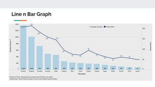
- 11. Line n Bar Graph
- 12. Box Plot
- 13. Scatter Plot
- 14. Tree Map
- 15. Heat Map
- 17. Radial Bar Chart
- 18. Sankey Chart
- 19. Geographical Map - Bubble Map
- 20. Geographical Map - Filled Map
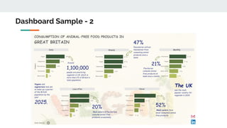
- 22. Dashboard Sample - 2