HTML and Responsive Design
Download as PPTX, PDF6 likes3,850 views

The document discusses the importance of HTML and responsive design for users and content producers, highlighting the need to accommodate various devices and browsers. It emphasizes the use of the viewport meta tag, flexible images, and mobile-specific stylesheets for optimal web design. Additionally, it mentions frameworks that incorporate responsive design to streamline the website creation process.


![HTML and Responsive Design
Presentation by Mindy McAdams
[February 2014]](https://image.slidesharecdn.com/week7htmlcss-130218114141-phpapp01/85/HTML-and-Responsive-Design-29-320.jpg)
HTML and Responsive Design
- 1. HTML and Responsive Design Why is this so important for users and content producers?
- 2. First, any questions? http://bit.ly/html_css_checklist All is explained herein.
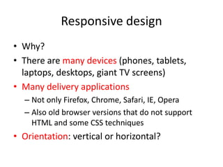
- 3. Responsive design • Why? • There are many devices (phones, tablets, laptops, desktops, giant TV screens) • Many delivery applications – Not only Firefox, Chrome, Safari, IE, Opera – Also old browser versions that do not support HTML and some CSS techniques • Orientation: vertical or horizontal?
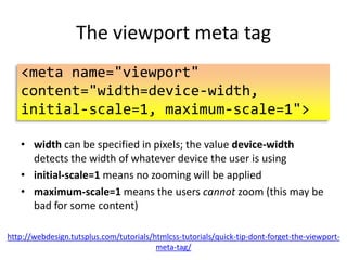
- 4. The viewport meta tag <meta name="viewport" content="width=device-width, initial-scale=1"> • width can be specified in pixels; the value device-width detects the width of whatever device the user is using • initial-scale=1 means no zooming will be applied • Not recommended: Adding maximum-scale=1 means the users cannot zoom (this may be bad for some content) http://webdesign.tutsplus.com/tutorials/htmlcss-tutorials/quick-tip-dont-forget-the-viewportmeta-tag/
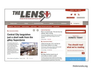
- 10. thelensnola.org
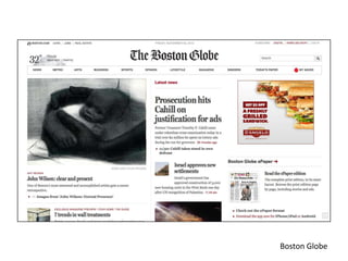
- 11. Boston Globe
- 12. Boston Globe
- 13. Boston Globe
- 14. The design is a little less successful when we turn the iPhone sideways (landscape mode). Boston Globe
- 15. This information graphic (about hockey brain injuries) is much more successful on the iPhone. Boston Globe
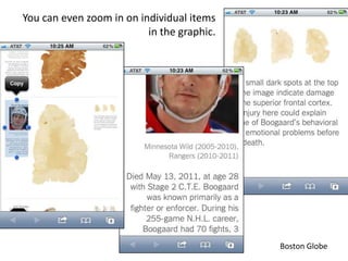
- 16. You can even zoom in on individual items in the graphic. Boston Globe
- 17. Using multiple CSS stylesheets <link rel="stylesheet" media="screen and (maxdevice-width: 900px)" href="css/mobile.css"> <link rel="stylesheet" media="screen and (-webkitdevice-pixel-ratio: 1.5)" href="css/mobile.css"> • Making a separate stylesheet for mobile devices (anything with a smaller screen) is another option. • “The most important task for the mobile.css … is to reset the website width and main content wrapping from the hardcoded centered column to something spreading across the whole mobile screen width.” http://opensourcehacker.com/2012/01/09/including-mobile-specific-css-with-css3-mediaqueries-setting-mobile-browser-viewport-mobilizing-websites-with-responsive-design-andhtml5-part-5/
- 20. Coding flexible images img { max-width: 100%; padding: 10px 20px; } • However, if you enclose the image in a fixed-width wrapper div, the image will not automatically flex this way. • Web designers have to make choices. • They have to know what their choices are. http://coding.smashingmagazine.com/2011/01/12/guidelines-for-responsive-web-design/ Note this article is from 2011. Always check for latest updates to design best practices.
- 21. Frameworks • Choosing and learning a framework takes time • It’s well worth it for people who design lots of websites, or if you have to create a new, large website • Frameworks that have responsive design “baked in” can save the designer from reinventing the wheel • http://webexpedition18.com/articles/responsive-cssframeworks/ • http://www.vermilion.com/news/articles/2012/10/22/compa ring-responsive-css-frameworks-bootstrap-foundation-andskeleton
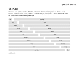
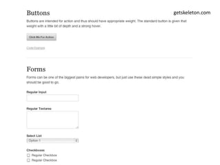
- 22. getskeleton.com
- 23. getskeleton.com
- 24. getskeleton.com
- 25. unsemantic.com
- 27. “Django is a framework that makes it easy to build big, robust web applications in the programming language Python.”
- 28. Tips and best practices to develop responsive websites http://www.catswhocode.com/blog/tips-and-best-practices-todevelop-responsible-websites (This might be the most helpful article for beginners. And it’s short!)
- 29. HTML and Responsive Design Presentation by Mindy McAdams [February 2014]
Editor's Notes
- #2: Lecture by Mindy McAdams, University of Florida, February 2013.Updated: February 2014
- #3: Correctly formatted HEAD for an HTML5 document.
- #4: Reasons why it is important to understand what responsive design is and what it does.
- #5: See http://webdesign.tutsplus.com/tutorials/htmlcss-tutorials/quick-tip-dont-forget-the-viewport-meta-tag/And http://www.quirksmode.org/mobile/viewports.html
- #6: From http://webdesign.tutsplus.com/tutorials/htmlcss-tutorials/quick-tip-dont-forget-the-viewport-meta-tag/
- #7: They look the same in a normal Web browser on a laptop computer … From http://webdesign.tutsplus.com/tutorials/htmlcss-tutorials/quick-tip-dont-forget-the-viewport-meta-tag/
- #8: The same two pages, viewed in Safari on an iPhone 5. From http://webdesign.tutsplus.com/tutorials/htmlcss-tutorials/quick-tip-dont-forget-the-viewport-meta-tag/
- #9: This is the result of the viewport meta tag, used intelligently. From http://webdesign.tutsplus.com/tutorials/htmlcss-tutorials/quick-tip-dont-forget-the-viewport-meta-tag/
- #10: “The Lens” is anonline-only nonprofit news site coming from New Orleans. It uses responsive design. http://thelensnola.org/
- #11: The same document, viewed on Chrome on a MacBook. http://thelensnola.org/
- #12: The Boston Globe recently launched with a new responsive design. Page One.http://bostonglobe.com/
- #13: The Boston Globe recently launched with a new responsive design. Article page.http://bostonglobe.com/
- #14: The same two pages, viewed in Safari on an iPhone 3GS. Page One, left. Article page, right. http://bostonglobe.com/
- #15: The design is a little less successful when we turn the iPhone sideways (landscape mode).http://bostonglobe.com/
- #16: The design is more successful here (portrait vs. landscape mode). http://bostonglobe.com/
- #17: You can even zoom in on the individual items in the graphic, on the phone screen. http://bostonglobe.com/
- #18: This seems to require a lot more work – viewport is probably the superior option. See http://opensourcehacker.com/2012/01/09/including-mobile-specific-css-with-css3-media-queries-setting-mobile-browser-viewport-mobilizing-websites-with-responsive-design-and-html5-part-5/
- #19: Flexible images
- #20: Flexible images
- #21: Being a professional means researching what the best practices are – now. See http://coding.smashingmagazine.com/2011/01/12/guidelines-for-responsive-web-design/
- #22: http://webexpedition18.com/articles/responsive-css-frameworks/http://www.vermilion.com/news/articles/2012/10/22/comparing-responsive-css-frameworks-bootstrap-foundation-and-skeleton
- #23: Skeleton: One example of a framework
- #24: Skeleton: One example of a framework
- #25: Skeleton: One example of a framework
- #26: Unsemantic - a fluid grid system - successor to the 960 Grid System. The 960 Grid was a very popular framework for several years. http://unsemantic.com/
- #27: The 960 Grid System. Not responsive? http://960.gs/demo_24_col.html
- #28: Django is a Web framework used by some news operations. https://www.djangoproject.com/ QUOTE FROM:http://skillcrush.com/2012/09/14/django/
- #29: This might be the most helpful article for beginners.
- #30: CONTACT ----- http://mindymcadams.com/ ----- Lecture by Mindy McAdams, University of Florida, February 2014.