2 biostatistics presenting data
1 like•403 views

This document discusses organizing and presenting data through descriptive statistics. It describes various types of descriptive statistics including measures to condense data like frequency distributions and graphic presentations. It then provides examples and steps for creating frequency distribution tables and different types of graphs like bar charts, histograms, line graphs, scatterplots and pie charts to summarize both qualitative and quantitative data.


2 biostatistics presenting data
- 1. ORGANIZING AND PRESENTING DATA 1 College of Nursing 3rd stage Biostatistics Dr. Nazar A. Mahmood
- 2. 2 o Once you have designed a study and collected data, the next step is to decide how to present the collected data. o Descriptive statistics are used to describe and summarize data to make them more meaningful. Types of descriptive statistics are a. Measures to condense data. b. Measures of central tendency. c. Measures of variability. d. Measures of relationships.
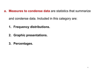
- 3. 3 a. Measures to condense data are statistics that summarize and condense data. Included in this category are: 1. Frequency distributions. 2. Graphic presentations. 3. Percentages.
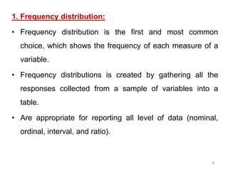
- 4. 4 1. Frequency distribution: • Frequency distribution is the first and most common choice, which shows the frequency of each measure of a variable. • Frequency distributions is created by gathering all the responses collected from a sample of variables into a table. • Are appropriate for reporting all level of data (nominal, ordinal, interval, and ratio).
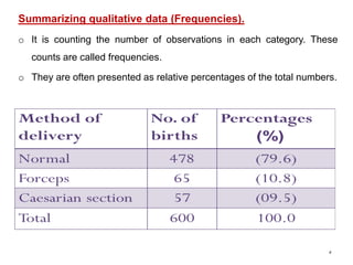
- 5. 5 Summarizing qualitative data (Frequencies). o It is counting the number of observations in each category. These counts are called frequencies. o They are often presented as relative percentages of the total numbers.
- 6. 6 Summarizing quantitative data (Frequencies). o It is a tabulation of the values that one or more variables take in a sample. o Each entry in the table contains the frequency or count of the occurrences of values within a particular group or interval, and in this way the table summarizes the distribution of values in the sample. o If the range of scores in a frequency distribution is small, say less than 20, each score may be listed individually (Ungrouped) o Class intervals: (Grouped) When the range of scores is large, it may be helpful to group the scores before counting frequencies
- 7. 7 Example 1: Frequency distribution (Ungrouped):
- 8. 8 Example 2: Frequency distribution (Grouped):
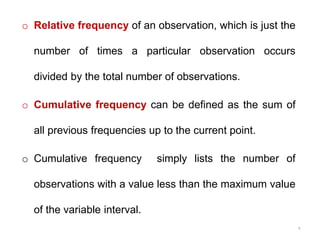
- 9. 9 o Relative frequency of an observation, which is just the number of times a particular observation occurs divided by the total number of observations. o Cumulative frequency can be defined as the sum of all previous frequencies up to the current point. o Cumulative frequency simply lists the number of observations with a value less than the maximum value of the variable interval.
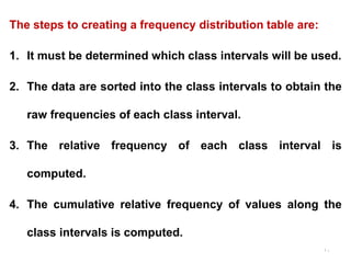
- 10. 10 The steps to creating a frequency distribution table are: 1. It must be determined which class intervals will be used. 2. The data are sorted into the class intervals to obtain the raw frequencies of each class interval. 3. The relative frequency of each class interval is computed. 4. The cumulative relative frequency of values along the class intervals is computed.
- 11. 11
- 12. 12 Class intervals Sturge’s rule (formula): K = 1 + 3.322 (log10 n) K = No. of class intervals. n = sample size.
- 13. 13 Notes on class intervals: o There must be no overlapping between these intervals, like 0-5, 5-10, 10-15, ..etc o Too few & too many intervals are undesirable, because, too few intervals is losing information while too many intervals is cancelling the objective of summarization. o The appropriate No. of class intervals is 6-15.
- 14. 14
- 15. Graphic presentation of data 1. Bar charts (Bar graphs) 2. Histograms 3. Line graph (frequency polygon) 4. Time series graphs 5. Pie charts (Pie graphs) 6. Scatter plot 3/5/202015
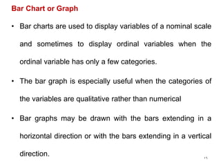
- 16. 16 Bar Chart or Graph • Bar charts are used to display variables of a nominal scale and sometimes to display ordinal variables when the ordinal variable has only a few categories. • The bar graph is especially useful when the categories of the variables are qualitative rather than numerical • Bar graphs may be drawn with the bars extending in a horizontal direction or with the bars extending in a vertical direction.
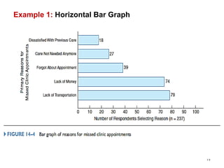
- 17. Example 1: Horizontal Bar Graph 17
- 18. Example 1: Vertical Bar Graph 18
- 19. 19 Another option for displaying nominal data is a pie chart. In this type of graph, a large circle (the pie) is divided into smaller pieces, and each piece illustrates a percentage of the whole.
- 20. 20
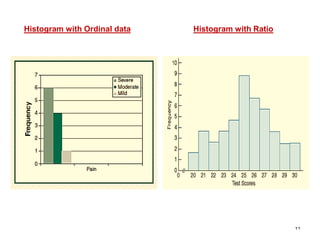
- 21. 21 Histogram • A histogram is a type of bar chart. • Histograms often have no spaces between the bars because these charts are most frequently used to display either ordinal data or continuous data. • (ordinal data has categories that show a ranked difference; continuous data has an infinite number of possible, in-between measures.)
- 22. 22 Histogram with Ordinal data Histogram with Ratio
- 23. How to make histogram Divide range of data into intervals (bins) of equal widths Count the number of observations in each class Draw the histogram Label scales Example: The weights (gm) of 30 mice are given below. Display the data with a frequency distribution using seven classes then draw a histogram. 143 151 136 127 132 132 126 138 119 104 113 90 126 123 121 133 104 99 112 129 107 139 122 137 112 121 140 134 133 123 3/5/202023
- 24. 3/5/202024
- 25. 3/5/202025 1 3 4 6 9 6 1 85-94 95-104 105-114 115-124 125-134 135-144 145-154 0 1 2 3 4 5 6 7 8 9 10 weight (gm) frequency
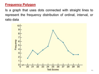
- 26. 26 Frequency Polygon Is a graph that uses dots connected with straight lines to represent the frequency distribution of ordinal, interval, or ratio data
- 27. Time series graph (Line Graph) A time series graph displays data that are observed over a given period of time. From the graph, one can analyze the behavior of the data over time. 3/5/202027 Example: Obesity rates among males and females
- 28. 3/5/202028 1960 1970 1980 1990 2000 2010 0 5 10 15 20 25 30 35 Males Females
- 29. Time series graph of profits company (Dec.2000_Dec.2009) 3/5/202029 $0 $50,000 $100,000 $150,000 $200,000 $250,000 Profit (US $)
- 30. 30 Scatterplots Scatterplots are a little different from the previously discussed graphs in that each point represents how one subject relates to two variables.
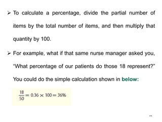
- 31. 31 3- Percentages A percentage is a statistic that represents the proportion of a subgroup to a total group, expressed as a percentage ranging from 0 to 100. A percentage is the number of parts per 100 that a certain portion of the whole represents.
- 32. 32 To calculate a percentage, divide the partial number of items by the total number of items, and then multiply that quantity by 100. For example, what if that same nurse manager asked you, “What percentage of our patients do those 18 represent?” You could do the simple calculation shown in below: