


![CALLBACK FUNCTIONS
Callback functions process user inputs and update the app accordingly
• They are triggered by a change to a property of an HTML component (input)
• They then change the property of another HTML component (output)
*Copyright Maven Analytics, LLC
id = "color-input"
dcc.Dropdown
value = ""
options = ["Red", "Green", "Blue"]
id = "color-output"
html.Div
children = "Color selected: None"
EXAMPLE Adding a dropdown color-picker](https://image.slidesharecdn.com/3-interactive-dashboards-with-plotly-dash-240922123427-3354fb64/85/3-Interactive-Dashboards-with-Plotly-Dash-pdf-28-320.jpg)
![value = ""
children = "Color selected: None"
CALLBACK FUNCTIONS
Callback functions process user inputs and update the app accordingly
• They are triggered by a change to a property of an HTML component (input)
• They then change the property of another HTML component (output)
*Copyright Maven Analytics, LLC
id = "color-input"
dcc.Dropdown
value = "Green"
options = ["Red", "Green", "Blue"]
id = "color-output"
html.Div
children = "Color selected: Green"
Callback
function
EXAMPLE Adding a dropdown color-picker](https://image.slidesharecdn.com/3-interactive-dashboards-with-plotly-dash-240922123427-3354fb64/85/3-Interactive-Dashboards-with-Plotly-Dash-pdf-29-320.jpg)


![INTERACTIVE ELEMENTS
*Copyright Maven Analytics, LLC
The Dash Core Components (dcc) module has several interactive elements that
can be used in Dash apps to create dynamic dashboards with Plotly figures
dcc.Dropdown() Dropdown list of options for the user to select (or multi-select) ==, !=, in, not in
dcc.Checklist() Checkboxes with options for the user to select or deselect ==, !=, in, not in
dcc.RadioItems() Radio buttons with options for the user to toggle between ==, !=, in, not in
dcc.Slider() Slider with a handle for the user to drag and select values with ==, <, <=, >, >=
dcc.RangeSlider() Slider with two handles for the user to drag and select ranges with .between(value[0], value[1])
dcc.DatePickerSingle() Dropdown calendar for the user to select a date with ==, <, <=, >, >=
dcc.DatePickerRange() Dropdown calendar for the user to select a date range with .between(start, end)
For a full list of arguments, visit: https://dash.plotly.com/dash-core-components
Other key considerations to discuss are data types
and the number of options available to users
These are used in the callback functions to
filter the visuals based on the user selections](https://image.slidesharecdn.com/3-interactive-dashboards-with-plotly-dash-240922123427-3354fb64/85/3-Interactive-Dashboards-with-Plotly-Dash-pdf-82-320.jpg)


![DASH BOOTSTRAP THEMES
*Copyright Maven Analytics, LLC
For an interactive theme viewer, visit: https://dash-bootstrap-components.opensource.faculty.ai/docs/themes/explorer/
There are 26 themes available in the Dash Bootstrap Components library
• Dash(__name__, external_stylesheets=[dbc.themes.THEME_NAME])
Bootstrap Cerulean Slate Quartz
The DBC Theme Explorer (linked below) has an app for previewing the different
themes available – odds are you will find one that matches your desired aesthetic!](https://image.slidesharecdn.com/3-interactive-dashboards-with-plotly-dash-240922123427-3354fb64/85/3-Interactive-Dashboards-with-Plotly-Dash-pdf-137-320.jpg)
![DASH BOOTSTRAP THEMES
*Copyright Maven Analytics, LLC
There are 26 themes available in the Dash Bootstrap Components library
• Dash(__name__, external_stylesheets=[dbc.themes.THEME_NAME])
EXAMPLE Applying the “slate” theme
Simply specify the theme name here!
Note that the DCC components &
Plotly figures don’t adopt the style
(for now!)](https://image.slidesharecdn.com/3-interactive-dashboards-with-plotly-dash-240922123427-3354fb64/85/3-Interactive-Dashboards-with-Plotly-Dash-pdf-138-320.jpg)


3 - Interactive-Dashboards-with-Plotly-Dash.pdf
- 1. *Copyright Maven Analytics, LLC With Expert Python Instructor Chris Bruehl DASHBOARDS WITH
- 2. COURSE STRUCTURE This is a project-based course for students looking for a practical, hands-on approach to learning Plotly and Dash for building interactive visualizations & dashboards using Python Additional resources include: Quizzes & Assignments to test and reinforce key concepts, with step-by-step solutions Interactive demos to keep you engaged and apply your skills throughout the course Downloadable PDF to serve as a helpful reference when you’re offline or on the go *Copyright Maven Analytics, LLC
- 3. Dashboard Layouts 4 Learn how to organize your visualizations and interactive components into a visually appealing and logical structure Intro to Plotly & Dash 1 Introduce the Plotly & Dash libraries, and cover the key steps & components for creating a basic Dash application with interactive Plotly visuals Plotly Figures & Chart Types 2 Dive deep into the Plotly library and use it to build & customize several chart types, including line charts, bar charts, pie charts, scatterplots, and histograms *Copyright Maven Analytics, LLC COURSE OUTLINE Advanced Functionality 5 Take your applications to the next level by learning how to update your application with real-time data, develop chained-callback functions, and more! PROJECT: Interactive Ski Resort Visualizations PROJECT: Building A Dashboard to Help Agents Find The Best Ski resorts For Customers Interactive Elements 3 Get comfortable embedding Dash’s interactive elements into your application, and using them to manipulate Plotly Visualizations
- 4. THE COURSE PROJECT *Copyright Maven Analytics, LLC • Use Pandas to read & manipulate multiple datasets • Use Plotly to visualize data, communicate insights, and help users get the information they need • Use Dash to add interactivity to the Plotly visuals, then build and deploy comprehensive dashboards OBJECTIVES THE SITUATION THE You’ve just been hired to join the Analytics team at Maveluxe Travel, a high-end travel agency with best-in-class services for helping customers find the perfect resorts based on their preferences ASSIGNMENT THE Your task is to build interactive visuals and dashboards to help Maveluxe’s travel agents pick the best ski resorts for their customers based on their very picky tastes. We will build a dashboard that includes interactive maps and report cards for ski resorts around the world.
- 5. SETTING EXPECTATIONS *Copyright Maven Analytics, LLC We’ll focus on creating interactive visuals & dashboards • We will cover Plotly chart types enough to get you comfortable with them, but we won’t dive into extreme customization. Instead, our focus is interactivity. We’ll use Jupyter Notebooks as our primary coding environment • Jupyter Notebooks are free to use, and the industry standard for conducting data analysis with Python (we’ll introduce Google Colab as an alternative, cloud-based environment as well) This course requires previous knowledge of Python and Pandas • It is strongly recommended that you complete the 3 previous courses in our Python specialist path, or have a solid understanding of base Python, DataFrame manipulation with Pandas, and visualization with Matplotlib or Seaborn This course covers the core functionality for Plotly & Dash • We’ll focus on adding interactivity to charts and constructing dashboard applications
- 6. *Copyright Maven Analytics, LLC
- 7. INSTALLING ANACONDA (MAC) 1) Go to anaconda.com/products/distribution and click 2) Click X on the Anaconda Nucleus pop-up (no need to launch) 3) Launch the downloaded Anaconda pkg file 4) Follow the installation steps (default settings are OK) *Copyright Maven Analytics, LLC
- 8. INSTALLING ANACONDA (PC) 1) Go to anaconda.com/products/distribution and click 2) Click X on the Anaconda Nucleus pop-up (no need to launch) 3) Launch the downloaded Anaconda exe file 4) Follow the installation steps (default settings are OK) *Copyright Maven Analytics, LLC
- 9. LAUNCHING JUPYTER 1) Launch Anaconda Navigator 2) Find Jupyter Notebook and click *Copyright Maven Analytics, LLC
- 10. YOUR FIRST JUPYTER NOTEBOOK 1) Once inside the Jupyter interface, create a folder to store your notebooks for the course 2) Open your new coursework folder and launch your first Jupyter notebook! *Copyright Maven Analytics, LLC NOTE: You can rename your notebook by clicking on the title at the top of the screen NOTE: You can rename your folder by clicking “Rename” in the top left corner
- 11. THE NOTEBOOK SERVER *Copyright Maven Analytics, LLC NOTE: When you launch a Jupyter notebook, a terminal window may pop up as well; this is called a notebook server, and it powers the notebook interface If you close the server window, your notebooks will not run! Depending on your OS, and method of launching Jupyter, one may not open. As long as you can run your notebooks, don’t worry!
- 12. ALTERNATIVE: GOOGLE COLAB Google Colab is Google’s cloud-based version of Jupyter Notebooks Colab is very similar to Jupyter Notebooks (they even share the same file extension); the main difference is that you are connecting to Google Drive rather than your machine, so files will be stored in Google’s cloud *Copyright Maven Analytics, LLC To create a Colab notebook: 1. Log in to a Gmail account 2. Go to colab.research.google.com 3. Click “new notebook”
- 13. *Copyright Maven Analytics, LLC
- 14. • Recognize the value of interactive charts & graphs • Understand the anatomy of a Dash application, and the essential steps for creating one • Learn to add interactive elements and process them with callback functions to update the app • Create your first interactive visual with Plotly & Dash INTRO TO PLOTLY & DASH TOPICS WE’LL COVER: GOALS FOR THIS SECTION: In this section we’ll introduce the Plotly & Dash libraries, and cover the steps & key components for creating a basic Dash application with interactive Plotly visuals *Copyright Maven Analytics, LLC
- 15. WHY INTERACTIVITY? *Copyright Maven Analytics, LLC Adding interactivity to charts lets your stakeholders explore the data and conduct their own analysis, freeing up your time to tackle more problems EXAMPLE Visualizing store transactions over time (static) “Can you build me a line chart showing transactions by store over time?” “Great, now can you make another chart but zoom in for December 2013?” “Thank you! What is the exact value for store 3 on Dec 3? I was also curious about 2015…” “Sure thing!” “Yeah, here you go.” “Uh...”
- 16. WHY INTERACTIVITY? *Copyright Maven Analytics, LLC Adding interactivity to charts lets your stakeholders explore the data and conduct their own analysis, freeing up your time to tackle more problems EXAMPLE “Can you build me a line chart showing transactions by store over time?” “Sure thing, I set up an interactive chart that allows you to zoom in on selected date periods and hover over each point for more detail!” Visualizing store transactions over time (interactive) Adding interactive elements like dropdowns to filter data or tooltips to display metrics of interest can greatly improve the value of a single chart to its stakeholders
- 17. MEET PLOTLY & DASH *Copyright Maven Analytics, LLC Plotly is an open-source JavaScript based library that focuses on creating interactive visualizations with the Python, R, or Julia programming languages Dash is Plotly’s sister library that focuses on building dashboards with Plotly visuals and deploying them as interactive web applications
- 18. INSTALLING PLOTLY & DASH *Copyright Maven Analytics, LLC 1) Install plotly and dash via conda 2) Install jupyter-dash via pip This helps develop apps in Jupyter before Application Run If you get a warning that “a new version of conda exists” during the installation, you can ignore it or run the code specified in the output
- 19. THE ANATOMY OF A DASH APPLICATION *Copyright Maven Analytics, LLC Dash applications are web apps with two main components: • The front end displays interactive elements for user input (and any visuals affected by them) • The back end processes the inputs and returns the outputs to be displayed in the visuals Back End Callback functions process the user inputs and return any outputs to be displayed in the app Inputs Outputs
- 20. CREATING A DASH APPLICATION You can create a dash application by following these steps: Import the necessary libraries Create the Dash application Set up the HTML layout Add the callback functions Run the application 1 2 3 4 5 At this point you just have an empty app This is the front end of the web application This is the back end of the web application This runs the app! *Copyright Maven Analytics, LLC
- 21. THE WORLD’S SIMPLEST DASH APP This is all you need to create the world’s simplest dash app: *Copyright Maven Analytics, LLC 1. Import the Dash function and html module 2. Create the application with the Dash function 3. Add a single HTML element (div) with the text “Hello!” 4. Run the application on your local server Dash applications do not require callback functions to run, but they are necessary for adding interactivity based on user inputs Congrats, you just became a Python web developer!
- 22. THE WORLD’S SIMPLEST DASH APP You can use JupyterDash to run the app in-notebook as you’re designing it *Copyright Maven Analytics, LLC 1. Import the JupyterDash function instead of Dash 2. Create the application with the JupyterDash function 3. Add a single HTML element (div) with the text “Hello!” 4. Run the application inside the Jupyter Notebook, below the code cell (mode=“inline”) PRO TIP: Use JupyterDash to quickly and easily to iterate on your app inside the notebook – you can switch to Dash for Application Run once it’s finished (more later!)
- 23. IMPORTING LIBRARIES To build dashboards using Plotly & Dash, you may need to import these libraries: *Copyright Maven Analytics, LLC Functions for creating the app and adding elements Back-end functions for adding interactivity Function for creating & running the app in Jupyter Notebooks Library for adding Plotly visuals Library for data prep & ETL Importing specific functions and modules from dash instead of the full library helps when writing the code, as you don’t need to reference the library when calling each function
- 24. CREATING THE APP The Dash(__name__) function creates a Dash application • This is typically assigned to a variable called “app” *Copyright Maven Analytics, LLC Note that importing the entire dash library requires calling it before the Dash(__name__) function This is a Dash application object __name__ is a special variable used to only run a Dash app if the script is being run directly (not being imported as a module)
- 25. HTML LAYOUTS Dash uses HTML layouts for designing the front-end of the application • Use the html module to specify the visual components and assign it to app.layout *Copyright Maven Analytics, LLC The .Div() method lets you add html sections to store different components Familiarity with the HTML and CSS web design languages can be a big help for making beautiful applications – we will conduct a brief crash course on the basics later!
- 26. INTERACTIVE ELEMENTS Dash has many interactive elements that can be added to apps for user input • These are provided by the Dash Core Components module (dcc) *Copyright Maven Analytics, LLC Dropdown Single or multi-select dropdown list of pre-defined options Slider Slider for selecting a single value from a pre-defined list RangeSlider Slider for selecting a range of values from a pre-defined list Checklist Multi-select checkboxes from a pre-defined list RadioItems Single-select radio buttons from a pre-defined list DatePickerSingle Dropdown calendar to select a single date DatePickerRange Dropdown calendar to select a data range Tabs Tabs for navigating to different views of the app Graphs Container for Plotly figures These interactive elements are useless until they are processed in the back-end with callback functions
- 27. INTERACTIVE ELEMENTS Dash has many interactive elements that can be added to apps for user input • These are provided by the Dash Core Components module (dcc) *Copyright Maven Analytics, LLC EXAMPLE Adding a dropdown color-picker This dcc.Dropdown() component has three properties: 1. options: contains the contents of the dropdown • This is a list of strings that populate the dropdown menu • The option selected by the user gets passed through the value • It is possible to have a user facing label that differs from the value processed in the backend(more later!) 2. id: the identifier for the value passed through • This helps tie input values to outputs in the app (like charts!) 3. value: the option selected • This helps set a default “starting” value if needed • This property changes whenever a user selects a new option
- 28. CALLBACK FUNCTIONS Callback functions process user inputs and update the app accordingly • They are triggered by a change to a property of an HTML component (input) • They then change the property of another HTML component (output) *Copyright Maven Analytics, LLC id = "color-input" dcc.Dropdown value = "" options = ["Red", "Green", "Blue"] id = "color-output" html.Div children = "Color selected: None" EXAMPLE Adding a dropdown color-picker
- 29. value = "" children = "Color selected: None" CALLBACK FUNCTIONS Callback functions process user inputs and update the app accordingly • They are triggered by a change to a property of an HTML component (input) • They then change the property of another HTML component (output) *Copyright Maven Analytics, LLC id = "color-input" dcc.Dropdown value = "Green" options = ["Red", "Green", "Blue"] id = "color-output" html.Div children = "Color selected: Green" Callback function EXAMPLE Adding a dropdown color-picker
- 30. CALLBACK FUNCTIONS Callback functions are defined by using the @app.callback decorator and have at least two arguments (Output & Input), followed by the function itself *Copyright Maven Analytics, LLC @app.callback( Output(component_id, component_property), Input(component_id, component_property)) The Input & Output arguments of the callback decorator (Output goes first!) The id of the html component that triggers (input) or gets modified by (output) the callback function The property of the html component that is passed into (input) or gets modified by (output) the callback function Examples: • “children” (for text) • “value” (for interactive elements) • “figure” (for charts)
- 31. @app.callback( Output(component_id, component_property), Input(component_id, component_property) ) def function_name(variable): #function steps return f"Output: {variable}" Defines the callback function and assigns the value from the property of the input component to a variable New value for the property of the output component CALLBACK FUNCTIONS *Copyright Maven Analytics, LLC Callback functions are defined by using the @app.callback decorator and have at least two arguments (Output & Input), followed by the function itself
- 32. CALLBACK FUNCTIONS *Copyright Maven Analytics, LLC Note that the “value” and “children” properties aren’t specified when creating the components This callback function is triggered when the “value” property of the “color-input” component changes, which updates the “children” property of the “color- output” component The function must immediately follow the @app.callback decorator EXAMPLE Adding a dropdown color-picker Callback functions are defined by using the @app.callback decorator and have at least two arguments (Output & Input), followed by the function itself
- 33. PREVENTING UPDATES Callback functions run as soon as the app launches by default, but you can add logic to prevent updates • This can help avoid errors when interactive elements are in an “empty state” *Copyright Maven Analytics, LLC Since the dropdown component has no “value” selected when launching the app, “None” gets passed into the callback function and output text This raises a PreventUpdate exception if the input is “None” which prevents the app from displaying any output text upon launch
- 34. APPLICATION RUN OPTIONS There are several Application Run options you can use when running the app: • debug=True: helps with troubleshooting during development (i.e., better error messages) • host/port: specify the server address of the app – the default is: http://127.0.0.1:8050/ • mode="inline": runs the app in-notebook when using JupyterDash (not an option in Dash) • height/width: set the height or width of the app in pixels or a percentage *Copyright Maven Analytics, LLC PRO TIP: The host/port options become more important when deploying your application; and setting width as a percentage is a great way to keep your app proportions consistent!
- 35. NEW MESSAGE From: Ernie Educator (Teacher & Friend) Subject: Favor? March 3, 2023 ASSIGNMENT: SIMPLE DASH APP Results Preview section01_assignments.ipynb *Copyright Maven Analytics, LLC Hey ol’ buddy, ol’ pal, Did you catch the game yesterday? Crazy… Anyways, last time we were together you mentioned you could build dashboards without paid software, and I was wondering if you could help me with a project for my blog. I am passionate about education and want to help others understand data on education funding – could you build a simple app that we can fill in together? Thanks!
- 36. SOLUTION: SIMPLE DASH APP Solution Code *Copyright Maven Analytics, LLC NEW MESSAGE From: Ernie Educator (Teacher & Friend) Subject: Favor? March 3, 2023 section01_solutions.ipynb Hey ol’ buddy, ol’ pal, Did you catch the game yesterday? Crazy… Anyways, last time we were together you mentioned you could build dashboards without paid software., and I was wondering if you could help me with a project for my blog. I am passionate about education and want to help others understand data on education funding – could you build a simple app that we can fill in together? Thanks!
- 37. INTERACTIVE PLOTLY VISUALS You can add interactive Plotly visuals to Dash apps with these 3 steps: 1. Create a “prototype” visual using Pandas & Plotly without interactivity 2. Identify the element that changes and define its options in the interactive component 3. Connect the interactive component to the visual using a callback function *Copyright Maven Analytics, LLC EXAMPLE Visualizing the different datasets from Anscombe’s Quartet Create one “view” of the visual as if you had interacted with it Use the values for the different “views” as the interactive options Create the chart in the callback function to bring it all together
- 38. INTERACTIVE PLOTLY VISUALS *Copyright Maven Analytics, LLC STEP 1 Create a “prototype” visual using Pandas & Plotly without interactivity Anscombe’s quartet is a group of four datasets with nearly identical regression lines but significantly different visual relationships You can use Plotly Express and the px.scatter function to plot the “x” and “y” columns in the DataFrame Note that this plots all four datasets in Anscombe’s quartet You can then filter the DataFrame to only plot one dataset at a time This will be the element that the user can change to filter the chart!
- 39. INTERACTIVE PLOTLY VISUALS *Copyright Maven Analytics, LLC You can add a Plotly visual to your app with the figure property of the dcc.Graph component STEP 1 Create a “prototype” visual using Pandas & Plotly without interactivity
- 40. INTERACTIVE PLOTLY VISUALS *Copyright Maven Analytics, LLC You can use the .unique() method to grab all possible values in a column to populate your dropdown This will let the user select from the possible values to filter the visual by STEP 2 Identify the element that changes and define its options in the interactive component Note that the dropdown and the visual are not connected yet!
- 41. INTERACTIVE PLOTLY VISUALS *Copyright Maven Analytics, LLC This uses the value in the dropdown to filter the DataFrame to be plotted, then updates the “figure” property of the graph to show the updated visual Note that the plot is only created in the callback function and doesn’t need to be declared inside the dcc.Graph component STEP 3 Connect the interactive component to the visual using a callback function
- 42. NEW MESSAGE From: Ernie Educator (Teacher & Friend) Subject: Embedding a Chart? March 3, 2023 ASSIGNMENT: A MORE REALISTIC DASH APP Results Preview section01_assignments.ipynb *Copyright Maven Analytics, LLC Hey, Cool application! I have a bit of Python knowledge, so I went ahead and prototyped a line chart that I’d like embedded in the application based on the state selected to analyze. Can you update the application? You can remove the html text output. Thanks!
- 43. NEW MESSAGE From: Ernie Educator (Teacher & Friend) Subject: Embedding a Chart? March 3, 2023 SOLUTION: A MORE REALISTIC DASH APP Solution Code section01_solutions.ipynb *Copyright Maven Analytics, LLC Hey, Cool application! I have a bit of Python knowledge, so I went ahead and prototyped a line chart that I’d like embedded in the application based on the state selected to analyze. Can you update the application? You can remove the html text output. Thanks!
- 44. KEY TAKEAWAYS Plotly & Dash are Python libraries for creating interactive visuals • Plotly lets you build charts and Dash lets you interact with them by deploying them as web applications Dash applications have two main components: a front-end & back-end • The front-end is the HTML layout that displays any text, interactive elements, and visuals • The back-end ties the interactive elements and visuals together by using callback functions *Copyright Maven Analytics, LLC Callback functions look for user “inputs” to update “outputs” accordingly • Each input and output is associated with a component id and property Pandas is key for manipulating the data you want to visualize • Plotly charts are built using Pandas DataFrames, and their interactivity often relies on sorting & filtering them
- 45. *Copyright Maven Analytics, LLC
- 46. • Understand the difference between the Plotly Graph Objects and Plotly Express plotting methods • Create basic charts using Plotly Express functions • Customize Plotly Express charts using update methods • Create map-based visuals using geographic data PLOTLY CHARTS TOPICS WE’LL COVER: GOALS FOR THIS SECTION: In this section we’ll dive into the Plotly library and use it to build & customize several chart types, including line charts, bar charts, pie charts, scatterplots, histograms, and maps *Copyright Maven Analytics, LLC
- 47. PLOTLY FIGURES *Copyright Maven Analytics, LLC Plotly figures are created by drawing “traces” on top of a blank canvas There are two methods for creating them: Charts are created by defining a figure object, and traces are customized using figure methods Charts are created with Plotly Express functions, with most customization options built in We’ll focus on Plotly Express, as it’s easier to work with and provides most of the options
- 48. px.pie(df, values="", names="") values names px.histogram(df, x="") x BASIC CHARTS *Copyright Maven Analytics, LLC px.scatter(df, x="", y="") px.line(df, x="", y="") px.bar(df, x="", y="") x y x y x y x y You can create these basic charts with Plotly Express by using these functions • You simply need to select a DataFrame as the first argument and specify the DataFrame columns to plot for the rest of the arguments (just be mindful of data types!) Just swap the columns!
- 49. categorical numerical BASIC CHARTS *Copyright Maven Analytics, LLC datetime numerical numerical These are the data types! You can create these basic charts with Plotly Express by using these functions • You simply need to select a DataFrame as the first argument and specify the DataFrame columns to plot for the rest of the arguments (just be mindful of data types!) numerical categorical numerical numerical categorical px.pie(df, values="", names="") px.histogram(df, x="") px.scatter(df, x="", y="") px.line(df, x="", y="") px.bar(df, x="", y="")
- 50. NEW MESSAGE From: Leonard Lift (Ski Trip Concierge) Subject: Info for Client March 7, 2023 ASSIGNMENT: LINE CHARTS Results Preview section02_assignments.ipynb *Copyright Maven Analytics, LLC Hey there, I have a very “challenging” client who is asking me a million questions about European Ski Resorts. Apparently, they went to Spain for a ski trip in the Pyrenees two decades ago and said it was way too crowded. Can you look at the Spanish ski data and see if skiing is still as popular in Spain as it was back then? Thanks!
- 51. NEW MESSAGE From: Leonard Lift (Ski Trip Concierge) Subject: Info for Client March 7, 2023 SOLUTION: LINE CHARTS Solution Code section02_solutions.ipynb *Copyright Maven Analytics, LLC Hey there, I have a very “challenging” client who is asking me a million questions about European Ski Resorts. Apparently, they went to Spain for a ski trip in the Pyrenees two decades ago and said it was way too crowded. Can you look at the Spanish ski data and see if skiing is still as popular in Spain as it was back then? Thanks!
- 52. MULTIPLE SERIES *Copyright Maven Analytics, LLC You can plot multiple series by using the “color” argument on most chart types
- 53. MULTIPLE SERIES *Copyright Maven Analytics, LLC You can plot multiple series by using the “color” argument on most chart types Bars are stacked by default!
- 54. PRO TIP: GROUPED BAR CHARTS *Copyright Maven Analytics, LLC You can turn a stacked bar chart into a grouped bar chart with barmode=“group”
- 55. NEW MESSAGE From: Leonard Lift (Ski Trip Concierge) Subject: National Lift Characteristics March 9, 2023 ASSIGNMENT: BAR CHARTS Results Preview section02_assignments.ipynb *Copyright Maven Analytics, LLC Hey there, We get questions from customers about which countries not only have the most ski lifts (some like to do multi-country tours) but also what types of lifts are available. Some customers really like gondola lifts for whatever reason. Could you produce a bar chart of lift count by country, and a second one that has these lifts broken out by lift category? Thanks!
- 56. NEW MESSAGE From: Leonard Lift (Ski Trip Concierge) Subject: National Lift Characteristics March 9, 2023 SOLUTION: BAR CHARTS Solution Code section02_solutions.ipynb *Copyright Maven Analytics, LLC Hey there, We get questions from customers about which countries not only have the most ski lifts (some like to do multi-country tours) but also what types of lifts are available. Some customers really like gondola lifts for whatever reason. Could you produce a bar chart of lift count by country, and a second one that has these lifts broken out by lift category? Thanks! Standard Bar Chart: Stacked Bar Chart:
- 57. PRO TIP: BUBBLE CHARTS *Copyright Maven Analytics, LLC You can turn a scatterplot into a bubble chart by using the “size” argument PRO TIP: Use trendline=“ols” to add the regression line
- 58. PRO TIP: DONUT CHARTS You can turn a pie into a donut chart by using the “hole” argument • Other options include changing the sort order, and modifying the color sequence *Copyright Maven Analytics, LLC
- 59. NEW MESSAGE From: Leonard Lift (Ski Trip Concierge) Subject: RE: Info for Client March 9, 2023 ASSIGNMENT: BUBBLE & DONUT CHARTS Results Preview section02_assignments.ipynb *Copyright Maven Analytics, LLC Hi again, Thanks for getting me those charts, the client was really pleased! Somewhat related, this client hates waiting in line at lifts, and believes resorts with high lift capacity and lift numbers will have shorter waits. They also prefer Gondola lifts. Can you build a bubble chart that compares TotalLifts to LiftCapacity with the size of each marker as the number of Gondola Lifts? Then build a donut chart breaking down lift types for the resort with the highest lift capacity.
- 60. NEW MESSAGE From: Leonard Lift (Ski Trip Concierge) Subject: RE: Info for Client March 9, 2023 SOLUTION: BUBBLE & DONUT CHARTS Solution Code section02_solutions.ipynb *Copyright Maven Analytics, LLC Hi again, Thanks for getting me those charts, the client was really pleased! Somewhat related, this client hates waiting in line at lifts, and believes resorts with high lift capacity and lift numbers will have shorter waits. They also prefer Gondola lifts. Can you build a bubble chart that compares TotalLifts to LiftCapacity with the size of each marker as the number of Gondola Lifts? Then build a donut chart breaking down lift types for the resort with the highest lift capacity. Donut Chart: Bubble Chart:
- 61. HISTOGRAM OPTIONS *Copyright Maven Analytics, LLC Histogram options include setting the number of bins, using relative frequencies, and adding data labels
- 62. UPDATE METHODS *Copyright Maven Analytics, LLC Update methods let you format Plotly Express charts using object-oriented commands, combining the best of both worlds! • While Plotly Express does have formatting options, update methods are occasionally useful Modifies chart elements like the title, legend, fonts, figure size, and more px.line(…).update_layout(legend_title, …) Modifies plotted data like the line styles, colors, markers, and more px.line(…).update_traces(opacity, …) Modifies the x-axis formatting, including the ticks, units, and text px.line(…).update_xaxes(nticks, …) Modifies the y-axis formatting, including the ticks, units, and text px.line(…).update_yaxes(showgrid, …) This can be any chart type For a full list of arguments, visit: https://plotly.com/python/reference/index/
- 63. UPDATE LAYOUT *Copyright Maven Analytics, LLC The .update_layout() method lets you customize figure and plot elements • This is commonly used to modify the title and legend formatting, as well as fonts and colors This modifies the title’s color, size, and position, removes the legend title, and changes the figure’s width
- 64. UPDATE LAYOUT *Copyright Maven Analytics, LLC The .update_layout() method lets you customize figure and plot elements • This is commonly used to modify the title and legend formatting, as well as fonts and colors By assigning the Plotly Express chart to a variable “fig”, you can gradually apply chart formatting using update methods
- 65. UPDATE TRACES *Copyright Maven Analytics, LLC The .update_traces() method lets you modify the formatting of the plotted data • This is commonly used to change the styling, colors, and opacity This adds markers to the line charts and changes their opacity
- 66. UPDATE AXES *Copyright Maven Analytics, LLC The .update_xaxes() & .update_yaxes() methods let you format each axis • This is commonly used to customize the gridlines, ranges, and tick marks For the x-axis, this changes the title, removes the gridlines, modifies the range of years, and sets the ticks every 4 years For the y-axis, tis changes the title, and sets 5 ticks in total
- 67. PRO TIP: TREATING DATES AS TEXT *Copyright Maven Analytics, LLC You can use .update_xaxes(type=“category”) to avoid gaps when using dates Note that 2010 is missing!
- 68. ADDING ANNOTATIONS *Copyright Maven Analytics, LLC The .add_annotation() method lets you call out key data points in charts
- 69. ADDING TRACES *Copyright Maven Analytics, LLC The .add_trace() method lets you add shapes (like reference lines!) to charts
- 70. NEW MESSAGE From: Leonard Lift (Ski Trip Concierge) Subject: Aesthetics March 12, 2023 ASSIGNMENT: CHART FORMATTING Results Preview section02_assignments.ipynb *Copyright Maven Analytics, LLC Hi, One of our clients has asked for some changes to the aesthetics of the bar chart we made earlier. Additionally, they want to limit the view to the top 10 countries. I’ve added details in the notebook. Thanks!
- 71. NEW MESSAGE From: Leonard Lift (Ski Trip Concierge) Subject: Aesthetics March 12, 2023 SOLUTION: CHART FORMATTING Solution Code section02_solutions.ipynb *Copyright Maven Analytics, LLC Hi, One of our clients has asked for some changes to the aesthetics of the bar chart we made earlier. Additionally, they want to limit the view to the top 10 countries. I’ve added details in the notebook. Thanks!
- 72. MAP-BASED VISUALS *Copyright Maven Analytics, LLC Plotly Express also has functions for map-based visuals using geographical data: • px.choropleth uses geographic regions (countries, states, etc.) • px.scatter_mapbox and px.density_mapbox use latitude & longitude pairs PRO TIP: Plotly has built-in options for plotting countries and US states, but Googling examples for other regions is a great way to avoid creating a custom solution from scratch
- 73. CHOROPLETH MAPS *Copyright Maven Analytics, LLC Choropleth maps are created with the px.choropleth() function Like all Plotly Express charts, the first argument is the DataFrame, followed by: • locations: the DataFrame column that contains the geographical data (state, country, etc.) • locationmode: the type of geographical data used (“ISO-3”, “USA-states”, or “country names”) • color: the numerical DataFrame column that will determine the shade of each region • scope: the range of the map shown (default is “world”, others include “usa”, “europe”, “asia”, etc.) The locations & location_mode must match for the map to be created properly
- 74. PRO TIP: MAPBOX MAPS *Copyright Maven Analytics, LLC Mapbox maps use an open-source mapping API integrated into Plotly to create map-based visuals using latitude & longitude pairs The “center” & “zoom” arguments let you set a default view for the map
- 75. PRO TIP: MAPBOX MAPS *Copyright Maven Analytics, LLC Mapbox maps use an open-source mapping API integrated into Plotly to create map-based visuals using latitude & longitude pairs The “z” & “radius” arguments let you specify a numerical field for the heatmap PRO TIP: You can use the px.density_mapbox() function to create a heatmap style map
- 76. NEW MESSAGE From: Leonard Lift (Ski Trip Concierge) Subject: Lift Capacity March 11, 2023 ASSIGNMENT: MAPS Results Preview section02_assignments.ipynb *Copyright Maven Analytics, LLC Ok, This is hopefully the last need for our client (and me, the lowly concierge). Can we get a map-based view of lift capacity in each country? Should be easier to digest than a bar chart for this purpose. Thanks!
- 77. NEW MESSAGE From: Leonard Lift (Ski Trip Concierge) Subject: Lift Capacity March 11, 2023 SOLUTION: MAPS Solution Code section02_solutions.ipynb *Copyright Maven Analytics, LLC Ok, This is hopefully the last need for our client (and me, the lowly concierge). Can we get a map-based view of lift capacity in each country? Should be easier to digest than a bar chart for this purpose. Thanks!
- 78. KEY TAKEAWAYS Plotly has two methods for creating charts • Plotly Graph Objects is an object-oriented approach that offers extreme customization • Plotly Express is an intuitive functional framework that lets you easily create & customize charts Plotly Express has functions for most basic chart types • By reading in a DataFrame you can create line charts, bar charts, pie charts, scatterplots, and histograms *Copyright Maven Analytics, LLC Use update methods to customize the layout, plot, and axes of your charts • These leverage the object-oriented approach to creating charts for combining the best of both worlds Geographical data can be plotted with choropleth maps • Plotly Express has built-in options for countries and US states, but solutions for other regions can be found online
- 79. *Copyright Maven Analytics, LLC
- 80. • Identify the various types of components used to interact with Plotly visuals in Dash and their use cases • Learn to create & format interactive elements and process their inputs through callback functions • Add multiple interactive elements to your Dash apps and write callback functions to handle multiple inputs INTERACTIVE ELEMENTS TOPICS WE’LL COVER: GOALS FOR THIS SECTION: *Copyright Maven Analytics, LLC In this section we’ll cover interactive elements from the Dash Core Components module, and use them to provide different data inputs for manipulating Plotly visuals in Dash apps
- 81. BASIC INTERACTIVITY *Copyright Maven Analytics, LLC Plotly figures have some basic interactivity by default • This includes tool tips with data labels, the ability to zoom in & out, and more! Hover Menu Options: • Download Image • Select Zoom Area • Pan • Zoom In • Zoom Out • Auto Scale • Return to Default
- 82. INTERACTIVE ELEMENTS *Copyright Maven Analytics, LLC The Dash Core Components (dcc) module has several interactive elements that can be used in Dash apps to create dynamic dashboards with Plotly figures dcc.Dropdown() Dropdown list of options for the user to select (or multi-select) ==, !=, in, not in dcc.Checklist() Checkboxes with options for the user to select or deselect ==, !=, in, not in dcc.RadioItems() Radio buttons with options for the user to toggle between ==, !=, in, not in dcc.Slider() Slider with a handle for the user to drag and select values with ==, <, <=, >, >= dcc.RangeSlider() Slider with two handles for the user to drag and select ranges with .between(value[0], value[1]) dcc.DatePickerSingle() Dropdown calendar for the user to select a date with ==, <, <=, >, >= dcc.DatePickerRange() Dropdown calendar for the user to select a date range with .between(start, end) For a full list of arguments, visit: https://dash.plotly.com/dash-core-components Other key considerations to discuss are data types and the number of options available to users These are used in the callback functions to filter the visuals based on the user selections
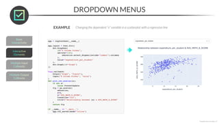
- 83. DROPDOWN MENUS *Copyright Maven Analytics, LLC Dropdown menus provide a list of options for the user to select (or multi-select) • dcc.Dropdown(id, options, value, multi) This sets the names for the columns with numerical data types as the options You can use dictionaries to show users labels in the dropdown that are different from the values passed through
- 84. DROPDOWN MENUS *Copyright Maven Analytics, LLC EXAMPLE Changing the dependent “x” variable in a scatterplot with a regression line This lets the user select a numerical column in the dropdown, and sets “expenditure_per_student” as the default The selection gets passed into the callback function and used as the “x” variable in the scatterplot, returning the updated chart
- 85. DROPDOWN MENUS *Copyright Maven Analytics, LLC EXAMPLE Changing the dependent “x” variable in a scatterplot with a regression line
- 86. MULTI-SELECT DROPDOWN MENUS *Copyright Maven Analytics, LLC You can create multi-select dropdown menus with the “multi” argument • This passes a list to the callback function instead of a string This sets the unique “STATE” values as the options, with “CALIFORNIA” and “OREGON” as the default, and enables multi-select The “in” logical operator lets you process the list, and the “color” argument plots a series for each state
- 87. MULTI-SELECT DROPDOWN MENUS *Copyright Maven Analytics, LLC You can create multi-select dropdown menus with the “multi” argument • This passes a list to the callback function instead of a string
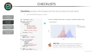
- 88. CHECKLISTS *Copyright Maven Analytics, LLC Checklists provide a list of options for the user to select (or multi-select) • dcc.Checklist(id, options, value) This sets the list of options (column names from the DataFrame) and the default selection This passes the list of selected columns into the “x” argument of the histogram, plotting each one
- 89. CHECKLISTS *Copyright Maven Analytics, LLC Checklists provide a list of options for the user to select (or multi-select) • dcc.Checklist(id, options, value) PRO TIP: Checklists are great for 2-8 options at a time, but beyond that can add significant clutter – consider a multi-select dropdown if you need more!
- 90. NEW MESSAGE From: Leonard Lift (Ski Trip Concierge) Subject: Park Features Map March 20, 2023 section03_assignments.ipynb Thanks for the help with the Map earlier! Can you add a checklist that allows me to filter down to ski resorts that have Snow Parks, Night Skiing or both? Will be really helpful to pinpoint which countries make the best destinations for clients looking for specific experiences. Thanks! ASSIGNMENT: CHECKLISTS Results Preview *Copyright Maven Analytics, LLC
- 91. NEW MESSAGE From: Leonard Lift (Ski Trip Concierge) Subject: Park Features Map March 20, 2023 section03_solutions.ipynb Thanks for the help with the Bar Chart earlier! Can you add a checklist that allows me to filter out whether ski resorts have Snow Parks, Night Skiing or both? Will be really helpful to pinpoint which countries make the best destinations for clients looking for specific experiences. Thanks! SOLUTION: CHECKLISTS Solution Code *Copyright Maven Analytics, LLC
- 92. RADIO BUTTONS *Copyright Maven Analytics, LLC Radio buttons provide a list of options for the user to toggle between • dcc.RadioItems(id, options, value) This sets the two options for the user to choose between, and sets the default This adds an “ols” trendline if the selection is not “Trendline Off”
- 93. RADIO BUTTONS *Copyright Maven Analytics, LLC Radio buttons provide a list of options for the user to toggle between • dcc.RadioItems(id, options, value)
- 94. SLIDERS *Copyright Maven Analytics, LLC Sliders let users drag a handle to select a value inside a defined range • dcc.Slider(min, max, step, value) This starts the slider at 15 and lets the user select values between 0-30 in 5-step intervals This filters the DataFrame for “expenditures per student” greater than the selected value, groups the results by year, and plots the number of rows (States) in a bar chart PRO TIP: These often align with Boolean operators, where users select options equal to, less than, or greater than some value
- 95. SLIDERS *Copyright Maven Analytics, LLC Sliders let users drag a handle to select a value inside a defined range • dcc.Slider(min, max, step, value)
- 96. RANGE SLIDERS *Copyright Maven Analytics, LLC Range sliders let users drag two handles to select a range of values • dcc.RangeSlider(min, max, step, value) This sets a list (or tuple) as the value This filters the DataFrame using the .between() method instead of a Boolean operator (Note that the values are accessed with their index) PRO TIP: Range Sliders let you perform “between” selections rather than single value or single directions selections (like with traditional sliders)
- 97. RANGE SLIDERS *Copyright Maven Analytics, LLC Range sliders let users drag two handles to select a range of values • dcc.RangeSlider(min, max, step, value)
- 98. NEW MESSAGE From: Leonard Lift (Ski Trip Concierge) Subject: Elevation Selector March 23, 2023 section03_assignments.ipynb ASSIGNMENT: SLIDERS Results Preview *Copyright Maven Analytics, LLC Ok, I’d like to update another visual you created before with interactivity. Some of our customers love to get HIGH (in terms of elevation, of course). Can you build a bar chart that shows number of ski resorts by country based on the elevation users select? Thanks!
- 99. NEW MESSAGE From: Leonard Lift (Ski Trip Concierge) Subject: Elevation Selector March 23, 2023 section03_solutions.ipynb Ok, I’d like to update another visual you created before with interactivity. Some of our customers love to get HIGH (in terms of elevation, of course). Can you build a bar chart that shows number of ski resorts by country based on the elevation users select? Thanks! SOLUTION: SLIDERS Solution Code *Copyright Maven Analytics, LLC
- 100. DATE PICKERS *Copyright Maven Analytics, LLC Date pickers let users select a date from a calendar drop down • dcc.DatePickerSingle(id, min_date_allowed, max_date_allowed, initial_visible_month, date, display_format) This sets the min/max dates in the calendar from the data, and sets the max date as the starting value This plots the collisions for the selected date on a bar chart by borough Note that the input property is “date”, not “value”
- 101. DATE PICKERS *Copyright Maven Analytics, LLC Date pickers let users select a date from a calendar drop down • dcc.DatePickerSingle(id, min_date_allowed, max_date_allowed, initial_visible_month, date, display_format)
- 102. DATE RANGE PICKERS *Copyright Maven Analytics, LLC Date range pickers let users select a range of dates from calendar drop downs • dcc.DatePickerRange(id, start_date, end_date, display_format) This sets the min/max dates in the data as the start/end dates for the calendar dropdowns Note that two inputs are needed (they don’t need to be in a list, but it keeps them organized) This filters the “DATE” using the range selected, groups the DataFrame by “DATE”, and sums the collisions, plotting them in a line chart
- 103. DATE RANGE PICKERS *Copyright Maven Analytics, LLC Date range pickers let users select a range of dates from calendar drop downs • dcc.DatePickerRange(id, start_date, end_date, display_format)
- 104. MULTIPLE INPUT CALLBACKS *Copyright Maven Analytics, LLC A single callback function can have multiple inputs • This lets you add multiple interactive elements to the same application! This creates two dropdowns for the user to select DataFrame columns with Note that two inputs are needed, and they are passed into the function in the same order This sets the “x” and “y” variables for the scatterplot using the selections
- 105. MULTIPLE INPUT CALLBACKS *Copyright Maven Analytics, LLC A single callback function can have multiple inputs • This lets you add multiple interactive elements to the same application!
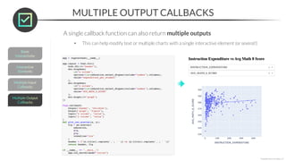
- 106. A single callback function can also return multiple outputs • This can help modify text or multiple charts with a single interactive element (or several!) MULTIPLE OUTPUT CALLBACKS *Copyright Maven Analytics, LLC This creates an empty header to be updated by the callback function (at the same time as the graph) Note that two outputs are used, one for the “graph” and the other for the “header” The order must follow the order of the outputs!
- 107. A single callback function can also return multiple outputs • This can help modify text or multiple charts with a single interactive element (or several!) MULTIPLE OUTPUT CALLBACKS *Copyright Maven Analytics, LLC
- 108. NEW MESSAGE From: Leonard Lift (Ski Trip Concierge) Subject: Single Map Feature View March 25, 2023 Section03_assignments.ipynb ASSIGNMENT: MULTIPLE INTERACTIVE ELEMENTS Results Preview *Copyright Maven Analytics, LLC Hey there, Can we apply the elevation slider to the map-based view? It’s much more helpful given we’re working with geographic areas (please keep the Snow Park & Night Ski checklist in the same map too!) If you’re daring, try to embed the elevation selected in the header of the chart as well! Thanks!
- 109. NEW MESSAGE From: Leonard Lift (Ski Trip Concierge) Subject: Single Map Feature View March 25, 2023 Section03_solutions.ipynb SOLUTION: MULTIPLE INTERACTIVE ELEMENTS Solution Code *Copyright Maven Analytics, LLC Hey there, Can we apply the elevation slider to the map-based view? It’s much more helpful given we’re working with geographic areas (please keep the Snow Park & Night Ski checklist in the same map too!) If you’re daring, try to embed the elevation selected in the header of the chart as well! Thanks!
- 110. KEY TAKEAWAYS Dash has a wide range of interactive elements you can use in apps • Choose the right one by considering the data types, number of options, and filtering criteria (logical comparisons) Use dropdowns, checklists, and radio buttons for categories • Checklists and radio buttons are great for a limited number of options, while dropdown menus can incorporate dozens while keeping your applications compact *Copyright Maven Analytics, LLC Use sliders and date pickers for numbers & dates • Singe value sliders and date pickers work well with inequalities, while range options are best for “between” logic Callback functions can have multiple inputs & outputs • Multiple outputs let you modify several visuals or text using a single interactive element • Multiple inputs let you use several interactive elements to modify text and visuals in your app
- 111. *Copyright Maven Analytics, LLC
- 112. PROJECT DATA: US & CANADA RESORTS *Copyright Maven Analytics, LLC
- 113. NEW MESSAGE From: Deepthi Downhill (VP of Analytics) Subject: More Ambitious Ski Resort App March 28, 2023 ASSIGNMENT: MIDCOURSE PROJECT Key Objectives section04_midcourse_project.ipynb *Copyright Maven Analytics, LLC 1. Build two working Dash Applications 2. Add multiple chart types and interactive elements 3. Connect them with callback functions capable of taking multiple inputs and returning multiple outputs Hello, The work you’ve been doing with Leonard is very exciting. This type of application can save our agents hundreds of hours annually! I want to applaud you both on this amazing initiative. That said, it’s time to think a bit bigger. While Europe is a solid market, it’s behind the US and Canada for us given our customers are almost exclusively from North America. Can you create two apps that will help us with these markets? Thanks!
- 114. *Copyright Maven Analytics, LLC
- 115. • Identify the types of dashboards, their key elements, and design principles for effective dashboard layouts • Create dashboard layouts using HTML, markdown, and Dash Bootstrap Components • Add custom formatting to layouts using themes or by styling each component individually DASHBOARD LAYOUTS TOPICS WE’LL COVER: GOALS FOR THIS SECTION: In this section we’ll introduce dashboard design principles and build dashboard layouts in Dash, including some more advanced HTML and the Dash Bootstrap Components library *Copyright Maven Analytics, LLC
- 116. DASHBOARDS 101 *Copyright Maven Analytics, LLC Dashboards are groups of visuals that help understand data and make decisions • They can be used for both exploratory and explanatory analysis EXPLORATORY EXPLANATORY • Goal is to explore and profile the data to see what insights emerge • Helps you understand the data and identify interesting patterns & trends • Goal is to tell a specific story or explain what happened and why • Identifies key business drivers and delivers insights & recommendations We’ll mostly focus on dashboards for exploratory analysis in this course, but you can check out our Data Visualization with Matplotlib & Seaborn for good explanatory examples
- 117. 1. Filters & interactivity • Will users need to see specific, filtered views? • Will they need to drill up or down to different levels of granularity? 2 1. Metrics & visuals • What are the main metrics (KPIs) the dashboard needs to track? • What other metrics add context to complement these? • What chart type is appropriate to visualize each metric? 1 DASHBOARD ELEMENTS *Copyright Maven Analytics, LLC There are two main types of dashboard elements: PRO TIP: Think like a business owner before you think like an analyst; before you begin building your dashboard with code, take time to understand the outcomes you’re trying to impact, the key stakeholders and their motivations, and the specific purpose your dashboard will serve
- 118. DASHBOARD LAYOUTS *Copyright Maven Analytics, LLC A strong dashboard layout adds cohesion to its visuals & interactivity, drawing attention to key metrics and guiding the viewer through a logical progression PRO TIP: Design your dashboard layout like an inverse pyramid; the most important metrics and visuals should come first, followed by any supporting data or more granular views KPIs Fine detail Nationwide view of test performance and other KPIs State-level deep dive with context on relative ranks First tab Second tab
- 119. RECAP: HTML LAYOUTS Dash uses HTML layouts for designing the front-end of the application • Use the html module to specify the visual components and assign it to app.layout *Copyright Maven Analytics, LLC The html.Div works as a container for its “children”, which can be html or dcc components Styles specified for html Divs will cascade to standard html elements within them, but dcc components override these styles by default (more on this later!)
- 120. RECAP: HTML LAYOUTS Dash uses HTML layouts for designing the front-end of the application • Use the html module to specify the visual components and assign it to app.layout *Copyright Maven Analytics, LLC The html module writes html code for us!
- 121. HTML COMPONENT CHEATSHEET *Copyright Maven Analytics, LLC These are the basic HTML components you need to get started: For a full list of components, visit: https://dash.plotly.com/dash-html-components html.Div() A web page section (you can use multiple Divs to create sections with different styles) html.H1(), H2(), …, H6() Different sized headers used to denote hierarchy or importance (more so than size itself) html.P() A paragraph, or generic body text, often smaller than and placed immediately below a header html.Span() Inline containers used to apply different colors or styles to text within headers or paragraphs
- 122. PRO TIP: MARKDOWN *Copyright Maven Analytics, LLC You can also use dcc.Markdown() to embed text into the front-end of your app PRO TIP: Markdown is easier to write and more convenient for things like modifying font weight and building lists than HTML – it’s a bit harder to style, but generally more than sufficient for most apps!
- 123. NEW MESSAGE From: Leonard Lift (Ski Trip Concierge) Subject: HTML? April 1, 2023 Section05_assignments.ipynb ASSIGNMENT: HTML & MARKDOWN Results Preview *Copyright Maven Analytics, LLC Hey there, Are you familiar with HTML? I was talking to our designer who is slammed, but I don’t want to delay – can you send me a basic HTML layout to show what you can do? If it’s decent, we can move forward with styling our app. More details in the notebook! Thanks!
- 124. NEW MESSAGE From: Leonard Lift (Ski Trip Concierge) Subject: HTML? April 1, 2023 Section05_solutions.ipynb SOLUTION: HTML & MARKDOWN Solution Code *Copyright Maven Analytics, LLC Hey there, Are you familiar with HTML? I was talking to our designer who is slammed, but I don’t want to delay – can you send me a basic HTML layout to show what you can do? If it’s decent, we can move forward with styling our app. More details in the notebook! Thanks!
- 125. STYLING HTML *Copyright Maven Analytics, LLC You can style HTML components with the “style” argument • This lets you modify things like font types, sizes, and colors, as well as the background color The default style for Dash apps and their components is black text with white backgrounds No style has been specified yet
- 126. STYLING HTML *Copyright Maven Analytics, LLC You can style HTML components with the “style” argument • This lets you modify things like font types, sizes, and colors, as well as the background color You can create a style dictionary in advance and assign it to a variable that can be reused in the app Styles applied to an outer Div are passed through to (most) of its children – more on this later! You can always apply a style to an individual html component directly to override any parent styles This sets a light grey Arial font on a black background for the app components, except for the final paragraph (this has a grey background color with an absurdly small font size)
- 127. STYLING HTML *Copyright Maven Analytics, LLC You can style HTML components with the “style” argument • This lets you modify things like font types, sizes, and colors, as well as the background color Note that the dropdown and chart didn’t inherit the parent style!
- 128. HTML STYLE CHEATSHEET *Copyright Maven Analytics, LLC These are the basic arguments for modifying HTML styles you need to get started: color “red”, “#FF0000” backgroundColor “red”, “#FF0000” fontSize 12, 14, 20 fontFamily “Arial”, “Calibri” text-align “center”, “left”, “right” PRO TIP: Consider defining style dictionaries in advance to improve readability within the front-end code
- 129. STYLING DCC COMPONENTS *Copyright Maven Analytics, LLC DCC components don’t inherit parent Div styles, but some styling can be applied • NOTE: Only some portions of DCC components can be styled without modifying the CSS code The background is now black, but the expanded options are still white, The font color is light grey, but the placeholder text is much darker
- 130. STYLING DCC COMPONENTS *Copyright Maven Analytics, LLC DCC components don’t inherit parent Div styles, but some styling can be applied • NOTE: Only some portions of DCC components can be styled without modifying the CSS code You can simply call the style you have set
- 131. STYLING DCC COMPONENTS *Copyright Maven Analytics, LLC DCC components don’t inherit parent Div styles, but some styling can be applied • NOTE: Only some portions of DCC components can be styled without modifying the CSS code DCC components are deceptively difficult to style because they are defined by Dash’s CSS, but there are ways to get around this without needing to know CSS The text colors are perfect after applying styles to each label, but the dropdown menu options are still white outside of the text!
- 132. FIGURE STYLING *Copyright Maven Analytics, LLC You need to style Plotly figures independently from HTML components • You can use the .update_layout() method to modify the style to match the rest of the app
- 133. ASSIGNMENT: APP STYLING Results Preview *Copyright Maven Analytics, LLC NEW MESSAGE From: Leonard Lift (Ski Trip Concierge) Subject: Ski Resort Map Styling April 3, 2023 section05_assignments.ipynb Hey there, Your HTML looked ok! Let’s modify the color and text on the Ski Resorts by Country map that we worked on. Thanks again!
- 134. SOLUTION: APP STYLING Solution Code *Copyright Maven Analytics, LLC NEW MESSAGE From: Leonard Lift (Ski Trip Concierge) Subject: Ski Resort Map Styling April 3, 2023 section05_solutions.ipynb Hey there, Your HTML looked ok! Let’s modify the color and text on the Ski Resorts by Country map that we worked on. Thanks again!
- 135. DASH BOOTSTRAP COMPONENTS *Copyright Maven Analytics, LLC The Dash Bootstrap Components (DBC) library offers incredible options for designing polished applications with fewer lines of code • This includes cohesive styles, built-in padding around components, and a grid-based framework Individual component styling Dash Bootstrap Components theme
- 136. DBC CHEATSHEET *Copyright Maven Analytics, LLC For a full list of components, visit: https://dash-bootstrap-components.opensource.faculty.ai/ These are the basic Dash Bootstrap Components you need to get started: dbc.themes Pre-built CSS style sheets that apply cohesive formatting to your application dbc.Container() The DBC equivalent of a Div that acts as a style wrapper for sections of the app layout dbc.Card() A specific type of container for components that adds padding & polish around them dbc.Row() Represents a horizontal row inside a dbc.Container (or html.Div) dbc.Col() Represents a vertical column inside a dbc.Row dcc.Tabs() Creates different tabs for users to navigate between PRO TIP: Use Dash Bootstrap Components to quickly apply a theme to your dashboard, then tweak individual elements as needed with the methods we’ve already covered
- 137. DASH BOOTSTRAP THEMES *Copyright Maven Analytics, LLC For an interactive theme viewer, visit: https://dash-bootstrap-components.opensource.faculty.ai/docs/themes/explorer/ There are 26 themes available in the Dash Bootstrap Components library • Dash(__name__, external_stylesheets=[dbc.themes.THEME_NAME]) Bootstrap Cerulean Slate Quartz The DBC Theme Explorer (linked below) has an app for previewing the different themes available – odds are you will find one that matches your desired aesthetic!
- 138. DASH BOOTSTRAP THEMES *Copyright Maven Analytics, LLC There are 26 themes available in the Dash Bootstrap Components library • Dash(__name__, external_stylesheets=[dbc.themes.THEME_NAME]) EXAMPLE Applying the “slate” theme Simply specify the theme name here! Note that the DCC components & Plotly figures don’t adopt the style (for now!)
- 139. APPLYING THEMES TO FIGURES *Copyright Maven Analytics, LLC You can apply themes to figures by using the dash_bootstrap_templates library • load_figure_template(“THEME_NAME”) 1) Install the library 2) Specify the desired theme Now we just need to deal with this pesky dropdown menu!
- 140. APPLYING THEMES TO DCC COMPONENTS *Copyright Maven Analytics, LLC You can apply themes to DCC components by using a special link (see code below) • You also need to specify className=“dbc” in your dcc component Imports external CSS that applies to specified dcc components Applies theme to the component You can apply your own CSS code with the same steps; Learning CSS is generally well beyond the scope of analyst roles, but it’s worth being aware of if you have the web developer skills (or want to learn them!)
- 141. GRID BASED LAYOUTS *Copyright Maven Analytics, LLC The DBC components for rows & columns let you create grid-based layouts • The height of each row is determined by the height of its content • You can specify the width of each column or let them distribute evenly by default
- 142. GRID BASED LAYOUTS *Copyright Maven Analytics, LLC The DBC components for rows & columns let you create grid-based layouts • The height of each row is determined by the height of its content • You can specify the width of each column or let them distribute evenly by default PRO TIP: Even though it’s not necessary, placing objects inside cards helps gives a better visual indication of the “grid” layout
- 143. GRID BASED LAYOUTS *Copyright Maven Analytics, LLC EXAMPLE Adding KPI cards and another chart to our dashboard The DBC components for rows & columns let you create grid-based layouts • The height of each row is determined by the height of its content • You can specify the width of each column or let them distribute evenly by default
- 144. MULTIPLE TABS *Copyright Maven Analytics, LLC You can create dashboards with multiple tabs with dcc.Tabs() and dcc.Tab() • Simply specify any number of dcc.Tab() components underneath parent dcc.Tabs() Note that the components in each tab are specified as a list in the “children” argument
- 145. MULTIPLE TABS *Copyright Maven Analytics, LLC EXAMPLE Adding a new tab our dashboard
- 146. NEW MESSAGE From: Leonard Lift (Ski Trip Concierge) Subject: Updated Layout April 05, 2023 Section05_assignments.ipynb ASSIGNMENT: DASH BOOTSTRAP COMPONENTS Results Preview *Copyright Maven Analytics, LLC Hey there, Can we modify the layout of the map application? I’d like for our interactive elements to be in a bar on the left side of our screen, with the map to the right. Additionally, apply a dbc theme of your choice to the application… it’s likely better than what you created earlier ;) Thanks again!
- 147. NEW MESSAGE From: Leonard Lift (Ski Trip Concierge) Subject: Updated Layout April 05, 2023 Section05_solutions.ipynb SOLUTION: DASH BOOTSTRAP COMPONENTS Solution Code *Copyright Maven Analytics, LLC Hey there, Can we modify the layout of the map application? I’d like for our interactive elements to be in a bar on the left side of our screen, with the map to the right. Additionally, apply a dbc theme of your choice to the application… it’s likely better than what you created earlier ;) Thanks again!
- 148. KEY TAKEAWAYS Dashboards are groups of visuals that help understand data at a glance • Adding filters & interactivity lets users explore the data themselves to see what insights emerge You can create dashboard layouts with HTML, markdown, and DBC • Dash Bootstrap Components (DBC) let you easily create grid-based layouts with multiple tabs • The focus of the layout should be to add cohesion to its visuals and interactive elements *Copyright Maven Analytics, LLC Themes let you easily apply pre-defined styles to your dashboards • You can still apply custom styles to individual components if needed
- 149. *Copyright Maven Analytics, LLC
- 150. • Embed data tables that users can sort, filter, and export into Dash applications • Write advanced callback function structures that take user interactivity to the next level • Learn to deploy an application to an online server that stakeholders can access ADVANCED TOPICS TOPICS WE’LL COVER: GOALS FOR THIS SECTION: In this section we’ll cover advanced topics like chained & conditional callback functions, cross-filtering, debug mode, data table outputs, and app deployment options *Copyright Maven Analytics, LLC
- 151. DATA TABLES *Copyright Maven Analytics, LLC You can embed data tables into your dashboards with the dash_table module • dash_table.DataTable(columns, data) This creates a table with the data from the “education” DataFrame with the column names as headers
- 152. DATA TABLES *Copyright Maven Analytics, LLC You can use additional arguments to let users sort, filter, and export the table • dash_table.DataTable(columns, data, filter_action, sort_action, export_format) The “native” options for sorting and filtering work quite well You can also export to “xlsx” This was sorted by TOTAL_REVENUE with the STATE filtered to “CALIFORNIA” The default style for tables isn’t the best, but they can be styled like any other HTML object (DBC has a table implementation with better aesthetics, but less functionality)
- 153. NEW MESSAGE From: Leonard Lift (Ski Trip Concierge) Subject: Table Output April 11, 2023 Section06_assignments.ipynb ASSIGNMENT: DATA TABLES Results Preview *Copyright Maven Analytics, LLC Hey there, Can you create a simple app that allows users to select country from a dropdown, uses our elevation slider, and returns a table of the resorts in that country with a highest point greater than the elevation specified? Make sure the table can be sorted, filtered, and exported – some of our clients want to browse and analyze our data themselves. If you’re up for it, try styling it! Thanks!
- 154. NEW MESSAGE From: Leonard Lift (Ski Trip Concierge) Subject: Table Output April 11, 2023 Section06_solutions.ipynb SOLUTION: DATA TABLES Solution Code *Copyright Maven Analytics, LLC Hey there, Can you create a simple app that allows users to select country from a dropdown, uses our elevation slider, and returns a table of the resorts in that country with a highest point greater than the elevation specified? Make sure the table can be sorted, filtered, and exported – some of our clients want to browse and analyze our data themselves. If you’re up for it, try styling it! Thanks!
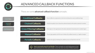
- 155. ADVANCED CALLBACK FUNCTIONS *Copyright Maven Analytics, LLC These are some advanced callback function concepts: Return different components to the front end based on some conditional logic Modify the options of an interactive element based on the option selected in another Filter figures in the app based on the data selected (or hovered over) in another figure Prevent app updates until the user initiates the callback process, or “applies changes” Dash is extremely powerful and flexible. These concepts are worth being aware of, but good dashboards are often quite simple, so you may never use most of these in practice Updates the app by initiating the callback process at fixed time intervals
- 156. CONDITIONAL CALLBACKS *Copyright Maven Analytics, LLC Conditional callbacks use logical tests to return different types of components to the front end of your application dcc.Graph (default) dash_table.DataTable
- 157. CONDITIONAL CALLBACKS *Copyright Maven Analytics, LLC Conditional callbacks use logical tests to return different types of components to the front end of your application If the user selects “bar”, the callback returns a dcc.Graph() component with a bar chart Otherwise, if the user selects “table”, the callback returns a DataTable object This gives the user two options: “bar” or table” This empty Div will house a component output by the “conditional” callback function
- 158. CHAINED CALLBACKS *Copyright Maven Analytics, LLC Chained callbacks use the output of a callback function as the input of another • This is typically used to modify the options of an interactive element based on the option selected in another (like dependent dropdown lists) “California” selected (default) “Oregon” selected The second dropdown has cities in California as options The second dropdown has cities in Oregon as options
- 159. CHAINED CALLBACKS *Copyright Maven Analytics, LLC Chained callbacks use the output of a callback function as the input of another • This is typically used to modify the options of an interactive element based on the option selected in another (like dependent dropdown lists) This dictionary sets the dependencies, with the keys being the options for the first dropdown, and the values are their corresponding options for the second dropdown This is the first dropdown with the dictionary keys This is the second dropdown with no options specified (yet!) The first callback takes the value from the first dropdown as the input, and uses it as the key to return its values from the “states_cities” dictionary as options for the second dropdown The second callback takes the value from the second dropdown and returns it to the dbc.Card component (you can use it to filter charts instead!)
- 160. PRO TIP: DEBUG MODE *Copyright Maven Analytics, LLC You can turn on debug mode when running an app to look at the structure of your callbacks, diagnose errors, and identify components causing poor performance • app.run_server(debug_mode=True) This expands the debug menu shown here This callback diagram shows your app’s components, their properties, and their callback relationships (and how long the callbacks take to run!)
- 161. PRO TIP: DEBUG MODE *Copyright Maven Analytics, LLC You can turn on debug mode when running an app to look at the structure of your callbacks, diagnose errors, and identify components causing poor performance • app.run_server(debug_mode=True) The error messages in debug mode are generated when interacting with the app, letting you pinpoint the cause of errors PRO TIP: Use debug mode when building the app, and turn it off before deployment
- 162. CROSS-FILTERING *Copyright Maven Analytics, LLC Cross-filtering uses chart selections as inputs to callbacks that filter other charts Load state (default) Hover state The app loads by plotting “California” in the second chart As you hover over states in the first chart, the second chart updates
- 163. The hoverData argument in dcc.Graph() lets you specify a starting value to pass through before the user hovers over a datapoint The custom_data argument lets you specify which column(s) to grab values from when the user hovers over a datapoint The callback function input is the hoverData from the scatterplot This grabs the “STATE” value from the hoverData dictionary passed through the callback and uses it to filter the DataFrame This plots a line chart with the “cross-filtered” DataFrame! CROSS-FILTERING *Copyright Maven Analytics, LLC Cross-filtering uses chart selections as inputs to callbacks that filter other charts
- 164. PRO TIP: MANUAL CALLBACKS *Copyright Maven Analytics, LLC You can add a button component to your app that run callbacks manually, allowing users to make multiple selections before applying any updates • This helps if your application has long processing times (common in ML models) The first chart relies on inputs from the radio buttons on the left, but the callback function won’t fire until the user clicks “Submit” (the second chart is displaying default values, and is unrelated to the radio buttons on the left) The first chart now displays values based on the user selections, and is also filtering the second chart by the selected data point Load state (no errors!) After manual callback
- 165. PRO TIP: MANUAL CALLBACKS *Copyright Maven Analytics, LLC You can add a button component to your app that run callbacks manually, allowing users to make multiple selections before applying any updates • This helps if your application has long processing times (common in ML models) This adds the “Submit” button and sets the “n_clicks” property equal to 0 The “n_clicks” property from the button gets passed as an input into the callback If the button has not been clicked, then the app doesn’t update (n_clicks=None)
- 166. PRO TIP: PERIODIC CALLBACKS *Copyright Maven Analytics, LLC You can schedule periodic callbacks with the dcc.Interval() component • This lets you update your app automatically without user input • dcc.Interval(interval, n_intervals) Load state (0 seconds) 10 seconds later This app is set to “refresh” every 2 seconds In 10 seconds, 5 callbacks have triggered every 2 seconds This can allow for real-time updates if your application is connected to a database or API, so instead of firing a random number generator, new data can be queried and appended to your DataFrame via pd.read_sql()
- 167. PRO TIP: PERIODIC CALLBACKS *Copyright Maven Analytics, LLC This will trigger every 2,000 milliseconds (2 seconds) You can schedule periodic callbacks with the dcc.Interval() component • This lets you update your app automatically without user input • dcc.Interval(interval, n_intervals) This takes “n_intervals” as the input, fires the callback function, and increments “n_intervals” by 1 This creates a histogram with randomized normal data, and show how many times it has run (you don’t need to use n_intervals in the function)
- 168. NEW MESSAGE From: Leonard Lift (Ski Trip Concierge) Subject: Updated Table App April 20, 2023 section06_assignments.ipynb ASSIGNMENT: ADVANCED CALLBACKS Results Preview *Copyright Maven Analytics, LLC Hey there, Can we update the table application we created earlier to include a few more features? I’d like the user to be able to select whether a bar chart or a table is returned, and I don’t want the app to run until the user clicks a button to confirm their choices. Thanks!
- 169. NEW MESSAGE From: Leonard Lift (Ski Trip Concierge) Subject: Updated Table App April 20, 2023 section06_solutions.ipynb SOLUTION: ADVANCED CALLBACKS Solution Code *Copyright Maven Analytics, LLC Hey there, Can we update the table application we created earlier to include a few more features? I’d like the user to be able to select whether a bar chart or a table is returned, and I don’t want the app to run until the user clicks a button to confirm their choices. Thanks!
- 170. DEPLOYING YOUR APP *Copyright Maven Analytics, LLC Check out my deployed app at: https://cwbruehl.pythonanywhere.com/ Deploying your app requires access to a server • For professional projects, you can use cloud services like AWS and Azure, or Dash Enterprise • For personal projects, you can use PythonAnywhere or Heroku This is hosted on PythonAnywhere
- 171. PYTHONANYWHERE *Copyright Maven Analytics, LLC You can deploy your app on PythonAnywhere for free by following these steps: 1) Go to pythonanywhere.com/pricing and click 2) Register, then upload your app and data files Upload our app file (file_name.py) and any data used (like CSV files)
- 172. PYTHONANYWHERE *Copyright Maven Analytics, LLC You can deploy your app on PythonAnywhere for free by following these steps: 3) Go to the “Web” tab and add a new web app Use the default domain Click “Manual Configuration” and select Python “3.10”
- 173. PYTHONANYWHERE *Copyright Maven Analytics, LLC You can deploy your app on PythonAnywhere for free by following these steps: 4) Your default app is live! 5) Go to the “Consoles” tab and start a new Bash Console
- 174. PYTHONANYWHERE *Copyright Maven Analytics, LLC You can deploy your app on PythonAnywhere for free by following these steps: 6) Type “mkvirtualenv myvirtualenv --python=/usr/bin/python3.10” to create an environment 7) Go to the “Web” tab and connect your app to your environment Replace “cwbruehl” with your username
- 175. PYTHONANYWHERE *Copyright Maven Analytics, LLC You can deploy your app on PythonAnywhere for free by following these steps: 8) In the “Web” tab, edit the WSGI configuration file with the code below and click “Save” The name of the module (.py file) storing your application Your username
- 176. PYTHONANYWHERE *Copyright Maven Analytics, LLC You can deploy your app on PythonAnywhere for free by following these steps: 9) Make tweaks to your code to prepare it for deployment Make sure you’re using Dash instead of Jupyter_Dash Remove app.run_server() – the last lines of code should be the final callback function Code tweaks can be done prior to uploading your code as well! There are good arguments for editing it both before and after upload, but either way will get you a running the app! 10) Specify the file path to your app in the “Source code”
- 177. PYTHONANYWHERE *Copyright Maven Analytics, LLC You can deploy your app on PythonAnywhere for free by following these steps: 11) Reload and visit your app! Got stuck somewhere? Check out PythonAnywhere’s help documentation – most of these steps are covered there! (they also have a great example of a Dash app deployment)
- 178. KEY TAKEAWAYS You can embed data tables into your Dash applications • This lets users inspect & analyze the raw data by sorting, filtering, or exporting it Advanced callback functions take user interactivity to the next level • Conditional, chained, and cross-filter callbacks let users explore the data in a wide variety of ways • Manual and periodic callbacks let users control when callbacks are fired *Copyright Maven Analytics, LLC Dash applications are meant to be deployed • If you’re building an application for work, consult your IT department about company or cloud-based servers • Python Anywhere is a solid free option for deploying your app (Heroku is another popular option)
- 179. *Copyright Maven Analytics, LLC
- 180. PROJECT DATA: WORLDWIDE RESORTS *Copyright Maven Analytics, LLC
- 181. NEW MESSAGE From: Deepthi Downhill (VP of Analytics) Subject: Even MORE Ambitious Resort App May 1, 2023 ASSIGNMENT: FINAL PROJECT Key Objectives section07_final_project.ipynb *Copyright Maven Analytics, LLC 1. Build a multi-tab dashboard with a grid-based layout 2. Add multiple chart types and interactive elements 3. Write standard callback functions to connect them 4. Include a chained callback function and (if you’re daring) a cross-filtering callback function Hey, thanks for the great work on the two dashboards. However, I’m getting some feedback that having two separate dashboards is challenging to navigate. Can you make this a single app, with each view on its own tab? Try to improve the design a bit as well. We also want to think EVEN BIGGER. The US and Canada were a great start, but we have access to data on ski resorts world-wide, and we should be able to leverage much of our existing code to include all of them. Thanks!