SlideShare a Scribd company logo
Intro to Responsive Web Design
Alexa IT Solution
What is Responsive Web Design?
“Responsive Web design is the approach that suggests
that design and development should respond to the user’s
behavior and environment based on screen size, platform
and orientation. The practice consists of a mix of flexible
grids and layouts, images and an intelligent use of CSS
media queries. As the user switches from their laptop to
iPad, the website should automatically switch to
accommodate for resolution, image size and scripting
abilities. In other words, the website should have the
technology to automatically respond to the user’s
preferences. This would eliminate the need for a
different design and development phase for each new
gadget on the market.”
Content Adaptation Techniques
Server-Side Adaptation - standard for providing the best
user experience; early 2000s
Progressive Enhancement - provide a baseline user
experience and build upon it based on the browser’s
capabilities; 2005-2007
Responsive Design - extension of Progressive Enhancement
utilizing CSS3, media queries, fluid content; 2011
Adaptive Design - hybrid approach of server-side and client-
side logic to provide the best user experience; 2013
Benefits of Responsive Design
● Single Code Base (Maintainability)
vs. different code bases for desktop / tablet / mobile
● Covers all screen sizes
vs. building specific tiers for “typical” device sizes
● Readability and Usability
vs. resizing / scrolling / panning / zooming
● Search Engine Optimization
vs. different content served for desktop / tablet / mobile
Responsive Frameworks
● Twitter Bootstrap
○ 12 column system, spanX widths
● Zurb Foundation
○ zurb example
CSS Media Queries
Add the @media tag to your CSS class and specify the
width of the screen in pixels where the following styles
should take affect.
The above line will apply styles when the width of the
screen is equal to or greater than 1024
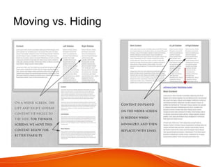
Moving vs. Hiding
Moving:
Grid Layout Alterations
Hiding:
The Semantic, Responsive Navicon
Mobile First
● Old - Graceful Degradation
○ A full, standard website would scale back and gradually remove
content and features as the viewport became smaller and the
system would become simpler
● New - Progressive Enhancement
○ Provide the users with minimal screen real estate and processing
power an amazing experience that both looks great and functions
perfectly. As the need arises, the site can gradually be “enhanced”
and even completely rethought for larger platforms with fewer
constraints.
Thinking Mobile
● Performance
○ Strip down third-party scripts : Facebook, Google, Twitter
○ Frameworks vs. Reduced/Simple Style Sheets
● RequireJS
○ only download it when you need it
● UglifyJS
● Touch vs. Hover (example)
Loading Images & Fonts
Problems:
Performance - why serve high resolution images to your
mobile users?
“Art Direction” - some images don’t scale so well
Solutions??
- CSS3 & web fonts
- SVG & icon fonts
- Picturefill - lightweight JS framework
- HiSRC - jquery plugin
- Foresight.js - JS framework
- Adaptive Images - server-side framework
- Sencha.io - image proxy service (aka TinySrc)
- ReSRC.it - similar to Sencha.io
Great Design Paradigms
1. Mostly Fluid
1. Column Drop
1. Left Nav Flyout & Toggle Nav
1. Form
1. Grid
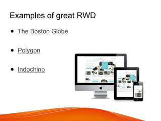
Examples of great RWD
● The Boston Globe
● Polygon
● Indochino
Responsive Best Practices
1. Breakpoints based on content and site layout &
design, not device.
2. Based on site design, but between 3 and 12
breakpoints typically. Giving versatility to the
layout style.
3. Adaptive loading for images that are better
suited to fit the screen size. (smaller images for
a smaller screen-size)
4. Think ‘mobile first’ and care about performance

More Related Content

What's hot (9)

PPTX
Multiple Design Strategies for Multiple Screens
Janine Warner
 
PPTX
Digital publishing Solutions - Dp2
TopCreations
 
PPTX
mSite exam presentation - GDG Sonargaon
Istiaque Reza
 
PPT
Responsive Web Design in Cascade Server, by Chris Cox of BarkleyREI
hannonhill
 
PPTX
Responsive Design pros and cons
mbieschke
 
PPTX
HTML and Responsive Design
Mindy McAdams
 
PPTX
Responsive Web Design and Testing
kksure
 
PPTX
Uniface Lectures Webinar - Extending Applications for Mobile
Uniface
 
PDF
Testing responsive web design pdf
crilusi
 
Multiple Design Strategies for Multiple Screens
Janine Warner
 
Digital publishing Solutions - Dp2
TopCreations
 
mSite exam presentation - GDG Sonargaon
Istiaque Reza
 
Responsive Web Design in Cascade Server, by Chris Cox of BarkleyREI
hannonhill
 
Responsive Design pros and cons
mbieschke
 
HTML and Responsive Design
Mindy McAdams
 
Responsive Web Design and Testing
kksure
 
Uniface Lectures Webinar - Extending Applications for Mobile
Uniface
 
Testing responsive web design pdf
crilusi
 

Similar to Alexa IT Solution Responsive Web designing (20)

PPTX
Reponsive web design (HTML5 + css3)
Sandip Jadhav
 
PPTX
reponsive-web-design.pptx
adarshgupta131049
 
PPTX
reponsive-web-design.pptx
adarshgupta131049
 
PPTX
Responsive Design
DheerajPachauri
 
PDF
Introduction | SEO Expate BD Ltd.
Sonia Simi
 
PDF
Introduction | SEO Expate BD Ltd.
Sonia Simi
 
PPTX
Responsive Web Design | Website Designing
MSA Technosoft
 
PDF
Responsive Web Designs
Sanjida Afrin
 
PPTX
Responsive web designing ppt(1)
admecindia1
 
PPTX
Responsive Web Designing Fundamentals
ADMEC Multimedia Institute
 
PDF
2014 Android and iOS Design Trends
RapidValue
 
PDF
Responsive Web Design
Heru WIjayanto
 
PPTX
Responsive Web Designing for web development
ZahraWaheed9
 
PDF
Responsive web design
Angela Brown
 
PPTX
RESPONSIVE_WEB_DESIGNRESPONSIVE_WEB_DESIGN
DaveEstonilo
 
PDF
Responsive Web Design: Advantages & Best Practice - Darrin Adams, Cantarus
Internet World
 
PPTX
Responsive Web Design - Advantages and Best Practice for Sports Direct
Cantarus
 
DOCX
Unlocking the Potential of Responsive Web Development Services.docx
Glorywebs Creatives Pvt. Ltd.
 
PPTX
Responsive design
DevelopmentArc LLC
 
PDF
Responsive Web design Zambig
Tribune Media
 
Reponsive web design (HTML5 + css3)
Sandip Jadhav
 
reponsive-web-design.pptx
adarshgupta131049
 
reponsive-web-design.pptx
adarshgupta131049
 
Responsive Design
DheerajPachauri
 
Introduction | SEO Expate BD Ltd.
Sonia Simi
 
Introduction | SEO Expate BD Ltd.
Sonia Simi
 
Responsive Web Design | Website Designing
MSA Technosoft
 
Responsive Web Designs
Sanjida Afrin
 
Responsive web designing ppt(1)
admecindia1
 
Responsive Web Designing Fundamentals
ADMEC Multimedia Institute
 
2014 Android and iOS Design Trends
RapidValue
 
Responsive Web Design
Heru WIjayanto
 
Responsive Web Designing for web development
ZahraWaheed9
 
Responsive web design
Angela Brown
 
RESPONSIVE_WEB_DESIGNRESPONSIVE_WEB_DESIGN
DaveEstonilo
 
Responsive Web Design: Advantages & Best Practice - Darrin Adams, Cantarus
Internet World
 
Responsive Web Design - Advantages and Best Practice for Sports Direct
Cantarus
 
Unlocking the Potential of Responsive Web Development Services.docx
Glorywebs Creatives Pvt. Ltd.
 
Responsive design
DevelopmentArc LLC
 
Responsive Web design Zambig
Tribune Media
 
Ad

Recently uploaded (20)

PPTX
CompanyReviewTypeOfPowerpointThatIsColor
plukleomarigpuara
 
PPTX
一比一原版(UOIT毕业证)安省理工大学毕业证如何办理
Taqyea
 
PDF
S2 Associates brings museum exhibits to life with innovative design.pdf
S2 Associates
 
PPTX
Dndnnnssjsjjsjsjjsssjsjsjjsjsjsjsjjsjsjdn.pptx
Nandy31
 
PPTX
SAMPLE FILE OF-PPT-FINAL-ORAL-DEFENSE.pptx
Yvez2
 
PPTX
Q1 PPT_PE 8 (Health-Related Fitness) [Autosaved].pptx
RegieMharBelamide
 
PDF
Presentation - Interior Design Concepts (2).pdf
vrindagrawal456
 
PPTX
TAMBO CANTA CALLAO C3 INFOGRAFIA - 05.07.pptx
milleracosta1
 
PPTX
sistem teknologi yang di desain untuk mahasiswa dan dosen agar memudahkan mer...
gamesonlya2rj
 
PDF
🔴BUKTI KEMENANGAN HARI INI SELASA 08 JULI 2025 !!!🔴
GRAB
 
PPTX
Town planning is a concept used in architectural design. It plays a very impo...
IshikaPanchal11
 
PPTX
Urban design is a huge concept when it comes to planning.
IshikaPanchal11
 
PDF
WEEK3-Literary-Gennnnnnnnnnnnnnnnnres.pdf
MaybelynVergara
 
PDF
Case Study on good and bad acoustics in auditorium
Disha Agrawal
 
PPTX
High-Rise Interior Mastery by Top 3D Visualization Experts
Yantram Animation Studio Corporation
 
PDF
ARC-101-B-4.pdfxxxxxxxxxxxxxxxxxxxxxxxxx
IzzyBaniquedBusto
 
PDF
cs603 ppts .pdf 222222222222222222222222
RabiaNazneen1
 
DOCX
Redefining Master Plans for creating sustainable cities-Jharkhand Conference...
JIT KUMAR GUPTA
 
DOCX
CERT HERNANDEZ CHURCH PHILIPPIBNES .docx
michael patino
 
PPT
Teaching Learning-1- (New) 2020.pptuuuo
omarekaabed
 
CompanyReviewTypeOfPowerpointThatIsColor
plukleomarigpuara
 
一比一原版(UOIT毕业证)安省理工大学毕业证如何办理
Taqyea
 
S2 Associates brings museum exhibits to life with innovative design.pdf
S2 Associates
 
Dndnnnssjsjjsjsjjsssjsjsjjsjsjsjsjjsjsjdn.pptx
Nandy31
 
SAMPLE FILE OF-PPT-FINAL-ORAL-DEFENSE.pptx
Yvez2
 
Q1 PPT_PE 8 (Health-Related Fitness) [Autosaved].pptx
RegieMharBelamide
 
Presentation - Interior Design Concepts (2).pdf
vrindagrawal456
 
TAMBO CANTA CALLAO C3 INFOGRAFIA - 05.07.pptx
milleracosta1
 
sistem teknologi yang di desain untuk mahasiswa dan dosen agar memudahkan mer...
gamesonlya2rj
 
🔴BUKTI KEMENANGAN HARI INI SELASA 08 JULI 2025 !!!🔴
GRAB
 
Town planning is a concept used in architectural design. It plays a very impo...
IshikaPanchal11
 
Urban design is a huge concept when it comes to planning.
IshikaPanchal11
 
WEEK3-Literary-Gennnnnnnnnnnnnnnnnres.pdf
MaybelynVergara
 
Case Study on good and bad acoustics in auditorium
Disha Agrawal
 
High-Rise Interior Mastery by Top 3D Visualization Experts
Yantram Animation Studio Corporation
 
ARC-101-B-4.pdfxxxxxxxxxxxxxxxxxxxxxxxxx
IzzyBaniquedBusto
 
cs603 ppts .pdf 222222222222222222222222
RabiaNazneen1
 
Redefining Master Plans for creating sustainable cities-Jharkhand Conference...
JIT KUMAR GUPTA
 
CERT HERNANDEZ CHURCH PHILIPPIBNES .docx
michael patino
 
Teaching Learning-1- (New) 2020.pptuuuo
omarekaabed
 
Ad

Alexa IT Solution Responsive Web designing

  • 1. Intro to Responsive Web Design Alexa IT Solution
  • 2. What is Responsive Web Design? “Responsive Web design is the approach that suggests that design and development should respond to the user’s behavior and environment based on screen size, platform and orientation. The practice consists of a mix of flexible grids and layouts, images and an intelligent use of CSS media queries. As the user switches from their laptop to iPad, the website should automatically switch to accommodate for resolution, image size and scripting abilities. In other words, the website should have the technology to automatically respond to the user’s preferences. This would eliminate the need for a different design and development phase for each new gadget on the market.”
  • 3. Content Adaptation Techniques Server-Side Adaptation - standard for providing the best user experience; early 2000s Progressive Enhancement - provide a baseline user experience and build upon it based on the browser’s capabilities; 2005-2007 Responsive Design - extension of Progressive Enhancement utilizing CSS3, media queries, fluid content; 2011 Adaptive Design - hybrid approach of server-side and client- side logic to provide the best user experience; 2013
  • 4. Benefits of Responsive Design ● Single Code Base (Maintainability) vs. different code bases for desktop / tablet / mobile ● Covers all screen sizes vs. building specific tiers for “typical” device sizes ● Readability and Usability vs. resizing / scrolling / panning / zooming ● Search Engine Optimization vs. different content served for desktop / tablet / mobile
  • 5. Responsive Frameworks ● Twitter Bootstrap ○ 12 column system, spanX widths ● Zurb Foundation ○ zurb example
  • 6. CSS Media Queries Add the @media tag to your CSS class and specify the width of the screen in pixels where the following styles should take affect. The above line will apply styles when the width of the screen is equal to or greater than 1024
  • 10. Mobile First ● Old - Graceful Degradation ○ A full, standard website would scale back and gradually remove content and features as the viewport became smaller and the system would become simpler ● New - Progressive Enhancement ○ Provide the users with minimal screen real estate and processing power an amazing experience that both looks great and functions perfectly. As the need arises, the site can gradually be “enhanced” and even completely rethought for larger platforms with fewer constraints.
  • 11. Thinking Mobile ● Performance ○ Strip down third-party scripts : Facebook, Google, Twitter ○ Frameworks vs. Reduced/Simple Style Sheets ● RequireJS ○ only download it when you need it ● UglifyJS ● Touch vs. Hover (example)
  • 12. Loading Images & Fonts Problems: Performance - why serve high resolution images to your mobile users? “Art Direction” - some images don’t scale so well Solutions?? - CSS3 & web fonts - SVG & icon fonts - Picturefill - lightweight JS framework - HiSRC - jquery plugin - Foresight.js - JS framework - Adaptive Images - server-side framework - Sencha.io - image proxy service (aka TinySrc) - ReSRC.it - similar to Sencha.io
  • 13. Great Design Paradigms 1. Mostly Fluid 1. Column Drop 1. Left Nav Flyout & Toggle Nav 1. Form 1. Grid
  • 14. Examples of great RWD ● The Boston Globe ● Polygon ● Indochino
  • 15. Responsive Best Practices 1. Breakpoints based on content and site layout & design, not device. 2. Based on site design, but between 3 and 12 breakpoints typically. Giving versatility to the layout style. 3. Adaptive loading for images that are better suited to fit the screen size. (smaller images for a smaller screen-size) 4. Think ‘mobile first’ and care about performance