Applying data visualisation to the
analytics process
Casper Blicher Olsen
Let’s go back in time
(The traveling industry)
Wright brothers 1900’s

Source:gizmodo.com
A lot has changed

Source:gizmodo.com
Boeing during the 70’s

Source:gizmodo.com
Boeing now

Source:boeing.com
Let’s go back in time
(Data Visualizations)
Napoleon's disastrous Russian campaign of 1812
Charles Joseph Minard (Paris, 1969)

Charles Joseph Minard

•

Lived 1781–1870

!
•

French civil engineer


•

Information graphics
pioneer


•

Known for the graphical
visualization on the left
(also know as):

“Carte figurative des
pertes successives en
hommes de l'Armée
Française dans la
campagne de Russie
1812-1813”
World immigration during 1858
Charles Joseph Minard (Paris, 1962)

Charles Joseph Minard

•

Lived 1781–1870

!
•

French civil engineer


•

Information graphics
pioneer
Flow visualisations (2014)
Google Analytics

Google Analytics


•

Graphical representation
of visitors’ flow


•

Nodes are automatically
clustered according to an
intelligence algorithm that
groups together the most
likely visitor flow through
a site.

!
•

Option to drill down into
any node.
It (officially) started in 1919
Worlds first book on informations graphics

Get the book here: http://goo.gl/mI7Rzv
It (officially) started in 1919
Worlds first book on informations graphics

Get the book here: http://goo.gl/mI7Rzv
It (officially) started in 1919
Worlds first book on informations graphics

Get the book here: http://goo.gl/mI7Rzv
Warning: do not try this at home…
…or at work!
It (officially) started in 1919
Worlds first book presenting a PIE CHART!

Get the book here: http://goo.gl/mI7Rzv
It’s the pie chart!
and the truth about it
Don’t be a “Pie Charter”
Seriously–don’t!

Source: Urbandictionary
The Pie Chart

Round, tasty and full of colours

The reason you should avoid the
use of pie charts…

Source: truefacts.dk
The truth about pie charts

before you can break the rules, you need to know them first

Positive

•

Simple share of total.


Negative

•

Whenever there is similarity in the
information available, a pie chart is not

•

Charts are a way to take information

the right chart to use.


and make it more understandable.

•

Whenever there are multiple (3 or
more) different points of data, a pie
chart is not the right chart to use.


•

Pie charts are very easy to abuse. 


•

A pie chart is not the right chart to use
if you need to label each percent.
World's most accurate pie chart
True story
A misleading data visualization
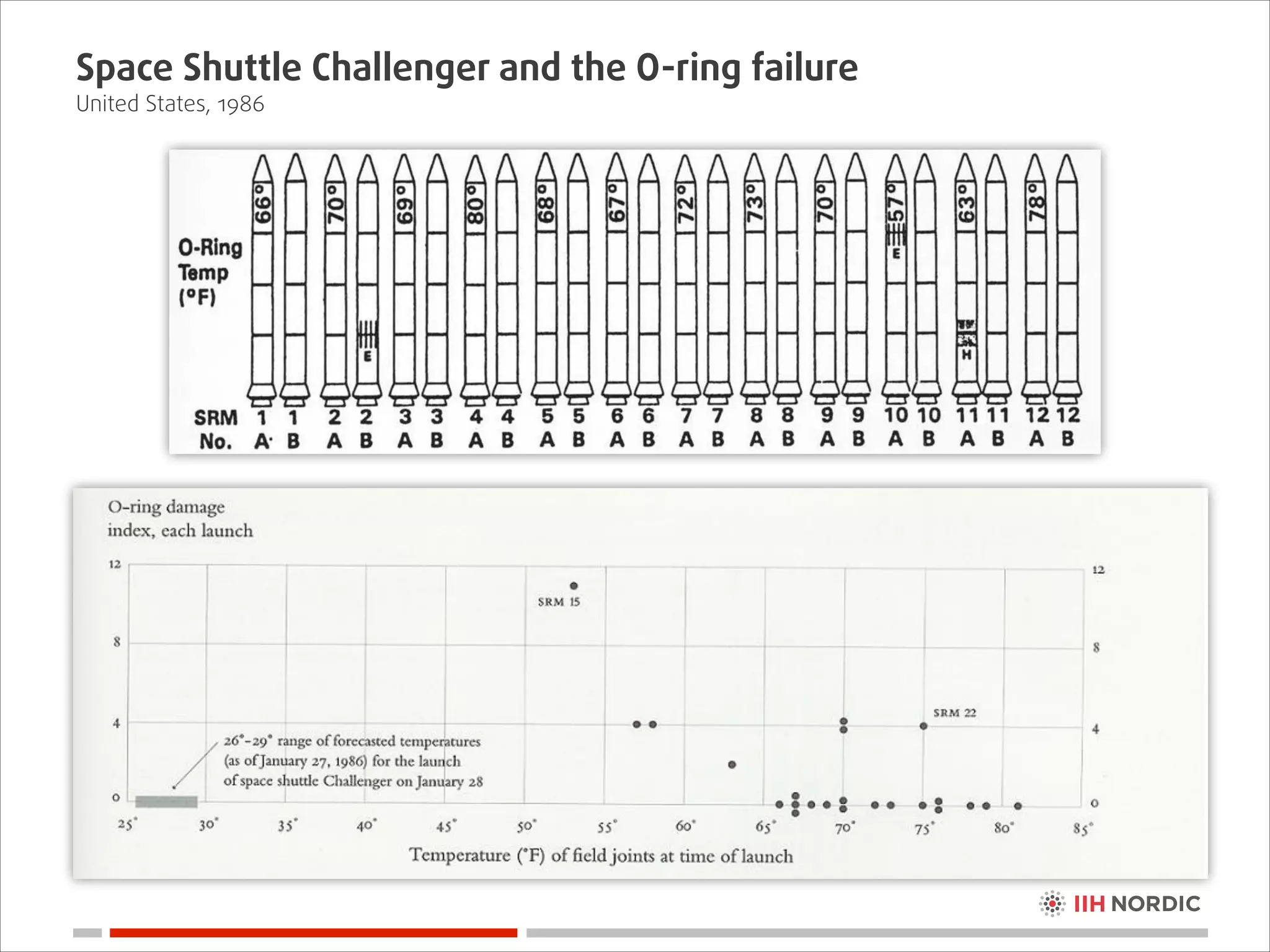
that lead to a disaster
(Space Shuttle Challenger, 1986)
Space Shuttle Challenger and the O-ring failure
United States, 1986
Space Shuttle Challenger and the O-ring failure
United States, 1986
Space Shuttle Challenger and the O-ring failure
United States, 1986
Space Shuttle Challenger and the O-ring failure
United States, 1986
Space Shuttle Challenger and the O-ring failure
United States, 1986
Space Shuttle Challenger and the O-ring failure
United States, 1986

The outcome

!
•

Challenger was destroyed at
11:39:13 am Eastern Standard
Time on January 28, 1986.


•

Seven crew members were killed

!
•

A two-and-a-half year grounding
of the NASA shuttle fleet.
Space Shuttle Challenger and the O-ring failure
United States, 1986

Edward Tufte (1942-)

!
•

American statistician and professor emeritus of political
science, statistics, and computer science at Yale University.

!
•

Pioneer in the field of data visualisation

!
•

Books

Tufte also invented sparklines
Space Shuttle Challenger and the O-ring failure
United States, 1986
Space Shuttle Challenger and the O-ring failure
United States, 1986

Edward Tufte's advice on sharing information

!
1. The most effective way of presenting information in a technical setting, is by
distributing a brief written report that can be read by all participants in the
first 5 to 10 minutes of the meeting.

2. The rest of the meeting is devoted to discussion and debate.
Aligning data visualisation to
your analytics processes
The definition of visual analytics
From data to visuals to action

Visual analytics is the representation and presentation
of data that EXPLOITS OUR VISUAL PERCEPTION
ABILITIES in order to AMPLIFY COGNITION.
- Andy Kirk, author of “Data Visualisation: a successful design process”
The visual sense is our dominating sense
From data to visuals to action

Source: astro.ku.dk/lys/synet.html
The core principals of data visualization
From data to visuals to action

What this means…
The core principals of data visualization
The visual elements
The core principals of data visualization
From data to visuals to action
The core principals of data visualization
From data to visuals to action
The core principals of data visualization
From data to visuals to action
How we THINK we’re using visual analytics
Chuck Norris style
…but the truth is something els!
And much more boring.
Visual Analytics Maturity Framework
Getting the data

Technology-centric,
engineering-oriented

Report
Store
Integrate
Convert
Clean
Collect
General Level
Inspired by the work of Stephen Few
Visual Analytics Maturity Framework
Going from data to visuals

Human-centric,
design-oriented

Predict
Monitor
Communicate

Technology-centric,
engineering-oriented

Analyse
Explore

Report
Store
Integrate
Convert
Clean
Collect
General Level
Inspired by the work of Stephen Few
Visual Analytics Maturity Framework
Making visual analytics part of the organisation

Business-centric,
changing behaviour

Transform
Human-centric,
design-oriented

Embed
Scale
Predict

Monitor
Communicate

Technology-centric,
engineering-oriented

Analyse
Explore

Report
Store
Integrate
Convert
Clean
Collect
General Level

CXO Level
Inspired by the work of Stephen Few
Takeaways
Key takeaways
Something to take home

Something to think about

• What question do you want to answer?
!
• Is this the best way to answer this question?
!
• Does the visualisation add value to the business?

• Are labels, titles and legends effective?
!
• Does the visualisation apply visual best practices?
!
• Is the visualisation right for the receiver / audience?

Taken from Sasha Pasulka, Senior Manager, Product Marketing, Tableau.
Stop guessing, just have a look below
Chart Suggestions - A Though-Starter
Variable Width
Column Chart

Table or Table with
Embedded Charts

Bar Chart

Column Chart

Circular Area Chart

Line Chart

Column Chart

Line Chart

Column Histogram

Scatter Chart
Line Histogram

Bubble Chart
Scatter Chart

3D Area Chart

Stacked 100%
Column Chart

Stacked
Column Chart

Stacked 100%
Area Chart

Stacked Area Chart

Pie Chart

Waterfall Chart

Source: http://www.extremepresentation.com/uploads/documents/choosing_a_good_chart.pdf

Stacked 100% Column Chart
with Subcomponents
Key takeaways
Helpful resources

Recommended readings for my infographics and visualisation:

!

Akeley, K. & Hanrahan, P. (2001). Real-Time Graphics Architecture. Retrieved November 2, 2013 from
www.graphics.stanford.edu_courses_cs448a-01-fall_lectures_lecture_renderman.2up.pdf.gz

!

Arthur, W.B. (1989). Competing technologies, increasing returns, and lock-in by historical events. Economic Journal 97: 642–665.

!

Charles Joseph Minard. (n.d.). In Wikipedia. Retrieved November 4, 2013 from http://en.wikipedia.org/wiki/
Charles_Joseph_Minard

!

Clair, C.L. (2012). BIG DATA, ANALYTICS, AND HOSPITAL READMISSION RATES. Retrieved November 1,
2013 from http://blogs.forrester.com/craig_le_clair/12-03-18-big_data_analytics_and_hospital _readmission_rates

!

Gualtieri, M. (2013). The Forrester Wave™: Big Data Predictive Analytics Solutions, Q1 2013. Retrieved
November 3, 2013 from http://www.forrester.com/pimages/rws/reprints/document/85601/oid/ 1-KWYFVB

!

VizWiz (2013). Retrieved November 1, 2013 from http://vizwiz.blogspot.dk/p/about-me.html

Few, S. C. (2012). Show Me the Numbers: Designing Tables and Graphs to Enlighten. Burlingame, CA:
Analytics Press.

!

Other awesome stuff: http://www.thefunctionalart.com/2012/10/recommended-readings-for-infographics.html

!

Doyle, A., C. (2003). The Complete Sherlock Holmes: Vol. 1. New York: NY. Barnes & Noble Classics.
Wise words from Sherlock Holms
Sir Arthur Conan Doyle’s book (2003)

It is of the highest importance in the art of detection
to be able to recognise, out of a number of facts, which
are incidental and which vital.


Otherwise your energy and attention must be
dissipated instead of being concentrated.
- Sherlock Holm, Private Detective
Questions?
CASPER BLICHER OLSEN
Digital Analytics & Insights Lead
Mail:
casper@iihnordic.com
Cell:
+45 6 1 3 1 40 07
Office: +45 70 20 29 1 9
IIH Nordic A/S, Lille Strandstraede 6
1254 Copenhagen K, Denmark

www.iihnordic.com

Denmark . Norway . Sweden

Thank you

Applying data visualisation to the analytics process

  • 1.
    Applying data visualisationto the analytics process Casper Blicher Olsen
  • 2.
    Let’s go backin time (The traveling industry)
  • 3.
  • 4.
    A lot haschanged Source:gizmodo.com
  • 5.
    Boeing during the70’s Source:gizmodo.com
  • 6.
  • 7.
    Let’s go backin time (Data Visualizations)
  • 8.
    Napoleon's disastrous Russiancampaign of 1812 Charles Joseph Minard (Paris, 1969) Charles Joseph Minard • Lived 1781–1870 ! • French civil engineer
 • Information graphics pioneer
 • Known for the graphical visualization on the left (also know as):
 “Carte figurative des pertes successives en hommes de l'Armée Française dans la campagne de Russie 1812-1813”
  • 9.
    World immigration during1858 Charles Joseph Minard (Paris, 1962) Charles Joseph Minard • Lived 1781–1870 ! • French civil engineer
 • Information graphics pioneer
  • 10.
    Flow visualisations (2014) GoogleAnalytics Google Analytics
 • Graphical representation of visitors’ flow
 • Nodes are automatically clustered according to an intelligence algorithm that groups together the most likely visitor flow through a site. ! • Option to drill down into any node.
  • 11.
    It (officially) startedin 1919 Worlds first book on informations graphics Get the book here: http://goo.gl/mI7Rzv
  • 12.
    It (officially) startedin 1919 Worlds first book on informations graphics Get the book here: http://goo.gl/mI7Rzv
  • 13.
    It (officially) startedin 1919 Worlds first book on informations graphics Get the book here: http://goo.gl/mI7Rzv
  • 14.
    Warning: do nottry this at home… …or at work!
  • 15.
    It (officially) startedin 1919 Worlds first book presenting a PIE CHART! Get the book here: http://goo.gl/mI7Rzv
  • 16.
    It’s the piechart! and the truth about it
  • 17.
    Don’t be a“Pie Charter” Seriously–don’t! Source: Urbandictionary
  • 18.
    The Pie Chart Round,tasty and full of colours The reason you should avoid the use of pie charts… Source: truefacts.dk
  • 19.
    The truth aboutpie charts before you can break the rules, you need to know them first Positive • Simple share of total.
 Negative • Whenever there is similarity in the information available, a pie chart is not • Charts are a way to take information the right chart to use.
 and make it more understandable. • Whenever there are multiple (3 or more) different points of data, a pie chart is not the right chart to use.
 • Pie charts are very easy to abuse. 
 • A pie chart is not the right chart to use if you need to label each percent.
  • 20.
    World's most accuratepie chart True story
  • 21.
    A misleading datavisualization that lead to a disaster (Space Shuttle Challenger, 1986)
  • 22.
    Space Shuttle Challengerand the O-ring failure United States, 1986
  • 23.
    Space Shuttle Challengerand the O-ring failure United States, 1986
  • 24.
    Space Shuttle Challengerand the O-ring failure United States, 1986
  • 25.
    Space Shuttle Challengerand the O-ring failure United States, 1986
  • 26.
    Space Shuttle Challengerand the O-ring failure United States, 1986
  • 27.
    Space Shuttle Challengerand the O-ring failure United States, 1986 The outcome ! • Challenger was destroyed at 11:39:13 am Eastern Standard Time on January 28, 1986.
 • Seven crew members were killed ! • A two-and-a-half year grounding of the NASA shuttle fleet.
  • 28.
    Space Shuttle Challengerand the O-ring failure United States, 1986 Edward Tufte (1942-) ! • American statistician and professor emeritus of political science, statistics, and computer science at Yale University. ! • Pioneer in the field of data visualisation ! • Books Tufte also invented sparklines
  • 29.
    Space Shuttle Challengerand the O-ring failure United States, 1986
  • 30.
    Space Shuttle Challengerand the O-ring failure United States, 1986 Edward Tufte's advice on sharing information ! 1. The most effective way of presenting information in a technical setting, is by distributing a brief written report that can be read by all participants in the first 5 to 10 minutes of the meeting.
 2. The rest of the meeting is devoted to discussion and debate.
  • 31.
    Aligning data visualisationto your analytics processes
  • 32.
    The definition ofvisual analytics From data to visuals to action Visual analytics is the representation and presentation of data that EXPLOITS OUR VISUAL PERCEPTION ABILITIES in order to AMPLIFY COGNITION. - Andy Kirk, author of “Data Visualisation: a successful design process”
  • 33.
    The visual senseis our dominating sense From data to visuals to action Source: astro.ku.dk/lys/synet.html
  • 34.
    The core principalsof data visualization From data to visuals to action What this means…
  • 35.
    The core principalsof data visualization The visual elements
  • 36.
    The core principalsof data visualization From data to visuals to action
  • 37.
    The core principalsof data visualization From data to visuals to action
  • 38.
    The core principalsof data visualization From data to visuals to action
  • 39.
    How we THINKwe’re using visual analytics Chuck Norris style
  • 40.
    …but the truthis something els! And much more boring.
  • 41.
    Visual Analytics MaturityFramework Getting the data Technology-centric, engineering-oriented Report Store Integrate Convert Clean Collect General Level Inspired by the work of Stephen Few
  • 42.
    Visual Analytics MaturityFramework Going from data to visuals Human-centric, design-oriented Predict Monitor Communicate Technology-centric, engineering-oriented Analyse Explore Report Store Integrate Convert Clean Collect General Level Inspired by the work of Stephen Few
  • 43.
    Visual Analytics MaturityFramework Making visual analytics part of the organisation Business-centric, changing behaviour Transform Human-centric, design-oriented Embed Scale Predict Monitor Communicate Technology-centric, engineering-oriented Analyse Explore Report Store Integrate Convert Clean Collect General Level CXO Level Inspired by the work of Stephen Few
  • 44.
  • 45.
    Key takeaways Something totake home Something to think about • What question do you want to answer? ! • Is this the best way to answer this question? ! • Does the visualisation add value to the business?
 • Are labels, titles and legends effective? ! • Does the visualisation apply visual best practices? ! • Is the visualisation right for the receiver / audience? Taken from Sasha Pasulka, Senior Manager, Product Marketing, Tableau.
  • 46.
    Stop guessing, justhave a look below Chart Suggestions - A Though-Starter Variable Width Column Chart Table or Table with Embedded Charts Bar Chart Column Chart Circular Area Chart Line Chart Column Chart Line Chart Column Histogram Scatter Chart Line Histogram Bubble Chart Scatter Chart 3D Area Chart Stacked 100% Column Chart Stacked Column Chart Stacked 100% Area Chart Stacked Area Chart Pie Chart Waterfall Chart Source: http://www.extremepresentation.com/uploads/documents/choosing_a_good_chart.pdf Stacked 100% Column Chart with Subcomponents
  • 47.
    Key takeaways Helpful resources Recommendedreadings for my infographics and visualisation: ! Akeley, K. & Hanrahan, P. (2001). Real-Time Graphics Architecture. Retrieved November 2, 2013 from www.graphics.stanford.edu_courses_cs448a-01-fall_lectures_lecture_renderman.2up.pdf.gz ! Arthur, W.B. (1989). Competing technologies, increasing returns, and lock-in by historical events. Economic Journal 97: 642–665. ! Charles Joseph Minard. (n.d.). In Wikipedia. Retrieved November 4, 2013 from http://en.wikipedia.org/wiki/ Charles_Joseph_Minard ! Clair, C.L. (2012). BIG DATA, ANALYTICS, AND HOSPITAL READMISSION RATES. Retrieved November 1, 2013 from http://blogs.forrester.com/craig_le_clair/12-03-18-big_data_analytics_and_hospital _readmission_rates ! Gualtieri, M. (2013). The Forrester Wave™: Big Data Predictive Analytics Solutions, Q1 2013. Retrieved November 3, 2013 from http://www.forrester.com/pimages/rws/reprints/document/85601/oid/ 1-KWYFVB ! VizWiz (2013). Retrieved November 1, 2013 from http://vizwiz.blogspot.dk/p/about-me.html
 Few, S. C. (2012). Show Me the Numbers: Designing Tables and Graphs to Enlighten. Burlingame, CA: Analytics Press. ! Other awesome stuff: http://www.thefunctionalart.com/2012/10/recommended-readings-for-infographics.html !
  • 48.
    Key takeaways Helpful resources Recommendedreadings for my infographics and visualisation: ! Akeley, K. & Hanrahan, P. (2001). Real-Time Graphics Architecture. Retrieved November 2, 2013 from www.graphics.stanford.edu_courses_cs448a-01-fall_lectures_lecture_renderman.2up.pdf.gz ! Arthur, W.B. (1989). Competing technologies, increasing returns, and lock-in by historical events. Economic Journal 97: 642–665. ! Charles Joseph Minard. (n.d.). In Wikipedia. Retrieved November 4, 2013 from http://en.wikipedia.org/wiki/ Charles_Joseph_Minard ! Clair, C.L. (2012). BIG DATA, ANALYTICS, AND HOSPITAL READMISSION RATES. Retrieved November 1, 2013 from http://blogs.forrester.com/craig_le_clair/12-03-18-big_data_analytics_and_hospital _readmission_rates ! Gualtieri, M. (2013). The Forrester Wave™: Big Data Predictive Analytics Solutions, Q1 2013. Retrieved November 3, 2013 from http://www.forrester.com/pimages/rws/reprints/document/85601/oid/ 1-KWYFVB ! VizWiz (2013). Retrieved November 1, 2013 from http://vizwiz.blogspot.dk/p/about-me.html
 Few, S. C. (2012). Show Me the Numbers: Designing Tables and Graphs to Enlighten. Burlingame, CA: Analytics Press. ! Other awesome stuff: http://www.thefunctionalart.com/2012/10/recommended-readings-for-infographics.html ! Doyle, A., C. (2003). The Complete Sherlock Holmes: Vol. 1. New York: NY. Barnes & Noble Classics.
  • 49.
    Wise words fromSherlock Holms Sir Arthur Conan Doyle’s book (2003) It is of the highest importance in the art of detection to be able to recognise, out of a number of facts, which are incidental and which vital. 
 Otherwise your energy and attention must be dissipated instead of being concentrated. - Sherlock Holm, Private Detective
  • 50.
  • 51.
    CASPER BLICHER OLSEN DigitalAnalytics & Insights Lead Mail: [email protected] Cell: +45 6 1 3 1 40 07 Office: +45 70 20 29 1 9 IIH Nordic A/S, Lille Strandstraede 6 1254 Copenhagen K, Denmark www.iihnordic.com Denmark . Norway . Sweden Thank you