SlideShare a Scribd company logo
Accessible

Button

Dropdown
Creating an
Introduction
My main role in recent times is to
work on the UX/UI and front-end
development of Pattern Libraries
for web applications.
However, I also work in the
Accessibility space. My focus in this
area is helping developers build
accessible web components for
complex Web apps.
One web component that can
present accessibility issues is the
button dropdown.
A button dropdown is where a
button is used to trigger the display
of contextual menus - such as a list
of links.
A diagram showing a button “Weyland Industries” with no dropdown displayed
A diagram showing a button “Weyland Industries” with the dropdown displayed below. 

The dropdown displays three options: “Weyland Industries”, “Stark Industries” and “Cyberdyne Systems”
We’re going to look at a range of
possible checkpoints that could
help make button dropdowns more
accessible.
We’ll use an imaginary example of a
button dropdown that allows users
to switch their current
organisation.
A diagram showing a button “Weyland Industries” with the dropdown displayed below. 

The dropdown displays three options: “Weyland Industries”, “Stark Industries” and “Cyberdyne Systems”
1.
Semantics
As the name suggests, the ideal
element that should be used for the
trigger, is the <button> element.
<button  type="button">  
    Weyland  Industries  
</button>
The fundamental difference between
buttons and links is that buttons
should do something (cause
something to happen), and links
should go somewhere (go to a
different location).
The markup for the dropdown
depends on the role of the items
inside. If the items are a list of links,
then an unordered list of links is
ideal.
<ul>  
    <li><a  href="#">Weyland  Industries</a></li>  
    <li><a  href="#">Stark  Industries</a></li>  
    <li><a  href="#">Cyberdyne  Systems</a></li>  
</ul>
2.
Getting to the button
Keyboard-only users should be
able to TAB to the button, which
then receives focus.
3.
Announcing the button
The aria-­‐label attribute can be
used to announce the button value
along with any additional
information to screen reader users.
For modern screen readers, the
aria-­‐label value will be
announced instead of the button
value.
<button  
    type="button"  
aria-­‐label="Current  company:  Weyland  Industries.  Use  
the  dropdown  menu  to  switch  companies"  
>  
    Weyland  Industries  
</button>
The aria-­‐haspopup="true"
attribute can be used to announce
the button as a “popup button” to
screen readers.
This is important, as it tells screen
reader users that it is a different
type of button - not a normal
button associated with submitting a
form etc.
<button  
    type="button"  
aria-­‐label="Current  company:  Weyland  Industries.  Use  
the  dropdown  menu  to  switch  companies"  
    aria-­‐haspopup="true"  
>  
    Weyland  Industries  
</button>
The aria-­‐expanded="false"
attribute can be used to announce
the current state of the popup
button to screen readers - i.e the
dropdown below the button is not
currently expanded.
The "false" value would need to
be changed to "true" via
JavaScript as soon as the user
triggers the button.
<button  
    type="button"  
aria-­‐label="Current  company:  Weyland  Industries.  Use  
the  dropdown  menu  to  switch  companies"  
    aria-­‐haspopup="true"  
    aria-­‐expanded="false"  
>  
    Weyland  Industries  
</button>
Alternatively, the aria-­‐
expanded="true" attribute could
be injected via JavaScript only
when the button is triggered -
which would reduce the amount of
information being announced.
4.
Triggering the button
For keyboard-only users, ENTER or
SPACEBAR strokes should trigger
the dropdown to appear.
5.
After the button is
triggered
If the aria-­‐expanded="false"
attribute is present in the default
button state, it should be changed
to aria-­‐expanded="true" via
JavaScript.
If the aria-­‐expanded="false"
attribute is not present in the
default button state, the aria-­‐
expanded="true" should be
injected via JavaScript.
<button  
    type="button"  
aria-­‐label="Current  company:  Weyland  Industries.  Use  
the  dropdown  menu  to  switch  companies"  
    aria-­‐haspopup="true"  
    aria-­‐expanded="true"  
>  
    Weyland  Industries  
</button>
Focus should immediately shift to
the <ul> element and the dropdown
should become visible.
This is something that most button
dropdown solutions do not solve
elegantly. In many cases, users
trigger the button but the focus
does not shift at all.
Users are either given silence after
they trigger the button, or the button
information is repeated again. This
can cause confusion for users who
cannot see that the dropdown has
been triggered, but nothing has
been announced.
The <ul> element could be given an
aria-­‐label value, which means
that when it receives focus, it’s
purpose is announced.
<ul  aria-­‐label="Switch  Companies">  
    <li><a  href="#">Weyland  Industries</a></li>  
    <li><a  href="#">Stark  Industries</a></li>  
    <li><a  href="#">Cyberdyne  Systems</a></li>  
</ul>  
A side note:

If the current organisation exists in
the long list of dropdown items, it
may be a good ideal to flag this item
as the current organisation for
screen reader users.
This can be achieved with a range
of different methods, including
providing additional information
that is hidden off-screen.
<ul  aria-­‐label="Switch  Companies">  
    <li>  
        <a  href="#">  
            <span  class="hidden">Current  company:  </span>  
            Weyland  Industries  
        </a>  
    </li>  
    <li><a  href="#">Stark  Industries</a></li>  
    <li><a  href="#">Cyberdyne  Systems</a></li>  
</ul>
8.
To escape the dropdown
For keyboard-only users, the ESC
keystroke should close the
dropdown and return focus to the
button.
7.
To navigate through
items within the
dropdown
When focus has shifted to the <ul>
element, keyboard-only users
should be able to use TAB, SHIFT
TAB, UP ARROW or DOWN
ARROW to move forwards or
backwards through the list items.
When users reach the start or end of
the list, UP ARROW and DOWN
ARROW keystrokes should then
have not have any effect.
8.
Selecting a dropdown
item
Keyboard-only users should be able
to select a dropdown menu item
using ENTER and possibly the
SPACEBAR keystrokes.
9.
To leave the dropdown
Keyboard-only users should be able
to TAB forward through the
dropdown items and then on to
other focusable items outside the
dropdown.
As soon focus leave the last
dropdown item, the dropdown
should disappear.
Users should be able to SHIFT
TAB backwards through the
dropdown items and back to the
button.
The dropdown should remain open
when the button receives focus.
(Users can close the dropdown by
triggering the button again).
Conclusion
So, that’s it. A few simple pointers
to help make button dropdowns
more accessible.

Thanks for listening!
Russ Weakley
Max Design
Site: maxdesign.com.au
Twitter: twitter.com/russmaxdesign
Slideshare: slideshare.net/maxdesign
Linkedin: linkedin.com/in/russweakley

More Related Content

What's hot (20)

PDF
Digital 2022 Western Sahara (February 2022) v01
DataReportal
 
PDF
The future of healthcare 2019
Future Agenda
 
PPT
Survival analysis
IbraahimAli3
 
PDF
An Update of Lot Quality Assurance Sampling (LQAS) Technologies Valdez
CORE Group
 
PPTX
BIG Data & Hadoop Applications in E-Commerce
Skillspeed
 
PDF
Digital 2022 Sweden (February 2022) v01
DataReportal
 
PDF
Digital 2023 United States Virgin Islands (February 2023) v01
DataReportal
 
PDF
Digital 2022 Azerbaijan (February 2022) v01
DataReportal
 
PDF
Tips for Effective Google Search
silpara
 
PDF
Digital 2022 France (February 2022) v02
DataReportal
 
PDF
Digital 2022: Essential Pinterest Stats for Q1 2022 v01
DataReportal
 
PDF
Digital 2022 October Global Statshot Report (Oct 2022) v02
DataReportal
 
PDF
Digital 2022 Hong Kong (February 2022) v01
DataReportal
 
PPTX
Applications of Virtual Reality
NEETHU S JAYAN
 
PDF
Chapter 6 data analysis iec11
Ho Cao Viet
 
PDF
Digital 2023 Australia (February 2023) v01
DataReportal
 
PPTX
Digital marketing in pharma - trends and way ahead
Ranajay Sengupta
 
PPTX
VR in Education: How Virtual Reality Can Impact Learning
Hugh Seaton
 
PDF
Digital 2022 Libya (February 2022) v01
DataReportal
 
PPT
Data Analysis
sikander kushwaha
 
Digital 2022 Western Sahara (February 2022) v01
DataReportal
 
The future of healthcare 2019
Future Agenda
 
Survival analysis
IbraahimAli3
 
An Update of Lot Quality Assurance Sampling (LQAS) Technologies Valdez
CORE Group
 
BIG Data & Hadoop Applications in E-Commerce
Skillspeed
 
Digital 2022 Sweden (February 2022) v01
DataReportal
 
Digital 2023 United States Virgin Islands (February 2023) v01
DataReportal
 
Digital 2022 Azerbaijan (February 2022) v01
DataReportal
 
Tips for Effective Google Search
silpara
 
Digital 2022 France (February 2022) v02
DataReportal
 
Digital 2022: Essential Pinterest Stats for Q1 2022 v01
DataReportal
 
Digital 2022 October Global Statshot Report (Oct 2022) v02
DataReportal
 
Digital 2022 Hong Kong (February 2022) v01
DataReportal
 
Applications of Virtual Reality
NEETHU S JAYAN
 
Chapter 6 data analysis iec11
Ho Cao Viet
 
Digital 2023 Australia (February 2023) v01
DataReportal
 
Digital marketing in pharma - trends and way ahead
Ranajay Sengupta
 
VR in Education: How Virtual Reality Can Impact Learning
Hugh Seaton
 
Digital 2022 Libya (February 2022) v01
DataReportal
 
Data Analysis
sikander kushwaha
 

Similar to Creating an Accessible button dropdown (20)

PDF
Accessibility microinteractions: better user experience, happier developers
Aidan Tierney
 
PPTX
Web accessibility
Afif Alfiano
 
PDF
Building Accessible Web Components
Russ Weakley
 
PDF
Front End Frameworks - are they accessible
Russ Weakley
 
PDF
ARIA Serious
Eric Eggert
 
PDF
Neue Infos rund um WCAG 2.0
Eric Eggert
 
PDF
Keyboard and Interaction Accessibility Techniques
Jared Smith
 
PDF
CSS Disable Button - How to Disable Buttons Using CSS - Blogs
RonDosh
 
PDF
Accidentally becoming accessibility champions - Chris Gibbons & Anya Braun [C...
Nexer Digital
 
PPT
Module-5-screen based control (1).ppt
SuneelShinde4
 
PPT
Module-5-screen based control.ppt
SuneelShinde4
 
PDF
Accessible modal windows
Russ Weakley
 
KEY
Keyboard Access APIs
toddkloots
 
PPT
Devices on the Web (2.0)
Gurpreet Singh
 
PPTX
BUTTONS.pptx
praneethpcs20
 
PDF
Search Views Guidelines
Fabien Pinckaers
 
PPT
Navigation Bar Presentation
Sarahcondliffe
 
PPTX
HTML Forms: The HTML element represents a document section containing interac...
BINJAD1
 
PDF
a11yTO - Web Accessibility for Developers
Monika Piotrowicz
 
PPTX
Rich Internet Applications - How to Make them Accessible
Dylan Barrell
 
Accessibility microinteractions: better user experience, happier developers
Aidan Tierney
 
Web accessibility
Afif Alfiano
 
Building Accessible Web Components
Russ Weakley
 
Front End Frameworks - are they accessible
Russ Weakley
 
ARIA Serious
Eric Eggert
 
Neue Infos rund um WCAG 2.0
Eric Eggert
 
Keyboard and Interaction Accessibility Techniques
Jared Smith
 
CSS Disable Button - How to Disable Buttons Using CSS - Blogs
RonDosh
 
Accidentally becoming accessibility champions - Chris Gibbons & Anya Braun [C...
Nexer Digital
 
Module-5-screen based control (1).ppt
SuneelShinde4
 
Module-5-screen based control.ppt
SuneelShinde4
 
Accessible modal windows
Russ Weakley
 
Keyboard Access APIs
toddkloots
 
Devices on the Web (2.0)
Gurpreet Singh
 
BUTTONS.pptx
praneethpcs20
 
Search Views Guidelines
Fabien Pinckaers
 
Navigation Bar Presentation
Sarahcondliffe
 
HTML Forms: The HTML element represents a document section containing interac...
BINJAD1
 
a11yTO - Web Accessibility for Developers
Monika Piotrowicz
 
Rich Internet Applications - How to Make them Accessible
Dylan Barrell
 
Ad

More from Russ Weakley (20)

PDF
Accessible chat windows
Russ Weakley
 
PDF
Accessible names & descriptions
Russ Weakley
 
PDF
A deep dive into accessible names
Russ Weakley
 
PDF
What are accessible names and why should you care?
Russ Weakley
 
PDF
How to build accessible UI components
Russ Weakley
 
PDF
What is WCAG 2 and why should we care?
Russ Weakley
 
PDF
Accessible states in Design Systems
Russ Weakley
 
PDF
Creating accessible modals and autocompletes
Russ Weakley
 
PDF
Building an accessible progressive loader
Russ Weakley
 
PDF
Accessibility in Design systems - the pain and glory
Russ Weakley
 
PDF
Accessible Inline errors messages
Russ Weakley
 
PDF
Accessible Form Hints and Errors
Russ Weakley
 
PDF
What is accessibility?
Russ Weakley
 
PDF
Accessibility in Pattern Libraries
Russ Weakley
 
PDF
Accessibility in pattern libraries
Russ Weakley
 
PDF
Building an accessible auto-complete - #ID24
Russ Weakley
 
PDF
Building an accessible auto-complete
Russ Weakley
 
PDF
Creating Acessible floating labels
Russ Weakley
 
PDF
Creating a Simple, Accessible On/Off Switch
Russ Weakley
 
PDF
Accessible custom radio buttons and checkboxes
Russ Weakley
 
Accessible chat windows
Russ Weakley
 
Accessible names & descriptions
Russ Weakley
 
A deep dive into accessible names
Russ Weakley
 
What are accessible names and why should you care?
Russ Weakley
 
How to build accessible UI components
Russ Weakley
 
What is WCAG 2 and why should we care?
Russ Weakley
 
Accessible states in Design Systems
Russ Weakley
 
Creating accessible modals and autocompletes
Russ Weakley
 
Building an accessible progressive loader
Russ Weakley
 
Accessibility in Design systems - the pain and glory
Russ Weakley
 
Accessible Inline errors messages
Russ Weakley
 
Accessible Form Hints and Errors
Russ Weakley
 
What is accessibility?
Russ Weakley
 
Accessibility in Pattern Libraries
Russ Weakley
 
Accessibility in pattern libraries
Russ Weakley
 
Building an accessible auto-complete - #ID24
Russ Weakley
 
Building an accessible auto-complete
Russ Weakley
 
Creating Acessible floating labels
Russ Weakley
 
Creating a Simple, Accessible On/Off Switch
Russ Weakley
 
Accessible custom radio buttons and checkboxes
Russ Weakley
 
Ad

Recently uploaded (20)

PPTX
PPT-Q1-WK-3-ENGLISH Revised Matatag Grade 3.pptx
reijhongidayawan02
 
PDF
DIGESTION OF CARBOHYDRATES,PROTEINS,LIPIDS
raviralanaresh2
 
PPTX
grade 5 lesson matatag ENGLISH 5_Q1_PPT_WEEK4.pptx
SireQuinn
 
PDF
ARAL-Orientation_Morning-Session_Day-11.pdf
JoelVilloso1
 
PPTX
Post Dated Cheque(PDC) Management in Odoo 18
Celine George
 
PPTX
PPT-Q1-WEEK-3-SCIENCE-ERevised Matatag Grade 3.pptx
reijhongidayawan02
 
PPTX
GRADE-3-PPT-EVE-2025-ENG-Q1-LESSON-1.pptx
EveOdrapngimapNarido
 
PDF
Exploring the Different Types of Experimental Research
Thelma Villaflores
 
PPTX
Unit 2 COMMERCIAL BANKING, Corporate banking.pptx
AnubalaSuresh1
 
PDF
Generative AI: it's STILL not a robot (CIJ Summer 2025)
Paul Bradshaw
 
PPTX
How to Create Odoo JS Dialog_Popup in Odoo 18
Celine George
 
PPT
Talk on Critical Theory, Part One, Philosophy of Social Sciences
Soraj Hongladarom
 
PDF
CONCURSO DE POESIA “POETUFAS – PASSOS SUAVES PELO VERSO.pdf
Colégio Santa Teresinha
 
PPTX
Growth and development and milestones, factors
BHUVANESHWARI BADIGER
 
PPTX
Cultivation practice of Litchi in Nepal.pptx
UmeshTimilsina1
 
PDF
Reconstruct, Restore, Reimagine: New Perspectives on Stoke Newington’s Histor...
History of Stoke Newington
 
PDF
Horarios de distribución de agua en julio
pegazohn1978
 
PPTX
How to Manage Large Scrollbar in Odoo 18 POS
Celine George
 
PPTX
Identifying elements in the story. Arrange the events in the story
geraldineamahido2
 
PDF
The History of Phone Numbers in Stoke Newington by Billy Thomas
History of Stoke Newington
 
PPT-Q1-WK-3-ENGLISH Revised Matatag Grade 3.pptx
reijhongidayawan02
 
DIGESTION OF CARBOHYDRATES,PROTEINS,LIPIDS
raviralanaresh2
 
grade 5 lesson matatag ENGLISH 5_Q1_PPT_WEEK4.pptx
SireQuinn
 
ARAL-Orientation_Morning-Session_Day-11.pdf
JoelVilloso1
 
Post Dated Cheque(PDC) Management in Odoo 18
Celine George
 
PPT-Q1-WEEK-3-SCIENCE-ERevised Matatag Grade 3.pptx
reijhongidayawan02
 
GRADE-3-PPT-EVE-2025-ENG-Q1-LESSON-1.pptx
EveOdrapngimapNarido
 
Exploring the Different Types of Experimental Research
Thelma Villaflores
 
Unit 2 COMMERCIAL BANKING, Corporate banking.pptx
AnubalaSuresh1
 
Generative AI: it's STILL not a robot (CIJ Summer 2025)
Paul Bradshaw
 
How to Create Odoo JS Dialog_Popup in Odoo 18
Celine George
 
Talk on Critical Theory, Part One, Philosophy of Social Sciences
Soraj Hongladarom
 
CONCURSO DE POESIA “POETUFAS – PASSOS SUAVES PELO VERSO.pdf
Colégio Santa Teresinha
 
Growth and development and milestones, factors
BHUVANESHWARI BADIGER
 
Cultivation practice of Litchi in Nepal.pptx
UmeshTimilsina1
 
Reconstruct, Restore, Reimagine: New Perspectives on Stoke Newington’s Histor...
History of Stoke Newington
 
Horarios de distribución de agua en julio
pegazohn1978
 
How to Manage Large Scrollbar in Odoo 18 POS
Celine George
 
Identifying elements in the story. Arrange the events in the story
geraldineamahido2
 
The History of Phone Numbers in Stoke Newington by Billy Thomas
History of Stoke Newington
 

Creating an Accessible button dropdown

  • 3. My main role in recent times is to work on the UX/UI and front-end development of Pattern Libraries for web applications.
  • 4. However, I also work in the Accessibility space. My focus in this area is helping developers build accessible web components for complex Web apps.
  • 5. One web component that can present accessibility issues is the button dropdown.
  • 6. A button dropdown is where a button is used to trigger the display of contextual menus - such as a list of links.
  • 7. A diagram showing a button “Weyland Industries” with no dropdown displayed
  • 8. A diagram showing a button “Weyland Industries” with the dropdown displayed below. The dropdown displays three options: “Weyland Industries”, “Stark Industries” and “Cyberdyne Systems”
  • 9. We’re going to look at a range of possible checkpoints that could help make button dropdowns more accessible.
  • 10. We’ll use an imaginary example of a button dropdown that allows users to switch their current organisation.
  • 11. A diagram showing a button “Weyland Industries” with the dropdown displayed below. The dropdown displays three options: “Weyland Industries”, “Stark Industries” and “Cyberdyne Systems”
  • 13. As the name suggests, the ideal element that should be used for the trigger, is the <button> element.
  • 14. <button  type="button">      Weyland  Industries   </button>
  • 15. The fundamental difference between buttons and links is that buttons should do something (cause something to happen), and links should go somewhere (go to a different location).
  • 16. The markup for the dropdown depends on the role of the items inside. If the items are a list of links, then an unordered list of links is ideal.
  • 17. <ul>      <li><a  href="#">Weyland  Industries</a></li>      <li><a  href="#">Stark  Industries</a></li>      <li><a  href="#">Cyberdyne  Systems</a></li>   </ul>
  • 19. Keyboard-only users should be able to TAB to the button, which then receives focus.
  • 21. The aria-­‐label attribute can be used to announce the button value along with any additional information to screen reader users.
  • 22. For modern screen readers, the aria-­‐label value will be announced instead of the button value.
  • 23. <button      type="button"   aria-­‐label="Current  company:  Weyland  Industries.  Use   the  dropdown  menu  to  switch  companies"   >      Weyland  Industries   </button>
  • 24. The aria-­‐haspopup="true" attribute can be used to announce the button as a “popup button” to screen readers.
  • 25. This is important, as it tells screen reader users that it is a different type of button - not a normal button associated with submitting a form etc.
  • 26. <button      type="button"   aria-­‐label="Current  company:  Weyland  Industries.  Use   the  dropdown  menu  to  switch  companies"      aria-­‐haspopup="true"   >      Weyland  Industries   </button>
  • 27. The aria-­‐expanded="false" attribute can be used to announce the current state of the popup button to screen readers - i.e the dropdown below the button is not currently expanded.
  • 28. The "false" value would need to be changed to "true" via JavaScript as soon as the user triggers the button.
  • 29. <button      type="button"   aria-­‐label="Current  company:  Weyland  Industries.  Use   the  dropdown  menu  to  switch  companies"      aria-­‐haspopup="true"      aria-­‐expanded="false"   >      Weyland  Industries   </button>
  • 30. Alternatively, the aria-­‐ expanded="true" attribute could be injected via JavaScript only when the button is triggered - which would reduce the amount of information being announced.
  • 32. For keyboard-only users, ENTER or SPACEBAR strokes should trigger the dropdown to appear.
  • 33. 5. After the button is triggered
  • 34. If the aria-­‐expanded="false" attribute is present in the default button state, it should be changed to aria-­‐expanded="true" via JavaScript.
  • 35. If the aria-­‐expanded="false" attribute is not present in the default button state, the aria-­‐ expanded="true" should be injected via JavaScript.
  • 36. <button      type="button"   aria-­‐label="Current  company:  Weyland  Industries.  Use   the  dropdown  menu  to  switch  companies"      aria-­‐haspopup="true"      aria-­‐expanded="true"   >      Weyland  Industries   </button>
  • 37. Focus should immediately shift to the <ul> element and the dropdown should become visible.
  • 38. This is something that most button dropdown solutions do not solve elegantly. In many cases, users trigger the button but the focus does not shift at all.
  • 39. Users are either given silence after they trigger the button, or the button information is repeated again. This can cause confusion for users who cannot see that the dropdown has been triggered, but nothing has been announced.
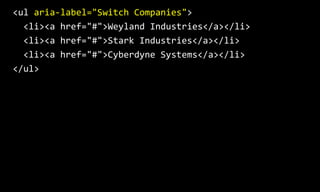
  • 40. The <ul> element could be given an aria-­‐label value, which means that when it receives focus, it’s purpose is announced.
  • 41. <ul  aria-­‐label="Switch  Companies">      <li><a  href="#">Weyland  Industries</a></li>      <li><a  href="#">Stark  Industries</a></li>      <li><a  href="#">Cyberdyne  Systems</a></li>   </ul>  
  • 42. A side note:
 If the current organisation exists in the long list of dropdown items, it may be a good ideal to flag this item as the current organisation for screen reader users.
  • 43. This can be achieved with a range of different methods, including providing additional information that is hidden off-screen.
  • 44. <ul  aria-­‐label="Switch  Companies">      <li>          <a  href="#">              <span  class="hidden">Current  company:  </span>              Weyland  Industries          </a>      </li>      <li><a  href="#">Stark  Industries</a></li>      <li><a  href="#">Cyberdyne  Systems</a></li>   </ul>
  • 45. 8. To escape the dropdown
  • 46. For keyboard-only users, the ESC keystroke should close the dropdown and return focus to the button.
  • 47. 7. To navigate through items within the dropdown
  • 48. When focus has shifted to the <ul> element, keyboard-only users should be able to use TAB, SHIFT TAB, UP ARROW or DOWN ARROW to move forwards or backwards through the list items.
  • 49. When users reach the start or end of the list, UP ARROW and DOWN ARROW keystrokes should then have not have any effect.
  • 51. Keyboard-only users should be able to select a dropdown menu item using ENTER and possibly the SPACEBAR keystrokes.
  • 52. 9. To leave the dropdown
  • 53. Keyboard-only users should be able to TAB forward through the dropdown items and then on to other focusable items outside the dropdown.
  • 54. As soon focus leave the last dropdown item, the dropdown should disappear.
  • 55. Users should be able to SHIFT TAB backwards through the dropdown items and back to the button.
  • 56. The dropdown should remain open when the button receives focus. (Users can close the dropdown by triggering the button again).
  • 58. So, that’s it. A few simple pointers to help make button dropdowns more accessible. Thanks for listening!
  • 59. Russ Weakley Max Design Site: maxdesign.com.au Twitter: twitter.com/russmaxdesign Slideshare: slideshare.net/maxdesign Linkedin: linkedin.com/in/russweakley