SlideShare a Scribd company logo
CSS for Developers
MD. Sayyedul Islam
Software Engineer
Nascenia Ltd.
CSS Box Model
All HTML elements can be considered as boxes. It includes:
Content (text, images)
Padding
Border
Margin
div {
border: 25px solid orange;
padding: 25px;
margin: 25px;
CSS3 Box Sizing
By default, the width and height of an element is calculated like this:
width + padding + border = actual width of an element
height + padding + border = actual height of an element
.div1 {
width: 300px;
height: 100px;
border: 1px solid blue;
padding: 20px;
}
Calculated width: 300(original width) + 40(padding-left: 20 + padding-right: 20) + 2(border-left: 1 + border-
right: 1) = 342px
Calculated height: 100(original height) + 40(padding-top: 20 + padding-bottom: 20) + 2(border-top: 1 +
border-bottom: 1) = 142px
CSS3 Box Sizing (continued..)
.div2 {
width: 300px;
height: 100px;
border: 1px solid blue;
padding: 20px;
box-sizing: border-box;
}
Make it global:
* {
-webkit-box-sizing: border-box;
-moz-box-sizing: border-box;
box-sizing: border-box;
}
:after, :before {
-webkit-box-sizing: border-box;
-moz-box-sizing: border-box;
box-sizing: border-box;
}
Float & Clear
<div class="box-section">
<div class="box pull-left">Div 1</div>
<div class="box pull-left">Div 2</div>
</div>
.box {
width: 50%;
height: 100px;
padding: 20px;
}
.pull-left {
float: left;
}
.box-section {
padding: 20px;
background: orange;
}
Float & Clear (continued..)
Solution 1:
<div class="box-section">
<div class="box pull-left">Div 1</div>
<div class="box pull-left">Div 2</div>
<div class="clear"></div>
</div>
.clear {
clear: both;
}
Solution 2 (better):
<div class="box-section clearfix">
<div class="box pull-left">Div 1</div>
<div class="box pull-left">Div 2</div>
</div>
.clearfix:before,
.clearfix:after {
display: table;
content: " ";
}
.clearfix:after {
clear: both;
}
Float & Clear (continued..)
CSS Pseudo-elements
A CSS pseudo-element is used to style
specified parts of an element.
Some pseudo-elements are:
:first-letter
:first-line
:selection
:before
:after
<h1>This is a heading</h1>
h1:before {
content: url('smiley.gif');
}
<ul>
<li><a href=”#”>Home</a></li>
<li><a href=”#”>About Us</a></li>
<li><a href=”#”>Contact</a></li>
</ul>
li:after {
content: '/';
}
CSS Pseudo-classes
A pseudo-class is used to define a special state of an element.
Some pseudo-classes are:
:hover
:focus
:first-child
:last-of-type
:not(selector)
:nth-child(n)
:nth-of-type(n)
The Difference Between :nth-child and :nth-of-type
<section>
<h1>Words</h1>
<p>One</p>
<p>Two</p> <!-- Want this one -->
<p>Three</p>
<p>Four</p>
</section>
:nth-child(n) - p:nth-child(2)
Selects every <p> element that is the second child of its
parent
:nth-of-type(n) - p:nth-of-type(2)
Selects every <p> element that is the second <p>
element of its parent
p:nth-child(2) { color: red; }
p:nth-of-type(2) { color: red; }
Some CSS Selectors
<div id="container">
<ul>
<li> List Item
<ul>
<li> Child </li>
</ul>
</li>
<li> List Item </li>
</ul>
</div>
#container ul {
border: 1px solid white;
}
#container > ul {
border: 1px solid white;
}
The difference between the standard X Y and X > Y is
that the latter will only select direct children.
Some CSS Selectors (continued..)
ul + p {
color: red;
}
X + Y will select only the element that is placed
immediately after the former element.
ul ~ p {
color: red;
}
X ~ Y will select, referring to our example above,
any p elements, as long as they follow a ul
Position
Mainly, there are 4 values:
Static: Default value. Elements render in order, as they appear in the document
flow
Relative: The element is positioned relative to its normal position
Absolute: The element is positioned directly in relation to their containing
parent whom is relatively or absolutely positioned.
Fixed: The element is positioned relative to the browser window
Position: static
Considering this HTML:
<div class="box-set">
<div class="box box-1">Box 1</div>
<div class="box box-2">Box 2</div>
<div class="box box-3">Box 3</div>
<div class="box box-4">Box 4</div>
</div>
CSS:
.box-set {
background: #eaeaed;
position: static;
}
.box {
position: static;
}
Position: relative & absolute
.box-set {
background: #eaeaed;
}
.box-1 {
left: 10px;
top: 10px;
}
.box-2 {
bottom: 10px;
left: 70px;
}
.box-3 {
left: 130px;
top: 10px;
}
.box-4 {
bottom: 10px;
left: 190px;
}
.box-set {
background: #eaeaed;
min-height: 160px;
position: relative;
}
.box {
position: absolute;
}
.box {
position: relative;
}
Position: fixed
.box-set {
background: #eaeaed;
min-height: 160px;
}
.box {
position: fixed;
}
Z-Index
.box-set {
background: #eaeaed;
min-height: 160px;
position: relative;
}
.box {
position: absolute;
}
.box-1 {
left: 10px;
top: 10px;
}
.box-2 {
bottom: 10px;
left: 70px;
z-index: 3;
}
.box-3 {
left: 130px;
top: 10px;
z-index: 2;
}
.box-4 {
bottom: 10px;
left: 190px;
z-index: 1;
}
Display
<div>
Sample text………... <span class="different-
text">Max und Moritz</span> …….. Sample text
</div>
.different-text { display: inline; }
.different-text { display: inline-block; }
.different-text { display: block; }
Flexible Box Model
<div class="container">
<div class="box">1</div>
<div class="box">2</div>
<div class="box">3</div>
</div>
.container {
display: flex;
}
.box {
width: 200px;
height: 200px;
margin: auto;
}
Flexible Box Model (continued..)
Order:
.box:nth-child(1) {
order: 2;
}
.box:nth-child(2) {
order: 3;
}
.box:nth-child(1) {
order: 1;
}
Flexible Box Model (continued..)
Equal Length Columns:
<div class="column-container">
<div class="column">
<p>Sample text...</p>
</div>
<div class="column">
<p>Sample text...</p>
</div>
<div class="column">
<p>Sample text...</p>
</div>
</div>
.column-container {
display: flex;
align-items: stretch;
}
.column {
width: 33%;
padding: 20px;
}
Flexible Box Model (continued..)
Vertical Centering:
<div class="box vertical-center-container">
Sample Text
</div>
CSS Flexible box Reference:
https://css-tricks.com/snippets/css/a-guide-to-flexbox
https://paulund.co.uk/css-flexbox
.vertical-center-container {
display: flex;
align-items: center;
}
CSS calc() Function
<div class="row">
<div class="col-sm-2">
<img src="images/person.jpg" alt="Person"
class="person-img img-responsive" />
</div>
<div class="col-sm-10">
<p>Sample text...</p>
</div>
</div>
.person-img {
width: 50px;
}
CSS calc() Function (continued..)
<div class="clearfix">
<div class="person-img-block pull-left">
<img src="images/person.jpg" alt="Person"
class="person-img img-responsive" />
</div>
<div class="person-info pull-left">
<p>Sample text...</p>
</div>
</div>
.person-img-block {
width: 50px;
margin-right: 20px;
}
.person-info {
width: calc(100% - 70px);
}
CSS calc() Function (continued..)
<div class="row">
<div class="col-sm-6 col-sm-offset-3">
<div class="content">
<p>Sample text...</p>
</div>
</div>
</div>
.content {
padding: 20px 25px;
border: 1px solid #eee;
background-color: #f1f1f1;
color: #333;
}
CSS calc() Function (continued..)
<div class="content">
<p>Sample text...</p>
</div>
.content {
width: 500px;
margin-left: calc((100% - 500px)/2);
padding: 20px 30px;
border: 1px solid #eee;
background-color: #f1f1f1;
color: #333;
}
PX, EM or REM?
px: The pixels are an absolute unit of measurement. In
practice, they aren’t the same length everywhere because
different devices treat them differently, but on each device a
pixel is always the same.
em: Relative to the font-size of the element (2em means 2
times the size of the current font).
rem: Relative to font-size of the root element.
PX, EM or REM? (continued..)
Rems are better.
Px are still safe.
Reference:
https://benfrain.com/just-use-pixels
http://engageinteractive.co.uk/blog/em-vs-rem-vs-px
https://zellwk.com/blog/media-query-units
https://alastairc.ac/2017/04/px-em-or-rem-media-queries-different-conclusion
Legible Font Sizes
body {
font-size: 16px;
}
h2 {
font-size: 32px; /* 200% of the baseline */
}
.large {
font-size: 20px; /* 125% of the baseline */
}
.medium-small {
font-size: 13.6px; /* 85% of the baseline */
}
body {
font-size: 1rem; /* 16px */
}
h2 {
font-size: 2rem; /* 32px */
}
.large {
font-size: 1.25rem; /* 20px */
}
.medium-small {
font-size: 0.85rem; /* 13.6px */
}
Reference:
https://developers.google.com/speed/docs/insights/UseLegibleFontSizes
Web Fonts (font-face)
Deepest Possible Browser Support:
@font-face {
font-family: 'MyWebFont';
src: url('webfont.eot'); /* IE9 Compat Modes */
src: url('webfont.eot?#iefix') format('embedded-
opentype'), /* IE6-IE8 */
url('webfont.woff2') format('woff2'), /* Super Modern
Browsers */
url('webfont.woff') format('woff'), /* Pretty Modern
Browsers */
url('webfont.ttf') format('truetype'), /* Safari,
Android, iOS */
url('webfont.svg#svgFontName') format('svg'); /*
Legacy iOS */
font-weight: normal;
font-style: normal;
}
Practical Level of Browser Support:
@font-face {
font-family: 'MyWebFont';
src: url('myfont.woff2') format('woff2'),
url('myfont.woff') format('woff');
font-weight: normal;
font-style: normal;
}
body {
font-family: 'MyWebFont', Fallback, sans-serif;
}
Web Fonts (font-face) (continued..)
<p>All of us have been through the dreaded
experience of <strong>sleepless
nights</strong> before the exam day.</p>
body {
font-family: 'Roboto-Regular';
}
strong {
font-family: 'Roboto-Bold';
}
Correct Way:
b, strong {
font-family: 'Roboto-Bold';
font-weight: normal;
}
Google Web Fonts
<link
href="https://fonts.googleapis.com/css?family=Open+Sans:400,400i,600,600i,700"
rel="stylesheet">
body {
font-family: 'Open Sans', sans-serif;
font-weight: 400;
}
.semibold {
font-weight: 600;
}
b, strong, .bold {
font-weight: 700;
}
i {
font-style: italic;
font-weight: 400;
}
.semibold-italic {
font-style: italic;
font-weight: 600;
}
Media Query
@media (max-width: 1199px) {
}
@media (min-width: 1025px)
and (max-width: 1199px) {
}
@media (min-width: 992px)
and (max-width: 1024px) {
}
@media (max-width: 991px) {
}
@media (max-width: 767px) {
}
@media (min-width: 576px)
and (max-width: 767px) {
}
Breakpoints:
Extra small devices /
Phones: (<768px)
Small devices / Tablets:
(≥768px)
Medium devices / Desktops:
(≥992px)
Large devices / Desktops:
(≥1200px)
Mobile First Design
Media Query (continued..)
@media (max-width: 767px) {
}
@media (min-width: 576px)
and (max-width: 767px) {
}
@media (max-device-width: 480px)
and (orientation: landscape) {
}
@media (min-width: 768px) {
}
@media (min-width: 992px) {
}
@media (min-width: 1024px)
and (max-width: 1199px) {
}
@media (min-width: 1200px) {
}
Media Query (continued..)
/* ==== Non-Mobile First Method ==== */
/* Extra small devices / Phones */
@media (max-width: 1199px) {
}
@media (max-width: 991px) {
}
@media (max-width: 767px) {
}
/* ==== Mobile First Method ==== */
/* Small devices / Tablets */
@media (min-width: 768px) {
}
/* Medium devices / Desktops */
@media (min-width: 992px) {
}
/* Large devices / Desktops */
@media (min-width: 1200px) {
}
Benefits of CSS Preprocessors (LESS, SASS etc.)
$variables
$color-green: #91ea42;
.text-green {
color: $color-green;
}
.button-green {
background: $color-green;
}
@imports
@import 'partials/sidebar.scss';
@mixins
@mixin border-radius($radius) {
-webkit-border-radius: $radius;
-moz-border-radius: $radius;
-ms-border-radius: $radius;
border-radius: $radius;
}
.box {
@include border-radius(10px);
width: 100px;
height: 100px;
}
//compiled to:
.box {
-webkit-border-radius: 10px;
-moz-border-radius: 10px;
-ms-border-radius: 10px;
border-radius: 10px;
width: 100px;
height: 100px;
}
CSS Preprocessors (LESS, SASS etc.) (continued..)
@extend
.button {
display: block;
border-radius: 3px;
padding: 16px;
}
.button-green {
@extend .button;
color: $text-light;
background: $color-green;
}
//compiled to
.button, .button-green {
display: block;
border-radius: 3px;
padding: 16px;
}
.button-green {
color: #ccc;
background: #91ea42;
}
CSS Preprocessors (LESS, SASS etc.) (continued..)
When to use @extend; when to use a mixin
@extend should be used only when the rulesets which are being tried to DRY out are inherently and
thematically related.
Reference:
http://vanseodesign.com/css/sass-mixin-or-extend
https://csswizardry.com/2014/11/when-to-use-extend-when-to-use-a-mixin
Helper Classes for Margin & Padding
<div class="box">
<p>Sample text...</p>
</div>
.box {
margin: 20px 10px 20px;
padding: 15px;
}
@media (min-width: 768px) {
.box {
margin: 20px 30px 30px;
padding: 20px;
}
}
<div class="
box xs-mt-20 xs-mx-10 xs-mb-20 xs-p-15
sm-mx-30 sm-mb-30 sm-p-20">
<p>Sample text...</p>
</div>
.xs-mt-20 {
margin-top: 20px;
}
.xs-mb-20 {
margin-bottom: 20px;
}
.xs-p-15 {
padding: 15px;
}
@media (min-width:
768px) {
.sm-mx-30 {
margin-left: 30px;
margin-right: 30px;
}
}
Helper Classes for Margin & Padding (continued..)
LESS & SASS library
http://aslanbakan.com/en/blog/less-space-responsive-css-margin-and-padding-helper-classes
https://gist.github.com/jimujing/a1fe8ae825b63f0846a0edaff9e260d4
Custom Helper Classes:
p : padding,
pt : padding-top,
pr : padding-right,
pb : padding-bottom,
pl : padding-left,
px : (padding-left, padding-right),
py : (padding-top, padding-bottom),
m : margin,
mt : margin-top,
mr : margin-right,
mb : margin-bottom,
ml : margin-left,
mx : (margin-left, margin-right),
my : (margin-top, margin-bottom)
Bootstrap Grid (column spacing)
<div class="row">
<div class="col-sm-8 article-content">
<p>Sample text...</p>
</div>
<div class="col-sm-4 right-sidebar">
<p>Sample text...</p>
</div>
</div>
.article-content {
background-color: #f1f1f1;
}
.right-sidebar {
border: 3px solid #333;
}
Bootstrap Grid (column spacing) (continued..)
<div class="row">
<div class="col-sm-8">
<div class=" article-content">
<p>Sample text...</p>
</div>
</div>
<div class="col-sm-4">
<div class="right-sidebar">
<p>Sample text...</p>
</div>
</div>
</div>
.article-content {
background-color: #f1f1f1;
padding: 25px 15px 30px;
}
.right-sidebar {
padding: 20px 15px 10px;
border: 3px solid #333;
}
Reference:
http://www.helloerik.com/the-subtle-magic-behind-why-the-bootstrap-3-grid-works
CSS Reset
Documentation:
https://github.com/shannonmoeller/reset-css
gem: https://github.com/adamstac/meyer-reset
Overwriting reset.css & adding custom css:
body {
font-size: 16px;
line-height: 1.2;
}
* {
-webkit-box-sizing: border-box;
-moz-box-sizing: border-box;
box-sizing: border-box;
}
:after, :before {
-webkit-box-sizing: border-box;
-moz-box-sizing: border-box;
box-sizing: border-box;
}
N.B. If we use framework like bootstrap, we won’t need that reset.css or custom reset. But, we should set
base font & line-height at boddy according to google developer’s guide.
Thank You!

More Related Content

What's hot (19)

PPTX
Haste (Same Language, Multiple Platforms) and Tagless Final Style (Same Synta...
takeoutweight
 
DOCX
Gradient effect for ie 7
rccsaikat
 
PPTX
Working With JQuery Part1
saydin_soft
 
PDF
Introductionto fp with groovy
Isuru Samaraweera
 
PDF
7 Habits For a More Functional Swift
Jason Larsen
 
PDF
Traversals for all ocasions
Luka Jacobowitz
 
PPTX
LINQ Internals - STLDODN
Keith Dahlby
 
PDF
Computational Social Science, Lecture 09: Data Wrangling
jakehofman
 
PPTX
ProgrammingwithGOLang
Shishir Dwivedi
 
PPT
Groovy unleashed
Isuru Samaraweera
 
PDF
Model-View-Update, and Beyond!
Simon Fowler
 
PDF
Swift에서 꼬리재귀 사용기 (Tail Recursion)
진성 오
 
PDF
Fs2 - Crash Course
Lukasz Byczynski
 
PDF
Regex - Regular Expression Basics
Eterna Han Tsai
 
PPT
DBIx-DataModel v2.0 in detail
Laurent Dami
 
PDF
(안드로이드 개발자를 위한) 오픈소스 라이브러리 사용 가이드
Taeho Kim
 
PDF
Hive function-cheat-sheet
Dr. Volkan OBAN
 
PDF
레진코믹스가 코틀린으로 간 까닭은?
Taeho Kim
 
PDF
Type safe embedded domain-specific languages
Arthur Xavier
 
Haste (Same Language, Multiple Platforms) and Tagless Final Style (Same Synta...
takeoutweight
 
Gradient effect for ie 7
rccsaikat
 
Working With JQuery Part1
saydin_soft
 
Introductionto fp with groovy
Isuru Samaraweera
 
7 Habits For a More Functional Swift
Jason Larsen
 
Traversals for all ocasions
Luka Jacobowitz
 
LINQ Internals - STLDODN
Keith Dahlby
 
Computational Social Science, Lecture 09: Data Wrangling
jakehofman
 
ProgrammingwithGOLang
Shishir Dwivedi
 
Groovy unleashed
Isuru Samaraweera
 
Model-View-Update, and Beyond!
Simon Fowler
 
Swift에서 꼬리재귀 사용기 (Tail Recursion)
진성 오
 
Fs2 - Crash Course
Lukasz Byczynski
 
Regex - Regular Expression Basics
Eterna Han Tsai
 
DBIx-DataModel v2.0 in detail
Laurent Dami
 
(안드로이드 개발자를 위한) 오픈소스 라이브러리 사용 가이드
Taeho Kim
 
Hive function-cheat-sheet
Dr. Volkan OBAN
 
레진코믹스가 코틀린으로 간 까닭은?
Taeho Kim
 
Type safe embedded domain-specific languages
Arthur Xavier
 

Similar to CSS for Developers (20)

PPTX
Oocss & progressive css3 selectors
daniel_sternlicht
 
PDF
Prototyping w/HTML5 and CSS3
Todd Zaki Warfel
 
PDF
Exam 70 480 CSS3 at Jinal Desai .NET
jinaldesailive
 
PDF
5. Web Technology CSS Advanced
Jyoti Yadav
 
ODP
Cascading Style Sheets - Part 01
Hatem Mahmoud
 
PPT
CSS Basics
WordPress Memphis
 
PPTX
Software programming tools for creating/managing CSS files
Dinu Suman
 
PDF
CSS3 and Selectors
Rachel Andrew
 
PDF
Start your app the better way with Styled System
Hsin-Hao Tang
 
TXT
Tmx9
Lukas Mickosz
 
PDF
Accelerated Stylesheets
Wynn Netherland
 
PPTX
html
MeKwang Kreng
 
PDF
The road to &lt;> styled-components: CSS in component-based systems by Max S...
React London 2017
 
PDF
Getting Started with Sass & Compass
Rob Davarnia
 
PPTX
CSS Cascade Style Sheet
Adeel Rasheed
 
KEY
Core CSS3
Rachel Andrew
 
PPT
Css class-02
Md Ali Hossain
 
PPTX
Braces to Pixels - CSS Day 2016
Greg Whitworth
 
PDF
DotNetNuke World CSS3
gravityworksdd
 
PDF
BloggingWithStyle_2008
tutorialsruby
 
Oocss & progressive css3 selectors
daniel_sternlicht
 
Prototyping w/HTML5 and CSS3
Todd Zaki Warfel
 
Exam 70 480 CSS3 at Jinal Desai .NET
jinaldesailive
 
5. Web Technology CSS Advanced
Jyoti Yadav
 
Cascading Style Sheets - Part 01
Hatem Mahmoud
 
CSS Basics
WordPress Memphis
 
Software programming tools for creating/managing CSS files
Dinu Suman
 
CSS3 and Selectors
Rachel Andrew
 
Start your app the better way with Styled System
Hsin-Hao Tang
 
Accelerated Stylesheets
Wynn Netherland
 
The road to &lt;> styled-components: CSS in component-based systems by Max S...
React London 2017
 
Getting Started with Sass & Compass
Rob Davarnia
 
CSS Cascade Style Sheet
Adeel Rasheed
 
Core CSS3
Rachel Andrew
 
Css class-02
Md Ali Hossain
 
Braces to Pixels - CSS Day 2016
Greg Whitworth
 
DotNetNuke World CSS3
gravityworksdd
 
BloggingWithStyle_2008
tutorialsruby
 
Ad

More from Nascenia IT (20)

PPTX
Exploring DeepSeek A Hands-On Dive & How to Adapt the AI Surge.pptx
Nascenia IT
 
PPTX
AI Tools for Productivity: Exploring Prompt Engineering and Key Features
Nascenia IT
 
PDF
Introduction to basic data analytics tools
Nascenia IT
 
PPTX
Communication workshop in nascenia
Nascenia IT
 
PPTX
The Art of Statistical Deception
Nascenia IT
 
PDF
করোনায় কী করি!
Nascenia IT
 
PPTX
GDPR compliance expectations from the development team
Nascenia IT
 
PPTX
Writing Clean Code
Nascenia IT
 
PPTX
History & Introduction of Neural Network and use of it in Computer Vision
Nascenia IT
 
PPTX
Ruby on Rails: Coding Guideline
Nascenia IT
 
PPTX
iphone 11 new features
Nascenia IT
 
PPTX
Software quality assurance and cyber security
Nascenia IT
 
PPTX
Job Market Scenario For Freshers
Nascenia IT
 
PPTX
Modern Frontend Technologies (BEM, Retina)
Nascenia IT
 
PPTX
Big commerce app development
Nascenia IT
 
PPTX
Integrating QuickBooks Desktop with Rails Application
Nascenia IT
 
PPTX
Shopify
Nascenia IT
 
PPTX
TypeScript: Basic Features and Compilation Guide
Nascenia IT
 
PPTX
Clean code
Nascenia IT
 
PPTX
Ruby conf 2016 - Secrets of Testing Rails 5 Apps
Nascenia IT
 
Exploring DeepSeek A Hands-On Dive & How to Adapt the AI Surge.pptx
Nascenia IT
 
AI Tools for Productivity: Exploring Prompt Engineering and Key Features
Nascenia IT
 
Introduction to basic data analytics tools
Nascenia IT
 
Communication workshop in nascenia
Nascenia IT
 
The Art of Statistical Deception
Nascenia IT
 
করোনায় কী করি!
Nascenia IT
 
GDPR compliance expectations from the development team
Nascenia IT
 
Writing Clean Code
Nascenia IT
 
History & Introduction of Neural Network and use of it in Computer Vision
Nascenia IT
 
Ruby on Rails: Coding Guideline
Nascenia IT
 
iphone 11 new features
Nascenia IT
 
Software quality assurance and cyber security
Nascenia IT
 
Job Market Scenario For Freshers
Nascenia IT
 
Modern Frontend Technologies (BEM, Retina)
Nascenia IT
 
Big commerce app development
Nascenia IT
 
Integrating QuickBooks Desktop with Rails Application
Nascenia IT
 
Shopify
Nascenia IT
 
TypeScript: Basic Features and Compilation Guide
Nascenia IT
 
Clean code
Nascenia IT
 
Ruby conf 2016 - Secrets of Testing Rails 5 Apps
Nascenia IT
 
Ad

Recently uploaded (20)

PDF
Adobe Premiere Pro Crack / Full Version / Free Download
hashhshs786
 
PDF
Wondershare PDFelement Pro Crack for MacOS New Version Latest 2025
bashirkhan333g
 
PDF
Top Agile Project Management Tools for Teams in 2025
Orangescrum
 
PPTX
Change Common Properties in IBM SPSS Statistics Version 31.pptx
Version 1 Analytics
 
PDF
MiniTool Partition Wizard Free Crack + Full Free Download 2025
bashirkhan333g
 
PDF
Empower Your Tech Vision- Why Businesses Prefer to Hire Remote Developers fro...
logixshapers59
 
PDF
IDM Crack with Internet Download Manager 6.42 Build 43 with Patch Latest 2025
bashirkhan333g
 
PDF
Driver Easy Pro 6.1.1 Crack Licensce key 2025 FREE
utfefguu
 
PPTX
In From the Cold: Open Source as Part of Mainstream Software Asset Management
Shane Coughlan
 
PDF
Download Canva Pro 2025 PC Crack Full Latest Version
bashirkhan333g
 
PPTX
Agentic Automation Journey Session 1/5: Context Grounding and Autopilot for E...
klpathrudu
 
PDF
Add Background Images to Charts in IBM SPSS Statistics Version 31.pdf
Version 1 Analytics
 
PDF
NEW-Viral>Wondershare Filmora 14.5.18.12900 Crack Free
sherryg1122g
 
PDF
How to Hire AI Developers_ Step-by-Step Guide in 2025.pdf
DianApps Technologies
 
PDF
SciPy 2025 - Packaging a Scientific Python Project
Henry Schreiner
 
PDF
Open Chain Q2 Steering Committee Meeting - 2025-06-25
Shane Coughlan
 
PDF
IObit Driver Booster Pro 12.4.0.585 Crack Free Download
henryc1122g
 
PDF
Automate Cybersecurity Tasks with Python
VICTOR MAESTRE RAMIREZ
 
PDF
MiniTool Partition Wizard 12.8 Crack License Key LATEST
hashhshs786
 
PDF
SAP Firmaya İade ABAB Kodları - ABAB ile yazılmıl hazır kod örneği
Salih Küçük
 
Adobe Premiere Pro Crack / Full Version / Free Download
hashhshs786
 
Wondershare PDFelement Pro Crack for MacOS New Version Latest 2025
bashirkhan333g
 
Top Agile Project Management Tools for Teams in 2025
Orangescrum
 
Change Common Properties in IBM SPSS Statistics Version 31.pptx
Version 1 Analytics
 
MiniTool Partition Wizard Free Crack + Full Free Download 2025
bashirkhan333g
 
Empower Your Tech Vision- Why Businesses Prefer to Hire Remote Developers fro...
logixshapers59
 
IDM Crack with Internet Download Manager 6.42 Build 43 with Patch Latest 2025
bashirkhan333g
 
Driver Easy Pro 6.1.1 Crack Licensce key 2025 FREE
utfefguu
 
In From the Cold: Open Source as Part of Mainstream Software Asset Management
Shane Coughlan
 
Download Canva Pro 2025 PC Crack Full Latest Version
bashirkhan333g
 
Agentic Automation Journey Session 1/5: Context Grounding and Autopilot for E...
klpathrudu
 
Add Background Images to Charts in IBM SPSS Statistics Version 31.pdf
Version 1 Analytics
 
NEW-Viral>Wondershare Filmora 14.5.18.12900 Crack Free
sherryg1122g
 
How to Hire AI Developers_ Step-by-Step Guide in 2025.pdf
DianApps Technologies
 
SciPy 2025 - Packaging a Scientific Python Project
Henry Schreiner
 
Open Chain Q2 Steering Committee Meeting - 2025-06-25
Shane Coughlan
 
IObit Driver Booster Pro 12.4.0.585 Crack Free Download
henryc1122g
 
Automate Cybersecurity Tasks with Python
VICTOR MAESTRE RAMIREZ
 
MiniTool Partition Wizard 12.8 Crack License Key LATEST
hashhshs786
 
SAP Firmaya İade ABAB Kodları - ABAB ile yazılmıl hazır kod örneği
Salih Küçük
 

CSS for Developers

  • 1. CSS for Developers MD. Sayyedul Islam Software Engineer Nascenia Ltd.
  • 2. CSS Box Model All HTML elements can be considered as boxes. It includes: Content (text, images) Padding Border Margin div { border: 25px solid orange; padding: 25px; margin: 25px;
  • 3. CSS3 Box Sizing By default, the width and height of an element is calculated like this: width + padding + border = actual width of an element height + padding + border = actual height of an element .div1 { width: 300px; height: 100px; border: 1px solid blue; padding: 20px; } Calculated width: 300(original width) + 40(padding-left: 20 + padding-right: 20) + 2(border-left: 1 + border- right: 1) = 342px Calculated height: 100(original height) + 40(padding-top: 20 + padding-bottom: 20) + 2(border-top: 1 + border-bottom: 1) = 142px
  • 4. CSS3 Box Sizing (continued..) .div2 { width: 300px; height: 100px; border: 1px solid blue; padding: 20px; box-sizing: border-box; } Make it global: * { -webkit-box-sizing: border-box; -moz-box-sizing: border-box; box-sizing: border-box; } :after, :before { -webkit-box-sizing: border-box; -moz-box-sizing: border-box; box-sizing: border-box; }
  • 5. Float & Clear <div class="box-section"> <div class="box pull-left">Div 1</div> <div class="box pull-left">Div 2</div> </div> .box { width: 50%; height: 100px; padding: 20px; } .pull-left { float: left; } .box-section { padding: 20px; background: orange; }
  • 6. Float & Clear (continued..) Solution 1: <div class="box-section"> <div class="box pull-left">Div 1</div> <div class="box pull-left">Div 2</div> <div class="clear"></div> </div> .clear { clear: both; } Solution 2 (better): <div class="box-section clearfix"> <div class="box pull-left">Div 1</div> <div class="box pull-left">Div 2</div> </div> .clearfix:before, .clearfix:after { display: table; content: " "; } .clearfix:after { clear: both; }
  • 7. Float & Clear (continued..)
  • 8. CSS Pseudo-elements A CSS pseudo-element is used to style specified parts of an element. Some pseudo-elements are: :first-letter :first-line :selection :before :after <h1>This is a heading</h1> h1:before { content: url('smiley.gif'); } <ul> <li><a href=”#”>Home</a></li> <li><a href=”#”>About Us</a></li> <li><a href=”#”>Contact</a></li> </ul> li:after { content: '/'; }
  • 9. CSS Pseudo-classes A pseudo-class is used to define a special state of an element. Some pseudo-classes are: :hover :focus :first-child :last-of-type :not(selector) :nth-child(n) :nth-of-type(n)
  • 10. The Difference Between :nth-child and :nth-of-type <section> <h1>Words</h1> <p>One</p> <p>Two</p> <!-- Want this one --> <p>Three</p> <p>Four</p> </section> :nth-child(n) - p:nth-child(2) Selects every <p> element that is the second child of its parent :nth-of-type(n) - p:nth-of-type(2) Selects every <p> element that is the second <p> element of its parent p:nth-child(2) { color: red; } p:nth-of-type(2) { color: red; }
  • 11. Some CSS Selectors <div id="container"> <ul> <li> List Item <ul> <li> Child </li> </ul> </li> <li> List Item </li> <li> List Item </li> <li> List Item </li> </ul> </div> #container ul { border: 1px solid white; } #container > ul { border: 1px solid white; } The difference between the standard X Y and X > Y is that the latter will only select direct children.
  • 12. Some CSS Selectors (continued..) ul + p { color: red; } X + Y will select only the element that is placed immediately after the former element. ul ~ p { color: red; } X ~ Y will select, referring to our example above, any p elements, as long as they follow a ul
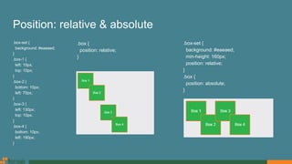
  • 13. Position Mainly, there are 4 values: Static: Default value. Elements render in order, as they appear in the document flow Relative: The element is positioned relative to its normal position Absolute: The element is positioned directly in relation to their containing parent whom is relatively or absolutely positioned. Fixed: The element is positioned relative to the browser window
  • 14. Position: static Considering this HTML: <div class="box-set"> <div class="box box-1">Box 1</div> <div class="box box-2">Box 2</div> <div class="box box-3">Box 3</div> <div class="box box-4">Box 4</div> </div> CSS: .box-set { background: #eaeaed; position: static; } .box { position: static; }
  • 15. Position: relative & absolute .box-set { background: #eaeaed; } .box-1 { left: 10px; top: 10px; } .box-2 { bottom: 10px; left: 70px; } .box-3 { left: 130px; top: 10px; } .box-4 { bottom: 10px; left: 190px; } .box-set { background: #eaeaed; min-height: 160px; position: relative; } .box { position: absolute; } .box { position: relative; }
  • 16. Position: fixed .box-set { background: #eaeaed; min-height: 160px; } .box { position: fixed; }
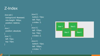
  • 17. Z-Index .box-set { background: #eaeaed; min-height: 160px; position: relative; } .box { position: absolute; } .box-1 { left: 10px; top: 10px; } .box-2 { bottom: 10px; left: 70px; z-index: 3; } .box-3 { left: 130px; top: 10px; z-index: 2; } .box-4 { bottom: 10px; left: 190px; z-index: 1; }
  • 18. Display <div> Sample text………... <span class="different- text">Max und Moritz</span> …….. Sample text </div> .different-text { display: inline; } .different-text { display: inline-block; } .different-text { display: block; }
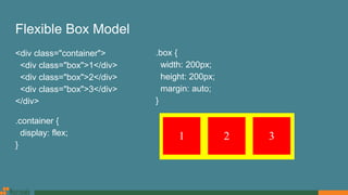
  • 19. Flexible Box Model <div class="container"> <div class="box">1</div> <div class="box">2</div> <div class="box">3</div> </div> .container { display: flex; } .box { width: 200px; height: 200px; margin: auto; }
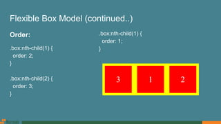
  • 20. Flexible Box Model (continued..) Order: .box:nth-child(1) { order: 2; } .box:nth-child(2) { order: 3; } .box:nth-child(1) { order: 1; }
  • 21. Flexible Box Model (continued..) Equal Length Columns: <div class="column-container"> <div class="column"> <p>Sample text...</p> </div> <div class="column"> <p>Sample text...</p> </div> <div class="column"> <p>Sample text...</p> </div> </div> .column-container { display: flex; align-items: stretch; } .column { width: 33%; padding: 20px; }
  • 22. Flexible Box Model (continued..) Vertical Centering: <div class="box vertical-center-container"> Sample Text </div> CSS Flexible box Reference: https://css-tricks.com/snippets/css/a-guide-to-flexbox https://paulund.co.uk/css-flexbox .vertical-center-container { display: flex; align-items: center; }
  • 23. CSS calc() Function <div class="row"> <div class="col-sm-2"> <img src="images/person.jpg" alt="Person" class="person-img img-responsive" /> </div> <div class="col-sm-10"> <p>Sample text...</p> </div> </div> .person-img { width: 50px; }
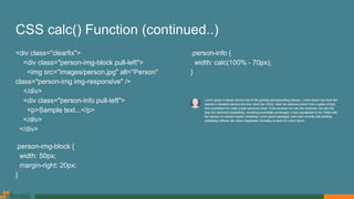
  • 24. CSS calc() Function (continued..) <div class="clearfix"> <div class="person-img-block pull-left"> <img src="images/person.jpg" alt="Person" class="person-img img-responsive" /> </div> <div class="person-info pull-left"> <p>Sample text...</p> </div> </div> .person-img-block { width: 50px; margin-right: 20px; } .person-info { width: calc(100% - 70px); }
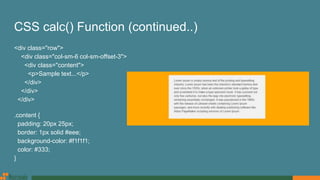
  • 25. CSS calc() Function (continued..) <div class="row"> <div class="col-sm-6 col-sm-offset-3"> <div class="content"> <p>Sample text...</p> </div> </div> </div> .content { padding: 20px 25px; border: 1px solid #eee; background-color: #f1f1f1; color: #333; }
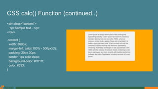
  • 26. CSS calc() Function (continued..) <div class="content"> <p>Sample text...</p> </div> .content { width: 500px; margin-left: calc((100% - 500px)/2); padding: 20px 30px; border: 1px solid #eee; background-color: #f1f1f1; color: #333; }
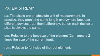
  • 27. PX, EM or REM? px: The pixels are an absolute unit of measurement. In practice, they aren’t the same length everywhere because different devices treat them differently, but on each device a pixel is always the same. em: Relative to the font-size of the element (2em means 2 times the size of the current font). rem: Relative to font-size of the root element.
  • 28. PX, EM or REM? (continued..) Rems are better. Px are still safe. Reference: https://benfrain.com/just-use-pixels http://engageinteractive.co.uk/blog/em-vs-rem-vs-px https://zellwk.com/blog/media-query-units https://alastairc.ac/2017/04/px-em-or-rem-media-queries-different-conclusion
  • 29. Legible Font Sizes body { font-size: 16px; } h2 { font-size: 32px; /* 200% of the baseline */ } .large { font-size: 20px; /* 125% of the baseline */ } .medium-small { font-size: 13.6px; /* 85% of the baseline */ } body { font-size: 1rem; /* 16px */ } h2 { font-size: 2rem; /* 32px */ } .large { font-size: 1.25rem; /* 20px */ } .medium-small { font-size: 0.85rem; /* 13.6px */ } Reference: https://developers.google.com/speed/docs/insights/UseLegibleFontSizes
  • 30. Web Fonts (font-face) Deepest Possible Browser Support: @font-face { font-family: 'MyWebFont'; src: url('webfont.eot'); /* IE9 Compat Modes */ src: url('webfont.eot?#iefix') format('embedded- opentype'), /* IE6-IE8 */ url('webfont.woff2') format('woff2'), /* Super Modern Browsers */ url('webfont.woff') format('woff'), /* Pretty Modern Browsers */ url('webfont.ttf') format('truetype'), /* Safari, Android, iOS */ url('webfont.svg#svgFontName') format('svg'); /* Legacy iOS */ font-weight: normal; font-style: normal; } Practical Level of Browser Support: @font-face { font-family: 'MyWebFont'; src: url('myfont.woff2') format('woff2'), url('myfont.woff') format('woff'); font-weight: normal; font-style: normal; } body { font-family: 'MyWebFont', Fallback, sans-serif; }
  • 31. Web Fonts (font-face) (continued..) <p>All of us have been through the dreaded experience of <strong>sleepless nights</strong> before the exam day.</p> body { font-family: 'Roboto-Regular'; } strong { font-family: 'Roboto-Bold'; } Correct Way: b, strong { font-family: 'Roboto-Bold'; font-weight: normal; }
  • 32. Google Web Fonts <link href="https://fonts.googleapis.com/css?family=Open+Sans:400,400i,600,600i,700" rel="stylesheet"> body { font-family: 'Open Sans', sans-serif; font-weight: 400; } .semibold { font-weight: 600; } b, strong, .bold { font-weight: 700; } i { font-style: italic; font-weight: 400; } .semibold-italic { font-style: italic; font-weight: 600; }
  • 33. Media Query @media (max-width: 1199px) { } @media (min-width: 1025px) and (max-width: 1199px) { } @media (min-width: 992px) and (max-width: 1024px) { } @media (max-width: 991px) { } @media (max-width: 767px) { } @media (min-width: 576px) and (max-width: 767px) { } Breakpoints: Extra small devices / Phones: (<768px) Small devices / Tablets: (≥768px) Medium devices / Desktops: (≥992px) Large devices / Desktops: (≥1200px)
  • 35. Media Query (continued..) @media (max-width: 767px) { } @media (min-width: 576px) and (max-width: 767px) { } @media (max-device-width: 480px) and (orientation: landscape) { } @media (min-width: 768px) { } @media (min-width: 992px) { } @media (min-width: 1024px) and (max-width: 1199px) { } @media (min-width: 1200px) { }
  • 36. Media Query (continued..) /* ==== Non-Mobile First Method ==== */ /* Extra small devices / Phones */ @media (max-width: 1199px) { } @media (max-width: 991px) { } @media (max-width: 767px) { } /* ==== Mobile First Method ==== */ /* Small devices / Tablets */ @media (min-width: 768px) { } /* Medium devices / Desktops */ @media (min-width: 992px) { } /* Large devices / Desktops */ @media (min-width: 1200px) { }
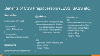
  • 37. Benefits of CSS Preprocessors (LESS, SASS etc.) $variables $color-green: #91ea42; .text-green { color: $color-green; } .button-green { background: $color-green; } @imports @import 'partials/sidebar.scss'; @mixins @mixin border-radius($radius) { -webkit-border-radius: $radius; -moz-border-radius: $radius; -ms-border-radius: $radius; border-radius: $radius; } .box { @include border-radius(10px); width: 100px; height: 100px; } //compiled to: .box { -webkit-border-radius: 10px; -moz-border-radius: 10px; -ms-border-radius: 10px; border-radius: 10px; width: 100px; height: 100px; }
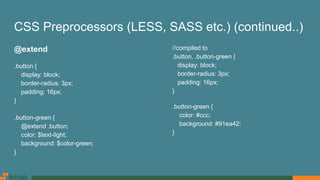
  • 38. CSS Preprocessors (LESS, SASS etc.) (continued..) @extend .button { display: block; border-radius: 3px; padding: 16px; } .button-green { @extend .button; color: $text-light; background: $color-green; } //compiled to .button, .button-green { display: block; border-radius: 3px; padding: 16px; } .button-green { color: #ccc; background: #91ea42; }
  • 39. CSS Preprocessors (LESS, SASS etc.) (continued..) When to use @extend; when to use a mixin @extend should be used only when the rulesets which are being tried to DRY out are inherently and thematically related. Reference: http://vanseodesign.com/css/sass-mixin-or-extend https://csswizardry.com/2014/11/when-to-use-extend-when-to-use-a-mixin
  • 40. Helper Classes for Margin & Padding <div class="box"> <p>Sample text...</p> </div> .box { margin: 20px 10px 20px; padding: 15px; } @media (min-width: 768px) { .box { margin: 20px 30px 30px; padding: 20px; } } <div class=" box xs-mt-20 xs-mx-10 xs-mb-20 xs-p-15 sm-mx-30 sm-mb-30 sm-p-20"> <p>Sample text...</p> </div> .xs-mt-20 { margin-top: 20px; } .xs-mb-20 { margin-bottom: 20px; } .xs-p-15 { padding: 15px; } @media (min-width: 768px) { .sm-mx-30 { margin-left: 30px; margin-right: 30px; } }
  • 41. Helper Classes for Margin & Padding (continued..) LESS & SASS library http://aslanbakan.com/en/blog/less-space-responsive-css-margin-and-padding-helper-classes https://gist.github.com/jimujing/a1fe8ae825b63f0846a0edaff9e260d4 Custom Helper Classes: p : padding, pt : padding-top, pr : padding-right, pb : padding-bottom, pl : padding-left, px : (padding-left, padding-right), py : (padding-top, padding-bottom), m : margin, mt : margin-top, mr : margin-right, mb : margin-bottom, ml : margin-left, mx : (margin-left, margin-right), my : (margin-top, margin-bottom)
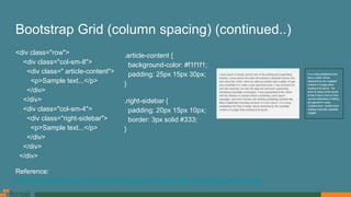
  • 42. Bootstrap Grid (column spacing) <div class="row"> <div class="col-sm-8 article-content"> <p>Sample text...</p> </div> <div class="col-sm-4 right-sidebar"> <p>Sample text...</p> </div> </div> .article-content { background-color: #f1f1f1; } .right-sidebar { border: 3px solid #333; }
  • 43. Bootstrap Grid (column spacing) (continued..) <div class="row"> <div class="col-sm-8"> <div class=" article-content"> <p>Sample text...</p> </div> </div> <div class="col-sm-4"> <div class="right-sidebar"> <p>Sample text...</p> </div> </div> </div> .article-content { background-color: #f1f1f1; padding: 25px 15px 30px; } .right-sidebar { padding: 20px 15px 10px; border: 3px solid #333; } Reference: http://www.helloerik.com/the-subtle-magic-behind-why-the-bootstrap-3-grid-works
  • 44. CSS Reset Documentation: https://github.com/shannonmoeller/reset-css gem: https://github.com/adamstac/meyer-reset Overwriting reset.css & adding custom css: body { font-size: 16px; line-height: 1.2; } * { -webkit-box-sizing: border-box; -moz-box-sizing: border-box; box-sizing: border-box; } :after, :before { -webkit-box-sizing: border-box; -moz-box-sizing: border-box; box-sizing: border-box; } N.B. If we use framework like bootstrap, we won’t need that reset.css or custom reset. But, we should set base font & line-height at boddy according to google developer’s guide.

Editor's Notes

  • #5: The CSS3 box-sizing property allows us to include the padding and border in an element's total width and height.
  • #9: The ::before pseudo-element can be used to insert some content before the content of an element. The ::after pseudo-element can be used to insert some content after the content of an element. The ::selection pseudo-element matches the portion of an element that is selected by a user.
  • #10: :first-child - p:first-child Selects every <p> elements that is the first child of its parent :first-of-type - p:first-of-type Selects every <p> element that is the first <p> element of its parent :nth-child(n) - p:nth-child(2) Selects every <p> element that is the second child of its parent :nth-last-child(n) - p:nth-last-child(2) Selects every <p> element that is the second child of its parent, counting from the last child :nth-last-of-type(n) - p:nth-last-of-type(2) Selects every <p> element that is the second <p> element of its parent, counting from the last child :nth-of-type(n) - p:nth-of-type(2) Selects every <p> element that is the second <p> element of its parent
  • #19: Elements with display:inline-block are like display:inline elements, but they can have a width and a height. That means that we can use an inline-block element as a block while flowing it within text or other elements.
  • #27: The + and - operators must always be surrounded by whitespace. The operand of calc(50% -8px) for instance will be parsed as a percentage followed by a negative length, an invalid expression, while the operand of calc(50% - 8px) is a percentage followed by a minus sign and a length. Even further, calc(8px + -50%) is treated as a length followed by a plus sign and a negative percentage. The * and / operators do not require whitespace, but adding it for consistency is allowed, and recommended.
  • #38: @import: CSS @import makes another http request to fetch another stylesheet, while a Preprocessor @import grabs the content from inside our imported file and includes it within the compiled stylesheet. This means only one http request, allowing us to create partials and organize our css just that little bit better without any downsides!