CSS Layout Techniques
- 1. CSS Layout Techniques Current practices of web page layout development http://definitelysimple.com 1
- 2. Goals • Understand different layout terminology • Differentiate various overlapping terms – Layout vs. design – Implementation vs. approach • Glance at CSS3 specification • Choosing appropriate layout strategy http://definitelysimple.com 2
- 3. About • DS – Definitely Simple – Articles and case studies – Everyday subjects • Computers, economics, politics, sociology – Goal of simplicity and elegance • Visit at – http://definitelysimple.com http://definitelysimple.com 3
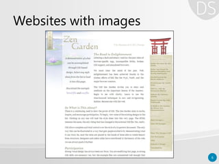
- 4. Web page layouts • Need – Web evolved from simple text-based document serving to complex image and other multimedia serving sites – Web transitioned from web sites to web apps http://definitelysimple.com 4
- 7. Multimedia & web apps 7
- 8. http://definitelysimple.com 8 Complexity Time1990 2013 HTML serving pages with only text Images are served along with text Multimedia support & plugins Websites turning web apps For each feature added to HTML, the layout complexity goes up exponentially
- 9. Early efforts • No CSS to manage complexity • Multicolumn layouts with Tables – HTML <table> tag with border=“0” http://definitelysimple.com 9 <tr><td>col 1 row 1</td> <td>col 2 row 1</td></tr> <tr><td>col 1 row 2</td></tr>
- 10. Problems with <table> • Semantic violations – Mixing markup with presentation • Hard to maintain • Screen reader issues • Performance problem – <table> needs more browser reflows http://definitelysimple.com 10
- 11. Rise of CSS • Separate markup (HTML) from presentation (styling) – CSS float and clear – CSS display: block, inline, inline-block • Solved problems of <table> tag http://definitelysimple.com 11
- 12. CSS Evolution • Evolved from simple styling to medium for laying out complex web page layouts • Different approaches and philosophies emerged for CSS layouts http://definitelysimple.com 12
- 17. Absolute layout • Very first layouts – Developer moved from print media to web – Units of measurement (inch and cm) – Very rigid and inflexible – Rarely used for web design – Useful for creating printer-friendly style sheets http://definitelysimple.com 17
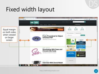
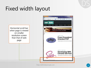
- 19. Fixed width layout • Popular and very widely used – Width of overall layout is set to standard number like 980px, 960px or 760px; – Fit in the middle when viewed on larger screen – Horizontal scroll bar when viewed on smaller screen – Uses CSS unit of pixels (px) http://definitelysimple.com 19
- 20. Fixed width layout http://definitelysimple.com 20 Equal margin on both sides when viewed on larger screen
- 21. Fixed width layout http://definitelysimple.com 21 No margin; Content fits perfectly on the screen when resolution of page matches with that of screen
- 22. Fixed width layout http://definitelysimple.com 22 Horizontal scroll bar when page is viewed on smaller resolution screen than that of web page
- 23. Fixed width layout http://definitelysimple.com 23 Possible to create extremely complex design layouts
- 24. Fixed width layout • Advantages – Pixel perfection (create very complex layouts) – Easier to develop and test • Disadvantages – Very annoying/little usability on small devices – Zoom & text resize not handled property – World is migrating towards mobile http://definitelysimple.com 24
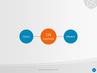
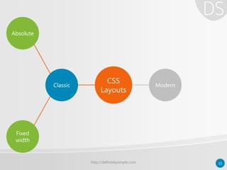
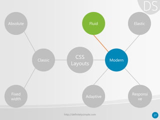
- 25. http://definitelysimple.com 25 Classic Modern Absolute ElasticFluid Fixed width Adaptive Responsi ve CSS Layouts
- 26. Modern layouts • Also known as “Relative layouts” – No fixed width for elements – Works on both large and small screen devices – Use relative CSS units • Rem, ems, percentages, max/min values – Recent layouts use CSS3 media queries http://definitelysimple.com 26
- 27. http://definitelysimple.com 27 Classic Modern Absolute ElasticFluid Fixed width Adaptive Responsi ve CSS Layouts
- 28. Fluid layout • Same as “liquid layout” – Percentage based layouts – Size of element is based on % of its container’s size – Elements always occupy same space regardless of screen size – Better use of screen estate • Foundation for other modern layouts http://definitelysimple.com 28
- 29. Fluid layout http://definitelysimple.com 29 Notice the relative proportions between various column
- 30. Fluid layout http://definitelysimple.com 30 On smaller resolutions proportions have reduced
- 31. Fluid layout • Advantages – Better at handling white spaces – Easier than other modern layouts • Disadvantage – Hampered usability at very low & high resolutions; needs to set limit with max/min – Provides only size experience to users; no real shift in user experience http://definitelysimple.com 31
- 32. http://definitelysimple.com 32 Classic Modern Absolute ElasticFluid Fixed width Adaptive Responsi ve CSS Layouts
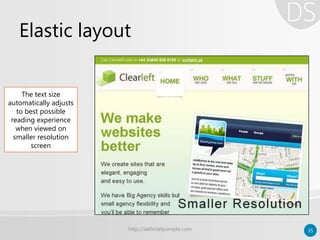
- 33. Elastic layout • Uses CSS “em” unit for measurement – Layout adjusts itself depending upon the content’s need – Width is determined by size of the text set in user’s browser – Not widely used as compared to others – Ideal for text-heavy (content) web pages http://definitelysimple.com 33
- 34. Elastic layout http://definitelysimple.com 34 Notice the font/text size when elastic layout is viewed on large screen
- 35. Elastic layout http://definitelysimple.com 35 The text size automatically adjusts to best possible reading experience when viewed on smaller resolution screen
- 36. Elastic layout • Advantages – Highest content accessibility – Better typographic control – Renders good on small and big screen • Disadvantages – Little use beyond text-heavy web – More difficult to develop & maintain http://definitelysimple.com 36
- 37. http://definitelysimple.com 37 Classic Modern Absolute ElasticFluid Fixed width Adaptive Responsi ve CSS Layouts
- 38. Adaptive layout • Targets specific screen resolutions – Selecting most common resolutions • Uses either fluid or fixed layout – Also uses CSS3 media queries if required • Device is served the layout with the closest possible match http://definitelysimple.com 38
- 39. Responsive layout • One step beyond adaptive layout – No specific screen resolution – Entire page is free to flow and consume space – Mostly uses fluid layouts ideology • Wherever page layout break – Uses CSS3 media queries to solve the problem – Uses flexible images http://definitelysimple.com 39
- 40. Adaptive vs. responsive layout Adaptive • Predefined screen resolution sets • Can use both fixed/fluid layouts internally • Almost same end result as responsive layout • Less development efforts Responsive • No predefined screen resolution sets • Internally, uses fluid layouts only • Theoretically, better end result than adaptive • More development efforts http://definitelysimple.com 40
- 41. Adaptive/responsive example http://definitelysimple.com 41 Breakpoint 1: Responsive layout when viewed on large screen (1200px)
- 42. Adaptive/responsive example http://definitelysimple.com 42 Breakpoint 2: Responsive layout when viewed on normal screen (960px)
- 43. Adaptive/responsive example http://definitelysimple.com 43 Breakpoint 3: Responsive layout when viewed on tablet screen (870px) Breakpoint 4: Responsive layout when viewed on mobile screen (360px)
- 44. http://definitelysimple.com 44 Classic Modern Absolute ElasticFluid Fixed width Adaptive Responsi ve CSS Layouts
- 45. Modern layout – retrospective • Modern layout is not a formally recognized word or layout strategy • It is to distinguish between traditional and newer layout techniques • By just looking at a page, it is difficult to tell which approach has been followed since all the techniques try for same end result http://definitelysimple.com 45
- 46. Modern layout – retrospective • All of them strives for same goal – Serving the users with quality user experience – Serving the same webpage that can work seamlessly & optimally across as many devices as possible without compromising on user experience http://definitelysimple.com 46
- 47. Modern layout – retrospective • Some assume fluid and elastic are base layouts helping as a foundation for adaptive and responsive layouts • While others tend to keep all the terms separate and avoid possible overlap http://definitelysimple.com 47
- 48. Modern layout – retrospective • However one thing governs everything – How people are consuming content – How rapidly technology is moving from traditional systems to modern devices likes mobiles, tables, glass, etc. http://definitelysimple.com 48
- 49. MOVING TO A BIGGER WORLD Layouts are just one part of yet another bigger universe called as “design philosophy” http://definitelysimple.com 49
- 50. Layout is not design • Adaptive layout is not Adaptive Web Design (AWD) • Responsive layout is not Responsive Web Design (RWD) • Layout is not design http://definitelysimple.com 50
- 51. RWD – Responsive web design • RWD is web design approach • RWD goes beyond responsive layout • Describes few design guidelines • Term coined by Ethan Marcotte • Often accompanied by Mobile-first approach http://definitelysimple.com 51
- 52. RWD – Responsive web design • Few possible disadvantages – Performance issues as all devices receive all markup which maybe unnecessary – More development & testing effort – No pixel perfect control over layout – Loads all the resources by default on client computer http://definitelysimple.com 52
- 53. AWD – Adaptive web design • Builds on top of RWD • Incorporate Progressive Enhancement • Uses JavaScript to achieve the goal • Extended into two verticals – Client side adaptive – Server side adaptive (often, needs to manage multiple templates for same resource) http://definitelysimple.com 53
- 54. AWD – Adaptive web design • On client side adaptive – Follows streamlined, layered approach of progressive enhancement (PE) • 1st: PE with HTML • 2nd: PE with CSS • 3rd: PE with JavaScript • 4th: PE with Accessibility http://definitelysimple.com 54
- 55. AWD – Adaptive web design • Few possible disadvantages – Learning curve for developers as they need to learn JavaScript – Maintaining each layer of functionality can be a problem in a long run – May or may not have pixel perfect control depending on layout used – Server side adaptive introduces other new issues http://definitelysimple.com 55
- 56. Points to notes • Four terms – Adaptive layout – Responsive layout – Responsive web design – Adaptive web design • All four are different terms & should not be confused. http://definitelysimple.com 56
- 57. Responsive & Adaptive Layouts • Responsive layout is more complex & robust than adaptive layout • Responsive layout targets more wider range than adaptive layout • Responsive layout needs more development effort Web design approach • AWD builds on top of RWD and addresses even more concerns • RWD is concerned about page design while AWD goes beyond page design to include best possible UX and IXD http://definitelysimple.com 57
- 58. Adaptive design as umbrella http://definitelysimple.com 58 *Source: http://viljamis.com/blog/2012/adaptive-vs-responsive-whats-the-difference.php
- 59. Possible conflicts • There are few variations – As opposite, some consider AWD to be a part of RWD umbrella – Some consider Adaptive layout and AWD as one and the same thing – Some consider any approach that leads to responsive pages as RWD http://definitelysimple.com 59
- 60. But what matters is the end result; And… http://definitelysimple.com 60
- 61. End justifies means • Both AWD and RWD strive for one ultimate goal: One Web http://definitelysimple.com 61
- 62. Future of layouts • So far – All layouts used various means to flexibility – Relative measurements – Display block, inline-blocks, etc. – CSS float property – CSS3 media quires • However, there is more to CSS3… http://definitelysimple.com 62
- 63. Future of layouts • New CSS3 features to create better layouts – Multi-column layout module – CSS3 regions module – Flexible box layout module – Grid template layout module – Box alignment module – Exclusions and shape module http://definitelysimple.com 63
- 64. Future of layouts • However – All new CSS3 modules are coding techniques to create page layouts – Web design approach and coding techniques are two different things – One is theory while other is practical – These new modules may give rise new approaches and theories http://definitelysimple.com 64
- 66. Further reading & references • Books – Flexible web design • By Zoe Gillenwater – Adaptive web design • Aaron Gustafson – Responsive web design • Ethan Marcotte http://definitelysimple.com 66
- 67. Further reading & references • http://coding.smashingmagazine.com/2009/06/02/fixed-vs-fluid-vs- elastic-layout-whats-the-right-one-for-you/ • http://www.w3.org/TR/mobile-bp/ • http://www.netmagazine.com/features/pros-guide-css-layouts • http://sixrevisions.com/web_design/a-guide-on-layout-types-in-web- design/ • http://viljamis.com/blog/2012/adaptive-vs-responsive-whats-the- difference.php • http://www.zeldman.com/2011/07/06/responsive-design-i-dont-think- that-word-means-what-you-think-it-means/ • www.webmonkey.com/2013/05/the-two-flavors-of-a-one-web- approach-responsive-vs-adaptive/ http://definitelysimple.com 67


