SlideShare a Scribd company logo
Data Visualization
using R
C. Tobin Magle, PhD
05-16-2017
10:00-11:30 a.m.
Morgan Library
Computer Classroom 175
Based on http://www.datacarpentry.org/R-ecology-lesson/
Hypothesis
Raw
data
Experimental
design
Tidy
Data
ResultsArticle
Processing/
Cleaning
Analysis
Open Data
Code
The research cycle
Outline
• Basic elements (data, aesthetics, geoms)
• Modifications (transparency, color, grouping)
• Themes (modifying default, using premade, saving your own)
• Exporting plots (ggsave)
Setup
• Install R and R studio
http://www.datacarpentry.org/R-ecology-lesson/index.html#setup_instructions
• Download the quickstart files: http://tinyurl.com/kp6bxt4
• See the Basic Analysis with R lesson if you’re unfamiliar with R
or R studio
http://libguides.colostate.edu/data-and-donuts/r-analysis
Data set: survey of small animals
• Stored in a data frame
• Rows: observations of
individual animals
• Columns: Variables that
describe the animals
• Species, sex, date, location, etc
Load data into R
• Import data using read.csv function
• Arguments: a csv file
• Output: a data frame
Example: surveys <- read.csv('data/surveys_complete.csv')
Graphics with ggplot2
• data: data frame
• aesthetics: looks
• geoms: type of plot
• Ex: points, lines, bars
ggplot2 functions
• ggplot(): initializes ggplot object
• aes(): draws axes based on arguments
• geom_XXX(): draws points/lines etc.
• + operator: adds components to plot
• Modular structure
Simplest ggplot
Need data, aesthetics and a geom
to create a plot.
Example:
ggplot(data = surveys_complete,
aes(x = weight,
y = hindfoot_length)) +
geom_point()
ggplot()
ggplot(data = surveys_complete)
Argument: data frame
Output: blank plot area
ggplot() + aes()
ggplot(data = surveys_complete,
aes(x = weight,
y = hindfoot_length))
ggplot arguments:
data frame + aes()
aes arguments:
• x = x axis variable
• y = y axis variable
• Output: draws axes
ggplot + aes + geom_point
ggplot(data = surveys_complete,
aes(x = weight,
y = hindfoot_length)) +
geom_point()
+ operator: adds point to the
specified plot area
Output: scatterplot of weigh vs.
hindfood length
Add transparency
ggplot(data = surveys_complete,
aes(x = weight,
y = hindfoot_length)) +
geom_point(alpha = 0.1)
Argument: alpha = 0.1
• 1/10 opacity
• Range: 0-1
Add color
ggplot(data = surveys_complete,
aes(x = weight,
y = hindfoot_length)) +
geom_point(alpha = 0.1,
color = "blue")
Argument: color; makes all points blue
Ref chart: http://sape.inf.usi.ch/quick-
reference/ggplot2/colour
Add color by species
ggplot(data = surveys_complete,
aes(x = weight,
y = hindfoot_length)) +
geom_point(alpha = 0.1,
aes(color=species_id))
Argument: color = <factor variable>
• Must be inside aes()
Add color by species
ggplot(data = surveys_complete,
aes(x = weight,
y = hindfoot_length)) +
geom_point(alpha = 0.1,
aes(color=species_id))
Argument: color = <factor variable>
• Must be inside aes()
Points only
Whole plot
Exercise 1
• Use the previous example as a starting point.
• Add color to the data points according to the plot from which the
sample was taken (plot_id).
• Hint: Check the class for plot_id. Consider changing the class
of plot_id from integer to factor. Why does this change how R
makes the graph?
Plot factor variables with box plot
ggplot(data = surveys_complete,
aes(x = species_id,
y = hindfoot_length)) +
geom_boxplot()
aes arguments:
• x: species id (factor)
• y: hinfoot length (numeric)
Overlay points on a box plot
ggplot(data = surveys_complete,
aes(x = species_id,
y = hindfoot_length)) +
geom_boxplot(alpha = 0) +
geom_jitter(alpha = 0.3,
color = "tomato")
Exercise 2: Violin plot
• Plot the same data as in the previous example, but as a Violin
plot
• Hint: see geom_violin().
• What information does this give you about the data that a box
plot does?
Time series data
Reshape data:
yearly_counts <- surveys_complete %>%
group_by(year, species_id) %>%
tally
Time series data
ggplot(data = yearly_counts,
aes(x = year,
y = n)) +
geom_line()
Arguments:
• Data = yearly counts
• X = year
• Y = n (# observations)
Separate by species
ggplot(data = yearly_counts,
aes(x = year,
y = n,
group = species_id)) +
geom_line()
New aes argument: group
• Makes a line for each species id
Color by species
ggplot(data = yearly_counts,
aes(x = year, y = n,
group = species_id,
color = species_id)) +
geom_line()
Combine group and color to create
species_id legend
Exercise #3
• Use what you just learned to create a plot that depicts how the
average weight of each species changes through the years.
• Hint: reshape the data using the following code
yearly_weight <- surveys_complete %>%
group_by(year, species_id) %>%
summarize(avg_weight = mean(weight))
Publication quality graph
Applying a premade theme
ggplot(data = yearly_counts,
aes(x = year, y = n,
color = sex,
group = sex)) +
geom_line() +
theme_bw()
• See ?theme_bw() to see
descriptions of all ggplot themes
Customize axis labels with labs()
ggplot(data = yearly_counts,
aes(x = year,
y = n,
color = species_id)) +
geom_line() +
labs(title = ’Observed Species in time',
x = 'Year of observation',
y = 'Count') +
theme_bw()
Customize font size with element_text()
ggplot(data = yearly_counts,
aes(x = year,
y = n,
color = species_id)) +
geom_line() +
labs(title = Observed Species in Time',
x = 'Year of observation',
y = 'Count') +
theme_bw() +
theme(text=element_text(size=16,
family="Arial"))
See ?margin for more ggplot theme elements
See ?theme for more theme arguments
Create your own theme
arial_theme <- theme_bw()+
theme(text = element_text(size=16,
family="Arial"))
Apply your theme
ggplot(surveys_complete,
aes(x = species_id,
y = hindfoot_length)) +
geom_boxplot() +
arial_theme
Save your plot with ggsave()
• Save a plot to a variable
• ggsave: saves plot to a file
• Arguments: name of file, ggplot variable, width + height
• Output: a png file
Example:
ggsave("name_of_file.png", my_plot, width=15, height=10)
Need help?
• Email: tobin.magle@colostate.edu
• Data Management Services website:
http://lib.colostate.edu/services/data-management
• Data Carpentry: http://www.datacarpentry.org/
• R Ecology Lesson:
http://www.datacarpentry.org/R-ecology-lesson/04-visualization-ggplot2.html
• Ggplot2 Cheat Sheets:
• https://www.rstudio.com/wp-content/uploads/2015/03/ggplot2-cheatsheet.pdf

More Related Content

What's hot (20)

PDF
Basic Tutorial of Association Mapping by Avjinder Kaler
Avjinder (Avi) Kaler
 
PDF
LA R meetup - Nov 2013 - Eric Klusman
rusersla
 
PDF
Genomic Selection with Bayesian Generalized Linear Regression model using R
Avjinder (Avi) Kaler
 
PDF
Tutorial for Estimating Broad and Narrow Sense Heritability using R
Avjinder (Avi) Kaler
 
PPTX
Python programming
sirikeshava
 
PPTX
D-REPR: A Language For Describing And Mapping Diversely-Structured Data Sourc...
Binh Vu
 
PDF
useR! 2012 Talk
rtelmore
 
PPTX
.net F# mutable dictionay
DrRajeshreeKhande
 
PPTX
Why R? A Brief Introduction to the Open Source Statistics Platform
Syracuse University
 
PDF
SAS and R Code for Basic Statistics
Avjinder (Avi) Kaler
 
PPTX
C# Filtering in generic collections
Prem Kumar Badri
 
PDF
R code descriptive statistics of phenotypic data by Avjinder Kaler
Avjinder (Avi) Kaler
 
PPTX
Data Structures (CS8391)
Elavarasi K
 
PPTX
Rattle Graphical Interface for R Language
Majid Abdollahi
 
PPT
Data structures
Manaswi Sharma
 
PPTX
Data structures
Sneha Chopra
 
PPT
Data Structure In C#
Shahzad
 
PPTX
R programming Language , Rahul Singh
Ravi Basil
 
PPTX
Java Tutorial Lab 6
Berk Soysal
 
PPTX
Presentation on basics of python
NanditaDutta4
 
Basic Tutorial of Association Mapping by Avjinder Kaler
Avjinder (Avi) Kaler
 
LA R meetup - Nov 2013 - Eric Klusman
rusersla
 
Genomic Selection with Bayesian Generalized Linear Regression model using R
Avjinder (Avi) Kaler
 
Tutorial for Estimating Broad and Narrow Sense Heritability using R
Avjinder (Avi) Kaler
 
Python programming
sirikeshava
 
D-REPR: A Language For Describing And Mapping Diversely-Structured Data Sourc...
Binh Vu
 
useR! 2012 Talk
rtelmore
 
.net F# mutable dictionay
DrRajeshreeKhande
 
Why R? A Brief Introduction to the Open Source Statistics Platform
Syracuse University
 
SAS and R Code for Basic Statistics
Avjinder (Avi) Kaler
 
C# Filtering in generic collections
Prem Kumar Badri
 
R code descriptive statistics of phenotypic data by Avjinder Kaler
Avjinder (Avi) Kaler
 
Data Structures (CS8391)
Elavarasi K
 
Rattle Graphical Interface for R Language
Majid Abdollahi
 
Data structures
Manaswi Sharma
 
Data structures
Sneha Chopra
 
Data Structure In C#
Shahzad
 
R programming Language , Rahul Singh
Ravi Basil
 
Java Tutorial Lab 6
Berk Soysal
 
Presentation on basics of python
NanditaDutta4
 

Viewers also liked (20)

PPTX
Data and Donuts: Data cleaning with OpenRefine
C. Tobin Magle
 
PPTX
Data and Donuts: Data organization
C. Tobin Magle
 
PPTX
Reproducible research concepts and tools
C. Tobin Magle
 
PPTX
Data and Donuts: The Impact of Data Management
C. Tobin Magle
 
PDF
Chunked, dplyr for large text files
Edwin de Jonge
 
PDF
Next Generation Programming in R
Florian Uhlitz
 
PDF
Data Manipulation Using R (& dplyr)
Ram Narasimhan
 
PDF
Fast data munging in R
Alexander Konduforov
 
PDF
Introduction to data analysis using R
Victoria López
 
PPTX
Data and Donuts: How to write a data management plan
C. Tobin Magle
 
PPTX
WF ED 540, Class Meeting 3 - Introduction to dplyr, 2016
Penn State University
 
PPTX
20160611 kintone Café 高知 Vol.3 LT資料
安隆 沖
 
PDF
Rlecturenotes
thecar1992
 
PDF
Paquete ggplot - Potencia y facilidad para generar gráficos en R
Nestor Montaño
 
PDF
Análisis espacial con R (asignatura de Master - UPM)
Vladimir Gutierrez, PhD
 
PPT
R Brown-bag seminars : Seminar-8
Muhammad Nabi Ahmad
 
PPTX
Learn to use dplyr (Feb 2015 Philly R User Meetup)
Fan Li
 
PPTX
WF ED 540, Class Meeting 3 - select, filter, arrange, 2016
Penn State University
 
PPTX
R seminar dplyr package
Muhammad Nabi Ahmad
 
PPTX
WF ED 540, Class Meeting 3 - mutate and summarise, 2016
Penn State University
 
Data and Donuts: Data cleaning with OpenRefine
C. Tobin Magle
 
Data and Donuts: Data organization
C. Tobin Magle
 
Reproducible research concepts and tools
C. Tobin Magle
 
Data and Donuts: The Impact of Data Management
C. Tobin Magle
 
Chunked, dplyr for large text files
Edwin de Jonge
 
Next Generation Programming in R
Florian Uhlitz
 
Data Manipulation Using R (& dplyr)
Ram Narasimhan
 
Fast data munging in R
Alexander Konduforov
 
Introduction to data analysis using R
Victoria López
 
Data and Donuts: How to write a data management plan
C. Tobin Magle
 
WF ED 540, Class Meeting 3 - Introduction to dplyr, 2016
Penn State University
 
20160611 kintone Café 高知 Vol.3 LT資料
安隆 沖
 
Rlecturenotes
thecar1992
 
Paquete ggplot - Potencia y facilidad para generar gráficos en R
Nestor Montaño
 
Análisis espacial con R (asignatura de Master - UPM)
Vladimir Gutierrez, PhD
 
R Brown-bag seminars : Seminar-8
Muhammad Nabi Ahmad
 
Learn to use dplyr (Feb 2015 Philly R User Meetup)
Fan Li
 
WF ED 540, Class Meeting 3 - select, filter, arrange, 2016
Penn State University
 
R seminar dplyr package
Muhammad Nabi Ahmad
 
WF ED 540, Class Meeting 3 - mutate and summarise, 2016
Penn State University
 
Ad

Similar to Data and donuts: Data Visualization using R (20)

PDF
Intro to ggplot2 - Sheffield R Users Group, Feb 2015
Paul Richards
 
PDF
data-visualization.pdf
Juan José Rivas
 
PDF
Data Visualization with ggplot2.pdf
CarlosTrujillo199971
 
PDF
Data visualization-2.1
RenukaRajmohan
 
PDF
Ggplot2 cheatsheet-2.1
Dieudonne Nahigombeye
 
DOCX
R-ggplot2 package Examples
Dr. Volkan OBAN
 
PDF
Download full ebook of Datacamp Ggplot2 Cheatsheet Itebooks instant download pdf
miatalafeer
 
PDF
VISIALIZACION DE DATA.pdf
Ivan Bautista Fuentes
 
PDF
Ggplot
Jhojan Diaz Roa
 
PDF
Introduction to R Short course Fall 2016
Spencer Fox
 
PDF
Chapter 2: R tutorial Handbook for Data Science and Machine Learning Practiti...
Raman Kannan
 
DOCX
Background This course is all about data visualization. However, we.docx
rosemaryralphs52525
 
PPTX
Spruce up your ggplot2 visualizations with formatted text
Claus Wilke
 
PDF
R Visualization Assignment
Vassilis Kapatsoulias
 
PDF
Ggplot2 ch2
heba_ahmad
 
PDF
Broom: Converting Statistical Models to Tidy Data Frames
Work-Bench
 
PPTX
Exploratory Analysis Part1 Coursera DataScience Specialisation
Wesley Goi
 
PDF
Ggplot2 work
ARUN DN
 
PPTX
2015-10-23_wim_davis_r_slides.pptx on consumer
tirlukachaitanya
 
PDF
Rtips123
Mahendra Babu
 
Intro to ggplot2 - Sheffield R Users Group, Feb 2015
Paul Richards
 
data-visualization.pdf
Juan José Rivas
 
Data Visualization with ggplot2.pdf
CarlosTrujillo199971
 
Data visualization-2.1
RenukaRajmohan
 
Ggplot2 cheatsheet-2.1
Dieudonne Nahigombeye
 
R-ggplot2 package Examples
Dr. Volkan OBAN
 
Download full ebook of Datacamp Ggplot2 Cheatsheet Itebooks instant download pdf
miatalafeer
 
VISIALIZACION DE DATA.pdf
Ivan Bautista Fuentes
 
Introduction to R Short course Fall 2016
Spencer Fox
 
Chapter 2: R tutorial Handbook for Data Science and Machine Learning Practiti...
Raman Kannan
 
Background This course is all about data visualization. However, we.docx
rosemaryralphs52525
 
Spruce up your ggplot2 visualizations with formatted text
Claus Wilke
 
R Visualization Assignment
Vassilis Kapatsoulias
 
Ggplot2 ch2
heba_ahmad
 
Broom: Converting Statistical Models to Tidy Data Frames
Work-Bench
 
Exploratory Analysis Part1 Coursera DataScience Specialisation
Wesley Goi
 
Ggplot2 work
ARUN DN
 
2015-10-23_wim_davis_r_slides.pptx on consumer
tirlukachaitanya
 
Rtips123
Mahendra Babu
 
Ad

More from C. Tobin Magle (14)

PPTX
Data Management for librarians
C. Tobin Magle
 
PPTX
Datat and donuts: how to write a data management plan
C. Tobin Magle
 
PPTX
Data Archiving and Sharing
C. Tobin Magle
 
PPTX
Reproducible research
C. Tobin Magle
 
PPTX
Intro to Reproducible Research
C. Tobin Magle
 
PPTX
Responsible conduct of research: Data Management
C. Tobin Magle
 
PPTX
Collaborative Data Management using OSF
C. Tobin Magle
 
PPTX
Data Management Services at the Morgan Library
C. Tobin Magle
 
PPTX
Open access day
C. Tobin Magle
 
PPTX
Bringing bioinformatics into the library
C. Tobin Magle
 
PPTX
Reproducible research: practice
C. Tobin Magle
 
PPTX
Reproducible research: theory
C. Tobin Magle
 
PPTX
CU Anschutz Health Science Library Data Services
C. Tobin Magle
 
PPTX
Magle data curation in libraries
C. Tobin Magle
 
Data Management for librarians
C. Tobin Magle
 
Datat and donuts: how to write a data management plan
C. Tobin Magle
 
Data Archiving and Sharing
C. Tobin Magle
 
Reproducible research
C. Tobin Magle
 
Intro to Reproducible Research
C. Tobin Magle
 
Responsible conduct of research: Data Management
C. Tobin Magle
 
Collaborative Data Management using OSF
C. Tobin Magle
 
Data Management Services at the Morgan Library
C. Tobin Magle
 
Open access day
C. Tobin Magle
 
Bringing bioinformatics into the library
C. Tobin Magle
 
Reproducible research: practice
C. Tobin Magle
 
Reproducible research: theory
C. Tobin Magle
 
CU Anschutz Health Science Library Data Services
C. Tobin Magle
 
Magle data curation in libraries
C. Tobin Magle
 

Recently uploaded (20)

PDF
Avatar for apidays apidays PRO June 07, 2025 0 5 apidays Helsinki & North 2...
apidays
 
PDF
apidays Singapore 2025 - Streaming Lakehouse with Kafka, Flink and Iceberg by...
apidays
 
PDF
Driving Employee Engagement in a Hybrid World.pdf
Mia scott
 
PDF
JavaScript - Good or Bad? Tips for Google Tag Manager
📊 Markus Baersch
 
PPTX
apidays Helsinki & North 2025 - From Chaos to Clarity: Designing (AI-Ready) A...
apidays
 
PPTX
Listify-Intelligent-Voice-to-Catalog-Agent.pptx
nareshkottees
 
PDF
apidays Singapore 2025 - Surviving an interconnected world with API governanc...
apidays
 
PDF
Context Engineering for AI Agents, approaches, memories.pdf
Tamanna
 
PPTX
apidays Munich 2025 - Building an AWS Serverless Application with Terraform, ...
apidays
 
PDF
Data Retrieval and Preparation Business Analytics.pdf
kayserrakib80
 
PDF
apidays Singapore 2025 - How APIs can make - or break - trust in your AI by S...
apidays
 
PDF
apidays Singapore 2025 - The API Playbook for AI by Shin Wee Chuang (PAND AI)
apidays
 
PDF
Simplifying Document Processing with Docling for AI Applications.pdf
Tamanna
 
PDF
apidays Singapore 2025 - Trustworthy Generative AI: The Role of Observability...
apidays
 
PDF
apidays Singapore 2025 - Building a Federated Future, Alex Szomora (GSMA)
apidays
 
PDF
The European Business Wallet: Why It Matters and How It Powers the EUDI Ecosy...
Lal Chandran
 
PPTX
apidays Helsinki & North 2025 - APIs at Scale: Designing for Alignment, Trust...
apidays
 
PPTX
apidays Helsinki & North 2025 - API access control strategies beyond JWT bear...
apidays
 
PDF
apidays Helsinki & North 2025 - API-Powered Journeys: Mobility in an API-Driv...
apidays
 
PDF
What does good look like - CRAP Brighton 8 July 2025
Jan Kierzyk
 
Avatar for apidays apidays PRO June 07, 2025 0 5 apidays Helsinki & North 2...
apidays
 
apidays Singapore 2025 - Streaming Lakehouse with Kafka, Flink and Iceberg by...
apidays
 
Driving Employee Engagement in a Hybrid World.pdf
Mia scott
 
JavaScript - Good or Bad? Tips for Google Tag Manager
📊 Markus Baersch
 
apidays Helsinki & North 2025 - From Chaos to Clarity: Designing (AI-Ready) A...
apidays
 
Listify-Intelligent-Voice-to-Catalog-Agent.pptx
nareshkottees
 
apidays Singapore 2025 - Surviving an interconnected world with API governanc...
apidays
 
Context Engineering for AI Agents, approaches, memories.pdf
Tamanna
 
apidays Munich 2025 - Building an AWS Serverless Application with Terraform, ...
apidays
 
Data Retrieval and Preparation Business Analytics.pdf
kayserrakib80
 
apidays Singapore 2025 - How APIs can make - or break - trust in your AI by S...
apidays
 
apidays Singapore 2025 - The API Playbook for AI by Shin Wee Chuang (PAND AI)
apidays
 
Simplifying Document Processing with Docling for AI Applications.pdf
Tamanna
 
apidays Singapore 2025 - Trustworthy Generative AI: The Role of Observability...
apidays
 
apidays Singapore 2025 - Building a Federated Future, Alex Szomora (GSMA)
apidays
 
The European Business Wallet: Why It Matters and How It Powers the EUDI Ecosy...
Lal Chandran
 
apidays Helsinki & North 2025 - APIs at Scale: Designing for Alignment, Trust...
apidays
 
apidays Helsinki & North 2025 - API access control strategies beyond JWT bear...
apidays
 
apidays Helsinki & North 2025 - API-Powered Journeys: Mobility in an API-Driv...
apidays
 
What does good look like - CRAP Brighton 8 July 2025
Jan Kierzyk
 

Data and donuts: Data Visualization using R

  • 1. Data Visualization using R C. Tobin Magle, PhD 05-16-2017 10:00-11:30 a.m. Morgan Library Computer Classroom 175 Based on http://www.datacarpentry.org/R-ecology-lesson/
  • 3. Outline • Basic elements (data, aesthetics, geoms) • Modifications (transparency, color, grouping) • Themes (modifying default, using premade, saving your own) • Exporting plots (ggsave)
  • 4. Setup • Install R and R studio http://www.datacarpentry.org/R-ecology-lesson/index.html#setup_instructions • Download the quickstart files: http://tinyurl.com/kp6bxt4 • See the Basic Analysis with R lesson if you’re unfamiliar with R or R studio http://libguides.colostate.edu/data-and-donuts/r-analysis
  • 5. Data set: survey of small animals • Stored in a data frame • Rows: observations of individual animals • Columns: Variables that describe the animals • Species, sex, date, location, etc
  • 6. Load data into R • Import data using read.csv function • Arguments: a csv file • Output: a data frame Example: surveys <- read.csv('data/surveys_complete.csv')
  • 7. Graphics with ggplot2 • data: data frame • aesthetics: looks • geoms: type of plot • Ex: points, lines, bars
  • 8. ggplot2 functions • ggplot(): initializes ggplot object • aes(): draws axes based on arguments • geom_XXX(): draws points/lines etc. • + operator: adds components to plot • Modular structure
  • 9. Simplest ggplot Need data, aesthetics and a geom to create a plot. Example: ggplot(data = surveys_complete, aes(x = weight, y = hindfoot_length)) + geom_point()
  • 10. ggplot() ggplot(data = surveys_complete) Argument: data frame Output: blank plot area
  • 11. ggplot() + aes() ggplot(data = surveys_complete, aes(x = weight, y = hindfoot_length)) ggplot arguments: data frame + aes() aes arguments: • x = x axis variable • y = y axis variable • Output: draws axes
  • 12. ggplot + aes + geom_point ggplot(data = surveys_complete, aes(x = weight, y = hindfoot_length)) + geom_point() + operator: adds point to the specified plot area Output: scatterplot of weigh vs. hindfood length
  • 13. Add transparency ggplot(data = surveys_complete, aes(x = weight, y = hindfoot_length)) + geom_point(alpha = 0.1) Argument: alpha = 0.1 • 1/10 opacity • Range: 0-1
  • 14. Add color ggplot(data = surveys_complete, aes(x = weight, y = hindfoot_length)) + geom_point(alpha = 0.1, color = "blue") Argument: color; makes all points blue Ref chart: http://sape.inf.usi.ch/quick- reference/ggplot2/colour
  • 15. Add color by species ggplot(data = surveys_complete, aes(x = weight, y = hindfoot_length)) + geom_point(alpha = 0.1, aes(color=species_id)) Argument: color = <factor variable> • Must be inside aes()
  • 16. Add color by species ggplot(data = surveys_complete, aes(x = weight, y = hindfoot_length)) + geom_point(alpha = 0.1, aes(color=species_id)) Argument: color = <factor variable> • Must be inside aes() Points only Whole plot
  • 17. Exercise 1 • Use the previous example as a starting point. • Add color to the data points according to the plot from which the sample was taken (plot_id). • Hint: Check the class for plot_id. Consider changing the class of plot_id from integer to factor. Why does this change how R makes the graph?
  • 18. Plot factor variables with box plot ggplot(data = surveys_complete, aes(x = species_id, y = hindfoot_length)) + geom_boxplot() aes arguments: • x: species id (factor) • y: hinfoot length (numeric)
  • 19. Overlay points on a box plot ggplot(data = surveys_complete, aes(x = species_id, y = hindfoot_length)) + geom_boxplot(alpha = 0) + geom_jitter(alpha = 0.3, color = "tomato")
  • 20. Exercise 2: Violin plot • Plot the same data as in the previous example, but as a Violin plot • Hint: see geom_violin(). • What information does this give you about the data that a box plot does?
  • 21. Time series data Reshape data: yearly_counts <- surveys_complete %>% group_by(year, species_id) %>% tally
  • 22. Time series data ggplot(data = yearly_counts, aes(x = year, y = n)) + geom_line() Arguments: • Data = yearly counts • X = year • Y = n (# observations)
  • 23. Separate by species ggplot(data = yearly_counts, aes(x = year, y = n, group = species_id)) + geom_line() New aes argument: group • Makes a line for each species id
  • 24. Color by species ggplot(data = yearly_counts, aes(x = year, y = n, group = species_id, color = species_id)) + geom_line() Combine group and color to create species_id legend
  • 25. Exercise #3 • Use what you just learned to create a plot that depicts how the average weight of each species changes through the years. • Hint: reshape the data using the following code yearly_weight <- surveys_complete %>% group_by(year, species_id) %>% summarize(avg_weight = mean(weight))
  • 27. Applying a premade theme ggplot(data = yearly_counts, aes(x = year, y = n, color = sex, group = sex)) + geom_line() + theme_bw() • See ?theme_bw() to see descriptions of all ggplot themes
  • 28. Customize axis labels with labs() ggplot(data = yearly_counts, aes(x = year, y = n, color = species_id)) + geom_line() + labs(title = ’Observed Species in time', x = 'Year of observation', y = 'Count') + theme_bw()
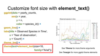
  • 29. Customize font size with element_text() ggplot(data = yearly_counts, aes(x = year, y = n, color = species_id)) + geom_line() + labs(title = Observed Species in Time', x = 'Year of observation', y = 'Count') + theme_bw() + theme(text=element_text(size=16, family="Arial")) See ?margin for more ggplot theme elements See ?theme for more theme arguments
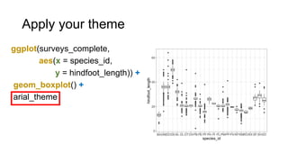
  • 30. Create your own theme arial_theme <- theme_bw()+ theme(text = element_text(size=16, family="Arial"))
  • 31. Apply your theme ggplot(surveys_complete, aes(x = species_id, y = hindfoot_length)) + geom_boxplot() + arial_theme
  • 32. Save your plot with ggsave() • Save a plot to a variable • ggsave: saves plot to a file • Arguments: name of file, ggplot variable, width + height • Output: a png file Example: ggsave("name_of_file.png", my_plot, width=15, height=10)
  • 33. Need help? • Email: [email protected] • Data Management Services website: http://lib.colostate.edu/services/data-management • Data Carpentry: http://www.datacarpentry.org/ • R Ecology Lesson: http://www.datacarpentry.org/R-ecology-lesson/04-visualization-ggplot2.html • Ggplot2 Cheat Sheets: • https://www.rstudio.com/wp-content/uploads/2015/03/ggplot2-cheatsheet.pdf