Design for Developers
Download as PPTX, PDF•1 like•1,005 views

This document provides an overview of design fundamentals for developers. It discusses determining audience and goals, using layout principles like grids and the rule of thirds. Design elements like balance, hierarchy, typography and color are explained. Specific tools for designing and finding inspiration are also listed. The document concludes that understanding basic design principles can help developers create better products, even if they are not artists.


Design for Developers
- 2. Who Are You?
- 3. Design is a talent
- 4. Design is a skill
- 5. Design fundamentals make you a better developer
- 6. How?
- 10. PLANNING
- 11. Determine: What are you trying?
- 13. Audience determines what you are creating.
- 15. Phones break many of the rules
- 18. Draw
- 20. Design Fundamentals • Layout • Typography • Color
- 21. LAYOUT
- 22. Grid Grid Start with a Grid Grid GRID Grid Grid Grid
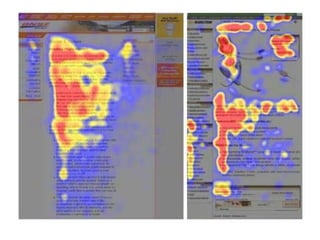
- 23. Rule of Thirds • Dividing a page into 3 rows and 3 columns • The eye naturally follows this “F” shape
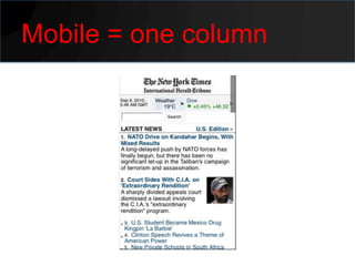
- 27. Mobile = one column
- 28. The THE GOLDEN RATIO Golden Ratio
- 29. The Golden Ratio • Proportion defined as 1.618 • Found in nature, art and architecture 1.618 1
- 31. The golden ratio in Layout • Overall Width / 1.618 = Content Block • Overall Width – Content Block = Sidebar Block Overall Width Content Block Sidebar Block 1.618 1
- 34. ELEMENTS OF A GOOD LAYOUT
- 35. Implies importance, elegance, and professionalism. Implies importance, elegance, and professionalism. Implies importance, elegance, and professionalism. Implies importance, elegance, and professionalism. Implies importance, elegance, and professionalism. Implies importance, elegance, and professionalism. Implies importance, elegance, and professionalism. Implies importance, elegance, and Space professionalism. Implies importance, elegance, and professionalism. Implies importance, elegance, and professionalism. Implies importance, elegance, and professionalism. Implies importance, elegance, and professionalism. Implies importance, elegance, and
- 37. Space Don’t try to be great, try to be invisible
- 38. Space Wal-Mart Target
- 41. BALANCE
- 43. Symmetrical balance Salvador Dali – The Last Supper
- 48. Variety Variety Variety Variety VARIETY VARIETY Variety VARIETY Variety variety variety variety variety variety Variety
- 49. Variety • Gives visual and conceptual interest • Too much and the design will appear amateurish • Too little and the design will appear boring
- 52. HIERARCHY
- 53. Hierarchy • A clear starting point that guides the viewer through the design • Separate the most important element • Group the less important elements
- 55. TYPOGRAPHY
- 56. Typography • Choose a font that fits the subject • Don’t use more than three
- 57. Legible Contrast Size Hierarchy
- 58. Font Structure • There are different type classifications • Understand type anatomy • Understand type measurements.
- 60. Important Ones • • • Monospaced • Script • Non Latin Alphabets • Italic • Bold
- 62. Anatomy
- 63. Measurements • Pixels – Actual Pixels on Screen • Points – Measure for print only • Em – Relative to document
- 64. COLOR
- 65. Color • Use color to create hierarchy, dominance, and balance. • Consistent use of a few colors makes a more cohesive design.
- 66. Color Meaning
- 67. Color • Warm colors bring elements forward. • Cool colors move elements back.
- 68. Dong Kingman
- 71. TOOLS
- 72. Design Program • Photo manipulators • Vector graphic manipulators • Hybrids • My choice: Fireworks
- 73. Fonts • Whatthefont.com • Identifont.com • Typekit.com
- 74. Color • Color Dropper Extension • Kuler
- 75. Miscelleneous • Web Developers Toolbar • Smashingmagazine.com • Golden Ratio AIR app: – http://designupdate.com/blog/2010/09/01/the- golden-ratio-for-great-layouts/
- 76. INSPIRATION
- 77. How do you start from nothing?
- 78. Steal
- 80. Where to get it • http://www.mobileawesomeness.com • http://www.thefwa.com • http://patterntap.com • http://quince.infragistics.com • http://www.designupdate.com
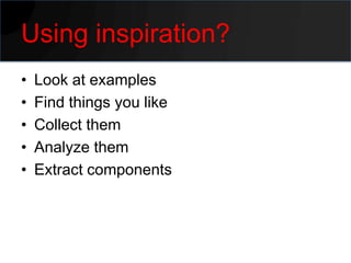
- 81. Using inspiration? • Look at examples • Find things you like • Collect them • Analyze them • Extract components
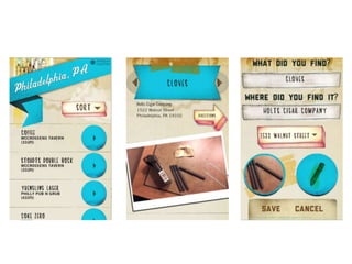
- 86. Another Example
- 91. HTML5 • Acquired Nitobi, makers of PhoneGap • Released new beta of Edge • CSS Shaders submitted to W3C
- 92. Language has been awesomified!
- 101. CONCLUSIONS
- 102. Design is a skill
- 103. Just because you won’t be an artist
- 104. Doesn’t mean you have to give up on any design
- 105. Design will make you a better developer
- 106. Follow up? • Feel free to contact me – [email protected] – http://terrenceryan.com – Twitter: @tpryan
Editor's Notes
- #15: Avoid graphical applicationsThe temptation is to think “I have to do some design, that means I need to open Photoshop. That is what designers use”. Of course that is entirely true, designers do use graphic applications like Photoshop or Freehand. However, I would suggest that unless you are already familiar with these kinds of applications, you are just adding more complexity to the problem.Its hard enough to apply the principles of good design without adding learning a new application on top of it.You know code, so work with code. Build your site using CSS and XHTML and these are the tools with which you are familiar. Sure, it wont lead to outstanding design, but that is not the aim as I discuss next…Don’t try and be great; be invisibleDon’t try and produce a “creative” or “innovative” piece of design. Designers find this hard enough to do. The danger is that if you try and do this, you will create something that some people may love, but the majority completely hate. Instead, play safe. Try and make your design invisible. A good solid piece of design will not impress but neither will it offend. The idea is that the users will not even notice it, they just use it. If the user doesn’t acknowledge what you have produced it means it hasn’t caused them any problems and that is a good thing. Sure, you wont win any design awards but that isn’t very likely anyway!
- #17: Avoid graphical applicationsThe temptation is to think “I have to do some design, that means I need to open Photoshop. That is what designers use”. Of course that is entirely true, designers do use graphic applications like Photoshop or Freehand. However, I would suggest that unless you are already familiar with these kinds of applications, you are just adding more complexity to the problem.Its hard enough to apply the principles of good design without adding learning a new application on top of it.You know code, so work with code. Build your site using CSS and XHTML and these are the tools with which you are familiar. Sure, it wont lead to outstanding design, but that is not the aim as I discuss next…Don’t try and be great; be invisibleDon’t try and produce a “creative” or “innovative” piece of design. Designers find this hard enough to do. The danger is that if you try and do this, you will create something that some people may love, but the majority completely hate. Instead, play safe. Try and make your design invisible. A good solid piece of design will not impress but neither will it offend. The idea is that the users will not even notice it, they just use it. If the user doesn’t acknowledge what you have produced it means it hasn’t caused them any problems and that is a good thing. Sure, you wont win any design awards but that isn’t very likely anyway!
- #18: Avoid graphical applicationsThe temptation is to think “I have to do some design, that means I need to open Photoshop. That is what designers use”. Of course that is entirely true, designers do use graphic applications like Photoshop or Freehand. However, I would suggest that unless you are already familiar with these kinds of applications, you are just adding more complexity to the problem.Its hard enough to apply the principles of good design without adding learning a new application on top of it.You know code, so work with code. Build your site using CSS and XHTML and these are the tools with which you are familiar. Sure, it wont lead to outstanding design, but that is not the aim as I discuss next…Don’t try and be great; be invisibleDon’t try and produce a “creative” or “innovative” piece of design. Designers find this hard enough to do. The danger is that if you try and do this, you will create something that some people may love, but the majority completely hate. Instead, play safe. Try and make your design invisible. A good solid piece of design will not impress but neither will it offend. The idea is that the users will not even notice it, they just use it. If the user doesn’t acknowledge what you have produced it means it hasn’t caused them any problems and that is a good thing. Sure, you wont win any design awards but that isn’t very likely anyway!
- #24: http://www.useit.com/alertbox/reading_pattern.html
- #25: http://www.useit.com/alertbox/reading_pattern.html
- #26: http://www.useit.com/alertbox/reading_pattern.html
- #27: http://www.useit.com/alertbox/reading_pattern.html
- #28: http://www.useit.com/alertbox/reading_pattern.html
- #30: Each section of an index finger, from the tip to the base of the wrist, is larger than the preceding one by about 1.618, fitting the Fibonacci numbers 2, 3, 5 and 8.The Fibonacci numbers and golden section are widely found in the plant kingdom. In nearly all flowers, the number of petals is a Fibonacci number. For instance, lilies have 3 petals, buttercups have 5, many delphiniums have 8, marigolds have 13, asters have 21, and daisies commonly have 13, 21, 34, 55 or 89. http://davidpratt.info/pattern1.htm
- #31: Each section of an index finger, from the tip to the base of the wrist, is larger than the preceding one by about 1.618, fitting the Fibonacci numbers 2, 3, 5 and 8.The Fibonacci numbers and golden section are widely found in the plant kingdom. In nearly all flowers, the number of petals is a Fibonacci number. For instance, lilies have 3 petals, buttercups have 5, many delphiniums have 8, marigolds have 13, asters have 21, and daisies commonly have 13, 21, 34, 55 or 89. http://davidpratt.info/pattern1.htm
- #32: Each section of an index finger, from the tip to the base of the wrist, is larger than the preceding one by about 1.618, fitting the Fibonacci numbers 2, 3, 5 and 8.The Fibonacci numbers and golden section are widely found in the plant kingdom. In nearly all flowers, the number of petals is a Fibonacci number. For instance, lilies have 3 petals, buttercups have 5, many delphiniums have 8, marigolds have 13, asters have 21, and daisies commonly have 13, 21, 34, 55 or 89. http://www.intmath.com/Numbers/mathOfBeauty.phphttp://davidpratt.info/pattern1.htmhttp://discovermagazine.com/2007/jun/blinded-by-science
- #33: http://www.useit.com/alertbox/reading_pattern.html
- #34: http://www.useit.com/alertbox/reading_pattern.html
- #35: Avoid graphical applicationsThe temptation is to think “I have to do some design, that means I need to open Photoshop. That is what designers use”. Of course that is entirely true, designers do use graphic applications like Photoshop or Freehand. However, I would suggest that unless you are already familiar with these kinds of applications, you are just adding more complexity to the problem.Its hard enough to apply the principles of good design without adding learning a new application on top of it.You know code, so work with code. Build your site using CSS and XHTML and these are the tools with which you are familiar. Sure, it wont lead to outstanding design, but that is not the aim as I discuss next…Don’t try and be great; be invisibleDon’t try and produce a “creative” or “innovative” piece of design. Designers find this hard enough to do. The danger is that if you try and do this, you will create something that some people may love, but the majority completely hate. Instead, play safe. Try and make your design invisible. A good solid piece of design will not impress but neither will it offend. The idea is that the users will not even notice it, they just use it. If the user doesn’t acknowledge what you have produced it means it hasn’t caused them any problems and that is a good thing. Sure, you wont win any design awards but that isn’t very likely anyway!
- #39: One of the biggest mistakes typical business people make with documents is going out of their way to seemingly use every centimeter of space on a page, filling it up with text, boxes, clip art, charts, footers, etc. Space, often called "white space," is good. Embrace it. Use it. Often, the more space you don't use on a page, the clearer your message becomes.Empty space is beautiful, yes. But empty space also implies importance, elegance, professionalism. This is true with graphic design, but you can see the importance of space (both visual and physical) in the context of interior design. Think of the retail space, for example. Target is dedicated to design although they are a discounter. They know about space. Target stores are well designed. They have more empty space than other discounters, Walmart, for example.
- #40: One of the biggest mistakes typical business people make with documents is going out of their way to seemingly use every centimeter of space on a page, filling it up with text, boxes, clip art, charts, footers, etc. Space, often called "white space," is good. Embrace it. Use it. Often, the more space you don't use on a page, the clearer your message becomes.Empty space is beautiful, yes. But empty space also implies importance, elegance, professionalism. This is true with graphic design, but you can see the importance of space (both visual and physical) in the context of interior design. Think of the retail space, for example. Target is dedicated to design although they are a discounter. They know about space. Target stores are well designed. They have more empty space than other discounters, Walmart, for example.
- #41: One of the biggest mistakes typical business people make with documents is going out of their way to seemingly use every centimeter of space on a page, filling it up with text, boxes, clip art, charts, footers, etc. Space, often called "white space," is good. Embrace it. Use it. Often, the more space you don't use on a page, the clearer your message becomes.Empty space is beautiful, yes. But empty space also implies importance, elegance, professionalism. This is true with graphic design, but you can see the importance of space (both visual and physical) in the context of interior design. Think of the retail space, for example. Target is dedicated to design although they are a discounter. They know about space. Target stores are well designed. They have more empty space than other discounters, Walmart, for example.
- #42: If a design is out of balance, the individual elements of the design will dominate the overall design. A well-balanced design has a clear, single, unified message. Alex White points out that there are three types of balance: Symmetrical, asymmetrical, and mosaic. Symmetrical balance is vertically centered and is equivalent on both sides. Symmetrical designs are more static than asymmetrical designs and evoke feelings of formality (think wedding invitations).Asymmetrical designs are more informal and are dynamic with a variety of sizes, shapes, etc. on both sides of the page/slide. Asymmetrical designs make good, calculated use of white space. Asymmetrical designs evoke feelings of action and modernity. Mosaic designs usually are ones with too much information according to White. This kind of balance often lacks hierarchy and a unified message can be difficult to achieve, leaving the design to look just plain "noisy."All seven of the above design elements are evident in good design. You can focus on one or two more than others, but all will be in there to one degree or another. Arranging elements so that no one part of a work overpowers, or seems heavier than any other part. The three different kinds of balance are symmetrical, asymmetrical, and mosaic.Grid-based design.
- #44: If a design is out of balance, the individual elements of the design will dominate the overall design. A well-balanced design has a clear, single, unified message. Alex White points out that there are three types of balance: Symmetrical, asymmetrical, and mosaic. Symmetrical balance is vertically centered and is equivalent on both sides. Symmetrical designs are more static than asymmetrical designs and evoke feelings of formality (think wedding invitations).Asymmetrical designs are more informal and are dynamic with a variety of sizes, shapes, etc. on both sides of the page/slide. Asymmetrical designs make good, calculated use of white space. Asymmetrical designs evoke feelings of action and modernity. Mosaic designs usually are ones with too much information according to White. This kind of balance often lacks hierarchy and a unified message can be difficult to achieve, leaving the design to look just plain "noisy."All seven of the above design elements are evident in good design. You can focus on one or two more than others, but all will be in there to one degree or another.
- #45: If a design is out of balance, the individual elements of the design will dominate the overall design. A well-balanced design has a clear, single, unified message. Alex White points out that there are three types of balance: Symmetrical, asymmetrical, and mosaic. Symmetrical balance is vertically centered and is equivalent on both sides. Symmetrical designs are more static than asymmetrical designs and evoke feelings of formality (think wedding invitations).Asymmetrical designs are more informal and are dynamic with a variety of sizes, shapes, etc. on both sides of the page/slide. Asymmetrical designs make good, calculated use of white space. Asymmetrical designs evoke feelings of action and modernity. Mosaic designs usually are ones with too much information according to White. This kind of balance often lacks hierarchy and a unified message can be difficult to achieve, leaving the design to look just plain "noisy."All seven of the above design elements are evident in good design. You can focus on one or two more than others, but all will be in there to one degree or another.
- #46: If a design is out of balance, the individual elements of the design will dominate the overall design. A well-balanced design has a clear, single, unified message. Alex White points out that there are three types of balance: Symmetrical, asymmetrical, and mosaic. Symmetrical balance is vertically centered and is equivalent on both sides. Symmetrical designs are more static than asymmetrical designs and evoke feelings of formality (think wedding invitations).Asymmetrical designs are more informal and are dynamic with a variety of sizes, shapes, etc. on both sides of the page/slide. Asymmetrical designs make good, calculated use of white space. Asymmetrical designs evoke feelings of action and modernity. Mosaic designs usually are ones with too much information according to White. This kind of balance often lacks hierarchy and a unified message can be difficult to achieve, leaving the design to look just plain "noisy."All seven of the above design elements are evident in good design. You can focus on one or two more than others, but all will be in there to one degree or another.
- #47: If a design is out of balance, the individual elements of the design will dominate the overall design. A well-balanced design has a clear, single, unified message. Alex White points out that there are three types of balance: Symmetrical, asymmetrical, and mosaic. Symmetrical balance is vertically centered and is equivalent on both sides. Symmetrical designs are more static than asymmetrical designs and evoke feelings of formality (think wedding invitations).Asymmetrical designs are more informal and are dynamic with a variety of sizes, shapes, etc. on both sides of the page/slide. Asymmetrical designs make good, calculated use of white space. Asymmetrical designs evoke feelings of action and modernity. Mosaic designs usually are ones with too much information according to White. This kind of balance often lacks hierarchy and a unified message can be difficult to achieve, leaving the design to look just plain "noisy."All seven of the above design elements are evident in good design. You can focus on one or two more than others, but all will be in there to one degree or another.
- #48: If a design is out of balance, the individual elements of the design will dominate the overall design. A well-balanced design has a clear, single, unified message. Alex White points out that there are three types of balance: Symmetrical, asymmetrical, and mosaic. Symmetrical balance is vertically centered and is equivalent on both sides. Symmetrical designs are more static than asymmetrical designs and evoke feelings of formality (think wedding invitations).Asymmetrical designs are more informal and are dynamic with a variety of sizes, shapes, etc. on both sides of the page/slide. Asymmetrical designs make good, calculated use of white space. Asymmetrical designs evoke feelings of action and modernity. Mosaic designs usually are ones with too much information according to White. This kind of balance often lacks hierarchy and a unified message can be difficult to achieve, leaving the design to look just plain "noisy."All seven of the above design elements are evident in good design. You can focus on one or two more than others, but all will be in there to one degree or another.
- #49: Groupings, calls to action, important stuff. Disassociated from other items.The differences which give a design visual and conceptual interest: notably use of contrast, emphasis, difference in size and color.
- #51: At the forefront of the ‘large bkgd’ trend which has become very popular. Variety b/t floral illustrations and tactile paper creates both a divide and a balance
- #52: Pop quiz: why is this design unsuccessful?
- #53: A well designed page/slide has a clear starting point (helped by a clear dominance) and guides the viewer through the design. What is most important, less important, and the least important parts of the design can be clearly expressed by having a clear hierarchy. You can achieve clear hierarchy of elements by clearly separating the most important element on the page and group more closely together other less important elements. You can use the same color or shape of similar elements to guide a reader or viewer down the page. In general, according to White, having more than three levels of hierarchy in a single design leads to confusion for the reader.
- #55: Having more than three levels of hierarchy in a single design leads to confusion.A well designed page/slide has a clear starting point (helped by a clear dominance) and guides the viewer through the design. What is most important, less important, and the least important parts of the design can be clearly expressed by having a clear hierarchy. You can achieve clear hierarchy of elements by clearly separating the most important element on the page and group more closely together other less important elements. You can use the same color or shape of similar elements to guide a reader or viewer down the page. In general, according to White, having more than three levels of hierarchy in a single design leads to confusion for the reader.
- #58: http://lab.arc90.com/experiments/readability/ http://psd.tutsplus.com/articles/techniques/a-20-minute-intro-to-typography-basics/ http://ilovetypography.com/2008/02/28/a-guide-to-web-typography/ http://ilovetypography.com/2008/04/04/on-choosing-type/
- #59: Avoid graphical applicationsThe temptation is to think “I have to do some design, that means I need to open Photoshop. That is what designers use”. Of course that is entirely true, designers do use graphic applications like Photoshop or Freehand. However, I would suggest that unless you are already familiar with these kinds of applications, you are just adding more complexity to the problem.Its hard enough to apply the principles of good design without adding learning a new application on top of it.You know code, so work with code. Build your site using CSS and XHTML and these are the tools with which you are familiar. Sure, it wont lead to outstanding design, but that is not the aim as I discuss next…Don’t try and be great; be invisibleDon’t try and produce a “creative” or “innovative” piece of design. Designers find this hard enough to do. The danger is that if you try and do this, you will create something that some people may love, but the majority completely hate. Instead, play safe. Try and make your design invisible. A good solid piece of design will not impress but neither will it offend. The idea is that the users will not even notice it, they just use it. If the user doesn’t acknowledge what you have produced it means it hasn’t caused them any problems and that is a good thing. Sure, you wont win any design awards but that isn’t very likely anyway!
- #68: The conscious use of color to create hierarchy, dominance, and balance in a design can be very effective.Remember that color is useful for achieving a more unified and organized design. But to do so one must be consistent with the use of color on a page. Consistency is easier to achieve if the designer (i.e., you) limits the use of color choices to just a few. Using many colors in a single design would be like using many different font types — this inevitably leads to a messy and confusing piece of work. Make your color choices at the beginning of the design process rather than at the end. Leaving color choice to the end will likely end up leading to a superficial application of color. Color, like good design in general, is not cosmetic or veneer. Color choice is fundamental.Good color usage can help you guide the viewer's eyes through the design. Color can be used to emphasize. For example, darker type is noticed first. Color (say, red on a white page with black body text) can be used to highlight elements on a page which are most important. Color can also provide direction. Warm colors bring elements forward; cool colors move elements back. Alexander White suggests using graduated tints since there are no flat colors found in nature. When it comes to color use, however, one thing is quite clear: The benefits of color usage quickly diminish when color highlights are used too much or too many colors are applied to a design.
- #69: The conscious use of color to create hierarchy, dominance, and balance in a design can be very effective.Remember that color is useful for achieving a more unified and organized design. But to do so one must be consistent with the use of color on a page. Consistency is easier to achieve if the designer (i.e., you) limits the use of color choices to just a few. Using many colors in a single design would be like using many different font types — this inevitably leads to a messy and confusing piece of work. Make your color choices at the beginning of the design process rather than at the end. Leaving color choice to the end will likely end up leading to a superficial application of color. Color, like good design in general, is not cosmetic or veneer. Color choice is fundamental.Good color usage can help you guide the viewer's eyes through the design. Color can be used to emphasize. For example, darker type is noticed first. Color (say, red on a white page with black body text) can be used to highlight elements on a page which are most important. Color can also provide direction. Warm colors bring elements forward; cool colors move elements back. Alexander White suggests using graduated tints since there are no flat colors found in nature. When it comes to color use, however, one thing is quite clear: The benefits of color usage quickly diminish when color highlights are used too much or too many colors are applied to a design.
- #70: The conscious use of color to create hierarchy, dominance, and balance in a design can be very effective.Remember that color is useful for achieving a more unified and organized design. But to do so one must be consistent with the use of color on a page. Consistency is easier to achieve if the designer (i.e., you) limits the use of color choices to just a few. Using many colors in a single design would be like using many different font types — this inevitably leads to a messy and confusing piece of work. Make your color choices at the beginning of the design process rather than at the end. Leaving color choice to the end will likely end up leading to a superficial application of color. Color, like good design in general, is not cosmetic or veneer. Color choice is fundamental.Good color usage can help you guide the viewer's eyes through the design. Color can be used to emphasize. For example, darker type is noticed first. Color (say, red on a white page with black body text) can be used to highlight elements on a page which are most important. Color can also provide direction. Warm colors bring elements forward; cool colors move elements back. Alexander White suggests using graduated tints since there are no flat colors found in nature. When it comes to color use, however, one thing is quite clear: The benefits of color usage quickly diminish when color highlights are used too much or too many colors are applied to a design.
- #71: The conscious use of color to create hierarchy, dominance, and balance in a design can be very effective.Remember that color is useful for achieving a more unified and organized design. But to do so one must be consistent with the use of color on a page. Consistency is easier to achieve if the designer (i.e., you) limits the use of color choices to just a few. Using many colors in a single design would be like using many different font types — this inevitably leads to a messy and confusing piece of work. Make your color choices at the beginning of the design process rather than at the end. Leaving color choice to the end will likely end up leading to a superficial application of color. Color, like good design in general, is not cosmetic or veneer. Color choice is fundamental.Good color usage can help you guide the viewer's eyes through the design. Color can be used to emphasize. For example, darker type is noticed first. Color (say, red on a white page with black body text) can be used to highlight elements on a page which are most important. Color can also provide direction. Warm colors bring elements forward; cool colors move elements back. Alexander White suggests using graduated tints since there are no flat colors found in nature. When it comes to color use, however, one thing is quite clear: The benefits of color usage quickly diminish when color highlights are used too much or too many colors are applied to a design.