SlideShare a Scribd company logo
Designing for Web
& Beyond
Don’t Get Caught
With Your Browser
Down
Building Modern Web Sites
The Why, What & How
Designing for web & beyond – don’t get caught with your browser down finalclean
Designing, building, and marketing
modern web sites has been one of
our core evangelism tactics over the
past few years.
Designing for web & beyond – don’t get caught with your browser down finalclean
Can Microsoft.com become a hero web site for IE10?
The benefits of a modern, standards-
based web site:
Great customer experience
Seamlessly cross-device
High performance
Lower maintenance costs
Better marketability
Perception
So just make your site responsive…
right?
Designing for web & beyond – don’t get caught with your browser down finalclean
different way of
thinking.”
Sure, Responsive Design is
hip & cool, but is it enough?
User context drives needs.
Devices have different capabilities.
We need to be “on PAR”
but what the hell does that mean?
A set of web development methodologies and techniques
used for the creation of web experiences that work
seamlessly across browsers, platforms, sizes, & form factors.
Progressive+Adaptive+Responsive
Being on PAR covers the 3 Tenets of
Modern Web Design
State-of-art Front-end.
Content that meet’s user intent.
Contemporary Design.
HTML5 & CSS3
Table-less layout
Semantic code
JavaScript libraries — jQuery, Fittext, etc.
Performance measures
“Beautiful” hand-written markup
Ensure site capabilities, features and content, are appropriately
rendered and targeted to the fullest extent possible - based on a
visitor’s device type, location, connection speed, and browser/OS.
An aesthetically and functionally great design that is
evidently web savvy.
So we knew what we had to do.
We just had to figure out how to
bring others along the journey.
… and by others, we really mean our
execs
Designing for web & beyond – don’t get caught with your browser down finalclean
What was the Customer Criteria for Selecting Site as Best in Class?
34% clear / clean / concise / simple
24% easy to navigate
20% good layout / well organized
15% easy to find what you’re looking for
13% graphics / pictures + images
Q: What is it about (this/these) websites that
makes (it/them) the best for visual design in
your opinion?
Q: What (does this/do these) website(s)
do better than other sites?
It’s easy to build experiences that function, are
understandable, and usable.
We also need to build experiences that bring joy,
excitement, fun, and yes, beauty to peoples lives.
Meaningful
Has personal significance
Pleasurable
Memorable experience worth sharing
Convenient
Super easy to use, works like I think
Usable
Can be used without difficulty
Reliable
Is available and accurate
Functional (Useful)
Works as programmed
Focused on Tasks
(Platform, Features)
**Modified from model created by Stephen P. Anderson
THIS IS THE CHASM THAT IS REALLY, REALLY
HARD FOR ORGANIZATIONS TO CROSS
Focused on Experiences
(People, Activities, Context)
Have a believable story
Co-create value with customers
Connect people in community
Appeal to emotional and social values
Highly personal
Empower people to do things
previously not possible
Simplify, organize, and clarify information
Display information visually
Reduce features and complexity
Easy to understand
Use language for more natural interactions
Add features that support desired behaviors
(gestures)
Have a Personality
Design for FLOW (boredom vs anxiety)
Prioritize Aesthetics (visual, behaviors,
sounds, psychology)
Create conversational and context aware
interactions (Narrative IA structures,
compelling dialog)
Elicit Desire (Limited availability, limited
access, curious and seductive experiences)
We needed to change how we work
We needed “Lean UX”
Common challenges
Tendency for siloed work – separation of
people/roles
Stuck in the “Waterfall” method – Business planning
phase, Design phase, Develop phase
Decision driven meetings, wrestling for “ownership”
Compromises were being made and the aspirational
vision was being lost
UX wasn’t championing the right experience
Designing for web & beyond – don’t get caught with your browser down finalclean
multiple quick rounds.
“devigner”
or “deseloper”
Lean UX key learnings
Early, frequent iteration together drives unity and
reduces opportunities for personal bias
You can expand the surface area of discussion
without becoming trapped by it
Having a common understanding of problems and
our philosophy speeds up downstream decisions
Designing for web & beyond – don’t get caught with your browser down finalclean
“Day by day, the number of devices, platforms, and browsers that need
to work with your site grows. Responsive design [Multi-device design]
represents a fundamental shift in how we’ll build websites for the
decade to come.”
Designing for web & beyond – don’t get caught with your browser down finalclean
Fixed width layouts :(
There is no standard screen resolution, so quit
designing like there is.
1336
1280
1024
480
1920
1440
16001680
1360
800 2560 320
768
Responsive = responsible
Consumption of content is more than just design.
Ensure your solutions are accessible, lightweight,
cross-browser compatible, etc.
Content hierarchy
choreography
Land on key content flows, balanced with business
priorities. Data will help prioritize how content layout
changes, disappears - but beware of removing content.
Instead use content enhancement.
Breakpoints and
tweakpoints
“If it ain’t broke, then don’t fix it.” – Someone
Define breakpoints when content breaks, not for
common device sizes
Microsoft.com breakpoint matrix
Designing for web & beyond – don’t get caught with your browser down finalclean
Designing from the Gut
Designing from the gut is a radical concept. It is
generally met with a tremendous amount of
friction in most software circles that tend to rely
heavily on "logic and data" for all decisions.
design and
developer community tech blogs
online news sites
Designing for web & beyond – don’t get caught with your browser down finalclean
“Looks great!” – Posted on Nov 28, 2012
duane.clare@microsoft.com

More Related Content

What's hot (20)

PPS
Design Session At Launch Camp Boston
Margery Stegman
 
PDF
User Experience
PitechConcept
 
PDF
User experience
Cliff Ashcroft
 
PPTX
UX for start-ups, presented to start-ups in Wayra, London
Karl Saynor
 
PPT
Usability & Accessibility - Mindset Then Methodology V1.0
Mike Osborne
 
PDF
UX STRAT 2013: Jill Hewitt, Journey to a Customer Experience Map
UX STRAT
 
PDF
Web usability, navigation & accessibility
Christoffer Rietz
 
PDF
Web Usability July 2011
Prototype Interactive
 
PPTX
Visual interface design and design for scan
Zhihua Dong
 
PDF
UX Insights from a Drunk Guy
Austin Knight
 
PPTX
An Eye Towards User Engagement, EyeTrackUX West
Andrew Schall
 
PPTX
UX design. What, how and why.
Serena Facchinetti
 
PDF
UX Fundamentals for Beginners
Lesley Robinson
 
PDF
Great Web Design = Leads & Sales
Bayshore Solutions
 
PDF
Growth hacking and User Experience: A love story?
Maite Dalila
 
PDF
Creating An Excellent User Experience.
Primarily Design
 
PDF
Ux sofia 2015 five questions
Lucrat
 
PDF
Learning to Be Lean (LDS.org Homepage Redesign Case Study)
James Valentine, MSC
 
PPTX
Bag of Tricks
guidecreative
 
PPTX
Bryan Daniel UX Portfolio
Bryandan6
 
Design Session At Launch Camp Boston
Margery Stegman
 
User Experience
PitechConcept
 
User experience
Cliff Ashcroft
 
UX for start-ups, presented to start-ups in Wayra, London
Karl Saynor
 
Usability & Accessibility - Mindset Then Methodology V1.0
Mike Osborne
 
UX STRAT 2013: Jill Hewitt, Journey to a Customer Experience Map
UX STRAT
 
Web usability, navigation & accessibility
Christoffer Rietz
 
Web Usability July 2011
Prototype Interactive
 
Visual interface design and design for scan
Zhihua Dong
 
UX Insights from a Drunk Guy
Austin Knight
 
An Eye Towards User Engagement, EyeTrackUX West
Andrew Schall
 
UX design. What, how and why.
Serena Facchinetti
 
UX Fundamentals for Beginners
Lesley Robinson
 
Great Web Design = Leads & Sales
Bayshore Solutions
 
Growth hacking and User Experience: A love story?
Maite Dalila
 
Creating An Excellent User Experience.
Primarily Design
 
Ux sofia 2015 five questions
Lucrat
 
Learning to Be Lean (LDS.org Homepage Redesign Case Study)
James Valentine, MSC
 
Bag of Tricks
guidecreative
 
Bryan Daniel UX Portfolio
Bryandan6
 

Viewers also liked (12)

PDF
Creative collaboration in online computer-supported collaborative learning.
Margarida Romero
 
PDF
HTML5 for Web Designers
Goodbytes
 
PDF
Conceptualizing collaboration in the context of computer-supported collaborat...
Aleksandra Lazareva
 
PPT
Average case Analysis of Quicksort
Rajendran
 
PDF
Computer-Supported Collaborative Learning with Mind-Maps
Georgiy Gerkushenko
 
PPT
Computer-Supported Collaborative Learning (CSCL), Virtual Math Teams (VMT) an...
Gerry Stahl
 
PDF
Blended learning in Software Engineering Education: the Application Lifecycle...
Alexey Neznanov
 
PPTX
Agile Software Development - Agile and Scrum Intro
Kaushik Saha, Sr. Business Analyst, CSM, CSP, APO, ICP
 
PPT
Quicksort
maamir farooq
 
PPT
Quick sort Algorithm Discussion And Analysis
SNJ Chaudhary
 
PPTX
Divide and conquer - Quick sort
Madhu Bala
 
PPT
Quick Sort
priyankanaidu6
 
Creative collaboration in online computer-supported collaborative learning.
Margarida Romero
 
HTML5 for Web Designers
Goodbytes
 
Conceptualizing collaboration in the context of computer-supported collaborat...
Aleksandra Lazareva
 
Average case Analysis of Quicksort
Rajendran
 
Computer-Supported Collaborative Learning with Mind-Maps
Georgiy Gerkushenko
 
Computer-Supported Collaborative Learning (CSCL), Virtual Math Teams (VMT) an...
Gerry Stahl
 
Blended learning in Software Engineering Education: the Application Lifecycle...
Alexey Neznanov
 
Agile Software Development - Agile and Scrum Intro
Kaushik Saha, Sr. Business Analyst, CSM, CSP, APO, ICP
 
Quicksort
maamir farooq
 
Quick sort Algorithm Discussion And Analysis
SNJ Chaudhary
 
Divide and conquer - Quick sort
Madhu Bala
 
Quick Sort
priyankanaidu6
 
Ad

Similar to Designing for web & beyond – don’t get caught with your browser down finalclean (20)

PDF
"Content First." Presentation - 2014 MSU IT Conference
Trevor Barnes
 
PDF
NYU Web Intensive - Week 3 Class 1
studiokandm
 
PPTX
Introduction to User Experience Design 2/15/20
Robert Stribley
 
PPT
webdesign.ppt
anil635053
 
PPT
webdesign.ppt
SharaafNazeer
 
PPT
webdesign.ppt
PonnathotaSujana
 
PPT
webdesign.ppt
Ernest Appiah
 
PPT
webdesign.ppt
PragyaJaiswal25
 
PDF
Designing the user experience
Sean Donnelly BA MSc QFA
 
PDF
Top Three Modern Product Trends
Jeremy Johnson
 
PPT
Mobuz Solutions | Things to remember when designing your website
Mobuz Solutions Pvt Ltd
 
PPT
Software and Website Development Company
samyakmahendra
 
PPT
Future Scope of Website Designing in India
Gagandeep Singh Rawat
 
PPT
Webdesign
Maria Stella Solon
 
PPTX
UX / UI Mobile Trends
Mark N Swaine
 
PPTX
Introduction to User Experience Design 06/22/19
Robert Stribley
 
PPT
webdesignforseminartopicincomputerrr.ppt
DkParsaniya
 
PPT
webdesignwebdesignwebdesignwebdesignwebdesignwebdesignwebdesign
Olajide Kuku
 
PPTX
Introduction to User Experience Design 12/07/19
Robert Stribley
 
"Content First." Presentation - 2014 MSU IT Conference
Trevor Barnes
 
NYU Web Intensive - Week 3 Class 1
studiokandm
 
Introduction to User Experience Design 2/15/20
Robert Stribley
 
webdesign.ppt
anil635053
 
webdesign.ppt
SharaafNazeer
 
webdesign.ppt
PonnathotaSujana
 
webdesign.ppt
Ernest Appiah
 
webdesign.ppt
PragyaJaiswal25
 
Designing the user experience
Sean Donnelly BA MSc QFA
 
Top Three Modern Product Trends
Jeremy Johnson
 
Mobuz Solutions | Things to remember when designing your website
Mobuz Solutions Pvt Ltd
 
Software and Website Development Company
samyakmahendra
 
Future Scope of Website Designing in India
Gagandeep Singh Rawat
 
UX / UI Mobile Trends
Mark N Swaine
 
Introduction to User Experience Design 06/22/19
Robert Stribley
 
webdesignforseminartopicincomputerrr.ppt
DkParsaniya
 
webdesignwebdesignwebdesignwebdesignwebdesignwebdesignwebdesign
Olajide Kuku
 
Introduction to User Experience Design 12/07/19
Robert Stribley
 
Ad

Recently uploaded (20)

PDF
Fashion Design Portfolio Berta Villanueva
BertaVillanueva
 
PDF
Line Sizing presentation about pipe sizes
anniebuzzfeed
 
PPTX
UIUX-Design-Enhancing-Digital-Experiences.pptx
kapilsolanki439
 
PPTX
designing in footwear- exploring the art and science behind shoe design
madhuvidya7
 
PPTX
Blended Wing Body y jet engines Aircrafts.pptx
anshul9051
 
PPTX
The Satavahanas.pptx....,......,........
Kritisharma797381
 
PPT
UNIT- 2 CARBON FOOT PRINT.ppt yvvuvvvvvvyvy
sriram270905
 
PDF
5 Psychological Principles to Apply in Web Design for Better User Engagement
DigitalConsulting
 
PPTX
DISS-Group-5_110345.pptx Basic Concepts of the major social science
mattygido
 
PPTX
Lesson 2 Application of Induced current.pptx
hananmahjoob18
 
PDF
Spring Summer 2027 Beauty & Wellness Trend Book
Peclers Paris
 
PPTX
Morph Slide Presentation transition.pptx
ArifaAkter10
 
PPTX
Residential_Interior_Design_No_Images.pptx
hasansarkeraidt
 
PPTX
700315768-Linguistic-Connnnnnnnnntext.pptx
rossanthonytan1
 
PDF
oop-slides.pdf 01-introduction OOPS concepts in C++ JAVA
muraliravisubs
 
PDF
Ggggggggggggggggggggroup singing.pdf.pdf
nadifalrazi3
 
PPTX
Time_Management_Presenuuuuuuutation.pptx
Rajni Goyal
 
PDF
Home_Decor_Presentation and idiea with decor
sp1357556
 
PPTX
Style and aesthetic about fashion lifestyle
Khushi Bera
 
PDF
Shayna Andrieze Yjasmin Goles - Your VA!
shaynagoles31
 
Fashion Design Portfolio Berta Villanueva
BertaVillanueva
 
Line Sizing presentation about pipe sizes
anniebuzzfeed
 
UIUX-Design-Enhancing-Digital-Experiences.pptx
kapilsolanki439
 
designing in footwear- exploring the art and science behind shoe design
madhuvidya7
 
Blended Wing Body y jet engines Aircrafts.pptx
anshul9051
 
The Satavahanas.pptx....,......,........
Kritisharma797381
 
UNIT- 2 CARBON FOOT PRINT.ppt yvvuvvvvvvyvy
sriram270905
 
5 Psychological Principles to Apply in Web Design for Better User Engagement
DigitalConsulting
 
DISS-Group-5_110345.pptx Basic Concepts of the major social science
mattygido
 
Lesson 2 Application of Induced current.pptx
hananmahjoob18
 
Spring Summer 2027 Beauty & Wellness Trend Book
Peclers Paris
 
Morph Slide Presentation transition.pptx
ArifaAkter10
 
Residential_Interior_Design_No_Images.pptx
hasansarkeraidt
 
700315768-Linguistic-Connnnnnnnnntext.pptx
rossanthonytan1
 
oop-slides.pdf 01-introduction OOPS concepts in C++ JAVA
muraliravisubs
 
Ggggggggggggggggggggroup singing.pdf.pdf
nadifalrazi3
 
Time_Management_Presenuuuuuuutation.pptx
Rajni Goyal
 
Home_Decor_Presentation and idiea with decor
sp1357556
 
Style and aesthetic about fashion lifestyle
Khushi Bera
 
Shayna Andrieze Yjasmin Goles - Your VA!
shaynagoles31
 

Designing for web & beyond – don’t get caught with your browser down finalclean

  • 1. Designing for Web & Beyond Don’t Get Caught With Your Browser Down
  • 2. Building Modern Web Sites The Why, What & How
  • 4. Designing, building, and marketing modern web sites has been one of our core evangelism tactics over the past few years.
  • 6. Can Microsoft.com become a hero web site for IE10?
  • 7. The benefits of a modern, standards- based web site: Great customer experience Seamlessly cross-device High performance Lower maintenance costs Better marketability Perception
  • 8. So just make your site responsive… right?
  • 12. Sure, Responsive Design is hip & cool, but is it enough? User context drives needs. Devices have different capabilities.
  • 13. We need to be “on PAR” but what the hell does that mean?
  • 14. A set of web development methodologies and techniques used for the creation of web experiences that work seamlessly across browsers, platforms, sizes, & form factors. Progressive+Adaptive+Responsive
  • 15. Being on PAR covers the 3 Tenets of Modern Web Design State-of-art Front-end. Content that meet’s user intent. Contemporary Design.
  • 16. HTML5 & CSS3 Table-less layout Semantic code JavaScript libraries — jQuery, Fittext, etc. Performance measures “Beautiful” hand-written markup
  • 17. Ensure site capabilities, features and content, are appropriately rendered and targeted to the fullest extent possible - based on a visitor’s device type, location, connection speed, and browser/OS.
  • 18. An aesthetically and functionally great design that is evidently web savvy.
  • 19. So we knew what we had to do. We just had to figure out how to bring others along the journey. … and by others, we really mean our execs
  • 21. What was the Customer Criteria for Selecting Site as Best in Class? 34% clear / clean / concise / simple 24% easy to navigate 20% good layout / well organized 15% easy to find what you’re looking for 13% graphics / pictures + images Q: What is it about (this/these) websites that makes (it/them) the best for visual design in your opinion? Q: What (does this/do these) website(s) do better than other sites?
  • 22. It’s easy to build experiences that function, are understandable, and usable. We also need to build experiences that bring joy, excitement, fun, and yes, beauty to peoples lives.
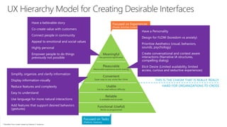
  • 23. Meaningful Has personal significance Pleasurable Memorable experience worth sharing Convenient Super easy to use, works like I think Usable Can be used without difficulty Reliable Is available and accurate Functional (Useful) Works as programmed Focused on Tasks (Platform, Features) **Modified from model created by Stephen P. Anderson THIS IS THE CHASM THAT IS REALLY, REALLY HARD FOR ORGANIZATIONS TO CROSS Focused on Experiences (People, Activities, Context) Have a believable story Co-create value with customers Connect people in community Appeal to emotional and social values Highly personal Empower people to do things previously not possible Simplify, organize, and clarify information Display information visually Reduce features and complexity Easy to understand Use language for more natural interactions Add features that support desired behaviors (gestures) Have a Personality Design for FLOW (boredom vs anxiety) Prioritize Aesthetics (visual, behaviors, sounds, psychology) Create conversational and context aware interactions (Narrative IA structures, compelling dialog) Elicit Desire (Limited availability, limited access, curious and seductive experiences)
  • 24. We needed to change how we work We needed “Lean UX”
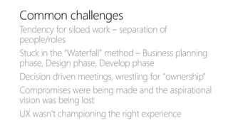
  • 25. Common challenges Tendency for siloed work – separation of people/roles Stuck in the “Waterfall” method – Business planning phase, Design phase, Develop phase Decision driven meetings, wrestling for “ownership” Compromises were being made and the aspirational vision was being lost UX wasn’t championing the right experience
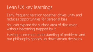
  • 29. Lean UX key learnings Early, frequent iteration together drives unity and reduces opportunities for personal bias You can expand the surface area of discussion without becoming trapped by it Having a common understanding of problems and our philosophy speeds up downstream decisions
  • 31. “Day by day, the number of devices, platforms, and browsers that need to work with your site grows. Responsive design [Multi-device design] represents a fundamental shift in how we’ll build websites for the decade to come.”
  • 33. Fixed width layouts :( There is no standard screen resolution, so quit designing like there is.
  • 35. Responsive = responsible Consumption of content is more than just design. Ensure your solutions are accessible, lightweight, cross-browser compatible, etc.
  • 36. Content hierarchy choreography Land on key content flows, balanced with business priorities. Data will help prioritize how content layout changes, disappears - but beware of removing content. Instead use content enhancement.
  • 37. Breakpoints and tweakpoints “If it ain’t broke, then don’t fix it.” – Someone Define breakpoints when content breaks, not for common device sizes
  • 40. Designing from the Gut Designing from the gut is a radical concept. It is generally met with a tremendous amount of friction in most software circles that tend to rely heavily on "logic and data" for all decisions.
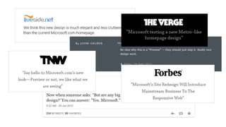
  • 41. design and developer community tech blogs online news sites
  • 43. “Looks great!” – Posted on Nov 28, 2012

Editor's Notes

  • #12: … to progressively enhance our work within different viewing contexts.
  • #15: Progressive capabilities (HTML5) Adaptive content (by device, browser) Responsive layout (breakpoints)
  • #17: Being truly Progressive means we needed to emphasize accessibility and semantics in web page markup, ensuring universal access to all basic content and functionality, regardless of a visitor’s browser and connection speed. And only serve additional, enhanced functionality, where the browsing experience is not degraded.
  • #18: As web designers, we have to look beyond the layout to envision how its elements will reflow & lockup at various widths, while maintaining form & hierarchy. Think flexible Text, Images, Videos, Tables, Forms, etc.
  • #19: Focus on the layout of a web page, ensuring the viewing environment renders appropriately across a broad range of devices and browsers, utilizing maximum effective screen real estate. “The concept of permanently placing content on a web page for a single browsing width or resolution is becoming a thing of the past.” Trent Walton – Paravel
  • #25: In order to have organizations and partners fully embrace the modern web design philosophy, you need to change how you work together.
  • #27: With Lean UX… the best way forward is to pull all members of a team together to design, build, test and then evaluate in multiple quick rounds.
  • #30: Collaboration, building trust, and having open discussions are key transformation principles that when paired with the Lean UX approach, maximize what is delivered and how it’s delivered.
  • #35: Get over the things you can’t control: Monitor color settings, Browser or version, Browser settings, Connection speed, User context
  • #36: Accessible means more then building for impaired users, it means designing for the person who is sitting outside, having a coffee on a bright sunny day.
  • #37: Content stacking, content swapping – its all the same. Media queries can be used to do more than patch broken layouts: with proper planning, you can begin to choreograph content proportional to screen size, serving the best possible experience on any device. Be careful though, what happens if a user visits at full-width one afternoon and revisits your site in the evening on a tablet, and everything looks completely different? It’s annoying.
  • #38: Determine your breakpoints based on visitor resolution ranges.
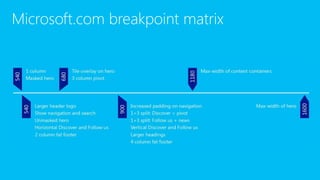
  • #39: 320px 1 column Masked hero 540px Larger header logo Show navigation and search Unmasked hero Horizontal Discover and Follow us 2 column fat footer 680px Tile overlay on hero 3 column pivot 900px Increased padding on navigation 1+3 split: Discover + pivot 1+3 split: Follow us + news Vertical Discover and Follow us Larger headings 4 column fat footer 1180px Max-width of content containers 1600px Max-width of hero
  • #41: This is not to say that there isn't a place for telemetry or usability studies in the act of designing software. It's simply a question of when and where. At Microsoft, we drew learnings from analytics and previous A/B testing, but at the end of the day it was strategy by gut, tweaking by data. Design had the ability and freedom to make gut calls.