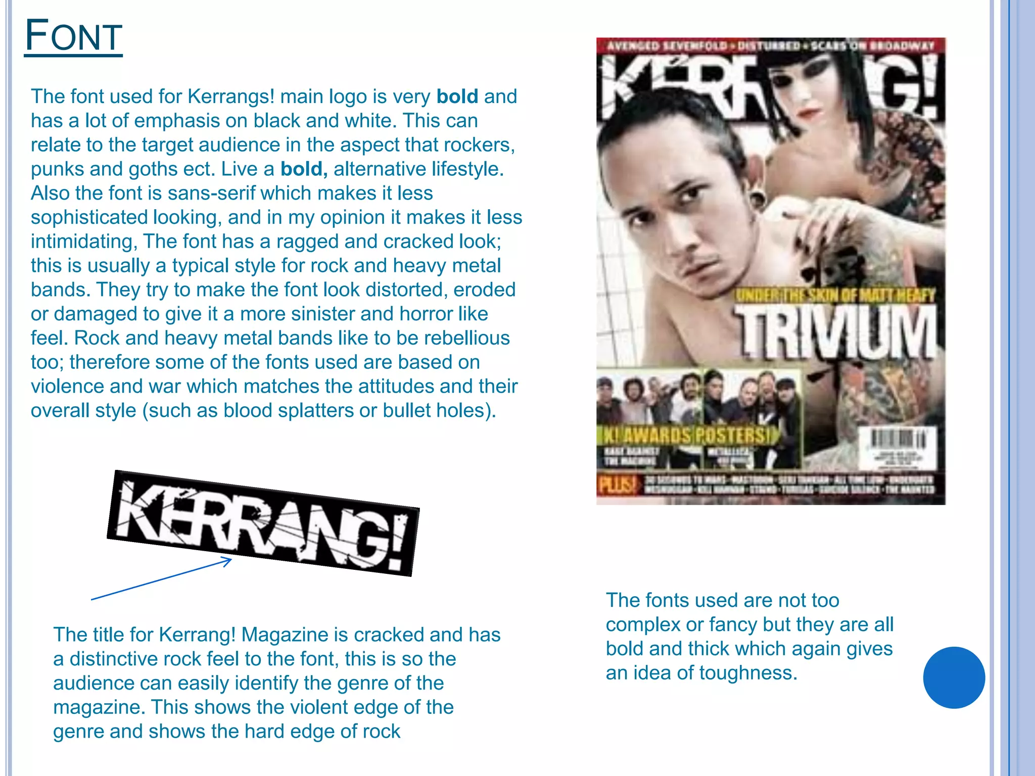
The fonts used in Kerrang! magazine are chosen to appeal to its target audience of 16-23 year olds interested in rock music. Bold, sans-serif fonts are used that have a ragged, distressed look meant to seem rebellious and rock-inspired. The title font is cracked to give a hard rock feel and show the genre. Captions and headlines use large, clear fonts so readers can easily find information. Photos show bands in a natural, intimate style relating to fans and the lively target demographic. Strong contrasts between black and white create emphasis. Overall the magazine strives to have an edgy yet accessible design that readers can easily identify with the rock genre.


