SlideShare a Scribd company logo
Bootstrap 4
Framework for easy and quick
responsive websites
Steps to Using Bootstrap
• Create or use an HTML page
• Load Bootstrap via CDN (or locally)
• Add jQuery and Bootstrap JavaScript
• Design your page
Open gallery.html
• Keep the viewport call – needed for Bootstrap
<!DOCTYPE html>
<html>
<head>
<title>Welcome to Bootstrap</title>
<meta charset="utf-8"> <!--might need -->
<meta name="viewport" content="width=device-width,initial-scale=1">
Load the CDN
• What is a CDN?
– a highly-distributed platform of servers that helps
minimize delays in loading web page content by
reducing the physical distance between the server
and the user.
– helps users around the world view the same high-
quality content without slow loading times.
– End goal is to reduce latency for web content
delivery
Definition from https://www.akamai.com/us/en/cdn/what-is-a-cdn.jsp
How does a CDN work?
• CDNs store a cached version of your website
content in multiple geographical locations
around the world,
– “points of presence” (PoPs)
• These PoPs will contain their own caching
servers and will be responsible for delivering
that content in the user’s location.
CDN Code
• Copy & paste the CDN code in the <head>
before other CSS
• https://getbootstrap.com
– Get started
<!DOCTYPE html>
<html>
<head>
<title>Welcome to Bootstrap</title>
<meta charset="utf-8">
<meta name="viewport" content="width=device-width,initial-scale=1">
<link rel="stylesheet"
href="https://maxcdn.bootstrapcdn.com/bootstrap/4.0.0/css/bootstrap.min.css"
integrity="sha384-
Gn5384xqQ1aoWXA+058RXPxPg6fy4IWvTNh0E263XmFcJlSAwiGgFAW/dAiS6JXm"
crossorigin="anonymous">
</head>
Link to JS files
• Before the closing </body> tag
<script src="https://code.jquery.com/jquery-3.3.1.slim.min.js" integrity="sha384-
q8i/X+965DzO0rT7abK41JStQIAqVgRVzpbzo5smXKp4YfRvH+8abtTE1Pi6jizo"
crossorigin="anonymous"></script>
<script src="https://cdnjs.cloudflare.com/ajax/libs/popper.js/1.14.7/umd/popper.min.js"
integrity="sha384-
UO2eT0CpHqdSJQ6hJty5KVphtPhzWj9WO1clHTMGa3JDZwrnQq4sF86dIHNDz0W1"
crossorigin="anonymous"></script>
<script src="https://stackpath.bootstrapcdn.com/bootstrap/4.3.1/js/bootstrap.min.js"
integrity="sha384-
JjSmVgyd0p3pXB1rRibZUAYoIIy6OrQ6VrjIEaFf/nJGzIxFDsf4x0xIM+B07jRM"
crossorigin="anonymous"></script>
</body>
</html>
NavBar Basics
• Creates a navigation element that is
responsive by default
• Automatically collapse on smaller screens
• Built-in support for adding branding, color
schemes, spacing, and other components
NavBar Basics
• Navbars require a wrapping .navbar with .navbar-
expand{-sm|-md|-lg|-xl} for responsive
collapsing and color scheme classes.
• Navbars and their contents are fluid by default.
• Navbars are responsive by default, but you can
easily modify them to change that.
• Ensure accessibility by using a <nav> element or,
if using a more generic element such as a <div>,
add a role="navigation" to every navbar to
explicitly identify it as a landmark region for users
of assistive technologies.
<nav class="navbar navbar-expand-md navbar-dark bg-dark">
<ul class="navbar-nav">
<li class="nav-item"><a class="nav-link" href="index.html">Home</a></li>
<li class="nav-item"><a class="nav-link" href="">About Us</a></li>
<li class="nav-item"><a class="nav-link" href="">Products</a></li>
<li class="nav-item"><a class="nav-link" href="">Gallery</a></li>
<li class="nav-item"><a class="nav-link" href="">Contact Us</a></li>
</ul>
</nav>
Responsive dark-themed navbar that collapses at the md (medium) breakpoint
Breakpoints
// Extra small devices (portrait phones, less than 576px)
// No media query since this is the default in Bootstrap
// Small devices (landscape phones, 576px and up)
@media (min-width: 576px) { ... }
// Medium devices (tablets, 768px and up)
@media (min-width: 768px) { ... }
// Large devices (desktops, 992px and up)
@media (min-width: 992px) { ... }
// Extra large devices (large desktops, 1200px and up)
@media (min-width: 1200px) { ... }
-sm for larger mobile phones
-md for tablets (≥768px);
-lg for laptops (≥992px);
-xl for desktops (≥1200px)
Color Schemes
Intro to Bootstrap
Adding Hamburger Button for mobile
• Add Button
<button class="navbar-toggler navbar-dark"
type="button" data-toggle="collapse" data-
target="#main-navigation">
<span class="navbar-toggler-icon"></span>
</button>
Adding Hamburger Button for mobile
• Tell it what should be collapsed in the button
<div class="collapse navbar-collapse" id="main-
navigation”>
<ul class="navbar-nav”>
<li class="nav-item"><a class="nav-link" href="index.html">Home</a></li>
…
<li class="nav-item"><a class="nav-link" href="">Contact Us</a></li>
</ul>
</div>
Layouts in Bootstrap
• Bootstrap Grid
– containers
• <div class="container">
– equal space on R & L of container
• <div class="container-fluid">
– full width
– columns
– rows
Container Examples
<div class="container">
Hello! I am in a simple container.
</div>
<div class="container-fluid">
Hello! I am in a full-width container.
</div>
From https://www.freecodecamp.org/news/learn-the-bootstrap-4-grid-system-in-10-minutes-e83bfae115da/
<div class="container”>
<header>
…
<img src="images/beagle_puppy.jpg" >
</div>
Bootstrap Rows
• Horizontal slices of the screen
• Have to be inside a “container”
• Only as containers for columns
• To use them, you need the .row class
<div class= “row”>
</div>
Bootstrap Columns
• Divide the screen horizontally
• If you place a single column in your row, it will
take up all the width.
• If you add two columns, they will each take
1/2 from the width.
• And so it goes for any number of columns up
to 12.
Setting Column Sizes
• Default
– Using the .col class sets the width for the column
dynamically.
– Depending on the number of columns in a row
• width of a column = width of the container / # of
columns
• Custom
– Use classes to define their size
– Bootstrap grid contains 12 columns by default
• 3 equal columns, you can use .col-4 for each one
<div class=“row”>
<div class = “col_6”>
…
</div>
<div class = “col_6”>
…
</div>
</div>
<div class=“row”>
<div class = “col_5”>
…
</div>
<div class = “col_7”>
…
</div>
</div>
<div class=“row”>
<div class = “col_6”>
…
</div>
<div class = “col_7”>
…
</div>
</div>
If the sum of the cols in your row
doesn’t get to 12, then they don’t
fill the whole row.
If the sum of the columns goes
beyond 12 then it will move to the
next line.
The first line will only display the
first elements that add up to 12 or
lower.
Setting Column Breakpoints
• Displaying 5 columns on mobile will make it
impossible to read/view
• Instead, use column breakpoints
• When specifying a breakpoint for a class, you
are telling the class to be active only for
resolutions that are at least as big as the
number that the breakpoint holds.
Bootstrap Breakpoints
• .col-sm for larger mobile phones (devices with
resolutions ≥ 576px);
• .col-md for tablets (≥768px);
• .col-lg for laptops (≥992px);
• .col-xl for desktops (≥1200px)
<div class=“row”>
<div class = “col-lg”>
…
</div>
<div class = “col-lg”>
…
</div>
</div>
Devices in the large view
Devices smaller than large
Combining Sizes and Breakpoints
<div class=“row”>
<div class = “col-lg-4”>
…
</div>
<div class = “col-lg-3”>
…
</div>
<div class = “col-lg-5”>
…
</div>
</div>
Smaller screens
Larger screens
Combining Sizes and Breakpoints
<div class=“row”>
<div class = “col-sm-6 col-lg-3”>
…
</div>
<div class = “col-sm-6 col-lg-3”>
…
</div>
<div class = “col-sm-6 col-lg-3”>
…
</div>
<div class = “col-sm-6 col-lg-3”>
…
</div>
</div>
Tablet screens
Laptop screens
Finishing Up The Gallery
<div class = "row”>
<div class="col-md-4 col-sm-6”>
<img src="images/balloons.jpg”>
</div>
…
</div>

More Related Content

Similar to Intro to Bootstrap (20)

PPTX
ICT Presentjrjdjdjdkkdkeeation Final.pptx
naziakhan111v
 
PPT
Twitter bootstrap (css, components and javascript)
NexThoughts Technologies
 
PDF
Bootstrap for webtechnology_data science.pdf
Harish Khodke
 
PDF
Pemrograman Web 4 - Bootstrap 3
Nur Fadli Utomo
 
PPT
Responsive web design
AirticsTrainer
 
PPTX
Create Responsive Website Design with Bootstrap 3
Wahyu Putra
 
PPTX
Bootstrap SLIDES for web development course
dreamy678
 
PDF
HTML & CSS #10 : Bootstrap
Jean Michel
 
PPTX
Module 3 - Intro to Bootstrap
Katherine McCurdy-Lapierre, R.G.D.
 
PPTX
Reboot-Typography.pptx reboot typography to help you in research
AadiChauhan2
 
PPT
Twitter bootstrap training_session_ppt
Radheshyam Kori
 
PPTX
Bootstrap
PumoTechnovation
 
PDF
Introduction to Responsive Web Development
Nikhil Baby
 
PPTX
Bootstrap [part 1]
Ghanshyam Patel
 
PDF
Stop reinventing the wheel: Build Responsive Websites Using Bootstrap
freshlybakedpixels
 
PPTX
Lecture-10.pptx
vishal choudhary
 
PPTX
Bootstrap
Divya Arora
 
PPTX
Bootstrap: the full overview
Gill Cleeren
 
PPTX
Bootstrap 3
Lanh Le
 
PPTX
Boot strap
Wahidullah Habib
 
ICT Presentjrjdjdjdkkdkeeation Final.pptx
naziakhan111v
 
Twitter bootstrap (css, components and javascript)
NexThoughts Technologies
 
Bootstrap for webtechnology_data science.pdf
Harish Khodke
 
Pemrograman Web 4 - Bootstrap 3
Nur Fadli Utomo
 
Responsive web design
AirticsTrainer
 
Create Responsive Website Design with Bootstrap 3
Wahyu Putra
 
Bootstrap SLIDES for web development course
dreamy678
 
HTML & CSS #10 : Bootstrap
Jean Michel
 
Module 3 - Intro to Bootstrap
Katherine McCurdy-Lapierre, R.G.D.
 
Reboot-Typography.pptx reboot typography to help you in research
AadiChauhan2
 
Twitter bootstrap training_session_ppt
Radheshyam Kori
 
Bootstrap
PumoTechnovation
 
Introduction to Responsive Web Development
Nikhil Baby
 
Bootstrap [part 1]
Ghanshyam Patel
 
Stop reinventing the wheel: Build Responsive Websites Using Bootstrap
freshlybakedpixels
 
Lecture-10.pptx
vishal choudhary
 
Bootstrap
Divya Arora
 
Bootstrap: the full overview
Gill Cleeren
 
Bootstrap 3
Lanh Le
 
Boot strap
Wahidullah Habib
 

More from kjkleindorfer (10)

PPTX
Logic and Coding of Java Interfaces & Swing Applications
kjkleindorfer
 
PPTX
Week11 Inheritance class relationships in Java
kjkleindorfer
 
PPTX
Week10 packages using objects in objects
kjkleindorfer
 
PPTX
Week9 Intro to classes and objects in Java
kjkleindorfer
 
PPTX
Layouts Part 2
kjkleindorfer
 
PPTX
Layouts
kjkleindorfer
 
PPTX
Using PHP to submit forms
kjkleindorfer
 
PPTX
Forms Part 1
kjkleindorfer
 
PPTX
CSS Box Model
kjkleindorfer
 
PPTX
CSS Selectors and Fonts
kjkleindorfer
 
Logic and Coding of Java Interfaces & Swing Applications
kjkleindorfer
 
Week11 Inheritance class relationships in Java
kjkleindorfer
 
Week10 packages using objects in objects
kjkleindorfer
 
Week9 Intro to classes and objects in Java
kjkleindorfer
 
Layouts Part 2
kjkleindorfer
 
Layouts
kjkleindorfer
 
Using PHP to submit forms
kjkleindorfer
 
Forms Part 1
kjkleindorfer
 
CSS Box Model
kjkleindorfer
 
CSS Selectors and Fonts
kjkleindorfer
 
Ad

Recently uploaded (20)

PPTX
2025 Winter SWAYAM NPTEL & A Student.pptx
Utsav Yagnik
 
DOCX
A summary of SPRING SILKWORMS by Mao Dun.docx
maryjosie1
 
PDF
ARAL-Orientation_Morning-Session_Day-11.pdf
JoelVilloso1
 
PDF
People & Earth's Ecosystem -Lesson 2: People & Population
marvinnbustamante1
 
PDF
Zoology (Animal Physiology) practical Manual
raviralanaresh2
 
PPTX
How to Configure Access Rights of Manufacturing Orders in Odoo 18 Manufacturing
Celine George
 
PDF
CONCURSO DE POESIA “POETUFAS – PASSOS SUAVES PELO VERSO.pdf
Colégio Santa Teresinha
 
PPTX
STAFF DEVELOPMENT AND WELFARE: MANAGEMENT
PRADEEP ABOTHU
 
PPTX
How to Manage Promotions in Odoo 18 Sales
Celine George
 
PPTX
HYDROCEPHALUS: NURSING MANAGEMENT .pptx
PRADEEP ABOTHU
 
PPSX
HEALTH ASSESSMENT (Community Health Nursing) - GNM 1st Year
Priyanshu Anand
 
PDF
community health nursing question paper 2.pdf
Prince kumar
 
PPTX
Pyhton with Mysql to perform CRUD operations.pptx
Ramakrishna Reddy Bijjam
 
PPTX
How to Configure Prepayments in Odoo 18 Sales
Celine George
 
PPTX
How to Set Maximum Difference Odoo 18 POS
Celine George
 
PPTX
Views on Education of Indian Thinkers J.Krishnamurthy..pptx
ShrutiMahanta1
 
PPTX
Growth and development and milestones, factors
BHUVANESHWARI BADIGER
 
PDF
'' IMPORTANCE OF EXCLUSIVE BREAST FEEDING ''
SHAHEEN SHAIKH
 
PPTX
How to Manage Access Rights & User Types in Odoo 18
Celine George
 
PPT
Talk on Critical Theory, Part One, Philosophy of Social Sciences
Soraj Hongladarom
 
2025 Winter SWAYAM NPTEL & A Student.pptx
Utsav Yagnik
 
A summary of SPRING SILKWORMS by Mao Dun.docx
maryjosie1
 
ARAL-Orientation_Morning-Session_Day-11.pdf
JoelVilloso1
 
People & Earth's Ecosystem -Lesson 2: People & Population
marvinnbustamante1
 
Zoology (Animal Physiology) practical Manual
raviralanaresh2
 
How to Configure Access Rights of Manufacturing Orders in Odoo 18 Manufacturing
Celine George
 
CONCURSO DE POESIA “POETUFAS – PASSOS SUAVES PELO VERSO.pdf
Colégio Santa Teresinha
 
STAFF DEVELOPMENT AND WELFARE: MANAGEMENT
PRADEEP ABOTHU
 
How to Manage Promotions in Odoo 18 Sales
Celine George
 
HYDROCEPHALUS: NURSING MANAGEMENT .pptx
PRADEEP ABOTHU
 
HEALTH ASSESSMENT (Community Health Nursing) - GNM 1st Year
Priyanshu Anand
 
community health nursing question paper 2.pdf
Prince kumar
 
Pyhton with Mysql to perform CRUD operations.pptx
Ramakrishna Reddy Bijjam
 
How to Configure Prepayments in Odoo 18 Sales
Celine George
 
How to Set Maximum Difference Odoo 18 POS
Celine George
 
Views on Education of Indian Thinkers J.Krishnamurthy..pptx
ShrutiMahanta1
 
Growth and development and milestones, factors
BHUVANESHWARI BADIGER
 
'' IMPORTANCE OF EXCLUSIVE BREAST FEEDING ''
SHAHEEN SHAIKH
 
How to Manage Access Rights & User Types in Odoo 18
Celine George
 
Talk on Critical Theory, Part One, Philosophy of Social Sciences
Soraj Hongladarom
 
Ad

Intro to Bootstrap

  • 1. Bootstrap 4 Framework for easy and quick responsive websites
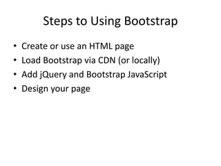
  • 2. Steps to Using Bootstrap • Create or use an HTML page • Load Bootstrap via CDN (or locally) • Add jQuery and Bootstrap JavaScript • Design your page
  • 3. Open gallery.html • Keep the viewport call – needed for Bootstrap <!DOCTYPE html> <html> <head> <title>Welcome to Bootstrap</title> <meta charset="utf-8"> <!--might need --> <meta name="viewport" content="width=device-width,initial-scale=1">
  • 4. Load the CDN • What is a CDN? – a highly-distributed platform of servers that helps minimize delays in loading web page content by reducing the physical distance between the server and the user. – helps users around the world view the same high- quality content without slow loading times. – End goal is to reduce latency for web content delivery Definition from https://www.akamai.com/us/en/cdn/what-is-a-cdn.jsp
  • 5. How does a CDN work? • CDNs store a cached version of your website content in multiple geographical locations around the world, – “points of presence” (PoPs) • These PoPs will contain their own caching servers and will be responsible for delivering that content in the user’s location.
  • 6. CDN Code • Copy & paste the CDN code in the <head> before other CSS • https://getbootstrap.com – Get started
  • 7. <!DOCTYPE html> <html> <head> <title>Welcome to Bootstrap</title> <meta charset="utf-8"> <meta name="viewport" content="width=device-width,initial-scale=1"> <link rel="stylesheet" href="https://maxcdn.bootstrapcdn.com/bootstrap/4.0.0/css/bootstrap.min.css" integrity="sha384- Gn5384xqQ1aoWXA+058RXPxPg6fy4IWvTNh0E263XmFcJlSAwiGgFAW/dAiS6JXm" crossorigin="anonymous"> </head>
  • 8. Link to JS files • Before the closing </body> tag
  • 9. <script src="https://code.jquery.com/jquery-3.3.1.slim.min.js" integrity="sha384- q8i/X+965DzO0rT7abK41JStQIAqVgRVzpbzo5smXKp4YfRvH+8abtTE1Pi6jizo" crossorigin="anonymous"></script> <script src="https://cdnjs.cloudflare.com/ajax/libs/popper.js/1.14.7/umd/popper.min.js" integrity="sha384- UO2eT0CpHqdSJQ6hJty5KVphtPhzWj9WO1clHTMGa3JDZwrnQq4sF86dIHNDz0W1" crossorigin="anonymous"></script> <script src="https://stackpath.bootstrapcdn.com/bootstrap/4.3.1/js/bootstrap.min.js" integrity="sha384- JjSmVgyd0p3pXB1rRibZUAYoIIy6OrQ6VrjIEaFf/nJGzIxFDsf4x0xIM+B07jRM" crossorigin="anonymous"></script> </body> </html>
  • 10. NavBar Basics • Creates a navigation element that is responsive by default • Automatically collapse on smaller screens • Built-in support for adding branding, color schemes, spacing, and other components
  • 11. NavBar Basics • Navbars require a wrapping .navbar with .navbar- expand{-sm|-md|-lg|-xl} for responsive collapsing and color scheme classes. • Navbars and their contents are fluid by default. • Navbars are responsive by default, but you can easily modify them to change that. • Ensure accessibility by using a <nav> element or, if using a more generic element such as a <div>, add a role="navigation" to every navbar to explicitly identify it as a landmark region for users of assistive technologies.
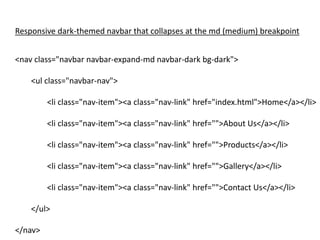
  • 12. <nav class="navbar navbar-expand-md navbar-dark bg-dark"> <ul class="navbar-nav"> <li class="nav-item"><a class="nav-link" href="index.html">Home</a></li> <li class="nav-item"><a class="nav-link" href="">About Us</a></li> <li class="nav-item"><a class="nav-link" href="">Products</a></li> <li class="nav-item"><a class="nav-link" href="">Gallery</a></li> <li class="nav-item"><a class="nav-link" href="">Contact Us</a></li> </ul> </nav> Responsive dark-themed navbar that collapses at the md (medium) breakpoint
  • 13. Breakpoints // Extra small devices (portrait phones, less than 576px) // No media query since this is the default in Bootstrap // Small devices (landscape phones, 576px and up) @media (min-width: 576px) { ... } // Medium devices (tablets, 768px and up) @media (min-width: 768px) { ... } // Large devices (desktops, 992px and up) @media (min-width: 992px) { ... } // Extra large devices (large desktops, 1200px and up) @media (min-width: 1200px) { ... } -sm for larger mobile phones -md for tablets (≥768px); -lg for laptops (≥992px); -xl for desktops (≥1200px)
  • 16. Adding Hamburger Button for mobile • Add Button <button class="navbar-toggler navbar-dark" type="button" data-toggle="collapse" data- target="#main-navigation"> <span class="navbar-toggler-icon"></span> </button>
  • 17. Adding Hamburger Button for mobile • Tell it what should be collapsed in the button <div class="collapse navbar-collapse" id="main- navigation”> <ul class="navbar-nav”> <li class="nav-item"><a class="nav-link" href="index.html">Home</a></li> … <li class="nav-item"><a class="nav-link" href="">Contact Us</a></li> </ul> </div>
  • 18. Layouts in Bootstrap • Bootstrap Grid – containers • <div class="container"> – equal space on R & L of container • <div class="container-fluid"> – full width – columns – rows
  • 19. Container Examples <div class="container"> Hello! I am in a simple container. </div> <div class="container-fluid"> Hello! I am in a full-width container. </div> From https://www.freecodecamp.org/news/learn-the-bootstrap-4-grid-system-in-10-minutes-e83bfae115da/
  • 21. Bootstrap Rows • Horizontal slices of the screen • Have to be inside a “container” • Only as containers for columns • To use them, you need the .row class <div class= “row”> </div>
  • 22. Bootstrap Columns • Divide the screen horizontally • If you place a single column in your row, it will take up all the width. • If you add two columns, they will each take 1/2 from the width. • And so it goes for any number of columns up to 12.
  • 23. Setting Column Sizes • Default – Using the .col class sets the width for the column dynamically. – Depending on the number of columns in a row • width of a column = width of the container / # of columns • Custom – Use classes to define their size – Bootstrap grid contains 12 columns by default • 3 equal columns, you can use .col-4 for each one
  • 24. <div class=“row”> <div class = “col_6”> … </div> <div class = “col_6”> … </div> </div>
  • 25. <div class=“row”> <div class = “col_5”> … </div> <div class = “col_7”> … </div> </div>
  • 26. <div class=“row”> <div class = “col_6”> … </div> <div class = “col_7”> … </div> </div> If the sum of the cols in your row doesn’t get to 12, then they don’t fill the whole row. If the sum of the columns goes beyond 12 then it will move to the next line. The first line will only display the first elements that add up to 12 or lower.
  • 27. Setting Column Breakpoints • Displaying 5 columns on mobile will make it impossible to read/view • Instead, use column breakpoints • When specifying a breakpoint for a class, you are telling the class to be active only for resolutions that are at least as big as the number that the breakpoint holds.
  • 28. Bootstrap Breakpoints • .col-sm for larger mobile phones (devices with resolutions ≥ 576px); • .col-md for tablets (≥768px); • .col-lg for laptops (≥992px); • .col-xl for desktops (≥1200px)
  • 29. <div class=“row”> <div class = “col-lg”> … </div> <div class = “col-lg”> … </div> </div> Devices in the large view Devices smaller than large
  • 30. Combining Sizes and Breakpoints <div class=“row”> <div class = “col-lg-4”> … </div> <div class = “col-lg-3”> … </div> <div class = “col-lg-5”> … </div> </div> Smaller screens Larger screens
  • 31. Combining Sizes and Breakpoints <div class=“row”> <div class = “col-sm-6 col-lg-3”> … </div> <div class = “col-sm-6 col-lg-3”> … </div> <div class = “col-sm-6 col-lg-3”> … </div> <div class = “col-sm-6 col-lg-3”> … </div> </div> Tablet screens Laptop screens
  • 32. Finishing Up The Gallery <div class = "row”> <div class="col-md-4 col-sm-6”> <img src="images/balloons.jpg”> </div> … </div>