Information Visualization
as a Research Method in
Art History


CAA 2012 session
Introduction by Lev Manovich
              1
visualization timeline:

- development of key techniques: by 1830s
- scientific visualization: 1988-
- information visualization: 1998-
- artistic visualization: 2001-
- visualization is featured in Design and
Elastic Mind at MOMA: 2008
- Obama campaign site uses sophisticated
visualization: 2008
- visualization become ubiquitous (you have
to include in your social web site): 2011

                          2
Aaron Koblin, Flight Patterns. 2005.
                                       3
Alex Dragulescki (UCSD). Spam Architecture. 2005.
                               4
Visualization of books flow in Seattle Public Library. Artist: George Legrady, UCSB

                                           5
IAC Building, NYC: outside view; the lobby with the visualization showing
global users accessing web properties owned by IAC.
Dynamic visualization as a new logo of a company/institution -- representation
of dynamic process rather than static identity.
                                           6
New York Times building: visualization of text drawn from NYT archives.
Artists: Ben Rubin and Mark Hanson.

                                             7
8
9
10
2008: Graphs of statistical data are beginning to be integrated in consumer software
and webware. Example: stats for activity on individual user account on Flickr.


                                           11
2009: stats for videos on YouTube.


               12
2009: stats for videos on YouTube.


               13
the development of “cultural visualization”:
graphing cultural patterns


                       14
History Flow

               15
History Flow

               16
Stefanie Posavec.
Literary Organism.

                     17
Lee Byron. Personal listening history using last.fm data.

                                             18
Blue pictures are by locals. Red pictures are by tourists. Yellow pictures might be by either.
Base map © OpenStreetMap, CC-BY-SA 
                                             19
Visualization by Eric Fischer
Mapping global culture using “digital traces.” Google Trends, 2007.


                               20
Intro to CAA 2012 session "Visualization as a Method in Art History"
visualization + big cultural data:

NEH Offfice of Digital Humanities (created 3/2008)

Humanities High Performance Computing initiative:
“Humanities High-Performance Computing (HHPC) refers to the use of high-
performance machines for humanities and social science projects. Currently, only a
small number of humanities scholars are taking advantage of high-performance
computing. But just as the sciences have, over time, begun to tap the enormous
potential of HPC, the humanities are beginning to as well. Humanities scholars often
deal with large sets of unstructured data. This might take the form of historical
newspapers, books, election data, archaeological fragments, audio or video contents,
or a host of others. HHPC offers the humanist opportunities to sort through, mine,
and better understand and visualize this data.”


                                          22
January 2009:
NEH and NSF announce DIGGING INTO DATA
CHALLENGE.
Grant amounts: up to 300K USD.

"The creation of vast quantities of Internet accessible digital data and the
development of techniques for large-scale data analysis and visualization have led
to remarkable new discoveries in genetics, astronomy, and other fields, and—
importantly—connections between academic disciplinary areas."

"With books, newspapers, journals, films, artworks, and sound recordings being
digitized on a massive scale, it is possible to apply data analysis techniques to large
collections of diverse cultural heritage resources as well as scientific data. How
might these techniques help scholars use these materials to ask new questions about
and gain new insights into our world?"


                                           23
Usually visualizations of cultural data do not
show the actual objects (texts, images, etc.)
but only show patterns in metadata (dates,
names, text features, geo locations).

In our Software Studies Initiative at UCSD
(softwarestudies.com) we developed tools
to visualize the actual large collections.
Images can be sorted in a variety of ways
using both existing metadata and automatic
measurements of their visual attributes.
Intro to CAA 2012 session "Visualization as a Method in Art History"
imageplot of 1 million manga pages organized by visual characteristics
Upper part of the visualization (closeup
                                         view) contains pages with full range of gray
                                         tones, and lots of texture and details


Bottom right part of the visualization
(closeup view) contains pages in
black and white with little detail and
no texture
Image plot of 393 Mark Rothko’s paintings (1927-1970). Hao Wang and Mayra
Vasquez (undergraduate UCSD students). 2011. X-axis = date (year). Y-axis =
average brightness (mean). Writings about Mark Rothko often emphasize the
dark paintings created in the last years of his life. However, visualizing 393
paintings (1927-1970) shows that this period represents a culmination of a trend
Image plots of selected paintings by six impressionist artists.
X-axis = mean saturation. Y-axis = median hue.
Megan O’Rourke (undergraduate UCSD student), 2012.
Intro to CAA 2012 session "Visualization as a Method in Art History"
our free software tools for analyzing and
visualizing large image and video
collections, publications and projects:

softwarestudies.com

More Related Content

PDF
How and why study big cultural data v2
PPTX
Urban algorithms
PPT
How and why study big cultural data
PDF
What Does Data Want? (2019-2020)
PDF
Science of culture? Computational analysis and visualization of cultural imag...
PPTX
Ai and Myths of Creativity
PDF
Can you pass a Turing test? AI, Creativity and the Arts
PPTX
AINL 2016: Rykov, Nagornyy, Koltsova, Natta, Kremenets, Manovich, Cerrone, Cr...
How and why study big cultural data v2
Urban algorithms
How and why study big cultural data
What Does Data Want? (2019-2020)
Science of culture? Computational analysis and visualization of cultural imag...
Ai and Myths of Creativity
Can you pass a Turing test? AI, Creativity and the Arts
AINL 2016: Rykov, Nagornyy, Koltsova, Natta, Kremenets, Manovich, Cerrone, Cr...

Similar to Intro to CAA 2012 session "Visualization as a Method in Art History" (20)

PPTX
Data Visualization: Using Vision to Think about the Humanities
PPTX
Data Visualizatiion: Using Vision to Think about the Humanities
PPTX
PDF
WDE08 Visualizing Web of Data
PDF
Curation, crowds, and big data
PDF
The Online-Life of Media Art-Archives
PPTX
Digital Art and Philosophy #2
PPS
The Museum Visitor of 2017: The Impact of the Internet Age on Labels, Exhibit...
PPTX
9 Visualization In E Social Science
PPTX
9 Visualization In E Social Science
DOC
Citizens, Journalists and User-Generated Content
PPT
The s+a3 project: leveraging analytic resources
PPTX
AHRC CDP Digital Humanities 101
PDF
Critical Network Mapping, Burak Arikan talk at Eyeo2014, Minneapolis
PPT
Lev Manovich
PDF
GeoVisualization for Understanding Cities
PDF
A Cartography Of Research In Graphic Design
PDF
Andrea Ballatore: Beyond GIS? The future of Cultural Geo-Analytics
PDF
Statistics in Journalism Sheffield 2014
PDF
pkpadmin,+1008-4741-1-CE.pdf
Data Visualization: Using Vision to Think about the Humanities
Data Visualizatiion: Using Vision to Think about the Humanities
WDE08 Visualizing Web of Data
Curation, crowds, and big data
The Online-Life of Media Art-Archives
Digital Art and Philosophy #2
The Museum Visitor of 2017: The Impact of the Internet Age on Labels, Exhibit...
9 Visualization In E Social Science
Citizens, Journalists and User-Generated Content
The s+a3 project: leveraging analytic resources
AHRC CDP Digital Humanities 101
Critical Network Mapping, Burak Arikan talk at Eyeo2014, Minneapolis
Lev Manovich
GeoVisualization for Understanding Cities
A Cartography Of Research In Graphic Design
Andrea Ballatore: Beyond GIS? The future of Cultural Geo-Analytics
Statistics in Journalism Sheffield 2014
pkpadmin,+1008-4741-1-CE.pdf
Ad

Recently uploaded (20)

PDF
Diabetes Mellitus , types , clinical picture, investigation and managment
PPTX
PLASMA AND ITS CONSTITUENTS 123.pptx
PPTX
Key-Features-of-the-SHS-Program-v4-Slides (3) PPT2.pptx
PDF
Lecture on Viruses: Structure, Classification, Replication, Effects on Cells,...
PDF
FYJC - Chemistry textbook - standard 11.
PDF
Everyday Spelling and Grammar by Kathi Wyldeck
PPTX
Power Point PR B.Inggris 12 Ed. 2019.pptx
PDF
Health aspects of bilberry: A review on its general benefits
PDF
Physical education and sports and CWSN notes
PPTX
BSCE 2 NIGHT (CHAPTER 2) just cases.pptx
PPT
hemostasis and its significance, physiology
PDF
0520_Scheme_of_Work_(for_examination_from_2021).pdf
PDF
African Communication Research: A review
PPTX
4. Diagnosis and treatment planning in RPD.pptx
PPT
hsl powerpoint resource goyloveh feb 07.ppt
PDF
The TKT Course. Modules 1, 2, 3.for self study
PPTX
Thinking Routines and Learning Engagements.pptx
PPT
Acidosis in Dairy Herds: Causes, Signs, Management, Prevention and Treatment
PDF
Nurlina - Urban Planner Portfolio (english ver)
PDF
Chevening Scholarship Application and Interview Preparation Guide
Diabetes Mellitus , types , clinical picture, investigation and managment
PLASMA AND ITS CONSTITUENTS 123.pptx
Key-Features-of-the-SHS-Program-v4-Slides (3) PPT2.pptx
Lecture on Viruses: Structure, Classification, Replication, Effects on Cells,...
FYJC - Chemistry textbook - standard 11.
Everyday Spelling and Grammar by Kathi Wyldeck
Power Point PR B.Inggris 12 Ed. 2019.pptx
Health aspects of bilberry: A review on its general benefits
Physical education and sports and CWSN notes
BSCE 2 NIGHT (CHAPTER 2) just cases.pptx
hemostasis and its significance, physiology
0520_Scheme_of_Work_(for_examination_from_2021).pdf
African Communication Research: A review
4. Diagnosis and treatment planning in RPD.pptx
hsl powerpoint resource goyloveh feb 07.ppt
The TKT Course. Modules 1, 2, 3.for self study
Thinking Routines and Learning Engagements.pptx
Acidosis in Dairy Herds: Causes, Signs, Management, Prevention and Treatment
Nurlina - Urban Planner Portfolio (english ver)
Chevening Scholarship Application and Interview Preparation Guide
Ad

Intro to CAA 2012 session "Visualization as a Method in Art History"

  • 1. Information Visualization as a Research Method in Art History CAA 2012 session Introduction by Lev Manovich 1
  • 2. visualization timeline: - development of key techniques: by 1830s - scientific visualization: 1988- - information visualization: 1998- - artistic visualization: 2001- - visualization is featured in Design and Elastic Mind at MOMA: 2008 - Obama campaign site uses sophisticated visualization: 2008 - visualization become ubiquitous (you have to include in your social web site): 2011 2
  • 3. Aaron Koblin, Flight Patterns. 2005. 3
  • 4. Alex Dragulescki (UCSD). Spam Architecture. 2005. 4
  • 5. Visualization of books flow in Seattle Public Library. Artist: George Legrady, UCSB 5
  • 6. IAC Building, NYC: outside view; the lobby with the visualization showing global users accessing web properties owned by IAC. Dynamic visualization as a new logo of a company/institution -- representation of dynamic process rather than static identity. 6
  • 7. New York Times building: visualization of text drawn from NYT archives. Artists: Ben Rubin and Mark Hanson. 7
  • 8. 8
  • 9. 9
  • 10. 10
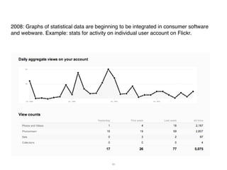
  • 11. 2008: Graphs of statistical data are beginning to be integrated in consumer software and webware. Example: stats for activity on individual user account on Flickr. 11
  • 12. 2009: stats for videos on YouTube. 12
  • 13. 2009: stats for videos on YouTube. 13
  • 14. the development of “cultural visualization”: graphing cultural patterns 14
  • 18. Lee Byron. Personal listening history using last.fm data. 18
  • 19. Blue pictures are by locals. Red pictures are by tourists. Yellow pictures might be by either. Base map © OpenStreetMap, CC-BY-SA  19 Visualization by Eric Fischer
  • 20. Mapping global culture using “digital traces.” Google Trends, 2007. 20
  • 22. visualization + big cultural data: NEH Offfice of Digital Humanities (created 3/2008) Humanities High Performance Computing initiative: “Humanities High-Performance Computing (HHPC) refers to the use of high- performance machines for humanities and social science projects. Currently, only a small number of humanities scholars are taking advantage of high-performance computing. But just as the sciences have, over time, begun to tap the enormous potential of HPC, the humanities are beginning to as well. Humanities scholars often deal with large sets of unstructured data. This might take the form of historical newspapers, books, election data, archaeological fragments, audio or video contents, or a host of others. HHPC offers the humanist opportunities to sort through, mine, and better understand and visualize this data.” 22
  • 23. January 2009: NEH and NSF announce DIGGING INTO DATA CHALLENGE. Grant amounts: up to 300K USD. "The creation of vast quantities of Internet accessible digital data and the development of techniques for large-scale data analysis and visualization have led to remarkable new discoveries in genetics, astronomy, and other fields, and— importantly—connections between academic disciplinary areas." "With books, newspapers, journals, films, artworks, and sound recordings being digitized on a massive scale, it is possible to apply data analysis techniques to large collections of diverse cultural heritage resources as well as scientific data. How might these techniques help scholars use these materials to ask new questions about and gain new insights into our world?" 23
  • 24. Usually visualizations of cultural data do not show the actual objects (texts, images, etc.) but only show patterns in metadata (dates, names, text features, geo locations). In our Software Studies Initiative at UCSD (softwarestudies.com) we developed tools to visualize the actual large collections. Images can be sorted in a variety of ways using both existing metadata and automatic measurements of their visual attributes.
  • 26. imageplot of 1 million manga pages organized by visual characteristics
  • 27. Upper part of the visualization (closeup view) contains pages with full range of gray tones, and lots of texture and details Bottom right part of the visualization (closeup view) contains pages in black and white with little detail and no texture
  • 28. Image plot of 393 Mark Rothko’s paintings (1927-1970). Hao Wang and Mayra Vasquez (undergraduate UCSD students). 2011. X-axis = date (year). Y-axis = average brightness (mean). Writings about Mark Rothko often emphasize the dark paintings created in the last years of his life. However, visualizing 393 paintings (1927-1970) shows that this period represents a culmination of a trend
  • 29. Image plots of selected paintings by six impressionist artists. X-axis = mean saturation. Y-axis = median hue. Megan O’Rourke (undergraduate UCSD student), 2012.
  • 31. our free software tools for analyzing and visualizing large image and video collections, publications and projects: softwarestudies.com