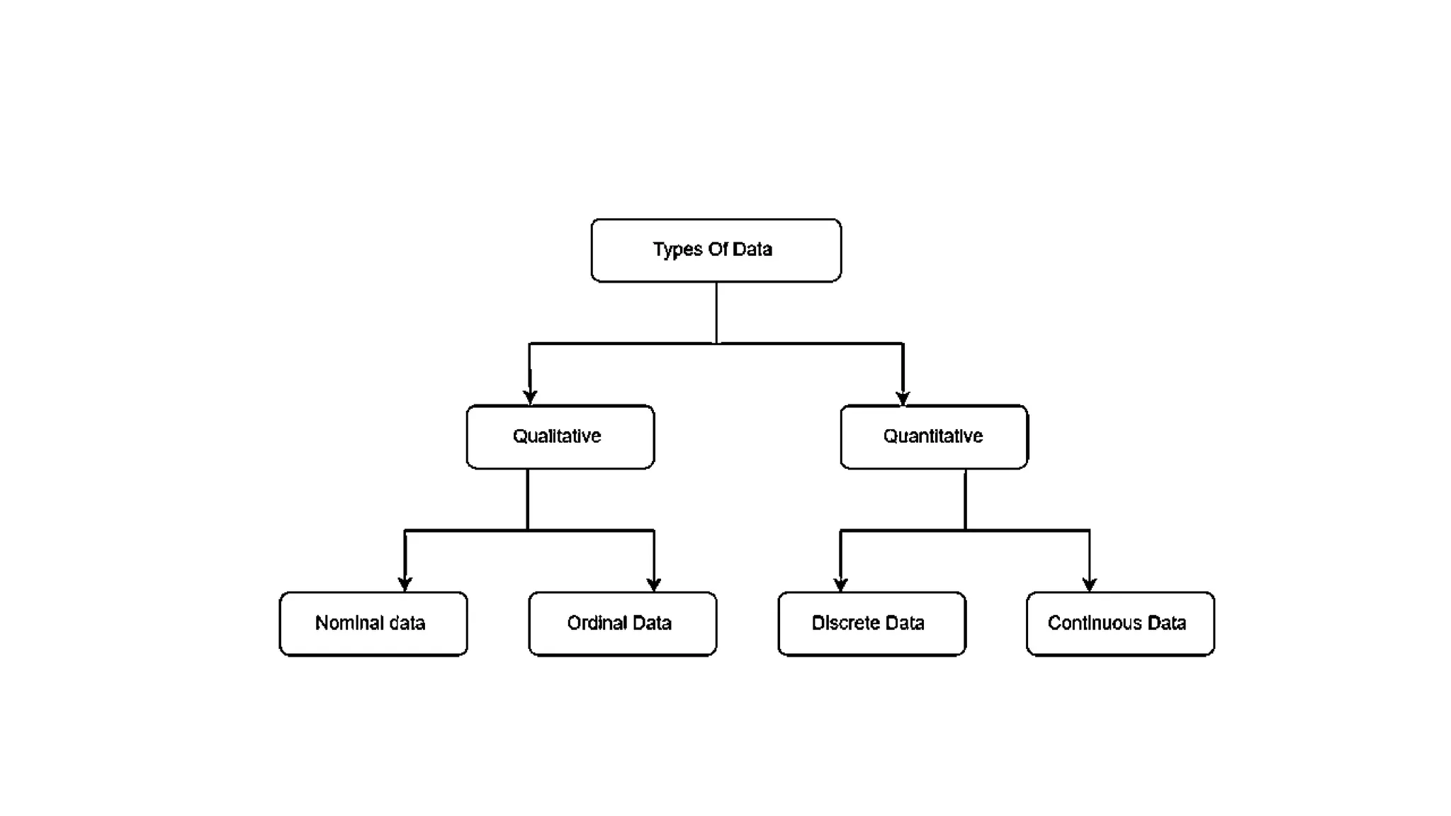
Module 1
Business Analytics
• Business analytics is the process of transforming data into
insights to improve business decisions.
• Data management, data visualization, predictive modeling, data
mining, forecasting simulation, and optimization are some of
the tools used to create insights from data. Business analytics
involves a combination of the following
• identifying new patterns and relationships with data mining;
• using quantitative and statistical analysis to design business models;
• conducting multi-variable testing based on findings;
• forecasting future business needs, performance, and industry trends
with predictive modeling; and
• communicating your findings in easy-to-digest reports to colleagues,
management, and customers.
To be more precise…
• shaping and evaluating future company decisions based on the
performance of past initiatives or market trends;
• examining individual departments’ performance within an organization
and influencing their growth efforts;
• monitoring employees’ performance and productivity;
• determining current and future staffing needs and the market skills
needed to perform these roles effectively;
• assessing and predicting how well potential investments will perform;
• identifying demand for a particular product or service based on market
trends and consumer behavior;
• scheduling release dates for new products and media;
• evaluating product sales by location, and using that
information to meet future customer demands;
• creating optimal logistics routes for shipping and delivering
merchandise;
• making product recommendations based on customers’ past
search habits;
• gathering data from vehicles and equipment to improve
future performance; and
• identifying potential growth opportunities for a business, and
how these scenarios could play out.
Different Types of Data
• There are different types of data in Statistics, that are collected, analyzed,
interpreted and presented.
• The data are the individual pieces of factual information recorded, and it is
used for the purpose of the analysis process.
• The two processes of data analysis are interpretation and presentation.
• Data classification and data handling are important processes as it involves a
multitude of tags and labels to define the data, its integrity and confidentiality.
• What are Types of Data in Statistics?
• The data is classified into majorly four categories:
• Nominal data
• Ordinal data
• Discrete data
• Continuous data
Visualization
• Data visualization is the representation of information and data
using charts, graphs, maps, and other visual tools. These
visualizations allow us to easily understand any patterns,
trends, or outliers in a data set.
• Data visualization also presents data to the general public or
specific audiences without technical knowledge in an accessible
manner. For example, the health agency in a government might
provide a map of vaccinated regions.
• The purpose of data visualization is to help drive informed
decision-making and to add colorful meaning to an otherwise
bland database.
• Benefits of data visualization
• Data visualization can be used in many contexts in nearly every field, like public
policy, finance, marketing, retail, education, sports, history, and more. Here are
the benefits of data visualization:
• Storytelling: People are drawn to colors and patterns in clothing, arts and
culture, architecture, and more. Data is no different—colors and patterns allow
us to visualize the story within the data.
• Accessibility: Information is shared in an accessible, easy-to-understand
manner for a variety of audiences.
• Visualize relationships: It’s easier to spot the relationships and patterns within
a data set when the information is presented in a graph or chart.
• Exploration: More accessible data means more opportunities to explore,
collaborate, and inform actionable decisions.
• Tools for visualizing data
• There are plenty of data visualization tools out there to suit your needs.
Before committing to one, consider researching whether you need an open-
source site or could simply create a graph using Excel or Google Charts. The
following are common data visualization tools that could suit your needs.
• Tableau
• Google Charts
• Dundas BI
• Power BI
• JupyteR
• Infogram
• ChartBlocks
• D3.js
• FusionCharts
• Grafana
• Types of data visualization
• Visualizing data can be as simple as a bar graph or scatter plot but becomes powerful
when analyzing, for example, the median age of the United States Congress vis-a-vis the
median age of Americans. Here are some common types of data visualizations:
• Table: A table is data displayed in rows and columns, which can be easily created in a
Word document or Excel spreadsheet.
• Chart or graph: Information is presented in tabular form with data displayed along an x
and y axis, usually with bars, points, or lines, to represent data in comparison. An
infographic is a special type of chart that combines visuals and words to illustrate the
data.
• Gantt chart: A Gantt chart is a bar chart that portrays a timeline and tasks specifically used in
project management.
• Pie chart: A pie chart divides data into percentages featured in “slices” of a pie, all adding up to
100%.
• Histograms: A histogram is a graph used to represent the frequency distribution of a few
data points of one variable. Histograms often classify data into various “bins” or “range
groups” and count how many data points belong to each of those bins.
• Geospatial visualization: Data is depicted in map form with shapes and colors that
illustrate the relationship between specific locations, such as a choropleth or heat map.
• Dashboard: Data and visualizations are displayed, usually for business purposes, to help
analysts understand and present data.
Introduction to Data science and understanding the basics

Introduction to Data science and understanding the basics

  • 1.
  • 7.
    Business Analytics • Businessanalytics is the process of transforming data into insights to improve business decisions. • Data management, data visualization, predictive modeling, data mining, forecasting simulation, and optimization are some of the tools used to create insights from data. Business analytics involves a combination of the following • identifying new patterns and relationships with data mining; • using quantitative and statistical analysis to design business models; • conducting multi-variable testing based on findings; • forecasting future business needs, performance, and industry trends with predictive modeling; and • communicating your findings in easy-to-digest reports to colleagues, management, and customers.
  • 8.
    To be moreprecise… • shaping and evaluating future company decisions based on the performance of past initiatives or market trends; • examining individual departments’ performance within an organization and influencing their growth efforts; • monitoring employees’ performance and productivity; • determining current and future staffing needs and the market skills needed to perform these roles effectively; • assessing and predicting how well potential investments will perform; • identifying demand for a particular product or service based on market trends and consumer behavior; • scheduling release dates for new products and media;
  • 9.
    • evaluating productsales by location, and using that information to meet future customer demands; • creating optimal logistics routes for shipping and delivering merchandise; • making product recommendations based on customers’ past search habits; • gathering data from vehicles and equipment to improve future performance; and • identifying potential growth opportunities for a business, and how these scenarios could play out.
  • 10.
    Different Types ofData • There are different types of data in Statistics, that are collected, analyzed, interpreted and presented. • The data are the individual pieces of factual information recorded, and it is used for the purpose of the analysis process. • The two processes of data analysis are interpretation and presentation. • Data classification and data handling are important processes as it involves a multitude of tags and labels to define the data, its integrity and confidentiality.
  • 11.
    • What areTypes of Data in Statistics? • The data is classified into majorly four categories: • Nominal data • Ordinal data • Discrete data • Continuous data
  • 13.
    Visualization • Data visualizationis the representation of information and data using charts, graphs, maps, and other visual tools. These visualizations allow us to easily understand any patterns, trends, or outliers in a data set. • Data visualization also presents data to the general public or specific audiences without technical knowledge in an accessible manner. For example, the health agency in a government might provide a map of vaccinated regions. • The purpose of data visualization is to help drive informed decision-making and to add colorful meaning to an otherwise bland database.
  • 14.
    • Benefits ofdata visualization • Data visualization can be used in many contexts in nearly every field, like public policy, finance, marketing, retail, education, sports, history, and more. Here are the benefits of data visualization: • Storytelling: People are drawn to colors and patterns in clothing, arts and culture, architecture, and more. Data is no different—colors and patterns allow us to visualize the story within the data. • Accessibility: Information is shared in an accessible, easy-to-understand manner for a variety of audiences. • Visualize relationships: It’s easier to spot the relationships and patterns within a data set when the information is presented in a graph or chart. • Exploration: More accessible data means more opportunities to explore, collaborate, and inform actionable decisions.
  • 15.
    • Tools forvisualizing data • There are plenty of data visualization tools out there to suit your needs. Before committing to one, consider researching whether you need an open- source site or could simply create a graph using Excel or Google Charts. The following are common data visualization tools that could suit your needs. • Tableau • Google Charts • Dundas BI • Power BI • JupyteR • Infogram • ChartBlocks • D3.js • FusionCharts • Grafana
  • 16.
    • Types ofdata visualization • Visualizing data can be as simple as a bar graph or scatter plot but becomes powerful when analyzing, for example, the median age of the United States Congress vis-a-vis the median age of Americans. Here are some common types of data visualizations: • Table: A table is data displayed in rows and columns, which can be easily created in a Word document or Excel spreadsheet. • Chart or graph: Information is presented in tabular form with data displayed along an x and y axis, usually with bars, points, or lines, to represent data in comparison. An infographic is a special type of chart that combines visuals and words to illustrate the data. • Gantt chart: A Gantt chart is a bar chart that portrays a timeline and tasks specifically used in project management. • Pie chart: A pie chart divides data into percentages featured in “slices” of a pie, all adding up to 100%. • Histograms: A histogram is a graph used to represent the frequency distribution of a few data points of one variable. Histograms often classify data into various “bins” or “range groups” and count how many data points belong to each of those bins. • Geospatial visualization: Data is depicted in map form with shapes and colors that illustrate the relationship between specific locations, such as a choropleth or heat map. • Dashboard: Data and visualizations are displayed, usually for business purposes, to help analysts understand and present data.