INTRODUCTION TO VISUAL ANALYTICS,
CSDM 1N50
Please fill out this survey (if you haven’t already):
https://www.surveymonkey.com/r/RKJJ6R3
Hello, and welcome!
-  Introductions, Course objectives
-  Overview – What is data visualization, and what makes a good visualization?
-  Data – types of data, mapping data to visual variables, where to get data,
TODAY:
CSDM 1N50
Ana Jofre
Kashmeera
Megnath
Maria Astrid
GubitschMartin Lui
Introductions
https://www.surveymonkey.com/r/RKJJ6R3
Leonardo
Restivo
Sarah
Obtinalla
COURSE DESCRIPTION
The Introduction to Visual Analytics course will expose students to:
1) fundamental concepts in data, statistics, data visualization and visual analytics
2) the diversity of data visualization work across different domains
c) hands-on work with data using existing open source data visualization tools.
 
The Introduction to Visual Analytics course covers the basic principles of data
analysis, cognitive perception, and design. It includes a survey of data
visualization work in various domains (art, journalism, information design,
network analysis, science, and map-based applications) as well as different media
(print, screen, interactive, 3d). Students will apply these principles, and take
inspiration from the examples, to create their own visualizations.
 
LEARNING OUTCOMES
Upon the successful completion of this course, students will have:
learned some basic principles in data analysis, design, and data visualization
been exposed to a wide range of data visualization work across different domains
created their own visualizations using the tools provided in class
 
TEACHING METHODS & DELIVERY
This is a studio-based learning environment. Teaching methods and delivery will
include a combination of lectures, demonstrations, critiques, individual and group
discussions and in class labs. Attendance will be taken at the beginning of each
class. Two absences will result in an incompletion of the course.
WEEK 1 October 31
• Introductions
• Topic and Course Overview
• Introduction to data visualization – some basic principles
• What is data?
• Extracting data
WEEK 2 November 7
• Processing data: curating, managing, cleaning data.
• Review of statistics
• Introduction to some data visualization tools
WEEK 3 November 14
• Visualization Design
• Cognitive science and perception
• Bertin’s semiotics and use of metaphors
• How not to lie with graphics
Weekly Plan (subject to adjustments)
WEEK 4 November 21
• Taxonomy of representation
• Survey of visualization typologies and organizational structures (spatial,
temporal, network, multi-dimensional, treemaps etc.)
• Students will have time today to work with their choice of data visualization
tool(s) to create a visualization
WEEK 5 November 28
• Infographics vs data visualization vs visual analytics (Discussion)
• Review of best practices (Discussion)
• Beyond visualization: data materialization, data sonification, ambient data
displays
• Students will have time today to work with their choice of data visualization
tool(s) to create a visualization
WEEK 6 December 5
• Synthesis and review
• Students will have time today to work with their choice of data visualization
tool(s) finish their visualizations
• Student critique
What is Data Visualization?
http://images.all-free-download.com/images/graphicthumb chart_elements_of_color_vector_graphic_530706.jpg
What is Data Visualization?
http://www.ted.com/talks/david_mccandless_the_beauty_of_data_visualization#t-576041
http://www.informationisbeautiful.net/
https://public.tableau.com/s/gallery
https://github.com/mbostock/d3/wiki/Gallery
http://labratrevenge.com/nation-of-poverty/
http://demographics.coopercenter.org/DotMap/
http://www.davidmccandless.com/
http://www.iadb.org/en/topics/energy/energy-database/energy-database,19144.html
http://www.informationisbeautiful.net/visualizations/billion-dollar-o-gram-2013/
http://infobeautiful4.s3.amazonaws.com/2015/05/1276_left_right_usa.png
Gapminder!
http://www.on-broadway.nyc/
•  Show the data
•  Induce the viewer to think about the substance of the findings rather
that the methodology, the graphical design, or other aspects
•  Avoid distorting what the data have to say
•  Present many numbers in a small space, i.e, efficiently
•  Make large data sets coherent
•  Encourage the eye to compare different pieces of data
•  Reveal the data at several levels of detail, from a broad overview to the
fine structure
•  Serve a clear purpose: description, exploration, tabulation, decoration
•  Be closely integrated with the statistical and verbal descriptions of the
data set
Principles of Graphical Excellence
from E.R. Tufte
E. R. Tufte. The Visual Display of Quantitative Information, 2nd Ed. Graphics Press, Cheshire, Connecticut, 2001.
Show the data means high data to ink ratio.
http://socialmediaguerilla.com/content-marketing/less-is-more-improving-the-data-ink-ratio/
www.darkhorseanalytics.com
churchnumbers.com/less-is-more/
Avoid distorting what the data have to say
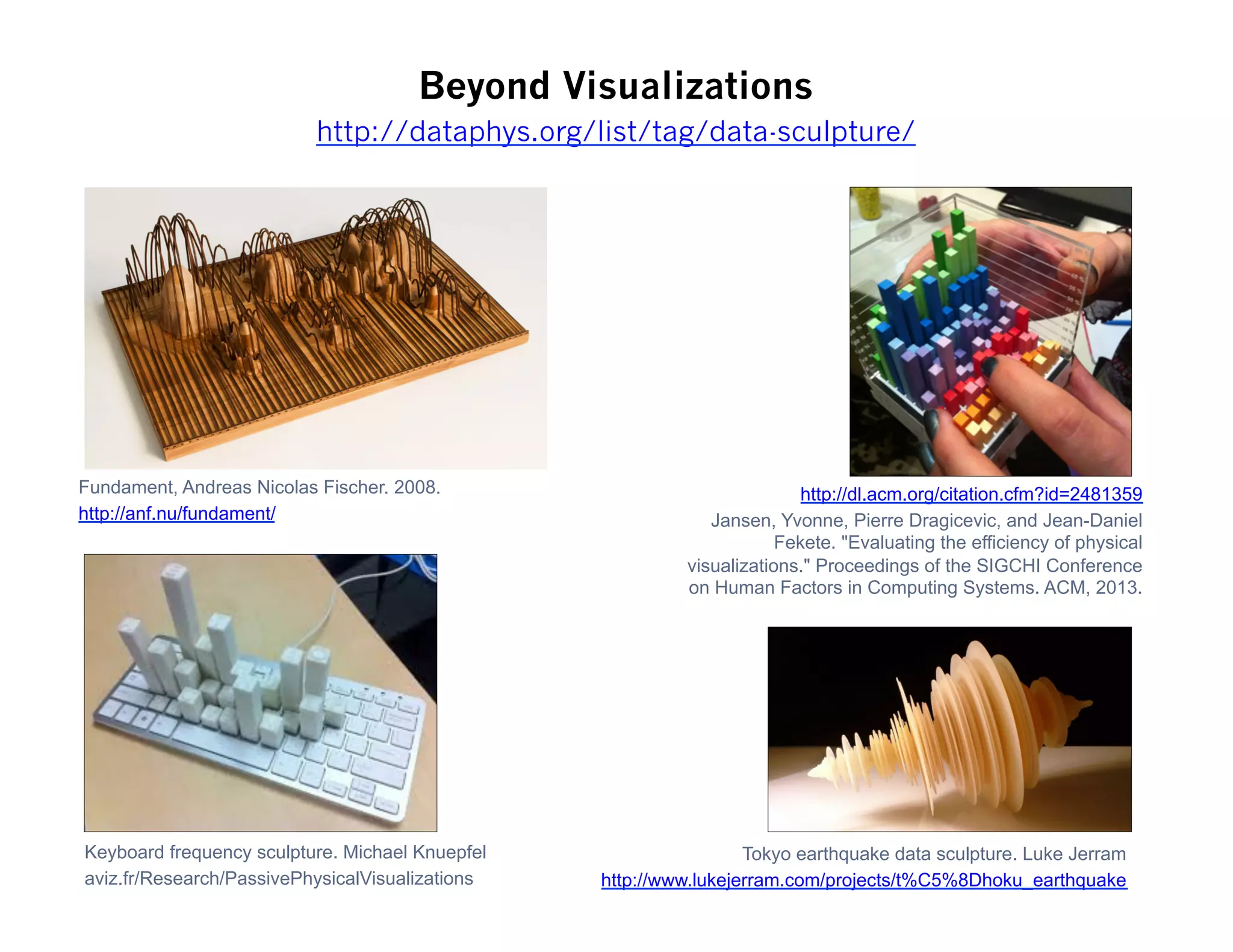
Beyond Visualizations
Fundament, Andreas Nicolas Fischer. 2008.
http://anf.nu/fundament/
Tokyo earthquake data sculpture. Luke Jerram
http://www.lukejerram.com/projects/t%C5%8Dhoku_earthquake
http://dl.acm.org/citation.cfm?id=2481359
Jansen, Yvonne, Pierre Dragicevic, and Jean-Daniel
Fekete. "Evaluating the efficiency of physical
visualizations." Proceedings of the SIGCHI Conference
on Human Factors in Computing Systems. ACM, 2013.
Keyboard frequency sculpture. Michael Knuepfel
aviz.fr/Research/PassivePhysicalVisualizations
http://dataphys.org/list/tag/data-sculpture/
Manifest Justice Exhibition, Los Angeles, May 2015
http://www.afropunk.com/profiles/blogs/feature-manifestjustice-art-exhibit-in-los-angeles
DATA
Quantitative
(Numerical)
Qualitative
(Descriptive)
Nominal
Data has no
natural order.
Includes objects,
names, and
concepts.
Examples:
gender, race,
religion, sport
Ordinal
Data can be
arranged in order
or rank
Examples: sizes
(small, medium,
large), attitudes
(strongly
disagree,
disagree, neutral,
agree, strongly
agree), house
number.
Continuous
Data is measured
on a continuous
scale.
Examples:
Temperature,
length, height
Discrete
Data is
countable, and
exists only in
whole numbers
Examples:
Number of
people taking
this class,
Number of candy
bars collected on
Halloween.
http://www.infovis-wiki.net/index.php?title=Visual_Variables&oldid=142161
Some Data Sources:
 
Universities:
http://lib.stat.cmu.edu/DASL/
http://sunsite3.berkeley.edu/wikis/datalab/
www.stat.ucla.edu/data/
 
General Data Applications
www.freebase.com
http://infochimps.org
http://numbrary.com
http://aggdata.com
http://aws.amazon.com/publicdatasets
 
Geography
www.census.gov/geo/www/tiger/
www.openstreetmap.org
www.geocommons.com
 
World
www.globalhealthfacts.org
http://data.un.org
www.who.int/research/en/
http://stats.oecd.org/
http://data.worldbank.org
https://www.cia.gov/library/
publications/the-world-factbook/
index.html
 
US Government
www.census.gov
http://data.gov
www.followthemoney.org
www.opensecrets.org
 
Canadian Government
http://www12.statcan.gc.ca/census-
recensement/index-eng.cfm
http://open.canada.ca/en/open-data
 
https://gist.github.com/gjreda/f3e6875f869779ec03db
http://www.gregreda.com/2013/03/03/web-scraping-101-with-python/
Scraping Data off a Webpage with Python
Facepager – scraping tool for facebook and twitter
Scraping data from websites
https://github.com/strohne/Facepager
https://www.youtube.com/watch?v=S9kYApoR8U4
 
You can get your facebook data from Wolfram Alpha
http://www.wolframalpha.com/facebook/

Introduction to Data Visualization

  • 1.
    INTRODUCTION TO VISUALANALYTICS, CSDM 1N50 Please fill out this survey (if you haven’t already): https://www.surveymonkey.com/r/RKJJ6R3 Hello, and welcome! -  Introductions, Course objectives -  Overview – What is data visualization, and what makes a good visualization? -  Data – types of data, mapping data to visual variables, where to get data, TODAY:
  • 2.
    CSDM 1N50 Ana Jofre Kashmeera Megnath MariaAstrid GubitschMartin Lui Introductions https://www.surveymonkey.com/r/RKJJ6R3 Leonardo Restivo Sarah Obtinalla
  • 3.
    COURSE DESCRIPTION The Introductionto Visual Analytics course will expose students to: 1) fundamental concepts in data, statistics, data visualization and visual analytics 2) the diversity of data visualization work across different domains c) hands-on work with data using existing open source data visualization tools.   The Introduction to Visual Analytics course covers the basic principles of data analysis, cognitive perception, and design. It includes a survey of data visualization work in various domains (art, journalism, information design, network analysis, science, and map-based applications) as well as different media (print, screen, interactive, 3d). Students will apply these principles, and take inspiration from the examples, to create their own visualizations.   LEARNING OUTCOMES Upon the successful completion of this course, students will have: learned some basic principles in data analysis, design, and data visualization been exposed to a wide range of data visualization work across different domains created their own visualizations using the tools provided in class   TEACHING METHODS & DELIVERY This is a studio-based learning environment. Teaching methods and delivery will include a combination of lectures, demonstrations, critiques, individual and group discussions and in class labs. Attendance will be taken at the beginning of each class. Two absences will result in an incompletion of the course.
  • 4.
    WEEK 1 October31 • Introductions • Topic and Course Overview • Introduction to data visualization – some basic principles • What is data? • Extracting data WEEK 2 November 7 • Processing data: curating, managing, cleaning data. • Review of statistics • Introduction to some data visualization tools WEEK 3 November 14 • Visualization Design • Cognitive science and perception • Bertin’s semiotics and use of metaphors • How not to lie with graphics Weekly Plan (subject to adjustments)
  • 5.
    WEEK 4 November21 • Taxonomy of representation • Survey of visualization typologies and organizational structures (spatial, temporal, network, multi-dimensional, treemaps etc.) • Students will have time today to work with their choice of data visualization tool(s) to create a visualization WEEK 5 November 28 • Infographics vs data visualization vs visual analytics (Discussion) • Review of best practices (Discussion) • Beyond visualization: data materialization, data sonification, ambient data displays • Students will have time today to work with their choice of data visualization tool(s) to create a visualization WEEK 6 December 5 • Synthesis and review • Students will have time today to work with their choice of data visualization tool(s) finish their visualizations • Student critique
  • 6.
    What is DataVisualization? http://images.all-free-download.com/images/graphicthumb chart_elements_of_color_vector_graphic_530706.jpg
  • 7.
    What is DataVisualization? http://www.ted.com/talks/david_mccandless_the_beauty_of_data_visualization#t-576041 http://www.informationisbeautiful.net/ https://public.tableau.com/s/gallery https://github.com/mbostock/d3/wiki/Gallery http://labratrevenge.com/nation-of-poverty/ http://demographics.coopercenter.org/DotMap/ http://www.davidmccandless.com/ http://www.iadb.org/en/topics/energy/energy-database/energy-database,19144.html http://www.informationisbeautiful.net/visualizations/billion-dollar-o-gram-2013/ http://infobeautiful4.s3.amazonaws.com/2015/05/1276_left_right_usa.png Gapminder! http://www.on-broadway.nyc/
  • 10.
    •  Show thedata •  Induce the viewer to think about the substance of the findings rather that the methodology, the graphical design, or other aspects •  Avoid distorting what the data have to say •  Present many numbers in a small space, i.e, efficiently •  Make large data sets coherent •  Encourage the eye to compare different pieces of data •  Reveal the data at several levels of detail, from a broad overview to the fine structure •  Serve a clear purpose: description, exploration, tabulation, decoration •  Be closely integrated with the statistical and verbal descriptions of the data set Principles of Graphical Excellence from E.R. Tufte E. R. Tufte. The Visual Display of Quantitative Information, 2nd Ed. Graphics Press, Cheshire, Connecticut, 2001.
  • 11.
    Show the datameans high data to ink ratio. http://socialmediaguerilla.com/content-marketing/less-is-more-improving-the-data-ink-ratio/ www.darkhorseanalytics.com
  • 12.
  • 14.
    Beyond Visualizations Fundament, AndreasNicolas Fischer. 2008. http://anf.nu/fundament/ Tokyo earthquake data sculpture. Luke Jerram http://www.lukejerram.com/projects/t%C5%8Dhoku_earthquake http://dl.acm.org/citation.cfm?id=2481359 Jansen, Yvonne, Pierre Dragicevic, and Jean-Daniel Fekete. "Evaluating the efficiency of physical visualizations." Proceedings of the SIGCHI Conference on Human Factors in Computing Systems. ACM, 2013. Keyboard frequency sculpture. Michael Knuepfel aviz.fr/Research/PassivePhysicalVisualizations http://dataphys.org/list/tag/data-sculpture/
  • 15.
    Manifest Justice Exhibition,Los Angeles, May 2015 http://www.afropunk.com/profiles/blogs/feature-manifestjustice-art-exhibit-in-los-angeles
  • 16.
    DATA Quantitative (Numerical) Qualitative (Descriptive) Nominal Data has no naturalorder. Includes objects, names, and concepts. Examples: gender, race, religion, sport Ordinal Data can be arranged in order or rank Examples: sizes (small, medium, large), attitudes (strongly disagree, disagree, neutral, agree, strongly agree), house number. Continuous Data is measured on a continuous scale. Examples: Temperature, length, height Discrete Data is countable, and exists only in whole numbers Examples: Number of people taking this class, Number of candy bars collected on Halloween.
  • 17.
  • 18.
    Some Data Sources:   Universities: http://lib.stat.cmu.edu/DASL/ http://sunsite3.berkeley.edu/wikis/datalab/ www.stat.ucla.edu/data/   GeneralData Applications www.freebase.com http://infochimps.org http://numbrary.com http://aggdata.com http://aws.amazon.com/publicdatasets   Geography www.census.gov/geo/www/tiger/ www.openstreetmap.org www.geocommons.com   World www.globalhealthfacts.org http://data.un.org www.who.int/research/en/ http://stats.oecd.org/ http://data.worldbank.org https://www.cia.gov/library/ publications/the-world-factbook/ index.html   US Government www.census.gov http://data.gov www.followthemoney.org www.opensecrets.org   Canadian Government http://www12.statcan.gc.ca/census- recensement/index-eng.cfm http://open.canada.ca/en/open-data  
  • 19.
    https://gist.github.com/gjreda/f3e6875f869779ec03db http://www.gregreda.com/2013/03/03/web-scraping-101-with-python/ Scraping Data offa Webpage with Python Facepager – scraping tool for facebook and twitter Scraping data from websites https://github.com/strohne/Facepager https://www.youtube.com/watch?v=S9kYApoR8U4   You can get your facebook data from Wolfram Alpha http://www.wolframalpha.com/facebook/