An Introduction to Data
       Visualisation for Analysis
                 Exploring the Dataset -
            Textual, Numerical and Otherwise


http://www.slideshare.net/shawnday/m-phil-datavisforanalysis
Agenda
  Thoughts from last week - wordpress.com?
  Introduction
  What do we mean by Data Analysis?
  Some foundation terms and concepts
  The Data Visualisation Process
  Tools and Methods
  Extending your toolset
  An Exercise
Objective


    To appreciate the rich variety of techniques and
   tools available to digital humanities scholars for
            data visualisation and analysis.
     The intention is to be able to add tools to your
   arsenal and to have a sense of where to look for
                          more.
Breakpoint

        One of the keys to good visualization is
   understanding what your immediate goals are.
  Are you visualizing data to understand what’s in it,
    or are you trying to communicate meaning to
                        others?
         You - Visualisation for Data Analysis
        Others - Visualisation for Presentation
Speaking of Data Analysis
   SPSS
   SAS
   OS Equivalents
So Why Would You Want to Visualise
Your Data?
   Bypass language centres to tap directly into the
   visual cortex
   Leverage ability to recognise patterns - what they
   call visual sense-making
   Powerful graphics engines now allow for live
   data processing and sophisticated animations
   and interactive research environments


                               Sources: Geoff McGhee, Getting Started with Data Viz
So Why Would You Want to Visualise
Your Data?
   Work with new data to create new knowledge
   Explore data to discover things that used to be
   unknown, unknowable or impractical to know
   Take a new perspective on the familiar to reveal
   previously hidden insights
Visualising New Information


                  Tourists vs Locals, Eric Fischer, 2010 - Flickr
Visualising New Information


            Flickr Flow, Martin Wattenberg and Fernanda Viegas, 2009
The Familiar through New Eyes


                  The Times Atlas
How Could You Use Data Analysis
   “In the Lab” - for your own analysis
   Online as part of collabourative groups
   Through dissemination for extension of own work
   - crowdsourcing
   Others?
The Time Ribbon and the Tree Map
Visualisation Objective
   Exploring the ordinary life of rural pioneers in
     nineteenth century Ontario
Farm Journal


               William Sunter Farm Diary, 1858
Diaries: the raw materials
   • 100s of pages
   • Varying hands
   • Varying quality
The Process
  • Generate word frequency (Voyeur, TAPoR)
  • Isolate known farm activities (NLP -
    LanguageWare)
  • Collocate to link activity references to time,
    duration, and resources (Voyeur)
Example: Medical Diary


                         Medical Diary by BlueChillies
Example: History Flow


                        History flow by Martin Wattenberg and Fernanda Viegas
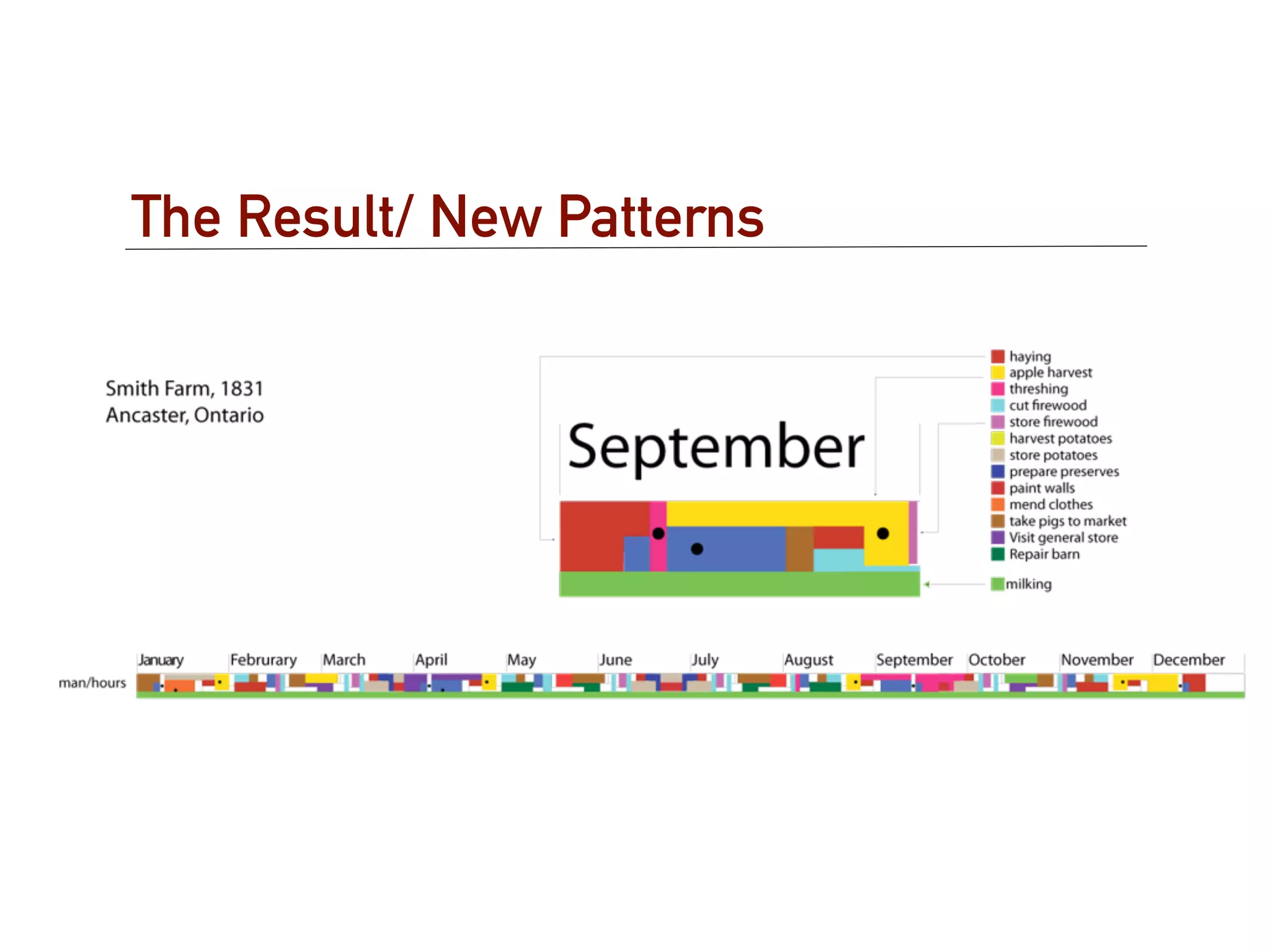
The Result/ New Patterns
•Less time haying
•The impact of technology
•More tasks faster
How Else Could this be done?
What is the Value of this Visualisation

  • Easier to compare over intervals
  • Multiple vectors with greater granularity in a
    compressed space
  • The challenge is to find rich enough source
    materials to yield substantive datasets
The Tree Map
Example: Newsmap
Example: Panopticon
Case Study:
Occupations of Politicians
   • What are we studying?
     – Self-declared occupations of politicians
   • Why?
     – What bias might they bring to their job?
   • How?
     – Visualising past occupation and mapping to political
       platform of party affiliated with
Occupations of TDs in the 30th Dáil
Occupations of MPs in the 2nd Parliament
Occupations of MPs in the 37th Parliament
The Result/ New Patterns
  • The emergence of the professional politician with
    no private sector experience
  • Occupational continuity across changes in
    governing party
How Else Could this be Done?
The Value of Data Vis for Analysis
   • New ways of presenting allow new ways of seeing
   • Hidden patterns become evident
   • Suggest other hypothesis to test
Basic Terms
   Datamining
   Statistics
   Structured/Unstructured Data
   Visualisation
   Modelling
Types of Data to Visualise
   Audio Data            Network Data
   Categorical Data          Social
   Cartographic Data         Other

   Collections           Numerical Data
   Image Data            Temporal Data
     Still               Textual Data
     Moving                  Narrative
   Metadata                  Qualitative

   Multimedia Data       ????
General Steps in Data Vis for DH
   Discovery / Acquisition
   Cleaning / ‘Munging’
   Analysis / Exploratory Vis
   Presentation
Discovery / Acquisition
   Original Research      Scraping
     Spreadsheets           Junar
     Databases              Outwit Hub
     Digitized Media        ScraperWiki

   Other Downloads
     Public Data
     Archives/Libraries
     Academic Partners
     Purchase
Demo/Hands-On: Junar
  http://www.junar.com
Cleaning / Munging
(Normalisation, Format Conversion)
    Tools:
      Data Wrangler
      Google Refine
      Mr. Data Converter

    Data Wrangler
      Does simple, split, clear, fold/unfold transforms on data
      See example --> Data and Script

    Google Refine
      Works with larger datasets
Hands-On: Data Wrangler
   http://vis.stanford.edu/wrangler/app/
Hands-On: Google Refine
   http://code.google.com/p/google-refine/
Hands-On: Mr Data Converter
   http://shancarter.com/data_converter/
Analysis / Exploratory Visualisation
     Web Services
       Google Fusion Tables
       Google Spreadsheets
       IBM ManyEyes
       TimeFlow
     Applications
       Tableau/Tableau Public
       MS Office
       OpenOffice
       Gephi
       Node XL (plug-in for Excel)
       Spotfire
       R Processing
Google NGram Viewers
  Examine word frequency in digitised books
  Currently about 4% of books ever published
  In English, Chinese, French, German, Hebrew,
  Russian, and Spanish
  Changes in word usage
  Trends

  Check out the Cultural Observatory @ Harvard
Google NGram Viewer
Wordle
  Visually present word frequency using size,
  weight, colour


  Consider Word Clouds Considered Harmful
Exercise
   Choose a dataset from a source such as:
      The CSO
      Project Guttenberg
      or your own material
   Choose an appropriate Data Visualisation from a webservice we explored
   in workshop.
   Explain the process and how you madeyour choice and embed it in your
   own blog using wordpress.com as we explored last week.
   Suggest a research question that can be answered by using this data
   visualisation as a research environment
   Send the link to me at: days@tcd.ie
   Maybe: http://politicalreform.ie/2011/12/04/state-of-enda-sunday-
   business-post-red-c-poll-4th-september-2011/

MPhil Lecture on Data Vis for Analysis

  • 1.
    An Introduction toData Visualisation for Analysis Exploring the Dataset - Textual, Numerical and Otherwise http://www.slideshare.net/shawnday/m-phil-datavisforanalysis
  • 2.
    Agenda Thoughtsfrom last week - wordpress.com? Introduction What do we mean by Data Analysis? Some foundation terms and concepts The Data Visualisation Process Tools and Methods Extending your toolset An Exercise
  • 3.
    Objective To appreciate the rich variety of techniques and tools available to digital humanities scholars for data visualisation and analysis. The intention is to be able to add tools to your arsenal and to have a sense of where to look for more.
  • 4.
    Breakpoint One of the keys to good visualization is understanding what your immediate goals are. Are you visualizing data to understand what’s in it, or are you trying to communicate meaning to others? You - Visualisation for Data Analysis Others - Visualisation for Presentation
  • 5.
    Speaking of DataAnalysis SPSS SAS OS Equivalents
  • 6.
    So Why WouldYou Want to Visualise Your Data? Bypass language centres to tap directly into the visual cortex Leverage ability to recognise patterns - what they call visual sense-making Powerful graphics engines now allow for live data processing and sophisticated animations and interactive research environments Sources: Geoff McGhee, Getting Started with Data Viz
  • 7.
    So Why WouldYou Want to Visualise Your Data? Work with new data to create new knowledge Explore data to discover things that used to be unknown, unknowable or impractical to know Take a new perspective on the familiar to reveal previously hidden insights
  • 8.
    Visualising New Information Tourists vs Locals, Eric Fischer, 2010 - Flickr
  • 9.
    Visualising New Information Flickr Flow, Martin Wattenberg and Fernanda Viegas, 2009
  • 10.
    The Familiar throughNew Eyes The Times Atlas
  • 11.
    How Could YouUse Data Analysis “In the Lab” - for your own analysis Online as part of collabourative groups Through dissemination for extension of own work - crowdsourcing Others?
  • 12.
    The Time Ribbonand the Tree Map
  • 13.
    Visualisation Objective Exploring the ordinary life of rural pioneers in nineteenth century Ontario
  • 14.
    Farm Journal William Sunter Farm Diary, 1858
  • 15.
    Diaries: the rawmaterials • 100s of pages • Varying hands • Varying quality
  • 16.
    The Process • Generate word frequency (Voyeur, TAPoR) • Isolate known farm activities (NLP - LanguageWare) • Collocate to link activity references to time, duration, and resources (Voyeur)
  • 17.
    Example: Medical Diary Medical Diary by BlueChillies
  • 18.
    Example: History Flow History flow by Martin Wattenberg and Fernanda Viegas
  • 19.
  • 20.
    The Result/ NewPatterns •Less time haying •The impact of technology •More tasks faster
  • 21.
    How Else Couldthis be done?
  • 22.
    What is theValue of this Visualisation • Easier to compare over intervals • Multiple vectors with greater granularity in a compressed space • The challenge is to find rich enough source materials to yield substantive datasets
  • 23.
  • 24.
  • 25.
  • 26.
    Case Study: Occupations ofPoliticians • What are we studying? – Self-declared occupations of politicians • Why? – What bias might they bring to their job? • How? – Visualising past occupation and mapping to political platform of party affiliated with
  • 27.
    Occupations of TDsin the 30th Dáil
  • 28.
    Occupations of MPsin the 2nd Parliament
  • 29.
    Occupations of MPsin the 37th Parliament
  • 30.
    The Result/ NewPatterns • The emergence of the professional politician with no private sector experience • Occupational continuity across changes in governing party
  • 31.
    How Else Couldthis be Done?
  • 32.
    The Value ofData Vis for Analysis • New ways of presenting allow new ways of seeing • Hidden patterns become evident • Suggest other hypothesis to test
  • 33.
    Basic Terms Datamining Statistics Structured/Unstructured Data Visualisation Modelling
  • 34.
    Types of Datato Visualise Audio Data Network Data Categorical Data Social Cartographic Data Other Collections Numerical Data Image Data Temporal Data Still Textual Data Moving Narrative Metadata Qualitative Multimedia Data ????
  • 35.
    General Steps inData Vis for DH Discovery / Acquisition Cleaning / ‘Munging’ Analysis / Exploratory Vis Presentation
  • 36.
    Discovery / Acquisition Original Research Scraping Spreadsheets Junar Databases Outwit Hub Digitized Media ScraperWiki Other Downloads Public Data Archives/Libraries Academic Partners Purchase
  • 37.
    Demo/Hands-On: Junar http://www.junar.com
  • 38.
    Cleaning / Munging (Normalisation,Format Conversion) Tools: Data Wrangler Google Refine Mr. Data Converter Data Wrangler Does simple, split, clear, fold/unfold transforms on data See example --> Data and Script Google Refine Works with larger datasets
  • 39.
    Hands-On: Data Wrangler http://vis.stanford.edu/wrangler/app/
  • 40.
    Hands-On: Google Refine http://code.google.com/p/google-refine/
  • 41.
    Hands-On: Mr DataConverter http://shancarter.com/data_converter/
  • 42.
    Analysis / ExploratoryVisualisation Web Services Google Fusion Tables Google Spreadsheets IBM ManyEyes TimeFlow Applications Tableau/Tableau Public MS Office OpenOffice Gephi Node XL (plug-in for Excel) Spotfire R Processing
  • 43.
    Google NGram Viewers Examine word frequency in digitised books Currently about 4% of books ever published In English, Chinese, French, German, Hebrew, Russian, and Spanish Changes in word usage Trends Check out the Cultural Observatory @ Harvard
  • 44.
  • 45.
    Wordle Visuallypresent word frequency using size, weight, colour Consider Word Clouds Considered Harmful
  • 46.
    Exercise Choose a dataset from a source such as: The CSO Project Guttenberg or your own material Choose an appropriate Data Visualisation from a webservice we explored in workshop. Explain the process and how you madeyour choice and embed it in your own blog using wordpress.com as we explored last week. Suggest a research question that can be answered by using this data visualisation as a research environment Send the link to me at: [email protected] Maybe: http://politicalreform.ie/2011/12/04/state-of-enda-sunday- business-post-red-c-poll-4th-september-2011/