mobile application using automatin using node ja java on
Download as PPTX, PDF0 likes5 views

mobile app


![Paste this
import { Component } from
'@angular/core';
import {
IonHeader,
IonToolbar,
IonTitle,
IonContent,
IonCard,
IonCardHeader,
IonCardContent,
IonButton,
IonCardTitle
} from
'@ionic/angular/standalo
ne';
import { AlertController }
from '@ionic/angular';
@Component({
selector: 'app-home',
standalone: true, // ✅ Required for standalone components
templateUrl: 'home.page.html',
styleUrls: ['home.page.scss'],
imports: [
IonHeader,
IonToolbar,
IonTitle,
IonContent,
IonCard,
IonCardHeader,
IonCardContent,
IonCardTitle,
IonButton
],
})
export class HomePage {
constructor(private alertController: AlertController) {}
async doSomething() {
const alert = await this.alertController.create({
header: 'Action',
message: 'Button clicked!',
buttons: ['OK']
});
await alert.present();
}
}](https://image.slidesharecdn.com/lecture-3-cap918-250716092241-6eda988c/85/mobile-application-using-automatin-using-node-ja-java-on-15-320.jpg)


![src/app/example.component.html
<ion-button id="present-alert">Click Me</ion-button>
<ion-alert
trigger="present-alert"
header="A Short Title Is Best"
subHeader="A Sub Header Is Optional"
message="A message should be a short, complete sentence."
[buttons]="alertButtons"
></ion-alert>](https://image.slidesharecdn.com/lecture-3-cap918-250716092241-6eda988c/85/mobile-application-using-automatin-using-node-ja-java-on-19-320.jpg)
![src/app/example.component.ts
import { Component } from '@angular/core';
import { IonAlert, IonButton } from '@ionic/angular/standalone';
@Component({
selector: 'app-example',
templateUrl: 'example.component.html',
styleUrls: ['example.component.css'],
imports: [IonAlert, IonButton],
})
export class ExampleComponent {
alertButtons = ['Action'];
}](https://image.slidesharecdn.com/lecture-3-cap918-250716092241-6eda988c/85/mobile-application-using-automatin-using-node-ja-java-on-20-320.jpg)

![src/app/example.component.html
<ion-button id="present-alert">Click Me</ion-button>
<ion-alert
trigger="present-alert"
header="Alert!"
[buttons]="alertButtons"
(didDismiss)="setResult($event)"
></ion-alert>](https://image.slidesharecdn.com/lecture-3-cap918-250716092241-6eda988c/85/mobile-application-using-automatin-using-node-ja-java-on-22-320.jpg)
![src/app/example.component.ts
import { Component } from '@angular/core';
import { IonAlert, IonButton } from '@ionic/angular/standalone';
import type { OverlayEventDetail } from '@ionic/core';
@Component({
selector: 'app-example',
templateUrl: 'example.component.html',
styleUrls: ['example.component.css'],
imports: [IonAlert, IonButton],
})](https://image.slidesharecdn.com/lecture-3-cap918-250716092241-6eda988c/85/mobile-application-using-automatin-using-node-ja-java-on-23-320.jpg)
![export class ExampleComponent {
public alertButtons = [
{
text: 'Cancel',
role: 'cancel',
handler: () => {
console.log('Alert canceled');
},
},
{
text: 'OK',
role: 'confirm',
handler: () => {
console.log('Alert confirmed');
},
},
];
setResult(event: CustomEvent<OverlayEventDetail>) {
console.log(`Dismissed with role: ${event.detail.role}`);
}
}](https://image.slidesharecdn.com/lecture-3-cap918-250716092241-6eda988c/85/mobile-application-using-automatin-using-node-ja-java-on-24-320.jpg)

![src/app/example.component.html
<ion-button id="present-alert">Click Me</ion-button>
<ion-alert
trigger="present-alert"
header="Please enter your info"
[buttons]="alertButtons"
[inputs]="alertInputs"
></ion-alert>](https://image.slidesharecdn.com/lecture-3-cap918-250716092241-6eda988c/85/mobile-application-using-automatin-using-node-ja-java-on-26-320.jpg)
![src/app/example.component.ts
• import { Component } from '@angular/core';
import { IonAlert, IonButton } from
'@ionic/angular/standalone';
@Component({
selector: 'app-example',
templateUrl: 'example.component.html',
styleUrls: ['example.component.css'],
imports: [IonAlert, IonButton],
})
export class ExampleComponent {
public alertButtons = ['OK'];](https://image.slidesharecdn.com/lecture-3-cap918-250716092241-6eda988c/85/mobile-application-using-automatin-using-node-ja-java-on-27-320.jpg)
![public alertInputs = [
{
placeholder: 'Name',
},
{
placeholder: 'Nickname (max 8 characters)',
attributes: {
maxlength: 8,
},
},
{
type: 'number',
placeholder: 'Age',
min: 1,
max: 100,
},
{
type: 'textarea',
placeholder: 'A little about yourself',
},
];
}](https://image.slidesharecdn.com/lecture-3-cap918-250716092241-6eda988c/85/mobile-application-using-automatin-using-node-ja-java-on-28-320.jpg)


![import { Component } from '@angular/core';
import { IonCol, IonGrid, IonRow } from '@ionic/angular/standalone';
@Component({
selector: 'app-example',
templateUrl: 'example.component.html',
styleUrls: ['example.component.css'],
imports: [IonCol, IonGrid, IonRow],
})
export class ExampleComponent {}
src/app/
example.component.ts](https://image.slidesharecdn.com/lecture-3-cap918-250716092241-6eda988c/85/mobile-application-using-automatin-using-node-ja-java-on-34-320.jpg)
mobile application using automatin using node ja java on
- 1. DECAP918- MULTIPLATFORM MOBILE APP DEVELOPMENT WITH WEB TECHNOLOGIES The Kick Start Session
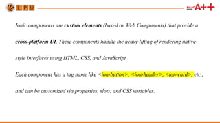
- 3. Ionic components are custom elements (based on Web Components) that provide a cross-platform UI. These components handle the heavy lifting of rendering native- style interfaces using HTML, CSS, and JavaScript. Each component has a tag name like <ion-button>, <ion-header>, <ion-card>, etc., and can be customized via properties, slots, and CSS variables.
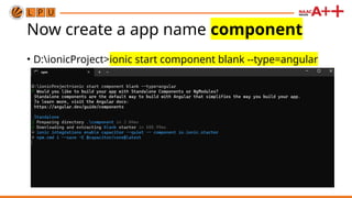
- 4. Before creating project first install ionic cli • D:ionicProject>npm install -g @ionic/cli
- 5. Now create a app name component • D:ionicProject>ionic start component blank --type=angular
- 6. Now change directory using command CD component
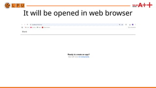
- 7. Now type ionic serve to start app
- 8. It will be opened in web browser
- 9. Now we have to see code the I open this project in visual studio code • Again I will open command prompt and go to that director that is component directory
- 10. Now I will type code . It will open project in visual studio code
- 11. App component open in vs code here we do changes
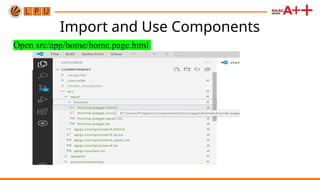
- 12. Import and Use Components Open src/app/home/home.page.html
- 13. Paste this code there <ion-header> <ion-toolbar> <ion-title> My Ionic App </ion-title> </ion-toolbar> </ion-header> <ion-content class="ion-padding"> <ion-card> <ion-card-header> <ion-card-title>Welcome</ion-card- title> </ion-card-header> <ion-card-content> This is an example of an Ionic card. </ion-card-content> </ion-card> <ion-button expand="block" color="primary" (click)="doSomething()"> Click Me </ion-button> </ion-content>
- 15. Paste this import { Component } from '@angular/core'; import { IonHeader, IonToolbar, IonTitle, IonContent, IonCard, IonCardHeader, IonCardContent, IonButton, IonCardTitle } from '@ionic/angular/standalo ne'; import { AlertController } from '@ionic/angular'; @Component({ selector: 'app-home', standalone: true, // ✅ Required for standalone components templateUrl: 'home.page.html', styleUrls: ['home.page.scss'], imports: [ IonHeader, IonToolbar, IonTitle, IonContent, IonCard, IonCardHeader, IonCardContent, IonCardTitle, IonButton ], }) export class HomePage { constructor(private alertController: AlertController) {} async doSomething() { const alert = await this.alertController.create({ header: 'Action', message: 'Button clicked!', buttons: ['OK'] }); await alert.present(); } }
- 16. doSomething()
- 17. Save and see app
- 18. ion-alert An Alert is a dialog that presents users with information or collects information from the user using inputs. An alert appears on top of the app's content, and must be manually dismissed by the user before they can resume interaction with the app. It can also optionally have a header, subHeader and message.
- 19. src/app/example.component.html <ion-button id="present-alert">Click Me</ion-button> <ion-alert trigger="present-alert" header="A Short Title Is Best" subHeader="A Sub Header Is Optional" message="A message should be a short, complete sentence." [buttons]="alertButtons" ></ion-alert>
- 20. src/app/example.component.ts import { Component } from '@angular/core'; import { IonAlert, IonButton } from '@ionic/angular/standalone'; @Component({ selector: 'app-example', templateUrl: 'example.component.html', styleUrls: ['example.component.css'], imports: [IonAlert, IonButton], }) export class ExampleComponent { alertButtons = ['Action']; }
- 21. Buttons In the array of buttons, each button includes properties for its text, and optionally a handler. If a handler returns false then the alert will not automatically be dismissed when the button is clicked. All buttons will show up in the order they have been added to the buttons array from left to right. Note: The right most button (the last one in the array) is the main button. Optionally, a role property can be added to a button, such as cancel. If a cancel role is on one of the buttons, then if the alert is dismissed by tapping the backdrop, then it will fire the handler from the button with a cancel role.
- 23. src/app/example.component.ts import { Component } from '@angular/core'; import { IonAlert, IonButton } from '@ionic/angular/standalone'; import type { OverlayEventDetail } from '@ionic/core'; @Component({ selector: 'app-example', templateUrl: 'example.component.html', styleUrls: ['example.component.css'], imports: [IonAlert, IonButton], })
- 24. export class ExampleComponent { public alertButtons = [ { text: 'Cancel', role: 'cancel', handler: () => { console.log('Alert canceled'); }, }, { text: 'OK', role: 'confirm', handler: () => { console.log('Alert confirmed'); }, }, ]; setResult(event: CustomEvent<OverlayEventDetail>) { console.log(`Dismissed with role: ${event.detail.role}`); } }
- 25. Alerts Inputs Alerts can also include several different inputs whose data can be passed back to the app. Inputs can be used as a simple way to prompt users for information. Radios, checkboxes and text inputs are all accepted, but they cannot be mixed. For example, an alert could have all radio button inputs, or all checkbox inputs, but the same alert cannot mix radio and checkbox inputs. Do note however, different types of "text" inputs can be mixed, such as url, email, text, textarea etc. If you require a complex form UI which doesn't fit within the guidelines of an alert then we recommend building the form within a modal instead.
- 26. src/app/example.component.html <ion-button id="present-alert">Click Me</ion-button> <ion-alert trigger="present-alert" header="Please enter your info" [buttons]="alertButtons" [inputs]="alertInputs" ></ion-alert>
- 27. src/app/example.component.ts • import { Component } from '@angular/core'; import { IonAlert, IonButton } from '@ionic/angular/standalone'; @Component({ selector: 'app-example', templateUrl: 'example.component.html', styleUrls: ['example.component.css'], imports: [IonAlert, IonButton], }) export class ExampleComponent { public alertButtons = ['OK'];
- 28. public alertInputs = [ { placeholder: 'Name', }, { placeholder: 'Nickname (max 8 characters)', attributes: { maxlength: 8, }, }, { type: 'number', placeholder: 'Age', min: 1, max: 100, }, { type: 'textarea', placeholder: 'A little about yourself', }, ]; }
- 29. ion-grid The grid is a powerful mobile-first flexbox system for building custom layouts. It is composed of three units — a grid, row(s) and column(s). Columns will expand to fill the row, and will resize to fit additional columns. It is based on a 12 column layout with different breakpoints based on the screen size. The number of columns can be customized using CSS.
- 30. 1. Grids act as a container for all rows and columns. Grids take up the full width of their container, but adding the fixed property will set the width based on the screen size, see Fixed Grid below. 2. Rows are horizontal groups of columns that line the columns up properly. 3. Content should be placed within columns, and only columns may be immediate children of rows. 4. The size property indicates the number of columns to use out of the default 12 per row. So, size="4" can be added to a column in order to take up 1/3 of the grid, or 4 of the 12 columns. 5. Columns without a value for size will automatically have equal widths. For example, four columns will each automatically be 25% wide.
- 31. • Column widths are set as a percentage, so they’re always fluid and sized relative to their parent element. • There is padding between individual columns. However, the padding can be removed from the grid and columns by adding the ion-no- padding class to the grid. See the CSS Utilities for more styles that can be applied to the grid. • There are five grid tiers, one for each responsive breakpoint: all breakpoints (extra small), small, medium, large, and extra large. • Grid tiers are based on minimum widths, meaning they apply to their tier and all those larger than them (e.g., size-sm="4" applies to small, medium, large, and extra large devices).
- 33. src/app/example.component.css ion-col { background-color: green; border: solid 1px yellow; color: pink; text-align: center; }
- 34. import { Component } from '@angular/core'; import { IonCol, IonGrid, IonRow } from '@ionic/angular/standalone'; @Component({ selector: 'app-example', templateUrl: 'example.component.html', styleUrls: ['example.component.css'], imports: [IonCol, IonGrid, IonRow], }) export class ExampleComponent {} src/app/ example.component.ts