Overview data analyis and visualisation tools 2020
Download as PPTX, PDF0 likes476 views

This document provides an overview of various tools for data analysis and visualization. It discusses tools for data cleaning like Microsoft Excel, DataWrangler, and OpenRefine. For statistical analysis, it outlines R, RStudio, and Notepad++. Visualization applications mentioned include Tableau Public, Microsoft Power BI, and Google Data Studio. Qualitative data analysis software like Atlas.ti and Dedoose are also highlighted. Code libraries like D3.js are presented as options for helping with coding.


Overview data analyis and visualisation tools 2020
- 1. OVERVIEW OF TOOLS FOR DATA ANALYSIS AND DATA VISUALISATION MARIÉ ROUX MANAGER: RESEARCH IMPACT SERVICES KIRCHNER VAN DEVENTER HEAD: RESEARCH COMMONS
- 2. CONTENT Introduction Data Cleaning Statistical analysis Visualisation applications and services Code help: Wizards, libraries, APIs GIS/mapping Temporal data analysis Text/word clouds Infographics Social and other network analysis Working with Colour
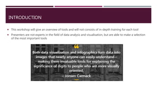
- 3. INTRODUCTION This workshop will give an overview of tools and will not consists of in-depth training for each tool Presenters are not experts in the field of data analysis and visualisation, but are able to make a selection of the most important tools
- 4. DATA CLEANING Microsoft Excel The most common tool used for manipulating spreadsheets and building analyses. With decades of development behind it, Excel can support almost any standard analytics workflow and is extendable through its native programming language, Visual Basic. Excel is suitable for simple analysis, but it is not suited for analyzing big data — it has a limit of around 1 million rows — and it does not have good support for collaboration or versioning. Consider more modern cloud-based analytics platforms for large and collaborative analyses. Learn more: Data cleaning in Excel
- 5. DATA CLEANING DataWrangler (For the most recent version of the tool, see the free Trifacta Wrangler) Why wrangle? Too much time is spent manipulating data just to get analysis and visualisation tools to read it. Wrangler is designed to accelerate this process: spend less time fighting with your data and more time learning from it. Wrangler allows interactive transformation of messy, real-world data into the data tables analysis tools expect. Export data for use in Excel, R, Tableau, Protovis, ... Demo video: https://vimeo.com/19185801
- 6. DATA CLEANING OpenRefine OpenRefine is a powerful tool for working with messy data: cleaning it; transforming it from one format into another; and extending it with web services and external data. It was borne out of a project started by Google (and used to be called Google Refine), but is now an open source project hosted on Github. What can it do? Best tool to work with if you need to tidy up messy data. ‘Wrangle' messy or un-structured data to make it more structured. This is a necessary first step if you want to analyse the data in a spreadsheet or other statistical analysis tool. Finding and removing duplicates; grouping similar data; trim whitespace from beginning and end of values; Translate street addresses to lat/lng coordinates, etc. Learn more: Explore data; Clean and transform data; Reconcile and match data
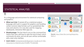
- 7. STATISTICAL ANALYSIS R R is a language and environment for statistical computing and graphics. What can it do: R started off as a statistical analysis language with built-in support for graphics and handling certain common data formats such as spreadsheet-like rows and columns. It is now also used for mapping, dashboards, interactive Web apps etc. Disadvantage: The fact that R runs on the command line means that users will have to take the time to learn which commands do what, and not all users will be comfortable with a text-only interface. Learn more: Computerworld Beginner's Guide to R / 60+ resources to improve your R skills / R tutorials Source: https://data-flair.training/blogs/why- learn-r/
- 8. STATISTICAL ANALYSIS RStudio What can it do: RStudio is a set of integrated tools designed to help you be more productive with R. It includes a console, syntax- highlighting editor that supports direct code execution, and a variety of tools for plotting, viewing history and managing your workspace. Learn more: RStudio education; RStudio tutorial; Coursera: Open Source tools for Data Science; Introduction to RStudio (Princeton University)
- 9. STATISTICAL ANALYSIS Notepad++: What it does: Notepad++ is a free source code editor and Notepad replacement that supports several languages. It supports tabbed editing, which allows working with multiple open files in a single window. Learn more: User manual and tutorials; Beginners guide to Notepad++; Introduction for beginners (YouTube) NppToR What it does: NppToR aims to extend the functionality of code passing to the Notepad++ code editor. It is a companion utility that facilitates communication between R and Notepad++. It provides code passing from Notepad++ into the windows R Gui. Learn more: Help with NppToR
- 10. OTHER STATISTICAL ANALYSIS TOOLS SAS (Analytics Software & Solutions): Leader in analytics. Through innovative analytics, BI and data management software and services, SAS helps turn data into better decisions. SPSS: The SPSS® software platform offers advanced statistical analysis, a vast library of machine learning algorithms, text analysis, open source extensibility, integration with big data and seamless deployment into applications. Statistica: An advanced analytics software portfolio that provides enterprise and desktop software for statistics, data analysis, data management, data visualization, data mining (also called predictive analytics), and quality control. Campus licenses for above: IT ‘s Software Hub (http://www.sun.ac.za/softwarehub ) for students where you can download Statistica, Mathematica, SAS and SPSS directly. Log in with your SU username and password.
- 11. QUALITATIVE DATA ANALYSIS SOFTWARE Atlas.ti What it does: A powerful workbench for the qualitative analysis of large bodies of textual, graphical, audio and video data. Sophisticated tools help to arrange, reassemble, and manage material in creative, yet systematic ways. Advantages: Use of automatic network layouts; Word frequencies can be visualized as tables and as word clouds; support text, PDF, survey, audio, video and graphical files; -lots of built-in functions for coding, retrieving, analyzing, visualizing and exporting Learn more: Video tutorials / Quick tour and manuals / Creating and assigning codes / Library guide on Atlas.ti, University of Utah / Advice on coding in Atlas.ti / PGSkills workshop Source: https://atlasti.com/2016/12/23/rethinking-atlasti8/
- 12. QUALITATIVE DATA ANALYSIS SOFTWARE Dedoose What it does: A cross-platform app for analyzing qualitative and mixed methods research with text, photos, audio, videos, spreadsheet data and more. Advantages: User-friendly; easy storage on a cloud; affordable pricing (you only pay for the months in which you use it); full qualitative and mixed methods support; interactive visualisations and analytics Learn more: Dedoose resources; Review of Dedoose
- 14. DEDOOSE EXCERPTS AND CODING
- 15. VISUALISATION APPLICATIONS AND SERVICES Tableau Public What it does? This tool can turn data into any number of visualisations, from simple to complex. You can drag and drop fields onto the work area and ask the software to suggest a visualisation type, then customize everything from labels and tool tips to size, interactive filters and legend display. Tableau Public offers a variety of ways to display interactive data. You can combine multiple connected visualisations onto a single dashboard, where one search filter can act on numerous charts, graphs and maps; underlying data tables can also be joined. Learn more: Several short training videos available on the Tableau site, where you can also find downloadable data files that you can use for practice.
- 16. VISUALISATION APPLICATIONS AND SERVICES Microsoft Power BI What it does: This is Microsoft's general Business Intelligence (BI) platform, with data wrangling and visualisation for many different data sources (without Excel's row limits), as well as a web service that allows for streaming data and scheduled data updates. This is simple to use for basic visualisations and report creation and makes it fairly easy to do data exploration. It will handle files too large for Excel. Runs R scripts within the desktop software and can generate many R visualisations. Learn more: Free data visualization with Microsoft Power BI: Your step-by-step guide as well as training resources from Microsoft.
- 17. VISUALISATION APPLICATIONS AND SERVICES Google Data Studio What it does: This service is designed to create dashboards and reports from multiple data sources. The focus is on Google sources such as Google Sheets, Google Analytics and BigQuery, but some other sources are supported as well. You can create meaningful, shareable charts and graphs with a few clicks — just drag and drop. Customise everything from colours to logos, add shapes and images, insert dynamic controls, and easily give viewers a way to select the data they want to see in a report from multiple sources — including Analytics, Google Ads, Google Search Console, YouTube, and Campaign Manager. Learn more: Data Studio video tutorials / Gallery with examples.
- 18. VISUALISATION APPLICATIONS AND SERVICES RAWGraphs What it does: The idea behind RAWGraphs is to provide a tool that allows people without coding skills to produce visualisations on their own. Originally conceived for graphic designers to complete a series of tasks that were unavailable in other tools, it evolved into a platform that provides simple ways to map data dimensions onto visual variables. Basically RAWGraphs allows users to easily and quickly create data visualisations that can be exported and edited in graphics software (such as Adobe Illustrator and Sketch). Learn more: Using RAWGraphs
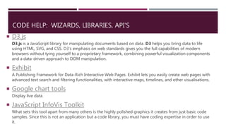
- 19. CODE HELP: WIZARDS, LIBRARIES, API’S D3.js D3.js is a JavaScript library for manipulating documents based on data. D3 helps you bring data to life using HTML, SVG, and CSS. D3’s emphasis on web standards gives you the full capabilities of modern browsers without tying yourself to a proprietary framework, combining powerful visualization components and a data-driven approach to DOM manipulation. Exhibit A Publishing Framework for Data-Rich Interactive Web Pages. Exhibit lets you easily create web pages with advanced text search and filtering functionalities, with interactive maps, timelines, and other visualisations. Google chart tools Display live data. JavaScript InfoVis Toolkit What sets this tool apart from many others is the highly polished graphics it creates from just basic code samples. Since this is not an application but a code library, you must have coding expertise in order to use it.
- 20. GIS / MAPPING Geographic Information Systems (GIS) What it does Programs that create, edit, visualise, analyse and publish geospatial information on Windows, Mac, Linux, BSD (Android coming soon) Can open digital maps on your computer, create new spatial information to add to a map, create printed maps customised to your needs and perform spatial analysis. Interactive tool for data analysis, integration and visualisation. Convey information in an intuitive and accessible manner For example: Google Maps Waze https://qgis.org/en/site/index. html
- 21. QUANTUM GIS (QGIS) Major open-source GIS program Accessible and functional Free to download, small installation size and low system requirements compared to other open-source GIS Can import, edit and save most spatial file formats Significant user-base and online documentation offers a wide community of support Integrates with other open-source GIS and extends its capabilities Multiple plugins and tools allow for greater customisation User-friendly interface https://qgis.org/en/site/
- 22. OTHER OPEN SOURCE GIS/MAPPING TOOLS GRASS GIS https://grass.osgeo.org/ OpenJUMP http://www.openjump.org/ OpenLayers https://openlayers.org/ OpenStreetMap https://openstreetmap.org CARTO https://carto.com Free to try for 12 months
- 23. TEMPORAL DATA ANALYSIS Temporal data is data that represents a state in time, such as land- use patterns, total rainfall over a certain period. Can be used to analyse weather patterns and other environmental variables, monitor traffic conditions, study demographic trends, etc. Examples of temporal data. Source: https://desktop.arcgis.com/en/arcmap/10.3/map/time/what-is-temporal-data.htm
- 24. TEMPORAL DATA VISUALISATION TOOLS D3.js (https://d3js.org/) What it is JavaScript library for manipulating documents based on data Uses HTML, SVG and CSS Allows for animation and interaction in data visualisation Pros Massive community of support Highly flexible in design choices Free to use Cons Requires knowledge of coding and then learning D3 on top of that
- 25. TEMPORAL DATA VISUALISATION TOOLS Observable (https://observablehq.com/) What it is A website where you can learn to use D3.js and other data visualisation tools through tutorials and practical training
- 26. TEMPORAL DATA VISUALISATION TOOLS Timeline JS (https://timeline.knightlab.com/) What it is A user-friendly website where you can create timelines following an easy set of instructions Can create visually rich, interactive timelines
- 27. TEXT/WORD CLOUDS Wordle (http://www.wordle.net/) What it does Converts keywords into a visual ‘cloud’ Quick way to determine the frequency of words in a text Need to install Java to run the program IBM Word-Cloud Generator Can be used within R through plugin For more advanced users Example of a word cloud using the text Heart of Darkness by Joseph Conrad (1899)
- 28. INFOGRAPHICS Canva (https://www.canva.com/) Free to use graphic design platform (with optional upgrade plans for more advanced use) Can create social media graphics, presentations, posters and infographics Infogram (https://infogram.com/) Free to use (with optional upgrade plans for more advanced use) Piktochart (https://piktochart.com/) Free to use, but limited to the creation of 5 graphics Example of Canva’s many templates
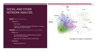
- 29. SOCIAL AND OTHER NETWORK ANALYSIS Gephi (https://gephi.org/) What it is Free to use Useful for visualizing statistical information, including relationships within networks NodeXL (https://www.smrfoundation.org/nodexl/) What it is An Excel plugin that can display network graphs from a list of connections Optimised for analysing online social media Drawback Requires Excel to run Example of a Gephi visualisation
- 30. WORKING WITH COLOUR ColorBrewer (https://colorbrewer2.org/) An online tool designed to help with selecting appropriate colour schemes for maps and other graphics The provided map does not depict actual data, but rather serves as a carefully designed diagnostic tool for evaluating individual colour schemes It provides you with your chosen colours’ codes to apply to your own map
- 31. USEFUL LINKS http://www.kwantu.net/blog/2016/12/28/how-to-clean-up-messy-data-using-open-refine https://atlasti.com/2016/12/23/rethinking-atlasti8/ https://www.visualisingdata.com/resources/ https://www.computerworld.com/article/2507728/enterprise-applications-22-free-tools-for-data- visualization-and-analysis.html?page=10 http://selection.datavisualization.ch/ https://steemit.com/utopian-io/@scipio/how-to-do-data-visualization-using-rawgraphs
- 32. Questions?