SlideShare a Scribd company logo
Mrs. Suja Santosh
Professor
RVS College of Nursing,
Sulur, Coimbatore
Method by which the people organize,
summarize and communicate information
using a variety of tools such as tables,
graphs and diagrams
Tabular
presentation
Visual
Presentation
Graphical
Presentation
Diagrammatical
Presentation
• Easy and better understanding of the
subject
• Provides first hand information about data
• Helpful in future analysis
• Easy for making comparisons
• Very attractive
• Data should be presented in simple form
• Arose interest in reader
• Should be concise but without losing important
details
• Facilitate further statistical analysis
• Define problem and Should suggest its solution
It is a systematic and logical arrangement
of classified data in rows and columns.
•Simplifies complex data
•Unnecessary details and repetitions of data avoided in tabulation
•Facilitates comparison
•Gives identity to data
•Reveals pattern with in the figures which cannot be seen in the
narrative form
•A number should be assigned to the table ( Table No.)
•A title should be given to the table , it should be concise and self
explanatory
•Contents of the table should be defined clearly
•Subtitles should be properly mentioned with columns and rows
•Group intervals in columns and rows should neither be too
narrow nor too wide. They should also be mutually exclusive
•Unit of measurement must be mentioned clearly where ever
necessary
•Any short forms /symbols , if used should be explained in the
footnote
•No place should be left in the body of tables
•There should be logical arrangement of data in the table
Row
Heading
Column Headings
( Unit of measurement)
Total
Row entries Body of the table
Title
Table No.
Foot Note
Source:
•Table should suit the size of the paper
•Captions and stubs should be arranged in some systematic order
•Unit of measurement should be clearly defined and given in the
table.
•Figures should be rounded to avoid unnecessary details in the
table and footnote to this effect should be given
basis of
Purpose
basis of
Content
Reference
Table
Text
Tables
Simple
Tables
Complex
Tables
Double
Table
Treble
Tables
Multiple
tableFrequency Distribution tables
Master table
These tables present the original data for reference
purposes.
It contains only absolute and actual figures and round
numbers or percentages.
Eg: Tables in census record, Appendices of Publications
Sl.No Contents Page numbers
Presentation of data ppt
Constructed to present selected data
from one or more general purpose tables.
It brings out a specific point of answer
to specific question.
 It includes ratios, percentages, averages
etc.
 It should be found in the body of the
text.
Data relating to only one characteristics
Gender No of students
Boys 9
Girls 29
Data relating to only 2 characteristics
Gender Food habit
Vegetarians Non Vegetarians
Boys 2 7
Girls 5 24
Data relating to only 3 characteristics
Gender Food habit
Vegetarians Non Vegetarians
Age below
20 years
Age 20 &
above years
Age below
20 years
Age 20 &
above years
Boys 0 2 1 6
Girls 1 4 10 14
Gender
Food habit
Vegetarians Non Vegetarians
Age <20
years
Age >=20
years
Age < 20
years
Age>= 20
years
Boys Day
scholars
0 0 1 4
Hosteller
s
0 2 0 2
Girls Day
scholars
0 1 2 2
Hosteller
s
1 3 8 12
Age
ResidingArea
Graphs &
Diagrams
 They are attractive
 They give a bird’s eye-view of the data
 They can be easily understood by common men
 They facilitate comparison of various characteristics
 The impression created by them are long lasting
 Theorems and results of statistics can be visualized using
graphs
They are visual aids. They cannot be considered as alternatives
for numerical data.
Though theories and results could be easily visualized by
diagrams and graphs, mathematical rigour cannot be brought in
Diagrams and graphs are not accurate as tabular data. Only
tabular data can be used for further analysis.
By diagrammatical and graphical misrepresentation observers
can be misled easily. It is possible to create wrong impressions
using diagrams and graphs.
•First choose the form of diagrams /graphs which is capable of
representing the given set of data.
•Title- gives information of diagrams or graphs contain.
•Scale – selection of scale should be neither too small or too large.
The scale should also specify the size of unit and what it represents. (eg: No. of
persons in thousands).
•Neatness
•Attractive – different types of lines or shades, colours etc can be
used to make the pictures more attractive.
•Originality – helps the observer to see the details with accuracy
•Simplicity –good diagram depends upon ease with which the
observer can interpret it.
•Economy – cost and labour should be exercised drawing a diagram.
• To construct a graph, graph paper is generally used
whereas a diagram is constructed on a plain paper.
• A graph represents mathematical relationship between two
variables where as a diagram does not.
• Graphs are more appropriate than diagrams to represent
frequency distributions and time series. Diagrams are not
at all used for representing frequency distributions.
• Diagrams are more attractive to the eyes and as such are
better suited for publicity and propaganda.
• Diagrams do not add anything to the meaning of the data
and hence they are not helpful in analysis of data.
• Graphs are very much used by the statisticians and the
research workers in their analysis.
Graphs Diagrams
Histogram
frequency curve
Frequency
Polygon
Ogives
Line graph
Bar Diagram
-Simple bar diagram
-Multiple bar diagram
-Component bar diagram
-Percentage bar diagram
-Deviation bar diagram
Pie diagram
Presentation of data
Graphs
•Represented by a set of rectangular bars
•Variables (Class) is taken along the X-axis & frequency along the Y-axis.
•With the class intervals as base, rectangles with height proportional
to class frequency are drawn.
•The set of rectangular bars so obtained gives histogram.
Note :
•The total area of the rectangles in a histogram represent total
frequency.
•If the frequency distribution has inclusive class intervals, they
should be converted into exclusive type
•Mode of the distribution can be obtained from the histogram
( from the highest rectangular bar)
Presentation of data ppt
Mode of the distribution can be obtained from the histogram
 Variables is taken along the X-axis and frequencies along Y-axis. .
 Frequencies are plotted against the class mid-values and
then, these points are joined by a smooth curve.
 The curve so obtained is the frequency curve.
 Total area under the frequency curve represents total frequency.
Presentation of data ppt
Variables is taken along the X-axis and
frequencies along the Y-axis.
Class frequencies are plotted against the
class mid-values and then,
these points are joined by Straight line.
 The figure so obtained is the frequency
polygon.
Total area under the frequency curve
represents total frequency.
Presentation of data ppt
•Ogives is a smooth graph with cumulative frequency (cf)
plotted against values of variables (Class limits).
•Class limits are taken along X-axis and cf along Y-axis.
•There are 2 types of ogives
- less than cf curve or less than ogive (<cf)
- greater than cf curve or greater than ogive (>cf).
Less than cf curve (< ogive):
the variables values (class limits) is taken along the X-axis and <cf along the Y-axis.
< cf are plotted against the respective Variable values.
Then these points are joint by a smooth curve.
The resulting graph is less than ogive.
Greater than cf curve (> ogive):
Here, the variables values (class limits) is taken along the X-axis and >cf along the Y-axis.
>cf are plotted against the respective variable values.
Then these points are joint by a smooth curve.
The resulting graph is greater than ogive.
Note:
The two ogives are drawn together with common axis.
The points of intersection of the two ogives gives the Median point of the distribution.
Ogives are used to locate partition values also (like median, quartiles, deciles,
percentiles ).
Presentation of data ppt
Line Graph: (Time series graph)
• Line graphs are used to display the comparison between two
variables which are plotted on the X-axis and Y-axis.
• The X-axis represents measures of time, while the Y-axis
represents percentage or measures of quantity.
•They organize and present data in a clear manner and show
relationships between the data.
•Line graphs displays a change in direction
•It shows trend of an event occurring over a period of time to know
whether it is increased or decreased. Eg: IMR, Cancer deaths etc
Line Graph: (Time series graph)
Diagrams
• presenting discrete data of qualitative characteristics such as
blood groups, RH factor, Age group, sex group, causes of
mortality or social group in a population etc.
• The frequencies of the groups are shown in a circle.
• Degrees of angle denote the frequency and area of the
sector.
• It gives comparative difference at a glance.
• Size of each angle is calculating by multiplying the
frequency/total frequency by 3600
.
Size of each angle (degree measure) =
Presentation of data ppt
Items Expenditure
(Rs)
Degree
measurement
Food 1050 1260
Clothing 650 780
House
rent
500 600
Education 350 420
Fuel 200 240
Others 250 300
Eg: The following table gives the monthly expenditure of a family. It can be
represented by means of a pie diagram.
Pie diagram
food
clothing
House Rent
Education
Fuel
Others
• Bar diagram consists of a series of rectangular
bars of equal width.
• The bars stand on common base line with equal
gap between one bar and another.
• The bars may be either horizontal or vertical.
• The bars are constructed in such a way that their
lengths are proportional to the magnitudes
(frequency)
Note:
• Space between consecutive bars are equal
• The bars are of equal width.
BAR DIAGRAM/ BARCHART
• Used to represent when items have to be
compared with regard to a single
characteristic.
• Here, the items are represented by
rectangular bars of equal width and
height proportional to their magnitude.
• The bars are drawn on a common base
line, with equal distance between
consecutive bars.
• The bars may be shaded.
An example shows the number of ways children travel to school in one of the classes.
Presentation of data ppt
• The data have items whose magnitudes have two or
more components.
• Here, the items are represented by rectangular bars
of equal width and height proportional to
magnitude.
• Then, the bars are divided so that the sub-divisions
in height represent the components.
• To distinguish the components from one another
clearly, different shades are applied and an index
describing the shades is provided.
• Component bars are drawn when a comparison of
total magnitudes along with the components is
required
10
7
6
9
40
38
41
29
0
10
20
30
40
50
60
I B.Sc II B.Sc III B.Sc IV B.Sc
Girls
Boys
An example shows the strength of students in nursing degree course
Nursing degree course
Strengthofstudents
To represent items whose magnitudes have two or more components
The comparison of components are expressed as percentages of the
corresponding totals.
The totals are represented by bars of equal width and height equal to 100
each.
These bars are divided according to the percentage components.
The different sub-divisions are shaded properly and an index which
describes the shades is provided.
Percentage bars are useful in comparing percentage components.
An example shows preference of
extra curricular activities the
students in nursing course based
on gender.
Presentation of data ppt
• When there are two or more different
comparable sets of values, multiple bars are
drawn.
Eg: Imports and exports.
• Here, sets of rectangular bars of equal
width with height proportional to the value
are drawn.
• The bars corresponding to the same unit
are placed together adjacent to one
another.
• The diagram is shaded properly and an
index is provided.
10
7
6
9
40
38
41
29
0
5
10
15
20
25
30
35
40
45
I B.Sc II B.Sc III B.Sc IV B.Sc
Boys
Girls
An example shows the strength of students based on gender classification in
nursing degree course.
Useful for presenting net quantities which have both
positive and negative values.
The positive deviations are presented by bars above the
base line while negative deviations are presented by bars
below the base line.
Variation from
budget in different
areas
Presentation of data ppt
Other presentation of data
A stem and leaf plot is a quick way to organize
large amounts of data.
A special table where each data value is split into a
"leaf" (usually the last digit) and a "stem" (the other
digits).
The "stem" values are listed down, and the "leaf"
values go right (or left) from the stem values.
The "stem" is used to group the scores and each
"leaf" indicates the individual scores within each
group.
Eg: The example presents the pulse rate of 19 samples
before and after intervention
Presentation of data ppt

More Related Content

What's hot (20)

PPTX
Bar Diagram (chart) in Statistics presentation
sheiblu
 
PPT
Measures of dispersion
Sachin Shekde
 
PPT
SAMPLING AND SAMPLING ERRORS
rambhu21
 
PPTX
Data
Ashutosh Mittal
 
PPTX
Data and its Types
RajaKrishnan M
 
PPTX
DATA Types
Aniruddha Deshmukh
 
PPT
Measures of central tendency
Alex Chris
 
PPTX
Tabulation of data
RekhaChoudhary24
 
PPTX
Biostatics
Navneet Randhawa
 
PPTX
Pie Chart
Dr. Amjad Ali Arain
 
DOCX
descriptive and inferential statistics
Mona Sajid
 
PPTX
coefficient correlation
irshad narejo
 
PPTX
Tabular and Graphical Representation of Data
Sir Parashurambhau College, Pune
 
PPT
Tabulation
Nirmal Singh
 
PPTX
Sampling techniques
Bharat Paul
 
PPTX
Chi -square test
VIVEK KUMAR SINGH
 
PPTX
Bar chart
DrGhadooRa
 
PPTX
Measure OF Central Tendency
Iqrabutt038
 
PPTX
Frequency distribution
Aishwarya PT
 
PPTX
Type of data
Amit Sharma
 
Bar Diagram (chart) in Statistics presentation
sheiblu
 
Measures of dispersion
Sachin Shekde
 
SAMPLING AND SAMPLING ERRORS
rambhu21
 
Data and its Types
RajaKrishnan M
 
DATA Types
Aniruddha Deshmukh
 
Measures of central tendency
Alex Chris
 
Tabulation of data
RekhaChoudhary24
 
Biostatics
Navneet Randhawa
 
descriptive and inferential statistics
Mona Sajid
 
coefficient correlation
irshad narejo
 
Tabular and Graphical Representation of Data
Sir Parashurambhau College, Pune
 
Tabulation
Nirmal Singh
 
Sampling techniques
Bharat Paul
 
Chi -square test
VIVEK KUMAR SINGH
 
Bar chart
DrGhadooRa
 
Measure OF Central Tendency
Iqrabutt038
 
Frequency distribution
Aishwarya PT
 
Type of data
Amit Sharma
 

Similar to Presentation of data ppt (20)

PPTX
Hanan's presentation.pptx
saimwaheed2
 
PPTX
data collection.pptx
AbhishekRaj508
 
PPTX
Types of data and graphical representation
Reena Titoria
 
PDF
DATA PRESENTATION of research methodology
drderajo
 
PPTX
DATA PRESENTATION and quality of research 1.pptx
drderajo
 
PPTX
Data presentation.pptx
ssusera0e0e9
 
PPTX
PRESENTATION OF STATISTICAL DATA
keerthi samuel
 
PPTX
2. AAdata presentation edited edited tutor srudents(1).pptx
ssuser504dda
 
PDF
DATA GRAPHICS 8th Sem.pdf
Ravinandan A P
 
PDF
diagrammatic and graphical representation of data
Varun Prem Varu
 
PPTX
Intro to statistics
Ratheeshkrishnakripa
 
PPT
graphic representations in statistics
Unsa Shakir
 
PPTX
Data visualization.pptx
naveen shyam
 
PDF
vishal stats.pdf education maths statis
nimitpatwari05
 
PDF
generic skills for college satictis and businesss
nimitpatwari05
 
PPTX
collectionandrepresentationofdata1-200904192336.pptx
RAJESHKUMAR428748
 
PPTX
4. Organising and Displaying of Data.pptx
MuhammadAli413741
 
PPTX
Organizational Data Analysis by Mr Mumba.pptx
bentrym2
 
PPTX
UNIT II DESCRIPTIVE STATISTICS TABLE GRAPH.pptx
rehabonehealthcare
 
PPT
FREQUENCY DISTRIBUTION in Basic Statistics with clear samples.ppt
joviedelgado11
 
Hanan's presentation.pptx
saimwaheed2
 
data collection.pptx
AbhishekRaj508
 
Types of data and graphical representation
Reena Titoria
 
DATA PRESENTATION of research methodology
drderajo
 
DATA PRESENTATION and quality of research 1.pptx
drderajo
 
Data presentation.pptx
ssusera0e0e9
 
PRESENTATION OF STATISTICAL DATA
keerthi samuel
 
2. AAdata presentation edited edited tutor srudents(1).pptx
ssuser504dda
 
DATA GRAPHICS 8th Sem.pdf
Ravinandan A P
 
diagrammatic and graphical representation of data
Varun Prem Varu
 
Intro to statistics
Ratheeshkrishnakripa
 
graphic representations in statistics
Unsa Shakir
 
Data visualization.pptx
naveen shyam
 
vishal stats.pdf education maths statis
nimitpatwari05
 
generic skills for college satictis and businesss
nimitpatwari05
 
collectionandrepresentationofdata1-200904192336.pptx
RAJESHKUMAR428748
 
4. Organising and Displaying of Data.pptx
MuhammadAli413741
 
Organizational Data Analysis by Mr Mumba.pptx
bentrym2
 
UNIT II DESCRIPTIVE STATISTICS TABLE GRAPH.pptx
rehabonehealthcare
 
FREQUENCY DISTRIBUTION in Basic Statistics with clear samples.ppt
joviedelgado11
 
Ad

More from RVS Institute of Health Sciences, Sulur, Coimbatore (11)

PPTX
Data collection - Nursing research
RVS Institute of Health Sciences, Sulur, Coimbatore
 
PPTX
Method of Teaching - Microteaching, CAI, PI, PS, SDL
RVS Institute of Health Sciences, Sulur, Coimbatore
 
PPTX
Methods of Teaching- Exhibitions, Field trips, Roleplay, Project method, Prob...
RVS Institute of Health Sciences, Sulur, Coimbatore
 
PPTX
Methods of Teaching- Panel discussion and Workshop
RVS Institute of Health Sciences, Sulur, Coimbatore
 
PPTX
Methods of Teaching- Seminar and Symposium
RVS Institute of Health Sciences, Sulur, Coimbatore
 
PPTX
Methods of teaching- Introduction, Lecture Method and Demonstration Method
RVS Institute of Health Sciences, Sulur, Coimbatore
 
PPTX
Non- Projected Aids -Display Board
RVS Institute of Health Sciences, Sulur, Coimbatore
 
Data collection - Nursing research
RVS Institute of Health Sciences, Sulur, Coimbatore
 
Method of Teaching - Microteaching, CAI, PI, PS, SDL
RVS Institute of Health Sciences, Sulur, Coimbatore
 
Methods of Teaching- Exhibitions, Field trips, Roleplay, Project method, Prob...
RVS Institute of Health Sciences, Sulur, Coimbatore
 
Methods of Teaching- Panel discussion and Workshop
RVS Institute of Health Sciences, Sulur, Coimbatore
 
Methods of Teaching- Seminar and Symposium
RVS Institute of Health Sciences, Sulur, Coimbatore
 
Methods of teaching- Introduction, Lecture Method and Demonstration Method
RVS Institute of Health Sciences, Sulur, Coimbatore
 
Non- Projected Aids -Display Board
RVS Institute of Health Sciences, Sulur, Coimbatore
 
Ad

Recently uploaded (20)

PPTX
ASRB NET 2023 PREVIOUS YEAR QUESTION PAPER GENETICS AND PLANT BREEDING BY SAT...
Krashi Coaching
 
PDF
Zoology (Animal Physiology) practical Manual
raviralanaresh2
 
PPTX
How to Set Maximum Difference Odoo 18 POS
Celine George
 
PDF
IMP NAAC REFORMS 2024 - 10 Attributes.pdf
BHARTIWADEKAR
 
PDF
BÀI TẬP BỔ TRỢ THEO LESSON TIẾNG ANH - I-LEARN SMART WORLD 7 - CẢ NĂM - CÓ ĐÁ...
Nguyen Thanh Tu Collection
 
PPTX
Views on Education of Indian Thinkers J.Krishnamurthy..pptx
ShrutiMahanta1
 
PPTX
BANDHA (BANDAGES) PPT.pptx ayurveda shalya tantra
rakhan78619
 
PDF
ARAL-Orientation_Morning-Session_Day-11.pdf
JoelVilloso1
 
PPTX
How to Configure Lost Reasons in Odoo 18 CRM
Celine George
 
PPSX
Health Planning in india - Unit 03 - CHN 2 - GNM 3RD YEAR.ppsx
Priyanshu Anand
 
PPTX
HYDROCEPHALUS: NURSING MANAGEMENT .pptx
PRADEEP ABOTHU
 
PPTX
Unit 2 COMMERCIAL BANKING, Corporate banking.pptx
AnubalaSuresh1
 
PDF
1, 2, 3… E MAIS UM CICLO CHEGA AO FIM!.pdf
Colégio Santa Teresinha
 
PPTX
How to Create Rental Orders in Odoo 18 Rental
Celine George
 
PPTX
PPT on the Development of Education in the Victorian England
Beena E S
 
PDF
CONCURSO DE POESIA “POETUFAS – PASSOS SUAVES PELO VERSO.pdf
Colégio Santa Teresinha
 
PDF
ARAL_Orientation_Day-2-Sessions_ARAL-Readung ARAL-Mathematics ARAL-Sciencev2.pdf
JoelVilloso1
 
PPTX
A PPT on Alfred Lord Tennyson's Ulysses.
Beena E S
 
DOCX
A summary of SPRING SILKWORMS by Mao Dun.docx
maryjosie1
 
PPTX
How to Configure Access Rights of Manufacturing Orders in Odoo 18 Manufacturing
Celine George
 
ASRB NET 2023 PREVIOUS YEAR QUESTION PAPER GENETICS AND PLANT BREEDING BY SAT...
Krashi Coaching
 
Zoology (Animal Physiology) practical Manual
raviralanaresh2
 
How to Set Maximum Difference Odoo 18 POS
Celine George
 
IMP NAAC REFORMS 2024 - 10 Attributes.pdf
BHARTIWADEKAR
 
BÀI TẬP BỔ TRỢ THEO LESSON TIẾNG ANH - I-LEARN SMART WORLD 7 - CẢ NĂM - CÓ ĐÁ...
Nguyen Thanh Tu Collection
 
Views on Education of Indian Thinkers J.Krishnamurthy..pptx
ShrutiMahanta1
 
BANDHA (BANDAGES) PPT.pptx ayurveda shalya tantra
rakhan78619
 
ARAL-Orientation_Morning-Session_Day-11.pdf
JoelVilloso1
 
How to Configure Lost Reasons in Odoo 18 CRM
Celine George
 
Health Planning in india - Unit 03 - CHN 2 - GNM 3RD YEAR.ppsx
Priyanshu Anand
 
HYDROCEPHALUS: NURSING MANAGEMENT .pptx
PRADEEP ABOTHU
 
Unit 2 COMMERCIAL BANKING, Corporate banking.pptx
AnubalaSuresh1
 
1, 2, 3… E MAIS UM CICLO CHEGA AO FIM!.pdf
Colégio Santa Teresinha
 
How to Create Rental Orders in Odoo 18 Rental
Celine George
 
PPT on the Development of Education in the Victorian England
Beena E S
 
CONCURSO DE POESIA “POETUFAS – PASSOS SUAVES PELO VERSO.pdf
Colégio Santa Teresinha
 
ARAL_Orientation_Day-2-Sessions_ARAL-Readung ARAL-Mathematics ARAL-Sciencev2.pdf
JoelVilloso1
 
A PPT on Alfred Lord Tennyson's Ulysses.
Beena E S
 
A summary of SPRING SILKWORMS by Mao Dun.docx
maryjosie1
 
How to Configure Access Rights of Manufacturing Orders in Odoo 18 Manufacturing
Celine George
 

Presentation of data ppt

  • 1. Mrs. Suja Santosh Professor RVS College of Nursing, Sulur, Coimbatore
  • 2. Method by which the people organize, summarize and communicate information using a variety of tools such as tables, graphs and diagrams
  • 4. • Easy and better understanding of the subject • Provides first hand information about data • Helpful in future analysis • Easy for making comparisons • Very attractive
  • 5. • Data should be presented in simple form • Arose interest in reader • Should be concise but without losing important details • Facilitate further statistical analysis • Define problem and Should suggest its solution
  • 6. It is a systematic and logical arrangement of classified data in rows and columns.
  • 7. •Simplifies complex data •Unnecessary details and repetitions of data avoided in tabulation •Facilitates comparison •Gives identity to data •Reveals pattern with in the figures which cannot be seen in the narrative form
  • 8. •A number should be assigned to the table ( Table No.) •A title should be given to the table , it should be concise and self explanatory •Contents of the table should be defined clearly •Subtitles should be properly mentioned with columns and rows •Group intervals in columns and rows should neither be too narrow nor too wide. They should also be mutually exclusive •Unit of measurement must be mentioned clearly where ever necessary •Any short forms /symbols , if used should be explained in the footnote •No place should be left in the body of tables •There should be logical arrangement of data in the table
  • 9. Row Heading Column Headings ( Unit of measurement) Total Row entries Body of the table Title Table No. Foot Note Source:
  • 10. •Table should suit the size of the paper •Captions and stubs should be arranged in some systematic order •Unit of measurement should be clearly defined and given in the table. •Figures should be rounded to avoid unnecessary details in the table and footnote to this effect should be given
  • 12. These tables present the original data for reference purposes. It contains only absolute and actual figures and round numbers or percentages. Eg: Tables in census record, Appendices of Publications Sl.No Contents Page numbers
  • 14. Constructed to present selected data from one or more general purpose tables. It brings out a specific point of answer to specific question.  It includes ratios, percentages, averages etc.  It should be found in the body of the text.
  • 15. Data relating to only one characteristics Gender No of students Boys 9 Girls 29 Data relating to only 2 characteristics Gender Food habit Vegetarians Non Vegetarians Boys 2 7 Girls 5 24
  • 16. Data relating to only 3 characteristics Gender Food habit Vegetarians Non Vegetarians Age below 20 years Age 20 & above years Age below 20 years Age 20 & above years Boys 0 2 1 6 Girls 1 4 10 14
  • 17. Gender Food habit Vegetarians Non Vegetarians Age <20 years Age >=20 years Age < 20 years Age>= 20 years Boys Day scholars 0 0 1 4 Hosteller s 0 2 0 2 Girls Day scholars 0 1 2 2 Hosteller s 1 3 8 12 Age ResidingArea
  • 19.  They are attractive  They give a bird’s eye-view of the data  They can be easily understood by common men  They facilitate comparison of various characteristics  The impression created by them are long lasting  Theorems and results of statistics can be visualized using graphs
  • 20. They are visual aids. They cannot be considered as alternatives for numerical data. Though theories and results could be easily visualized by diagrams and graphs, mathematical rigour cannot be brought in Diagrams and graphs are not accurate as tabular data. Only tabular data can be used for further analysis. By diagrammatical and graphical misrepresentation observers can be misled easily. It is possible to create wrong impressions using diagrams and graphs.
  • 21. •First choose the form of diagrams /graphs which is capable of representing the given set of data. •Title- gives information of diagrams or graphs contain. •Scale – selection of scale should be neither too small or too large. The scale should also specify the size of unit and what it represents. (eg: No. of persons in thousands). •Neatness •Attractive – different types of lines or shades, colours etc can be used to make the pictures more attractive. •Originality – helps the observer to see the details with accuracy •Simplicity –good diagram depends upon ease with which the observer can interpret it. •Economy – cost and labour should be exercised drawing a diagram.
  • 22. • To construct a graph, graph paper is generally used whereas a diagram is constructed on a plain paper. • A graph represents mathematical relationship between two variables where as a diagram does not. • Graphs are more appropriate than diagrams to represent frequency distributions and time series. Diagrams are not at all used for representing frequency distributions. • Diagrams are more attractive to the eyes and as such are better suited for publicity and propaganda. • Diagrams do not add anything to the meaning of the data and hence they are not helpful in analysis of data. • Graphs are very much used by the statisticians and the research workers in their analysis.
  • 23. Graphs Diagrams Histogram frequency curve Frequency Polygon Ogives Line graph Bar Diagram -Simple bar diagram -Multiple bar diagram -Component bar diagram -Percentage bar diagram -Deviation bar diagram Pie diagram Presentation of data
  • 25. •Represented by a set of rectangular bars •Variables (Class) is taken along the X-axis & frequency along the Y-axis. •With the class intervals as base, rectangles with height proportional to class frequency are drawn. •The set of rectangular bars so obtained gives histogram. Note : •The total area of the rectangles in a histogram represent total frequency. •If the frequency distribution has inclusive class intervals, they should be converted into exclusive type •Mode of the distribution can be obtained from the histogram ( from the highest rectangular bar)
  • 27. Mode of the distribution can be obtained from the histogram
  • 28.  Variables is taken along the X-axis and frequencies along Y-axis. .  Frequencies are plotted against the class mid-values and then, these points are joined by a smooth curve.  The curve so obtained is the frequency curve.  Total area under the frequency curve represents total frequency.
  • 30. Variables is taken along the X-axis and frequencies along the Y-axis. Class frequencies are plotted against the class mid-values and then, these points are joined by Straight line.  The figure so obtained is the frequency polygon. Total area under the frequency curve represents total frequency.
  • 32. •Ogives is a smooth graph with cumulative frequency (cf) plotted against values of variables (Class limits). •Class limits are taken along X-axis and cf along Y-axis. •There are 2 types of ogives - less than cf curve or less than ogive (<cf) - greater than cf curve or greater than ogive (>cf).
  • 33. Less than cf curve (< ogive): the variables values (class limits) is taken along the X-axis and <cf along the Y-axis. < cf are plotted against the respective Variable values. Then these points are joint by a smooth curve. The resulting graph is less than ogive. Greater than cf curve (> ogive): Here, the variables values (class limits) is taken along the X-axis and >cf along the Y-axis. >cf are plotted against the respective variable values. Then these points are joint by a smooth curve. The resulting graph is greater than ogive. Note: The two ogives are drawn together with common axis. The points of intersection of the two ogives gives the Median point of the distribution. Ogives are used to locate partition values also (like median, quartiles, deciles, percentiles ).
  • 36. Line Graph: (Time series graph) • Line graphs are used to display the comparison between two variables which are plotted on the X-axis and Y-axis. • The X-axis represents measures of time, while the Y-axis represents percentage or measures of quantity. •They organize and present data in a clear manner and show relationships between the data. •Line graphs displays a change in direction •It shows trend of an event occurring over a period of time to know whether it is increased or decreased. Eg: IMR, Cancer deaths etc
  • 37. Line Graph: (Time series graph)
  • 38. Line Graph: (Time series graph)
  • 40. • presenting discrete data of qualitative characteristics such as blood groups, RH factor, Age group, sex group, causes of mortality or social group in a population etc. • The frequencies of the groups are shown in a circle. • Degrees of angle denote the frequency and area of the sector. • It gives comparative difference at a glance. • Size of each angle is calculating by multiplying the frequency/total frequency by 3600 . Size of each angle (degree measure) =
  • 43. Items Expenditure (Rs) Degree measurement Food 1050 1260 Clothing 650 780 House rent 500 600 Education 350 420 Fuel 200 240 Others 250 300 Eg: The following table gives the monthly expenditure of a family. It can be represented by means of a pie diagram. Pie diagram food clothing House Rent Education Fuel Others
  • 44. • Bar diagram consists of a series of rectangular bars of equal width. • The bars stand on common base line with equal gap between one bar and another. • The bars may be either horizontal or vertical. • The bars are constructed in such a way that their lengths are proportional to the magnitudes (frequency) Note: • Space between consecutive bars are equal • The bars are of equal width. BAR DIAGRAM/ BARCHART
  • 45. • Used to represent when items have to be compared with regard to a single characteristic. • Here, the items are represented by rectangular bars of equal width and height proportional to their magnitude. • The bars are drawn on a common base line, with equal distance between consecutive bars. • The bars may be shaded.
  • 46. An example shows the number of ways children travel to school in one of the classes.
  • 48. • The data have items whose magnitudes have two or more components. • Here, the items are represented by rectangular bars of equal width and height proportional to magnitude. • Then, the bars are divided so that the sub-divisions in height represent the components. • To distinguish the components from one another clearly, different shades are applied and an index describing the shades is provided. • Component bars are drawn when a comparison of total magnitudes along with the components is required
  • 49. 10 7 6 9 40 38 41 29 0 10 20 30 40 50 60 I B.Sc II B.Sc III B.Sc IV B.Sc Girls Boys An example shows the strength of students in nursing degree course Nursing degree course Strengthofstudents
  • 50. To represent items whose magnitudes have two or more components The comparison of components are expressed as percentages of the corresponding totals. The totals are represented by bars of equal width and height equal to 100 each. These bars are divided according to the percentage components. The different sub-divisions are shaded properly and an index which describes the shades is provided. Percentage bars are useful in comparing percentage components. An example shows preference of extra curricular activities the students in nursing course based on gender.
  • 52. • When there are two or more different comparable sets of values, multiple bars are drawn. Eg: Imports and exports. • Here, sets of rectangular bars of equal width with height proportional to the value are drawn. • The bars corresponding to the same unit are placed together adjacent to one another. • The diagram is shaded properly and an index is provided.
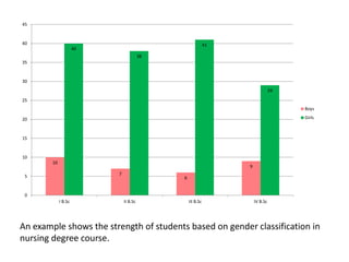
  • 53. 10 7 6 9 40 38 41 29 0 5 10 15 20 25 30 35 40 45 I B.Sc II B.Sc III B.Sc IV B.Sc Boys Girls An example shows the strength of students based on gender classification in nursing degree course.
  • 54. Useful for presenting net quantities which have both positive and negative values. The positive deviations are presented by bars above the base line while negative deviations are presented by bars below the base line.
  • 55. Variation from budget in different areas
  • 57. Other presentation of data A stem and leaf plot is a quick way to organize large amounts of data. A special table where each data value is split into a "leaf" (usually the last digit) and a "stem" (the other digits). The "stem" values are listed down, and the "leaf" values go right (or left) from the stem values. The "stem" is used to group the scores and each "leaf" indicates the individual scores within each group.
  • 58. Eg: The example presents the pulse rate of 19 samples before and after intervention