SlideShare a Scribd company logo
Responsive Web Designing Using CSS3 & HTML5
-Sandip Jadhav
“We are building a web, for all device ”
Contents
• Mobile is Future
• What is Responsive Web Designs
• Why do you need Responsive web designs
• Adoptive vs Responsive web designs
• Key benefits of Responsive web designs
• How does it works
• How you can implement Responsive Websites
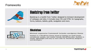
• Frameworks.
• Demo
2
Mobile is Future
• In the Year 2013 Mobile users accessing internet were more than
computer users.
3
Why do you need Responsive web designs
• The Number of devices, platforms and browser that need to
work with your website is growing exponential rate.
• New devices with varying screen resolution
4
What is Responsive Web Designs
• Responsive Websites respond to there environment.
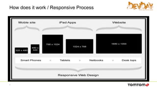
• Responsive Web Designing (RWD) is a process of designing a
single website to be used and compatible on different portable or
handy electronic devices with different Screen size , platform and
orientation .
5
What is Responsive Web Designs
• A Responsive Website serves the exact same page to every visitor
but the design and layout of that page responds to the size of the
visitors screen size. Every piece of content on a responsive site
adapts to how it is being viewed – be it desktop PC , Mobile or TV.
• All Type of devices are considered during design process.
6
How does it work / Responsive Process
7
Adoptive Vs Responsive web designs
• AWD depends on predefined screen sizing
• RWD depends on flexible and fluid grids
• AWD possesses a consistent and layered approach using scripting
• RWD consists of a little more coding approach with fluid grids & CSS
• AWD is recommended for end users with a limited budget or limited device types
and screen sizes. It is also better for applications which have a lot of images
which do not scale well
• RWD is recommended for end users for whom budget is no question and who
need a variance of mobile devices for their application to be implemented.
8
ADVANTAGES of Responsive Web Design
• User Experience (UX): Website adjusts to any screen size, making
it a good long-term solution to UX with the current plethora of
devices (including mobile/tablet hybrids). Hiding elements which
aren't crucial for mobile visitors helps to achieve their goals faster.
• Analytics: One complete view for all the traffic. To get insights on
the mobile visitors, create a "mobile-only" segment
• Sharing/Linking: One URL to accumulate all of the shares, likes,
tweets, and inbound links.
• SEO: Going with the advantage above, one URL accumulates all
links, PageRank, Page Authority, etc.
9
ADVANTAGES of Responsive Web Design
• Development: RWD involves no redirects to take care of, no user-agent
targeting.
• Maintenance: Once your website is responsive, there's very little
maintenance involved, as opposed to up-keeping a separate mobile site. It
is not required to up-keep a user-agent list with all of the up-to-date mobile
devices.
• Information Architecture (IA): With a 1-to-1 relationship to the desktop
site, mobile mimics the full site's IA, reducing the learning curve to get
accustomed to using the mobile version.
10
Key benefits of Responsive web designs
• Save money
• Save Time
• Better performance
• Improved SEO
• Wider browser support
11
How do we design for RWD
Use the Mobile First Approach and favor
Progressive Enhancement instead of the
traditional Graceful Degradation
12
How does it works
• A flexible grid
– A flexible grid-based layout is one of the cornerstones of responsive
design.
– Stop using pixel-based layouts and start using percentages or the em for
sizing
• Flexible images and media
– Adapt your images or other media to load differently depending on the
device, either by scaling or by using the CSS overflow property
• CSS3 media queries
– You can use media queries to scope styles to specific capabilities,
applying different styles based on the capabilities that match your query
13
Media Query example
body {
background-color: blue;
}
@media screen and (max-width: 960px) {
body {
background-color: red;
}
}
@media screen and (max-width: 768px) {
body {
background-color: blue;
}
}
@media screen and (max-width: 320px) {
body {
background-color: green;
}
}
14
Media Query example
15
Media Query example
16
Important guide lines
• Resizing image to fit the screen resolution.
• Hiding non-essential elements especially for smaller screen.
• Do not use web technologies that don’t work on mobile.
• Make sure that wesite get loaded properly in seconds
• Optimize your page for vertical scrolling.
17
Frameworks
18
Frameworks
19
Thank you
Any questions?

More Related Content

What's hot (20)

PPT
Google Maps in Android
Mobile 2.0 Europe
 
PDF
Responsive Web Design
Vladimir Zhidal
 
KEY
CSS and CSS3
Robyn Overstreet
 
PPTX
Introduction to Mobile Development
Pragnesh Vaghela
 
PPTX
web development.pptx
MohdArbazraza
 
PPTX
Augmented Reality Application - Final Year Project
Yash Kaushik
 
PPT
Introduction to BOOTSTRAP
Jeanie Arnoco
 
PPTX
Web Content Accessibility Guidelines
PurnimaAgarwal6
 
PDF
Swift UI - Declarative Programming [Pramati Technologies]
Pramati Technologies
 
PPTX
INDUSTRIAL TRAINING Presentation on Web Development. (2).pptx
12KritiGaneriwal
 
PDF
Fundamental CSS3
Achmad Solichin
 
PPTX
Responsive web design ppt
accede16
 
PPTX
An introduction to Xamarin
Cynoteck Technology Solutions Private Limited
 
PDF
CSS3 Media Queries
Russ Weakley
 
PPTX
Ppt on Website Planning
Om Prakash
 
PPTX
Good/Bad Web Design
Yaowaluck Promdee
 
PPTX
Java script
reddivarihareesh
 
PPTX
Web Development and Web Development technologies - Temitayo Fadojutimi
Temitayo Fadojutimi
 
PPTX
Android ppt
srikanth982
 
PDF
Website Design Basics
Jennifer Janviere
 
Google Maps in Android
Mobile 2.0 Europe
 
Responsive Web Design
Vladimir Zhidal
 
CSS and CSS3
Robyn Overstreet
 
Introduction to Mobile Development
Pragnesh Vaghela
 
web development.pptx
MohdArbazraza
 
Augmented Reality Application - Final Year Project
Yash Kaushik
 
Introduction to BOOTSTRAP
Jeanie Arnoco
 
Web Content Accessibility Guidelines
PurnimaAgarwal6
 
Swift UI - Declarative Programming [Pramati Technologies]
Pramati Technologies
 
INDUSTRIAL TRAINING Presentation on Web Development. (2).pptx
12KritiGaneriwal
 
Fundamental CSS3
Achmad Solichin
 
Responsive web design ppt
accede16
 
CSS3 Media Queries
Russ Weakley
 
Ppt on Website Planning
Om Prakash
 
Good/Bad Web Design
Yaowaluck Promdee
 
Java script
reddivarihareesh
 
Web Development and Web Development technologies - Temitayo Fadojutimi
Temitayo Fadojutimi
 
Android ppt
srikanth982
 
Website Design Basics
Jennifer Janviere
 

Viewers also liked (12)

PDF
Game jump: frontend introduction #1
Sebastian Pożoga
 
PDF
Introduction to Frontend Development - Session 1 - HTML Fundamentals
Kalin Chernev
 
PDF
Game jump frontend introduction #workshop1
Sebastian Pożoga
 
PDF
Responsive Web Design with HTML5 and CSS3
Kannika Kong
 
PDF
(Practical) Beyond Responsive Web Design (WordCamp Miami 2011)
arborwebsolutions
 
PDF
Bootstrap
Jadson Santos
 
PDF
Refreshing Your UI with HTML5, Bootstrap and CSS3
Matt Raible
 
PDF
Responsive Webdesign
Antonio De Pasquale
 
PDF
UX & UI Design - Differentiate through design
DMI
 
PPT
Lect 1. introduction to programming languages
Varun Garg
 
PDF
Introduction to Bootstrap
Ron Reiter
 
PDF
Simple Steps to UX/UI Web Design
Koombea
 
Game jump: frontend introduction #1
Sebastian Pożoga
 
Introduction to Frontend Development - Session 1 - HTML Fundamentals
Kalin Chernev
 
Game jump frontend introduction #workshop1
Sebastian Pożoga
 
Responsive Web Design with HTML5 and CSS3
Kannika Kong
 
(Practical) Beyond Responsive Web Design (WordCamp Miami 2011)
arborwebsolutions
 
Bootstrap
Jadson Santos
 
Refreshing Your UI with HTML5, Bootstrap and CSS3
Matt Raible
 
Responsive Webdesign
Antonio De Pasquale
 
UX & UI Design - Differentiate through design
DMI
 
Lect 1. introduction to programming languages
Varun Garg
 
Introduction to Bootstrap
Ron Reiter
 
Simple Steps to UX/UI Web Design
Koombea
 
Ad

Similar to Reponsive web design (HTML5 + css3) (20)

DOC
Responsive web design is the future
Key difference
 
PDF
Responsive Web Design
Heru WIjayanto
 
PDF
Responsive Web Design (HeadStart TechTalks)
Tirthesh Ganatra
 
PPTX
Responsive Web Designing for web development
ZahraWaheed9
 
PPSX
Responsive web design
Gopinath Ambothi
 
DOCX
Responsive Web Design vs Mobile Web App
Pamela Ireri
 
PDF
Responsive Web Design Whitepaper
Prototype Interactive
 
PPTX
Adaptive vs Responsive Layouts
Ihor Zenich
 
PPTX
Responsive Web Design
Julia Vi
 
PPTX
Chapter 17: Responsive Web Design
Steve Guinan
 
PPTX
Responsive web design
Metatagg Solutions
 
PPTX
Responsive Web Design_2013
Achieve Internet
 
PPTX
Nitishreys
Anirudh Reys
 
PPTX
Getting Down & Dirty with Responsive Web Design
martinridgway
 
PPTX
Responsive Web Designing Fundamentals
ADMEC Multimedia Institute
 
PDF
Responsive Web Designs
Sanjida Afrin
 
PPTX
Responsive web designing
Aanand Bohara
 
PDF
Responsive Web Design
Cory Webb
 
PDF
Responsive Web Design (RWD) vs Adaptive Web Design (AWD)
Jamshaid (Jam) Hashmi
 
PPTX
Responsive web design UDI.pptx
ATULKUMAR527024
 
Responsive web design is the future
Key difference
 
Responsive Web Design
Heru WIjayanto
 
Responsive Web Design (HeadStart TechTalks)
Tirthesh Ganatra
 
Responsive Web Designing for web development
ZahraWaheed9
 
Responsive web design
Gopinath Ambothi
 
Responsive Web Design vs Mobile Web App
Pamela Ireri
 
Responsive Web Design Whitepaper
Prototype Interactive
 
Adaptive vs Responsive Layouts
Ihor Zenich
 
Responsive Web Design
Julia Vi
 
Chapter 17: Responsive Web Design
Steve Guinan
 
Responsive web design
Metatagg Solutions
 
Responsive Web Design_2013
Achieve Internet
 
Nitishreys
Anirudh Reys
 
Getting Down & Dirty with Responsive Web Design
martinridgway
 
Responsive Web Designing Fundamentals
ADMEC Multimedia Institute
 
Responsive Web Designs
Sanjida Afrin
 
Responsive web designing
Aanand Bohara
 
Responsive Web Design
Cory Webb
 
Responsive Web Design (RWD) vs Adaptive Web Design (AWD)
Jamshaid (Jam) Hashmi
 
Responsive web design UDI.pptx
ATULKUMAR527024
 
Ad

Recently uploaded (20)

PDF
HiHelloHR – Simplify HR Operations for Modern Workplaces
HiHelloHR
 
PDF
Thread In Android-Mastering Concurrency for Responsive Apps.pdf
Nabin Dhakal
 
PPTX
Empowering Asian Contributions: The Rise of Regional User Groups in Open Sour...
Shane Coughlan
 
PPTX
Home Care Tools: Benefits, features and more
Third Rock Techkno
 
PPTX
ChiSquare Procedure in IBM SPSS Statistics Version 31.pptx
Version 1 Analytics
 
PDF
Why Businesses Are Switching to Open Source Alternatives to Crystal Reports.pdf
Varsha Nayak
 
PDF
Alexander Marshalov - How to use AI Assistants with your Monitoring system Q2...
VictoriaMetrics
 
PDF
Automate Cybersecurity Tasks with Python
VICTOR MAESTRE RAMIREZ
 
PDF
[Solution] Why Choose the VeryPDF DRM Protector Custom-Built Solution for You...
Lingwen1998
 
PDF
Unlock Efficiency with Insurance Policy Administration Systems
Insurance Tech Services
 
PDF
유니티에서 Burst Compiler+ThreadedJobs+SIMD 적용사례
Seongdae Kim
 
PPTX
Tally software_Introduction_Presentation
AditiBansal54083
 
PDF
Odoo CRM vs Zoho CRM: Honest Comparison 2025
Odiware Technologies Private Limited
 
PDF
Online Queue Management System for Public Service Offices in Nepal [Focused i...
Rishab Acharya
 
PDF
Wondershare PDFelement Pro Crack for MacOS New Version Latest 2025
bashirkhan333g
 
PDF
Download Canva Pro 2025 PC Crack Full Latest Version
bashirkhan333g
 
PDF
Build It, Buy It, or Already Got It? Make Smarter Martech Decisions
bbedford2
 
PDF
SciPy 2025 - Packaging a Scientific Python Project
Henry Schreiner
 
PDF
iTop VPN With Crack Lifetime Activation Key-CODE
utfefguu
 
PPTX
Homogeneity of Variance Test Options IBM SPSS Statistics Version 31.pptx
Version 1 Analytics
 
HiHelloHR – Simplify HR Operations for Modern Workplaces
HiHelloHR
 
Thread In Android-Mastering Concurrency for Responsive Apps.pdf
Nabin Dhakal
 
Empowering Asian Contributions: The Rise of Regional User Groups in Open Sour...
Shane Coughlan
 
Home Care Tools: Benefits, features and more
Third Rock Techkno
 
ChiSquare Procedure in IBM SPSS Statistics Version 31.pptx
Version 1 Analytics
 
Why Businesses Are Switching to Open Source Alternatives to Crystal Reports.pdf
Varsha Nayak
 
Alexander Marshalov - How to use AI Assistants with your Monitoring system Q2...
VictoriaMetrics
 
Automate Cybersecurity Tasks with Python
VICTOR MAESTRE RAMIREZ
 
[Solution] Why Choose the VeryPDF DRM Protector Custom-Built Solution for You...
Lingwen1998
 
Unlock Efficiency with Insurance Policy Administration Systems
Insurance Tech Services
 
유니티에서 Burst Compiler+ThreadedJobs+SIMD 적용사례
Seongdae Kim
 
Tally software_Introduction_Presentation
AditiBansal54083
 
Odoo CRM vs Zoho CRM: Honest Comparison 2025
Odiware Technologies Private Limited
 
Online Queue Management System for Public Service Offices in Nepal [Focused i...
Rishab Acharya
 
Wondershare PDFelement Pro Crack for MacOS New Version Latest 2025
bashirkhan333g
 
Download Canva Pro 2025 PC Crack Full Latest Version
bashirkhan333g
 
Build It, Buy It, or Already Got It? Make Smarter Martech Decisions
bbedford2
 
SciPy 2025 - Packaging a Scientific Python Project
Henry Schreiner
 
iTop VPN With Crack Lifetime Activation Key-CODE
utfefguu
 
Homogeneity of Variance Test Options IBM SPSS Statistics Version 31.pptx
Version 1 Analytics
 

Reponsive web design (HTML5 + css3)

  • 1. Responsive Web Designing Using CSS3 & HTML5 -Sandip Jadhav “We are building a web, for all device ”
  • 2. Contents • Mobile is Future • What is Responsive Web Designs • Why do you need Responsive web designs • Adoptive vs Responsive web designs • Key benefits of Responsive web designs • How does it works • How you can implement Responsive Websites • Frameworks. • Demo 2
  • 3. Mobile is Future • In the Year 2013 Mobile users accessing internet were more than computer users. 3
  • 4. Why do you need Responsive web designs • The Number of devices, platforms and browser that need to work with your website is growing exponential rate. • New devices with varying screen resolution 4
  • 5. What is Responsive Web Designs • Responsive Websites respond to there environment. • Responsive Web Designing (RWD) is a process of designing a single website to be used and compatible on different portable or handy electronic devices with different Screen size , platform and orientation . 5
  • 6. What is Responsive Web Designs • A Responsive Website serves the exact same page to every visitor but the design and layout of that page responds to the size of the visitors screen size. Every piece of content on a responsive site adapts to how it is being viewed – be it desktop PC , Mobile or TV. • All Type of devices are considered during design process. 6
  • 7. How does it work / Responsive Process 7
  • 8. Adoptive Vs Responsive web designs • AWD depends on predefined screen sizing • RWD depends on flexible and fluid grids • AWD possesses a consistent and layered approach using scripting • RWD consists of a little more coding approach with fluid grids & CSS • AWD is recommended for end users with a limited budget or limited device types and screen sizes. It is also better for applications which have a lot of images which do not scale well • RWD is recommended for end users for whom budget is no question and who need a variance of mobile devices for their application to be implemented. 8
  • 9. ADVANTAGES of Responsive Web Design • User Experience (UX): Website adjusts to any screen size, making it a good long-term solution to UX with the current plethora of devices (including mobile/tablet hybrids). Hiding elements which aren't crucial for mobile visitors helps to achieve their goals faster. • Analytics: One complete view for all the traffic. To get insights on the mobile visitors, create a "mobile-only" segment • Sharing/Linking: One URL to accumulate all of the shares, likes, tweets, and inbound links. • SEO: Going with the advantage above, one URL accumulates all links, PageRank, Page Authority, etc. 9
  • 10. ADVANTAGES of Responsive Web Design • Development: RWD involves no redirects to take care of, no user-agent targeting. • Maintenance: Once your website is responsive, there's very little maintenance involved, as opposed to up-keeping a separate mobile site. It is not required to up-keep a user-agent list with all of the up-to-date mobile devices. • Information Architecture (IA): With a 1-to-1 relationship to the desktop site, mobile mimics the full site's IA, reducing the learning curve to get accustomed to using the mobile version. 10
  • 11. Key benefits of Responsive web designs • Save money • Save Time • Better performance • Improved SEO • Wider browser support 11
  • 12. How do we design for RWD Use the Mobile First Approach and favor Progressive Enhancement instead of the traditional Graceful Degradation 12
  • 13. How does it works • A flexible grid – A flexible grid-based layout is one of the cornerstones of responsive design. – Stop using pixel-based layouts and start using percentages or the em for sizing • Flexible images and media – Adapt your images or other media to load differently depending on the device, either by scaling or by using the CSS overflow property • CSS3 media queries – You can use media queries to scope styles to specific capabilities, applying different styles based on the capabilities that match your query 13
  • 14. Media Query example body { background-color: blue; } @media screen and (max-width: 960px) { body { background-color: red; } } @media screen and (max-width: 768px) { body { background-color: blue; } } @media screen and (max-width: 320px) { body { background-color: green; } } 14
  • 17. Important guide lines • Resizing image to fit the screen resolution. • Hiding non-essential elements especially for smaller screen. • Do not use web technologies that don’t work on mobile. • Make sure that wesite get loaded properly in seconds • Optimize your page for vertical scrolling. 17