SlideShare a Scribd company logo
Responsive Web Design: The View
of the World Depends on the
Glasses I Wear
Paul Laberge
Technical Evangelist
Microsoft Canada
@plaberge
paul.laberge@microsoft.com
How we viewed the web…
• The Desktop Browser
How we view the web today…
•   The Desktop Browser
•   Mobile Browsers
•   Tablet form-factors
•   Televisions
•   Game Consoles
•   More…
•   Yeah, so what’s the problem?
demo
The Anti-Pattern
Responsive Web Design - 01.26.12
Responsive Web Design
• Thinking of the user’s needs instead of ours.
• Adapt to various device capabilities instead of
  configurations.
• Help future-proof our sites.
demo
Responsive Web Designs
Elements of Responsive Web Design
•   A flexible, grid-based layout,
•   Flexible images and media, and
•   Media queries.
•   Something else.
Flexible, Grid-based Layout
Ok, so what’s the problem?
•   Non-responsive sites are no fun.
•   Fixed-width sites are not the best experiences.
•   Design tools tend to use pixels.
•   Sometimes a pixel does not equal a pixel.
•   So how do we turn pixels to their em
    counterparts?
Pixels to Ems Algorithm
Responsive Web Design - 01.26.12
Responsive Web Design READ MORE >>

     h1 {                                      h1 {
em     font-size: 24px;        24 / 16 = 1.5     font-size: 1.5em;
     }                                         }


     h1 a {                      11 / 24 =     h1 a {
%      font-size: 24px;       0.458333333+       font: 0.458333333+;
     }                                         }
                1                    2                    3
Didn’t You Say Something About a Grid?
Flexible Images and Media
A Simple Solution


Works on images, as well as other media like <video>.
Another Possibility


     Filament Group – depends on cookies and JavaScript
Media Queries
Not so long ago…
•   We could define media types: screen and print.
•   But not easily respond to the user’s display.
•   Lots of grunt work.
•   Didn’t spend much time thinking about mobile
    devices.
CSS3 Media Queries
• The CSS3 Media Queries Module specifies
  methods to enable web developers to scope a
  style sheet to a set of precise device capabilities.
Simple Example
@media screen and (max-width: 600px) {
   body {
      font-size: 80%;
   }
}
Other Queries
@media screen and (min-width:320px) and (max-
width:480px)

@media not print and (max-width:600px)

@media screen (x) and (y), print (a) and (b)
Can be declared…
In the Stylesheet
Import Rule
   @import url(mq.css) only screen and (max-
   width:600px)
link Element
   <link rel=“stylesheet” media=“only screen and
   (max-width:800px)” href=“mq.css”>
Supported Media Properties
•   min/max-width         •   color
•   min/max-height        •   color-index
•   device-width          •   monochrome
•   device-height         •   resolution
•   orientation
•   aspect-ratio
•   device-aspect-ratio
demo
Little Pea Bakery
What About Devices?
• viewport meta tag
  • <meta name=“viewport”
    content=“width=device-width”>
• device-width vs. width
• maximum-zoom
What about non-supportive browsers?
• css3-mediaqueries-js by Wouter van der Graaf
• Just include the script in your pages
• Parses the CSS and applies style for positive media
  tests
Responsive Web Design - 01.26.12
Hey, what was that 4th thing?
• Design.
  • Do we start with mobile-first?
  • Is it best that all sites are responsive?
  • Do we need or want to do visual comps for every
    device?
  • Don’t dismiss mobile as walking and looking something
    up.
  • We are at the beginning, that’s what makes this
    interesting!
Responsive Web Design - 01.26.12
Remember To Complete Your Evaluations!
You could WIN a Samsung Focus
Windows Phone 7!
Let us know what you liked & disliked!
Remember, 1=Bad, 5=Good 
Please provide comments!
No purchase necessary. The contest is open to residents of Canada (excluding government employees). The Toronto Tech·Days evaluation form contest begins on October 25th, 2011 and
ends on October 26th, 2011. The Vancouver Tech·Days evaluation form contest begins on November 15th, 2011 and ends on November 16th, 2011. The Montreal Tech·Days evaluation
form contest begins on November 29th, 2011 and ends on November 30th, 2011. Participants can enter the contest in one of two ways: (1) complete and submit an evaluation form by the
contest close date; or (2) provide contact information by the contest close date. The draw for Toronto will take place on October 31st, 2011. The draw for Vancouver will take place on
November 21st, 2011. The draw for Montreal will take place on December 5th, 2011. The chances of being selected depend upon the number of eligible entries. Selected participants will be
contacted by phone and/or e-mail and will be required to answer correctly a time-limited skill-testing question. There are three (3) prizes available to be won. One (1) prize will be given away
for each Tech·Days event in Toronto (October 25-26 2011), Vancouver (November 15-16 2011) and Montreal (November 29-30 2011). The prize consists of a Samsung Focus Windows
Phone 7 (handset only; voice and/or data plan not included) (approximate retail value of $499 CAD). The prize will be delivered to the shipping address designated by the winner within 6-8
weeks. The winner may be required to sign a declaration and release form. For full contest rules, please see a Microsoft Tech·Days representative.


 You can email any additional comments directly to
        td_can@microsoft.com at any time.
Q&A
© 2011 Microsoft Corporation. All rights reserved. Microsoft, Windows, Windows Vista and other product names are or may be registered trademarks and/or trademarks in the U.S. and/or other countries.
The information herein is for informational purposes only and represents the current view of Microsoft Corporation as of the date of this presentation. Because Microsoft must respond to changing market conditions, it should
                          not be interpreted to be a commitment on the part of Microsoft, and Microsoft cannot guarantee the accuracy of any information provided after the date of this presentation.
                                                  MICROSOFT MAKES NO WARRANTIES, EXPRESS, IMPLIED OR STATUTORY, AS TO THE INFORMATION IN THIS PRESENTATION.

More Related Content

Viewers also liked (17)

PDF
MALCOLM X (Building Bridges – Getting The DEVIL OFF YOUR BACK)-russian
VogelDenise
 
PDF
MALCOLM X (Building Bridges – Getting The DEVIL OFF YOUR BACK)-norwegian
VogelDenise
 
PDF
MALCOLM X (Building Bridges – Getting The DEVIL OFF YOUR BACK)-icelandic
VogelDenise
 
PDF
Success after collegev3
Tom Bartlett
 
PDF
Monetary policy review 28jan14
jignesh shah
 
PDF
KU KLUX KLAN ACT OF 1871 (AFRIKAANS)
VogelDenise
 
PDF
Malcolm x building bridges (getting the devil off your back)-korean
VogelDenise
 
PDF
Obama read my lips -obama fraudgate (irish)
VogelDenise
 
PDF
033016 - CITIZENS OF JACKSON MISSISSIPPI PROPOSED LAWSUIT AGAINST CITY OF JAC...
VogelDenise
 
PDF
Interpol bringing the united states to justice (hungarian)
VogelDenise
 
PDF
GEORGE ZIMMERMAN'S NOT GUILTY VERDICT - NOT SO FAST (croatian)
VogelDenise
 
PDF
Interpol bringing the united states to justice (korean)
VogelDenise
 
PDF
Interpol bringing the united states to justice (hindi)
VogelDenise
 
PDF
Lithuanian thank you to republic of ecuador (asylum of julian assange)
VogelDenise
 
PDF
Obama read my lips -obama fraudgate (macedonian)
VogelDenise
 
PDF
052215 - FAX TO DELNER THOMAS & BENNIE THOMPSON (Urdu)
VogelDenise
 
PDF
Romanian thank you to republic of ecuador (asylum of julian assange)
VogelDenise
 
MALCOLM X (Building Bridges – Getting The DEVIL OFF YOUR BACK)-russian
VogelDenise
 
MALCOLM X (Building Bridges – Getting The DEVIL OFF YOUR BACK)-norwegian
VogelDenise
 
MALCOLM X (Building Bridges – Getting The DEVIL OFF YOUR BACK)-icelandic
VogelDenise
 
Success after collegev3
Tom Bartlett
 
Monetary policy review 28jan14
jignesh shah
 
KU KLUX KLAN ACT OF 1871 (AFRIKAANS)
VogelDenise
 
Malcolm x building bridges (getting the devil off your back)-korean
VogelDenise
 
Obama read my lips -obama fraudgate (irish)
VogelDenise
 
033016 - CITIZENS OF JACKSON MISSISSIPPI PROPOSED LAWSUIT AGAINST CITY OF JAC...
VogelDenise
 
Interpol bringing the united states to justice (hungarian)
VogelDenise
 
GEORGE ZIMMERMAN'S NOT GUILTY VERDICT - NOT SO FAST (croatian)
VogelDenise
 
Interpol bringing the united states to justice (korean)
VogelDenise
 
Interpol bringing the united states to justice (hindi)
VogelDenise
 
Lithuanian thank you to republic of ecuador (asylum of julian assange)
VogelDenise
 
Obama read my lips -obama fraudgate (macedonian)
VogelDenise
 
052215 - FAX TO DELNER THOMAS & BENNIE THOMPSON (Urdu)
VogelDenise
 
Romanian thank you to republic of ecuador (asylum of julian assange)
VogelDenise
 

Similar to Responsive Web Design - 01.26.12 (20)

PPTX
FITC - 2012-04-23 - Responsive Web Design
Frédéric Harper
 
PPTX
SCREENS - 2012-09-28 - Responsive Web Design, get the best from your design
Frédéric Harper
 
PPTX
Responsive Web Design - Web & PHP Conference - 2013-09-18
Frédéric Harper
 
PDF
Prairie Dev Con West - 2012-03-15 - Responsive Web Design
Frédéric Harper
 
PPTX
SEF 2014 - Responsive Design in SharePoint 2013
Marc D Anderson
 
PDF
Wizard - Credential 2013
Vũ Thịnh
 
PDF
Ciw going mobile
r82093403
 
PDF
Responsive design lunch and learn
Ricardo Queiroz
 
PDF
Digital Success Stack for DCBKK 2018
Kyvio
 
PDF
User interface-ui-training-by-ruchiwebsolutions
php2ranjan
 
PDF
User interface ui training hyderabad
Ruchiwebsolutions
 
KEY
The web standards gentleman: a matter of (evolving) standards)
Chris Mills
 
PPT
Quality and the "Secret Mission:" From End-Stage Tester to Skilled Analyst
Devorah Firestone
 
PDF
Responsive Design
David Hudson
 
PDF
Design Learnings
Quikr
 
PDF
Web designing-training-by-ruchiwebsolutions
php2ranjan
 
PDF
Responsive and Mobile Design
Interactive Mechanics
 
PDF
Expanding Your Online Community with Web Accessibility
TechSoup
 
PDF
Responsive Web Design (April 18th, Los Angeles)
Thinkful
 
PPTX
MobileStore.pptx
AkashChourasiya13
 
FITC - 2012-04-23 - Responsive Web Design
Frédéric Harper
 
SCREENS - 2012-09-28 - Responsive Web Design, get the best from your design
Frédéric Harper
 
Responsive Web Design - Web & PHP Conference - 2013-09-18
Frédéric Harper
 
Prairie Dev Con West - 2012-03-15 - Responsive Web Design
Frédéric Harper
 
SEF 2014 - Responsive Design in SharePoint 2013
Marc D Anderson
 
Wizard - Credential 2013
Vũ Thịnh
 
Ciw going mobile
r82093403
 
Responsive design lunch and learn
Ricardo Queiroz
 
Digital Success Stack for DCBKK 2018
Kyvio
 
User interface-ui-training-by-ruchiwebsolutions
php2ranjan
 
User interface ui training hyderabad
Ruchiwebsolutions
 
The web standards gentleman: a matter of (evolving) standards)
Chris Mills
 
Quality and the "Secret Mission:" From End-Stage Tester to Skilled Analyst
Devorah Firestone
 
Responsive Design
David Hudson
 
Design Learnings
Quikr
 
Web designing-training-by-ruchiwebsolutions
php2ranjan
 
Responsive and Mobile Design
Interactive Mechanics
 
Expanding Your Online Community with Web Accessibility
TechSoup
 
Responsive Web Design (April 18th, Los Angeles)
Thinkful
 
MobileStore.pptx
AkashChourasiya13
 
Ad

Recently uploaded (20)

PDF
Peak of Data & AI Encore - Real-Time Insights & Scalable Editing with ArcGIS
Safe Software
 
PPTX
Agentic AI in Healthcare Driving the Next Wave of Digital Transformation
danielle hunter
 
PPTX
AI Code Generation Risks (Ramkumar Dilli, CIO, Myridius)
Priyanka Aash
 
PDF
AI Unleashed - Shaping the Future -Starting Today - AIOUG Yatra 2025 - For Co...
Sandesh Rao
 
PDF
RAT Builders - How to Catch Them All [DeepSec 2024]
malmoeb
 
PDF
Presentation about Hardware and Software in Computer
snehamodhawadiya
 
PDF
MASTERDECK GRAPHSUMMIT SYDNEY (Public).pdf
Neo4j
 
PPTX
Farrell_Programming Logic and Design slides_10e_ch02_PowerPoint.pptx
bashnahara11
 
PDF
Market Insight : ETH Dominance Returns
CIFDAQ
 
PDF
TrustArc Webinar - Navigating Data Privacy in LATAM: Laws, Trends, and Compli...
TrustArc
 
PDF
OFFOFFBOX™ – A New Era for African Film | Startup Presentation
ambaicciwalkerbrian
 
PDF
Structs to JSON: How Go Powers REST APIs
Emily Achieng
 
PDF
State-Dependent Conformal Perception Bounds for Neuro-Symbolic Verification
Ivan Ruchkin
 
PDF
Economic Impact of Data Centres to the Malaysian Economy
flintglobalapac
 
PPTX
Simple and concise overview about Quantum computing..pptx
mughal641
 
PDF
How ETL Control Logic Keeps Your Pipelines Safe and Reliable.pdf
Stryv Solutions Pvt. Ltd.
 
PDF
Trying to figure out MCP by actually building an app from scratch with open s...
Julien SIMON
 
PDF
The Future of Mobile Is Context-Aware—Are You Ready?
iProgrammer Solutions Private Limited
 
PDF
Google I/O Extended 2025 Baku - all ppts
HusseinMalikMammadli
 
PDF
Make GenAI investments go further with the Dell AI Factory
Principled Technologies
 
Peak of Data & AI Encore - Real-Time Insights & Scalable Editing with ArcGIS
Safe Software
 
Agentic AI in Healthcare Driving the Next Wave of Digital Transformation
danielle hunter
 
AI Code Generation Risks (Ramkumar Dilli, CIO, Myridius)
Priyanka Aash
 
AI Unleashed - Shaping the Future -Starting Today - AIOUG Yatra 2025 - For Co...
Sandesh Rao
 
RAT Builders - How to Catch Them All [DeepSec 2024]
malmoeb
 
Presentation about Hardware and Software in Computer
snehamodhawadiya
 
MASTERDECK GRAPHSUMMIT SYDNEY (Public).pdf
Neo4j
 
Farrell_Programming Logic and Design slides_10e_ch02_PowerPoint.pptx
bashnahara11
 
Market Insight : ETH Dominance Returns
CIFDAQ
 
TrustArc Webinar - Navigating Data Privacy in LATAM: Laws, Trends, and Compli...
TrustArc
 
OFFOFFBOX™ – A New Era for African Film | Startup Presentation
ambaicciwalkerbrian
 
Structs to JSON: How Go Powers REST APIs
Emily Achieng
 
State-Dependent Conformal Perception Bounds for Neuro-Symbolic Verification
Ivan Ruchkin
 
Economic Impact of Data Centres to the Malaysian Economy
flintglobalapac
 
Simple and concise overview about Quantum computing..pptx
mughal641
 
How ETL Control Logic Keeps Your Pipelines Safe and Reliable.pdf
Stryv Solutions Pvt. Ltd.
 
Trying to figure out MCP by actually building an app from scratch with open s...
Julien SIMON
 
The Future of Mobile Is Context-Aware—Are You Ready?
iProgrammer Solutions Private Limited
 
Google I/O Extended 2025 Baku - all ppts
HusseinMalikMammadli
 
Make GenAI investments go further with the Dell AI Factory
Principled Technologies
 
Ad

Responsive Web Design - 01.26.12

  • 1. Responsive Web Design: The View of the World Depends on the Glasses I Wear Paul Laberge Technical Evangelist Microsoft Canada @plaberge [email protected]
  • 2. How we viewed the web… • The Desktop Browser
  • 3. How we view the web today… • The Desktop Browser • Mobile Browsers • Tablet form-factors • Televisions • Game Consoles • More… • Yeah, so what’s the problem?
  • 6. Responsive Web Design • Thinking of the user’s needs instead of ours. • Adapt to various device capabilities instead of configurations. • Help future-proof our sites.
  • 8. Elements of Responsive Web Design • A flexible, grid-based layout, • Flexible images and media, and • Media queries. • Something else.
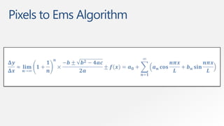
  • 10. Ok, so what’s the problem? • Non-responsive sites are no fun. • Fixed-width sites are not the best experiences. • Design tools tend to use pixels. • Sometimes a pixel does not equal a pixel. • So how do we turn pixels to their em counterparts?
  • 11. Pixels to Ems Algorithm
  • 13. Responsive Web Design READ MORE >> h1 { h1 { em font-size: 24px; 24 / 16 = 1.5 font-size: 1.5em; } } h1 a { 11 / 24 = h1 a { % font-size: 24px; 0.458333333+ font: 0.458333333+; } } 1 2 3
  • 14. Didn’t You Say Something About a Grid?
  • 16. A Simple Solution Works on images, as well as other media like <video>.
  • 17. Another Possibility Filament Group – depends on cookies and JavaScript
  • 19. Not so long ago… • We could define media types: screen and print. • But not easily respond to the user’s display. • Lots of grunt work. • Didn’t spend much time thinking about mobile devices.
  • 20. CSS3 Media Queries • The CSS3 Media Queries Module specifies methods to enable web developers to scope a style sheet to a set of precise device capabilities.
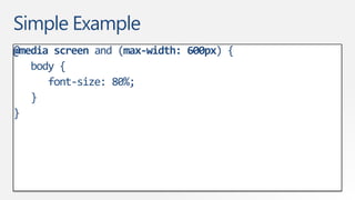
  • 21. Simple Example @media screen and (max-width: 600px) { body { font-size: 80%; } }
  • 22. Other Queries @media screen and (min-width:320px) and (max- width:480px) @media not print and (max-width:600px) @media screen (x) and (y), print (a) and (b)
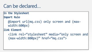
  • 23. Can be declared… In the Stylesheet Import Rule @import url(mq.css) only screen and (max- width:600px) link Element <link rel=“stylesheet” media=“only screen and (max-width:800px)” href=“mq.css”>
  • 24. Supported Media Properties • min/max-width • color • min/max-height • color-index • device-width • monochrome • device-height • resolution • orientation • aspect-ratio • device-aspect-ratio
  • 26. What About Devices? • viewport meta tag • <meta name=“viewport” content=“width=device-width”> • device-width vs. width • maximum-zoom
  • 27. What about non-supportive browsers? • css3-mediaqueries-js by Wouter van der Graaf • Just include the script in your pages • Parses the CSS and applies style for positive media tests
  • 33. Hey, what was that 4th thing? • Design. • Do we start with mobile-first? • Is it best that all sites are responsive? • Do we need or want to do visual comps for every device? • Don’t dismiss mobile as walking and looking something up. • We are at the beginning, that’s what makes this interesting!
  • 35. Remember To Complete Your Evaluations! You could WIN a Samsung Focus Windows Phone 7! Let us know what you liked & disliked! Remember, 1=Bad, 5=Good  Please provide comments! No purchase necessary. The contest is open to residents of Canada (excluding government employees). The Toronto Tech·Days evaluation form contest begins on October 25th, 2011 and ends on October 26th, 2011. The Vancouver Tech·Days evaluation form contest begins on November 15th, 2011 and ends on November 16th, 2011. The Montreal Tech·Days evaluation form contest begins on November 29th, 2011 and ends on November 30th, 2011. Participants can enter the contest in one of two ways: (1) complete and submit an evaluation form by the contest close date; or (2) provide contact information by the contest close date. The draw for Toronto will take place on October 31st, 2011. The draw for Vancouver will take place on November 21st, 2011. The draw for Montreal will take place on December 5th, 2011. The chances of being selected depend upon the number of eligible entries. Selected participants will be contacted by phone and/or e-mail and will be required to answer correctly a time-limited skill-testing question. There are three (3) prizes available to be won. One (1) prize will be given away for each Tech·Days event in Toronto (October 25-26 2011), Vancouver (November 15-16 2011) and Montreal (November 29-30 2011). The prize consists of a Samsung Focus Windows Phone 7 (handset only; voice and/or data plan not included) (approximate retail value of $499 CAD). The prize will be delivered to the shipping address designated by the winner within 6-8 weeks. The winner may be required to sign a declaration and release form. For full contest rules, please see a Microsoft Tech·Days representative. You can email any additional comments directly to [email protected] at any time.
  • 36. Q&A
  • 37. © 2011 Microsoft Corporation. All rights reserved. Microsoft, Windows, Windows Vista and other product names are or may be registered trademarks and/or trademarks in the U.S. and/or other countries. The information herein is for informational purposes only and represents the current view of Microsoft Corporation as of the date of this presentation. Because Microsoft must respond to changing market conditions, it should not be interpreted to be a commitment on the part of Microsoft, and Microsoft cannot guarantee the accuracy of any information provided after the date of this presentation. MICROSOFT MAKES NO WARRANTIES, EXPRESS, IMPLIED OR STATUTORY, AS TO THE INFORMATION IN THIS PRESENTATION.