SlideShare a Scribd company logo
RESPONSIVE
WEB DESIGN
MARCH 2016
INTRO
AUSTIN WALKER
Senior UX Designer at Credera
AUSTIN WALKER
Dad at Home
Responsive Web Design Basics
CHALLENGE
INTERNET USERS
1995
35MM, 0.6% of world pop.
http://www.kpcb.com/internet-trends
INTERNET USERS
2014
2.8B, 39% of world pop.
http://www.kpcb.com/internet-trends
MOBILE PHONE USERS
1995
80MM, 1% of world pop.
http://www.kpcb.com/internet-trends
MOBILE PHONE USERS
2014
5.2B, 73% of world pop.
http://www.kpcb.com/internet-trends
Responsive Web Design Basics
THAT WAS IN 2012
THAT WAS IN 2012
at a small web conference
DEVICE SIZES AND
CAPABILITIES CONTINUE
TO PROLIFERATE
HOW SHOULD WE DELIVER
OUR VALUE TO PEOPLE
ON DIFFERENT DEVICES?
POSSIBLE
SOLUTIONS
BASIC CRITERIA
Discoverability Highly targeted audience or broadly available?
Control How detailed do we want to be?
Functionality Do we need device specific functionality such
as utilizing accelerometers?
Overhead Does the value of operating separate
customer facing applications outweigh the
effort to maintain separate codebases? How
quickly can we update?
POSSIBLE SOLUTIONS
SOLUTION WINS ON LOSES ON
Native App Control, Functionality Overhead, Discoverability
Mobile Site Control, Discoverability Overhead, Functionality
Responsive Discoverability, Overhead Functionality, Control
WE’RE GOING TO ASSUME…
• We can deliver everything we need to in a browser
• We want to quickly reach as many people as easily as possible
• We don’t want to maintain separate codebases
WE DECIDED TO BUILD A
RESPONSIVE WEBSITE
WE DECIDED TO BUILD A
RESPONSIVE WEBSITE
Surprise!
BUILDING
LAYOUT VIA GRIDS
1 1 1 1 1 1 1 1 1 1 1 1
Example 12 Column Grid
LAYOUT VIA GRIDS
Example 12 Column Grid
9
3
12
82 2
LAYOUT VIA GRIDS
Example 12 Column Grid
9
3
12
82 2
LAYOUT VIA GRIDS
Example 12 Column Grid
9
3
12
82 2
LAYOUT VIA GRIDS
Example 12 Column Grid
ARTICLE
META
NAV
OVERSIZED HEADLINE
Responsive Web Design Basics
LAYOUT VIA GRIDS
Example 12 Column Grid
ARTICLE
META
NAV
OVERSIZED HEADLINE
Responsive Web Design Basics
LAYOUT VIA GRIDS
Example 12 Column Grid
ARTICLE
META
NAV
OVERSIZED HEADLINE
LAYOUT VIA GRIDS
Example 12 Column Grid
ARTICLE
META
NAV
OVERSIZED
HEADLINE
LAYOUT VIA GRIDS
Example 12 Column Grid
ARTICLE
META
NAV
OVERSIZED
HEADLINE
Too Tight?
Breaks out?
Unused Width?
Wraps?
CSS MEDIA QUERIES
• CSS defines the visual style of the HTML elements on a page
• CSS media queries allow you to define specific visual styles
whenever the browser meets certain criteria
• Usually based on the width of the browser window
CSS MEDIA QUERIES
Mobile First For screens larger than X, apply these styles…
Desktop First For screens smaller than Y, apply these styles…
MOBILE FIRST
.headline-container {

width: 100%;

}
@media screen and (min-width: 320px) {

.headline-container {

width: 66.6666667%;

}

}
Best practice is to start developing ‘Mobile First’ but for this demo we’ll be doing ‘Desktop First’.
DESKTOP FIRST
.headline-container {

width: 66.6666667%;

}
@media screen and (max-width: 320px) {

.headline-container {

width: 100%;

}

}
Best practice is to start developing ‘Mobile First’ but for this demo we’ll be doing ‘Desktop First’.
LAYOUT VIA GRIDS
Example 12 Column Grid
ARTICLE
META
NAV
OVERSIZED
HEADLINE
Too Tight?
Breaks out?
Unused Width?
Wraps?
LAYOUT VIA GRIDS
Example 12 Column Grid
ARTICLE
NAV
OVERSIZED HEADLINE
EXAMPLES
This Is Responsive Bare bones responsive layout demo
Uncrate Simple layout with responsive aspects
The Onion More complex than Uncrate
Invision Labs Highly polished responsive example
Rally Interactive Highly polished responsive example
BEST PRACTICES
Keep page 

weight light
Utilize a mobile first approach to ensure
you don’t accidentally punish mobile users
Characteristics 

≠ Capabilities
Don’t infer device capability from device
characteristics or type
Be consistent 

across breakpoints
Don’t unreasonably remove or display
content / functionality based on
breakpoints
ADVANCED
RESPONSIVE
CLIENT SIDE + SERVER SIDE
• Responsive Web Design is focused on the client side (browser)
• RESS = Responsive with Server Side components
• Server detects device type based on UA (User Agent) and sends
content specifically for that type of device
• Benefits of an m. site without a redirect or separate codebase
SAFARI USER AGENT STRINGS
Responsive Web Design Basics
RESS AT AMAZON
Desktop
Content Type A
Desktop
Content Type A
iPhone
Content Type B
LATEST
DEVELOPMENTS
THE LATEST DEVELOPMENTS
Google’s Mobile
Friendly Tag
In mobile search results, Google will tag
your site as ‘Mobile Friendly’ and
penalize you if it’s not
Google’s Accelerated
Mobile Pages (AMP)
Special stripped down HTML pages that
Google’s promoting in search results
Increasing support 

for flex box
More flexible in layout control than
floated columns
WRAP UP
WHAT WE TALKED ABOUT
Device
Proliferation
As device sizes fragment, we need a solution
that covers this breadth
Why Responsive Responsive web design provides more breadth
but less functionality compared to native apps
Grids & Media
Queries
We can adapt the layout (and other)
characteristics of our site for different devices
RESS & Latest
Developments
New approaches continue to be developed to
meet different needs
LEARNING MORE
CODE
Google Developers (Mobile)
Codepen
Codrops Playground
Twitter Bootstrap
RESOURCES
This Is Responsive
A List Apart
A Book Apart
PEOPLE
Brad Frost
Luke W.
Ethan Marcotte
Scott Jehl
• RWD is only a small 

part of what we do
• Our Technology

Solutions practice covers

custom app dev,

eCommerce, mobile

apps, analytics and other
• We’re looking for FEDs in

the UX practice
CREDERA MC
UX
TECH
Responsive Web Design Basics
AUSTIN WALKER
Senior UX Designer at Credera
awalker@credera.com
credera.com/careers ▪ ux.credera.com ▪ awalker@credera.com

More Related Content

What's hot (20)

PDF
Intel AppUp Day Bologna
Andrea Balducci
 
PPTX
Why front-end matters in 2019
Timmy Kokke
 
PPTX
Presentation - Windows app development - I - Mr. Chandan Gupta
MobileNepal
 
PPTX
Building a Startup for the Mobile-first, Cloud-first World
Nick Landry
 
PPTX
Web develpment trends 2017
hira hussain
 
PDF
The changing face of mobile apps in the future of mobile
Brian Katz
 
PPTX
The Future of the Web Is Conversational
Kentico Software
 
PPTX
Progressive WebVR Apps
Luis Diego González-Zúñiga, PhD
 
PDF
Future of Mobile Web Application and Web App Store
Jonathan Jeon
 
PPTX
What's Coming Coming Coming
Luis Diego González-Zúñiga, PhD
 
PPT
Hybrid Cloud presentation at the Insight Client Event V3
James Governor
 
PPTX
WTIA Cloud Computing Series - Part IV: Microsofts World View of Cloud Computing
Washington Technology Industry Association
 
PDF
Stratégie et évolution de Microsoft IT pour supporter la transformation digit...
Microsoft Décideurs IT
 
PDF
Razorfish 2014 Tech Summit - Founder/CEO of Bug Labs Peter Semmelhack
Razorfish
 
PPTX
Razorfish 2014 Tech Summit - Kick-off by Global CTO Ray Velez
Razorfish
 
PDF
Big Bang The Gigabots
US-Ignite
 
PPTX
As Software eats the World, APIs eat Software
3scale
 
PDF
Open stack summit spring 2014 hybrid cloud landmines - 2014-05-15
drumulonimbus
 
PPTX
Building The Pillars Of Modern Enterprise
Krishnan Subramanian
 
PDF
Public, Private or Hybrid Cloud Computing?
Don Talend
 
Intel AppUp Day Bologna
Andrea Balducci
 
Why front-end matters in 2019
Timmy Kokke
 
Presentation - Windows app development - I - Mr. Chandan Gupta
MobileNepal
 
Building a Startup for the Mobile-first, Cloud-first World
Nick Landry
 
Web develpment trends 2017
hira hussain
 
The changing face of mobile apps in the future of mobile
Brian Katz
 
The Future of the Web Is Conversational
Kentico Software
 
Progressive WebVR Apps
Luis Diego González-Zúñiga, PhD
 
Future of Mobile Web Application and Web App Store
Jonathan Jeon
 
What's Coming Coming Coming
Luis Diego González-Zúñiga, PhD
 
Hybrid Cloud presentation at the Insight Client Event V3
James Governor
 
WTIA Cloud Computing Series - Part IV: Microsofts World View of Cloud Computing
Washington Technology Industry Association
 
Stratégie et évolution de Microsoft IT pour supporter la transformation digit...
Microsoft Décideurs IT
 
Razorfish 2014 Tech Summit - Founder/CEO of Bug Labs Peter Semmelhack
Razorfish
 
Razorfish 2014 Tech Summit - Kick-off by Global CTO Ray Velez
Razorfish
 
Big Bang The Gigabots
US-Ignite
 
As Software eats the World, APIs eat Software
3scale
 
Open stack summit spring 2014 hybrid cloud landmines - 2014-05-15
drumulonimbus
 
Building The Pillars Of Modern Enterprise
Krishnan Subramanian
 
Public, Private or Hybrid Cloud Computing?
Don Talend
 

Viewers also liked (20)

PDF
Web Typography Fundamentals
markboultondesign
 
PDF
Opening the Flood Gates: Font Embedding and Typography
markboultondesign
 
PDF
Drupalcon Redesign Keynote
markboultondesign
 
PDF
Grids Are Good
Alexander Sergeev
 
PDF
Student Mentoring Programs: The Why's, How's, and More
Cindy Pao
 
PPTX
Learn how to Responsive web desing
DHARA
 
ODP
Web Design And Development With Open Source
Baki Goxhaj
 
PDF
Introduction to cryptography
Amir Neziri
 
PPTX
Social networks security risks
osuhaibany
 
PDF
Social Networks and Security: What Your Teenager Likely Won't Tell You
Denim Group
 
PDF
Building Social Networks
nyccamp
 
PPTX
Data Visualization and Social Network Analysis for Recruiting.
Matt Charney
 
PDF
Improving the Responsive Web Design Process in 2016
Cristina Chumillas
 
PPTX
Planning for Responsive: Why Your Developers Hate You
Steve Floyd
 
PDF
Introduction to Cryptography Part I
Maksim Djackov
 
PDF
FITC - Bootstrap Unleashed
Rami Sayar
 
PDF
"Responsive Web Design: Clever Tips and Techniques". Vitaly Friedman, Smashin...
Yandex
 
PDF
(Practical) Beyond Responsive Web Design (WordCamp Miami 2011)
arborwebsolutions
 
PPTX
Brian Beckham - Atomic Design - Modularity Matters: Bringing Atomic Design to...
SUGCON
 
PDF
Designing Responsive Websites
Clarissa Peterson
 
Web Typography Fundamentals
markboultondesign
 
Opening the Flood Gates: Font Embedding and Typography
markboultondesign
 
Drupalcon Redesign Keynote
markboultondesign
 
Grids Are Good
Alexander Sergeev
 
Student Mentoring Programs: The Why's, How's, and More
Cindy Pao
 
Learn how to Responsive web desing
DHARA
 
Web Design And Development With Open Source
Baki Goxhaj
 
Introduction to cryptography
Amir Neziri
 
Social networks security risks
osuhaibany
 
Social Networks and Security: What Your Teenager Likely Won't Tell You
Denim Group
 
Building Social Networks
nyccamp
 
Data Visualization and Social Network Analysis for Recruiting.
Matt Charney
 
Improving the Responsive Web Design Process in 2016
Cristina Chumillas
 
Planning for Responsive: Why Your Developers Hate You
Steve Floyd
 
Introduction to Cryptography Part I
Maksim Djackov
 
FITC - Bootstrap Unleashed
Rami Sayar
 
"Responsive Web Design: Clever Tips and Techniques". Vitaly Friedman, Smashin...
Yandex
 
(Practical) Beyond Responsive Web Design (WordCamp Miami 2011)
arborwebsolutions
 
Brian Beckham - Atomic Design - Modularity Matters: Bringing Atomic Design to...
SUGCON
 
Designing Responsive Websites
Clarissa Peterson
 
Ad

Similar to Responsive Web Design Basics (20)

PDF
#1NLab14: Responsive Design
One North
 
PDF
Great Responsive-ability Web Design
Mike Wilcox
 
PDF
Going responsive
Robert Cochran
 
PPT
Alexa IT Solution Responsive Web designing
Ravi Panchal
 
PPTX
Getting Down & Dirty with Responsive Web Design
martinridgway
 
PPTX
Responsive Web Design
Julia Vi
 
PDF
Two approaches to RWD: Pure & Hybrid. Brendan Falkowski
MeetMagentoNY2014
 
PPTX
Advancio, Inc. Academy: Responsive Web Design
Advancio
 
PDF
Responsive Web Design - more than just a buzzword
Russ Weakley
 
PDF
Responsive Web Design
Debra Shapiro
 
PPTX
Developing for Responsive Design - Frederic Welterlin
Razorfish
 
PDF
Responsive Web Design - Why and How
Judi Wunderlich
 
PDF
Responsive Web Design
Heru WIjayanto
 
PPTX
Spectrum 2015 responsive design
Neil Perlin
 
PPTX
Responsive Web Designing for web development
ZahraWaheed9
 
PDF
Responsive Web Site Design
Jussi Pohjolainen
 
PPTX
Responsive web designing
Aanand Bohara
 
PDF
Responsive Web Design (HeadStart TechTalks)
Tirthesh Ganatra
 
PDF
Responsive Web Design
CLEVER°FRANKE
 
PDF
Responsive Design in 2016
Megan Hawkins
 
#1NLab14: Responsive Design
One North
 
Great Responsive-ability Web Design
Mike Wilcox
 
Going responsive
Robert Cochran
 
Alexa IT Solution Responsive Web designing
Ravi Panchal
 
Getting Down & Dirty with Responsive Web Design
martinridgway
 
Responsive Web Design
Julia Vi
 
Two approaches to RWD: Pure & Hybrid. Brendan Falkowski
MeetMagentoNY2014
 
Advancio, Inc. Academy: Responsive Web Design
Advancio
 
Responsive Web Design - more than just a buzzword
Russ Weakley
 
Responsive Web Design
Debra Shapiro
 
Developing for Responsive Design - Frederic Welterlin
Razorfish
 
Responsive Web Design - Why and How
Judi Wunderlich
 
Responsive Web Design
Heru WIjayanto
 
Spectrum 2015 responsive design
Neil Perlin
 
Responsive Web Designing for web development
ZahraWaheed9
 
Responsive Web Site Design
Jussi Pohjolainen
 
Responsive web designing
Aanand Bohara
 
Responsive Web Design (HeadStart TechTalks)
Tirthesh Ganatra
 
Responsive Web Design
CLEVER°FRANKE
 
Responsive Design in 2016
Megan Hawkins
 
Ad

Recently uploaded (20)

PDF
POV_ Why Enterprises Need to Find Value in ZERO.pdf
darshakparmar
 
DOCX
Cryptography Quiz: test your knowledge of this important security concept.
Rajni Bhardwaj Grover
 
PDF
DevBcn - Building 10x Organizations Using Modern Productivity Metrics
Justin Reock
 
PDF
Bitcoin for Millennials podcast with Bram, Power Laws of Bitcoin
Stephen Perrenod
 
PPTX
Q2 FY26 Tableau User Group Leader Quarterly Call
lward7
 
PDF
Achieving Consistent and Reliable AI Code Generation - Medusa AI
medusaaico
 
PDF
Empower Inclusion Through Accessible Java Applications
Ana-Maria Mihalceanu
 
PDF
Advancing WebDriver BiDi support in WebKit
Igalia
 
PPTX
AI Penetration Testing Essentials: A Cybersecurity Guide for 2025
defencerabbit Team
 
PPTX
Building Search Using OpenSearch: Limitations and Workarounds
Sease
 
PDF
"Beyond English: Navigating the Challenges of Building a Ukrainian-language R...
Fwdays
 
PDF
Exolore The Essential AI Tools in 2025.pdf
Srinivasan M
 
PPTX
WooCommerce Workshop: Bring Your Laptop
Laura Hartwig
 
PDF
What Makes Contify’s News API Stand Out: Key Features at a Glance
Contify
 
PDF
Biography of Daniel Podor.pdf
Daniel Podor
 
PDF
Newgen 2022-Forrester Newgen TEI_13 05 2022-The-Total-Economic-Impact-Newgen-...
darshakparmar
 
PDF
Staying Human in a Machine- Accelerated World
Catalin Jora
 
PDF
Transforming Utility Networks: Large-scale Data Migrations with FME
Safe Software
 
PDF
[Newgen] NewgenONE Marvin Brochure 1.pdf
darshakparmar
 
PPTX
OpenID AuthZEN - Analyst Briefing July 2025
David Brossard
 
POV_ Why Enterprises Need to Find Value in ZERO.pdf
darshakparmar
 
Cryptography Quiz: test your knowledge of this important security concept.
Rajni Bhardwaj Grover
 
DevBcn - Building 10x Organizations Using Modern Productivity Metrics
Justin Reock
 
Bitcoin for Millennials podcast with Bram, Power Laws of Bitcoin
Stephen Perrenod
 
Q2 FY26 Tableau User Group Leader Quarterly Call
lward7
 
Achieving Consistent and Reliable AI Code Generation - Medusa AI
medusaaico
 
Empower Inclusion Through Accessible Java Applications
Ana-Maria Mihalceanu
 
Advancing WebDriver BiDi support in WebKit
Igalia
 
AI Penetration Testing Essentials: A Cybersecurity Guide for 2025
defencerabbit Team
 
Building Search Using OpenSearch: Limitations and Workarounds
Sease
 
"Beyond English: Navigating the Challenges of Building a Ukrainian-language R...
Fwdays
 
Exolore The Essential AI Tools in 2025.pdf
Srinivasan M
 
WooCommerce Workshop: Bring Your Laptop
Laura Hartwig
 
What Makes Contify’s News API Stand Out: Key Features at a Glance
Contify
 
Biography of Daniel Podor.pdf
Daniel Podor
 
Newgen 2022-Forrester Newgen TEI_13 05 2022-The-Total-Economic-Impact-Newgen-...
darshakparmar
 
Staying Human in a Machine- Accelerated World
Catalin Jora
 
Transforming Utility Networks: Large-scale Data Migrations with FME
Safe Software
 
[Newgen] NewgenONE Marvin Brochure 1.pdf
darshakparmar
 
OpenID AuthZEN - Analyst Briefing July 2025
David Brossard
 

Responsive Web Design Basics

  • 3. AUSTIN WALKER Senior UX Designer at Credera
  • 9. INTERNET USERS 1995 35MM, 0.6% of world pop. http://www.kpcb.com/internet-trends
  • 10. INTERNET USERS 2014 2.8B, 39% of world pop. http://www.kpcb.com/internet-trends
  • 11. MOBILE PHONE USERS 1995 80MM, 1% of world pop. http://www.kpcb.com/internet-trends
  • 12. MOBILE PHONE USERS 2014 5.2B, 73% of world pop. http://www.kpcb.com/internet-trends
  • 14. THAT WAS IN 2012
  • 15. THAT WAS IN 2012 at a small web conference
  • 16. DEVICE SIZES AND CAPABILITIES CONTINUE TO PROLIFERATE
  • 17. HOW SHOULD WE DELIVER OUR VALUE TO PEOPLE ON DIFFERENT DEVICES?
  • 19. BASIC CRITERIA Discoverability Highly targeted audience or broadly available? Control How detailed do we want to be? Functionality Do we need device specific functionality such as utilizing accelerometers? Overhead Does the value of operating separate customer facing applications outweigh the effort to maintain separate codebases? How quickly can we update?
  • 20. POSSIBLE SOLUTIONS SOLUTION WINS ON LOSES ON Native App Control, Functionality Overhead, Discoverability Mobile Site Control, Discoverability Overhead, Functionality Responsive Discoverability, Overhead Functionality, Control
  • 21. WE’RE GOING TO ASSUME… • We can deliver everything we need to in a browser • We want to quickly reach as many people as easily as possible • We don’t want to maintain separate codebases
  • 22. WE DECIDED TO BUILD A RESPONSIVE WEBSITE
  • 23. WE DECIDED TO BUILD A RESPONSIVE WEBSITE Surprise!
  • 25. LAYOUT VIA GRIDS 1 1 1 1 1 1 1 1 1 1 1 1 Example 12 Column Grid
  • 26. LAYOUT VIA GRIDS Example 12 Column Grid 9 3 12 82 2
  • 27. LAYOUT VIA GRIDS Example 12 Column Grid 9 3 12 82 2
  • 28. LAYOUT VIA GRIDS Example 12 Column Grid 9 3 12 82 2
  • 29. LAYOUT VIA GRIDS Example 12 Column Grid ARTICLE META NAV OVERSIZED HEADLINE
  • 32. LAYOUT VIA GRIDS Example 12 Column Grid ARTICLE META NAV OVERSIZED HEADLINE
  • 34. LAYOUT VIA GRIDS Example 12 Column Grid ARTICLE META NAV OVERSIZED HEADLINE
  • 35. LAYOUT VIA GRIDS Example 12 Column Grid ARTICLE META NAV OVERSIZED HEADLINE
  • 36. LAYOUT VIA GRIDS Example 12 Column Grid ARTICLE META NAV OVERSIZED HEADLINE Too Tight? Breaks out? Unused Width? Wraps?
  • 37. CSS MEDIA QUERIES • CSS defines the visual style of the HTML elements on a page • CSS media queries allow you to define specific visual styles whenever the browser meets certain criteria • Usually based on the width of the browser window
  • 38. CSS MEDIA QUERIES Mobile First For screens larger than X, apply these styles… Desktop First For screens smaller than Y, apply these styles…
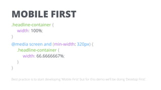
  • 39. MOBILE FIRST .headline-container {
 width: 100%;
 } @media screen and (min-width: 320px) {
 .headline-container {
 width: 66.6666667%;
 }
 } Best practice is to start developing ‘Mobile First’ but for this demo we’ll be doing ‘Desktop First’.
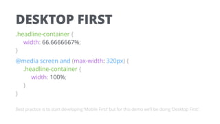
  • 40. DESKTOP FIRST .headline-container {
 width: 66.6666667%;
 } @media screen and (max-width: 320px) {
 .headline-container {
 width: 100%;
 }
 } Best practice is to start developing ‘Mobile First’ but for this demo we’ll be doing ‘Desktop First’.
  • 41. LAYOUT VIA GRIDS Example 12 Column Grid ARTICLE META NAV OVERSIZED HEADLINE Too Tight? Breaks out? Unused Width? Wraps?
  • 42. LAYOUT VIA GRIDS Example 12 Column Grid ARTICLE NAV OVERSIZED HEADLINE
  • 43. EXAMPLES This Is Responsive Bare bones responsive layout demo Uncrate Simple layout with responsive aspects The Onion More complex than Uncrate Invision Labs Highly polished responsive example Rally Interactive Highly polished responsive example
  • 44. BEST PRACTICES Keep page 
 weight light Utilize a mobile first approach to ensure you don’t accidentally punish mobile users Characteristics 
 ≠ Capabilities Don’t infer device capability from device characteristics or type Be consistent 
 across breakpoints Don’t unreasonably remove or display content / functionality based on breakpoints
  • 46. CLIENT SIDE + SERVER SIDE • Responsive Web Design is focused on the client side (browser) • RESS = Responsive with Server Side components • Server detects device type based on UA (User Agent) and sends content specifically for that type of device • Benefits of an m. site without a redirect or separate codebase
  • 47. SAFARI USER AGENT STRINGS
  • 49. RESS AT AMAZON Desktop Content Type A Desktop Content Type A iPhone Content Type B
  • 51. THE LATEST DEVELOPMENTS Google’s Mobile Friendly Tag In mobile search results, Google will tag your site as ‘Mobile Friendly’ and penalize you if it’s not Google’s Accelerated Mobile Pages (AMP) Special stripped down HTML pages that Google’s promoting in search results Increasing support 
 for flex box More flexible in layout control than floated columns
  • 53. WHAT WE TALKED ABOUT Device Proliferation As device sizes fragment, we need a solution that covers this breadth Why Responsive Responsive web design provides more breadth but less functionality compared to native apps Grids & Media Queries We can adapt the layout (and other) characteristics of our site for different devices RESS & Latest Developments New approaches continue to be developed to meet different needs
  • 54. LEARNING MORE CODE Google Developers (Mobile) Codepen Codrops Playground Twitter Bootstrap RESOURCES This Is Responsive A List Apart A Book Apart PEOPLE Brad Frost Luke W. Ethan Marcotte Scott Jehl
  • 55. • RWD is only a small 
 part of what we do • Our Technology
 Solutions practice covers
 custom app dev,
 eCommerce, mobile
 apps, analytics and other • We’re looking for FEDs in
 the UX practice CREDERA MC UX TECH