10 STOPS TOWARDS
A RESPONSIVE WEB
DESIGN MINDSET
Miika Puputti   miikap@


                          www.frantic.com
THE MOBILE WEB IS
         ALREADY HERE

•    In 2011, smartphone
    shipments surpassed
    desktop device
    shipments.

•   The web is changing
    and we need to change
    the way we design and
    develop for it...
LETS GO!
1. PLANT THE SEED


•   Just start thinking that the site you’re creating
    is going to be viewed on different devices
    and, more importantly, in different contexts.

•   Knowing that there are variable screens and
    ways of use will spark new ideas about the
    way your content can shine.
2. PROTOTYPE!


•   Start developing your content with context in
    mind. What do you want to say when the
    screen is huge or small? What will the priorities
    be?

•   Wireframe these stages, where the site is
    different, and prototype with tools like Twitter’s
    Bootstrap or Zurb’s Foundation. They will help
    you take your wireframes to the next level and
    help you understand the way fluid grids work.
3. DO TEAMWORK. SERIOUSLY, DO IT.


•   The lone wolf tactic does not work here, so
    teamwork is needed from the start. Designers
    have to talk with developers about the
    solutions that are on the drawing board.

•   Nobody likes last minute surprises that need
    to work on multiple devices and browsers.
4. CREATE A DESIGN LANGUAGE


•   How to design for a vast number of devices?
    What are they? Should we make different
    visuals for all of them? No.

•   Create a design language that will be
    consistent on all of the devices; it still may
    vary a little from device to device.
5. SIMPLIFY AND GET TO THE POINT


•   When browsing with a mobile device, users
    tend to want content right away, so keep it
    simple and straightforward. Take the load
    times in count and hide stuff that the mobile-
    phone user does not need right away.
6. MOBILE FIRST


•   The mindset of creating content
    for mobile first creates focus and
    opportunity to make the desktop
    version come to life, while the
    core idea of the website is optimal
    for the smallest of screens.
7. TEST AS MUCH AS POSSIBLE


•   Test your solution with the devices at hand
    and test it on the go, just to get a feel for the
    content while your out and about.
8. PICK THE RIGHT TOOLS


•   To help your workflow there’s many tools, for
    example Adobe Shadow, that help you
    preview the code and designs on multiple
    devices at once. These come in handy when
    you don’t have a testing server.


             http://labs.adobe.com/
             technologies/shadow/
9. GOD IS IN THE DETAILS


 •   Be ready to clock some extra
     hours to fine tune the details of
     the content, visuals and code.

 •   Add special treats for retina
     displays, Easter eggs for the
     desktop users, turbo boost the
     analytics and check the error
     pages and Humans.txt file.
10. FUTURE FRIENDLY


•   What next? Your site should now be
    ready for a myriad of situations and
    displays, and maybe in the future
    your food blog will be on the retina
    screens of modern fridges or an
    automotive fuel saver application
    page will be found on electric         http://futurefriend.ly

    vehicle dashboards.

•   Let’s start making the web future
    friendly.
THAT’S IT FOLKS!
AUTHOR:
MIIKA PUPUTTI
miika.puputti@frantic.com
skype: miikapuputti
Working as a designer at
Frantic in Helsinki,
Finland.

Special thanks to:

http://ethanmarcotte.com/, http://bradfrostweb.com/
and http://www.lukew.com/


         Follow me at: @miikap

More Related Content

PDF
Creating mLearning With Your Existing Toolkit
PPTX
Responsive Web Design | Bside Studios
KEY
Building Mobile Apps with HTML, CSS, and JavaScript
PDF
Mobile UX - Dmytro Svarytsevych
KEY
Mobile webapp
PPTX
Mornington Peninsula responsive design
PPT
PDF
Tablet Design Tips
Creating mLearning With Your Existing Toolkit
Responsive Web Design | Bside Studios
Building Mobile Apps with HTML, CSS, and JavaScript
Mobile UX - Dmytro Svarytsevych
Mobile webapp
Mornington Peninsula responsive design
Tablet Design Tips

What's hot (20)

PDF
Fred Spencer: Designing a Great UI
PDF
Online web based applications.ppt
PPT
Evernote for Your Real Estate Business
PPTX
Your iPad More than Email & Web Surfing
PPTX
Going native - Taking desktop applications to mobile devices
PPTX
M jackson edit5395_asign3
PPTX
Designing and delivering elearning in a multi-device world
PDF
Native is not the only way to heaven
PDF
iOS 5 Tech Talk World Tour 2011 draft001
PPT
#ThroughGlass : An Introduction to Google Glass
KEY
Why Do Mobile Projects Fail?
PDF
Responsive Vs Mobile Development in Magento - Kimberly Thomas - @MagentoGirl
PPT
Mob tech 2
KEY
Mobile Internet
PDF
Designing mobile apps
PDF
Building Literacy with Technology (7-12)
PDF
responsive awareness
PPTX
Mobile first web principles
PPTX
PPTX
Building mobile apps with PhoneGap and Titanium appcelerator
Fred Spencer: Designing a Great UI
Online web based applications.ppt
Evernote for Your Real Estate Business
Your iPad More than Email & Web Surfing
Going native - Taking desktop applications to mobile devices
M jackson edit5395_asign3
Designing and delivering elearning in a multi-device world
Native is not the only way to heaven
iOS 5 Tech Talk World Tour 2011 draft001
#ThroughGlass : An Introduction to Google Glass
Why Do Mobile Projects Fail?
Responsive Vs Mobile Development in Magento - Kimberly Thomas - @MagentoGirl
Mob tech 2
Mobile Internet
Designing mobile apps
Building Literacy with Technology (7-12)
responsive awareness
Mobile first web principles
Building mobile apps with PhoneGap and Titanium appcelerator
Ad

Similar to 10 stops towards a responsive web design mindset (20)

PPTX
Getting Down & Dirty with Responsive Web Design
PDF
Everything You Know is Not Quite Right Anymore: Rethinking Best Practices to ...
PDF
Everything You Know is Not Quite Right Anymore: Rethinking Best Web Practices...
PDF
Web designtrends 5-29-2013
PDF
Device Agnostic Design - UCD2014, London 25 Oct 2014
PDF
UCD14 Talk - Anna Dahlstrom - Device Agnostic Design: How to get your content...
PPTX
Responsive Design Workflow
PDF
Responsive Webdesign - UXtour Microsoft
PDF
Responsive webdesign
PDF
Responsive & Adaptive Design: Delivering Websites That Delight Your Users
PPTX
Responsive Web Design: One Size No Longer Fits All
PPTX
Responsive Web Design Analysis
PPTX
Responsive Design for an Omnichannel World
PDF
10 Things Web Designers Need to Do Before Going Mobile
PDF
Fundamentals of Designing for Multiple Devices - GA, New York, 07 Oct 2013
PDF
UX design for every screen
PDF
Uxpin web ui design patterns 2014
ODT
10 golden rules for website design
PPT
Responsible, Responsive Design Webinar - November 12, 2014
PDF
Tdf responsive design101_v1
Getting Down & Dirty with Responsive Web Design
Everything You Know is Not Quite Right Anymore: Rethinking Best Practices to ...
Everything You Know is Not Quite Right Anymore: Rethinking Best Web Practices...
Web designtrends 5-29-2013
Device Agnostic Design - UCD2014, London 25 Oct 2014
UCD14 Talk - Anna Dahlstrom - Device Agnostic Design: How to get your content...
Responsive Design Workflow
Responsive Webdesign - UXtour Microsoft
Responsive webdesign
Responsive & Adaptive Design: Delivering Websites That Delight Your Users
Responsive Web Design: One Size No Longer Fits All
Responsive Web Design Analysis
Responsive Design for an Omnichannel World
10 Things Web Designers Need to Do Before Going Mobile
Fundamentals of Designing for Multiple Devices - GA, New York, 07 Oct 2013
UX design for every screen
Uxpin web ui design patterns 2014
10 golden rules for website design
Responsible, Responsive Design Webinar - November 12, 2014
Tdf responsive design101_v1
Ad

More from Miika Puputti (7)

PPTX
Breaking The Digital Barriers
PPTX
What's Behind The Corner For User Experience? // UX-congress 2015
PDF
Rise Of The Aware
PDF
Internet of things - Frantic
PDF
Responsive web design
PDF
Frantic After Work: Mobile Web and Business
PDF
Ixd12 Frantic recap
Breaking The Digital Barriers
What's Behind The Corner For User Experience? // UX-congress 2015
Rise Of The Aware
Internet of things - Frantic
Responsive web design
Frantic After Work: Mobile Web and Business
Ixd12 Frantic recap

Recently uploaded (20)

PDF
Zenith AI: Advanced Artificial Intelligence
PDF
A contest of sentiment analysis: k-nearest neighbor versus neural network
PPT
Module 1.ppt Iot fundamentals and Architecture
PDF
How ambidextrous entrepreneurial leaders react to the artificial intelligence...
PPT
Geologic Time for studying geology for geologist
PPT
Galois Field Theory of Risk: A Perspective, Protocol, and Mathematical Backgr...
PDF
Produktkatalog für HOBO Datenlogger, Wetterstationen, Sensoren, Software und ...
PDF
NewMind AI Weekly Chronicles – August ’25 Week III
PPTX
Final SEM Unit 1 for mit wpu at pune .pptx
PDF
A review of recent deep learning applications in wood surface defect identifi...
PDF
Hybrid horned lizard optimization algorithm-aquila optimizer for DC motor
PDF
CloudStack 4.21: First Look Webinar slides
PPTX
2018-HIPAA-Renewal-Training for executives
PPTX
Modernising the Digital Integration Hub
PPTX
AI IN MARKETING- PRESENTED BY ANWAR KABIR 1st June 2025.pptx
PPTX
Build Your First AI Agent with UiPath.pptx
PDF
Getting started with AI Agents and Multi-Agent Systems
PPTX
Custom Battery Pack Design Considerations for Performance and Safety
PPTX
Benefits of Physical activity for teenagers.pptx
PDF
Developing a website for English-speaking practice to English as a foreign la...
Zenith AI: Advanced Artificial Intelligence
A contest of sentiment analysis: k-nearest neighbor versus neural network
Module 1.ppt Iot fundamentals and Architecture
How ambidextrous entrepreneurial leaders react to the artificial intelligence...
Geologic Time for studying geology for geologist
Galois Field Theory of Risk: A Perspective, Protocol, and Mathematical Backgr...
Produktkatalog für HOBO Datenlogger, Wetterstationen, Sensoren, Software und ...
NewMind AI Weekly Chronicles – August ’25 Week III
Final SEM Unit 1 for mit wpu at pune .pptx
A review of recent deep learning applications in wood surface defect identifi...
Hybrid horned lizard optimization algorithm-aquila optimizer for DC motor
CloudStack 4.21: First Look Webinar slides
2018-HIPAA-Renewal-Training for executives
Modernising the Digital Integration Hub
AI IN MARKETING- PRESENTED BY ANWAR KABIR 1st June 2025.pptx
Build Your First AI Agent with UiPath.pptx
Getting started with AI Agents and Multi-Agent Systems
Custom Battery Pack Design Considerations for Performance and Safety
Benefits of Physical activity for teenagers.pptx
Developing a website for English-speaking practice to English as a foreign la...

10 stops towards a responsive web design mindset

  • 1. 10 STOPS TOWARDS A RESPONSIVE WEB DESIGN MINDSET Miika Puputti miikap@ www.frantic.com
  • 2. THE MOBILE WEB IS ALREADY HERE • In 2011, smartphone shipments surpassed desktop device shipments. • The web is changing and we need to change the way we design and develop for it...
  • 4. 1. PLANT THE SEED • Just start thinking that the site you’re creating is going to be viewed on different devices and, more importantly, in different contexts. • Knowing that there are variable screens and ways of use will spark new ideas about the way your content can shine.
  • 5. 2. PROTOTYPE! • Start developing your content with context in mind. What do you want to say when the screen is huge or small? What will the priorities be? • Wireframe these stages, where the site is different, and prototype with tools like Twitter’s Bootstrap or Zurb’s Foundation. They will help you take your wireframes to the next level and help you understand the way fluid grids work.
  • 6. 3. DO TEAMWORK. SERIOUSLY, DO IT. • The lone wolf tactic does not work here, so teamwork is needed from the start. Designers have to talk with developers about the solutions that are on the drawing board. • Nobody likes last minute surprises that need to work on multiple devices and browsers.
  • 7. 4. CREATE A DESIGN LANGUAGE • How to design for a vast number of devices? What are they? Should we make different visuals for all of them? No. • Create a design language that will be consistent on all of the devices; it still may vary a little from device to device.
  • 8. 5. SIMPLIFY AND GET TO THE POINT • When browsing with a mobile device, users tend to want content right away, so keep it simple and straightforward. Take the load times in count and hide stuff that the mobile- phone user does not need right away.
  • 9. 6. MOBILE FIRST • The mindset of creating content for mobile first creates focus and opportunity to make the desktop version come to life, while the core idea of the website is optimal for the smallest of screens.
  • 10. 7. TEST AS MUCH AS POSSIBLE • Test your solution with the devices at hand and test it on the go, just to get a feel for the content while your out and about.
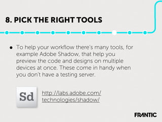
  • 11. 8. PICK THE RIGHT TOOLS • To help your workflow there’s many tools, for example Adobe Shadow, that help you preview the code and designs on multiple devices at once. These come in handy when you don’t have a testing server. http://labs.adobe.com/ technologies/shadow/
  • 12. 9. GOD IS IN THE DETAILS • Be ready to clock some extra hours to fine tune the details of the content, visuals and code. • Add special treats for retina displays, Easter eggs for the desktop users, turbo boost the analytics and check the error pages and Humans.txt file.
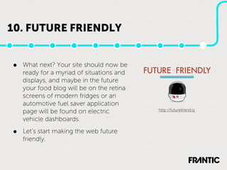
  • 13. 10. FUTURE FRIENDLY • What next? Your site should now be ready for a myriad of situations and displays, and maybe in the future your food blog will be on the retina screens of modern fridges or an automotive fuel saver application page will be found on electric http://futurefriend.ly vehicle dashboards. • Let’s start making the web future friendly.
  • 15. AUTHOR: MIIKA PUPUTTI [email protected] skype: miikapuputti Working as a designer at Frantic in Helsinki, Finland. Special thanks to: http://ethanmarcotte.com/, http://bradfrostweb.com/ and http://www.lukew.com/ Follow me at: @miikap