Rise of the responsive single page application
- 1. Rise of the Responsive Single Page Application “2013 Is the Year of Responsive Web Design” - Mashable Photo and Quote http://mashable.com/2012/12/11/responsive-web-design/
- 2. Design
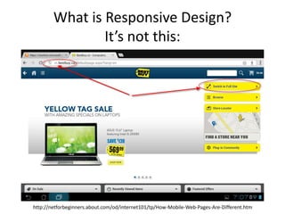
- 3. What is Responsive Design? It’s not this: http://netforbeginners.about.com/od/internet101/tp/How-Mobile-Web-Pages-Are-Different.htm
- 4. Trello: The Best Practice • Use Media Queries • Everything is accessible on every platform • Even Navigation/Header is Responsive http://blog.fogcreek.com/building-trello-com-for-multiple-devices/
- 5. Why Responsive? • Better Experience – Unified across experiences (Don’t use iOS or Android’s design patterns, use your own) – Mobile: in browser or app – Consistent URL structure – Single page – Pages are so 2000s – Mobile Users Don’t Need to Do Everything that Web Users Need to Do – FALSE
- 6. Why Responsive? • Better SEO – Decrease mobile bounce rate – Backlinks go to one site • Better Deployment & Maintenance – Deploy once to multiple platforms – No (or less) versioning on API – Circumvent app stores on updates (Sometimes) – All content is in one place
- 7. Developing Responsively The Good The Ugly • One small, talented • More design work team can deliver a lot (target every screen • No one gets left out size) – Windows Phone • Manage loading times – Blackberry • It’s hard 1.5x the work = 3-4x the reward
- 8. Technology
- 13. Javascript can get messy…
- 14. Google to the rescue! a framework for single page applications
- 16. The Angular philosophy • Decouple the client side of an app from the server side. This allows development work to progress in parallel, and allows for reuse of both sides. • Decouple DOM manipulation from app logic. • It is very helpful if the framework guides developers through the entire journey of building an app: from designing the UI, through writing the business logic, to testing. http://www.slideshare.net/AgentK/angularjs-for-designers-and-developers
- 17. Our Dev Workflow Speed up and improve development workflow by • Enforcing code practices • Testing • Automating everything • Doing these things as early as possible
- 19. Our grunt workflow (346 lines) grunt server Watch when files change then – Lint – Compile less to css – Compile html templates – Include development mocks – Reload the page grunt server:test grunt build Above + Above + Minify +
- 20. • Point any browsers to the url
- 21. • Trigger tests in parallel
Editor's Notes
- #2: http://mashable.com/2012/12/11/responsive-web-design/
- #5: Only 3 guys on the trello team
- #6: No userfrustration on redirects/download app screens. No learning 2-3 interfaces
- #7: Mobile optimized sites rank higher in mobile search – duh (responsive ranks just as high)
- #8: A little bit of hard work up front pays off big time in the long run
- #10: Build one site everywhere. The UI framework we use, jquery mobile, is tested on all major mobile devices and computers. The latest version 1.3 is now even responsive
- #11: Build a application and host in on the web. Then just insert in on a mobile device (that way you can update without going through apple approval)
- #12: If you need any native functionality use one common javascriptapi: Phonegap (an adobe company)
- #13: That way you can use things like: camera, gps, notifications, contacts
- #14: The problem is javascript is messy, so how can you build a large application?
- #15: Google had the same problem so they built angular
- #16: HBO starting to rebuild their entire site (also responsive) see: https://docs.google.com/presentation/d/1XlUpoYN2eO4VSOuEB8kq-p5t9zzKuEr334PmekycsT8/present#slide=id.g1d171640_5_0Of course google is also using it: Youtube application on PS3See more on built with angular: http://builtwith.angularjs.org/
- #17: Good code is decoupled
- #18: We also have a pretty cool development workflow
- #20: Linting is an important practice employed at companies like Facebook and Google where you enforce consistent code style and best practices.Testacular is a test framework by google that runs your code directly on devices. So just by pulling up the right url on any device you want to test it will run those tests
- #21: Instead of needing a driver like selenium Testacular injects tests into the browser, so by pointing any device to the url, you can run tests in parallel


