[rwdsummit] Adaptive Images in Responsive Web Design
- 1. RWD SUMMIT 2014 ADAPTIVE IMAGESIN RESPONSIVE WEB DESIGN CHRISTOPHER SCHMITT @teleject
- 3. @teleject
- 12. y x
- 19. WHY DON’T WE ASK THE BROWSER? (cc) flic.kr/p/vUBHv
- 20. alert("User-agent header sent: " + navigator.userAgent);
- 21. alert("User-agent header sent: " + navigator.userAgent);
- 23. Mozilla/1.0 (Win3.1) Mozilla/1.22 (compatible; MSIE 2.0; Windows 95) (cc) flic.kr/p/vUBHv http://www.useragentstring.com/
- 24. Mozilla/5.0 (Macintosh; Intel Mac OS X 10_7_3) AppleWebKit/ 534.55.3 (KHTML, like Gecko) Version/5.1.5 Safari/534.55.3 (cc) flic.kr/p/vUBHv http://www.useragentstring.com/
- 25. Mozilla/5.0 (Macintosh; Intel Mac OS X 10_7_3) AppleWebKit/ 534.55.3 (KHTML, like Gecko) Version/5.1.5 Safari/534.55.3 http://webaim.org/blog/user-agent-string-history/ (cc) flic.kr/p/vUBHv
- 27. FEATURE TESTINGvs. BROWSER SNIFFING 1 2 3
- 28. FEATURE TESTINGvs. BROWSER SNIFFING 1 Browser width 2 3
- 29. A scripting approach var myWidth = 0, myHeight = 0; if( typeof( window.innerWidth ) == 'number' ) { //Non-IE myWidth = window.innerWidth; myHeight = window.innerHeight; } else if( document.documentElement && ( document.documentElement.clientWidth || document.documentElement.clientHeight ) ) { //IE 6+ in 'standards compliant mode' myWidth = document.documentElement.clientWidth; myHeight = document.documentElement.clientHeight; } http://www.howtocreate.co.uk/tutorials/javascript/browserwindow
- 30. The jQuery approach // returns width of browser viewport $(window).width(); // returns height of browser viewport $(window).height(); // returns width of HTML document $(document).width(); // returns height of HTML document $(document).height(); http://api.jquery.com/width/ & http://api.jquery.com/height/
- 31. CSS media queries // default, mobile-1st CSS rules devices go here @media screen and (min-width: 480px) { ... } @media screen and (min-width: 600px) { ... } @media screen and (min-width: 768px) { ... } @media screen and (min-width: 910px) { ... }
- 33. BROWSER WIDTH GIVES US FRAME, NOT THE CANVAS
- 34. FEATURE TESTINGvs. BROWSER SNIFFING 1 Browser width 2 Screen resolution 3
- 35. 72PPIHAS SERVED US WELL (cc) flic.kr/p/6tjjRP
- 36. 72 points-per-inch = 72 pixels-per-inch
- 37. 96PPI IF A WINDOWS USER
- 38. 72 points-per-inch x [1+(1/3)] = 96 PPI
- 39. 78μm goo.gl/zpkFy 78μm “RETINA” DISPLAYS300ppi at 12 inches from the eyes
- 41. [In 2013, Intel sees their product line] offer a higher resolution experience than a top-of-the-line 1080p HDTV.” “ http://liliputing.com/2012/04/intel-retina-laptop- desktop-displays-coming-in-2013.html
- 42. 72 PPI
- 43. 240
- 44. 240 PPI
- 45. 240 PPI
- 46. 72 PPI
- 48. RETINA DISPLAYS = LARGER IMAGES, LARGER FILE SIZES
- 49. FEATURE TESTINGvs. BROWSER SNIFFING 1 Browser width 2 Screen resolution 3 Bandwidth
- 50. (cc) flic.kr/p/4DziUN SPEED TESTS HINDER SPEED, USER EXPERIENCE
- 51. Testing for speed of an internet connection is like stepping in front of a car to see how fast it is.” “ (cc) flic.kr/p/4DziUN
- 52. Testing for speed of an internet connection is like stepping in front of a car to see how fast it is.” “ But, Christopher, you only have to test it once.”“ (cc) flic.kr/p/4DziUN
- 55. Native speed test // @Modernizr's network-connection.js connection = navigator.connection || { type: 0 }, // polyfill isSlowConnection = connection.type == 3 || connection.type == 4 | /^[23]g$/.test(connection.type); http://davidbcalhoun.com/2010/using-navigator-connection-android
- 56. FEATURE TESTINGvs. BROWSER SNIFFING 1 Browser width 2 Screen resolution 3 Bandwidth
- 57. IMGGIMME THAT OLD SCHOOL 1 2 3
- 58. 1 .htaccess 2 3 IMGGIMME THAT OLD SCHOOL
- 59. Filament .htaccess # Responsive Images # Mobile-First images that scale responsively and responsibly # Copyright 2010, Scott Jehl, Filament Group, Inc # Dual licensed under the MIT or GPL Version 2 licenses. # //Start Responsive Images RewriteEngine On # direct image requests to temp RewriteCond %{QUERY_STRING} full=(.*)&? RewriteRule (.*)rwd-router/.*.(jpe?g|png|gif|webp) $1%1 [L] # ignore trap for non-image requests, rewrite URL without trap segment RewriteRule (.*)rwd-router/(.*)$ $1$2 # //End Responsive Images https://github.com/filamentgroup/Responsive-Images
- 60. Filament .htaccess <script src="responsiveimgs.js"></script> <img src="sample-content/running-sml.jpg? full=sample-content/running-lrg.jpg" /> 8+4+
- 61. ...the server has no way to know what resolution the client’s device is, so it can’t send the appropriately sized embeded images.” “ http://mattwilcox.net/archive/entry/id/1053/
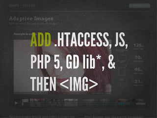
- 63. ADD .HTACCESS, JS, PHP 5, GD lib*, & THEN <IMG>
- 64. 1 .htaccess 2 <picture> and/or srcset 3 GIMME THAT OLD SCHOOL IMG
- 65. media queries in HTML <video controls> <source type="video/mp4" src="video/windowsill_small.mp4" media="all and (max-width: 480px), all and (max-device-width: 480px)"> <source type="video/webm" src="video/windowsill_small.webm" media="all and (max-width: 480px), all and (max-device-width: 480px)"> <source type="video/mp4" src="video/windowsill.mp4"> <source type="video/webm" src="video/windowsill.webm"> <!-- proper fallback content goes here --> </video> http://www.w3.org/community/respimg/2012/03/15/polyfilling- picture-without-the-overhead/
- 66. <span data-picture data-alt="A giant stone face at The Bayon temple in Angkor Thom, Cambodia"> <span data-src="small.jpg"></span> <span data-src="medium.jpg" data-media="(min-width: 400px)"></span> <span data-src="large.jpg" data-media="(min-width: 800px)"></span> <span data-src="extralarge.jpg" data-media="(min-width: 1000px)"></span> <noscript> <img src="small.jpg" alt="A giant stone face at The Bayon temple in Angkor Thom, Cambodia"> </noscript> </span> https://github.com/scottjehl/picturefill
- 67. ADD IF-ELSE HTML, JS, BORROW <VIDEO>, & THEN <IMG>
- 68. @srcset standard? <h1><img alt="The Breakfast Combo" src="banner.jpeg" srcset="banner-HD.jpeg 2x, banner-phone.jpeg 100w, banner-phone-HD.jpeg 100w 2x"> </h1> http://www.whatwg.org/specs/web-apps/current-work/multipage/ embedded-content-1.html#attr-img-srcset
- 71. <picture width="500" height="500"> <source media="(min-width: 45em)" src="large.jpg"> <source media="(min-width: 18em)" src="med.jpg"> <source src="small.jpg"> <img src="small.jpg" alt=""> <p>Accessible text</p> </picture> http://www.whatwg.org/specs/web-apps/current-work/multipage/ embedded-content-1.html#attr-img-srcset
- 72. <picture width="500" height="500"> <source media="(min-width: 45em)" srcset="large-1.jpg 1x, large-2.jpg 2x"> <source media="(min-width: 18em)" srcset="med-1.jpg 1x, med-2.jpg 2x"> <source srcset="small-1.jpg 1x, small-2.jpg 2x"> <img src="small-1.jpg" alt=""> <p>Accessible text</p> </picture> http://www.whatwg.org/specs/web-apps/current-work/multipage/ embedded-content-1.html#attr-img-srcset
- 73. 1 .htaccess 2 <picture> and/or srcset 3 HiSRC GIMME THAT OLD SCHOOL IMG
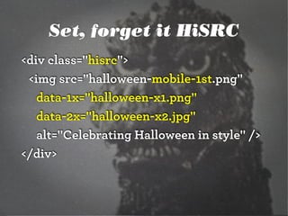
- 74. Set, forget it HiSRC <script src="https://ajax.googleapis.com/ajax/ libs/jquery/1.7.2/jquery.min.js"></script> <script src="hisrc.js"></script> <script> $(document).ready(function(){ $(".hisrc img").hisrc(); }); </script> https://github.com/teleject/hisrc
- 75. Set, forget it HiSRC <div class="hisrc"> <img src="halloween-mobile-1st.png" data-1x="halloween-x1.png" data-2x="halloween-x2.jpg" alt="Celebrating Halloween in style" /> </div>
- 76. Set, forget it HiSRC <div class="hisrc"> <img src="halloween-mobile-1st.png" data-1x="halloween-x1.png" data-2x="halloween-x2.jpg" alt="Celebrating Halloween in style" /> </div>
- 77. SERIES OF CHECKS TO FIND OUT RESPONSIVE PATH FOR IMAGES...
- 78. DO NATIVE SPEED TEST FOR MOBILE DEVICES FIRST... http://davidbcalhoun.com/2010/using-navigator-connection-android
- 79. $.hisrc.devicePixelRatio = 1; if(window.devicePixelRatio !== undefined) { $.hisrc.devicePixelRatio = window.devicePixelRatio }; Check pixel density... https://gist.github.com/2428356
- 81. LESS THAN 4G MEANS MOBILE IMAGES LEFT IN PLACE
- 82. BETWEEN 4G & 300 Kbps MEANS REGULAR DESKTOP IMAGES SWAPPED IN
- 83. FAST SPEED & HIGH DENSITY, RETINA IMAGES SWAPPED IN https://github.com/crdeutsch/hisrc/tree/v2
- 86. http://css-tricks.com/which- responsive-images-solution- should-you-use/ ALL SOLUTIONS HAVE 2x HTTP REQUESTS + JAVASCRIPT
- 87. WORKAROUNDSTRICKS in CONTEXT 1 2 3 & (cc) flic.kr/p/64fGf6
- 88. WORKAROUNDSTRICKS 1 background-size: 100% 2 3 & (cc) flic.kr/p/64fGf6
- 90. background-size: 100% <a href="example.com/link">Download on Github</a> .download a { padding: .095em .8em; background: url(../img/arrow.png) no-repeat; background-size: 100%; margin-left: .4em; -webkit-transition: margin 0.15s ease-out; -moz-transition: margin 0.15s ease-out; text-decoration: none; } 9+5+9+ 11.6+17+
- 91. WORKAROUNDSTRICKS in CONTEXT 1 background-size: auto 2 SVG 3 & (cc) flic.kr/p/64fGf6
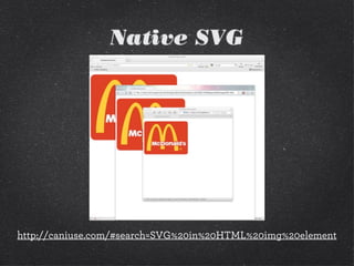
- 92. SVG
- 96. PNG 16kb SVG 7kb 9+5+9+ 11.6+17+
- 97. http://petercollingridge.appspot.com/svg-optimiser
- 100. Modernizr check if(!Modernizr.svg){ var images = document.getElementsByTagName("img"); for(var i = 0; i < images.length; i++){ var src = images[i].src.split("."); images[i].src = src[0] + ".png"; } } http://stackoverflow.com/questions/12846852/ svg-png-extension-switch
- 102. WORKAROUNDSTRICKS in CONTEXT 1 background-size: auto 2 SVG 3 font-based solutions & (cc) flic.kr/p/64fGf6
- 103. ...if you use <meta charset="utf-8"> (you should be for HTML5), you’re adding common Unicode characters like and ✆, and you don’t need a specific font’s version... just copy and paste them into your HTML.” “
- 108. Font-based RWD http://ilovetypography.com/2012/04/11/designing-type-systems/ avg file size 40kb/per font
- 112. Font-based icons <style> [data-icon]:before { font-family: 'icon-font'; content: attr(data-icon); } </style> <a href="http://example.com/cloud/save/"> <span data-icon="C" aria-hidden="true"></span> Save to Cloud </a>
- 113. WORKAROUNDSTRICKS in CONTEXT 1 background-size: 100% 2 SVG 3 font-based solutions & (cc) flic.kr/p/64fGf6 4 compressed JPEGs
- 118. iCloud iOS 5 OSX Lion iPad 2 iPhone OS The world’s most advanced desktop operating system advances even further. With over 250 new features including Multi-Touch gestures, Mission Control, full-screen apps, and Launchpad, OS X Lion takes the Mac further than ever. Learn More X Lion
- 119. iCloud iOS 5 OSX Lion iPad 2 iPhone OS The world’s most advanced desktop operating system advances even further. With over 250 new features including Multi-Touch gestures, Mission Control, full-screen apps, and Launchpad, OS X Lion takes the Mac further than ever. Learn More X Lion ! " ← ↑
- 120. iCloud iOS 5 OSX Lion iPad 2 iPhone OS The world’s most advanced desktop operating system advances even further. With over 250 new features including Multi-Touch gestures, Mission Control, full-screen apps, and Launchpad, OS X Lion takes the Mac further than ever. Learn More X Lion ! ↙ " ← ← ↗ ↑ ↖ ↑ ↖
- 121. (cc) flic.kr/p/64fGf6
- 123. 446kb < 8,755.2kb (cc) flic.kr/p/64fGf6 0% vs 100%
- 124. <picture> Patch <picture alt="A giant stone face at The Bayon temple in Angkor Thom, Cambodia"> <!-- <source src="small.jpg"> --> <source src="small.jpg"> <!-- <source src="medium.jpg" media="(min-width: 400px)"> --> <source src="medium.jpg" media="(min-width: 400px)"> <!-- <source src="large.jpg" media="(min-width: 800px)"> --> <source src="large.jpg" media="(min-width: 800px)"> <!-- Fallback content for non-JS browsers. Same src as the initial source element. --> <noscript><img src="small.jpg" alt="A giant stone face at The Bayon temple in Angkor Thom, Cambodia"></noscript> </picture> http://www.w3.org/community/respimg/2012/03/15/polyfilling- picture-without-the-overhead/
- 125. Size Type Dimensions Display Px Density File Size Extreme 2276x1400 1x & 2x 446kb Extra Large 1024x1536 2x 1,745kb Extra Large 512x768 1x 503kb Large 640x960 2x 746kb Large 320x480 1x 223kb Medium 500x750 2x 485kb Medium 250x375 1x 145kb
- 126. Size Type Dimensions Display Px Density File Size Extreme 2276x1400 1x & 2x 446kb Extra Large 1024x1536 2x 1,745kb Extra Large 512x768 1x 503kb Large 640x960 2x 746kb Large 320x480 1x 223kb Medium 500x750 2x 485kb Medium 250x375 1x 145kb
- 127. <img src="rock-climber.jpg" alt="" /> One Image, One IMG
- 131. (cc) flic.kr/p/64fGf6 COMBO MOVESCLOWN CAR TECHNIQUE + HIGHLY COMPRESSED JPEGS
- 132. <svg xmlns="http://www.w3.org/2000/svg" viewBox="0 0 300 329" preserveAspectRatio="xMidYMid meet"> <title>Clown Car Technique</title> <style> svg { background-size: 100% 100%; background-repeat: no-repeat; } @media screen and (max-width: 400px) { svg {background-image: url(images/small.png");} } @media screen and (min-width: 401px) and (max-width: 700px) { svg {background-image: url(images/medium.png);} } @media screen and (min-width: 701px) and (max-width: 1000px) { svg {background-image: url(images/big.png);} } @media screen and (min-width: 1001px) { https://github.com/estelle/clowncar
- 133. <svg xmlns="http://www.w3.org/2000/svg" viewBox="0 0 300 329" preserveAspectRatio="xMidYMid meet"> <title>Clown Car Technique</title> <style> svg { background-size: 100% 100%; background-repeat: no-repeat; } @media screen and (max-width: 400px) { svg {background-image: url(images/small.png");} } @media screen and (min-width: 401px) and (max-width: 700px) { svg {background-image: url(images/medium.png);} } @media screen and (min-width: 701px) and (max-width: 1000px) { svg {background-image: url(images/big.png);} } @media screen and (min-width: 1001px) { https://github.com/estelle/clowncar
- 136. Size Type Dimensions Display Px Density File Size Extreme 2276x1400 1x & 2x 446kb Extra Large 1024x1536 2x 1,745kb Extra Large 512x768 1x 503kb Large 640x960 2x 746kb Large 320x480 1x 223kb Medium 500x750 2x 485kb Medium 250x375 1x 145kb
- 137. @media screen and (min-width: 401px), screen and (max-width: 800px) and (-webkit-min-device-pixel- ratio: 1.75) { svg { background-image: url("extremely-highly-compressed.jpg"); outline: red solid 5px; } } http://codepen.io/teleject/pen/KlzBe Combo Move: Compressed JPEG
- 141. COMBO MOVEDON’T BLAME THE PLAYER 1 2 3 No additional HTTP request1 # of images = 2 No JavaScript http://codepen.io/teleject/pen/KlzBe
- 144. IMGGIMME THAT NEW SCHOOL 1 2 3 #rwdimg
- 145. IMGGIMME THAT NEW SCHOOL 1 2 3 simple design for users #rwdimg 1
- 146. IMGGIMME THAT NEW SCHOOL 1 2 3 simple design for users browser, server handshake #rwdimg 2
- 147. IMGGIMME THAT NEW SCHOOL 1 2 3 simple design for users browser, server handshake same, several formats #rwdimg 3
- 148. #rwdimg
- 150. #rwdimg
- 151. #rwdimg
- 152. #rwdimg
- 153. #rwdimg <link rel="shortcut icon" href="/assets/favicon.ico" /> Favicon
- 154. #rwdimg <link rel="apple-touch-icon-precomposed" sizes="144x144" href="apple-touch-icon-144x144-precomposed.png" /> <link rel="apple-touch-icon-precomposed" sizes="114x114" href="apple-touch-icon-114x114-precomposed.png" /> <link rel="apple-touch-icon-precomposed" sizes="72x72" href="apple-touch-icon-72x72-precomposed.png" /> <link rel="apple-touch-icon-precomposed" href="apple-touch-icon-precomposed.png" /> Mobile iOS Bookmarks
- 155. #rwdimg
- 156. THANK YOU!CHRISTOPHER SCHMITT @teleject The Non Breaking Space Podcast - http://nonbreakingspace.tv/


![[rwdsummit] Adaptive Images in Responsive Web Design](https://image.slidesharecdn.com/adaptive-imagesv18-1-140325201134-phpapp02/85/rwdsummit-Adaptive-Images-in-Responsive-Web-Design-7-320.jpg)
![[rwdsummit] Adaptive Images in Responsive Web Design](https://image.slidesharecdn.com/adaptive-imagesv18-1-140325201134-phpapp02/85/rwdsummit-Adaptive-Images-in-Responsive-Web-Design-8-320.jpg)
![[rwdsummit] Adaptive Images in Responsive Web Design](https://image.slidesharecdn.com/adaptive-imagesv18-1-140325201134-phpapp02/85/rwdsummit-Adaptive-Images-in-Responsive-Web-Design-9-320.jpg)
![[rwdsummit] Adaptive Images in Responsive Web Design](https://image.slidesharecdn.com/adaptive-imagesv18-1-140325201134-phpapp02/85/rwdsummit-Adaptive-Images-in-Responsive-Web-Design-10-320.jpg)
![[rwdsummit] Adaptive Images in Responsive Web Design](https://image.slidesharecdn.com/adaptive-imagesv18-1-140325201134-phpapp02/85/rwdsummit-Adaptive-Images-in-Responsive-Web-Design-11-320.jpg)

![[rwdsummit] Adaptive Images in Responsive Web Design](https://image.slidesharecdn.com/adaptive-imagesv18-1-140325201134-phpapp02/85/rwdsummit-Adaptive-Images-in-Responsive-Web-Design-13-320.jpg)
![[rwdsummit] Adaptive Images in Responsive Web Design](https://image.slidesharecdn.com/adaptive-imagesv18-1-140325201134-phpapp02/85/rwdsummit-Adaptive-Images-in-Responsive-Web-Design-14-320.jpg)
![[rwdsummit] Adaptive Images in Responsive Web Design](https://image.slidesharecdn.com/adaptive-imagesv18-1-140325201134-phpapp02/85/rwdsummit-Adaptive-Images-in-Responsive-Web-Design-15-320.jpg)

![[rwdsummit] Adaptive Images in Responsive Web Design](https://image.slidesharecdn.com/adaptive-imagesv18-1-140325201134-phpapp02/85/rwdsummit-Adaptive-Images-in-Responsive-Web-Design-17-320.jpg)
![[rwdsummit] Adaptive Images in Responsive Web Design](https://image.slidesharecdn.com/adaptive-imagesv18-1-140325201134-phpapp02/85/rwdsummit-Adaptive-Images-in-Responsive-Web-Design-18-320.jpg)


![72 points-per-inch
x [1+(1/3)]
= 96 PPI](https://image.slidesharecdn.com/adaptive-imagesv18-1-140325201134-phpapp02/85/rwdsummit-Adaptive-Images-in-Responsive-Web-Design-38-320.jpg)

![[rwdsummit] Adaptive Images in Responsive Web Design](https://image.slidesharecdn.com/adaptive-imagesv18-1-140325201134-phpapp02/85/rwdsummit-Adaptive-Images-in-Responsive-Web-Design-40-320.jpg)
![[In 2013, Intel sees their
product line] offer a higher
resolution experience than a
top-of-the-line 1080p HDTV.”
“
http://liliputing.com/2012/04/intel-retina-laptop-
desktop-displays-coming-in-2013.html](https://image.slidesharecdn.com/adaptive-imagesv18-1-140325201134-phpapp02/85/rwdsummit-Adaptive-Images-in-Responsive-Web-Design-41-320.jpg)


![[rwdsummit] Adaptive Images in Responsive Web Design](https://image.slidesharecdn.com/adaptive-imagesv18-1-140325201134-phpapp02/85/rwdsummit-Adaptive-Images-in-Responsive-Web-Design-47-320.jpg)


![Native speed test
// @Modernizr's network-connection.js
connection = navigator.connection || {
type: 0 }, // polyfill
isSlowConnection = connection.type == 3
|| connection.type == 4
| /^[23]g$/.test(connection.type);
http://davidbcalhoun.com/2010/using-navigator-connection-android](https://image.slidesharecdn.com/adaptive-imagesv18-1-140325201134-phpapp02/85/rwdsummit-Adaptive-Images-in-Responsive-Web-Design-55-320.jpg)


![Filament .htaccess
# Responsive Images
# Mobile-First images that scale responsively and responsibly
# Copyright 2010, Scott Jehl, Filament Group, Inc
# Dual licensed under the MIT or GPL Version 2 licenses.
# //Start Responsive Images
RewriteEngine On
# direct image requests to temp
RewriteCond %{QUERY_STRING} full=(.*)&?
RewriteRule (.*)rwd-router/.*.(jpe?g|png|gif|webp) $1%1 [L]
# ignore trap for non-image requests, rewrite URL without trap segment
RewriteRule (.*)rwd-router/(.*)$ $1$2
# //End Responsive Images
https://github.com/filamentgroup/Responsive-Images](https://image.slidesharecdn.com/adaptive-imagesv18-1-140325201134-phpapp02/85/rwdsummit-Adaptive-Images-in-Responsive-Web-Design-59-320.jpg)


![[rwdsummit] Adaptive Images in Responsive Web Design](https://image.slidesharecdn.com/adaptive-imagesv18-1-140325201134-phpapp02/85/rwdsummit-Adaptive-Images-in-Responsive-Web-Design-93-320.jpg)
![[rwdsummit] Adaptive Images in Responsive Web Design](https://image.slidesharecdn.com/adaptive-imagesv18-1-140325201134-phpapp02/85/rwdsummit-Adaptive-Images-in-Responsive-Web-Design-94-320.jpg)


![Modernizr check
if(!Modernizr.svg){
var images =
document.getElementsByTagName("img");
for(var i = 0; i < images.length; i++){
var src = images[i].src.split(".");
images[i].src = src[0] + ".png";
}
}
http://stackoverflow.com/questions/12846852/
svg-png-extension-switch](https://image.slidesharecdn.com/adaptive-imagesv18-1-140325201134-phpapp02/85/rwdsummit-Adaptive-Images-in-Responsive-Web-Design-100-320.jpg)


![[rwdsummit] Adaptive Images in Responsive Web Design](https://image.slidesharecdn.com/adaptive-imagesv18-1-140325201134-phpapp02/85/rwdsummit-Adaptive-Images-in-Responsive-Web-Design-104-320.jpg)
![[rwdsummit] Adaptive Images in Responsive Web Design](https://image.slidesharecdn.com/adaptive-imagesv18-1-140325201134-phpapp02/85/rwdsummit-Adaptive-Images-in-Responsive-Web-Design-105-320.jpg)
![[rwdsummit] Adaptive Images in Responsive Web Design](https://image.slidesharecdn.com/adaptive-imagesv18-1-140325201134-phpapp02/85/rwdsummit-Adaptive-Images-in-Responsive-Web-Design-106-320.jpg)


![Font-based icons
<style>
[data-icon]:before {
font-family: 'icon-font';
content: attr(data-icon);
}
</style>
<a href="http://example.com/cloud/save/">
<span data-icon="C" aria-hidden="true"></span>
Save to Cloud
</a>](https://image.slidesharecdn.com/adaptive-imagesv18-1-140325201134-phpapp02/85/rwdsummit-Adaptive-Images-in-Responsive-Web-Design-112-320.jpg)

![[rwdsummit] Adaptive Images in Responsive Web Design](https://image.slidesharecdn.com/adaptive-imagesv18-1-140325201134-phpapp02/85/rwdsummit-Adaptive-Images-in-Responsive-Web-Design-114-320.jpg)
![[rwdsummit] Adaptive Images in Responsive Web Design](https://image.slidesharecdn.com/adaptive-imagesv18-1-140325201134-phpapp02/85/rwdsummit-Adaptive-Images-in-Responsive-Web-Design-115-320.jpg)
![[rwdsummit] Adaptive Images in Responsive Web Design](https://image.slidesharecdn.com/adaptive-imagesv18-1-140325201134-phpapp02/85/rwdsummit-Adaptive-Images-in-Responsive-Web-Design-116-320.jpg)
![[rwdsummit] Adaptive Images in Responsive Web Design](https://image.slidesharecdn.com/adaptive-imagesv18-1-140325201134-phpapp02/85/rwdsummit-Adaptive-Images-in-Responsive-Web-Design-117-320.jpg)


![[rwdsummit] Adaptive Images in Responsive Web Design](https://image.slidesharecdn.com/adaptive-imagesv18-1-140325201134-phpapp02/85/rwdsummit-Adaptive-Images-in-Responsive-Web-Design-122-320.jpg)


![[rwdsummit] Adaptive Images in Responsive Web Design](https://image.slidesharecdn.com/adaptive-imagesv18-1-140325201134-phpapp02/85/rwdsummit-Adaptive-Images-in-Responsive-Web-Design-129-320.jpg)
![[rwdsummit] Adaptive Images in Responsive Web Design](https://image.slidesharecdn.com/adaptive-imagesv18-1-140325201134-phpapp02/85/rwdsummit-Adaptive-Images-in-Responsive-Web-Design-130-320.jpg)


![[rwdsummit] Adaptive Images in Responsive Web Design](https://image.slidesharecdn.com/adaptive-imagesv18-1-140325201134-phpapp02/85/rwdsummit-Adaptive-Images-in-Responsive-Web-Design-134-320.jpg)


![[rwdsummit] Adaptive Images in Responsive Web Design](https://image.slidesharecdn.com/adaptive-imagesv18-1-140325201134-phpapp02/85/rwdsummit-Adaptive-Images-in-Responsive-Web-Design-142-320.jpg)
![[rwdsummit] Adaptive Images in Responsive Web Design](https://image.slidesharecdn.com/adaptive-imagesv18-1-140325201134-phpapp02/85/rwdsummit-Adaptive-Images-in-Responsive-Web-Design-143-320.jpg)


![[rwdsummit] Adaptive Images in Responsive Web Design](https://image.slidesharecdn.com/adaptive-imagesv18-1-140325201134-phpapp02/85/rwdsummit-Adaptive-Images-in-Responsive-Web-Design-149-320.jpg)


