SlideShare a Scribd company logo
Styling & Animating
Scalable Vector Graphics
with CSS
CSSConf - May 27th 2014, Florida
@SaraSoueidan / sarasoueidan.com
Hello,
I’m Sara.
Sara Soueidan: Styling and Animating Scalable Vector Graphics with CSS [CSSConfUS2014]
Scalable Vector Graphics (SVG) is an
XML-based vector image format for
two-dimensional graphics with support
for interactivity and animation.
Why SVGs?
➔ SVGs are accessible
➔ Scalable & Resolution Independent
➔ Very Good Browser Support
➔ Smaller sizes (can be gzipped)
➔ Built-in Graphics Effects (Blend Modes, Filters, etc.)
➔ Interactive and Styleable (CSS and Javascript)
➔ SVGs Have Tools
Creating SVGs
Adobe Illustrator Inkscape (Free) Sketch (Mac OS X only)
Optimize Exported Code (Standalone Tools)
http://goo.gl/0XvzHs
SVG Editor by Peter Collingridge
(Online)
Optimize Exported Code (Standalone Tools)
SVG O (NodeJS-Based + GUI)
Peter’s SVG
Editor
Clean Up & Give Classes
bird.svg
Replace generic class names with semantic ones that describe your illustration.
Styling SVGs with CSS
SVG Presentation Attributes
<svg xmlns="http://www.w3.org/2000/svg" version="1.1"
width="300px" height="300px" viewBox="0 0 300 300">
<polygon
fill = "#FF931E"
stroke = "#ED1C24"
stroke-width = "5"
points = "279.1,160.8 195.2,193.3 174.4,280.8
117.6,211.1 27.9,218.3 76.7,142.7 42.1,59.6 129.1,82.7
197.4,24.1 202.3,114 "/>
</svg>
star.svg
Shared with CSS SVG-only
font
font-family
font-size
font-size-adjust
font-stretch
font-style
font-variant
font-weight
direction
letter-spacing
text-decoration
unincode-bidi
word-spacing
visibility
text-rendering
writing-mode
clip-path
mask opacity
filter
pointer-events
image-rendering
clip
color
cursor
display
overflow
clip-rule
flood-color
flood-opacity
stop-opacity
kerning
text-anchor
color-profile color-
rendering
fill
fill-opacity
fill-rule
marker
marker-end
marker-mid marker-
start
stroke
stroke-width
stroke-opacity
stroke-dasharray
stroke-dashoffset
stroke-linecap
stroke-linejoin
stroke-miterlimit
alignment-baseline
baseline-shift
shape-rendering
glyph-orientation-horizontal
glyph-orientation-vertical
color-interpolation
color-interpolation-filters
dominant-baseline
lighting-color
stop-color
enable-background
http://goo.gl/LVkev
Inline Styles (style=” ”)
<svg xmlns="http://www.w3.org/2000/svg" version="1.1"
style=”width: 300px; height: 300px;” viewBox="0 0 300 300">
<polygon
style = ”fill: #FF931E; stroke: #ED1C24; stroke-width:
5;”
points = "279.1,160.8 195.2,193.3 174.4,280.8
117.6,211.1 27.9,218.3 76.7,142.7 42.1,59.6 129.1,82.7
197.4,24.1 202.3,114 "/>
</svg>
star.svg
Embedded Styles (<style>) Inside svg
<svg xmlns="http://www.w3.org/2000/svg" version="1.1"
width="300px" height="300px" viewBox="0 0 300 300">
<style type=”text/css”>
<![CDATA[
selector {/* styles */}
]]>
</style>
<g id=”..”> … </g>
</svg>
filename.svg
Embedded Styles (<style>) Outside svg
<!DOCTYPE html><!-- HTML5 document -->
<html> <head> ... </head> <body>
<style type=”text/css”>
/* style rules */
</style>
<!-- xmlns is optional in an HTML5 document -->
<svg version="1.1" viewBox="0 0 300 300">
<!-- SVG content -->
</svg>
</body> </html>
filename.html
External Style Sheets
<?xml version="1.0" standalone="no"?><?xml-stylesheet
type="text/css" href="style.css"?>
<svg xmlns="http://www.w3.org/2000/svg" version="1.1"
width=".." height=".." viewBox="..">
<!-- SVG content -->
</svg> filename.svg
Style Rules (Selectors)
Type Selectors:
g {/* style a group */}
circle, rect { fill: #009966; }
Class and ID Selectors:
.arrow-head { /* styles */ }
#bird { /* styles */ }
Dynamic Pseudo-Class Selectors:
.icon:hover, .icon:active, .icon:focus
{ /* styles */ }
Pseudo-Class Selectors:
:first-child, :last-child, :nth-*-
child(), :visited, :link and :lang,
:last-of-type, :first-of-type, :not(),
:nth-*-type(), :only-child, :only-of-
type, ...
Children Selectors:
g > circle {/* styles */}
Notes: Pseudo-elements/Generated Content don’t
work.
Style Cascades
http://goo.gl/QHFp6w
Presentation attributes count as low level “author stylesheets”
and are overridden by any other style definition (external
stylesheets, document stylesheets and inline styles).
<circle cx="100" cy="100" r="75"
fill="blue" style="fill:deepPink;" />
Example: Simple Hover Effect (Iconic)
Changing the stroke color and
stroke width. Fading background
in on hover.
http://goo.gl/Fofspo
Embedding SVGs
http://goo.gl/oiYssv
1
<img src=”image.svg” alt=”Site Logo” />
2
<object type="image/svg+xml" data="image.svg">
<img src=”fallback.jpg”><!-- fallback -->
</object>
3 <embed type="image/svg+xml" src="image.svg" />
4
<iframe src="image.svg">
<!-- fallback here -->
</iframe>
5 <svg> … </svg> <!-- XHTML/HTML5 Document -- >
6 #el { background-image: url(image.svg); }
SVG Embed Technique
Links, External Styles,
Interactivity, CSS Animations
<img src=”img.svg” alt=”” />
Nope*
<object type="image/svg+xml"
data="image.svg"></object> Yep
<embed type="image/svg+xml" src="image.svg" /> Yep
<iframe src="image.svg"></iframe>
Yep
Inline <svg> … </svg> Yep
background-image: url(image.svg); Nope*
* CSS animations won’t be played, but SVG (SMIL) animations will be preserved.
.
<svg version="1.1" xmlns="http://www.w3.org/2000/svg" width="350px"
height="400px” viewBox="0 0 350 400" >
<style type="text/css">
<![CDATA[
.fish {
transform-origin: 50%;
animation: shake .4s linear infinite;
}
@keyframes shake {
to {-webkit-transform: rotate(-10deg);}
}
]]>
</style>
<g id="bear" …> <!-- ... --></g>
</svg>
bear-css.svg
Example: CSS Animation
Example
(Embedded)
<svg version="1.1" xmlns="http://www.w3.org/2000/svg" width="350px"
height="400px” viewBox="0 0 350 400" >
<g id="bear" …>
<!-- … -->
<g class=”fish”>
<!-- ... -->
<animateTransform attributeName="transform"
type="rotate" begin="0s" dur=".4s"
from="0 380 530" to="-10 380 530"
repeatCount="indefinite" fill="freeze"
/>
</g>
</g>
</svg>
bear-smil.svg
Example: SVG (SMIL) Animation
Example (Embedded)
Responsifying SVGs
<svg xmlns="http://www.w3.org/2000/svg" version="1.1"
width=”300px height=”300px” >
<style type="text/css">
.eye{fill:#8B6A62;}
.face{fill:#F6E6E5;}
.head{fill:#F7A591;}
/* ... */
</style>
<path class="body" d=”...”>
<!-- ... -->
</svg>
owl.svg
Example
1. Remove Width & Height, Add viewBox
<svg xmlns="http://www.w3.org/2000/svg" version="1.1" viewBox="0
0 300 300">
<style type="text/css">
/* ... */
</style>
<path class="body" d=”...”>
<!-- ... -->
</svg>
owl.svg
2. Preserve Aspect Ratio
<svg xmlns="http://www.w3.org/2000/svg" version="1.1" viewBox="0
0 300 300" preserveAspectRatio="xMinYMin meet">
<style type="text/css">
/* ... */
</style>
<path class="body" d=”...”>
<!-- ... -->
</svg>
owl.svg
Note: Without viewBox, preserveAspectRatio has no effect.
http://goo.gl/b50HY8
3. Embed & Wrap in a container
<!DOCTYPE html><!-- HTML5 document -->
<html> <head> ... </head>
<body>
<div class=”my-svg-container”>
<object type="image/svg+xml" data="owl.svg" class=”my-
svg”>
<!-- fallback here -->
</object>
</div>
</body>
</html>
responsive-owl.html
SVG can be embedded as <object>, <img> or inline as an <svg>. The technique will work for all three embeds.
4. Padding Hack on Container
.my-svg-container {
height: 0;
position: relative; /* create positioning context for svg
*/
width: width-value;
padding-top: (SVG height / SVG width) * width-value;
}
responsive-owl.css
For owl.svg: padding-top = 300 / 300 * 100 = 1 * 100 = 100%;
If width of container = 60%: padding-top = 300 / 300 * 60 = 1 * 60 = 60%;
If owl.svg has width 250px, height 400px: padding-top = 400/250 * 100 = 1.6 * 100 = 160%;
4. Position SVG Inside Container
/* pull the svg to the top of the container */
.my-svg {
position: absolute;
top: 0;
left: 0;
width: 100%; /* only required for <img /> */
}
responsive-owl.css
6. Resize!
Animating SVGs with CSS
Transforming SVGs
Initial transform-origin on HTML & SVG
Box Model?
transform-origin
(default value)
HTML elements (div, etc.) Yes 50% 50%*
SVG elements (circle, rect, etc.) No 0 0**
*50% 50% = center of the HTML element itself
** 0 0 is the top left corner of the SVG canvas, not the element itself
CSS Transforms on HTML & SVG
<!DOCTYPE html>
...
<div style=”width: 100px; height: 100px; background-color: orange”>
</div>
<svg style=”width: 150px; height: 150px; background-color: #eee”>
<rect width="100" height="100" x="25" y="25" fill="orange" />
</svg>
Setting transform-origin on SVG Elements
1. Using Percentage Values: The value is set relative to the
element’s bounding box, which includes the stroke used to
draw its border.
2. Using absolute length values: The origin is set relative to the
SVG canvas.
CSS Transforms on HTML vs SVG (cont’d)
<!DOCTYPE html>
<style>
div, rect {
transform-origin: 50% 50%;
}
</style>
Heads up: Transform-Origin Issue In
Firefox With Percentage Values
Setting transform-origin using a percentage value currently
doesn’t work in Firefox. That is a bug. (It shouldn’t be a problem
if you’re not rotating anything.)
Setting it in absolute length values should be fairly simple using a graphics editor.
Example: PinWheel
PinWheel by http://pixeldoree.com/vector/free-vector-pinwheels-adobe-illustrator-and-png-files/
.wheel {
-webkit-transform-origin: 50% 50%;
transform-origin: 193px 164px;
animation:
spin 4s
cubic-bezier(.49,.05,.32,1.04)
infinite alternate;
}
@keyframes spin {
50% {
transform: rotate(360deg);
}
}
Zooming out (or in) in Webkit/Blink
does not maintain the transform
origin at the center of the rotating
element. This is a bug.
This issue does not happen in
Firefox, where the transform origin
is set in absolute values (relative to
the SVG canvas).
Heads up: Transform-Origin Issue In
Chrome With Percentage Values
→ Just use absolute values (for
the time being)!
Heads up: Hardware Acceleration In
Chrome
CSS 3D transforms are hardware accelerated in
Chrome when applied to HTML elements. However,
they are not accelerated when used on SVG elements -
they have the same performance profile as SVG
transform attributes. They are accelerated in Firefox.
Animating SVG Paths
Animated Line Drawing
To Animate an SVG path you need to know its exact length. Then:
#path {
stroke-dasharray: pathLength;
stroke-dashoffset: pathLength;
/* transition stroke-dashoffset */
transition: stroke-dashoffset 2s linear;
}
svg:hover #path{
stroke-dashoffset: 0;
}
Example
#cable {
stroke: #FFF2B1;
stroke-dasharray: 4000 4000;
stroke-dashoffset: 4000;
stroke-width: 4;
transition: stroke-dashoffset 8s
linear;
}
svg:hover #cable {
stroke-dashoffset: 0;
}
/* turn lamp on */
.inner-lamp{
fill:grey;
transition: fill .5s ease-in 6s;
}
svg:hover .inner-lamp {
fill: #FBFFF8;
}
/* ... */
The animated path is positioned on top of the black
path. When SVG is hovered path is animated, and the
lamp is “turned on” after path finishes animation, using a
delay that is equal to the animation (transition) time of
the path.
Example 2
http://goo.gl/zII9p0
var path = document.querySelector('.drawing-
path');path.getTotalLength();
//set CSS properties up
path.style.strokeDasharray = length + ' ' + length;
path.style.strokeDashoffset = length;
//set transition up
path.style.transition = 'stroke-dashoffset 2s ease-in-
out';// animatepath.style.strokeDashoffset = '0';
//more: http://jakearchibald.com/2013/animated-line-drawing-svg/
Animated Line Drawing: Retrieving Path
Length Using Javascript
#RecommendedReading
http://jakearchibald.com/2013/animated-line-drawing-svg/
Animated Paths (Morphing Paths)
http://goo.gl/ri9nwU
Animated Paths (Morphing Paths)
The idea is to create a SVG with one path and to morph that
path into another one.
You’ll need: the first path, the second path, and possibly
intermediate paths (depending on your animation).
There is no way in CSS to animate
one SVG path into another.
http://goo.gl/93gFYh
http://snapsvg.io/
Use Snap.svg
“ By using animated SVGs instead of
GIFs we were able to reduce our page
size from 1.6 mb to 389 kb, and reduce
our page load time from 8.75 s to 412
ms. That’s a huge difference.”
Animated SVGs As GIFs Replacement
http://oak.is/thinking/animated-svgs/
Don’t forget to..
Make SVGs Accessible
http://goo.gl/sG7G0j
#MustRead
Optimize & Degrade Gracefully
http://goo.gl/nhXtbu
#MustRead
http://caniuse.com/#
search=svg
Thank You!
@SaraSoueidan / sarasoueidan.com

More Related Content

What's hot (20)

PDF
Quality Development with CSS3
Shay Howe
 
PPTX
Accessibility Hacks version 2
Graham Armfield
 
PDF
Html5
Mehdi Jalal
 
PDF
Before Going Vector
david deraedt
 
PPTX
Accessibility Hacks Wordcamp Manchester October 2018
Graham Armfield
 
PDF
Girl Develop It Cincinnati: Intro to HTML/CSS Class 4
Erin M. Kidwell
 
PDF
Intro to CSS3
Denise Jacobs
 
PDF
CSS3: Simply Responsive
Denise Jacobs
 
PDF
Introduction to CSS3
Doris Chen
 
PDF
Html5
Mehdi Jalal
 
PDF
CSS3: Are you experienced?
Denise Jacobs
 
PPTX
HTML5 - A Whirlwind tour
Lohith Goudagere Nagaraj
 
PPTX
Css3
Deepak Mangal
 
PPTX
Html5 more than just html5 v final
Lohith Goudagere Nagaraj
 
PPTX
New Elements & Features in CSS3
Jamshid Hashimi
 
PPTX
Css3
Bronson Quick
 
PDF
Sass - Getting Started with Sass!
Eric Sembrat
 
PDF
Илья Пухальский (EPAM Systems)
Ontico
 
PDF
Improving the Responsive Web Design Process in 2016
Cristina Chumillas
 
Quality Development with CSS3
Shay Howe
 
Accessibility Hacks version 2
Graham Armfield
 
Before Going Vector
david deraedt
 
Accessibility Hacks Wordcamp Manchester October 2018
Graham Armfield
 
Girl Develop It Cincinnati: Intro to HTML/CSS Class 4
Erin M. Kidwell
 
Intro to CSS3
Denise Jacobs
 
CSS3: Simply Responsive
Denise Jacobs
 
Introduction to CSS3
Doris Chen
 
CSS3: Are you experienced?
Denise Jacobs
 
HTML5 - A Whirlwind tour
Lohith Goudagere Nagaraj
 
Html5 more than just html5 v final
Lohith Goudagere Nagaraj
 
New Elements & Features in CSS3
Jamshid Hashimi
 
Sass - Getting Started with Sass!
Eric Sembrat
 
Илья Пухальский (EPAM Systems)
Ontico
 
Improving the Responsive Web Design Process in 2016
Cristina Chumillas
 

Viewers also liked (20)

PDF
Matricula tcp 2011
CIMFORMACION1
 
PDF
Jamba Juice Email 1
Desmond B. Marzett
 
PPTX
XXXIX Congreso Odontológico Ecuatoriano 2010
Federación Odontológica Ecuatoriana
 
PDF
23 el costerito noviembre 2013, periódico escolar
Ricardo7000
 
PDF
Concurso cuentos Ampa
Carmelablan13
 
KEY
Présentation Mondes Virtuels et SeriousGame
Xavier COIFFARD
 
PPT
Avaliações Eficazes
Barreiro Toastmasters Club
 
PDF
Thousand Foot Krutch
GenoEndara
 
PPT
Horoscopo2
Ana Pacheco
 
PDF
Motivaciones y alternativas para el uso de la programación de ordenadores en ...
Piru Rex
 
PPTX
Address resolution protocol c
Tensor
 
PDF
Curso de formación de oficiales de control animal (FOCA). Nueva perspectiva e...
elreporteroanimal
 
PPTX
Ccofesud
juan del pino tineo
 
DOCX
bolsa mexicana de valores
Biiby Pola Ochoa
 
PDF
www.yoimginsengcoffee.com Carta presentacion
ITALY COFFEE TEA STORE
 
PPTX
Effective email communications
wearnerr
 
PDF
Como hacer una tesis sabino
alex17_86
 
PDF
Nefos mobile, die offline salesforce app, bei kb a
Kathrin Schmidt
 
PPT
Dsign Machine Indoor Media Advertising
ayazali73
 
Matricula tcp 2011
CIMFORMACION1
 
Jamba Juice Email 1
Desmond B. Marzett
 
XXXIX Congreso Odontológico Ecuatoriano 2010
Federación Odontológica Ecuatoriana
 
23 el costerito noviembre 2013, periódico escolar
Ricardo7000
 
Concurso cuentos Ampa
Carmelablan13
 
Présentation Mondes Virtuels et SeriousGame
Xavier COIFFARD
 
Avaliações Eficazes
Barreiro Toastmasters Club
 
Thousand Foot Krutch
GenoEndara
 
Horoscopo2
Ana Pacheco
 
Motivaciones y alternativas para el uso de la programación de ordenadores en ...
Piru Rex
 
Address resolution protocol c
Tensor
 
Curso de formación de oficiales de control animal (FOCA). Nueva perspectiva e...
elreporteroanimal
 
bolsa mexicana de valores
Biiby Pola Ochoa
 
www.yoimginsengcoffee.com Carta presentacion
ITALY COFFEE TEA STORE
 
Effective email communications
wearnerr
 
Como hacer una tesis sabino
alex17_86
 
Nefos mobile, die offline salesforce app, bei kb a
Kathrin Schmidt
 
Dsign Machine Indoor Media Advertising
ayazali73
 
Ad

Similar to Sara Soueidan: Styling and Animating Scalable Vector Graphics with CSS [CSSConfUS2014] (20)

PPTX
SVG and the web
Ken Shoufer Web Design
 
PDF
SVG - Scalable Vector Graphics
Shweta Sadawarte
 
KEY
SVG overview
Satoshi Watanabe
 
PPTX
5. SVG.pptx
NivethithaV19PHD1192
 
PPTX
SVG, CSS3, and D3 for Beginners
Oswald Campesato
 
PPTX
Deep Dive into SVG and Its Applications.pptx
JoelDSouza95
 
PDF
SVG Strikes Back
Matt Baxter
 
PDF
ClassJavaScript 1: Language Fundamentals06 .pdf
kasperkey106
 
PDF
SVG (Devoxx 2011, 2011-NOV-14)
Filip Van Laenen
 
PDF
Intro to SVG
All Things Open
 
PPTX
Html5 SVG
Nisa Soomro
 
PPT
Svg Overview And Js Libraries
seamusjr
 
PDF
Intro to SVGs
Ynon Perek
 
PPTX
Chapter 7: Images
Steve Guinan
 
PDF
Getting rid of images with CSS
Chris Mills
 
PDF
Use SVG to Bring the Web to Life (Quinton Jason Jr)
Future Insights
 
PPTX
D3js learning tips
LearningTech
 
PDF
Standard svg
jesusnoseq
 
PDF
The Image that called me - Active Content Injection with SVG Files
Mario Heiderich
 
PDF
SVG vs Canvas - Showdown of the Painters
Phil Reither
 
SVG and the web
Ken Shoufer Web Design
 
SVG - Scalable Vector Graphics
Shweta Sadawarte
 
SVG overview
Satoshi Watanabe
 
SVG, CSS3, and D3 for Beginners
Oswald Campesato
 
Deep Dive into SVG and Its Applications.pptx
JoelDSouza95
 
SVG Strikes Back
Matt Baxter
 
ClassJavaScript 1: Language Fundamentals06 .pdf
kasperkey106
 
SVG (Devoxx 2011, 2011-NOV-14)
Filip Van Laenen
 
Intro to SVG
All Things Open
 
Html5 SVG
Nisa Soomro
 
Svg Overview And Js Libraries
seamusjr
 
Intro to SVGs
Ynon Perek
 
Chapter 7: Images
Steve Guinan
 
Getting rid of images with CSS
Chris Mills
 
Use SVG to Bring the Web to Life (Quinton Jason Jr)
Future Insights
 
D3js learning tips
LearningTech
 
Standard svg
jesusnoseq
 
The Image that called me - Active Content Injection with SVG Files
Mario Heiderich
 
SVG vs Canvas - Showdown of the Painters
Phil Reither
 
Ad

Recently uploaded (20)

PPTX
Agentic Automation Journey Session 1/5: Context Grounding and Autopilot for E...
klpathrudu
 
PDF
Technical-Careers-Roadmap-in-Software-Market.pdf
Hussein Ali
 
PDF
MiniTool Power Data Recovery 8.8 With Crack New Latest 2025
bashirkhan333g
 
PDF
SciPy 2025 - Packaging a Scientific Python Project
Henry Schreiner
 
PPTX
AEM User Group: India Chapter Kickoff Meeting
jennaf3
 
PDF
Build It, Buy It, or Already Got It? Make Smarter Martech Decisions
bbedford2
 
PPTX
Homogeneity of Variance Test Options IBM SPSS Statistics Version 31.pptx
Version 1 Analytics
 
PDF
Top Agile Project Management Tools for Teams in 2025
Orangescrum
 
PDF
Automate Cybersecurity Tasks with Python
VICTOR MAESTRE RAMIREZ
 
PDF
vMix Pro 28.0.0.42 Download vMix Registration key Bundle
kulindacore
 
PDF
iTop VPN With Crack Lifetime Activation Key-CODE
utfefguu
 
PDF
Wondershare PDFelement Pro Crack for MacOS New Version Latest 2025
bashirkhan333g
 
PPTX
Comprehensive Risk Assessment Module for Smarter Risk Management
EHA Soft Solutions
 
PDF
Open Chain Q2 Steering Committee Meeting - 2025-06-25
Shane Coughlan
 
PDF
The 5 Reasons for IT Maintenance - Arna Softech
Arna Softech
 
PPTX
Change Common Properties in IBM SPSS Statistics Version 31.pptx
Version 1 Analytics
 
PDF
4K Video Downloader Plus Pro Crack for MacOS New Download 2025
bashirkhan333g
 
PPTX
Agentic Automation: Build & Deploy Your First UiPath Agent
klpathrudu
 
PPTX
Customise Your Correlation Table in IBM SPSS Statistics.pptx
Version 1 Analytics
 
PPTX
Coefficient of Variance in IBM SPSS Statistics Version 31.pptx
Version 1 Analytics
 
Agentic Automation Journey Session 1/5: Context Grounding and Autopilot for E...
klpathrudu
 
Technical-Careers-Roadmap-in-Software-Market.pdf
Hussein Ali
 
MiniTool Power Data Recovery 8.8 With Crack New Latest 2025
bashirkhan333g
 
SciPy 2025 - Packaging a Scientific Python Project
Henry Schreiner
 
AEM User Group: India Chapter Kickoff Meeting
jennaf3
 
Build It, Buy It, or Already Got It? Make Smarter Martech Decisions
bbedford2
 
Homogeneity of Variance Test Options IBM SPSS Statistics Version 31.pptx
Version 1 Analytics
 
Top Agile Project Management Tools for Teams in 2025
Orangescrum
 
Automate Cybersecurity Tasks with Python
VICTOR MAESTRE RAMIREZ
 
vMix Pro 28.0.0.42 Download vMix Registration key Bundle
kulindacore
 
iTop VPN With Crack Lifetime Activation Key-CODE
utfefguu
 
Wondershare PDFelement Pro Crack for MacOS New Version Latest 2025
bashirkhan333g
 
Comprehensive Risk Assessment Module for Smarter Risk Management
EHA Soft Solutions
 
Open Chain Q2 Steering Committee Meeting - 2025-06-25
Shane Coughlan
 
The 5 Reasons for IT Maintenance - Arna Softech
Arna Softech
 
Change Common Properties in IBM SPSS Statistics Version 31.pptx
Version 1 Analytics
 
4K Video Downloader Plus Pro Crack for MacOS New Download 2025
bashirkhan333g
 
Agentic Automation: Build & Deploy Your First UiPath Agent
klpathrudu
 
Customise Your Correlation Table in IBM SPSS Statistics.pptx
Version 1 Analytics
 
Coefficient of Variance in IBM SPSS Statistics Version 31.pptx
Version 1 Analytics
 

Sara Soueidan: Styling and Animating Scalable Vector Graphics with CSS [CSSConfUS2014]

  • 1. Styling & Animating Scalable Vector Graphics with CSS CSSConf - May 27th 2014, Florida @SaraSoueidan / sarasoueidan.com
  • 4. Scalable Vector Graphics (SVG) is an XML-based vector image format for two-dimensional graphics with support for interactivity and animation.
  • 5. Why SVGs? ➔ SVGs are accessible ➔ Scalable & Resolution Independent ➔ Very Good Browser Support ➔ Smaller sizes (can be gzipped) ➔ Built-in Graphics Effects (Blend Modes, Filters, etc.) ➔ Interactive and Styleable (CSS and Javascript) ➔ SVGs Have Tools
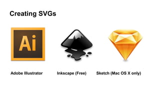
  • 6. Creating SVGs Adobe Illustrator Inkscape (Free) Sketch (Mac OS X only)
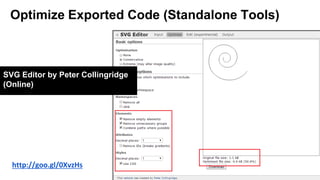
  • 7. Optimize Exported Code (Standalone Tools) http://goo.gl/0XvzHs SVG Editor by Peter Collingridge (Online)
  • 8. Optimize Exported Code (Standalone Tools) SVG O (NodeJS-Based + GUI)
  • 10. Clean Up & Give Classes bird.svg Replace generic class names with semantic ones that describe your illustration.
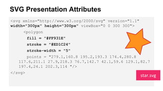
  • 12. SVG Presentation Attributes <svg xmlns="http://www.w3.org/2000/svg" version="1.1" width="300px" height="300px" viewBox="0 0 300 300"> <polygon fill = "#FF931E" stroke = "#ED1C24" stroke-width = "5" points = "279.1,160.8 195.2,193.3 174.4,280.8 117.6,211.1 27.9,218.3 76.7,142.7 42.1,59.6 129.1,82.7 197.4,24.1 202.3,114 "/> </svg> star.svg
  • 13. Shared with CSS SVG-only font font-family font-size font-size-adjust font-stretch font-style font-variant font-weight direction letter-spacing text-decoration unincode-bidi word-spacing visibility text-rendering writing-mode clip-path mask opacity filter pointer-events image-rendering clip color cursor display overflow clip-rule flood-color flood-opacity stop-opacity kerning text-anchor color-profile color- rendering fill fill-opacity fill-rule marker marker-end marker-mid marker- start stroke stroke-width stroke-opacity stroke-dasharray stroke-dashoffset stroke-linecap stroke-linejoin stroke-miterlimit alignment-baseline baseline-shift shape-rendering glyph-orientation-horizontal glyph-orientation-vertical color-interpolation color-interpolation-filters dominant-baseline lighting-color stop-color enable-background http://goo.gl/LVkev
  • 14. Inline Styles (style=” ”) <svg xmlns="http://www.w3.org/2000/svg" version="1.1" style=”width: 300px; height: 300px;” viewBox="0 0 300 300"> <polygon style = ”fill: #FF931E; stroke: #ED1C24; stroke-width: 5;” points = "279.1,160.8 195.2,193.3 174.4,280.8 117.6,211.1 27.9,218.3 76.7,142.7 42.1,59.6 129.1,82.7 197.4,24.1 202.3,114 "/> </svg> star.svg
  • 15. Embedded Styles (<style>) Inside svg <svg xmlns="http://www.w3.org/2000/svg" version="1.1" width="300px" height="300px" viewBox="0 0 300 300"> <style type=”text/css”> <![CDATA[ selector {/* styles */} ]]> </style> <g id=”..”> … </g> </svg> filename.svg
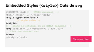
  • 16. Embedded Styles (<style>) Outside svg <!DOCTYPE html><!-- HTML5 document --> <html> <head> ... </head> <body> <style type=”text/css”> /* style rules */ </style> <!-- xmlns is optional in an HTML5 document --> <svg version="1.1" viewBox="0 0 300 300"> <!-- SVG content --> </svg> </body> </html> filename.html
  • 17. External Style Sheets <?xml version="1.0" standalone="no"?><?xml-stylesheet type="text/css" href="style.css"?> <svg xmlns="http://www.w3.org/2000/svg" version="1.1" width=".." height=".." viewBox=".."> <!-- SVG content --> </svg> filename.svg
  • 18. Style Rules (Selectors) Type Selectors: g {/* style a group */} circle, rect { fill: #009966; } Class and ID Selectors: .arrow-head { /* styles */ } #bird { /* styles */ } Dynamic Pseudo-Class Selectors: .icon:hover, .icon:active, .icon:focus { /* styles */ } Pseudo-Class Selectors: :first-child, :last-child, :nth-*- child(), :visited, :link and :lang, :last-of-type, :first-of-type, :not(), :nth-*-type(), :only-child, :only-of- type, ... Children Selectors: g > circle {/* styles */} Notes: Pseudo-elements/Generated Content don’t work.
  • 19. Style Cascades http://goo.gl/QHFp6w Presentation attributes count as low level “author stylesheets” and are overridden by any other style definition (external stylesheets, document stylesheets and inline styles). <circle cx="100" cy="100" r="75" fill="blue" style="fill:deepPink;" />
  • 20. Example: Simple Hover Effect (Iconic) Changing the stroke color and stroke width. Fading background in on hover. http://goo.gl/Fofspo
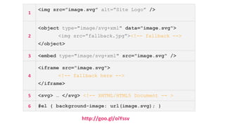
  • 22. http://goo.gl/oiYssv 1 <img src=”image.svg” alt=”Site Logo” /> 2 <object type="image/svg+xml" data="image.svg"> <img src=”fallback.jpg”><!-- fallback --> </object> 3 <embed type="image/svg+xml" src="image.svg" /> 4 <iframe src="image.svg"> <!-- fallback here --> </iframe> 5 <svg> … </svg> <!-- XHTML/HTML5 Document -- > 6 #el { background-image: url(image.svg); }
  • 23. SVG Embed Technique Links, External Styles, Interactivity, CSS Animations <img src=”img.svg” alt=”” /> Nope* <object type="image/svg+xml" data="image.svg"></object> Yep <embed type="image/svg+xml" src="image.svg" /> Yep <iframe src="image.svg"></iframe> Yep Inline <svg> … </svg> Yep background-image: url(image.svg); Nope* * CSS animations won’t be played, but SVG (SMIL) animations will be preserved. .
  • 24. <svg version="1.1" xmlns="http://www.w3.org/2000/svg" width="350px" height="400px” viewBox="0 0 350 400" > <style type="text/css"> <![CDATA[ .fish { transform-origin: 50%; animation: shake .4s linear infinite; } @keyframes shake { to {-webkit-transform: rotate(-10deg);} } ]]> </style> <g id="bear" …> <!-- ... --></g> </svg> bear-css.svg Example: CSS Animation
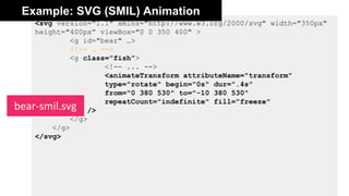
  • 26. <svg version="1.1" xmlns="http://www.w3.org/2000/svg" width="350px" height="400px” viewBox="0 0 350 400" > <g id="bear" …> <!-- … --> <g class=”fish”> <!-- ... --> <animateTransform attributeName="transform" type="rotate" begin="0s" dur=".4s" from="0 380 530" to="-10 380 530" repeatCount="indefinite" fill="freeze" /> </g> </g> </svg> bear-smil.svg Example: SVG (SMIL) Animation
  • 29. <svg xmlns="http://www.w3.org/2000/svg" version="1.1" width=”300px height=”300px” > <style type="text/css"> .eye{fill:#8B6A62;} .face{fill:#F6E6E5;} .head{fill:#F7A591;} /* ... */ </style> <path class="body" d=”...”> <!-- ... --> </svg> owl.svg Example
  • 30. 1. Remove Width & Height, Add viewBox <svg xmlns="http://www.w3.org/2000/svg" version="1.1" viewBox="0 0 300 300"> <style type="text/css"> /* ... */ </style> <path class="body" d=”...”> <!-- ... --> </svg> owl.svg
  • 31. 2. Preserve Aspect Ratio <svg xmlns="http://www.w3.org/2000/svg" version="1.1" viewBox="0 0 300 300" preserveAspectRatio="xMinYMin meet"> <style type="text/css"> /* ... */ </style> <path class="body" d=”...”> <!-- ... --> </svg> owl.svg Note: Without viewBox, preserveAspectRatio has no effect. http://goo.gl/b50HY8
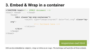
  • 32. 3. Embed & Wrap in a container <!DOCTYPE html><!-- HTML5 document --> <html> <head> ... </head> <body> <div class=”my-svg-container”> <object type="image/svg+xml" data="owl.svg" class=”my- svg”> <!-- fallback here --> </object> </div> </body> </html> responsive-owl.html SVG can be embedded as <object>, <img> or inline as an <svg>. The technique will work for all three embeds.
  • 33. 4. Padding Hack on Container .my-svg-container { height: 0; position: relative; /* create positioning context for svg */ width: width-value; padding-top: (SVG height / SVG width) * width-value; } responsive-owl.css For owl.svg: padding-top = 300 / 300 * 100 = 1 * 100 = 100%; If width of container = 60%: padding-top = 300 / 300 * 60 = 1 * 60 = 60%; If owl.svg has width 250px, height 400px: padding-top = 400/250 * 100 = 1.6 * 100 = 160%;
  • 34. 4. Position SVG Inside Container /* pull the svg to the top of the container */ .my-svg { position: absolute; top: 0; left: 0; width: 100%; /* only required for <img /> */ } responsive-owl.css
  • 38. Initial transform-origin on HTML & SVG Box Model? transform-origin (default value) HTML elements (div, etc.) Yes 50% 50%* SVG elements (circle, rect, etc.) No 0 0** *50% 50% = center of the HTML element itself ** 0 0 is the top left corner of the SVG canvas, not the element itself
  • 39. CSS Transforms on HTML & SVG <!DOCTYPE html> ... <div style=”width: 100px; height: 100px; background-color: orange”> </div> <svg style=”width: 150px; height: 150px; background-color: #eee”> <rect width="100" height="100" x="25" y="25" fill="orange" /> </svg>
  • 40. Setting transform-origin on SVG Elements 1. Using Percentage Values: The value is set relative to the element’s bounding box, which includes the stroke used to draw its border. 2. Using absolute length values: The origin is set relative to the SVG canvas.
  • 41. CSS Transforms on HTML vs SVG (cont’d) <!DOCTYPE html> <style> div, rect { transform-origin: 50% 50%; } </style>
  • 42. Heads up: Transform-Origin Issue In Firefox With Percentage Values Setting transform-origin using a percentage value currently doesn’t work in Firefox. That is a bug. (It shouldn’t be a problem if you’re not rotating anything.) Setting it in absolute length values should be fairly simple using a graphics editor.
  • 43. Example: PinWheel PinWheel by http://pixeldoree.com/vector/free-vector-pinwheels-adobe-illustrator-and-png-files/ .wheel { -webkit-transform-origin: 50% 50%; transform-origin: 193px 164px; animation: spin 4s cubic-bezier(.49,.05,.32,1.04) infinite alternate; } @keyframes spin { 50% { transform: rotate(360deg); } }
  • 44. Zooming out (or in) in Webkit/Blink does not maintain the transform origin at the center of the rotating element. This is a bug. This issue does not happen in Firefox, where the transform origin is set in absolute values (relative to the SVG canvas). Heads up: Transform-Origin Issue In Chrome With Percentage Values
  • 45. → Just use absolute values (for the time being)!
  • 46. Heads up: Hardware Acceleration In Chrome CSS 3D transforms are hardware accelerated in Chrome when applied to HTML elements. However, they are not accelerated when used on SVG elements - they have the same performance profile as SVG transform attributes. They are accelerated in Firefox.
  • 48. Animated Line Drawing To Animate an SVG path you need to know its exact length. Then: #path { stroke-dasharray: pathLength; stroke-dashoffset: pathLength; /* transition stroke-dashoffset */ transition: stroke-dashoffset 2s linear; } svg:hover #path{ stroke-dashoffset: 0; }
  • 49. Example #cable { stroke: #FFF2B1; stroke-dasharray: 4000 4000; stroke-dashoffset: 4000; stroke-width: 4; transition: stroke-dashoffset 8s linear; } svg:hover #cable { stroke-dashoffset: 0; } /* turn lamp on */ .inner-lamp{ fill:grey; transition: fill .5s ease-in 6s; } svg:hover .inner-lamp { fill: #FBFFF8; } /* ... */ The animated path is positioned on top of the black path. When SVG is hovered path is animated, and the lamp is “turned on” after path finishes animation, using a delay that is equal to the animation (transition) time of the path.
  • 51. var path = document.querySelector('.drawing- path');path.getTotalLength(); //set CSS properties up path.style.strokeDasharray = length + ' ' + length; path.style.strokeDashoffset = length; //set transition up path.style.transition = 'stroke-dashoffset 2s ease-in- out';// animatepath.style.strokeDashoffset = '0'; //more: http://jakearchibald.com/2013/animated-line-drawing-svg/ Animated Line Drawing: Retrieving Path Length Using Javascript
  • 53. Animated Paths (Morphing Paths) http://goo.gl/ri9nwU
  • 54. Animated Paths (Morphing Paths) The idea is to create a SVG with one path and to morph that path into another one. You’ll need: the first path, the second path, and possibly intermediate paths (depending on your animation). There is no way in CSS to animate one SVG path into another. http://goo.gl/93gFYh
  • 56. “ By using animated SVGs instead of GIFs we were able to reduce our page size from 1.6 mb to 389 kb, and reduce our page load time from 8.75 s to 412 ms. That’s a huge difference.” Animated SVGs As GIFs Replacement http://oak.is/thinking/animated-svgs/
  • 59. Optimize & Degrade Gracefully http://goo.gl/nhXtbu #MustRead
  • 61. Thank You! @SaraSoueidan / sarasoueidan.com