


![<!DOCTYPE html>
<svg width="960" height="500"></svg>
<script src="https://d3js.org/d3.v4.min.js"></script>
<script>
var svg = d3.select("svg"),
margin = {top: 20, right: 20, bottom: 30, left: 50},
width = +svg.attr("width") - margin.left - margin.right,
height = +svg.attr("height") - margin.top - margin.bottom,
g = svg.append("g").attr("transform", "translate(" + margin.left + "," +
margin.top + ")");
var parseTime = d3.timeParse("%d-%b-%y");
var x = d3.scaleTime()
.rangeRound([0, width]);
var y = d3.scaleLinear()
.rangeRound([height, 0]);
var line = d3.line()
.x(function(d) { return x(d.date); })
.y(function(d) { return y(d.close); });
d3.tsv("data.tsv", function(d) {
d.date = parseTime(d.date);
d.close = +d.close;
return d;
}, function(error, data) {
if (error) throw error;
x.domain(d3.extent(data, function(d) { return d.date; }));
y.domain(d3.extent(data, function(d) { return d.close; }));
g.append("g")
.attr("transform", "translate(0," + height + ")")
.call(d3.axisBottom(x))
.select(".domain")
.remove();
g.append("g")
.call(d3.axisLeft(y))
.append("text")
.attr("fill", "#000")
.attr("transform", "rotate(-90)")
.attr("y", 6)
.attr("dy", "0.71em")
.attr("text-anchor", "end")
.text("Price ($)");
g.append("path")
.datum(data)
.attr("fill", "none")
.attr("stroke", "steelblue")
.attr("stroke-linejoin", "round")
.attr("stroke-linecap", "round")
.attr("stroke-width", 1.5)
.attr("d", line); });
</script>](https://image.slidesharecdn.com/thefuture-170523181802/85/The-Tidyverse-and-the-Future-of-the-Monitoring-Toolchain-57-320.jpg)


![> gapminder %>%
+ group_by(country, continent) %>%
+ nest()
# A tibble: 142 × 3
country continent data
<fctr> <fctr> <list>
1 Afghanistan Asia <tibble [12 × 4]>
2 Albania Europe <tibble [12 × 4]>
3 Algeria Africa <tibble [12 × 4]>
4 Angola Africa <tibble [12 × 4]>
5 Argentina Americas <tibble [12 × 4]>
6 Australia Oceania <tibble [12 × 4]>
7 Austria Europe <tibble [12 × 4]>
8 Bahrain Asia <tibble [12 × 4]>
9 Bangladesh Asia <tibble [12 × 4]>
10 Belgium Europe <tibble [12 × 4]>
# ... with 132 more rows](https://image.slidesharecdn.com/thefuture-170523181802/85/The-Tidyverse-and-the-Future-of-the-Monitoring-Toolchain-73-320.jpg)
![> gapminder %>%
+ group_by(country, continent) %>%
+ nest()
# A tibble: 142 × 3
country continent data
<fctr> <fctr> <list>
1 Afghanistan Asia <tibble [12 × 4]>
2 Albania Europe <tibble [12 × 4]>
3 Algeria Africa <tibble [12 × 4]>
4 Angola Africa <tibble [12 × 4]>
5 Argentina Americas <tibble [12 × 4]>
6 Australia Oceania <tibble [12 × 4]>
7 Austria Europe <tibble [12 × 4]>
8 Bahrain Asia <tibble [12 × 4]>
9 Bangladesh Asia <tibble [12 × 4]>
10 Belgium Europe <tibble [12 × 4]>
# ... with 132 more rows](https://image.slidesharecdn.com/thefuture-170523181802/85/The-Tidyverse-and-the-Future-of-the-Monitoring-Toolchain-74-320.jpg)
![> gapminder %>%
+ group_by(country, continent) %>%
+ nest()
# A tibble: 142 × 3
country continent data
<fctr> <fctr> <list>
1 Afghanistan Asia <tibble [12 × 4]>
2 Albania Europe <tibble [12 × 4]>
3 Algeria Africa <tibble [12 × 4]>
4 Angola Africa <tibble [12 × 4]>
5 Argentina Americas <tibble [12 × 4]>
6 Australia Oceania <tibble [12 × 4]>
7 Austria Europe <tibble [12 × 4]>
8 Bahrain Asia <tibble [12 × 4]>
9 Bangladesh Asia <tibble [12 × 4]>
10 Belgium Europe <tibble [12 × 4]>
# ... with 132 more rows](https://image.slidesharecdn.com/thefuture-170523181802/85/The-Tidyverse-and-the-Future-of-the-Monitoring-Toolchain-75-320.jpg)


The Tidyverse and the Future of the Monitoring Toolchain
- 1. Finding Inspiration in the Data Science Toolchain John Rauser - @jrauser May 2017
- 2. A language that doesn't affect the way you think about programming, is not worth knowing. -Alan Perlis
- 3. the future
- 5. “The future is already here — it's just not very evenly distributed.” -William Gibson
- 12. “The future is already here — it's just not very evenly distributed.” -William Gibson
- 13. the future
- 14. John Rauser • Software engineer
- 15. John Rauser • Software engineer • Ran web-perf at Amazon
- 16. John Rauser • Software engineer • Ran web-perf at Amazon • Data scientist
- 17. +
- 20. learning R is not so difficult as it used to be
- 23. “The heart of the tidyverse is a set of consistent, shared principles that every package in the tidyverse subscribes to.” - Hadley Wickham, Data Science in the Tidyverse, 2017
- 28. The tidyverse is already transforming data science.
- 29. The ideas in the tidyverse are going to transform everything having to do with data manipulation and visualization.
- 34. sunspot # = #spots + 10 * #groups
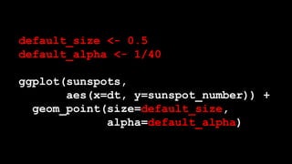
- 50. default_size <- 0.5 default_alpha <- 1/40 ggplot(sunspots, aes(x=dt, y=sunspot_number)) + geom_point(size=default_size, alpha=default_alpha)
- 51. p <- ggplot(sunspots, aes(x=dt, y=sunspot_number)) + geom_point(size=default_size, alpha=default_alpha)
- 54. minima <- as.numeric(as.Date("1954-01-01")) + seq(-9,5)*11*365.25 p + geom_vline(xintercept = minima, color = "lightblue")
- 57. <!DOCTYPE html> <svg width="960" height="500"></svg> <script src="https://d3js.org/d3.v4.min.js"></script> <script> var svg = d3.select("svg"), margin = {top: 20, right: 20, bottom: 30, left: 50}, width = +svg.attr("width") - margin.left - margin.right, height = +svg.attr("height") - margin.top - margin.bottom, g = svg.append("g").attr("transform", "translate(" + margin.left + "," + margin.top + ")"); var parseTime = d3.timeParse("%d-%b-%y"); var x = d3.scaleTime() .rangeRound([0, width]); var y = d3.scaleLinear() .rangeRound([height, 0]); var line = d3.line() .x(function(d) { return x(d.date); }) .y(function(d) { return y(d.close); }); d3.tsv("data.tsv", function(d) { d.date = parseTime(d.date); d.close = +d.close; return d; }, function(error, data) { if (error) throw error; x.domain(d3.extent(data, function(d) { return d.date; })); y.domain(d3.extent(data, function(d) { return d.close; })); g.append("g") .attr("transform", "translate(0," + height + ")") .call(d3.axisBottom(x)) .select(".domain") .remove(); g.append("g") .call(d3.axisLeft(y)) .append("text") .attr("fill", "#000") .attr("transform", "rotate(-90)") .attr("y", 6) .attr("dy", "0.71em") .attr("text-anchor", "end") .text("Price ($)"); g.append("path") .datum(data) .attr("fill", "none") .attr("stroke", "steelblue") .attr("stroke-linejoin", "round") .attr("stroke-linecap", "round") .attr("stroke-width", 1.5) .attr("d", line); }); </script>
- 59. ggplot2 is complete and compact and expressive
- 60. ggplot2 is the future* *or ggvis
- 62. data frame
- 64. data frame: data alignment is intrinsic
- 67. “Solve complex problems by combining simple, uniform pieces.” - Hadley Wickham
- 72. > gapminder # A tibble: 1,704 × 6 country continent year lifeExp pop gdpPercap <fctr> <fctr> <int> <dbl> <int> <dbl> 1 Afghanistan Asia 1952 28.801 8425333 779.4453 2 Afghanistan Asia 1957 30.332 9240934 820.8530 3 Afghanistan Asia 1962 31.997 10267083 853.1007 4 Afghanistan Asia 1967 34.020 11537966 836.1971 5 Afghanistan Asia 1972 36.088 13079460 739.9811 6 Afghanistan Asia 1977 38.438 14880372 786.1134 7 Afghanistan Asia 1982 39.854 12881816 978.0114 8 Afghanistan Asia 1987 40.822 13867957 852.3959 9 Afghanistan Asia 1992 41.674 16317921 649.3414 10 Afghanistan Asia 1997 41.763 22227415 635.3414 # ... with 1,694 more rows
- 73. > gapminder %>% + group_by(country, continent) %>% + nest() # A tibble: 142 × 3 country continent data <fctr> <fctr> <list> 1 Afghanistan Asia <tibble [12 × 4]> 2 Albania Europe <tibble [12 × 4]> 3 Algeria Africa <tibble [12 × 4]> 4 Angola Africa <tibble [12 × 4]> 5 Argentina Americas <tibble [12 × 4]> 6 Australia Oceania <tibble [12 × 4]> 7 Austria Europe <tibble [12 × 4]> 8 Bahrain Asia <tibble [12 × 4]> 9 Bangladesh Asia <tibble [12 × 4]> 10 Belgium Europe <tibble [12 × 4]> # ... with 132 more rows
- 74. > gapminder %>% + group_by(country, continent) %>% + nest() # A tibble: 142 × 3 country continent data <fctr> <fctr> <list> 1 Afghanistan Asia <tibble [12 × 4]> 2 Albania Europe <tibble [12 × 4]> 3 Algeria Africa <tibble [12 × 4]> 4 Angola Africa <tibble [12 × 4]> 5 Argentina Americas <tibble [12 × 4]> 6 Australia Oceania <tibble [12 × 4]> 7 Austria Europe <tibble [12 × 4]> 8 Bahrain Asia <tibble [12 × 4]> 9 Bangladesh Asia <tibble [12 × 4]> 10 Belgium Europe <tibble [12 × 4]> # ... with 132 more rows
- 75. > gapminder %>% + group_by(country, continent) %>% + nest() # A tibble: 142 × 3 country continent data <fctr> <fctr> <list> 1 Afghanistan Asia <tibble [12 × 4]> 2 Albania Europe <tibble [12 × 4]> 3 Algeria Africa <tibble [12 × 4]> 4 Angola Africa <tibble [12 × 4]> 5 Argentina Americas <tibble [12 × 4]> 6 Australia Oceania <tibble [12 × 4]> 7 Austria Europe <tibble [12 × 4]> 8 Bahrain Asia <tibble [12 × 4]> 9 Bangladesh Asia <tibble [12 × 4]> 10 Belgium Europe <tibble [12 × 4]> # ... with 132 more rows
- 79. tmp = scale(…) tmp2 = asPercent(tmp) tmp3 = movingAverage(tmp2) tmp4 = alias(tmp3)
- 81. scale(…) %>% asPercent() %>% movingAverage() %>% alias() alias(movingAverage(asPercent(scale(…)))))
- 82. cat data.txt | cut –f 7 | sort | uniq | wc -l
- 85. sunspots_month <- sunspots %>% mutate(month = format(dt, "%Y-%m-01”)) %>% group_by(month) %>% summarize(mean_sn = mean(sunspot_number)) transform to a monthly series
- 86. sunspots_month <- sunspots %>% mutate(month = format(dt, "%Y-%m-01”)) %>% group_by(month) %>% summarize(mean_sn = mean(sunspot_number)) transform to a monthly series
- 87. sunspots_month <- sunspots %>% mutate(month = format(dt, "%Y-%m-01”)) %>% group_by(month) %>% summarize(mean_sn = mean(sunspot_number)) transform to a monthly series
- 88. sunspots_month <- sunspots %>% mutate(month = format(dt, "%Y-%m-01”)) %>% group_by(month) %>% summarize(mean_sn = mean(sunspot_number)) transform to a monthly series
- 89. sunspots_month <- sunspots %>% mutate(month = format(dt, "%Y-%m-01”)) %>% group_by(month) %>% summarize(mean_sn = mean(sunspot_number)) select to_char(dt, ‘YYYY-MM-01’) as month, mean(sunspot_number) from sunspots group by to_char(dt, ‘YYYY-MM-01’)
- 90. dplyr will displace SQL for querying and transforming data.
- 92. ggplot(sunspots_month, aes(month, mean_sn)) + geom_point(alpha=1/3) + geom_smooth(method="loess", span=0.05)
- 95. data frame: a flexible, uniform data container dplyr and %>%: a domain specific language for data manipulation
- 96. “Goal: Solve complex problems by combining simple, uniform pieces.” - Hadley Wickham
- 97. “I want to live in the future too!”
- 99. tool makers
- 100. programming as a way of thinking
- 102. three languages 1. thoughts 2. formal algorithms 3. code
- 103. three languages 1. thoughts 2. formal algorithms 3. code “we are limited to the subset of the program we can express in all three”
- 104. three languages 1. thoughts 2. formal algorithms 3. code “we are limited to the subset of the program we can express in all three”
- 105. what we can express, not what can be expressed
- 106. what we can express, not what can be expressed we are the weakest link
- 107. we are limited by our ability to handle complexity
- 108. “… a large program must be divided into pieces, and the larger the program, the more it must be divided.” - Paul Graham, Programming bottom-Up, 1993
- 109. top-down bottom-up
- 110. “In Lisp, you don't just write your program down toward the language, you also build the language up toward your program.” - Paul Graham, Programming bottom-Up, 1993
- 111. “Like the border between two warring states, the boundary between language and program is drawn and redrawn, until eventually it comes to rest along the mountains and rivers, the natural frontiers of your problem.” - Paul Graham, Programming bottom-Up, 1993
- 112. “In the end your program will look as if the language had been designed for it. … you end up with code which is clear, small, and efficient. - Paul Graham, Programming bottom-Up, 1993
- 113. toolmakers should look to the tidyverse for inspiration
- 114. Fools ignore complexity. Pragmatists suffer it. Some can avoid it. Geniuses remove it. -Alan Perlis
- 115. end
Editor's Notes
- #3: Hi! I’m John Rauser, and I’m here from
- #4: The future. Now, I’m not literally here from the future
- #5: In the science fiction sense, rather, I’m from the future in this sense
- #6: I love this idea. “The future is already here, it’s just not very evenly distributed.”
- #7: This is an invitation to the first meeting of the Homebrew Computer Club. Gordon French invited people to hang out in his garage in March 1975 with the goal of making computers more accessible to everyone. In 1975, digital computers had been around for a long time, but what was new, was personal computers.
- #8: This is one of the first personal computers, the Altair 8800. The way you booted an Altair 8800, is you toggled those switches to encode the 16-bit address of the boot loader, and the toggled the execute switch to set the thing running. This is comically primitive by our modern standards, but the people building their own computers from mail-order kits in 1975 were at the leading edge of the personal computer revolution. They were glimpsing the future that you and I live in today. In fact,
- #9: Steve Wozniak was at the very first meeting of the Homebrew Computer club, and he credits that meeting with inspiring him to design the
- #10: Apple 1. So in a very real sense there is a direct line between
- #11: The Homebrew Computer Club and
- #12: This device, which 100s of millions of people carry around in their pockets every day. That’s what William Gibson means when he says
- #13: The future is already here. Those enthusiasts in 1975 were living in a microcosm of ubiquitous personal computing. All right… when I say that I’m from
- #14: The future, who the heck am I? Well, first, I’m a member of your tribe.
- #15: I spent the first half of my career as a software engineer, including 8 years at Amazon, and while I was at Amazon, I spent a lot of time working on
- #16: Website performance. That work culminated in running Amazon’s worldwide website performance program. While I was running that program, the very first thing I did every morning, and the very last thing I did every night was look at a set of about 80 graphs, which told me if the site was performing acceptably. If I saw something wrong, I figured out a likely cause and paged people to get it fixed. So I am of your tribe -- the people who care about monitoring and metrics and observability. To the extent that I was any good at managing web perf, it was because I loved data, and that’s what led me eventually, to become what people today call
- #17: A data scientist. But really, I was a data scientist back then, when I was poring my web performance charts day and night. I was looking at data and trying to make sense of it. And you too are data scientists, all of you, though perhaps you don’t know it yet. What I’ve learned, having made the leap to full blown data scientist from web perf nerd, is that data science tooling is spectacular. I can’t say the same is true for the monitoring and alerting toolchain, at least the open source part of that toolchain. I use graphite and grafana at my current job, and while they are minimally sufficient, they pale in comparison to what’s available to me as a data scientist. So what I want to do today is to talk about the data science toolchain, how it’s changed recently, why I think it’s so fantastically powerful. Specifically, I want to talk about
- #18: R and the tidyverse. Probably a lot of you have at least heard of R before. If you haven’t,
- #19: R is a programming language designed for data analysis tasks, and R is also a larger statistical computing environment, with extremely diverse library of add-on packages. R has a reputation for being a very difficult language to learn, and a big part of the difficulty is that while the core R language itself is quite small and beautiful, the base R library has what I call PHP disease: there are a million functions with very little consistency.
- #20: This is the opening of a book called the R inferno, which is modeled after Dante’s Inferno. It tries to explain all the little gotchas in R. It’s 126 pages long, and I have to say it was tremendously useful to me as I was learning R. But things have really changed.
- #21: R isn’t nearly so difficult as it used to be, and that’s largely thanks to
- #22: one person, Hadley Wickham. Hadley is a professor of Statistics at Rice University, and Chief Scientist at Rstudio, a company that makes a great IDE for R programming. Hadley is the driving force behind
- #23: the tidyverse. The tidyverse is a set of R packages that share a single, thoughtful philosophy and are designed to work together. In Hadley’s words,
- #24: The heart of the tidyverse is a set of consistent shared principles that every packages in the tidyverse subscribes to. I’m only going to talk about two of these packages, but for people doing monitoring/operational tasks, they’re the most important ones,
- #25: First, ggplot2, which is a package for plotting data. Even if you’ve never heard of ggplot2 before you’ve almost certainly seen plots that were made with it.
- #26: If the grey background and white gridlines on this plot look familiar, that’s the signature of a graphic made with ggplot2’s default settings. And then the other package
- #27: I want to talk about is dplyr, which is a package for querying and manipulating data.
- #28: Development on these packages began in 2005 when ggplot2 was released, but it’s really accelerated in the past 3 years. And it’s in those 3 years that I’ve started to feel like I’m living in the future. And here we come to my thesis.
- #29: These tools have already had a tremendous impact on how a huge number of data scientists do their work, but it isn’t going to stop there. I believe that
- #30: The ideas in the tidyverse, not the tools themselves but the fundamental ideas they are built upon, those ideas are going to have profound impact on everything having to do with data manipulation and visualization or data analysis more generally, and that obviously includes monitoring, metrics and analytics, the things you all care about. Ok, so I want to talk about these ideas in the context of a real problem, so we’re going to look at some
- #31: sunspot data. Sunspots are a result of the fact that the sun is a giant ball of plasma and that plasma is flowing around in complex ways. People have been observing sunspots for hundreds of years, so I downloaded a daily sunspot dataset, cleaned it up and made a first stab a visualization
- #32: ... which looked pretty crappy. The series I downloaded had daily observations, and the lines I used are really heavy, so there’s a ton of overplotting and you can’t really see the data at all. This sort of problem is really common in dashboards with fine-grained telemetry data. There are lots of ways to address this problem. Here’s one.
- #33: All I’ve done here, is draw the data as points with no line joining them, and then I muted each individual point by making it mostly transparent. Now you can start to actually see the structure of the data.
- #34: For example, you can see that in the 1850s the data never takes on values between 1 and 20. In more recent times it never takes on values between 1 and 10. It turns out that I’m plotting a metric called
- #35: the sunspot number, which today is defined as the total number of observed spots + 10 * the number of groups of spots. But it looks like in the past the definition was different. This is the kind of thing that a visualization makes obvious. So let’s talk about tools. In particular, I want to talk about
- #36: Code vs. clicking, so let’s look at some code.
- #37: Remember this line plot,
- #38: Here’s the code that made it. What ggplot2 offers is a domain specific language, hosted in R, for making plots. That language is based on something called the grammar of graphics (that’s what the gg in ggplot2 stands for, the grammar of graphics). Just to explain briefly what’s happening, that ggplot function call is essentially setting up the frame of the plot.
- #39: I’m saying I want to plot some data that’s stored in a variable named sunspots.
- #40: And then comes something called an aesthetic mapping. What I’m saying here is that there’s a variable named dt for date in my dataset and I want to put that on the x-axis. Then there’s another variable named sunspot number and I want to put that on the y-axis. So far so good, but I haven’t yet said how to draw the data,
- #41: the way I do that is I add (using the plus operator) a layer, where I’m drawing the data as a line. And this code results in
- #42: This plot. Something pretty remarkable just happened so I’m going to go over it again. To make this plot all I needed to do
- #43: is specify two things. First I need to say what the mapping was between variables in my data and aesthetic features of the graphical elements in the plot. Here I’m only mapping variables to x and y position but I could map other variables to things like the color of the points, the size, shape, alpha transparency and so on. And second, after declaring that mapping, I need to say what kind of geometric objects should encode the data. Here I choose a line, but I could have chosen points or bars or a surprising number of other geometric objects. This is the power of the grammar of graphics put into a domain specific language. This little bit of code, easily small enough to fit in a tweet, this little bit of code completely specifies a plot.
- #44: But once I saw it, I didn’t like the line plot, and I wanted to try something different,
- #45: so I changed the geometric object representing the data from a line to points, and then to mute the visual impact of each point, I
- #46: Added some parameters to make them small and mostly transparent, so you see something only where many points stack up.
- #47: and now I have a plot with much less overplotting. Now so far you not be very impressed. You might be thinking “why is this any better than
- #48: a tool like graphana where if I want to change from showing the data with points instead of lines all
- #49: I have to do is click a checkbox.” In fact it seems worse because I have to do all that typing and I have to remember the syntax. But what about when you have 5 or 50 plots and you want to make the same change to all of them, or all but one of them.
- #50: Now you're in an endless hell of clicking so painful that you probably just won’t do it, and you’ll just suffer with whatever I’ve got so far. But recall that ggplot2 is a domain specific language HOSTED in R.
- #51: So I’ve got all the features of a general purpose programming language available. That means I can give those constants names, and then use those names not just in this plot, but in many, many plots. And if I ever change my mind about those values I change them in one place not in dozens. But it gets better.
- #52: A plot itself is an object in the language, so I can give the plot a name, like p.
- #53: And then take a shot at guessing the structure of the cycle. If we eyeball this it looks like maybe a cycle lasts about 11 years, and there was a minimum in roughly 1954.
- #54: So here’s a really grody line of R code that computes at array of dates. You can see that 1954 and 11 years lurking in there.
- #55: And now because I’m working with composable objects in a programming language, I can add a layer of vertical lines to the plot and get
- #56: this, where blue lines equally spaced every eleven years kinda sorta line up with the troughs. So the first thing I want you to take away from the data science toolchain is that what ggplot2 offers is the ability to express visualizations completely
- #57: In code. No clicking. But completeness isn’t enough. A library like D3 in javascript is complete, but the equivalent code for this line plot in D3
- #58: looks like this. I had to shrink the font size down to 6 points to get it all to fit. So
- #59: not only is ggplot2 complete,
- #60: it is also compact and expressive, which makes it extremely powerful. I’ve only shown you the simplest possible plots, but for almost any plot you can imagine, you can go from idea to realized image in a handful of code, faster than in any other language I’m aware of. Because of this, ggplot2 has already transformed the workflows of many data scientists, but it’s not going to stop there,
- #61: I really believe that the ideas in ggplot2 and its successor ggvis, are going to transform every tool that deals in statistical graphics, monitoring tools included.
- #62: If you’d like to learn more about ggplot2, take a look at Hadley’s book R for data science, which is available online for free at the link on the right there.
- #63: Next I want to talk about another idea from R. The data frame is a fantastically useful idea that hasn’t been copied nearly as widely as it deserves. At its core, a data frame is just a table-like structure. You can think of it
- #64: As a spreadsheet in excel, or as a table in a database. A data frame is a structure where there’s one row per observation and a column for each variable. You might wonder why this is such a great idea, after all, you might say my language has two dimensional arrays, or my lanauge has lists and I can make lists of lists. The power of the data frame idea is really in the interface.
- #65: The key idea in the data frame interface is that data alignment is intrinsic. That mainly means that a row of data will remain intact throughout any operation. To see why that matters, maybe you’ve had this happen to you in excel,
- #66: Where you go to sort your data, but oops, you’ve accidentally selected a single column instead of the entire table, and so now you’ve wrecked the alignment of your data.
- #67: Another nice feature of a data frame, is that columns and optionally the rows have names, which allows for very natural indexing and filtering, and is also makes it easy to support joins. But the killer feature of a data frame is that they are a very flexible structure that can accommodate the needs of the vast majority of analytical problems. What that means is that people writing libraries in R can assume that you’ll pass in the data in a data frame and can return results back in a data frame. The power of that is it allows you to
- #68: In Hadley’s words, to solve complex problems by combining simple, uniform pieces. The data frame is the uniform medium of communication between tools in R. In this way, you can compare data frames to
- #69: legos. What lego provides is a consistent interface, and perhaps surprisingly,
- #70: That simple interface allows the expression of fantastically complex ideas. You see this idea show up in monitoring tools, in graphite
- #71: Functions usually take and return either a series or a series list. That makes it easy to chain together functions like this. I think that this one feature of graphite’s design is a major reason for it’s popularity. And in a way a series list is a bit like a data frame, but R goes one further. R supports something called a
- #72: Nested data frame. You’re used to tables containing atomic data types like numbers or strings or Boolean values. But in R, a column of a data frame can be a list, and an R list can contain any object you like, including a data frame. To see how that works it’s probably easiest to just look at an example.
- #73: Here’s a dataset from the gapminder tool. It has demographic data for different countries over time. What I can do with this in R
- #74: Is group the data by country and continent, and then ask it to nest the remaining columns, the demographic data. So now, I get one row for each country, and
- #75: The last column contains “tibbles” which are a kind of data frame. Each one is 12 rows long and 4 columns wide. So what’s happened is
- #76: We’ve nested little data frames in each row of a larger data frame. You can find something like this idea in some monitoring tools, like
- #77: In CAQL from circonus, where they have to notion of a histogram data point, that feels to me very much like a data frame where one column is a timestamp and another is a histogram object. But if you go all out
- #78: And allow nesting of dataframe inside data frame, you take an already very flexible structure and make it even more flexible and useful. So I think nested data frames is an idea that monitoring folks should steal outright from the data science community. Ok, next I want to talk about calling functions.
- #79: I mentioned that since graphite has a uniform structure of a series list, and because each function takes a series and returns a series, it allows chaining together functions like this. But chains of functions like this are hard to read because you have to read them inside out, and you spend a lot of time carefully matching up parentheses. I want to talk about two other ways of calling functions.
- #80: The first is to just give a name to the intermediate results, but because naming is hard, we usually end up with something awful like naming everything temp or foo. And the truth is that often these intermediate results aren’t very interesting, it’s not really worth thinking up good names for them. But this way is much more readable than the nested function calls. Another way to call a series of functions is with
- #81: the pipe operator. That funny percent greater than percent operator in R is the pipe operator. The R language has really nice meta-programming features, and so that operator is just a function that calls the function on its right-hand side with the result of evaluating it’s left hand side. In other words, these two snippets of code are identical, but the first is much easier to read.
- #82: You can read the pipe operator like the word “then”. So first scale the data, then compute a percentage, then take a moving average, then alias it. You’re probably all familiar with the pipe operator
- #83: in one of my favorite data analysis environments of all time, the UNIX command line. It’s worth noting again that this works so well because every tool in the system reads and writes a very flexible, common format -- the text file -- so you can combine simple tools to solve complex problems.
- #84: The Graphana UI emulates a pipe on top of graphite’s language. You can read these left to right: first scaleToSeconds, then take a moving average, then apply an alias. Circonus’s CAQL language has a pipe operator as a first class citizen. Let me show you a realistic example of using the pipe in R.
- #85: Remember our sunspots data, where we had guess at an eleven year cycle? Let’s try to fit a real time-series model to this data. To do that, the first thing I’m going to want to do it to reduce the granularity of this dataset. The raw series is daily, and that’s way more data than we need for a signal that moves this slowly. So let’s transform this daily series into a monthly series.
- #86: Here’s code that does that using dplyr. Dplyr is another part of the tidyverse, it’s a domain specific language for data manipulation. Like ggplot2, it is extremely expressive and powerful, and I can only give you a taste for it here. If we read through this we see that we’re starting off with the raw daily sunspots data,
- #87: and the first thing we do is is mutate it, adding a column named month, which just hold a string representing the month that day fall in.
- #88: Then we group by that new month column,
- #89: and apply the summarize function to each group. Summarize will return a data frame with one row per group and add a new column, with the average sunspot number for that month. If you know SQL this all sounds very familiar
- #90: this is like a group by with an aggregate, but it’s worth noting that unlike SQL I don’t *have* to aggregate each group to a single row, the functions that I apply to each group can return 1 row or 0 rows or more. In fact dplyr can do anything SQL can do and a whole lot more. dplyr is so powerful and expressive that in the fullness of time
- #91: I expect the ideas in dplyr to displace SQL-like languages for analytic work.
- #92: Here’s a plot that new monthly data, with a smoother layer laid over it. It’s worth noting that ggplot2 has really nice smoothing features built in, so to add that smoothed line
- #93: I just add another layer with a couple parameters specifying the smoothing algorithm and how much to smooth the data. And just to finish up, we said we wanted to fit a proper seasonal time-series model to this data, so
- #94: Here’s the code that does that. The details of this model aren’t very important, but what I’m doing here is pulling out that mean sunspot number from my data frame and fitting a TBATS model with a seasonal period of 11 years. TBATS is a somewhat fancier, more modern version of Holt-Winters exponential smoothing if you’re familiar with that. Then I can take that model and
- #95: plot it like this. At the top is the original monthly data. At the bottom you see the model’s estimate of the regular 11 year pattern in sunspots, and in the middle is the a sort of seasonally adjusted level of sunspot activity. This is really not a great model. It turns out that the solar cycle doesn’t run like a clock with a perfect 11 year period, it’s actually a lot more complex than that, but this was a fun first shot at trying to understand how the solar cycle works.
- #96: So, just to recap, at the core of what makes modern R such a great data science environment are a couple of fundamental ideas. First, the data frame, which is a very flexible container for data that allows nesting of data to arbitrary depth, and second this tool named dplyr, which is a domain specific language for data manipulation hosted in R, that on top of being very expressive and powerful lets you write very readable code because if its support for the pipe operator. Together, these tools help achieve Hadley’s goal
- #97: of allowing you to solve complex problems by combining simple uniform pieces. Ok. At this point I hope I have some of you thinking
- #98: I want to live in the future too! If you want to start playing around with these tools and the larger ideas, I’d say it really is worth it to teach yourself to use R and the tidyverse. It’s a fantastic tool for data intensive problems like capacity planning or modeling dependencies in complex systems. There’s also
- #99: shiny, which is a web application framework that you could probably use to replace your existing dashboards with something much more powerful and flexible. I should say here that I don’t work for RStudio, I’m just a very happy customer. But my real goal with this talk is to inspire
- #100: tool makers, as much as users. I want to end by looking at how Hadley did what he’s done with the tidyverse. I want to talk about
- #101: programming as a way of thinking. I got started thinking about this after I read
- #102: this great piece by Allen Downey in Scientific American. It wasn’t until after I read this piece that I really began to understand what Hadley had done with the tidyverse. The argument that Allen Downey makes is that modern programming languages are so powerful because they are very close to BOTH the way that you might describe a concept in natural language, and in formal, mathematical, notation.
- #103: There are really three different languages you work in when you work with computers. There’s the ideas running around in your head in natural human language. Then there’s something akin to math, a formal algorithm or description of the problem, and then there’s code in the programming language. Downey points out that
- #104: we are limited to the subset of programs that we can express in all three of these languages. And he takes pains to note that it’s
- #105: what we can express
- #106: not what can be expressed. Theoretically, you can express any idea in a general purpose programming language,
- #107: but we are the weakest link.
- #108: We are limited by our ability to handle complexity. And how do we handle complexity?
- #109: we break the program into pieces, and the larger the program the more it must be divided. In this essay, Graham talks about two different ways to do this. You can design
- #110: top down or bottom up. Top down you’re certainly familiar with. You say the program has to do four things, so there will be four subroutines, and then you look at each of those subroutines and split them up and so on until you have a tractable idea you can implement in a few lines of code. Bottom up design is different. In languages like
- #111: lisp and R, you don’t just do top-down design, you also have the power to build the language up toward your program. You think “I wish R had a pipe operator,” and then you just go and write it. You can do this in lisp and R because they have strong metaprogramming features, the language allows you to operate on the language itself. And when you do this, Graham uses this lovely metaphor to describe the result
- #112: Like the border between two warring states, the boundary between language and program is drawn and redrawn, until eventually it comes to rest along the mountains and rivers, the natural frontiers of your problem.
- #113: In the end your program will look as if the language had been designed for it. With ggplot2 and dplyr, Hadley has built the language up to the problems of data visualization and manipulation to the point that you can do practically anything you desire with small, beautiful code. The ideas in the tidyverse are so good that I can’t imagine them not leaking out into other toolchains.
- #114: You should look at the tidyverse because Hadley is thinking more clearly about tooling around data than anyone else, and if you do look at the tidyverse, I think you’ll be inspired to make the monitoring toolchain better.
- #115: That’s all I have, thanks for your time.
- #116: That’s all I have, thanks for your time.