SlideShare a Scribd company logo
UNLOCKING INSIGHTS:
DATA ANALYTICS AND
VISUALIZATION
A Guide to EDA and Visualization
OCTOBER 19, 2024
By: Anyika, Lorreta
INTRODUCTION
DATA ANALYTICS OVERVIEW
What is Data Analytics?
DATA ANALYTICS
The systematic computational analysis of
data to discover meaningful patterns,
trends, and insights that can inform
decision-making and improve processes.
KEY COMPONENTS
• Data Collection
• Data Cleaning and preparation
• Exploratory Data Analysis (EDA)
• Data Visualization
• Reporting and Interpretation
• Implementation and Decision-
making
Definition, Goals & Overview
01 02 03
Data Cleaning
Handle missing values, outliers, duplicates
Feature Engineering
Create new features for analysis
EXPLORATORY DATA ANALYSIS
Examine patterns, outliers, correlations
A step in data analysis where we
explore the dataset, understand its
structure and discover initial insights.
Data Cleaning, Aggregation, Visualization
Clean Data
Prepare data for analysis
Aggregate Data
Summarize information
Visualize Data
Create impactful visuals
PANDAS TECHNIQUES
Create Interactive Visualizations
Powerful plotting library
Matplotlib
Statistical data visualization
Seaborn
INTERACTIVE VISUALS
Viz Essentials (Seaborn and Matplotlib
INTRODUCTION
Introduction
•Comprehensive libraries for creating static, animated, and
interactive visualizations in Python.
•Often used in conjunction with NumPy and Pandas for data
analysis.
Key Components:
•Figure: The overall window or page on which everything is
drawn.
•Axes: The area where data is plotted (could have multiple
axes in one figure).
•Plot Types: Line plots, scatter plots, bar charts, histograms,
etc.
Basic Usage:
•Importing Matplotlib: import matplotlib.pyplot as plt.
•Creating a simple plot: plt.plot(x, y).
•Showing the plot: plt.show().
INTRODUCTION
Common Plot Types:
•Line Plots: Used for continuous data, showing trends over time.
•Scatter Plots: Used to show the relationship between two variables.
•Bar Plots: Used for categorical data comparison.
•Histograms: Used to show the distribution of numerical data.
Customization:
•titles and labels: plt.title(), plt.xlabel(), plt.ylabel().
•ChaAddingnging colors, line styles, and markers.
•Adding legends with plt.legend().
Saving Plots:
•Exporting a plot to a file (PNG, JPG, etc.):
plt.savefig('filename.png').
Integration with Pandas:
•Easy plotting of data directly from DataFrames using .plot()
method.
Viz Essentials (Seaborn and Matplotlib
Style, color, axis
Enhance visual appeal
Matplotlib Seaborn
Captivate audience with creativity
Data visualization
CUSTOMIZING VISUALS
Data Visualization Techniques
Line Plots
Show trends over time
Bar Charts
Compare categories visually
Scatter Plots
Display correlations and patterns
VISUALIZING TRENDS
Histograms, Box Plots, Pie Charts
Box Plots
Display of data distribution and outliers
COMPARISON PLOTS
Histograms
Visual representation of data distribution
Pie Charts
Illustration of proportions and
percentages
HANDS-ON SESSION
Practice time!
YOURNAME@EXAMPLE.COM 18 OCTOBER 2024
Closing Thoughts
It’s a wrap!
THANK YOU
ANYIKA, LORRETA U.
09071234510
Follow on X, LinkedIn, FB & IG @ Anyika
Lorreta

More Related Content

Similar to Unlocking Insights Data Analysis Visualization (20)

PDF
DAVLectuer3 Exploratory data analysis .pdf
ZaheerAbbas82578
 
PPTX
BDA_MO_1_S6_Basic_data_analytics_,reporting,_and_apply_basic_data.pptx
HarikaNimmaganti1
 
PPTX
Lec 04 -Visualization dataset using Python - Copy.pptx
AttaMohammadPanhyar
 
PPTX
Data Exploration in Python.pptx
SIDDHARTH435426
 
PPTX
11-11_EDA Samia.pptx 11-11_EDA Samia.pptx
samialachgar1
 
PPTX
UNIT_4_data visualization.pptx
BhagyasriPatel2
 
PPTX
Python for Data Science
Panimalar Engineering College
 
PPTX
Introduction to matplotlib
Piyush rai
 
PPTX
Types of Data in Machine Learning, Number aand Categorical
msiad
 
PPTX
Python_Matplotlib_13. _Slides.pptx
sukeerthankoyyada
 
PPTX
Matplotlib_Presentation jk jdjklskncncsjkk
sarfarazkhanwattoo
 
PPTX
Python Pyplot Class XII
ajay_opjs
 
DOCX
UNIT-4.docx
scet315
 
PPTX
PYTHON-Chapter 4-Plotting and Data Science PyLab - MAULIK BORSANIYA
Maulik Borsaniya
 
PPTX
Data Visualization in Python of b.tech student.pptx
TelanganaPakkaFolk
 
PPTX
Python_Matplotlib_13_Slides_With_Diagrams.pptx
sukeerthankoyyada
 
PPTX
Data Visualization1.pptx
qwtadhsaber
 
PPTX
Data-Visualization-with-Python-4 PPT.ppt
ChiragNahata2
 
DOCX
Data visualization using py plot part i
TutorialAICSIP
 
PDF
Chapter3_Visualizations2.pdf
MekiyaShigute1
 
DAVLectuer3 Exploratory data analysis .pdf
ZaheerAbbas82578
 
BDA_MO_1_S6_Basic_data_analytics_,reporting,_and_apply_basic_data.pptx
HarikaNimmaganti1
 
Lec 04 -Visualization dataset using Python - Copy.pptx
AttaMohammadPanhyar
 
Data Exploration in Python.pptx
SIDDHARTH435426
 
11-11_EDA Samia.pptx 11-11_EDA Samia.pptx
samialachgar1
 
UNIT_4_data visualization.pptx
BhagyasriPatel2
 
Python for Data Science
Panimalar Engineering College
 
Introduction to matplotlib
Piyush rai
 
Types of Data in Machine Learning, Number aand Categorical
msiad
 
Python_Matplotlib_13. _Slides.pptx
sukeerthankoyyada
 
Matplotlib_Presentation jk jdjklskncncsjkk
sarfarazkhanwattoo
 
Python Pyplot Class XII
ajay_opjs
 
UNIT-4.docx
scet315
 
PYTHON-Chapter 4-Plotting and Data Science PyLab - MAULIK BORSANIYA
Maulik Borsaniya
 
Data Visualization in Python of b.tech student.pptx
TelanganaPakkaFolk
 
Python_Matplotlib_13_Slides_With_Diagrams.pptx
sukeerthankoyyada
 
Data Visualization1.pptx
qwtadhsaber
 
Data-Visualization-with-Python-4 PPT.ppt
ChiragNahata2
 
Data visualization using py plot part i
TutorialAICSIP
 
Chapter3_Visualizations2.pdf
MekiyaShigute1
 

Recently uploaded (20)

PDF
“NPU IP Hardware Shaped Through Software and Use-case Analysis,” a Presentati...
Edge AI and Vision Alliance
 
PDF
Go Concurrency Real-World Patterns, Pitfalls, and Playground Battles.pdf
Emily Achieng
 
PDF
Reverse Engineering of Security Products: Developing an Advanced Microsoft De...
nwbxhhcyjv
 
PDF
POV_ Why Enterprises Need to Find Value in ZERO.pdf
darshakparmar
 
PDF
DevBcn - Building 10x Organizations Using Modern Productivity Metrics
Justin Reock
 
PDF
Exolore The Essential AI Tools in 2025.pdf
Srinivasan M
 
PPTX
WooCommerce Workshop: Bring Your Laptop
Laura Hartwig
 
PPTX
The Project Compass - GDG on Campus MSIT
dscmsitkol
 
PPTX
OpenID AuthZEN - Analyst Briefing July 2025
David Brossard
 
PDF
Bitcoin for Millennials podcast with Bram, Power Laws of Bitcoin
Stephen Perrenod
 
PPTX
From Sci-Fi to Reality: Exploring AI Evolution
Svetlana Meissner
 
PDF
Smart Trailers 2025 Update with History and Overview
Paul Menig
 
PDF
Agentic AI lifecycle for Enterprise Hyper-Automation
Debmalya Biswas
 
PDF
Staying Human in a Machine- Accelerated World
Catalin Jora
 
PPTX
Q2 FY26 Tableau User Group Leader Quarterly Call
lward7
 
DOCX
Python coding for beginners !! Start now!#
Rajni Bhardwaj Grover
 
PPTX
COMPARISON OF RASTER ANALYSIS TOOLS OF QGIS AND ARCGIS
Sharanya Sarkar
 
PDF
How Startups Are Growing Faster with App Developers in Australia.pdf
India App Developer
 
PDF
Building Real-Time Digital Twins with IBM Maximo & ArcGIS Indoors
Safe Software
 
PDF
Jak MŚP w Europie Środkowo-Wschodniej odnajdują się w świecie AI
dominikamizerska1
 
“NPU IP Hardware Shaped Through Software and Use-case Analysis,” a Presentati...
Edge AI and Vision Alliance
 
Go Concurrency Real-World Patterns, Pitfalls, and Playground Battles.pdf
Emily Achieng
 
Reverse Engineering of Security Products: Developing an Advanced Microsoft De...
nwbxhhcyjv
 
POV_ Why Enterprises Need to Find Value in ZERO.pdf
darshakparmar
 
DevBcn - Building 10x Organizations Using Modern Productivity Metrics
Justin Reock
 
Exolore The Essential AI Tools in 2025.pdf
Srinivasan M
 
WooCommerce Workshop: Bring Your Laptop
Laura Hartwig
 
The Project Compass - GDG on Campus MSIT
dscmsitkol
 
OpenID AuthZEN - Analyst Briefing July 2025
David Brossard
 
Bitcoin for Millennials podcast with Bram, Power Laws of Bitcoin
Stephen Perrenod
 
From Sci-Fi to Reality: Exploring AI Evolution
Svetlana Meissner
 
Smart Trailers 2025 Update with History and Overview
Paul Menig
 
Agentic AI lifecycle for Enterprise Hyper-Automation
Debmalya Biswas
 
Staying Human in a Machine- Accelerated World
Catalin Jora
 
Q2 FY26 Tableau User Group Leader Quarterly Call
lward7
 
Python coding for beginners !! Start now!#
Rajni Bhardwaj Grover
 
COMPARISON OF RASTER ANALYSIS TOOLS OF QGIS AND ARCGIS
Sharanya Sarkar
 
How Startups Are Growing Faster with App Developers in Australia.pdf
India App Developer
 
Building Real-Time Digital Twins with IBM Maximo & ArcGIS Indoors
Safe Software
 
Jak MŚP w Europie Środkowo-Wschodniej odnajdują się w świecie AI
dominikamizerska1
 
Ad

Unlocking Insights Data Analysis Visualization

  • 1. UNLOCKING INSIGHTS: DATA ANALYTICS AND VISUALIZATION A Guide to EDA and Visualization OCTOBER 19, 2024 By: Anyika, Lorreta
  • 3. DATA ANALYTICS The systematic computational analysis of data to discover meaningful patterns, trends, and insights that can inform decision-making and improve processes. KEY COMPONENTS • Data Collection • Data Cleaning and preparation • Exploratory Data Analysis (EDA) • Data Visualization • Reporting and Interpretation • Implementation and Decision- making
  • 4. Definition, Goals & Overview 01 02 03 Data Cleaning Handle missing values, outliers, duplicates Feature Engineering Create new features for analysis EXPLORATORY DATA ANALYSIS Examine patterns, outliers, correlations A step in data analysis where we explore the dataset, understand its structure and discover initial insights.
  • 5. Data Cleaning, Aggregation, Visualization Clean Data Prepare data for analysis Aggregate Data Summarize information Visualize Data Create impactful visuals PANDAS TECHNIQUES
  • 6. Create Interactive Visualizations Powerful plotting library Matplotlib Statistical data visualization Seaborn INTERACTIVE VISUALS
  • 7. Viz Essentials (Seaborn and Matplotlib INTRODUCTION Introduction •Comprehensive libraries for creating static, animated, and interactive visualizations in Python. •Often used in conjunction with NumPy and Pandas for data analysis. Key Components: •Figure: The overall window or page on which everything is drawn. •Axes: The area where data is plotted (could have multiple axes in one figure). •Plot Types: Line plots, scatter plots, bar charts, histograms, etc. Basic Usage: •Importing Matplotlib: import matplotlib.pyplot as plt. •Creating a simple plot: plt.plot(x, y). •Showing the plot: plt.show().
  • 8. INTRODUCTION Common Plot Types: •Line Plots: Used for continuous data, showing trends over time. •Scatter Plots: Used to show the relationship between two variables. •Bar Plots: Used for categorical data comparison. •Histograms: Used to show the distribution of numerical data. Customization: •titles and labels: plt.title(), plt.xlabel(), plt.ylabel(). •ChaAddingnging colors, line styles, and markers. •Adding legends with plt.legend(). Saving Plots: •Exporting a plot to a file (PNG, JPG, etc.): plt.savefig('filename.png'). Integration with Pandas: •Easy plotting of data directly from DataFrames using .plot() method. Viz Essentials (Seaborn and Matplotlib
  • 9. Style, color, axis Enhance visual appeal Matplotlib Seaborn Captivate audience with creativity Data visualization CUSTOMIZING VISUALS
  • 10. Data Visualization Techniques Line Plots Show trends over time Bar Charts Compare categories visually Scatter Plots Display correlations and patterns VISUALIZING TRENDS
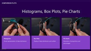
  • 11. Histograms, Box Plots, Pie Charts Box Plots Display of data distribution and outliers COMPARISON PLOTS Histograms Visual representation of data distribution Pie Charts Illustration of proportions and percentages
  • 13. [email protected] 18 OCTOBER 2024 Closing Thoughts
  • 14. It’s a wrap! THANK YOU ANYIKA, LORRETA U. 09071234510 Follow on X, LinkedIn, FB & IG @ Anyika Lorreta