@timelessfuture Hugo Huurdeman Open University of the Netherlands
Webmapping: 


Maps for presentation,
exploration & analysis
Guest Lecture, Digital Practice in Archaeology course, UvA/VU (15/03/22)
Outline / Learning goals:
1 Broadly define (map) visualization
2 Understand the map visualization process
3 Know basic questions before creating map visualization
4 Understand design choices during map creation process
1. Intro to visualization
Visualization?
• “A visualization is any kind of visual representation of
information designed to enable communication,
analysis, discovery, exploration, etc.” (Cairo, 2016)
• “The representation and presentation of data to
facilitate understanding (Kirk, 2016)
When to use visualization?
• Can be used in different stages
• initial exploration, get a grasp (exploratory)
Cairo
(2016)
When to use visualization?
• Can be used in different stages
• initial exploration, get a grasp (exploratory)
• as artefact of ongoing research (discovery)
• i.e. “as process”
Cairo
(2016)
When to use visualization?
• Can be used in different stages
• initial exploration, get a grasp (exploratory)
• as artefact of ongoing research (discovery)
• i.e. “as process”
• as end product (explanatory)
• i.e. “as product / outcome”
https://www.flickr.com/photos/idvsolutions/8806668702/sizes/o/in/photostream/
Cairo
(2016)
Qualities of visualizations
• Cairo (2016) suggests a number of qualities of visualizations (which are often not
met in practice!)
• Functional It should depict data accurately, but also be useful to people
• Beautiful A visualization should be ‘attractive’ to different audiences
• Insightful It should reveal evidence that we could have missed without the visualization
• Enlightening A visualization may “change our minds” (hopefully for the better…)
• Truthful A visualization should depict truthful and honest research
What is a “map”?
see also: Cairo (2016), AxisMaps
What is a “map”?
see also: Cairo (2016), AxisMaps
• A visual representation of a place

• “A map is not an objective depiction of reality”

• Practice of cartography: 

• “as much about removing things as depicting them”
What is a “map”?
see also: Cairo (2016), AxisMaps
• A visual representation of a place

• “A map is not an objective depiction of reality”

• Practice of cartography: 

• “as much about removing things as depicting them”
• Mapping places vs. mapping data
• e.g. a map of Amsterdam (reference map)

• e.g. a map of household incomes in Amsterdam (thematic map)
kolerekaart.nl
From static ..
https://rce.webgispublisher.nl/Viewer.aspx?map=Paleogeografischekaarten
https://maps.amsterdam.nl/archeologie/
… to interactive
https://maps.amsterdam.nl/archeologie/
… to interactive
polygraph.cool
combining media sources …
polygraph.cool
https://www.nytimes.com/interactive/2014/upshot/dialect-quiz-map.html
… quiz elements …
https://utrechtinvogelvlucht.nl/ (http://www.webmapper.net/)
… and perspectives
https://www.dordrecht5d.nl/
2. Visualization process
(Simplified) Steps#
visualization
(Simplified) Steps#
visualization
data wrangling data enrichment
dataset creation
(Simplified) Steps#
visualization
data wrangling data enrichment
dataset creation
Represent*
Refine*
Interact*
Clean
Parse*
Filter*
Mine*
Acquire*
Understand
* From 7 stages in data visualization (Fry, 2007)
(Simplified) Steps#
visualization
data wrangling data enrichment
dataset creation
Represent*
Refine*
Interact*
Clean
Parse*
Filter*
Mine*
Acquire*
Understand
# Usually iterative
* From 7 stages in data visualization (Fry, 2007)
(Simplified) Steps#
visualization
data wrangling data enrichment
dataset creation
Represent*
Refine*
Interact*
Clean
Parse*
Filter*
Mine*
Acquire*
Understand
→ Clean up
publisher names
→ Get geocodes
for placenames
→ Project publisher
locations onto map
# Usually iterative
* From 7 stages in data visualization (Fry, 2007)
Get dataset on
acquired books library
1
data wrangling data enrichment visualization
Adding geocoordinates to data
→ geocoding place names
• manually
• via a tool
e.g. QGIS, Google Earth, ArcGIS
• automatic geocoding (“mine”)
• via a tool
e.g. QGIS→MMQGIS plugin, ArcGIS
• via an online service
e.g. Batch GeoCoder
• custom scripting & APIs
e.g. Google Geocoding API ($),
OpenStreetMap API
→ Dataset ready to visualize
data creation
• Map visualizations:
• Visualize within tool itself

• ArcGIS, QGIS (tutorials), etc.

• Web export from tool

• e.g. QGIS to OpenLayers (via QGIS2Web)

• Via online solutions

• Google Maps (via My Maps) 

• Google Earth (via “New Project”) 

• MapBox, etc.

• Via dedicated Javascript libraries

• Leaflet

• OpenLayers

• kepler.gl 

• Cesium, etc.
data wrangling data enrichment visualization
Huurdeman, Ben-David, Samar (2013)
data creation
datavizcatalogue.com
3. Geomaps: two cases
Geomaps: initial questions
Audience, Medium and Purpose (e.g. Brewer, 2015)
• What: 

• What data would you like to present? (e.g. (un)orderable, numerical) 

• Who:
• What is the intended audience? (e.g. general vs experts)

• Why:
• What is the purpose? (e.g. data exploration, discovery, explanation)

• On the basis of these questions, you decide on the how, e.g.:
• static vs interactive map
• simple vs complex functionality
• see also: UX pattern checklist
Case 1: ResearchMapper
2009-2014
• Climate research mapping
• What: projects on climate mitigation and adaptation (locations,
text, multimedia)

• Who: general visitors of the website kennisvoorklimaat.nl 

• Why: quick glimpse of conducted projects & their location;
visually attractive “hub”. As end product (communication)

• How: via interactive map (streamlined functionality)

data representation: thumbnails

map layer: satellite
2.1
• Gather climate change-
related projects,
descriptions & media
files

• Google Earth editor:
add placemarks / lines /
shapes (try it out here)

• Export as KML file
→
data enrichment
dataset creation
2.2
• Create web application
integrating Google Maps 3D*
API

• Import KML-file

• Decide on base map layer 

• Adapt design, text, images,
videos 

• Testing with prospective users
* now deprecated
visualization
2.3 Final result (2009)
General
audience:
aiming for
simplicity
2.3 Final result (2009)
General
audience:
aiming for
simplicity
2.3 Final result (2009)
General
audience:
aiming for
simplicity
Visually
attractive: 3D
animations
Visually
attractive:
photo / video
materials
General audience:
short introductory
texts “Hub”: Links
to additional
information
Case 2: “Virtual Interiors” Maps
• What: visualize research on 17th century visual artist & art dealer
locations/networks (by Weixuan Li)
Case 2: “Virtual Interiors” Maps
• What: visualize research on 17th century visual artist & art dealer
locations/networks (by Weixuan Li)
• Who: experts (researchers, such as art historians), but also
historically interested general audiences
Case 2: “Virtual Interiors” Maps
• What: visualize research on 17th century visual artist & art dealer
locations/networks (by Weixuan Li)
• Who: experts (researchers, such as art historians), but also
historically interested general audiences
• Why: for exploration, ongoing research & (finally) as end
product
• How:
• interactive map (with research functionality)

• data representation: map points, areas, uncertainty displays

• map layers: historical maps
2.1
• Data collection Weixuan Li

• Initially artists 1585-1610

• Archival research (e.g.
birth/death registries,
transportakten, Bredius
archive)

• (Re)mapping polygons of
locations

• Extending Ecartico →
vondel.humanities.uva.nl/ecartico/
dataset creation
https://tiles.amsterdamtimemachine.nl/
2.2
• Make use of “Linked Data”
(explanation)

• Ecartico ID

→ Get additional
information + images
from Ecartico, Wikidata,
AdamLink, RKD
https://lod-cloud.net/
data enrichment
2.3
• Web application
integrating:

• OpenLayers (2D
maps)

• CesiumJS (3D maps)

• Uses spreadsheet
(CSV) with Ecartico
IDs & polygons (WKT)
visualization
work in progress
Historical
map
layers
Historical
streetplan
layers
Data layers
(artists,
publishers)
Timelines
Allow for
exploration:
filtering
work in progress
Area-based
filtering
Thumbnails
work in progress
Selected artist Linked Data
displays
Annotations
work in progress
Historical street scenes
(Wikidata, Adamnet)
work in progress
Historical street scenes
(Wikidata, Adamnet)
work in progress
Uncertainty
displays
work in progress
3D /
perspective
views
Challenge: uncertainty
• Data sparsity

• Uncertainty (MacEachren et al. 2005)

• what (attribute/thematic uncertainty) — e.g. are we sure these
archive documents talk about the same painter?

• where (positional uncertainty) — e.g. where was this painter
working exactly?

• when (temporal uncertainty) — e.g. when was this painter active?
See also: https://www.e-education.psu.edu/geog486/node/693
4. Diving into (design) decisions
4.1 Generalization & abstraction
Map as representation of reality
• Abstraction in mapping, e.g.:

• Selection (select visible elements)

• Simplification (reduce complexity)

• Aggregation (group similar points)

• Dynamic maps: think of map scales
• e.g. scale-dependent visibility; rule-
based styling in GIS packages

• e.g. marker clustering in Google
Maps API
OpenStreetMap
Selection, simplification Aggregations
Google Maps
4.2 Symbology
4.2 Symbology
• In context of cartographic design: “the use of graphical techniques
to represent geographic information on a map” (GIS Encyclopedia)
• Can we make it 

Functional - Beautiful - Insightful - Enlightening - Truthful ?
4.2 Symbology
• In context of cartographic design: “the use of graphical techniques
to represent geographic information on a map” (GIS Encyclopedia)
• Can we make it 

Functional - Beautiful - Insightful - Enlightening - Truthful ?
• Using visual variables → 4.2.1
• e.g. position, size, shape, orientation
• e.g. texture
• e.g. color value, hue
• Try to optimize visual hierarchy → 4.2.2
Jacques Bertin’s “retinal variables” (1967)
• Selective variables - quickly isolate group of variables

• Ordered variables - recognizable sequence

• Associative variables - recognize as group

• Quantitative variables - estimate numerical difference
www.axismaps.com/guide/visual-variables
4.2.1 Color use
• Nominal color schemes

• “unorderable”, qualitative
data (e.g. land use)

• Sequential color schemes

• orderable or numerical
(e.g. small/medium/large)

• Diverging color schemes

• natural “mid-point” (e.g.
avg per capita income)
https://www.axismaps.com/guide/using-colors-on-maps
https://colorbrewer2.org/ http://tristen.ca/hcl-picker/
4.2.2 Visual hierarchy_
• “A map’s visual
hierarchy should
match its intellectual
hierarchy.”

• Figure - ground
relationship 

(icons-background)

• Color-contrasts
https://www.axismaps.com/guide/visual-hierarchy
Webmapping: final words
• Always keep the What/Who/Why in mind
• Design == trade-offs

• e.g., Overview versus depth
Webmapping: final words
• Always keep the What/Who/Why in mind
• Design == trade-offs

• e.g., Overview versus depth
• Webmapping:

• compared to display in GIS packages you have to streamline your
content (and features)
Webmapping: final words
• Always keep the What/Who/Why in mind
• Design == trade-offs

• e.g., Overview versus depth
• Webmapping:

• compared to display in GIS packages you have to streamline your
content (and features)
• Again — (web) map == selective representation of reality
5. Conclusion
• Defining (map) visualization

• Map visualization process

• Defining questions 

• Two cases: researchmapper & Virtual
Interiors artist locations

• Design decisions
www.virtualinteriorsproject.nl
Open University, Technology-Enhanced Learning & Innovation

https://www.ou.nl/en/onderzoek-onderwijswetenschappen-leren-en-innoveren-met-ict-onderzoek
References
• Bertin, J. (1967), Sémiologie graphique, The Hague, Mouton

• Cairo (2016). The Truthful Art - Data, Charts, and Maps for Communication

• Fry (2007), Visualizing Data, O’Reilly

• Hirtle (2019), Geographical Design - Spatial Cognition and Geographical Information Science. Synthesis lectures on
Human-Centered Informatics. doi:10.2200/S00921ED2V01Y201904HCI043

• Huurdeman, H. C., Ben-David, A., & Sammar, T. (2013). Sprint Methods for Web Archive Research. Proceedings of the
5th Annual ACM Web Science Conference, 182–190.

• Kirk (2016). Data Visualization - A handbook for Data Driven Design

• MacEachren, A. M., Robinson, A., Hopper, S., Gardner, S., Murray, R., Gahegan, M., & Hetzler, E. (2005). Visualizing
geospatial information uncertainty: What we know and what we need to know. Cartography and Geographic
Information Science, 32(3), 139-. Gale Academic OneFile.

• MacEachren, A. M., Roth, R. E., O’Brien, J., Li, B., Swingley, D., & Gahegan, M. (2012). Visual Semiotics Uncertainty
Visualization: An Empirical Study. IEEE Transactions on Visualization and Computer Graphics, 18(12), 2496–2505.
https://doi.org/10.1109/TVCG.2012.279 

• Nussbaumer Knaflic (2015). Storytelling with Data. Wiley

• Tufte (1983). The Visual Display of Quantitative Information
Misc links
• Brief cartography guide

• https://www.axismaps.com/guide

• Cartography and Visualization course

• https://www.e-education.psu.edu/geog486 

• Visualization lecture Hugo (2018)

• https://www.slideshare.net/TimelessFuture/visualization-lecture-clariah-summer-school-2018

• Some mapping advice

• https://www.tableau.com/about/blog/2017/8/10-ways-add-value-your-dashboards-maps-75709

• UX Patterns maps: https://twitter.com/smashingmag/status/1247068814589792256 

• Chart usage guidelines: 

• eazybi.com/blog/data_visualization_and_chart_types

• Improving the ‘data-ink ratio’: 

• darkhorseanalytics.com/blog/data-looks-better-naked 

• Geocoding in QGIS

• https://guides.library.ucsc.edu/DS/Resources/QGIS

• Webmapping via QGIS

• https://www.qgistutorials.com/en/docs/web_mapping_with_qgis2web.html
Discussion
• Questions, ideas, suggestions?
?
@timelessfuture Hugo Huurdeman Open University of the Netherlands
Webmapping: 


Maps for presentation,
exploration & analysis
Guest Lecture, Digital Practice in Archaeology course, UvA/VU (15/03/22)

More Related Content

PPTX
Web mapping
PDF
GeoServer, an introduction for beginners
PDF
QGIS Open Source Desktop GIS
PPTX
GIS User to Web-GIS Developer Journey
PPTX
70.mobile gis
PPT
Web Mapping
PPTX
공간정보 거점대학 - OpenLayers의 고급 기능 이해 및 실습
Web mapping
GeoServer, an introduction for beginners
QGIS Open Source Desktop GIS
GIS User to Web-GIS Developer Journey
70.mobile gis
Web Mapping
공간정보 거점대학 - OpenLayers의 고급 기능 이해 및 실습

What's hot (20)

PPTX
Object Based Image Analysis
PPTX
Spatial analysis & interpolation in ARC GIS
PPTX
Introduction to GIS
PDF
PPT
Free open source gis
PPTX
Remote Sensing: Overlay Analysis
PPTX
오픈소스GIS 개론 과정 - OpenLayers 기초
PDF
ArcGIS Pro: la innovación del GIS
PPTX
Web GIS using Google Map and QGIS
PPTX
Gis functions
PPTX
TYBSC IT PGIS Unit III Chapter II Data Entry and Preparation
PDF
Introduction au webmapping au-dela de google maps
PPTX
공간정보연구원 PostGIS 강의교재
PPTX
Gis training ppt
PPTX
GEOGRAPHICAL INFORMATION SYSTEM (GIS)
PPTX
PostGIS - National Education Center for GIS: Open Source GIS
PDF
Principles of photogrammetry
PDF
Vector Tiles with GeoServer and OpenLayers
PDF
An introduction to geographic information systems (gis) m goulbourne 2007
PPTX
Object Based Image Analysis
Spatial analysis & interpolation in ARC GIS
Introduction to GIS
Free open source gis
Remote Sensing: Overlay Analysis
오픈소스GIS 개론 과정 - OpenLayers 기초
ArcGIS Pro: la innovación del GIS
Web GIS using Google Map and QGIS
Gis functions
TYBSC IT PGIS Unit III Chapter II Data Entry and Preparation
Introduction au webmapping au-dela de google maps
공간정보연구원 PostGIS 강의교재
Gis training ppt
GEOGRAPHICAL INFORMATION SYSTEM (GIS)
PostGIS - National Education Center for GIS: Open Source GIS
Principles of photogrammetry
Vector Tiles with GeoServer and OpenLayers
An introduction to geographic information systems (gis) m goulbourne 2007
Ad

Similar to Webmapping: maps for presentation, exploration & analysis (20)

PDF
Data Visualization via Enhanced Maps in a Digital Humanities Context – a Desi...
PDF
Introduction to Information Visualization (Part 2)
PPTX
TYBSC IT PGIS Unit V Data Visualization
PPTX
Data Visualization
PDF
Understanding cities
PPTX
Geo visualization_why maps
PPTX
CartoService: A Web Service Framework for Quality On-Demand Geovisualisation
PPTX
Chapter8- Web Map.pptx/...........................
PDF
Web-based Information Visualisation
PPTX
OKCon 2013 Moodboards
PDF
Information Visualization Workshop, ASIS&T 2015
PPTX
Visualization for Data Analysis: A New Way to Look at Content
PDF
Network Mapping & Data Storytelling for Beginners
PDF
DSH Week 3 – Storytelling with Place.pdf
PPTX
Maps_Visualization
PDF
Visualization Lecture - Clariah Summer School 2018
PPTX
Roughmaps
PDF
Data visualization - Courtland Jeffrey - Phoenix NewsTrain - 4.07.18
PPTX
Data visualization representation of Analytics data
PPTX
Examples for leverage points
Data Visualization via Enhanced Maps in a Digital Humanities Context – a Desi...
Introduction to Information Visualization (Part 2)
TYBSC IT PGIS Unit V Data Visualization
Data Visualization
Understanding cities
Geo visualization_why maps
CartoService: A Web Service Framework for Quality On-Demand Geovisualisation
Chapter8- Web Map.pptx/...........................
Web-based Information Visualisation
OKCon 2013 Moodboards
Information Visualization Workshop, ASIS&T 2015
Visualization for Data Analysis: A New Way to Look at Content
Network Mapping & Data Storytelling for Beginners
DSH Week 3 – Storytelling with Place.pdf
Maps_Visualization
Visualization Lecture - Clariah Summer School 2018
Roughmaps
Data visualization - Courtland Jeffrey - Phoenix NewsTrain - 4.07.18
Data visualization representation of Analytics data
Examples for leverage points
Ad

More from TimelessFuture (20)

PDF
Experiential Interfaces: 

3D reconstructions as entry points for exploration...
PDF
Step inside the Image: 

Interpretative Interfaces for 
3D Historical Content
PDF
Supporting the Interpretation of Enriched Audiovisual Sources through Tempora...
PDF
The Multi-Stage Experience: the Simulated Work Task Approach to Studying Info...
PDF
Op Ontdekkingsreis door het KB Webarchief - Exploratieve Visualisatie in een ...
PDF
Outcomes Visual Navigation Project
PDF
KNVI 2017: De collectie in een ander licht - Creatieve inzet van nieuwe techn...
PPTX
Chaos&Order: Using visualization as a means to
 explore large heritage collec...
PDF
Workshop: Inspirational Journeys - Challenges and Solutions for Visual Naviga...
PDF
“More than Meets the Eye” - Analyzing the Success of User Queries in Oria
PDF
Not available, or not found? Lessons from user queries in the Oria catalog at...
PDF
Webarchief & Wetenschap (Dutch)
PDF
From Exploration to Construction
 - How to Support the Complex Dynamics of In...
PDF
Towards Multidimensional Web Archive Access (IIPC 2016)
PDF
Active & Passive Utility of Search Interface Features in different Informatio...
PDF
Supporting the Process - Adapting Search Systems To Search Stages (ECIL15)
PDF
The Value of Multistage Search Systems for Book Search
PDF
Towards Research Engines: Supporting Search Stages in Web Archives (2015)
PDF
WebART: hoe maak je webarchieven bruikbaar voor de wetenschap? (Dutch)
PDF
Finding Pages on the Unarchived Web (DL 2014)
Experiential Interfaces: 

3D reconstructions as entry points for exploration...
Step inside the Image: 

Interpretative Interfaces for 
3D Historical Content
Supporting the Interpretation of Enriched Audiovisual Sources through Tempora...
The Multi-Stage Experience: the Simulated Work Task Approach to Studying Info...
Op Ontdekkingsreis door het KB Webarchief - Exploratieve Visualisatie in een ...
Outcomes Visual Navigation Project
KNVI 2017: De collectie in een ander licht - Creatieve inzet van nieuwe techn...
Chaos&Order: Using visualization as a means to
 explore large heritage collec...
Workshop: Inspirational Journeys - Challenges and Solutions for Visual Naviga...
“More than Meets the Eye” - Analyzing the Success of User Queries in Oria
Not available, or not found? Lessons from user queries in the Oria catalog at...
Webarchief & Wetenschap (Dutch)
From Exploration to Construction
 - How to Support the Complex Dynamics of In...
Towards Multidimensional Web Archive Access (IIPC 2016)
Active & Passive Utility of Search Interface Features in different Informatio...
Supporting the Process - Adapting Search Systems To Search Stages (ECIL15)
The Value of Multistage Search Systems for Book Search
Towards Research Engines: Supporting Search Stages in Web Archives (2015)
WebART: hoe maak je webarchieven bruikbaar voor de wetenschap? (Dutch)
Finding Pages on the Unarchived Web (DL 2014)

Recently uploaded (20)

PDF
faiz-khans about Radiotherapy Physics-02.pdf
PDF
0520_Scheme_of_Work_(for_examination_from_2021).pdf
PDF
FYJC - Chemistry textbook - standard 11.
PPTX
Designing Adaptive Learning Paths in Virtual Learning Environments
PPTX
PLASMA AND ITS CONSTITUENTS 123.pptx
PPTX
4. Diagnosis and treatment planning in RPD.pptx
PDF
Compact First Student's Book Cambridge Official
PPTX
IT infrastructure and emerging technologies
PDF
Review of Related Literature & Studies.pdf
PPTX
principlesofmanagementsem1slides-131211060335-phpapp01 (1).ppt
PPTX
Theoretical for class.pptxgshdhddhdhdhgd
PDF
fundamentals-of-heat-and-mass-transfer-6th-edition_incropera.pdf
PDF
Hospital Case Study .architecture design
PPT
Acidosis in Dairy Herds: Causes, Signs, Management, Prevention and Treatment
PDF
The TKT Course. Modules 1, 2, 3.for self study
DOCX
EDUCATIONAL ASSESSMENT ASSIGNMENT SEMESTER MAY 2025.docx
PDF
WHAT NURSES SAY_ COMMUNICATION BEHAVIORS ASSOCIATED WITH THE COMP.pdf
PDF
Kalaari-SaaS-Founder-Playbook-2024-Edition-.pdf
PDF
Fun with Grammar (Communicative Activities for the Azar Grammar Series)
PDF
CHALLENGES FACED BY TEACHERS WHEN TEACHING LEARNERS WITH DEVELOPMENTAL DISABI...
faiz-khans about Radiotherapy Physics-02.pdf
0520_Scheme_of_Work_(for_examination_from_2021).pdf
FYJC - Chemistry textbook - standard 11.
Designing Adaptive Learning Paths in Virtual Learning Environments
PLASMA AND ITS CONSTITUENTS 123.pptx
4. Diagnosis and treatment planning in RPD.pptx
Compact First Student's Book Cambridge Official
IT infrastructure and emerging technologies
Review of Related Literature & Studies.pdf
principlesofmanagementsem1slides-131211060335-phpapp01 (1).ppt
Theoretical for class.pptxgshdhddhdhdhgd
fundamentals-of-heat-and-mass-transfer-6th-edition_incropera.pdf
Hospital Case Study .architecture design
Acidosis in Dairy Herds: Causes, Signs, Management, Prevention and Treatment
The TKT Course. Modules 1, 2, 3.for self study
EDUCATIONAL ASSESSMENT ASSIGNMENT SEMESTER MAY 2025.docx
WHAT NURSES SAY_ COMMUNICATION BEHAVIORS ASSOCIATED WITH THE COMP.pdf
Kalaari-SaaS-Founder-Playbook-2024-Edition-.pdf
Fun with Grammar (Communicative Activities for the Azar Grammar Series)
CHALLENGES FACED BY TEACHERS WHEN TEACHING LEARNERS WITH DEVELOPMENTAL DISABI...

Webmapping: maps for presentation, exploration & analysis

  • 1. @timelessfuture Hugo Huurdeman Open University of the Netherlands Webmapping: 
 
 Maps for presentation, exploration & analysis Guest Lecture, Digital Practice in Archaeology course, UvA/VU (15/03/22)
  • 2. Outline / Learning goals: 1 Broadly define (map) visualization 2 Understand the map visualization process 3 Know basic questions before creating map visualization 4 Understand design choices during map creation process
  • 3. 1. Intro to visualization
  • 4. Visualization? • “A visualization is any kind of visual representation of information designed to enable communication, analysis, discovery, exploration, etc.” (Cairo, 2016) • “The representation and presentation of data to facilitate understanding (Kirk, 2016)
  • 5. When to use visualization? • Can be used in different stages • initial exploration, get a grasp (exploratory) Cairo (2016)
  • 6. When to use visualization? • Can be used in different stages • initial exploration, get a grasp (exploratory) • as artefact of ongoing research (discovery) • i.e. “as process” Cairo (2016)
  • 7. When to use visualization? • Can be used in different stages • initial exploration, get a grasp (exploratory) • as artefact of ongoing research (discovery) • i.e. “as process” • as end product (explanatory) • i.e. “as product / outcome” https://www.flickr.com/photos/idvsolutions/8806668702/sizes/o/in/photostream/ Cairo (2016)
  • 8. Qualities of visualizations • Cairo (2016) suggests a number of qualities of visualizations (which are often not met in practice!) • Functional It should depict data accurately, but also be useful to people • Beautiful A visualization should be ‘attractive’ to different audiences • Insightful It should reveal evidence that we could have missed without the visualization • Enlightening A visualization may “change our minds” (hopefully for the better…) • Truthful A visualization should depict truthful and honest research
  • 9. What is a “map”? see also: Cairo (2016), AxisMaps
  • 10. What is a “map”? see also: Cairo (2016), AxisMaps • A visual representation of a place • “A map is not an objective depiction of reality” • Practice of cartography: • “as much about removing things as depicting them”
  • 11. What is a “map”? see also: Cairo (2016), AxisMaps • A visual representation of a place • “A map is not an objective depiction of reality” • Practice of cartography: • “as much about removing things as depicting them” • Mapping places vs. mapping data • e.g. a map of Amsterdam (reference map) • e.g. a map of household incomes in Amsterdam (thematic map)
  • 23. (Simplified) Steps# visualization data wrangling data enrichment dataset creation
  • 24. (Simplified) Steps# visualization data wrangling data enrichment dataset creation Represent* Refine* Interact* Clean Parse* Filter* Mine* Acquire* Understand * From 7 stages in data visualization (Fry, 2007)
  • 25. (Simplified) Steps# visualization data wrangling data enrichment dataset creation Represent* Refine* Interact* Clean Parse* Filter* Mine* Acquire* Understand # Usually iterative * From 7 stages in data visualization (Fry, 2007)
  • 26. (Simplified) Steps# visualization data wrangling data enrichment dataset creation Represent* Refine* Interact* Clean Parse* Filter* Mine* Acquire* Understand → Clean up publisher names → Get geocodes for placenames → Project publisher locations onto map # Usually iterative * From 7 stages in data visualization (Fry, 2007) Get dataset on acquired books library 1
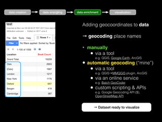
  • 27. data wrangling data enrichment visualization Adding geocoordinates to data → geocoding place names • manually • via a tool e.g. QGIS, Google Earth, ArcGIS • automatic geocoding (“mine”) • via a tool e.g. QGIS→MMQGIS plugin, ArcGIS • via an online service e.g. Batch GeoCoder • custom scripting & APIs e.g. Google Geocoding API ($), OpenStreetMap API → Dataset ready to visualize data creation
  • 28. • Map visualizations: • Visualize within tool itself • ArcGIS, QGIS (tutorials), etc. • Web export from tool • e.g. QGIS to OpenLayers (via QGIS2Web) • Via online solutions • Google Maps (via My Maps) • Google Earth (via “New Project”) • MapBox, etc. • Via dedicated Javascript libraries • Leaflet • OpenLayers • kepler.gl • Cesium, etc. data wrangling data enrichment visualization Huurdeman, Ben-David, Samar (2013) data creation
  • 31. Geomaps: initial questions Audience, Medium and Purpose (e.g. Brewer, 2015) • What: • What data would you like to present? (e.g. (un)orderable, numerical) • Who: • What is the intended audience? (e.g. general vs experts) • Why: • What is the purpose? (e.g. data exploration, discovery, explanation) • On the basis of these questions, you decide on the how, e.g.: • static vs interactive map • simple vs complex functionality • see also: UX pattern checklist
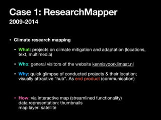
  • 32. Case 1: ResearchMapper 2009-2014 • Climate research mapping • What: projects on climate mitigation and adaptation (locations, text, multimedia) • Who: general visitors of the website kennisvoorklimaat.nl • Why: quick glimpse of conducted projects & their location; visually attractive “hub”. As end product (communication) • How: via interactive map (streamlined functionality)
 data representation: thumbnails
 map layer: satellite
  • 33. 2.1 • Gather climate change- related projects, descriptions & media files • Google Earth editor: add placemarks / lines / shapes (try it out here) • Export as KML file → data enrichment dataset creation
  • 34. 2.2 • Create web application integrating Google Maps 3D* API • Import KML-file • Decide on base map layer • Adapt design, text, images, videos • Testing with prospective users * now deprecated visualization
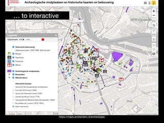
  • 35. 2.3 Final result (2009) General audience: aiming for simplicity
  • 36. 2.3 Final result (2009) General audience: aiming for simplicity
  • 37. 2.3 Final result (2009) General audience: aiming for simplicity Visually attractive: 3D animations Visually attractive: photo / video materials General audience: short introductory texts “Hub”: Links to additional information
  • 38. Case 2: “Virtual Interiors” Maps
  • 39. Case 2: “Virtual Interiors” Maps • What: visualize research on 17th century visual artist & art dealer locations/networks (by Weixuan Li)
  • 40. Case 2: “Virtual Interiors” Maps • What: visualize research on 17th century visual artist & art dealer locations/networks (by Weixuan Li) • Who: experts (researchers, such as art historians), but also historically interested general audiences
  • 41. Case 2: “Virtual Interiors” Maps • What: visualize research on 17th century visual artist & art dealer locations/networks (by Weixuan Li) • Who: experts (researchers, such as art historians), but also historically interested general audiences • Why: for exploration, ongoing research & (finally) as end product
  • 42. Case 2: “Virtual Interiors” Maps • What: visualize research on 17th century visual artist & art dealer locations/networks (by Weixuan Li) • Who: experts (researchers, such as art historians), but also historically interested general audiences • Why: for exploration, ongoing research & (finally) as end product • How: • interactive map (with research functionality) • data representation: map points, areas, uncertainty displays • map layers: historical maps
  • 43. 2.1 • Data collection Weixuan Li • Initially artists 1585-1610 • Archival research (e.g. birth/death registries, transportakten, Bredius archive) • (Re)mapping polygons of locations • Extending Ecartico → vondel.humanities.uva.nl/ecartico/ dataset creation
  • 45. 2.2 • Make use of “Linked Data” (explanation) • Ecartico ID → Get additional information + images from Ecartico, Wikidata, AdamLink, RKD https://lod-cloud.net/ data enrichment
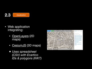
  • 46. 2.3 • Web application integrating: • OpenLayers (2D maps) • CesiumJS (3D maps) • Uses spreadsheet (CSV) with Ecartico IDs & polygons (WKT) visualization
  • 50. Selected artist Linked Data displays Annotations work in progress
  • 51. Historical street scenes (Wikidata, Adamnet) work in progress
  • 52. Historical street scenes (Wikidata, Adamnet) work in progress
  • 54. Challenge: uncertainty • Data sparsity • Uncertainty (MacEachren et al. 2005) • what (attribute/thematic uncertainty) — e.g. are we sure these archive documents talk about the same painter? • where (positional uncertainty) — e.g. where was this painter working exactly? • when (temporal uncertainty) — e.g. when was this painter active? See also: https://www.e-education.psu.edu/geog486/node/693
  • 55. 4. Diving into (design) decisions
  • 56. 4.1 Generalization & abstraction Map as representation of reality • Abstraction in mapping, e.g.: • Selection (select visible elements) • Simplification (reduce complexity) • Aggregation (group similar points) • Dynamic maps: think of map scales • e.g. scale-dependent visibility; rule- based styling in GIS packages • e.g. marker clustering in Google Maps API OpenStreetMap Selection, simplification Aggregations Google Maps
  • 58. 4.2 Symbology • In context of cartographic design: “the use of graphical techniques to represent geographic information on a map” (GIS Encyclopedia) • Can we make it 
 Functional - Beautiful - Insightful - Enlightening - Truthful ?
  • 59. 4.2 Symbology • In context of cartographic design: “the use of graphical techniques to represent geographic information on a map” (GIS Encyclopedia) • Can we make it 
 Functional - Beautiful - Insightful - Enlightening - Truthful ? • Using visual variables → 4.2.1 • e.g. position, size, shape, orientation • e.g. texture • e.g. color value, hue
  • 60. 4.2 Symbology • In context of cartographic design: “the use of graphical techniques to represent geographic information on a map” (GIS Encyclopedia) • Can we make it 
 Functional - Beautiful - Insightful - Enlightening - Truthful ? • Using visual variables → 4.2.1 • e.g. position, size, shape, orientation • e.g. texture • e.g. color value, hue • Try to optimize visual hierarchy → 4.2.2
  • 61. Jacques Bertin’s “retinal variables” (1967) • Selective variables - quickly isolate group of variables • Ordered variables - recognizable sequence • Associative variables - recognize as group • Quantitative variables - estimate numerical difference www.axismaps.com/guide/visual-variables
  • 62. 4.2.1 Color use • Nominal color schemes • “unorderable”, qualitative data (e.g. land use) • Sequential color schemes • orderable or numerical (e.g. small/medium/large) • Diverging color schemes • natural “mid-point” (e.g. avg per capita income) https://www.axismaps.com/guide/using-colors-on-maps
  • 64. 4.2.2 Visual hierarchy_ • “A map’s visual hierarchy should match its intellectual hierarchy.” • Figure - ground relationship 
 (icons-background) • Color-contrasts https://www.axismaps.com/guide/visual-hierarchy
  • 66. Webmapping: final words • Always keep the What/Who/Why in mind • Design == trade-offs • e.g., Overview versus depth
  • 67. Webmapping: final words • Always keep the What/Who/Why in mind • Design == trade-offs • e.g., Overview versus depth • Webmapping: • compared to display in GIS packages you have to streamline your content (and features)
  • 68. Webmapping: final words • Always keep the What/Who/Why in mind • Design == trade-offs • e.g., Overview versus depth • Webmapping: • compared to display in GIS packages you have to streamline your content (and features) • Again — (web) map == selective representation of reality
  • 69. 5. Conclusion • Defining (map) visualization • Map visualization process • Defining questions • Two cases: researchmapper & Virtual Interiors artist locations • Design decisions
  • 71. Open University, Technology-Enhanced Learning & Innovation https://www.ou.nl/en/onderzoek-onderwijswetenschappen-leren-en-innoveren-met-ict-onderzoek
  • 72. References • Bertin, J. (1967), Sémiologie graphique, The Hague, Mouton • Cairo (2016). The Truthful Art - Data, Charts, and Maps for Communication • Fry (2007), Visualizing Data, O’Reilly • Hirtle (2019), Geographical Design - Spatial Cognition and Geographical Information Science. Synthesis lectures on Human-Centered Informatics. doi:10.2200/S00921ED2V01Y201904HCI043 • Huurdeman, H. C., Ben-David, A., & Sammar, T. (2013). Sprint Methods for Web Archive Research. Proceedings of the 5th Annual ACM Web Science Conference, 182–190. • Kirk (2016). Data Visualization - A handbook for Data Driven Design • MacEachren, A. M., Robinson, A., Hopper, S., Gardner, S., Murray, R., Gahegan, M., & Hetzler, E. (2005). Visualizing geospatial information uncertainty: What we know and what we need to know. Cartography and Geographic Information Science, 32(3), 139-. Gale Academic OneFile. • MacEachren, A. M., Roth, R. E., O’Brien, J., Li, B., Swingley, D., & Gahegan, M. (2012). Visual Semiotics Uncertainty Visualization: An Empirical Study. IEEE Transactions on Visualization and Computer Graphics, 18(12), 2496–2505. https://doi.org/10.1109/TVCG.2012.279 • Nussbaumer Knaflic (2015). Storytelling with Data. Wiley • Tufte (1983). The Visual Display of Quantitative Information
  • 73. Misc links • Brief cartography guide • https://www.axismaps.com/guide • Cartography and Visualization course • https://www.e-education.psu.edu/geog486 • Visualization lecture Hugo (2018) • https://www.slideshare.net/TimelessFuture/visualization-lecture-clariah-summer-school-2018 • Some mapping advice • https://www.tableau.com/about/blog/2017/8/10-ways-add-value-your-dashboards-maps-75709 • UX Patterns maps: https://twitter.com/smashingmag/status/1247068814589792256 • Chart usage guidelines: • eazybi.com/blog/data_visualization_and_chart_types • Improving the ‘data-ink ratio’: • darkhorseanalytics.com/blog/data-looks-better-naked • Geocoding in QGIS • https://guides.library.ucsc.edu/DS/Resources/QGIS • Webmapping via QGIS • https://www.qgistutorials.com/en/docs/web_mapping_with_qgis2web.html
  • 75. @timelessfuture Hugo Huurdeman Open University of the Netherlands Webmapping: 
 
 Maps for presentation, exploration & analysis Guest Lecture, Digital Practice in Archaeology course, UvA/VU (15/03/22)