- SwiftUI - Home
- SwiftUI - Overview
- SwiftUI vs UIkit
- SwiftUI Environment
- SwiftUI - Environment Setup
- SwiftUI - Basic Components
- SwiftUI - Building First Application
- SwiftUI Views
- SwiftUI - Views
- SwiftUI - Customize Text View
- SwiftUI - Custom Image View
- SwiftUI - Stacks
- SwiftUI Drawing Shapes
- SwiftUI - Shapes
- SwiftUI - Drawing line
- SwiftUI - Drawing Rectangle
- SwiftUI - Drawing Rounded Rectangle
- SwiftUI - Drawing Triangle
- SwiftUI - Drawing Circle
- SwiftUI - Drawing Star
- SwiftUI - Drawing Polygon
- SwiftUI - Drawing Pie chart
- SwiftUI - Using built-in shapes
- SwiftUI - Text
- SwiftUI - Text View
- SwiftUI - Text Input and Output
- SwiftUI - Color
- SwiftUI - Color
- SwiftUI - Colorpicker
- SwiftUI - Gradients
- SwiftUI - Adjust Color
- SwiftUI - Effects
- SwiftUI - Effects
- SwiftUI - Blend Effect
- SwiftUI - BLur Effect
- SwiftUI - Shadow Effect
- SwiftUI - Hover Effect
- SwiftUI - Animations
- SwiftUI - Animations
- SwiftUI - Creating Animations
- SwiftUI - Creating an Explicit Animation
- SwiftUI - Multiple Animations
- SwiftUI - Transitions
- SwiftUI - Asymmetric Transition
- SwiftUI - Custom Transition
- SwiftUI - Image
- SwiftUI - Images
- SwiftUI - Image as Background
- SwiftUI - Rotating Image
- SwiftUI - Media
- SwiftUI - View Layout
- SwiftUI - View Layout
- SwiftUI - View Size
- SwiftUI - View Spacing
- SwiftUI - View Padding
- SwiftUI - UI Controls
- SwiftUI - UI Controls
- SwiftUI - Button
- SwiftUI - CheckBox
- SwiftUI - Menubar
- SwiftUI - Toolbar
- SwiftUI - Search Bar
- SwiftUI - TextField
- SwiftUI - Slider
- SwiftUI - Toggle
- SwiftUI - Pickers
- SwiftUI - Menus
- SwiftUI - List & Tables
- SwiftUI - Lists
- SwiftUI - Static List
- SwiftUI - Dynamic List
- SwiftUI - Customize List
- SwiftUI - Tables
- SwiftUI - Forms
- SwiftUI - Forms
- SwiftUI - Breaking Forms in Sections
- SwiftUI - Event Handling
- SwiftUI - Event Handling
- SwiftUI - Gesture
- SwiftUI - Clipboard
- SwiftUI - Drag and Drop
- SwiftUI - Focus
- SwiftUI - Alert
- SwiftUI - Miscellaneous
- SwiftUI - Containers
- SwiftUI - Navigation
- SwiftUI - Notifications
- SwiftUI - Cross-Platform UI
- SwiftUI - Data
- SwiftUI - Accessibility
- SwiftUI - Framework Integration
- SwiftUI - Framework Integration
- SwiftUI - Interfacing with UIKit
- SwiftUI - Creating macOS App
- SwiftUI Useful Resources
- SwiftUI - Useful Resources
- SwiftUI - Discussion
SwiftUI - Images
Image view is used to display visual content such as images, symbols, icons, illustation, etc. on the user interface. It is the commonly used method in SwiftUI to upload and display images on the UI. It can support all types of images such as png, jpeg, .heif, .pdf, .svg, SF symbol, .gif. In this chapter, we will add images in XCode, how to display images and much more about images.
How to add an image in XCode?
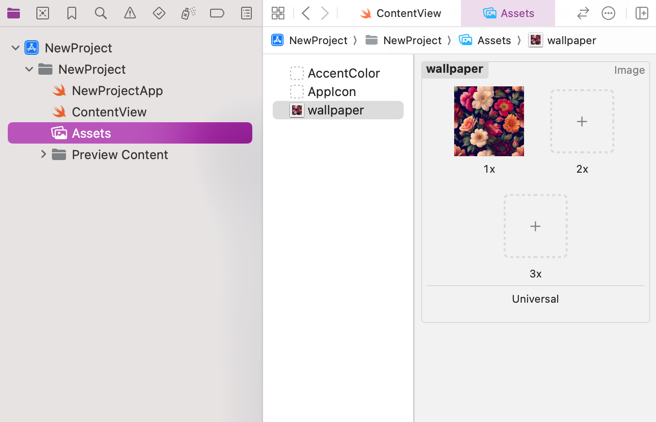
In SwiftUI, we can not directly add images in the XCode project, we have to first add images in the Assets.xcassets folder of the project. This folder contains all the images that will use in the project such as background images, app icons, etc. To add images to the assets we can either drag and drop the images or can click on the plus button.
Here we can add images in three different scales(1x, 2x, 3x) for different device screens, the resolution of these three scales is different 1x has lower whereas 3x has a higher resolution among all the three images. If we select image scale to single, then the image is used for all scales.
How to display images in SwiftUI?
In SwiftUI, we can display images with the help of Image View. It is the most common view to add images, or icons in the user interface of the app. It displays images from various sources including, asset catalogue, or SF symbols. It also provides various customizers to customize images such as ignoreSafeArea(), frame(), rotationEffect(), etc.
Syntax
Following is the syntax −
Image("Image Name")
Now follow the following steps to insert an image in the current view −
Step 1: Open a new project.
Step 2: Drag and drop an image in the Assets.xcassets folder.
Step 3: Go to ContentView and use Image view to insert an image.
Example 1
The following SwiftUI program inserts an image using Image view.
import SwiftUI

struct ContentView: View {
   var body: some View {
      ZStack{
         Image("wallpaper")
            .resizable()
            .ignoresSafeArea()

         Text("TutorialsPoint")
            .font(.title)
            .foregroundStyle(.white)
            .bold()

      }
   }
}

#Preview {
   ContentView()
}
Output

Example 2
The following SwiftUI program is used to insert the SF symbol using Image view.
import SwiftUI

struct ContentView: View {
   var body: some View {
      ZStack{
         Image(systemName:"cloud")
            .resizable()
            .scaledToFit()
            .foregroundStyle(.indigo)
      }
   }
}

#Preview {
   ContentView()
}
Output

Customize Images in SwiftUI
In SwiftUI, we can customize images using the following built-in modifiers −
| Modifier | Description |
|---|---|
| resizable() | Using this modifier we can resize the image automatically according to the size of the container. |
| aspectRatio() | It is used to manage the aspect ratio of the given image. |
| frame() | It is used to modify the height, width and alignment of the image. |
| scaleToFit() | It is used to scale the image to fit inside its parent view without stretching or compressing. |
| scaleToFill() | It is used to scale the image to fit inside the parent view with stretching or compressing. |
| clipped() | It is used to crop the image. Or we can say that it hides the content present outside the boundaries of the given shape. |
| clipShape() | It is used to change the shape of the image. It provides 5 different in-built shapes: circle, rectangle, rounded rectangle, capsule and ellipse |
| renderingMode() | It is used to render an image as it is or by using a different mode. |
| padding() | It is used to provide padding to the given image. |
| opacity() | It is used to adjust the opacity of the image. |
Example
The following SwiftUI program is used to apply customization on the image.
import SwiftUI

struct ContentView: View {
   var body: some View {
      VStack{
         Image("wallpaper")
            .resizable()
            .scaledToFit()
            .opacity(0.9)
            .frame(width: 200, height: 150)
         Image("wallpaper")
            .resizable()
            .scaledToFit()
            .clipShape(Circle())
            .opacity(1.2)
            .frame(width: 200, height: 150)
      }
   }
}

#Preview {
   ContentView()
}
Output
